At one time paperback books were thought of as trash, a term that described their perceived artistic and cultural level, production value, and utter disposability. This changed in the mid-20th century, when certain paperback publishers (Doubleday Anchor, for example, who hired Edward Gorey to design their covers in the 1950s) made a push for respectability. It worked so well that the signature aesthetics they developed still, nearly a lifetime later, pique our interest more readily than those of any other era.
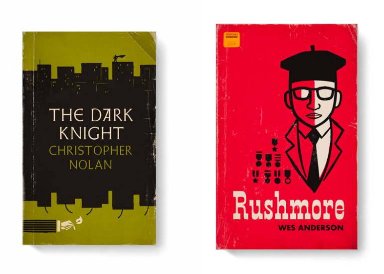
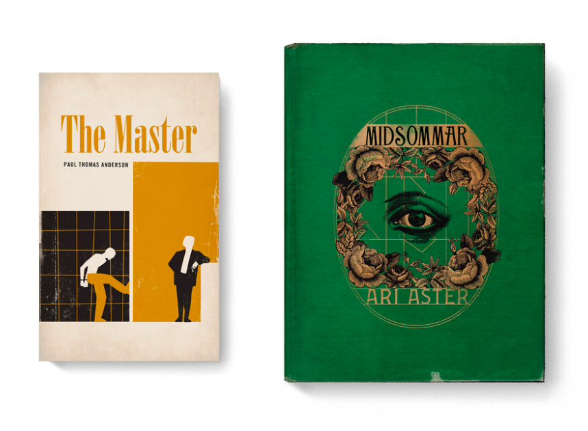
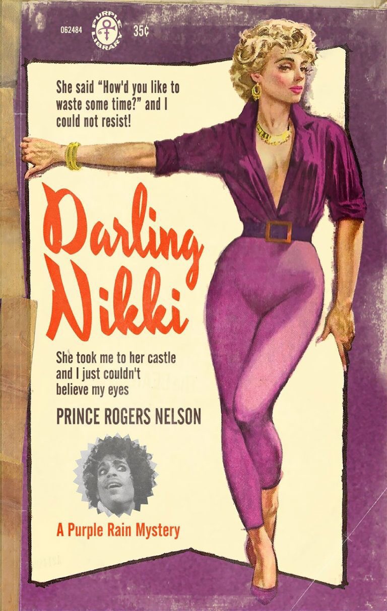
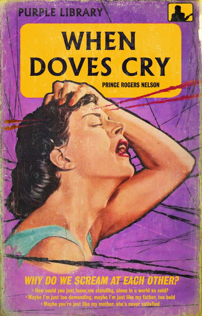
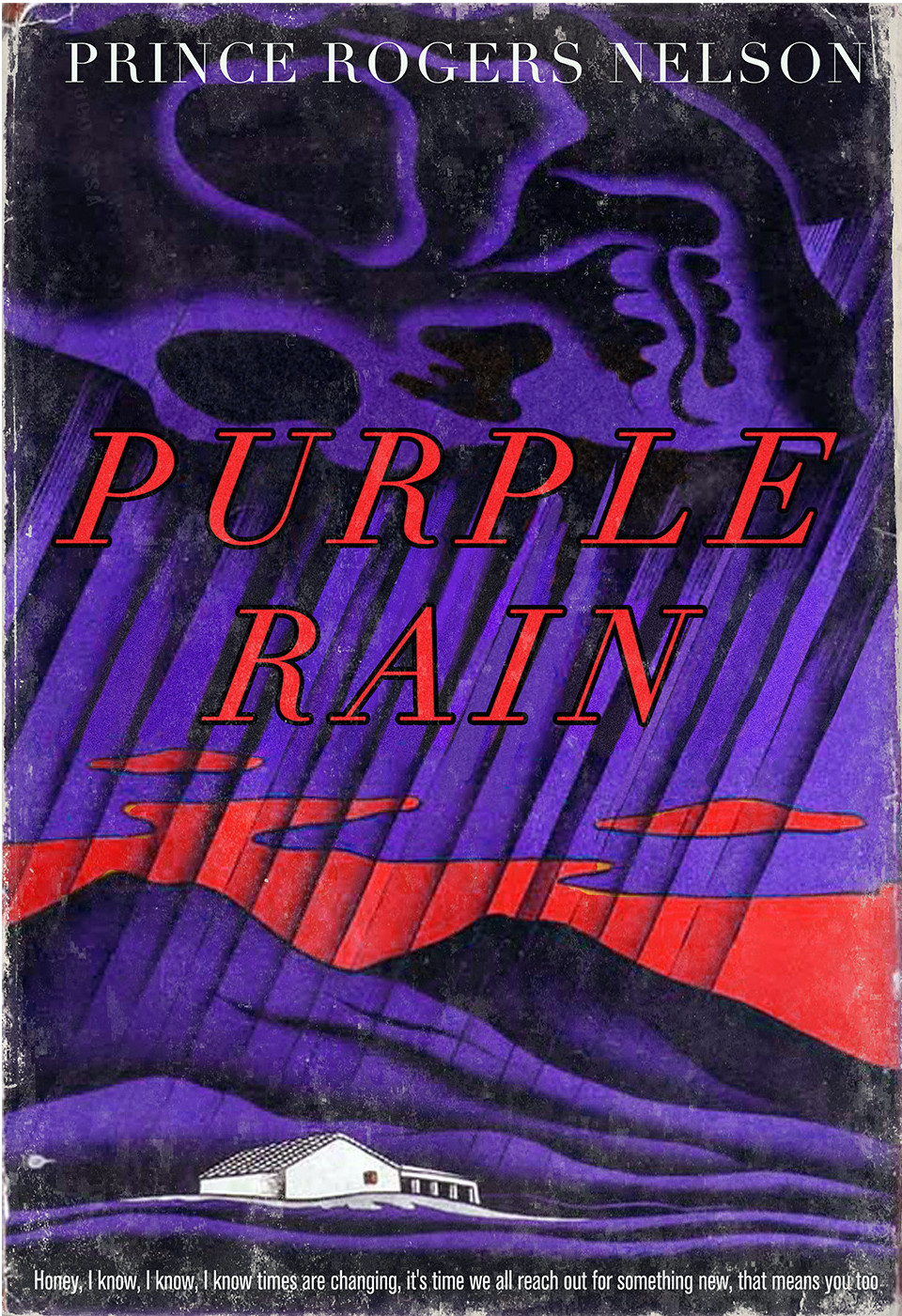
Even today, graphic designers put in the time and effort to master the art of the midcentury paperback cover and transpose it into other cultural realms, as Matt Stevens does in his “Good Movies as Old Books” series. In this “ongoing personal project,” Stevens writes, “I envision some of my favorite films as vintage books. Not a best of list, just movies I love.”
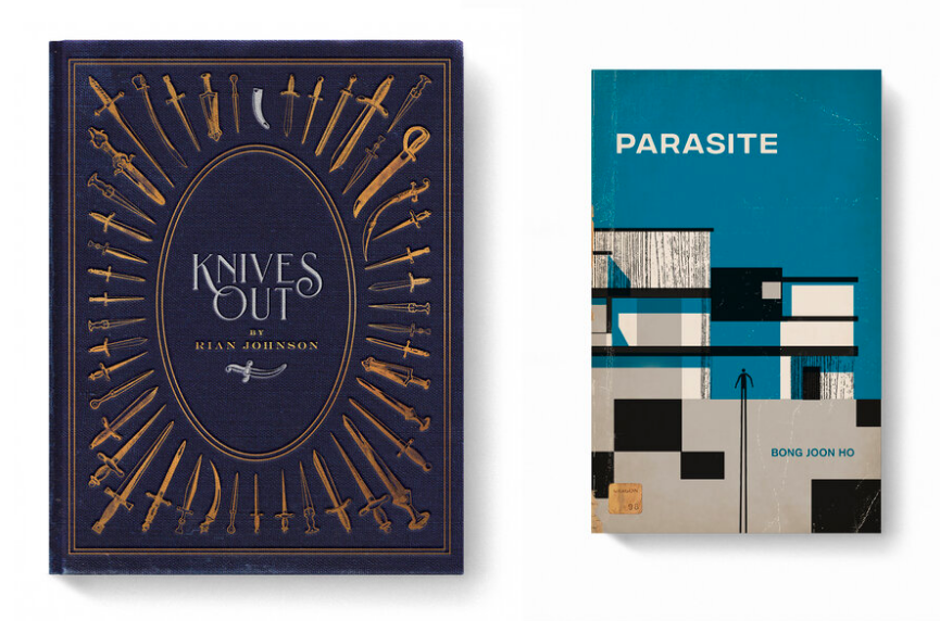
These movies, for the most part, date from more recent times than the mid-20th century. Some, like Jordan Peele’s Us, the Safdie brothers’ Uncut Gems, and Bong Joon-ho’s Parasite, came out just last year. The oldest pictures among them, such as Alfred Hitchcock’s The Birds, date from the early 1960s, when this type of graphic design had reached the peak of its popularity.
Suitably, Stevens also gives the retro treatment to a few already stylized period pieces like Steven Spielberg’s Raiders of the Lost Ark, Joe Johnston’s The Rocketeer, and Andrew Niccol’s Gattaca, a sci-fi vision of the future itself imbued with the aesthetics of the 1940s. Each and every one of Stevens’ beloved-movies-turned-old-books looks convincing as a work of graphic design from roughly the decade and a half after the Second World War, and some even include realistic creases and price tags. This makes us reflect on the connections certain of these films have to literature, most obviously those, like David Fincher’s Fight Club and Stephen Frears’ High Fidelity, adapted from novels in the first place.
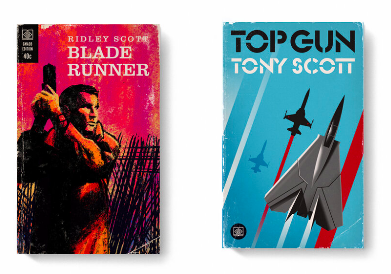
More subtle are Rian Johnson’s recent Knives Out, a thoroughgoing tribute to (if not an adaptation of) the work of Agatha Christie; Ridley Scott’s Blade Runner, which hybridizes a Philip K. Dick novella with pulp detective noir; and Wes Anderson’s Rushmore, a statement of its director’s intent to revive the look and feel of the early 1960s (its books and otherwise) for his own cinematic purposes. Stevens has made these imagined covers available for purchase as prints, but some retro design-inclined, bibliophilic film fans may prefer to own them in 21st-century book form. See all of his adaptations in web format here.
Related Content:
157 Animated Minimalist Mid-Century Book Covers
Vintage Book & Record Covers Brought to Life in a Mesmerizing Animated Video
Based in Seoul, Colin Marshall writes and broadcasts on cities, language, and culture. His projects include the book The Stateless City: a Walk through 21st-Century Los Angeles and the video series The City in Cinema. Follow him on Twitter at @colinmarshall, on Facebook, or on Instagram.