Jazz Typefaces Capture the Essence of 100 Iconic Jazz Musicians

In the 1950s and 60s, one record label stood “like a bea­con,” writes Robin Kin­ross at Eye, among a host of Civ­il Rights era inde­pen­dents that helped jazz “escape the racial-com­mer­cial con­straints applied by White Amer­i­cans, and find its own place, unpa­tro­n­ised and rel­a­tive­ly free of exploita­tion.” That label, Blue Note, ush­ered in the birth of the cool—both cool jazz and its many hip signifiers—as much through graph­ic design as through its metic­u­lous approach to record­ing.

Blue Note album cov­ers may seem prin­ci­pal­ly dis­tin­guished by the pho­tog­ra­phy of Fran­cis Wolff, whose instincts behind the cam­era pro­duced visu­al icon after icon. But the label’s style depend­ed on the lay­out, graph­ic design, and let­ter­ing of Reid Miles, who drew on min­i­mal­ist Swiss trends in “over 500 album cov­ers for Blue Note Records,” design­er Rea­gan Ray writes. “He pio­neered the use of cre­ative­ly-arranged type over mono­chro­mat­ic pho­tog­ra­phy, which is a style that is still wide­ly used in graph­ic design today.”

As we not­ed in a recent post on Blue Note’s leg­endary design team, Reid’s let­ter­ing some­times edged the pho­tog­ra­phy to the mar­gins, or off the cov­er alto­geth­er. Jazz greats were giv­en the free­dom to cre­ate the music they want­ed, but it was the design­ers who had to sell their cre­ativ­i­ty to the pub­lic in a visu­al lan­guage.

They had done so with dis­tinc­tive type­faces before Reid, of course. But the art of let­ter­ing became far more inter­est­ing through his influ­ence, both more play­ful and more refined at the same time.

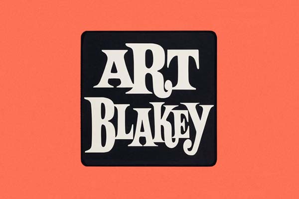
Since type­face has always played a sig­nif­i­cant role in the music’s com­mer­cial suc­cess, Ray decid­ed to com­pile sev­er­al hun­dred sam­plings of album let­ter­ing of jazz musician’s names, “for easy brows­ing and analy­sis” of type­face as an essen­tial ele­ment all on its own. The gallery may attempt “to cov­er most of the genre’s sig­nif­i­cant musi­cians,” but there are, Ray admits, many inevitable omis­sions.

Nonethe­less, it’s a for­mi­da­ble visu­al record of the var­i­ous looks of jazz in let­ter­ing, and the visu­al iden­ti­ties of its biggest artists over the course of sev­er­al decades. Ray does not name any of the design­ers, which is frus­trat­ing, but those in the know will rec­og­nize the work of Reid and oth­ers like album cov­er pio­neer Alex Stein­weiss. You may well spot let­ter­ing by Mil­ton Glaser, whom Ray pre­vi­ous­ly cov­ered in a huge curat­ed gallery of the famous designer’s album art.

The names behind the big names mat­ter, but it’s the musi­cians them­selves these indi­vid­u­al­ized type­faces are meant to imme­di­ate­ly evoke. Con­sid­er just how well most all of these exam­ples do just that—representing each artist’s music, peri­od, and image with the per­fect font and graph­ic arrange­ment, each one a unique logo. Some­what like the music it rep­re­sents, Ray’s gallery is, itself, a col­lec­tive tour-de-force per­for­mance of visu­al jazz.

Vis­it Ray’s gallery here.

via Kot­tke

Relat­ed Con­tent:

The Impos­si­bly Cool Album Cov­ers of Blue Note Records: Meet the Cre­ative Team Behind These Icon­ic Designs

Clas­sic Jazz Album Cov­ers Ani­mat­ed & Brought to Life

The Ground­break­ing Art of Alex Stein­weiss, Father of Record Cov­er Design

Josh Jones is a writer and musi­cian based in Durham, NC. Fol­low him at @jdmagness

Good Movies as Old Books: 100 Films Reimagined as Vintage Book Covers

At one time paper­back books were thought of as trash, a term that described their per­ceived artis­tic and cul­tur­al lev­el, pro­duc­tion val­ue, and utter dis­pos­abil­i­ty. This changed in the mid-20th cen­tu­ry, when cer­tain paper­back pub­lish­ers (Dou­ble­day Anchor, for exam­ple, who hired Edward Gorey to design their cov­ers in the 1950s) made a push for respectabil­i­ty. It worked so well that the sig­na­ture aes­thet­ics they devel­oped still, near­ly a life­time lat­er, pique our inter­est more read­i­ly than those of any oth­er era.

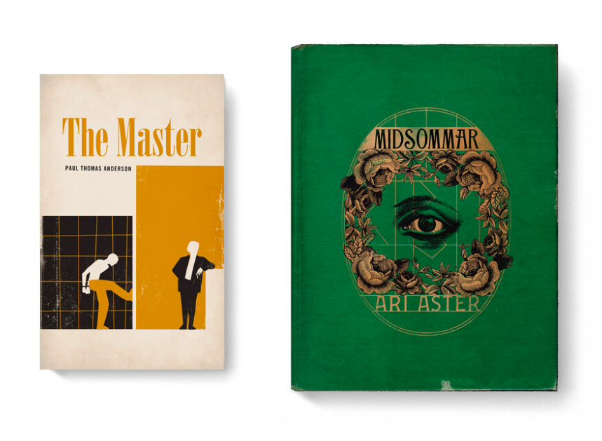
Even today, graph­ic design­ers put in the time and effort to mas­ter the art of the mid­cen­tu­ry paper­back cov­er and trans­pose it into oth­er cul­tur­al realms, as Matt Stevens does in his “Good Movies as Old Books” series. In this “ongo­ing per­son­al project,” Stevens writes, “I envi­sion some of my favorite films as vin­tage books. Not a best of list, just movies I love.”

These movies, for the most part, date from more recent times than the mid-20th cen­tu­ry. Some, like Jor­dan Peele’s Us, the Safdie broth­ers’ Uncut Gems, and Bong Joon-ho’s Par­a­site, came out just last year. The old­est pic­tures among them, such as Alfred Hitch­cock­’s The Birds, date from the ear­ly 1960s, when this type of graph­ic design had reached the peak of its pop­u­lar­i­ty.

Suit­ably, Stevens also gives the retro treat­ment to a few already styl­ized peri­od pieces like Steven Spiel­berg’s Raiders of the Lost Ark, Joe John­ston’s The Rock­e­teer, and Andrew Nic­col’s Gat­taca, a sci-fi vision of the future itself imbued with the aes­thet­ics of the 1940s. Each and every one of Stevens’ beloved-movies-turned-old-books looks con­vinc­ing as a work of graph­ic design from rough­ly the decade and a half after the Sec­ond World War, and some even include real­is­tic creas­es and price tags. This makes us reflect on the con­nec­tions cer­tain of these films have to lit­er­a­ture, most obvi­ous­ly those, like David Fincher’s Fight Club and Stephen Frears’ High Fideli­ty, adapt­ed from nov­els in the first place.

More sub­tle are Rian John­son’s recent Knives Out, a thor­ough­go­ing trib­ute to (if not an adap­ta­tion of) the work of Agatha Christie; Rid­ley Scot­t’s Blade Run­ner, which hybridizes a Philip K. Dick novel­la with pulp detec­tive noir; and Wes Ander­son­’s Rush­more, a state­ment of its direc­tor’s intent to revive the look and feel of the ear­ly 1960s (its books and oth­er­wise) for his own cin­e­mat­ic pur­pos­es. Stevens has made these imag­ined cov­ers avail­able for pur­chase as prints, but some retro design-inclined, bib­lio­philic film fans may pre­fer to own them in 21st-cen­tu­ry book form. See all of his adap­ta­tions in web for­mat here.

via Colos­sal

Relat­ed Con­tent:

157 Ani­mat­ed Min­i­mal­ist Mid-Cen­tu­ry Book Cov­ers

Vin­tage Book & Record Cov­ers Brought to Life in a Mes­mer­iz­ing Ani­mat­ed Video

When Edward Gorey Designed Book Cov­ers for Clas­sic Nov­els: See His Iron­ic-Goth­ic Take on Dick­ens, Con­rad, Poe & More

Songs by David Bowie, Elvis Costel­lo, Talk­ing Heads & More Re-Imag­ined as Pulp Fic­tion Book Cov­ers

Clas­sic Songs Re-Imag­ined as Vin­tage Book Cov­ers Dur­ing Our Trou­bled Times: “Under Pres­sure,” “It’s the End of the World as We Know It,” “Shel­ter from the Storm” & More

Based in Seoul, Col­in Mar­shall writes and broad­casts on cities, lan­guage, and cul­ture. His projects include the book The State­less City: a Walk through 21st-Cen­tu­ry Los Ange­les and the video series The City in Cin­e­ma. Fol­low him on Twit­ter at @colinmarshall, on Face­book, or on Insta­gram.

The Joy of Watching Old, Damaged Things Get Restored: Why the World is Captivated by Restoration Videos

The inter­net has giv­en us a few new ways to watch things, but many more new things to watch. It’s not just that we now tune in to our favorite shows online rather than on tele­vi­sion, but that our “favorite shows” have assumed forms we could­n’t have imag­ined before. Thir­ty years ago, if you’d gone to a TV net­work and pitched a pro­gram con­sist­ing of noth­ing but the process of antique restora­tion — no music, no nar­ra­tion, no sto­ry, and cer­tain­ly no stars — you’d have been told nobody want­ed to watch that. In 2020, we know the truth: not only do peo­ple want to watch that, but quite a lot of peo­ple want to watch that, as evi­denced by the enor­mous view counts of Youtube restora­tion videos.

At Vice, Mike Dozi­er pro­files the Swiss Youtube restora­tion chan­nel My Mechan­ics. Its “videos don’t just appeal to peo­ple inter­est­ed in antique restora­tion, which they sure­ly do, but many view­ers watch because they find the process relax­ing.”

Some come for the tech­niques and stay for the “hyp­not­ic qual­i­ty — the sounds of clink­ing met­al, the grind­ing of sand­pa­per and the whirring of a lathe pop­u­late each video. And watch­ing some­thing, like a rusty old cof­fee grinder, come back to life, shiny and look­ing brand-new, is unique­ly sat­is­fy­ing.” This verges on the new­ly carved-out ter­ri­to­ry of “autonomous sen­so­ry merid­i­an response,” or ASMR, a genre of video engi­neered specif­i­cal­ly to deliv­er psy­cho­log­i­cal­ly pleas­ing sounds.

In Korea, where I live, ASMR has attained dis­pro­por­tion­ate­ly mas­sive pop­u­lar­i­ty — though not quite the pop­u­lar­i­ty of muk­bang, the style of long-form eat­ing-on-cam­era video that has gone inter­na­tion­al in recent years. One the­o­ry of the appeal of muk­bang holds that it offers vic­ar­i­ous sat­is­fac­tion to view­ers who are diet­ing, broke, or oth­er­wise unable to con­sume enor­mous meals them­selves. That may also be true, to a degree, of restora­tion videos. To bring a 19th-cen­tu­ry screw­driv­er, say, or a World War II mil­i­tary watch back to like-new con­di­tion requires not just the right equip­ment but for­mi­da­ble amounts of knowl­edge and dex­ter­i­ty as well. Click­ing on a Youtube video asks of us much less in the way of time and ded­i­ca­tion. And yet, among the bil­lions of views restora­tion videos have racked up, there are sure­ly fans who have act­ed on the inspi­ra­tion and built old-school skills of their own.

In our increas­ing­ly dig­i­tal age — char­ac­ter­ized by noth­ing more acute­ly than our ten­den­cy to spend hours click­ing through increas­ing­ly spe­cial­ized Youtube videos — skilled phys­i­cal work has become an impres­sive spec­ta­cle in itself. As every­where on the inter­net, sub­gen­res have pro­duced sub-sub­gen­res: take the vin­tage toy restora­tion chan­nel Res­cue & Restore or art restor­er Julian Baum­gart­ner (who pro­duces both nar­rat­ed and ASMR ver­sion of his videos), both pre­vi­ous­ly fea­tured here on Open Cul­ture. If those don’t absorb you, have a look at Cool Again Restora­tionIron Man Restora­tion, Hand Tool Res­cue, MrRes­cue (a mod­el-car spe­cial­ist), Restora­tion and Met­al, Ran­dom Hands… and the list goes on, giv­en how much needs restor­ing in this world.

via metafil­ter

Relat­ed Con­tent:

Watch Bat­tered & Bruised Vin­tage Toys Get Mes­mer­iz­ing­ly Restored to Near Mint Con­di­tion

Watch an Art Con­ser­va­tor Bring Clas­sic Paint­ings Back to Life in Intrigu­ing­ly Nar­rat­ed Videos

How an Art Con­ser­va­tor Com­plete­ly Restores a Dam­aged Paint­ing: A Short, Med­i­ta­tive Doc­u­men­tary

Watch a 17th-Cen­tu­ry Por­trait Mag­i­cal­ly Get Restored to Its Bril­liant Orig­i­nal Col­ors

The Art of Restor­ing a 400-Year-Old Paint­ing: A Five-Minute Primer

The Art of Restor­ing Clas­sic Films: Cri­te­ri­on Shows You How It Refreshed Two Hitch­cock Movies

Based in Seoul, Col­in Mar­shall writes and broad­casts on cities, lan­guage, and cul­ture. His projects include the book The State­less City: a Walk through 21st-Cen­tu­ry Los Ange­les and the video series The City in Cin­e­ma. Fol­low him on Twit­ter at @colinmarshall, on Face­book, or on Insta­gram.

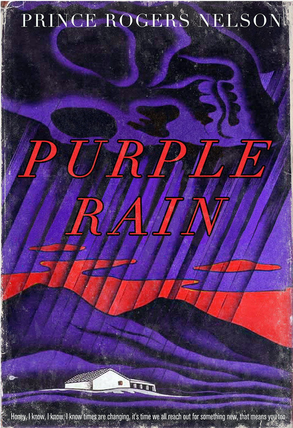
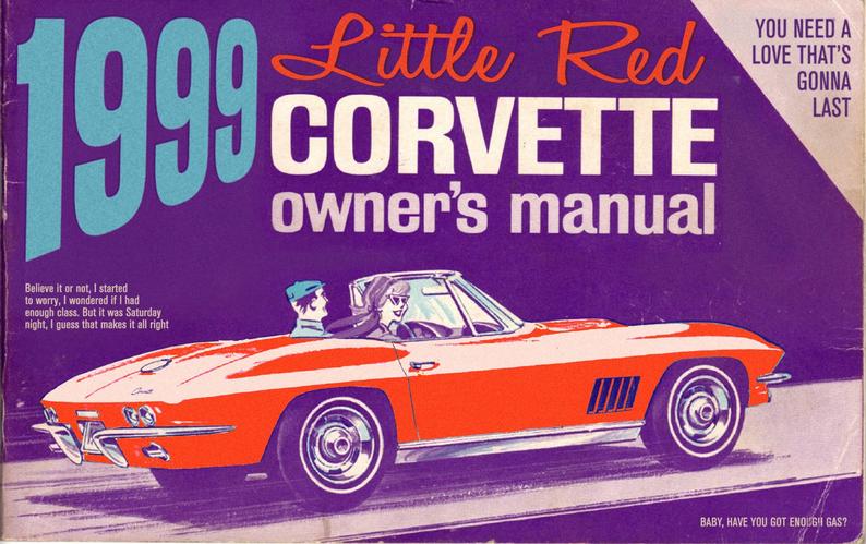
Four Classic Prince Songs Re-Imagined as Pulp Fiction Covers: When Doves Cry, Little Red Corvette & More

There’s a book-lined Knowl­edge Room in the late Prince Rogers Nel­son’s Pais­ley Park, but the Prince-inspired faux-books that artist Todd Alcott imag­ines are prob­a­bly bet­ter suit­ed to the estate’s pur­ple-lit Relax­ation Room.

The Knowl­edge Room was con­ceived of as a library where the world’s most famous con­vert to Jehovah’s Wit­ness­es could delve into reli­gious lit­er­a­ture, reflect on the mean­ing of life, and study the Bible deep into the night.

Alcott’s cov­ers harken to an ear­li­er stage in Prince’s evolution—one the star even­tu­al­ly disavowed—as well as sev­er­al bygone eras of book design.

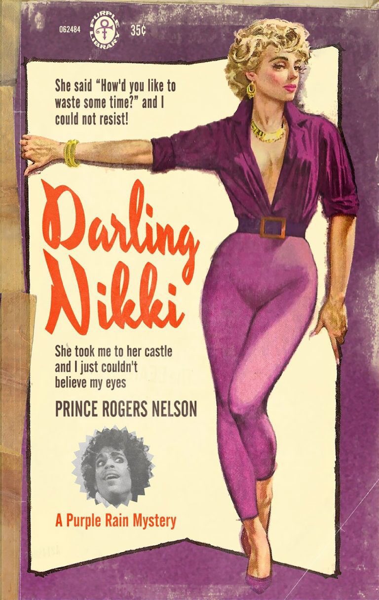
Lyri­cal­ly, there’s no mis­tak­ing what Prince’s noto­ri­ous 1984 “Dar­ling Nik­ki” is about. There’s a direct line between it and the cre­ation of parental advi­so­ry stick­ers for musi­cal releas­es con­tain­ing what is polite­ly referred to as “mature con­tent.”

Alcott’s 1950s pulp nov­el treat­ment, above, is sim­i­lar­ly graph­ic. Those skintight pur­ple curves are a promise that even pur­pler prose lays with­in, or would, were there any text couched behind that steamy cov­er.

“When Doves Cry” makes for a pret­ty pur­ple cov­er, too. In this case, the inspi­ra­tion is a 1950s self-help book, enriched with some Freudi­an taglines from Prince’s own pen. (“Maybe you’re just like my moth­er, she’s nev­er sat­is­fied.”)

Alcott remem­bers Prince being “an incred­i­bly lib­er­at­ing fig­ure” when he burst onto the scene:

There was his flam­boy­ant, out­ra­geous sex­u­al­i­ty, but also his musi­cal omniv­o­rous­ness; he played funk, rock, pop, jazz, every­thing. Pur­ple Rain was the Sergeant Pepper’s of its day, a wall-to-wall bril­liant album that every­one could rec­og­nize as a remark­able achieve­ment. I remem­ber when I first saw Pur­ple Rain, at the very begin­ning of the movie, before the movie has even begun, the Warn­er Bros logo came up and you heard the sound of an expec­tant crowd, and an announc­er says “Ladies and Gen­tle­men, The Rev­o­lu­tion,” and the first shot is of Prince, back­lit, sil­hou­et­ted in pur­ple against a dense mist, and he says “Dear­ly beloved, we have gath­ered here today to get through this thing called life.” And I was instant­ly, incon­tro­vert­ibly, a fan for life. The con­fi­dence of that open­ing, the sheer audac­i­ty of it, adopt­ing the tone of a priest at a wed­ding, in his Hen­drix out­fit and hair­do, the sheer gutsi­ness of that state­ment, alone, just blew me away. And then he pro­ceed­ed to play “Let’s Go Crazy” which com­plete­ly lived up to that open­ing. After that he could have run Buick ads for the rest of the movie and I’d still be a fan.

Decades lat­er, I was sit­ting in a Sub­way restau­rant at the end of a very, very long, tir­ing day, and was feel­ing com­plete­ly exhaust­ed and mis­er­able, and out of nowhere, “When Doves Cry” came on the sound sys­tem. And I was remind­ed that the song, which was a huge hit in 1984, the song of the year, had no bass line. The arrange­ment of it made no sense. It was a song put togeth­er by force of will, with its met­al gui­tar and its synth strings and its elec­tron­ic drums. And in that moment, at the end of a long, tir­ing day, I was remind­ed that mir­a­cles are pos­si­ble.

Alcott’s mirac­u­lous graph­ic trans­for­ma­tions are round­ed out with a com­par­a­tive­ly under­stat­ed 1930s mur­der mys­tery, Pur­ple Rain and an inge­nious Lit­tle Red Corvette owner’s man­u­al dat­ing to the mid-60s. Prints of Todd Alcott’s Prince-inspired paper­back cov­ers are avail­able in his Etsy shop.

Relat­ed Con­tent: 

Prince (RIP) Per­forms Ear­ly Hits in a 1982 Con­cert: “Con­tro­ver­sy,” “I Wan­na Be Your Lover” & More

Clas­sic Songs Re-Imag­ined as Vin­tage Book Cov­ers Dur­ing Our Trou­bled Times: “Under Pres­sure,” “It’s the End of the World as We Know It,” “Shel­ter from the Storm” & More

Clas­sic Radio­head Songs Re-Imag­ined as a Sci-Fi Book, Pulp Fic­tion Mag­a­zine & Oth­er Nos­tal­gic Arti­facts

Ayun Hal­l­i­day is an author, illus­tra­tor, the­ater mak­er and Chief Pri­ma­tol­o­gist of the East Vil­lage Inky zine. Fol­low her @AyunHalliday.

IKEA Digitizes & Puts Online 70 Years of Its Catalogs: Explore the Designs of the Swedish Furniture Giant

The time­less mod­ernism of the IKEA cat­a­log, its promise of tidi­ness, clean, eco­nom­i­cal lines, and excel­lent val­ue belie a strug­gle ahead, an ordeal cus­tomers of the glob­al Swedish build-it-your­self jug­ger­naut know too well. Will the bulky, major­ly-incon­ve­nient­ly shaped box­es fit in the car? Will the rebus-like instruc­tions make sense? Will we assem­ble a bed with love and care, only to find our­selves in a pile of its bro­ken parts come morn­ing?

Clear­ly out­weigh­ing such tragedies are the many hap­py mem­o­ries we asso­ciate with buy­ing, build­ing, and liv­ing with IKEA prod­ucts. The com­pa­ny itself has built such mem­o­ries over the course of almost eight decades with an empire of Scan­di­na­vian design super­mar­kets.

“As of 2019,” Marie Pati­no writes at City­Lab, “IKEA boasts 433 stores across 53 coun­tries.” The IKEA cat­a­log is as wide­ly cir­cu­lat­ed as the Bible and Quran. The Swedish com­pa­ny with the quirk­i­ly named prod­ucts and leg­endary cafe­te­ria meat­balls defines fur­ni­ture shop­ping.

The lay­out of IKEA’s show­rooms may turn “retail into retail ther­a­py,” with cor­ri­dors filled with mono­chro­mat­ic visions of clut­ter-free liv­ing. In these times, of course, we’re far more like­ly to take refuge in those ven­er­a­ble cat­a­logs or the company’s always-improv­ing web­site. Now we can do both at once with a trip through sev­en decades of IKEA cat­a­logs, uploaded to the web­site for the 70th anniver­sary of the first 1950 release.

1951 “marked the first prop­er IKEA cat­a­log,” writes Pati­no, as well as the first icon­ic cov­er fea­tur­ing the first icon­ic design, the MK wing chair. Cov­ers became more elab­o­rate, with smooth mid-cen­tu­ry mod­ern liv­ing room lay­outs that tan­ta­lized, but the con­tents of the cat­a­log looked like gov­ern­ment order forms until the late 60s and 70s. It did not appear in Eng­lish until 1985. In these ear­ly lay­outs we can see just how dat­ed so many of these designs appear in hind­sight.

The company’s sig­na­ture busi­ness mod­el came togeth­er slow­ly at first. It start­ed in 1943, found­ed by Ing­var Kam­prad in Swe­den, as a mail-order busi­ness for sta­tion­ary sup­plies. The fur­ni­ture arrived soon after, but it would take anoth­er decade or so for the flat-pack idea to ful­ly emerge. The BILLY book­shelf, per­haps the most pop­u­lar IKEA design ever, debuted in 1979. Oth­er sta­ples fol­lowed, and in 2013, the orig­i­nal wing­back chair made a mod­i­fied come­back as the STRANDMON. Through it all, the cat­a­log has doc­u­ment­ed Swedish design trends in a glob­al mar­ket­place.,

The 21st cen­tu­ry has seen not only the return of the wing­back but of the mid-cen­tu­ry Scan­di­na­vian mod­ernism with which the com­pa­ny made its name in the 1950s and 60s. Maybe that’s why it’s easy to think of IKEA as con­sis­tent­ly embody­ing this trend, slight­ly updat­ed every few years. But brows­ing through these cat­a­logs shows how thor­ough­ly IKEA absorbed all sorts of Euro­pean influences—as well as the look of hotel room fur­ni­ture from Mia­mi Vice.

What kind of ther­a­py is this? Gaz­ing at dat­ed or retro-hip prod­ucts we are years too late to buy? It offers the same expe­ri­ence as all IKEA cat­a­log shopping—without the strug­gle and expense of trans­port­ing and assem­bling the results: the dis­trac­tion of a world with­out dis­trac­tions. Explore the new archive of IKEA cat­a­logs here.

via Bloomberg and Kot­tke

Relat­ed Con­tent:

The Mas­sive Har­rods Cat­a­logue from 1912 Gets Dig­i­tized: Before Ama­zon, Har­rods Offered “Every­thing for Every­one, Every­where”

The Bauhaus Book­shelf: Down­load Orig­i­nal Bauhaus Books, Jour­nals, Man­i­festos & Ads That Still Inspire Design­ers World­wide

Meet the Mem­phis Group, the Bob Dylan-Inspired Design­ers of David Bowie’s Favorite Fur­ni­ture

Josh Jones is a writer and musi­cian based in Durham, NC. Fol­low him at @jdmagness

A Beautiful 1897 Illustrated Book Shows How Flowers Become Art Nouveau Designs

The art of draw­ing is not the art of observ­ing forms and objects alone, it is not mere mim­ic­ry of these objects; it is the art of know­ing how far and where­in, and with what just lim­i­ta­tions, those forms and objects can be repro­duced in a pic­ture, or in a dec­o­ra­tive work. — Eugène Gras­set, 1896

Flow­ers loomed large in Art Nou­veau, from the volup­tuous flo­ral head­pieces that crowned Alphonse Mucha’s female fig­ures to the stained glass ros­es favored by archi­tect Charles Ren­nie Mack­in­tosh.

Graph­ic design­er Eugène Gras­set’s 1897 book, Plants and Their Appli­ca­tion to Orna­ment, vivid­ly demon­strates the ways in which nature was dis­tilled into pop­u­lar dec­o­ra­tive motifs at the end of the 19th-cen­tu­ry.


Twen­ty-four flow­er­ing plants were select­ed for con­sid­er­a­tion, from hum­ble spec­i­mens like dan­de­lions and this­tle to such Art Nou­veau heavy hit­ters as pop­pies and iris­es.

Each flower is rep­re­sent­ed by a real­is­tic botan­i­cal study, with two addi­tion­al col­or plates in which its form is flat­tened out and mined for its dec­o­ra­tive, styl­is­tic ele­ments.


The plates were ren­dered by Grasset’s stu­dents at the Ă‰cole GuĂ©rin, young artists whom he had “for­bid­den to con­de­scend to the art of base and servile imi­ta­tion”:

The art of draw­ing is not the art of observ­ing forms and objects alone, it is not mere mim­ic­ry of these objects; it is the art of know­ing how far and where­in, and with what just lim­i­ta­tions, those forms and objects can be repro­duced in a pic­ture, or in a dec­o­ra­tive work.

He also expect­ed stu­dents to hone their pow­ers of obser­va­tion through intense study of the organ­ic struc­tures that would pro­vide their inspi­ra­tion, becom­ing inti­mate­ly acquaint­ed with the char­ac­ter of petal, leaf, and stem:

Beau­ti­ful lines are the foun­da­tion of all beau­ty. In a work of art, what­ev­er it be, appar­ent or hid­den sym­me­try is the vis­i­ble or secret cause of the plea­sure we feel. Every­thing that is cre­at­ed must have some rep­e­ti­tion in its parts to be under­stood, retained in the mem­o­ry, and per­ceived as a whole

When it came to adorn­ing house­hold imple­ments such as vas­es and plates, Gras­set insist­ed that dec­o­ra­tive ele­ments exist in har­mo­ny with their hosts, snip­ing that any artist who would dis­tort form with ill con­sid­ered flour­ish­es should make a bas-relief instead.

Thus­ly do chrysan­the­mum stems pro­vide log­i­cal-look­ing bal­last for a chan­de­lier, and a dandelion’s curved leaves hug the con­tours of a table leg.

Gras­set’s best known stu­dent, Mau­rice Pil­lard Verneuil, whose career spanned Art Nou­veau to Art Deco, absorbed and artic­u­lat­ed the master’s teach­ings:


It is no longer the nature (artists) see that they rep­re­sent, that they tran­scribe, but the nature that they aspire to see; nature more per­fect and more beau­ti­ful and of which they have the inte­ri­or vision.


View Eugène Grasset’s Plants and Their Appli­ca­tion to Orna­ment as part of the New York Pub­lic Library’s Dig­i­tal Col­lec­tions here. Or find illus­tra­tions at Raw­Pix­el.

via The Pub­lic Domain Review

Relat­ed Con­tent:

His­toric Man­u­script Filled with Beau­ti­ful Illus­tra­tions of Cuban Flow­ers & Plants Is Now Online (1826 )

Beau­ti­ful Hand-Col­ored Japan­ese Flow­ers Cre­at­ed by the Pio­neer­ing Pho­tog­ra­ph­er Ogawa Kazu­masa (1896)

Dis­cov­er Emi­ly Dickinson’s Herbar­i­um: A Beau­ti­ful Dig­i­tal Edi­tion of the Poet’s Col­lec­tion of Pressed Plants & Flow­ers Is Now Online

Ayun Hal­l­i­day is an author, illus­tra­tor, the­ater mak­er and Chief Pri­ma­tol­o­gist of the East Vil­lage Inky zine.  Fol­low her @AyunHalliday.

Milton Glaser’s Stylish Album Covers for The Band, Nina Simone, John Cage & Many More

Mil­ton Glaser hard­ly needs an intro­duc­tion. But if the name some­how doesn’t ring a bell, “Glaser’s many con­tri­bu­tions to pop cul­ture,” as Ayun Hal­l­i­day writes in a pre­vi­ous post, cer­tain­ly will. These include “the  I ❤NY logo, the psy­che­del­ic por­trait of a rain­bow-haired Bob Dylan, DC Comics’ clas­sic bul­let logo.” All images that “con­fer unde­ni­able author­i­ty.” Many chil­dren of the six­ties also know Glaser well for his album cov­ers.

Glaser designed the album art for The Band’s clas­sic Music from Pink, though he stepped back from the cov­er and used one of Bob Dylan’s paint­ings instead. He designed cov­ers for clas­sics like Peter, Paul & Mary’s The Best Of: (Ten) Years Togeth­er and Light­nin’ Hop­kins’ Light­nin’! Vol­umes One and Two.

“Glaser had a long his­to­ry with record labels,” writes design­er Rea­gan Ray. â€śAccord­ing to Discogs, he was cred­it­ed with the design of 255 albums over the course of 60 years. His rela­tion­ship with record label exec­u­tive Kevin Eggers led him to explore a vari­ety of cov­ers for the Pop­py and Toma­to record labels, includ­ing the career of Townes Van Zandt.”

Glaser illus­trat­ed rock, folk, blues, jazz…. “Clas­si­cal album cov­ers nev­er get much atten­tion in graph­ic design his­to­ry,” Ray points out. But “his col­or­ful paint­ings were inter­est­ing and unique in an oth­er­wise stuffy genre.” He even illus­trat­ed an album by Al Caiola’s Mag­ic Gui­tars called Music for Space Squir­rels, what­ev­er that is. Did he lis­ten to all of these albums? Who knows? Glaser left us in June, but not before dis­pens­ing “Ten Rules for Work and Life” that set the bar high for aspir­ing artists.

One of his rules: “Style is not to be trust­ed. Style change is usu­al­ly linked to eco­nom­ic fac­tors, as all of you know who have read Marx. Also fatigue occurs when peo­ple see too much of the same thing too often.” If any­one would know, it was Glaser. “His work is every­where,” writes Ray, “and his lega­cy is vast.” He also had a very rec­og­niz­able style. See a much larg­er selec­tion of Glaser’s album cov­ers, curat­ed by Ray from over 200 albums, here. And vis­it an online col­lec­tion of Glaser’s oth­er graph­ic design work at the School of Visu­al Arts.


Relat­ed Con­tent:

Mil­ton Glaser (RIP) Presents 10 Rules for Life & Work: Wis­dom from the Cel­e­brat­ed Design­er

Art Record Cov­ers: A Book of Over 500 Album Cov­ers Cre­at­ed by Famous Visu­al Artists

Enter the Cov­er Art Archive: A Mas­sive Col­lec­tion of 800,000 Album Cov­ers from the 1950s through 2018

The Icon­ic Album Cov­ers of Hipg­no­sis: Meet “The Bea­t­les of Album Cov­er Art” Who Cre­at­ed Unfor­get­table Designs for Pink Floyd, Led Zep­pelin, Peter Gabriel & Many More

Josh Jones is a writer and musi­cian based in Durham, NC. Fol­low him at @jdmagness

Milton Glaser (RIP) Explains Why We Must Overcome the Fear of Failure, Take Risks & Discover Our True Potential

Mil­ton Glaser died last week at the age of 91, a long life that includ­ed decade upon decade as the best-known name in graph­ic design. With­in the pro­fes­sion he became as well-known as sev­er­al of his designs did in the wider world: the Bob Dylan poster, logos for com­pa­nies like DC Comics, the Glaser Sten­cil font, and above all  I ❤ NY. Glaser may have become an icon, but he did­n’t become a brand — “one of my most despised words,” he says in the inter­view clip above. He also acknowl­edges that spe­cial­iza­tion, “hav­ing some­thing no one else has,” is the sine qua non of “finan­cial suc­cess and noto­ri­ety.” But “the con­se­quence of spe­cial­iza­tion and suc­cess is that it hurts you. It hurts you because it basi­cal­ly does­n’t aid in your devel­op­ment.” When we suc­ceed we usu­al­ly do so because peo­ple come to rely on us to do one par­tic­u­lar thing, and to do it well — in oth­er words, nev­er to fail at it.

But as Glaser reminds us, “devel­op­ment comes from fail­ure. Peo­ple begin to get bet­ter when they fail.” As an exam­ple of devel­op­ment through fail­ure he holds up Pablo Picas­so: “When­ev­er Picas­so learned how to do some­thing, he aban­doned it, and as a result of that, in terms of his devel­op­ment as an artist, the results were extra­or­di­nary.”

We may, of course, ques­tion the rel­e­vance of this com­par­i­son, since many would describe Picas­so as an artis­tic genius, and not a few would cast Glaser him­self in sim­i­lar terms. Sure­ly both of them, each in his own way, inhab­it­ed a world apart from the rest of us. And yet, don’t the “the rest of us” won­der from time to about our our own poten­tial for genius? Haven’t we, at times, felt near­ly con­vinced that we could achieve great things if only we weren’t so afraid to try.

Glaser breaks this fear down into con­stituent threats: the “con­dem­na­tion of oth­ers,” the “crit­i­cism of crit­ics and oth­er experts and even your friends and rel­a­tives,” the prospect that “you won’t get any more work.” But “the real embar­rass­ing issue about fail­ure is your own acknowl­edg­ment that you’re not a genius, that you’re not as good as you thought you were.” We can’t bear to acknowl­edge “that we real­ly don’t exact­ly know what we’re doing,” an inescapable real­i­ty in the process of self-devel­op­ment. But there is a solu­tion, and in Glaser’s view only one solu­tion: “You must embrace fail­ure, you must admit what is, you must find out what you’re capa­ble of doing and what you’re not capa­ble of doing.” You must “sub­ject your­self to the pos­si­bil­i­ty that you are not as good as you want to be, hope to be, or as oth­ers think you are.” And as the famous­ly nev­er-retired Glaser sure­ly knew, you must keep on doing it, no mat­ter how long you’ve been cel­e­brat­ed as a pro­fes­sion­al, a mas­ter, an icon, a genius.

Relat­ed Con­tent:

Mil­ton Glaser’s 10 Rules for Life & Work: The Cel­e­brat­ed Design­er Dis­pens­es Wis­dom Gained Over His Long Life & Career

Saul Bass’ Advice for Design­ers: Makes Some­thing Beau­ti­ful and Don’t Wor­ry About the Mon­ey

Paulo Coel­ho on How to Han­dle the Fear of Fail­ure

“Try Again. Fail Again. Fail Bet­ter”: How Samuel Beck­ett Cre­at­ed the Unlike­ly Mantra That Inspires Entre­pre­neurs Today

Based in Seoul, Col­in Mar­shall writes and broad­casts on cities, lan­guage, and cul­ture. His projects include the book The State­less City: a Walk through 21st-Cen­tu­ry Los Ange­les and the video series The City in Cin­e­ma. Fol­low him on Twit­ter at @colinmarshall, on Face­book, or on Insta­gram.

« Go BackMore in this category... »
Quantcast