An online design museum made by and for designers? The concept seems obvious, but has taken decades in internet years for the reality to fully emerge in the Letterform Archive. Now that it has, we can see why. Good design may look simple, but no one should be fooled into thinking it’s easy. “After years of development and months of feedback,” write the creators of the Letterform Archive online design museum, “we’re opening up the Online Archive to everyone. This project is a labor of love from everyone on our staff, and many generous volunteers, and we hope it provides a source of beautiful distraction and inspiration to all who love letters.”
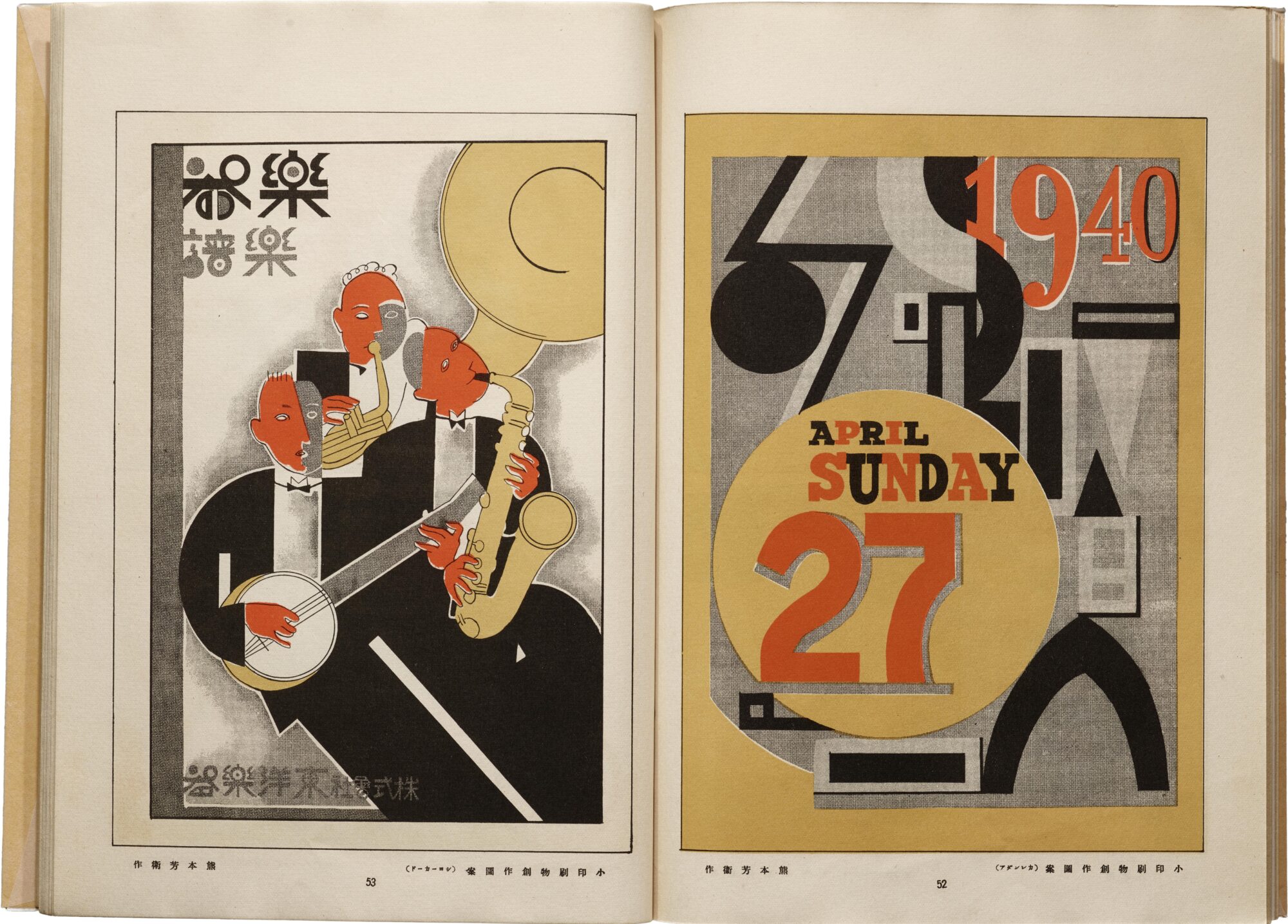
That’s letters as in fonts, not epistles, and there are thousands of them in the archive. But there are also thousands of photographs, lithographs, silkscreens, etc. representing the height of modern simplicity. This and other unifying threads run through the collection of the Letterform Archive, which offers “unprecedented access… with nearly 1,500 objects and 9,000 hi-fi images.”
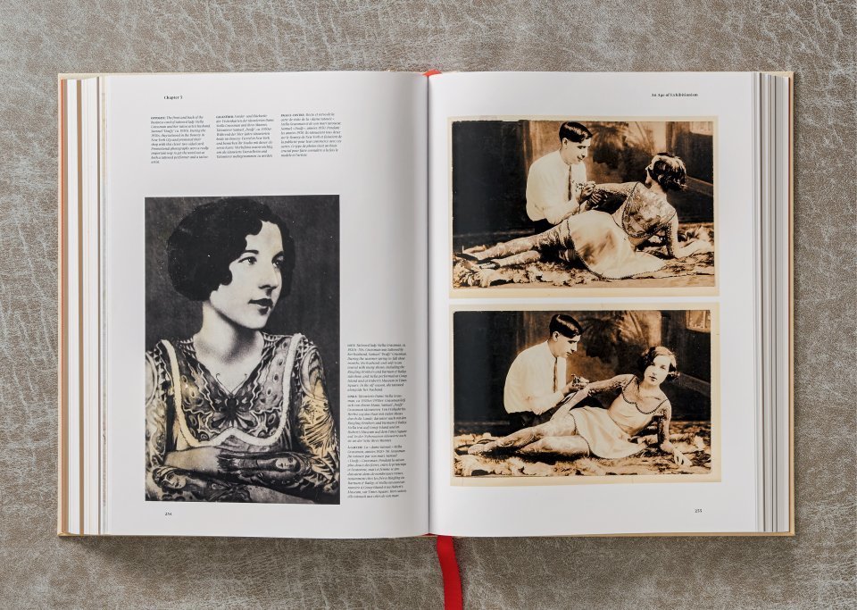
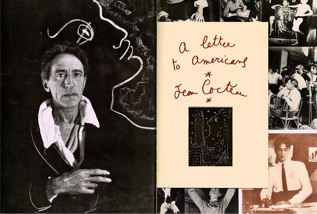
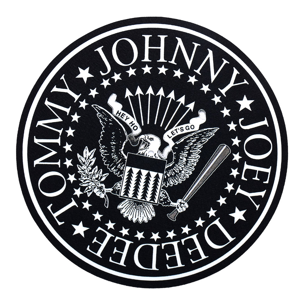
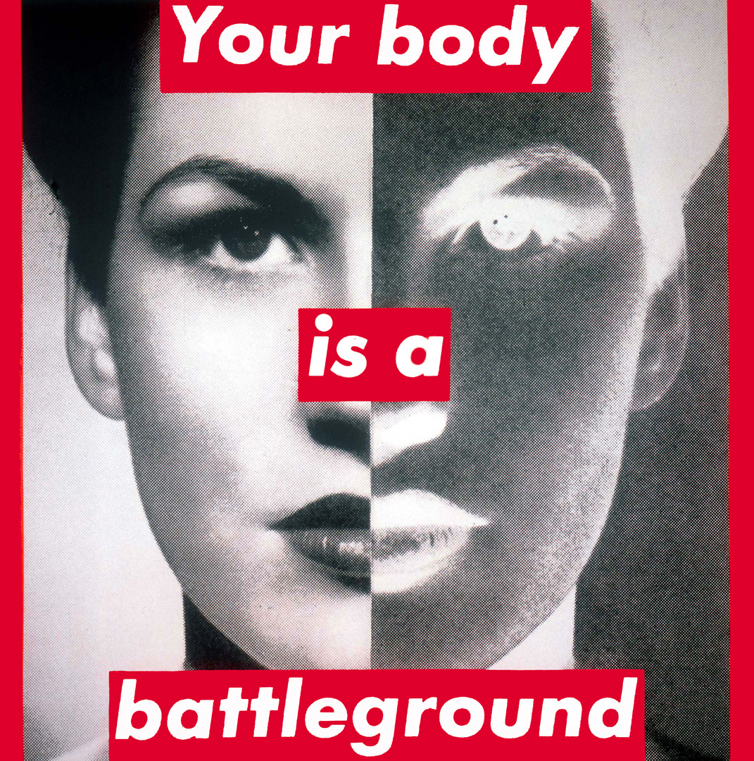
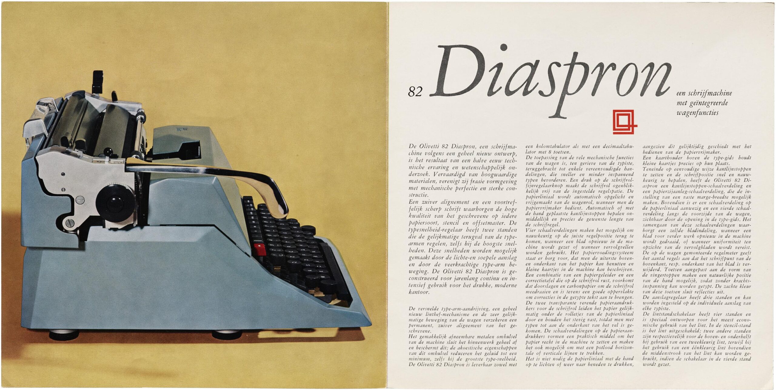
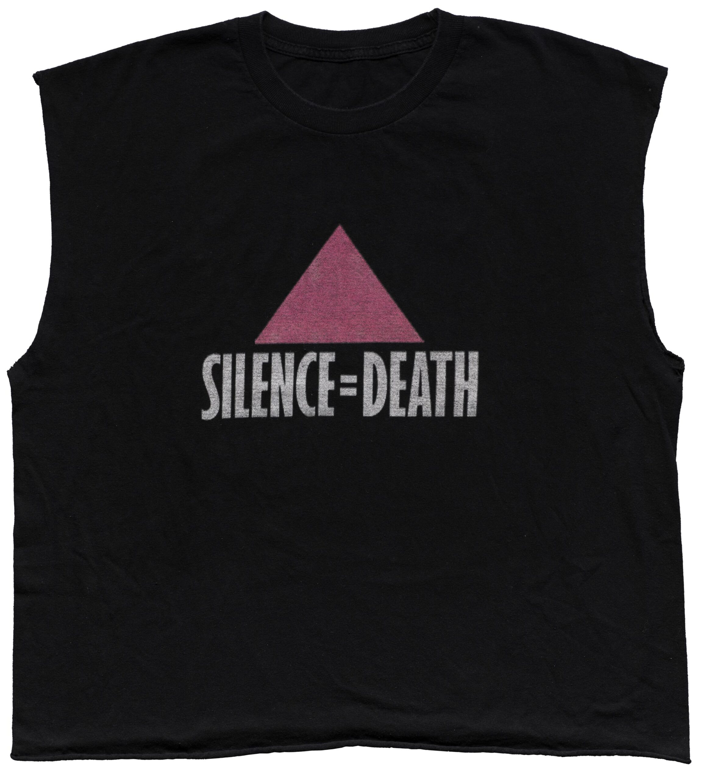
You’ll find in the Archive the sleek elegance of 1960s Olivetti catalogs, the iconic militancy of Emory Douglas’ designs for The Black Panther newspaper, and the eerily stark militancy of the “SILENCE=DEATH” t‑shirt from the 1980s AIDS crisis.
The site was built around the ideal of “radical accessibility,” with the aim of capturing “a sense of what it’s like to visit the Archive” (which lives permanently in San Francisco). But the focus is not on the casual onlooker — Letterform Archive online caters specifically to graphic designers, which makes its interface even simpler, more elegant, and easier to use for everyone, coincidentally (or not).
The graphic design focus also means there are functions specific to the discipline that designers won’t find in other online image libraries: “we encourage you to use the search filters: click on each category to explore disciplines like lettering, and formats like type specimens, or combine filters like decades and countries to narrow your view to a specific time and place.”
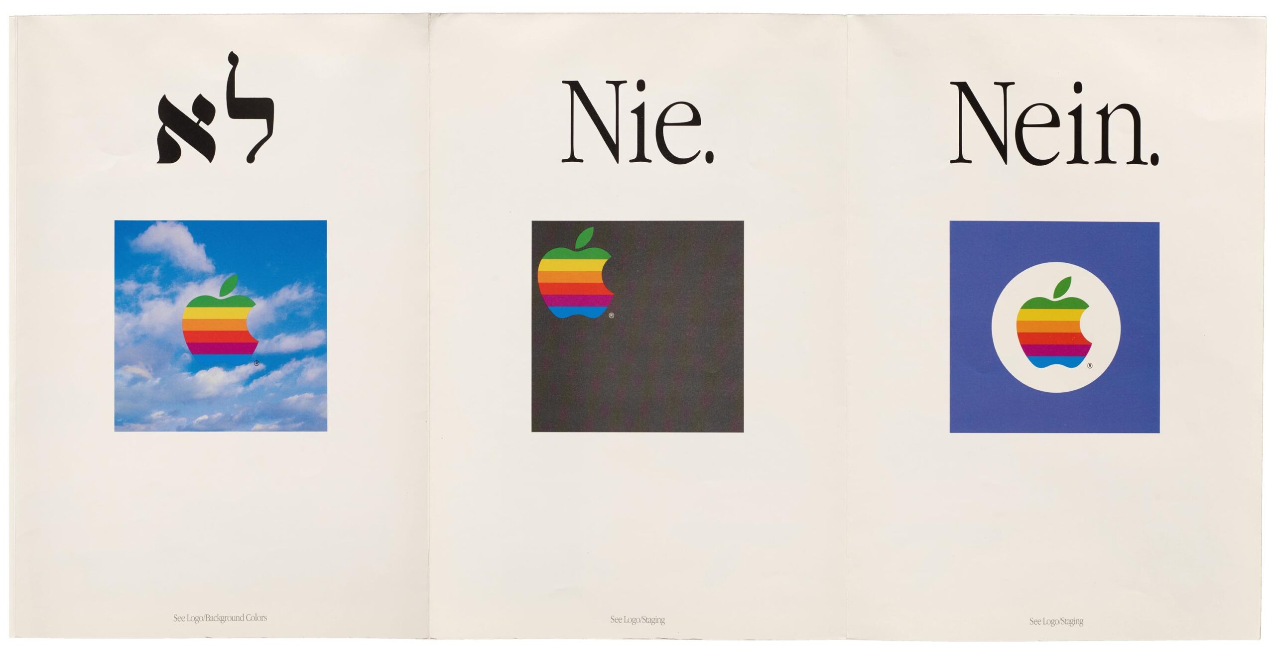
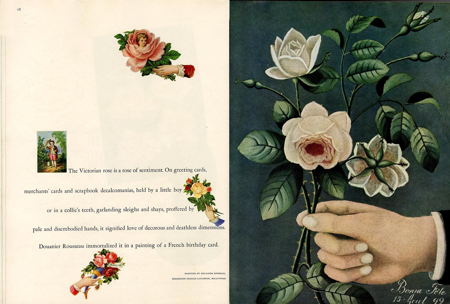
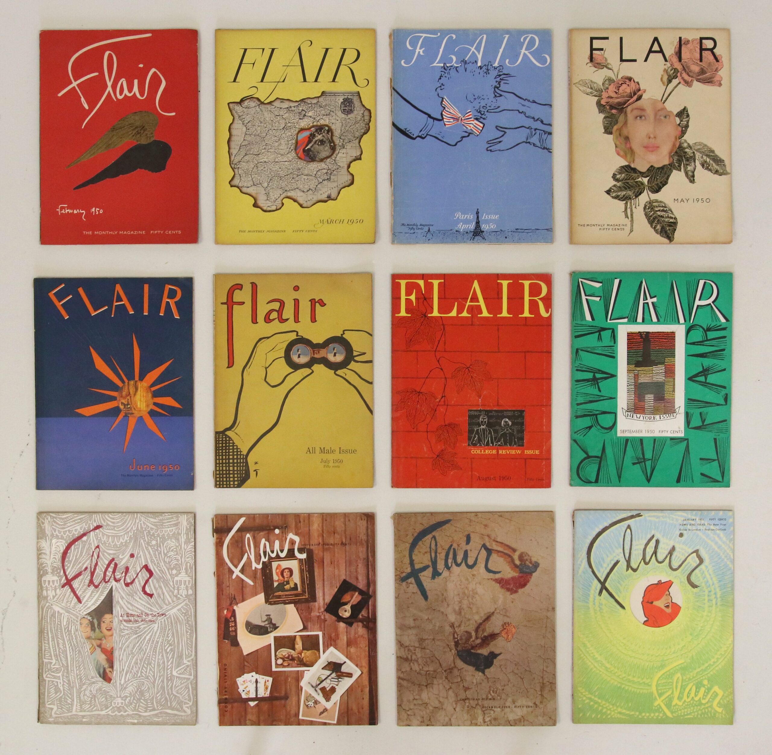
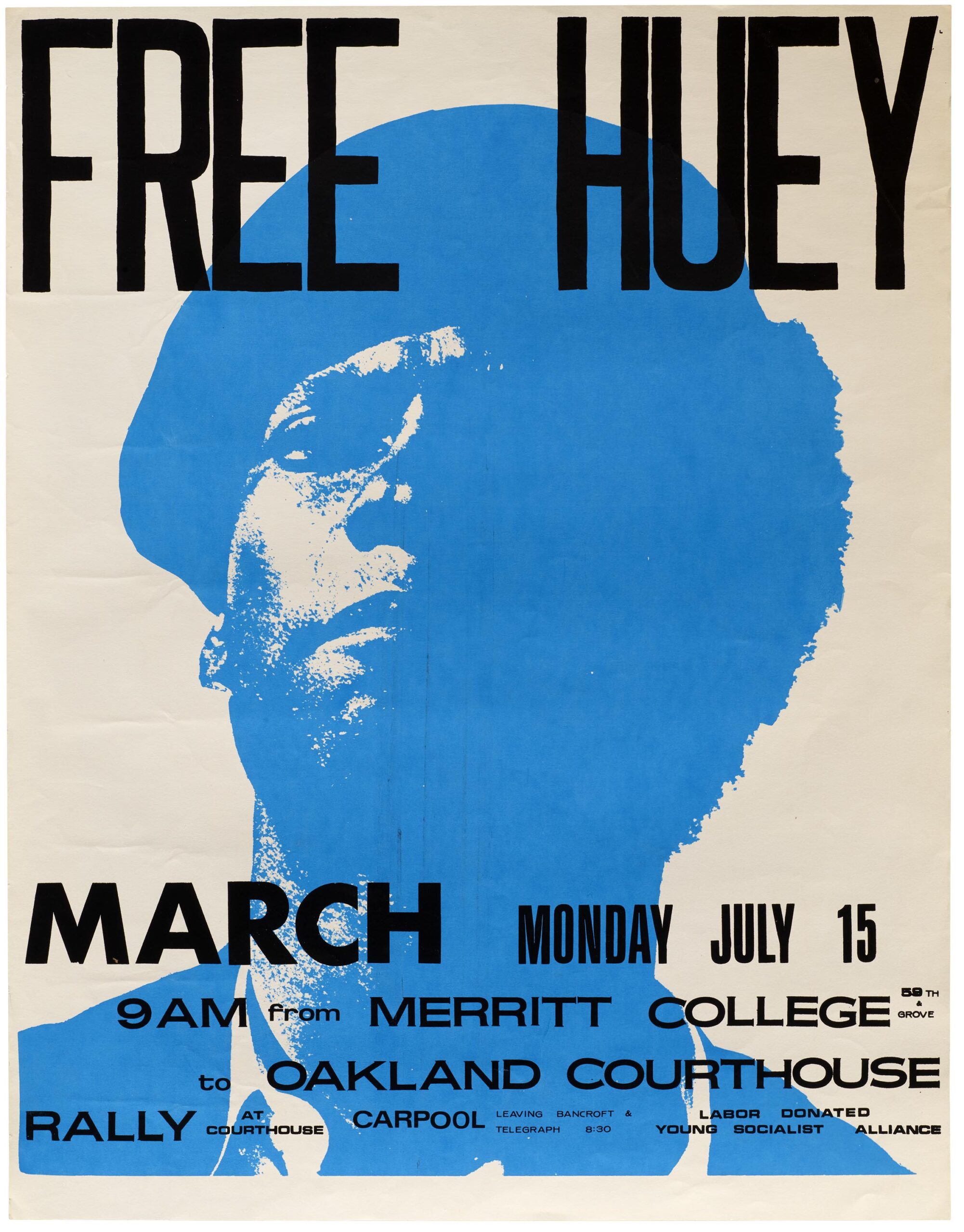
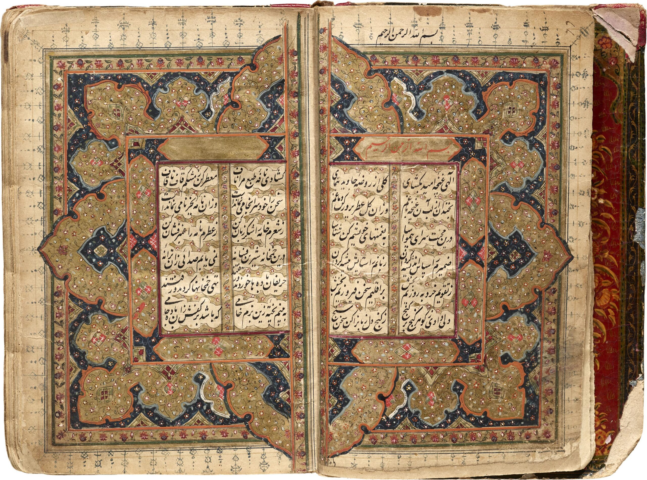
From the radical typography of Dada to the radical 60s zine scene to the sleek designs (and Neins) found in a 1987 Apple Logo Standards pamphlet, the museum has something for everyone interested in recent graphic design history and typology. But it’s not all sleek simplicity. There are also rare artifacts of elaborately intricate design, like the Persian Yusef and Zulaikha manuscript, below, dating from between 1880 and 1910. You’ll find dozens more such treasures in the Letterform Archive here.
Related Content:
Josh Jones is a writer and musician based in Durham, NC. Follow him at @jdmagness