We subscribe to the theory that art saves lives even in the best of times.
In the midst of a major public health crisis, art takes a front line position, communicating best practices to citizens with eye catching, easy to understand graphics and a few well chosen words.
In March of 2020, less than 2 weeks after COVID-19 brought New York to its knees, Angelina Lippert, the Chief Curator of Poster House, one of the city’s newer museums shared a blog post, considering the ways in which the CDC’s basic hygiene recommendations for helping stop the spread had been touted to previous generations.
As she noted in a lecture on the history of the poster as Public Service Announcement the following month, “mass public health action… is how we stopped tuberculosis, polio, and other major diseases that we don’t even think of today:”
And a major part of eradicating them was educating the public. That’s really what PSAs are—a means of informing and teaching the public en masse. It goes back to that idea … of not having to seek out information, but just being presented with it. Keeping the barrier for entry low means more people will see and absorb the information.
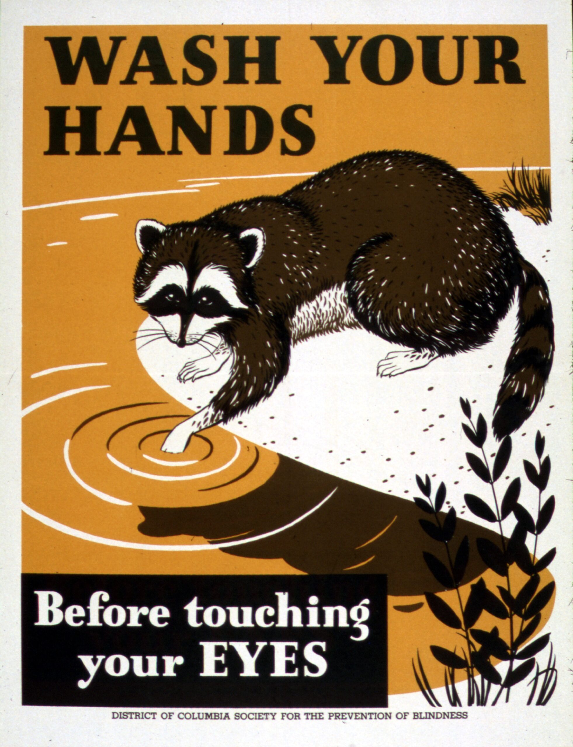
The Office of War Information and the District of Columbia Society for the Prevention of Blindness used an approachable looking raccoon to convince the public to wash hands in WWII.
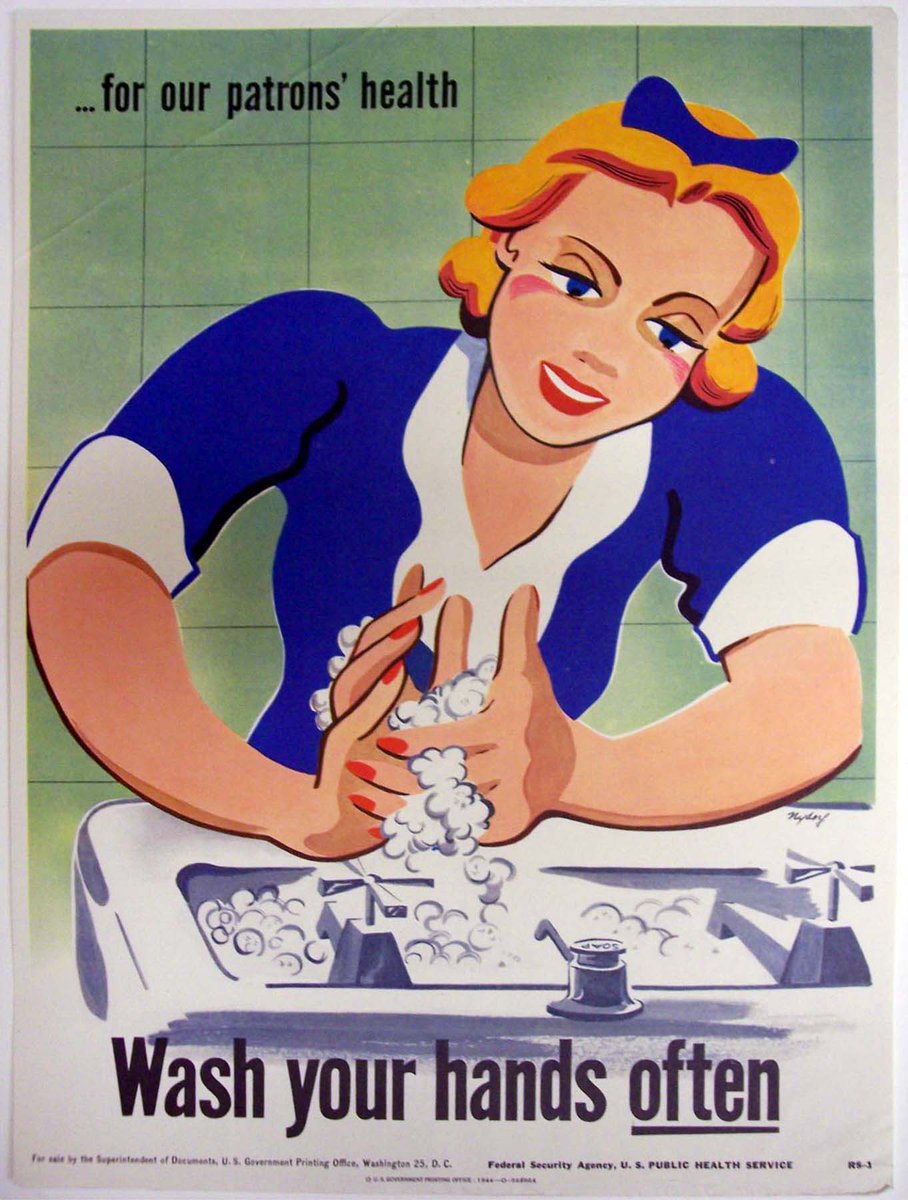
Artist Seymour Nydorf swapped the raccoon for a blonde waitress with glamorous red nails in a series of six posters for the U.S. Public Health Service of the Federal Security Agency
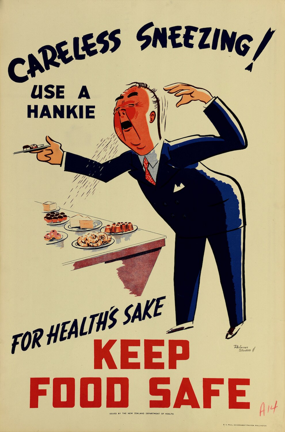
Coughing and sneezing took posters into somewhat grosser terrain.
The New Zealand Department of Health’s 50s era poster shamed careless sneezers into using a hankie, and might well have given those in their vicinity a persuasive reason to bypass the buffet table.
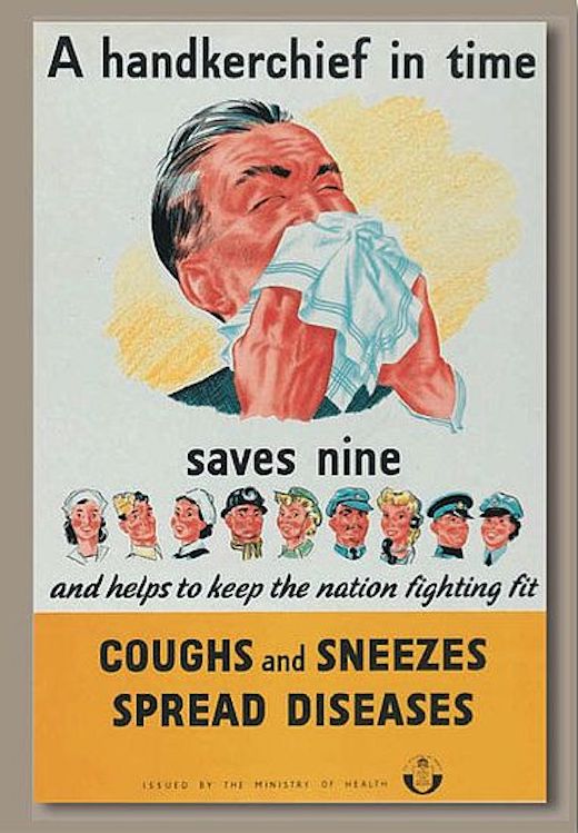
Great Britain’s Central Council for Health Education and Ministry of Health collaborated with
Her Majesty’s Stationery Office to teach the public some basic infection math in WWII.
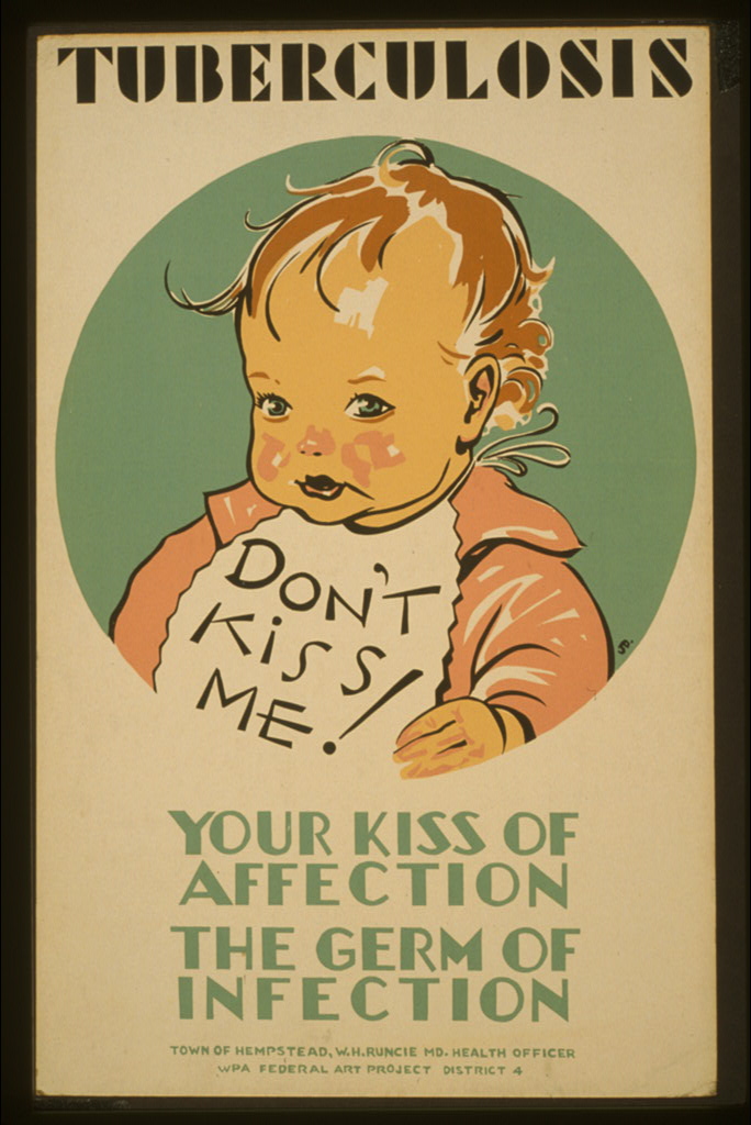
Children’s wellbeing can be a very persuasive tool. The WPA Federal Art Project was not playing in 1941 when it paired an image of a cherubic tot with stern warnings to parents and other family members to curb their affectionate impulses, as well as the transmission of tuberculosis.
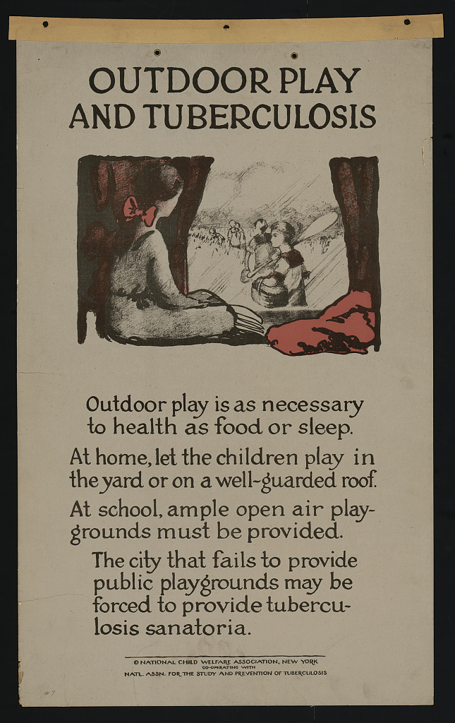
The arresting image packs more of a wallop than this earnest and far wordier, early 20s poster by the National Child Welfare Association and the National Association for the Study and Prevention of Tuberculosis.
Read Poster House Chief Curator Angelina Lippert’s Brief History of PSA Posters here.
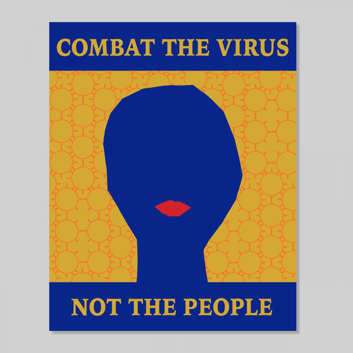
Download the free anti-xenophobia PSAs Poster House commissioned from designer Rachel Gingrich early in the pandemic here.
Related Content:
Download Beautiful Free Posters Celebrating the Achievements of Living Female STEM Leaders
Salvador Dalí Creates a Chilling Anti-Venereal Disease Poster During World War II
Ayun Halliday is an author, illustrator, theater maker and Chief Primatologist of the East Village Inky zine. Follow her @AyunHalliday.


