If you’ve ever run a marathon in costume, or for that matter, boarded public transportation with a large musical instrument or a bulky bag of athletic equipment, you know that gear can be a burden best shed.
But what if that gear is your first, nay, best line of defense against a fellow knight fixing to smite you in the name of their liege?
Such gear is non-optional.
Curious about the degree to which 15th-century knights were encumbered by their protective plating, medievalist Daniel Jaquet commissioned a top armor specialist from the Czech Republic to make a suit specific to his own personal measurements. The result is based on a 15th century specimen in Vienna that has been studied by the Wallace Collection’s archaeometallurgist Alan Williams. As Jaquet recalled in Sciences et Avenir:
We had to make compromises in the copying process, of course, because what interested me above all was to be able to do a behavioral study, to see how one moved with this equipment on the back rather than attaching myself to the number of exact rivets…we knew the composition and the hardness of the parts that we could compare to our replica.
The accomplished martial artist tested his mobility in the suit with a variety of highly public, modern activities: reaching for items on the highest supermarket shelves, jogging in the park, scaling a wall at a climbing gym, taking the Metro …
It may look like showboating, but these movements helped him assess how he’d perform in combat, as well as lower stress activities involving sitting down or standing up.
Out of his metal suit, Jaquet has been known to amuse himself by analyzing the verisimilitude of Game of Thrones’ combat scenes. (Conclusion: some liberties were taken, armor-wise, in that gruesome face off between the Mountain and the Viper.)
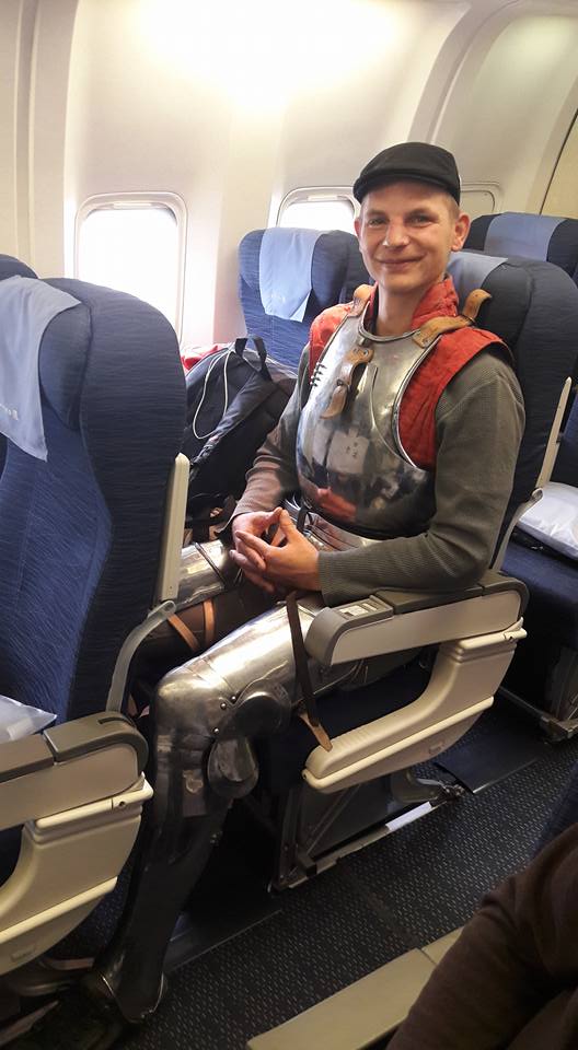
An invitation to travel to New York City to present at the Metropolitan Museum of Art offered an unexpected testing opportunity, compliments of the airline’s baggage restrictions:
For reasons of weight, space and cost, the solution to wear the armor over me was considered the best.
(The TSA officers at Newark were not amused...)
His armored experience sheds light on those of early 15th-century knight Jean le Maingre, aka Boucicaut, whose impressive career was cut short in 1415, when he was captured by the English at the Battle of Agincourt.
Boucicaut kept himself in tip top physical condition with a regular armored fitness regimen. His chivalric biography details gearing up for exercises that include running, chopping wood, vaulting onto a horse, and working his way up a ladder from the underside, without using his feet.
Jaquet duplicates them all in the above video.
(Reminder to those who would try this at home, make sure you’re capable of performing these exercises in lightweight shorts and t‑shirt before attempting to do them in armor.)
Like Boucicault’s, Jaquet’s armor is bespoke. Those who’ve struggled to lift their arms in an off-the-rack jacket will appreciate the trade off. It’s worth spending more to ensure sufficient range of movement.
In Boucicault’s day, ready-made pieces of lesser quality could be procured at markets, trading fairs, and shops in populous areas. You could also try your luck after battle, by stripping the captive and the dead of theirs. Size was always an issue. Too small and your movement would be restricted. Too big, and you’d be hauling around unnecessary weight.
Jaquet describes his load as being on par with the weight 21st-century soldiers are required to carry. Body armor is a lifesaver, according to a 2018 study by the Center for a New American Security, but it also reduces mobility, increases fatigue, and reduces mission performance.
Gizmodo’s Jennifer Ouellette finds that medieval knights faced similar challenges:
The legs alone were carrying an extra 15 to 18 pounds, so the muscles had to work that much harder to overcome inertia to set the legs in motion. There is also evidence that the thin slits in the face mask, and tight chest plate, restricted oxygen flow even further.
Read a detailed, scholarly account of Jaquet’s armor experiment in Historical Methods: A Journal of Quantitative and Interdisciplinary History.
For those looking for a lighter read, here is Jaquet’s account of taking a commercial flight in armor (and some best practice tips for those attempting the same.)
- Ayun Halliday is the Chief Primatologist of the East Village Inky zine and author, most recently, of Creative, Not Famous: The Small Potato Manifesto. Follow her @AyunHalliday.
Related Content
What It’s Like to Actually Fight in Medieval Armor
How to Make and Wear Medieval Armor: An In-Depth Primer