The Case for Andy Warhol in Three Minutes
Earlier this year, Colin Marshall introduced you to The Art Assignment, a weekly web series that celebrates the creative process and “today’s most innovative artistic minds.” The series typically features the hosts, John Green and Sarah Urist Green, “traveling around the country, visiting artists and asking them to give you [the audience] an art assignment.” But sometimes they take a break from their travels and look back at influential artists who shaped the modern art scene — like Andy Warhol.
Above, you can watch “The Case for Andy Warhol,” a three minute video that puts Warhol’s life and work in artistic perspective, explaining why his work, sometimes dismissed as a passing fad, is really worth your time and consideration.
When you’re done with the clip, you can head over to this Smart History clip where Steven Zucker and Sal Khan break down the artistic merits of Warhol’s famous soup cans. This one runs seven minutes.
And stay tuned, The Art Assignment will be back soon with a primer on Mark Rothko.
Related Content:
Watch the Uncensored Andy Warhol-Directed Video for The Cars’ Hit “Hello Again” (NSFW)
Andy Warhol Shoots “Screen Tests” of Nico, Bob Dylan & Salvador Dalí
Andy Warhol’s 1965 Film, Vinyl, Adapted from Anthony Burgess’ A Clockwork Orange
Read More...Watch Lucian Freud’s Very Last Day of Painting (2011)
All artists are mortal. Lucian Freud was, by anyone’s definition, an artist. Therefore, Lucian Freud was mortal — as, so his artistic vision emphasized, are the subjects of his “stark and revealing paintings of friends and intimates, splayed nude in his studio,” which, wrote William Grimes in Freud’s 2011 New York Times obituary, “recast the art of portraiture and offered a new approach to figurative art.” Freud “put the pictorial language of traditional European painting in the service of an anti-romantic, confrontational style of portraiture that stripped bare the sitter’s social facade. Ordinary people — many of them his friends — stared wide-eyed from the canvas, vulnerable to the artist’s ruthless inspection.”
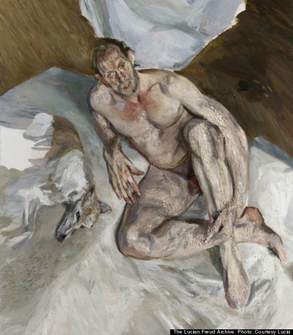
Or, in Freud’s own words: “I work from the people that interest me and that I care about, in rooms that I live in and know.” Just as every mortal artist’s career must begin with a first work, so it must end with a final work, and in the clip at the top of the post you can witness a few minutes from the very last day the painter spent painting somebody who interested him and whom he cared about, in a room he lived in and knew. He spent it on this canvas, an enormous and unfinished portrait of his assistant David Dawson and his whippet Eli called Portrait of the Hound.
“Every morning, seven days a week, I sat for Lucian,” said Dawson to The Telegraph’s Martin Gayford. “There was a very open acceptance of his not having so long to live. But he still had a burning desire to make a very good painting, right up to the end. He was painting three weeks before he died.” Dawson shot this footage of Freud’s final working day, July 3, 2011, which made it into the documentary Lucian Freud: Painted Life [part one, part two]. “We are in Freud’s home, which is very quiet, with lots of paintings on the walls, and filled with a subtle, natural light,” writes Hyperallergic’s Elisa Wouk Almino. “He was particular about painting under a northern light, which he once described as ‘cold and clear and constant.’ ”
Whether Freud lived the last truly painterly life, we can’t know for sure; we do know, however, that he lived one of the most resolutely painterly lives in recent history. “Lucian didn’t bother about what he didn’t need to,” said his final subject. “What was important was trying to make the best painting he possibly could. Work was what kept him going: that need to get out of bed, pick up a paintbrush and make another mark, make another decision. So that was what he did. It was a good way to go about living a life.”
via Hyperallergic
Related Content:
Jackson Pollock 51: Short Film Captures the Painter Creating Abstract Expressionist Art
Astonishing Film of Arthritic Impressionist Painter, Pierre-Auguste Renoir (1915)
Watch Picasso Create Entire Paintings in Magnificent Time-Lapse Film (1956)
Colin Marshall writes on cities, language, Asia, and men’s style. He’s at work on a book about Los Angeles, A Los Angeles Primer, and the video series The City in Cinema. Follow him on Twitter at @colinmarshall or on Facebook.
Read More...A Creepy Cut Out Animation of Samuel Beckett’s 1953 Novel, The Unnamable
Morning, friend! Ready to kick off your week with a Beckettian nightmare vision?
Samuel Beckett scholar Jenny Triggs was earning a masters in Visual Communications at the Edinburgh College of Art when she created the unsettling, cut out animation for his 1953 novel, The Unnamable, above. (Her PhD exhibition, a decade later, was a multi-screen video response to Beckett’s short story, Ping.)
The wretched creatures haunting the film conjure Bosch and Gilliam, in addition to Ireland’s best known avant-garde playwright.
Triggs seem to have drawn inspiration from the nameless narrator’s physical self-assessment:
I of whom I know nothing, I know my eyes are open because of the tears that pour from them unceasingly. I know I am seated, my hands on my knees, because of the pressure against my rump, against the soles of my feet? I don’t know. My spine is not supported. I mention these details to make sure I am not lying on my back, my legs raised and bent, my eyes closed.
Despite the narrator’s effort to keep track of his parts, Triggs ensures that something will always be missing. Her characters make do with rods, bits of chess pieces or nothing at all in places where limbs should be.
Are these birth defects or some sort of wartime disability that precludes prosthetics?
One character is described as “nothing but a shapeless heap… with a wild equine eye.”
The narrator steels himself “to invent another fairy tale with heads, trunks, arms, legs and all that follows.” Meanwhile, he’s tormented by a spiritual push-me-pull-you that feels very like the one afflicting Vladimir and Estragon in Waiting for Godot:
Where I am, I don’t know, I’ll never know, in the silence you don’t know, you must go on, I can’t go on, I’ll go on.
Triggs describes The Unnamable as a book that begs to be read aloud, and her narrators Louise Milne and Chris Noon are deserving of praise for parsing the meandering text in such a way that it makes sense, at least atmospherically.
To go on means going from here, means finding me, losing me, vanishing and beginning again, a stranger first, then little by little the same as always, in another place, where I shall say I have always been, of which I shall know nothing, being incapable of seeing, moving, thinking, speaking, but of which little by little, in spite of these handicaps, I shall begin to know something, just enough for it to turn out to be the same place as always, the same which seems made for me and does not want me, which I seem to want and do not want, take your choice, which spews me out or swallows me up, I’ll never know, which is perhaps merely the inside of my distant skull where once I wandered, now am fixed, lost for tininess, or straining against the walls, with my head, my hands, my feet, my back, and ever murmuring my old stories, my old story, as if it were the first time.
Related Content:
Rare Audio: Samuel Beckett Reads From His Novel Watt
Take a “Breath” and Watch Samuel Beckett’s One-Minute Play
Hear Samuel Beckett’s Avant-Garde Radio Plays: All That Fall, Embers, and More
Ayun Halliday is an author, illustrator, and Chief Primatologist of the East Village Inky zine. Follow her @AyunHalliday
Read More...Brazilian Man Sings The Beatles’ “Yesterday” as Doctors Perform Brain Surgery on Him
It’s a bittersweet scene. Actually, more bitter than sweet. The video above documents a recent operation where doctors removed a brain tumor from Anthony Kulkamp, a 33 year old Brazilian banker, all while he sang and played The Beatles’ “Yesterday” on the guitar. Clearly the song wasn’t an arbitrary pick, not with lyrics like:
Yesterday, all my troubles seemed so far away
Now it looks as though they’re here to stay
oh, I believe in yesterdaySuddenly, I’m not half the man I used to be
There’s a shadow hanging over me
Oh, yesterday came suddenly.
There was a point to singing “Yesterday” and other songs. Surgeons were able to monitor Kulkamp’s cerebral activity and ensure that his sensory, motor, and speech areas remained unharmed during the operation. Dr Jean Abreu Machado, a clinical director at the hospital in Brazil, told The Telegraph: “By keeping the patient awake during surgery, these areas [of the brain] can be monitored in real time. A kind of mapping of important areas can be done.”
Mr. Kulkamp was discharged from the hospital last Wednesday, and we hope to see him playing something optimistic before too long. Maybe a little “Here Comes the Sun” …
Related Content:
The Science of Singing: New, High-Speed MRI Machine Images Man Singing ‘If I Only Had a Brain’
This is Your Brain on Jazz Improvisation: The Neuroscience of Creativity
The 10-Minute, Never-Released, Experimental Demo of The Beatles’ “Revolution” (1968)
Read More...Hear the Enchanting Jorge Luis Borges Read “The Art of Poetry”
Very few people can offer us a satisfying definition of poetry. Enumerating the technical qualities of literary verse, as English teachers do each day, seems like a paltry explanation of what poetry is and does. Even the poets themselves have struggled mightily to find the contours of their art, only to end in gnomic koans or exasperated sighs. “A poem should not mean / But be,” concludes Archibald MacLeish’s “ Ars Poética,” after telling us a poem should be “dumb,” “silent,” and “wordless.” MacLeish’s contemporary Marianne Moore famously spent five decades revising her attempt, “Poetry.” Finally, she reduced it to three irritable lines in which she confesses her “dislike” and “perfect contempt” for her own art, however “genuine” it may be.
These pinched modernists not only resisted didactic conceptions of poetry put forth by the ancients, but they also turned away from the grandiose rhetoric of the Romantics, who saw poets, in Percy Shelley’s unforgettable phrase, as the “unacknowledged legislators of the world.” Perhaps they were right to do so. Perhaps also, there is another way to approach the subject, a way open to one poet only—Jorge Luis Borges. No one but Borges could make the claims for poetry as he does in his “Arte Poética” in such a moving and persuasive way: Poetry, he tells us, is the knowledge of time, of death, of infinity, and of our very selves. “Humble and immortal,” poetry allows us “To see in every day and year a symbol”
Of all the days of man and his years
And convert the outrage of the years
Into a music, a sound, and a symbolTo see in death a dream, in the sunset
A golden sadness, such is poetry
With reference to the mystical pre-Socratic philosopher Heraclitus in the first and last stanza, Borges makes his case with statements that seem the very opposite of humility, and yet feel utterly right; poetry is immortal, it is “a green eternity,” like Ulysses’ Ithaca, it is “endless like a river flowing.” Or at least we feel it should be. Borges gives us a Platonic ideal of poetry, and it is one he might say, humbly, every poet should aspire to.
At the top of the post, you can hear Borges himself read his poem, in Spanish with English titles, in a video shot in Uruguay and Borges’ native Argentina and featuring a stirring Spanish guitar score augmenting Borges’ solemn voice. Be sure to read the full text of Borges’ poem. As readers often do after finishing one of the Argentine master’s profoundly poetic works, you may find yourself for some time afterwards under a kind of spell, from an incantation that seems, at last, to unlock the secrets of art, of poetry, and of so much more.
Related Content:
Borges Explains The Task of Art
Jorge Luis Borges’ 1967–8 Norton Lectures On Poetry (And Everything Else Literary)
New Jorge Luis Borges-Inspired Project Will Test Whether Robots Can Appreciate Poetry
Josh Jones is a writer and musician based in Durham, NC. Follow him at @jdmagness
Read More...Eugène Delacroix Illustrates Goethe’s Faust, “One of the Very Greatest of All Illustrated Books”
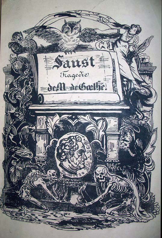
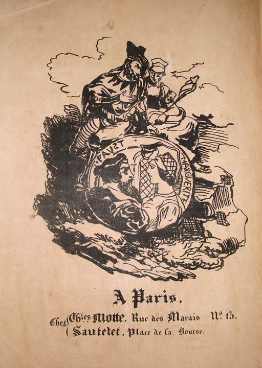
Did our post last month on Édouard Manet’s illustrations of Stephane Mallarmé’s translation of Edgar Allan Poe’s The Raven get you excited enough to track down Dover Publications’ collection of those haunting images? If so, you’ll notice that the book also contains Eugène Delacroix’s illustrations of Johann Wolfgang von Goethe’s Faust, a bold set of artworks that earned high praise, at least from Goethe himself: “Delacroix,” said the writer upon viewing the lithographs made for the text’s 1828 edition, “has surpassed my own vision.” You can see/read a complete version online here.
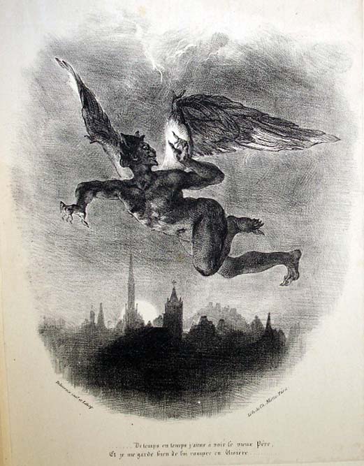
Princeton University Library’s Julie L. Mellby uses that line to open a post on Delacroix’s Faust, “considered by most historians to be one of the finest publications of the nineteenth century. Gordon Ray calls Delacroix’s illustrations ‘the high point of Romantic book illustration,’ and David Bland called the volume ‘one of the very greatest of all illustrated books.’ ” On that Princeton page you’ll find images scanned straight from Princeton’s copy of the book, and here we offer a select few to get you started appreciating how Delacroix interpreted Goethe’s oft-told tale of divine wagers, pacts with the devil, and the temptations of infinite knowledge.
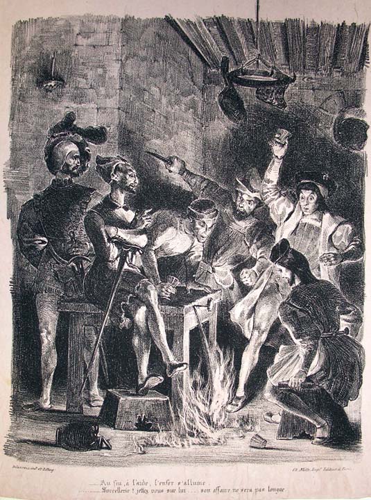
“Every time I look at the engravings of Faust I am seized with a longing to use an entirely new style of painting that would consist, so to speak, in making a literal tracing of nature.” Delacroix wrote that in his journal before taking on the project of illustrating Faust himself.
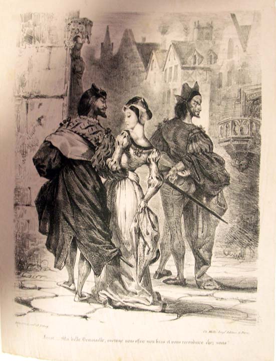
Maria Popova at BrainPickings quotes it in her own post on the work that resulted in “a mesmerizing dialogue across disciplines between these two geniuses, half a century apart in age.” (You can see more images on her site.) Whether or not Goethe knew he had written a work that would still resonate with humanity centuries later, he did seem to understand that no one who saw Delacroix’s visions of it would ever forget them.
H/T Princeton University / BrainPickings
Related Content:
Watch Goethe’s Haunting Poem, “Der Erlkönig,” Presented in an Artful Sand Animation
Baudelaire, Balzac, Dumas, Delacroix & Hugo Get a Little Baked at Their Hash Club (1844–1849)
The Death Masks of Great Authors: Dante, Goethe, Tolstoy, Joyce & More
Colin Marshall writes on cities, language, Asia, and men’s style. He’s at work on a book about Los Angeles, A Los Angeles Primer, and the video series The City in Cinema. Follow him on Twitter at @colinmarshall or on Facebook.
Read More...Hayao Miyazaki’s Beloved Characters Reimagined in the Style of 19th-Century Woodblock Prints

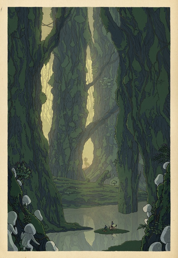
Like illustrator Bill Mudron, I’m drawn to the backgrounds of director Hayao Miyazaki’s animated features. The shadowy landscapes and traditional wooden houses exert a tonic effect, even as giant many-eyed insects roam free and curses turn parents into pigs. The characters can become a bit cloying (especially when dubbed for English-speaking audiences), but I’ll never tire of watching that cat bus charging through the Japanese countryside.
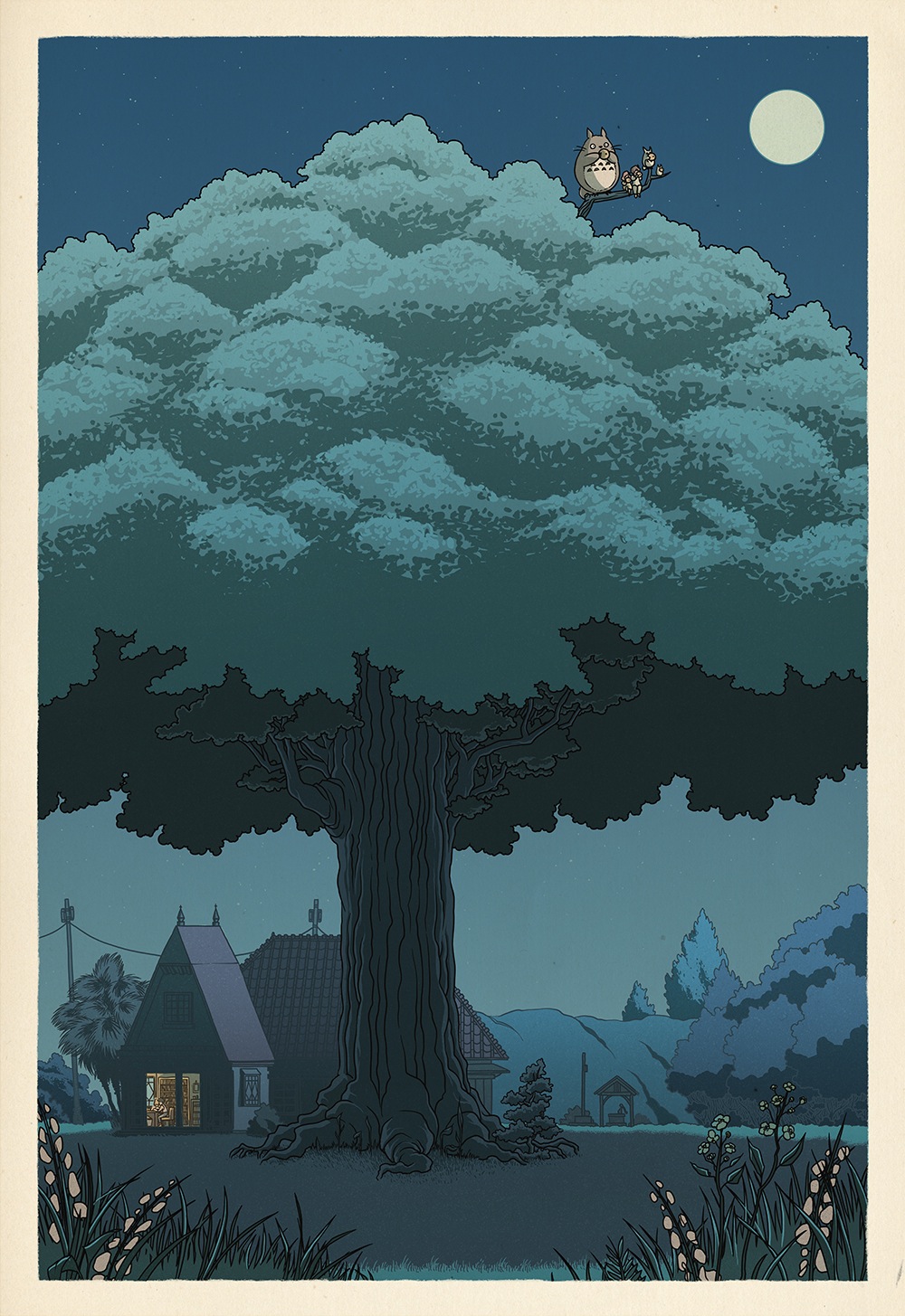
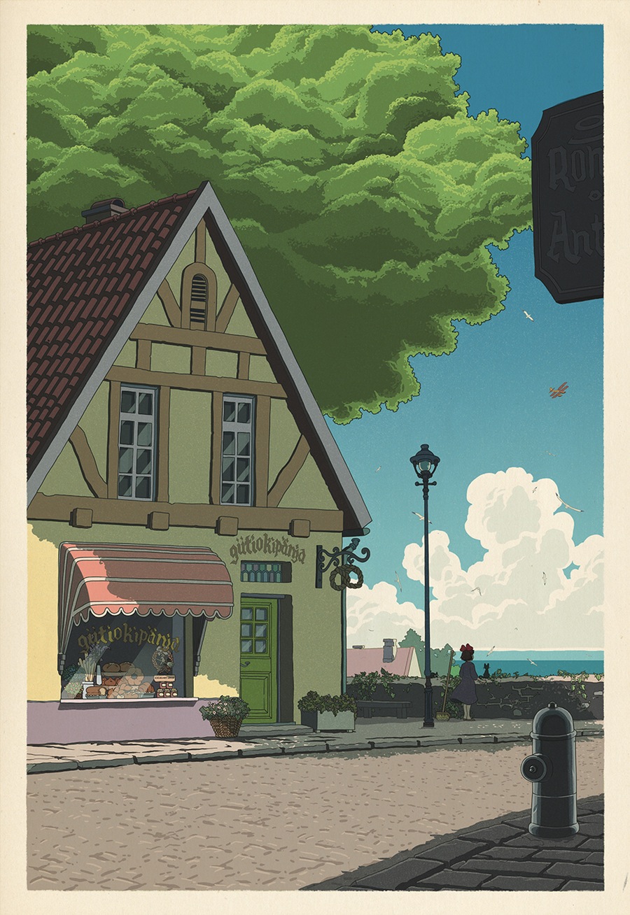
Mudron’s take on six of Miyazaki’s most fertile landscapes, including Spirited Away’s bathhouse, above, were rendered entirely in Photoshop, but aesthetically, they’re of a piece with artist Kawase Hasui’s late-19th and early-20th century woodblock prints. (You can purchase Mudron’s prints and support his work here.)
Mudron told The Creators Project that his project was born of reading a two-volume book on Hasui, right after seeing The Kingdom of Dreams and Madness, Mami Sunada’s documentary about Miyazaki’s Studio Ghibli.
Taking his lead from the figures in Hasui’s shin-hanga (“new prints”), Mudron makes Miyazaki’s characters wholly subordinate to their setting. It’s pretty hard to ignore the weird spirits thronging the bridge that leads to the bathhouse when watching the film of Spirited Away, but Mudron succeeds by pinning them to a single moment in time and shifting the focus to their destination.

Study the above detail from “Night Falls on the Spirit Realm.” There’s still a lot going on on that bridge, but relative to the big picture at the top of the page, these spirits are as anonymous as the umbrella toting figures in Hasui’s “Snow at Heian Shrine, Kyoto,” below.

Scroll down for Muldron’s view of iconic locations from My Neighbor Totoro, Kiki’s Delivery Service, and Princess Mononoke.
Related Content:
Hayao Miyazaki’s Magical Animated Music Video for the Japanese Pop Song, “On Your Mark”
Watch Sherlock Hound: Hayao Miyazaki’s Animated, Steampunk Take on Sherlock Holmes
Ayun Halliday is an author, illustrator, and Chief Primatologist of the East Village Inky zine. Follow her @AyunHalliday
Read More...Hip Hop Hits Sung Wonderfully in Sign Language: Eminem’s “Lose Yourself,” Wiz Khalifa’s “Black and Yellow” & More
The first time I went to see David Sedaris read some of his hilarious essays live, I ended up laughing much more than I expected. By luck of seating, I found myself at the right of the stage, facing his sign language interpreter. She didn’t just quickly parse what he said. No, she also became a sort of double act with the author, throwing her whole body and facial expressions into making Sedaris’ prose sing. Especially when he came to some sexual idiom or turn of phrase, we all became aware of the audience’s gaze shifting rightward to see what his signer would do. (The wondrous Internet has not revealed her name–possibly one of our readers knows.)
That’s a preamble to say that the latest YouTube sensation above, Shelby Mitchusson, who signs her way through Eminem’s “Lose Yourself,” should come as no surprise to those who have encountered such lively interpretation, turning language for the deaf into a performance art. Mitchusson admits she’s still a beginner, but her 3 million views says she has made fans of the deaf and hearing alike. (And for once the YouTube comments don’t make you sad for humanity.)
But Mitchusson’s “hit” leads to a whole world of American Sign Language (ASL) stars once you jump down the YouTube rabbit hole. Just over a year ago, Jimmy Kimmel had on three ASL interpreters to compete in a rap battle to Wiz Khalifa’s “Black and Yellow” which you can see below.
One of them, the pink-haired Amber Galloway Gallego, had her own time in the viral video limelight back in 2013. Her spirited versions of Snoop Lion, Kendrick Lamar, and others during Lollapalooza earned her many Internet views, no doubt for her lascivious performance of rap and r’n’b’s smuttiest lyrics. She even received coverage in Rolling Stone, where the San Antonio, TX native tells stories of signing “Baby Got Back” at a barbecue at the beginning of her career. Her YouTube channel features her own versions of all the current pop hits (Taylor Swift, Carly Rae Jepsen) and classics (The Human League, Celine Dion).
The history of sign language is long and deep, with a rough guess at 137 recognized versions around the globe, according to Ethnologue. (But as deaf communities often develop their own dialects, it’s hard to tell.)
And the Internet, specifically YouTube–along with the beat-heavy genre of hip hop–has brought a subculture into the mainstream, something that years of advocacy by deaf groups couldn’t quite manage to do. Thanks again, Internet!
You can find some online ASL lessons here, or in our meta collection of Free Language Lessons.
Related content:
Learn 48 Languages Online for Free: Spanish, Chinese, English & More
Helen Keller & Annie Sullivan Appear Together in Moving 1930 Newsreel
Baba Brinkman: The Rap Guide to Evolution
Ted Mills is a freelance writer on the arts who currently hosts the FunkZone Podcast. You can also follow him on Twitter at @tedmills, read his other arts writing at tedmills.com and/or watch his films here.
Read More...10 Million Years of Evolution Visualized in an Elegant, 5‑Foot Long Infographic from 1931
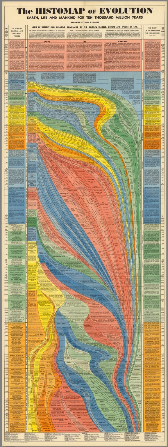
Click here to see the entire histomap in large, zoomable, format.
The early decades of the twentieth century belonged to Cecil B. DeMille and his epic films both Biblical and classical: The Ten Commandments, Cleopatra, Samson and Delilah. The grand scale of these pseudo-histories required the most up-to-date cinematic invention of the day, and the most imperial vision, one later decades looked upon rather cynically. But just as the epic has roared back with a vengeance—with technological feats that make The Greatest Show on Earth look like community theater—so another medium of ambitious scope once popular between the wars has made a reappearance: the historical infographic, or as it was called back then, the “histomap”—5‑foot long visual histories of a variety of disciplines.
As with film, information technology has advanced to such a degree to make this early means of condensing huge amounts of data perhaps seem quaint. But if we imagine a world pre-internet, when the prospect of visualizing a subject as complex as, say, evolution, would be daunting indeed, we might just find the histomap as impressive a means of conveying information as its early readers did. These huge graphs of big ideas, writes Rebecca Onion at Slate, fit “with a trend in nonfiction book publishing of the 1920s and 1930s: the ‘outline,’ in which large subjects (the history of the world! every school of philosophy! All of modern physics!) were distilled into a form comprehensible to the most uneducated layman.”
We’ve previously featured that 1931 “History of the World!” histomap, an impressive condensing of 4000 years of human activity. The evolution graphic you see here, also from 1931 and “arranged” by John B. Sparks, is equally impressive, and speaks to the times in ways that DeMille’s Bible movies did as well. Bear in mind that the Scopes Monkey Trial had only concluded six years earlier, and the country—as it is again today—was hotly divided over the subject represented here. Nonetheless, Sparks and publisher Rand McNally gamely presented this “Story of the Emergence and Progression of Life” with confident precision and without apology.
I couldn’t begin to tell you how the science here has aged, though some of it, I’d suspect, not particularly well. In any case, the form of this elegant data map, with its graceful lines of descent flowing down the page like magma, complements its content. Rather than presenting the theory of evolution as a forgone conclusion or belief, Sparks’ graphic lays out all of the evidence, and fits it together neatly and comprehensively. Some modern evolution infographics surpass the visual appeal, but not the level of scientific detail shown here. Others reduce the science, and the design, to the level of oversimplified ideology. And though we may have enough historical distance to make infographicss of hundreds of years of evolutionary thought, it may seem that the technology of the evolution infographic may not have advanced as much as we might expect.
Related Content:
4000 Years of History Displayed in a 5‑Foot-Long “Histomap” (Early Infographic) From 1931
Watch 570 Million Years of Evolution on Earth in 60 Seconds
Josh Jones is a writer and musician based in Durham, NC. Follow him at @jdmagness
Read More...The Art of The Black Panthers: A Short Documentary on the Revolutionary Artist Emory Douglas
Known as the Revolutionary Artist by his fellow Black Panthers and officially titled their Minister of Culture, Emory Douglas provided the striking visuals and designed the layout to the newspaper that bore the organization’s name when it premiered in 1967. In this short but insightful documentary by the outfit known as Dress Code, Douglas looks back at his time with Eldridge Cleaver, Huey P. Newton and the other Panthers during that most tumultuous decade and a half.
Douglas reminds us that San Francisco was segregated just as much as the South during the earlier part of the 20th century and that police brutality was, well, just like today, but without cell phone cameras. Ironically, it was because Douglas went to juvenile detention (he first got arrested at 13 years old) that he learned screenprinting in the print shop there, priming him to help Cleaver start up the The Black Panther newspaper in his apartment.
Douglas’ graphic design style was born from necessity–thick black lines did not let color seep out as much in the printing, and talking about color, he could only afford one or two. Professor Colette Gaiter called Douglas the “Norman Rockwell of the ghetto,” affording the poor and oppressed a normalcy in its depictions usually given to the middle class. And although pigs had symbolized power, greed and corruption long before Douglas was born, it was his depiction of cops and other authority figures as anthropomorphic swine that has stuck with us to this day.
At its height, The Black Panther newspaper had a weekly circulation of 400,000, but in the early ‘80s, Douglas stepped down as designer. He has never stopped working for social justice and by the 2000s, his huge body of work began to tour galleries and museums, admired for its technique and beauty, along with its message.
A critique of Dress Code’s documentary is that it only affords us slivers of Douglas’ art–zoomed in and animated.
This other doc from a 2008 studio visit provides a bit more context, and for those who would like to see the art alongside the essays, calls to action, and collages in the original issues, there are plenty of them scanned online for you to read.
Related Content:
Malcolm X, Debating at Oxford, Quotes Shakespeare’s Hamlet (1964)
Wattstax Documents the “Black Woodstock” Concert Held 7 Years After the Watts Riots (1973)
Ted Mills is a freelance writer on the arts who currently hosts the FunkZone Podcast. You can also follow him on Twitter at @tedmills, read his other arts writing at tedmills.com and/or watch his films here.
Read More...Support Us
We're hoping to rely on loyal readers, rather than erratic ads. Please click the Donate button and support Open Culture. You can use Paypal, Venmo, Patreon, even Crypto! We thank you!

About Us

Open Culture scours the web for the best educational media. We find the free courses and audio books you need, the language lessons & educational videos you want, and plenty of enlightenment in between.
Advertise With Us

FREE UPDATES!
GET OUR DAILY EMAIL
Get the best cultural and educational resources on the web curated for you in a daily email. We never spam. Unsubscribe at any time.
FOLLOW ON SOCIAL MEDIA

Open Culture editor Dan Colman scours the web for the best educational media. He finds the free courses and audio books you need, the language lessons & movies you want, and plenty of enlightenment in between.
Advertise With Us