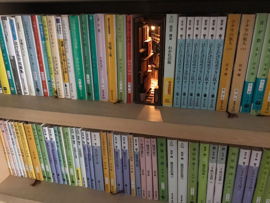
Should you find yourself in a Japanese city, spend time not on the Starbucks- and McDonald’s-lined boulevards but on the back streets that wind in all directions behind them. Or better yet, head into the back alleys branching off those streets, those half-hidden spaces that offer the most evocative glimpses of life in urban Japan by far. Only there can you find passage into the wonderfully idiosyncratic businesses tucked into the corners of the city, from bars and restaurants to coffee shops and of course bookstores. Those bookstores have long occupied Japan’s back alleys, but now an artist by the name of Monde has brought the back alleys onto bookshelves.
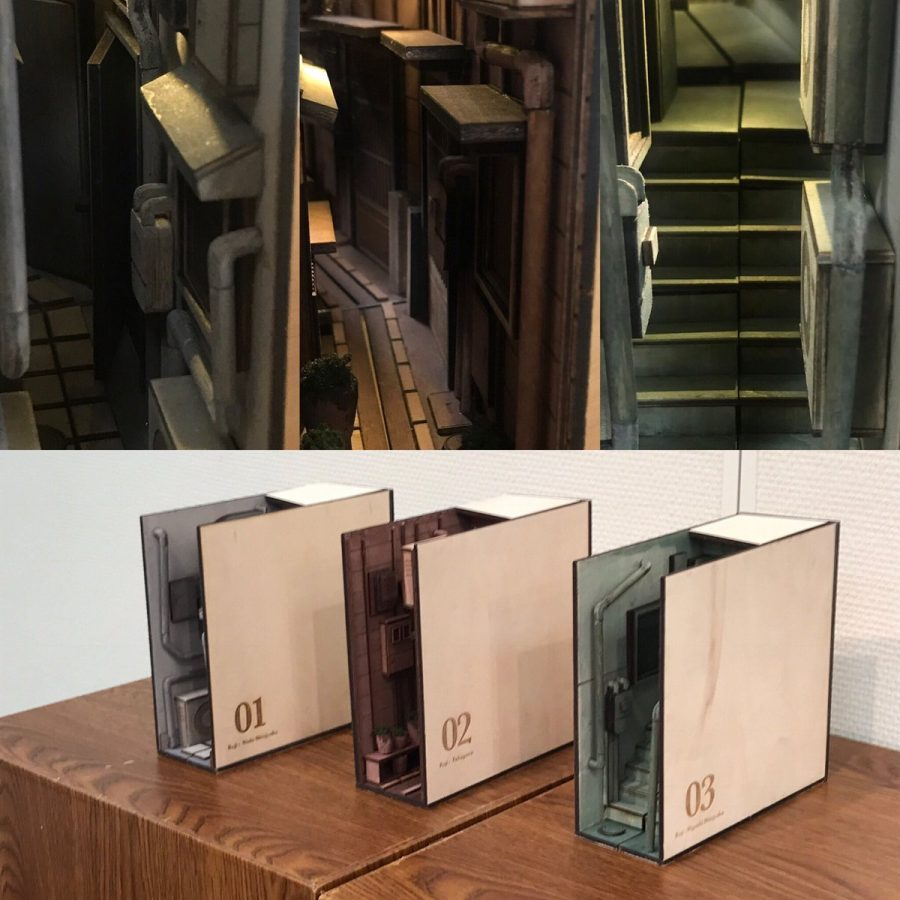
Monde’s handcrafted wooden bookend dioramas, which you can see on his Twitter feed as well as in a Buzzfeed Japan article about them, replicate the back alleys of his hometown of Tokyo. They do it in miniature, and down to the smallest detail — even the electric lights that illuminate the real thing at night.
Scaled to the height of not just a book but a small Japanese paperback, the likes of which fill those back-alley bookstores from floor to ceiling, they’re designed to slot right into bookshelves, providing a welcoming street scene to those browsing through their own or others’ volumes in the same way that the actual alleys they model come as a pleasant surprise to passersby on the main streets.
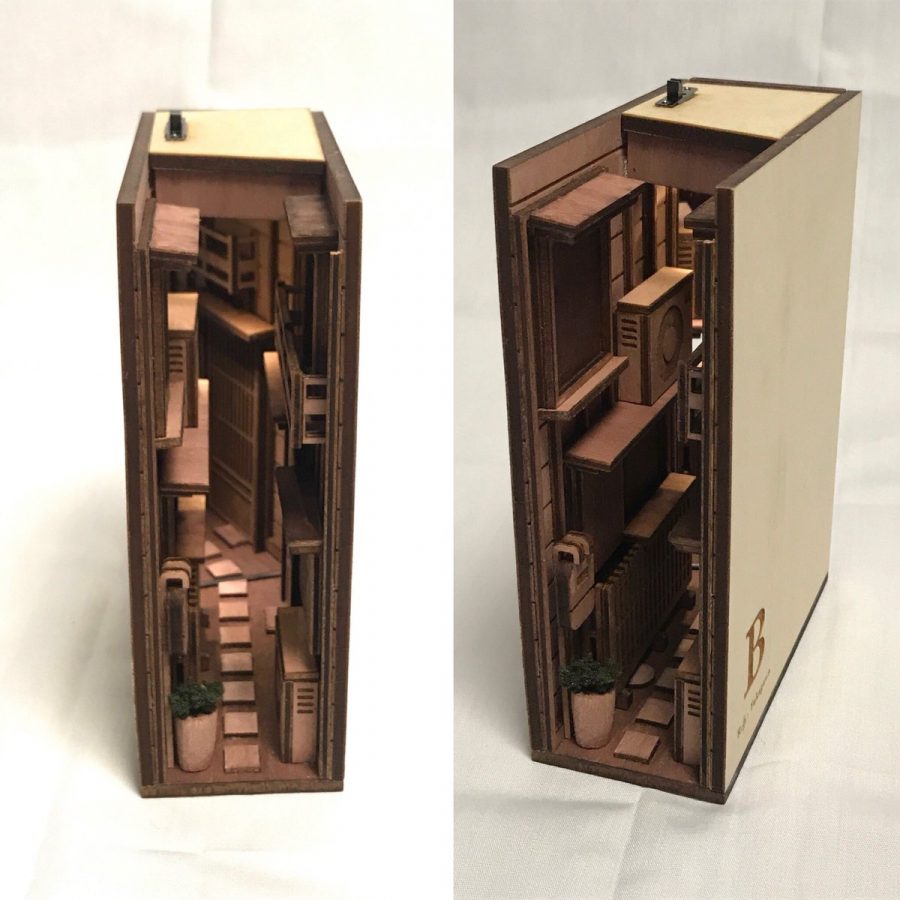
Tokyo has become a beloved city to Japanese and non-Japanese alike for countless reasons, but who can doubt the appeal of the way it combines the feeling of small-town life in its many neighborhoods that together make for a megacity scale? Monde’s dioramas capture the distinctive mixture of domesticity and density in the capital’s back alleys, reflecting the narrowness of the spaces in form and their somehow organically manmade nature — stepping stones, potted-plant gardens, and all the small pieces of infrastructure that have accumulated to support life in the homes of so many — in content. Though Tokyo has for decades been regarded, especially from the West, as a place of thorough hypermodernity, its alleys remind us that within the sometimes overwhelming present exists a mixture of eras that feel timeless — just like the content of a well-curated bookshelf.
via Twisted Sifter
Related Content:
A Photographic Tour of Haruki Murakami’s Tokyo, Where Dream, Memory, and Reality Meet
Based in Seoul, Colin Marshall writes and broadcasts on cities, language, and culture. His projects include the book The Stateless City: a Walk through 21st-Century Los Angeles and the video series The City in Cinema. Follow him on Twitter at @colinmarshall or on Facebook.


