How a Korean Potter Found a “Beautiful Life” Through His Art: A Short, Life-Affirming Documentary

I like to think I appre­ci­ate all aspects of the cul­ture of South Korea, where I live, but dif­fer­ent attrac­tions bring dif­fer­ent for­eign­ers here. Some come for the food, some come for the music (pop, tra­di­tion­al, or some­where in between), some come for the med­ical tourism. Oth­ers, like British ceram­i­cist Roger Law, come for the pot­tery. The half-hour doc­u­men­tary above will give you an idea of what makes Kore­an pot­tery, and the Kore­an pot­ters who craft it, so dis­tinc­tive, tak­ing view­ers into the work­shop of Lee Kang-hyo, who has become famous by there bring­ing togeth­er the dis­tinct tra­di­tions of onggi glazed earth­en­ware pot­tery and buncheong white slip dec­o­ra­tion.

“As a high school stu­dent, I asked myself some fun­da­men­tal ques­tions,” says Lee in voiceover as we watch him beat the clay of what looks more and more like a large jar into shape. “What would be good to do for a liv­ing? What is my best tal­ent? How can I enjoy a life of peace? It was then I decid­ed to become an artist.” As he cre­ates, he tells us about the long his­to­ry of pot­tery in Korea and his expe­ri­ence prac­tic­ing and mas­ter­ing the tra­di­tions in which he works. Looked at ong­gi, he says, “I nev­er thought they were sim­ply big jars. I thought they were great sculp­ture.”

“My doc­u­men­tary tells the sto­ry of Lee Kang-hyo’s search for a beau­ti­ful life, through his work with clay and the love of his fam­i­ly,” says direc­tor Alex Wright, a sto­ry that “gives an insight into the spir­i­tu­al jour­ney that plays a vital part in his artis­tic prac­tice.” For Lee, this had to do as much with the heart and mind as with the hand, loos­en­ing up and light­en­ing up even as he grew more skilled, a real­iza­tion that first occurred when he became friend­ly with Japan­ese mas­ter pot­ter Koie Ryo­ji. “Kang-hyo, why don’t you try to change your think­ing?’ ” Lee remem­bers Koie ask­ing after he pre­sent­ed him with his lat­est piece. “And he lift­ed it up and crushed it. He said: ‘Form does­n’t always have to be straight. It can be beau­ti­ful.’ ”

That les­son holds in oth­er cul­tur­al spheres as well. “Ceram­ic cul­ture is very close­ly con­nect­ed to dietary life and food cul­ture,” Lee observes. “Korea has devel­oped a fer­ment­ed food cul­ture. A lot of foods are fer­ment­ed and stored, such as sauces and kim­chi,” which might stay in their ceram­ic jars for years before con­sump­tion. And so “Korea has devel­oped the skills to make big jars, more than any oth­er coun­try” with the “quick­est and most per­fect forms.” This might sound like the mak­ings of a rus­tic, util­i­tar­i­an pot­tery — and indeed cui­sine — but in fact the work of Lee and oth­er Kore­an mas­ters increas­ing­ly aligns with the grow­ing glob­al taste for things out­ward­ly sim­ple but inward­ly refined. In that par­tic­u­lar sen­si­bil­i­ty, whether expressed as pot­tery or food or music or any­thing else, Korea might well lead the world.

Lee Kang-hyo ‘Ong­gi Mas­ter will be added to our col­lec­tion of Free Doc­u­men­taries, a sub­set of our col­lec­tion, 4,000+ Free Movies Online: Great Clas­sics, Indies, Noir, West­erns, Doc­u­men­taries & More.

Relat­ed con­tent:

“Prim­i­tive Pot­ter” Trav­els into the Back­coun­try for 10 Days with Only a Knife & Buck­skin and Makes Anasazi Pot­tery

The Art of the Japan­ese Teapot: Watch a Mas­ter Crafts­man at Work, from the Begin­ning Until the Star­tling End

Kintsu­gi: The Cen­turies-Old Japan­ese Craft of Repair­ing Pot­tery with Gold & Find­ing Beau­ty in Bro­ken Things

Three Pink Floyd Songs Played on the Tra­di­tion­al Kore­an Gayageum: “Com­fort­ably Numb,” “Anoth­er Brick in the Wall” & “Great Gig in the Sky”

Based in Seoul, Col­in Mar­shall writes and broad­casts on cities and cul­ture. His projects include the book The State­less City: a Walk through 21st-Cen­tu­ry Los Ange­les and the video series The City in Cin­e­ma. Fol­low him on Twit­ter at @colinmarshall or on Face­book.

Why Did Leonardo da Vinci Write Backwards? A Look Into the Ultimate Renaissance Man’s “Mirror Writing”

As the stand­out exam­ple of the “Renais­sance Man” ide­al, Leonar­do da Vin­ci racked up no small num­ber of accom­plish­ments in his life. He also had his eccen­tric­i­ties, and tried his hand at a num­ber of exper­i­ments that might look a bit odd even to his admir­ers today. In the case of one prac­tice he even­tu­al­ly mas­tered and with which he stuck, he tried his hand in a more lit­er­al sense than usu­al: Leonar­do, the evi­dence clear­ly shows, had a habit of writ­ing back­wards, start­ing at the right side of the page and mov­ing to the left.

“Only when he was writ­ing some­thing intend­ed for oth­er peo­ple did he write in the nor­mal direc­tion,” says the Muse­um of Sci­ence. Why did he write back­wards? That remains one of the host of so far unan­swer­able ques­tions about Leonar­do’s remark­able life, but “one idea is that it may have kept his hands clean. Peo­ple who were con­tem­po­raries of Leonar­do left records that they saw him write and paint left hand­ed. He also made sketch­es show­ing his own left hand at work. As a lefty, this mir­rored writ­ing style would have pre­vent­ed him from smudg­ing his ink as he wrote.”

Or Leonar­do could have devel­oped his “mir­ror writ­ing” out of fear, a hypoth­e­sis acknowl­edged even by books for young read­ers: “Through­out his life, he was wor­ried about the pos­si­bil­i­ty of oth­ers steal­ing his ideas,” writes Rachel A. Koestler-Grack in Leonar­do Da Vin­ci: Artist, Inven­tor, and Renais­sance Man“The obser­va­tions in his note­books were writ­ten in such a way that they could be read only by hold­ing the books up to a mir­ror.” The blog Walk­er’s Chap­ters makes a rep­re­sen­ta­tive coun­ter­ar­gu­ment: “Do you real­ly think that a man as clever as Leonar­do thought it was a good way to pre­vent peo­ple from read­ing his notes? This man, this genius, if he tru­ly want­ed to make his notes read­able only to him­self, he would’ve invent­ed an entire­ly new lan­guage for this pur­pose. We’re talk­ing about a dude who con­cep­tu­al­ized para­chutes even before heli­copters were a thing.”

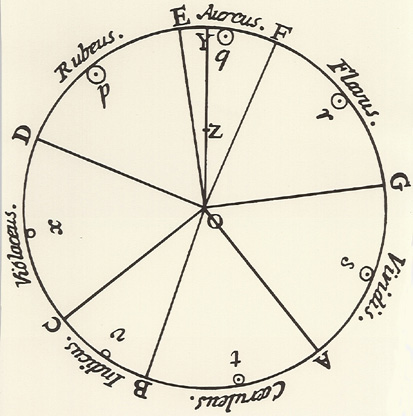
Per­haps the most wide­ly seen piece of Leonar­do’s mir­ror writ­ing is his notes on Vit­ru­vian Man (a piece of which appears at the top of the post), his enor­mous­ly famous draw­ing that fits the pro­por­tions of the human body into the geom­e­try of both a cir­cle and a square (and whose ele­gant math­e­mat­ics we fea­tured last week). Many exam­ples of mir­ror writ­ing exist after Leonar­do, from his coun­try­man Mat­teo Zac­col­in­i’s 17th-cen­tu­ry trea­tise on col­or to the 18th- and 19th-cen­tu­ry cal­lig­ra­phy of the Ottoman Empire to the front of ambu­lances today. Each of those has its func­tion, but one won­ders whether as curi­ous a mind as Leonar­do’s would want to write back­wards sim­ply for the joy of mas­ter­ing and using a skill, any skill, how­ev­er much it might baf­fle oth­ers — or indeed, because it might baf­fle them.

If you’re inter­est­ed in all things da Vin­ci, make sure you check out the new best­selling biog­ra­phy, Leonar­do da Vin­ci, by Wal­ter Isaac­son.

Relat­ed Con­tent:

The Ele­gant Math­e­mat­ics of Vit­ru­vian Man, Leonar­do da Vinci’s Most Famous Draw­ing: An Ani­mat­ed Intro­duc­tion

Down­load the Sub­lime Anato­my Draw­ings of Leonar­do da Vin­ci: Avail­able Online, or in a Great iPad App

Leonar­do da Vinci’s Bizarre Car­i­ca­tures & Mon­ster Draw­ings

Leonar­do da Vinci’s Vision­ary Note­books Now Online: Browse 570 Dig­i­tized Pages

Leonar­do da Vinci’s Hand­writ­ten Resume (1482)

Leonar­do Da Vinci’s To Do List (Cir­ca 1490) Is Much Cool­er Than Yours

Based in Seoul, Col­in Mar­shall writes and broad­casts on cities and cul­ture. His projects include the book The State­less City: a Walk through 21st-Cen­tu­ry Los Ange­les and the video series The City in Cin­e­ma. Fol­low him on Twit­ter at @colinmarshall or on Face­book.

Why Babies in Medieval Paintings Look Like Middle-Aged Men: An Investigative Video

How much spe­cial treat­ment should we give chil­dren, and how much should we regard them as small adults? The answer to that ques­tion varies not just between but with­in time peri­ods and soci­eties. The atti­tude in the 21st-cen­tu­ry west can, at times, seem to have erred toward a patron­iz­ing over­pro­tec­tive­ness, but his­to­ry has shown that if the social pen­du­lum swings one way, it’ll prob­a­bly swing the oth­er in due time. We cer­tain­ly find our­selves far from the view of chil­dren tak­en in medieval Europe, of which we catch a glimpse when­ev­er we behold the babies in its paint­ings — babies that invari­ably, accord­ing to a Vox piece by Phil Edwards, “look like ugly old men.”

“Medieval por­traits of chil­dren were usu­al­ly com­mis­sioned by church­es,” writes Edwards, “and that made the range of sub­jects lim­it­ed to Jesus and a few oth­er bib­li­cal babies. Medieval con­cepts of Jesus were deeply influ­enced by the homuncu­lus, which lit­er­al­ly means lit­tle man.” It also goes along with a strange­ness preva­lent in medieval art which, accord­ing to Creighton Uni­ver­si­ty art his­to­ri­an Matthew Averett, “stems from a lack of inter­est in nat­u­ral­ism” and a reliance on “expres­sion­is­tic con­ven­tions.” These con­di­tions changed, as did much else, with the Renais­sance: “a trans­for­ma­tion of the idea of chil­dren was under­way: from tiny adults to unique­ly inno­cent crea­tures” with the cute­ness to match.

You can wit­ness a ver­i­ta­ble parade of odd­ly man­like medieval babies in the short video at the top of the post. “After the Renais­sance, cherubs did­n’t seem out of place, and nei­ther did cuter pic­tures of baby Jesus,” says Edwards, nar­rat­ing. “It’s kind of stayed that way since. We want babies who look like they need their cheeks pinched, not their prostates checked. We want them chub­by and cute, and we want babies that fit our ideals” — ideals that have led from pudgy angels to the Ger­ber Baby to the col­lect­ed work of Anne Ged­des. We prob­a­bly need not fear an aes­thet­ic return to the mid­dle-aged, homuncu­lar babies of yore, but their frowny expres­sions have cer­tain­ly made a come­back in real life: just look at any 21st-cen­tu­ry infant immersed in an iPad.

via Vox

Relat­ed Con­tent:

Hierony­mus Bosch’s Medieval Paint­ing, “The Gar­den of Earth­ly Delights,” Comes to Life in a Gigan­tic, Mod­ern Ani­ma­tion

The Aberdeen Bes­tiary, One of the Great Medieval Illu­mi­nat­ed Man­u­scripts, Now Dig­i­tized in High Res­o­lu­tion & Made Avail­able Online

Leonar­do da Vinci’s Bizarre Car­i­ca­tures & Mon­ster Draw­ings

Based in Seoul, Col­in Mar­shall writes and broad­casts on cities and cul­ture. His projects include the book The State­less City: a Walk through 21st-Cen­tu­ry Los Ange­les and the video series The City in Cin­e­ma. Fol­low him on Twit­ter at @colinmarshall or on Face­book.

Watch a 17th-Century Portrait Magically Get Restored to Its Brilliant Original Colors

Every week, five mil­lion peo­ple in the Unit­ed King­dom alone tune in to the BBC’s Fake or For­tune?, a tele­vi­sion show about the prove­nance and attri­bu­tion of notable works of art. That may well say some­thing about the British char­ac­ter, but it says even more about its host and co-cre­ator, art deal­er Philip Mould. Involved with antiques from a very ear­ly age, he dis­plays in Fake or For­tune? and his oth­er media projects a keen sense of not just how a piece of art appeals to us, but what hid­den poten­tial it car­ries with­in. Take, for instance, the grimy 17th-cen­tu­ry por­trait you can see par­tial­ly restored in the clip above, which he post­ed on Twit­ter this week.

At first glance, the paint­ing might not look that much worse for wear than any­thing else from the Jacobean era, but even the first few min­utes of work reveal the true bril­liance of the col­ors hid­den under­neath what turn out to be lay­ers of brown and yel­low. They’ve actu­al­ly built up in the name of preser­va­tion: over about 200 years, a few (or more than a few) coats of var­nish had been applied to the can­vas in order to pro­tect it, but that var­nish turns col­or over time. Luck­i­ly, with the right tools and the right tech­nique, it comes off.

“The paint­ing was orig­i­nal­ly in a pri­vate col­lec­tion in Eng­land,” Mould told the Tele­graph. “A mix­ture of gel and sol­vent was cre­at­ed, specif­i­cal­ly just to remove the var­nish and not to dam­age the under­ly­ing paint.” Cer­tain­ly the por­trait’s sub­ject would approve of her appear­ance’s return to its for­mer splen­dor, though lit­tle infor­ma­tion remains as to the iden­ti­ty of the lady her­self: “We don’t know the iden­ti­ty yet but cer­tain icono­graph­ic clues are start­ing to emerge,” said Mould. “All we know is she is 36 and it was paint­ed in 1617.”

And so we hap­pen upon anoth­er of the com­pelling aspects of art his­to­ry: its poten­tial to turn into a detec­tive sto­ry. But if you’d like to accom­pa­ny the nar­ra­tive expe­ri­ence with a lit­tle more tech­ni­cal knowl­edge, have a look at the short video above show­ing what it takes to revive a 400-year-old mas­ter­work. Peo­ple once com­mis­sioned por­traits so that pos­ter­i­ty could know their like­ness­es, but one won­ders if they under­stood just how far into pos­ter­i­ty their like­ness­es would make it — some of them, thanks to art restor­ers, look­ing fresh­er than they have for cen­turies.

Relat­ed Con­tent:

The Art of Restor­ing a 400-Year-Old Paint­ing: A Five-Minute Primer

The Art of Restor­ing Clas­sic Films: Cri­te­ri­on Shows You How It Refreshed Two Hitch­cock Movies

The Met Dig­i­tal­ly Restores the Col­ors of an Ancient Egypt­ian Tem­ple, Using Pro­jec­tion Map­ping Tech­nol­o­gy

Short Film Takes You Inside the Recov­ery of Andy Warhol’s Lost Com­put­er Art

Based in Seoul, Col­in Mar­shall writes and broad­casts on cities and cul­ture. His projects include the book The State­less City: a Walk through 21st-Cen­tu­ry Los Ange­les and the video series The City in Cin­e­ma. Fol­low him on Twit­ter at @colinmarshall or on Face­book.

A Digital Archive of the Earliest Illustrated Editions of Dante’s Divine Comedy (1487–1568)

Book his­to­ry buffs don’t need to be told, but the rest of us prob­a­bly do: incun­able—from a Latin word mean­ing “cra­dle,” “swad­dling clothes,” or “infancy”—refers to a book print­ed before 1501, dur­ing the very first half-cen­tu­ry of print­ing in Europe. An over­whelm­ing num­ber of the works print­ed dur­ing this peri­od were in Latin, the transcon­ti­nen­tal lan­guage of phi­los­o­phy, the­ol­o­gy, and ear­ly sci­ence. Yet one of the most revered works of the time, Dante’s Divine Com­e­dy—writ­ten in Italian—fully attained its sta­tus as a lit­er­ary clas­sic in the lat­ter half of the 15th cen­tu­ry.

In addi­tion to numer­ous com­men­taries and biogra­phies of its author, over 10 edi­tions of the epic Medieval poem— the tale of Dante’s descent into hell and rise through pur­ga­to­ry and paradise—appeared in the peri­od of incunab­u­la, the first in 1472. The 1481 edi­tion con­tained art based on San­dro Botticelli’s unfin­ished series of Divine Com­e­dy illus­tra­tions. The first ful­ly-illus­trat­ed edi­tion appeared in 1491. None of these print­ings includ­ed the word Divine in the title, which did not come into use until 1555. The Com­me­dia, as it was orig­i­nal­ly called, con­tin­ued to gain in stature into the 16th cen­tu­ry, where it received lav­ish treat­ment in oth­er illus­trat­ed edi­tions.

You can see Illus­tra­tions from three of the edi­tions from the first 100-plus years of print­ing here, and many more at Dig­i­tal Dante, a col­lab­o­ra­tive effort from Colum­bia University’s Library and Depart­ment of Ital­ian. These images, from Columbi­a’s Rare Book and Man­u­script Library, rep­re­sent a 1497 wood­cut edi­tion, at the top, with a num­ber of hand-col­ored pages; an edi­tion from 1544, above, with almost 90 cir­cu­lar and tra­di­tion­al­ly-com­posed scenes, all of them prob­a­bly hand-col­ored in the 19th cen­tu­ry; and a 1568 edi­tion with three engraved maps, one for each book, like the care­ful­ly-ren­dered visu­al­iza­tion of pur­ga­to­ry, below.

Of this last edi­tion, Jane Siegel, Librar­i­an for Rare Books, writes, “the rel­a­tive lack of illus­tra­tions are bal­anced by the fine­ness and detail made pos­si­ble by using expen­sive cop­per engrav­ings as a medi­um, and by the live­ly dec­o­rat­ed and his­to­ri­at­ed wood­cut ini­tials sprin­kled through­out the vol­ume at the head of each can­to.” Each of these his­tor­i­cal arti­facts shows us a lin­eage of crafts­man­ship in the infan­cy and ear­ly child­hood of print­ing, a time when lit­er­ary works of art could be turned dou­bly into mas­ter­pieces with illus­tra­tion and typog­ra­phy that com­ple­ment­ed the text. Luck­i­ly for lovers of Dante, fine­ly-illus­trat­ed edi­tions of the Divine Com­e­dy have nev­er gone away.

You can see more images by enter­ing the Dig­i­tal Dante col­lec­tion here.

Relat­ed Con­tent:

A Free Course on Dante’s Divine Com­e­dy from Yale Uni­ver­si­ty

Artists Illus­trate Dante’s Divine Com­e­dy Through the Ages: Doré, Blake, Bot­ti­cel­li, Mœbius & More

Botticelli’s 92 Sur­viv­ing Illus­tra­tions of Dante’s Divine Com­e­dy (1481)

Mœbius Illus­trates Dante’s Par­adiso

Josh Jones is a writer and musi­cian based in Durham, NC. Fol­low him at @jdmagness

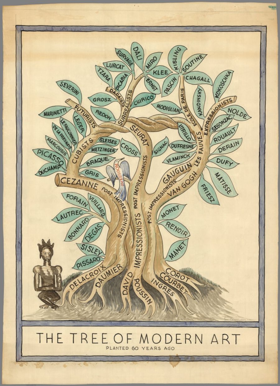
2,000+ Impressionist, Post-impressionist & Early Modern Paintings Now Free Online, Thanks to the Barnes Foundation

Georges Seu­rat, Hen­ri Rousseau, Gior­gio de Chiri­co, Auguste Renoir, Vin­cent Van Gogh — all of us asso­ciate these names with great inno­va­tions in paint­ing, but how many of us have had the oppor­tu­ni­ty to look long and close enough at their work to under­stand those inno­va­tions? To feel them, in oth­er words, rather than just to know about them? The Barnes Foun­da­tion in Philadel­phia has just recent­ly made it pos­si­ble for us to con­tem­plate thou­sands of works of art includ­ing those of Impres­sion­ist, Post-Impres­sion­ist, and ear­ly Mod­ern mas­ters, zoomed in up close and at any length we like, by dig­i­tiz­ing their col­lec­tion and mak­ing it free online.

“Thanks to Open Access,” writes Art­net’s Sarah Cas­cone, “2,081 of the Barnes’s 4,021 objects have been pub­lished online. Of those, there are high-res­o­lu­tion images of 1,429 works avail­able for down­load in the pub­lic domain.

It’s a big step for a muse­um that as recent­ly as 1991 hadn’t pub­lished any col­or imagery of its hold­ings,” due in part to the pref­er­ences of founder and “eccen­tric art col­lec­tor Alfred C. Barnes (1872–1951), who drew up strict rules for how the muse­um would be run.” For instance, it seems that Barnes, who dis­ap­proved of the way the ear­ly col­or pho­tog­ra­phy repro­duced paint­ings, felt he had no choice but to ban it in his muse­um entire­ly.

“As we were rethink­ing the pre­sen­ta­tion of our col­lec­tion online we were con­sid­er­ing the sen­si­tiv­i­ty Barnes had around col­or repro­duc­tion,” writes Deputy Direc­tor of Audi­ence Engage­ment and Chief Expe­ri­ence Offi­cer Shel­ley Bern­stein, “but we also had to think about the needs of today’s stu­dents, researchers, and schol­ars. It goes with­out say­ing that the work of oth­er insti­tu­tions  —  the open access ini­tia­tive at the Met, espe­cial­ly  —  helped make these deci­sions much eas­i­er.” And though the Barnes first start­ed putting its works of art on the inter­net five years ago, “that last iter­a­tion of the col­lec­tion online didn’t fore­ground the abil­i­ty for users to down­load or share images eas­i­ly.”

Now, the Barnes’ online col­lec­tion fea­tures near­ly 1,500 items free to down­load so far. But cur­rent­ly down­load­able or not, every­thing uploaded so far appears in an eas­i­ly search­able, brows­able, and, most of all, view­able form. Here we have van Gogh’s The Broth­el, Paul Cézan­ne’s The Bathers, and Rousseau’s Out­skirts of Paris, four paint­ings that, in many ways, look as styl­is­ti­cal­ly fresh as they did when first revealed in the late 19th cen­tu­ry to the mid-20th. The fact that 21st-cen­tu­ry tech­nol­o­gy has made it so much eas­i­er for all human­i­ty to see that would, one likes to think, have pleased even old Mr. Barnes him­self.

Enter the Barnes online col­lec­tion here.

via Art­net News

Relat­ed Con­tent:

Down­load 35,000 Works of Art from the Nation­al Gallery, Includ­ing Mas­ter­pieces by Van Gogh, Gau­guin, Rem­brandt & More

An Intro­duc­tion to 100 Impor­tant Paint­ings with Videos Cre­at­ed by Smarthis­to­ry

Aston­ish­ing Film of Arthrit­ic Impres­sion­ist Painter, Pierre-Auguste Renoir (1915)

Impres­sion­ist Painter Edgar Degas Takes a Stroll in Paris, 1915

The Maligned Impres­sion­ist Painter Pierre-Auguste Renoir Illus­trates Emile Zola’s Grit­ty Nov­el L’Assommoir (1878)

Based in Seoul, Col­in Mar­shall writes and broad­casts on cities and cul­ture. His projects include the book The State­less City: a Walk through 21st-Cen­tu­ry Los Ange­les and the video series The City in Cin­e­ma. Fol­low him on Twit­ter at @colinmarshall or on Face­book.

Salvador Dali’s 1978 Wine Guide, The Wines of Gala, Gets Reissued: Sensual Viticulture Meets Surreal Art

Pop­u­lar food cul­ture is dom­i­nat­ed by sta­tus sym­bols of restau­rant-inspired con­sumer kitchen­ware and appli­ances, thanks in large part to real­i­ty tele­vi­sions shows about cook­ing com­pe­ti­tions which can make the prepa­ra­tion of haute cui­sine seem more acces­si­ble to the aver­age home chef than it may actu­al­ly be.

Many would argue, how­ev­er, that we’ve come a long way since the 70s, when the mass-mar­ket prod­ucts that held sway over best-sell­ing cook­ing guides went by names like Ham­burg­er Helper, Cool Whip, and Jel­lo. Back then, will­ful anachro­nism Sal­vador Dali stepped into this com­mer­cial land­scape with his 1973 cook­book Les Din­ers de Gala, offer­ing aris­to­crat­ic, extrav­a­gant recipes—next to even more extrav­a­gant art—with exot­ic ingre­di­ents often impos­si­ble to find at the local super­mar­ket both then and now.

Dali made it plain that his object was to bring back pure plea­sure to din­ing, the adven­tur­ous opu­lence he and his wife, Gala, so appre­ci­at­ed in their own out­sized social lives. A few years lat­er, Dali did the same thing with the fine-din­ing bev­er­age of choice, pub­lish­ing The Wines of Gala, an “eccen­tric guide to wine grapes and their ori­gin,” writes This is Colos­sal. The book’s “group­ings are appro­pri­ate imag­i­na­tive clas­si­fi­ca­tions.”

The Wines of Gala splits into two parts: “Ten Divine Dali Wines” and “Ten Gala Wines.” The lat­ter includes cat­e­gories like “Wines of Friv­o­li­ty,” “Wines of Joy,” “Wines of Sen­su­al­i­ty,” “Wines of Pur­pose,” and “Wines of Aes­theti­cism.” Among the Divine Dali Wines, we find “The Wine of King Minos,” “Lacrima Christi,” “Chateauneuf-du-Pape,” and “Sher­ry.” In an appen­dix, Dali sur­veys “Vine­yards of the World,” gen­er­al­ly, and “Vine­yards of France,” specif­i­cal­ly, and offers “Advice to the Wine-Lov­ing Gourmet.”

While some of Dali’s wine advice may go over our heads, maybe the real rea­son we’re drawn to his cook­book and wine guide is the art­work they con­tain with­in their pages, like­ly also the prin­ci­ple rea­son arts pub­lish­er Taschen has reis­sued both of these pub­li­ca­tions. The Wines of Gala is due out on Novem­ber 21, but you can pre-order a hard copy now (or find used copies of the orig­i­nal 1970s edi­tion here). In it you’ll find much bewitch­ing orig­i­nal art to com­ple­ment the pas­sion­ate descrip­tions of wine.

The “rich and extrav­a­gant wine bible fea­tures 140 illus­tra­tions by Dali,” notes Rebec­ca Ful­leylove. “Many of the art­works fea­tured are appro­pri­at­ed pieces, includ­ing… a work from Dali’s late Nuclear Mys­tic phase, The Sacra­ment of the Last Sup­per.” Even to this solemn affair, Dali brings “his abil­i­ty to seek out plea­sure and beau­ty in every­thing.”

via This is Colos­sal/It’s Nice That

Relat­ed Con­tent:

Sal­vador Dalí’s 1973 Cook­book Gets Reis­sued: Sur­re­al­ist Art Meets Haute Cui­sine

Sal­vador Dalí Goes Com­mer­cial: Three Strange Tele­vi­sion Ads

Sal­vador Dalí’s Melt­ing Clocks Paint­ed on a Lat­te

Josh Jones is a writer and musi­cian based in Durham, NC. Fol­low him at @jdmagness

The Elegant Mathematics of Vitruvian Man, Leonardo da Vinci’s Most Famous Drawing: An Animated Introduction

Near­ly 500 years after his death, we still admire Leonar­do da Vin­ci’s many and var­ied accom­plish­ments in paint­ing, sculp­ture, archi­tec­ture, sci­ence, and quite a few oth­er fields besides, most of which would have begun with his putting down some part of the for­mi­da­ble con­tents of his head on to a piece of paper. (As we’ve seen, some­times he need­ed to draw up a to-do list first.) Some of those works remained on paper, and even became famous in that hum­ble form. If you’ve only seen one of Leonar­do’s draw­ings, for instance, it’s almost cer­tain­ly Vit­ru­vian Man.

Leonar­do’s cir­ca-1490 study of the pro­por­tions of the human body — or to put it in more com­mon terms, the pic­ture of the naked fel­low stand­ing inside a square and a cir­cle — stands at an inter­sec­tion of art and math­e­mat­ics, one at which Leonar­do spent a great deal of time through­out his life. The Ted-ED les­son above, writ­ten by edu­ca­tor James Ear­le, gets into “the geo­met­ric, reli­gious and philo­soph­i­cal sig­nif­i­cance of this decep­tive­ly sim­ple draw­ing” whose title ref­er­ences the first-cen­tu­ry BCE Roman archi­tect and civ­il engi­neer Mar­cus Vit­ru­vius Pol­lio, who claimed that “the navel is the cen­ter of the human body, and that if one takes a com­pass and places the fixed point on the navel, a cir­cle can be drawn per­fect­ly around the body.”

Vit­ru­vius also real­ized that “arm span and height have a near­ly per­fect cor­re­spon­dence in the human body, thus plac­ing the body per­fect­ly inside a square as well.” Both he and Leonar­do saw real impli­ca­tions in this align­ment between anato­my and geog­ra­phy, begin­ning with the notion that build­ings and oth­er works of man should also take on these “per­fect” pro­por­tions. All of this ties in with the prob­lem, first pro­posed by ancient geome­ters, of “squar­ing the cir­cle,” that is, find­ing a pro­ce­dure to hand-draw a square and a cir­cle both of equal area. Leonar­do used Vit­ru­vian Man to point toward one pos­si­ble solu­tion using the human body.

You can learn more about the impor­tance and lega­cy of the draw­ing in the BBC doc­u­men­tary The Beau­ty of Dia­grams, avail­able on Youtube (part one, part two). “Although the dia­gram does­n’t rep­re­sent some huge sci­en­tif­ic break­through,” says its host, math­e­mati­cian Mar­cus du Sautoy, “it cap­tures an idea: that math­e­mat­ics under­pins both nature and the man­made world. It rep­re­sents a syn­the­sis of archi­tec­ture, anato­my, and geom­e­try. But it’s the per­fec­tion and ele­gance of Leonar­do’s solu­tion to this rid­dle of the square and the cir­cle in Vit­ru­vius which gives the dia­gram its pow­er and its beau­ty.” And judg­ing by the unabat­ed pop­u­lar­i­ty of Vit­ru­vian Man par­o­dies, it looks to have at least anoth­er half-mil­len­ni­um of rel­e­vance ahead.

Relat­ed Con­tent:

Down­load the Sub­lime Anato­my Draw­ings of Leonar­do da Vin­ci: Avail­able Online, or in a Great iPad App

Leonar­do da Vinci’s Bizarre Car­i­ca­tures & Mon­ster Draw­ings

How to Build Leonar­do da Vinci’s Inge­nious Self-Sup­port­ing Bridge: Renais­sance Inno­va­tions You Can Still Enjoy Today

Leonar­do da Vinci’s Vision­ary Note­books Now Online: Browse 570 Dig­i­tized Pages

Ralph Steadman’s Wild­ly Illus­trat­ed Biog­ra­phy of Leonar­do da Vin­ci (1983)

Based in Seoul, Col­in Mar­shall writes and broad­casts on cities and cul­ture. His projects include the book The State­less City: a Walk through 21st-Cen­tu­ry Los Ange­les and the video series The City in Cin­e­ma. Fol­low him on Twit­ter at @colinmarshall or on Face­book.

« Go BackMore in this category... »
Quantcast