If you were to ask me in my callow years as a young art student to name my favorite painter, I would have answered without a moment’s hesitation: Wassily Kandinsky. His theoretical bent, his mysticism, his seemingly near total creative independence…. There were times when Kandinsky the thinker, writer, and teacher appealed to me even more than Kandinsky the painter. This may go a ways toward explaining why I left art school after my first year to pursue writing and teaching. But nowadays, having seen a tiny bit more of the world and its bountiful artistic treasures, I might pause for just a moment if asked about my favorite painter… then I’d answer: Wassily Kandinsky.

If you want to see the pioneering abstract expressionist’s art in the United States, your best bet is to get yourself to New York’s famed Guggenheim, which has a veritable treasure chest of Kandinsky’s work that documents his transition from paintings and woodcuts inspired by Russian folk art and French fauvism to completely non-representational canvases made entirely of intersecting lines, shapes, and colors—his own private symbology.
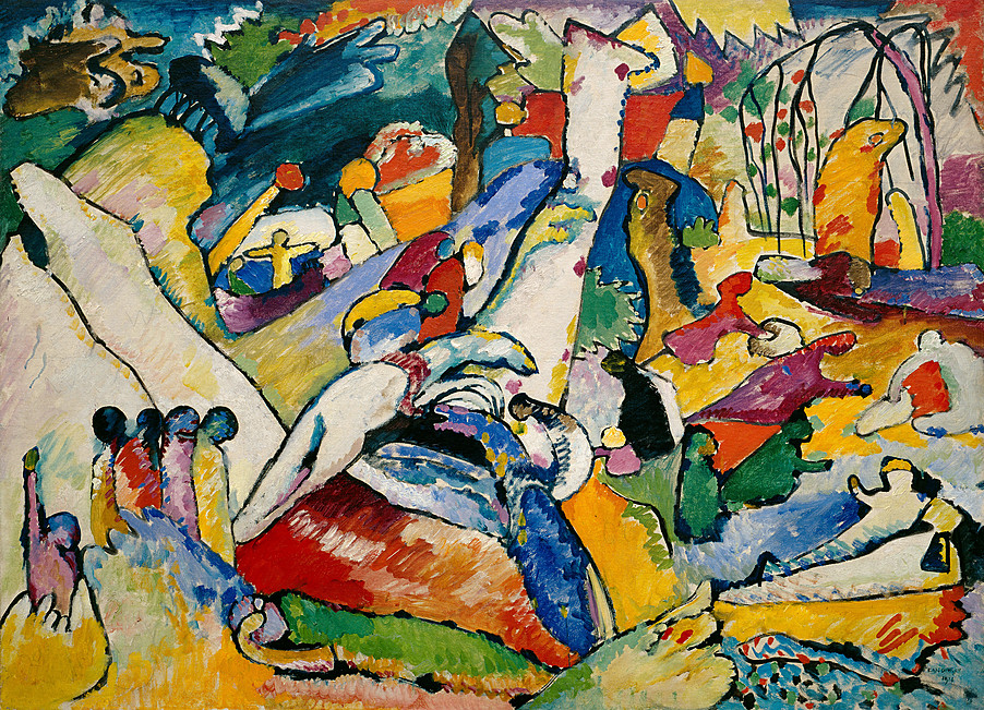
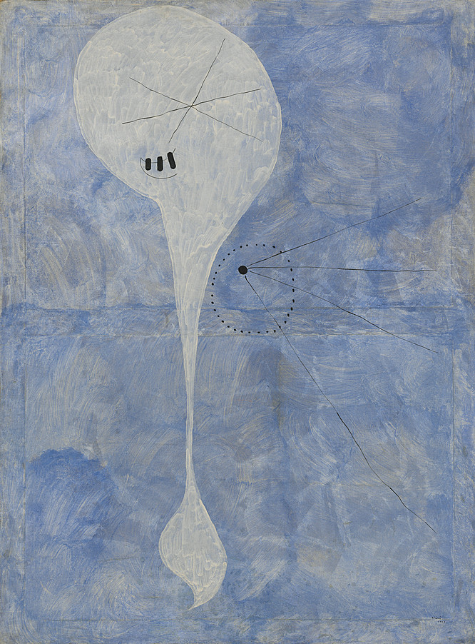
But if you can’t make it to New York, then just head on over to the Guggenheim’s online collection, where the museum has digitized “nearly 1600 artworks by more than 575 artists.” This is the most sweeping move toward greater accessibility since the private collection went public in 1937. You’ll find early representational Kandinskys; transitional Kandinskys like Sketch for Composition II from 1909-10 (top)—with still recognizable favorite motifs of his, like the horse and rider embedded in them; and you’ll find much more abstract Kandinskys like 1913’s Light Picture, above, showing his move even farther away from Matisse and Russian folks and closer to an inimitable individual aesthetic like that of Joan Miró or Paul Klee.
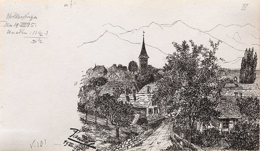
Speaking of Klee, another of my favorites, you’ll also find the sketch above, from 1895, before he began his formal training in Munich. It’s a far cry from his mature style—a primitive minimalism that drew inspiration from children’s art. If you know anyone who looks at abstract art and says, “I could do that,” show them the drawing above and ask if they could do this. Painters like Kandinsky and Klee, who worked and exhibited together, first learned to render in more rigorously formal styles before they broke every rule and made their own. It’s a necessary part of the discipline of art.
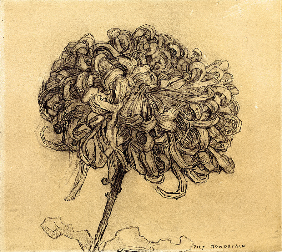
Of the three artists I’ve mentioned thus far, it is perhaps Miró who moved farthest away from any semblance of classical training. In works like Personage (above), the Spanish surrealist achieved his “assassination of painting” and the realist bourgeois values he detested in European art. Piet Mondrian, another artist who completely radicalized painting, did so by moving in the opposite direction, towards a formalism so exacting as to be almost chilling. But like all modern artists, Mondrian learned the classical rules before he tore them up for good, as evidenced by his drawing below, Chrysanthemum, from 1908-09.
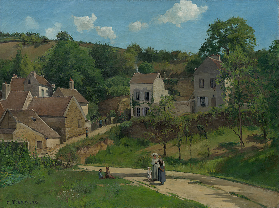
Of course you won’t only find artists from the early twentieth century in the Guggenheim’s online collection. This just happens to be one of my favorite periods, and the Guggenheim is most famous for its modernist collection. But you’ll also find work from more contemporary provocateurs like Marina Abramović and Ai Weiwei, as well as from early nineteenth century proto-impressionists like Camille Pissarro. (See Pissarro’s 1867 The Hermitage at Pontoise below.) And if you find yourself wanting more context, the Guggenheim has made it easy to give yourself a thorough education in modern art. As we’ve noted before, between 2012 and 2014, the museum placed over 100 art catalogues online, including a collection called “The Syllabus,” featuring books by the museum’s first curator. Looking for a way of understanding that weird phenomenon known as modern art? Look no further, the Guggenheim’s got you covered.
Related Content:
The Guggenheim Puts 109 Free Modern Art Books Online
Rijksmuseum Digitizes & Makes Free Online 210,000 Works of Art, Masterpieces Included!
Download 100,000 Free Art Images in High-Resolution from The Getty
The National Gallery Makes 25,000 Images of Artwork Freely Available Online
Download 448 Free Art Books from The Metropolitan Museum of Art
Josh Jones is a writer and musician based in Durham, NC. Follow him at @jdmagness