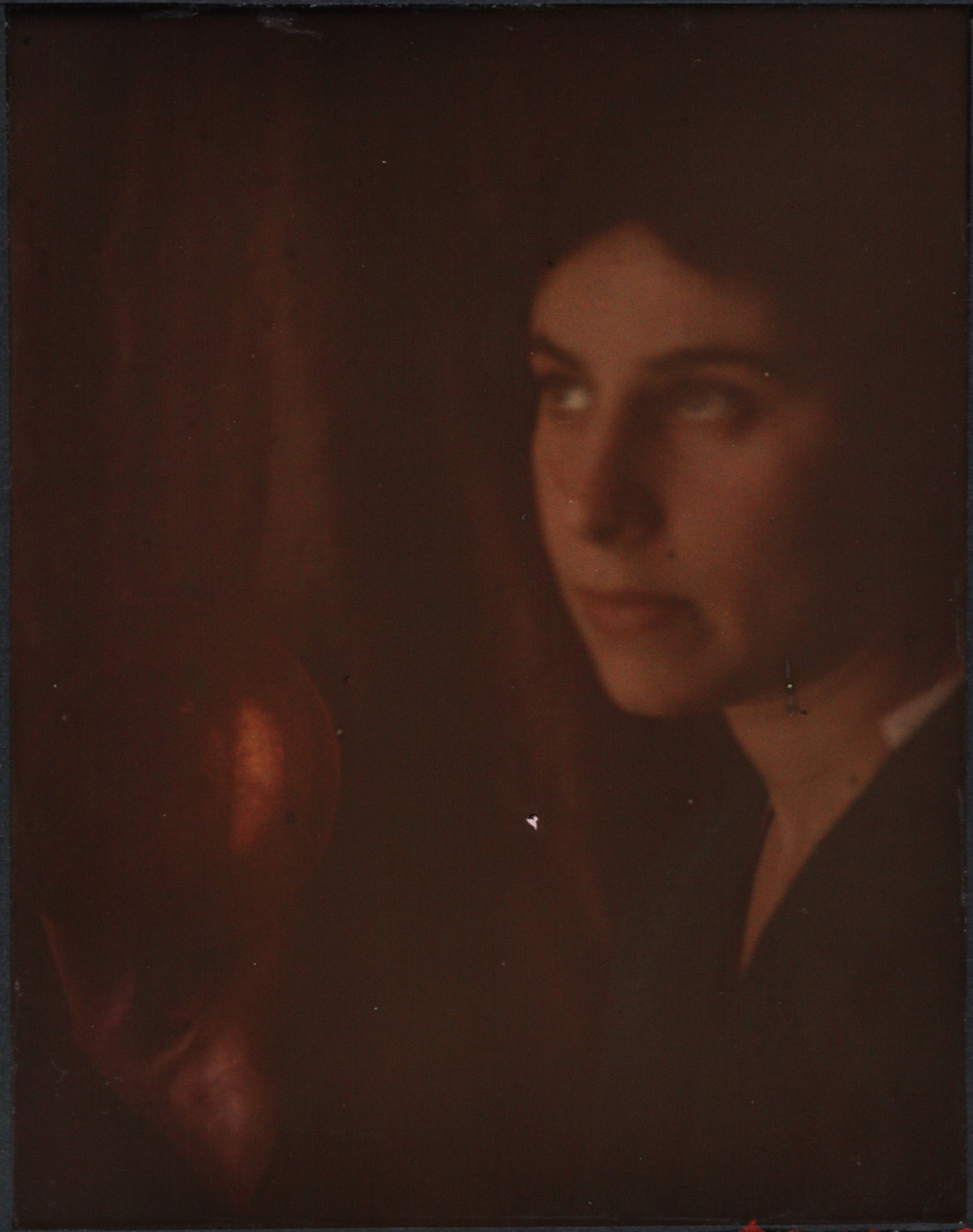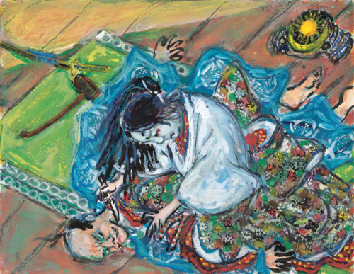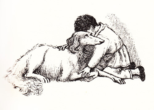
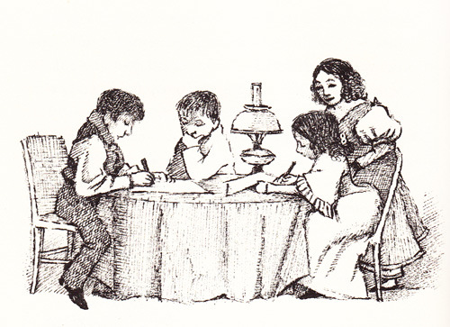
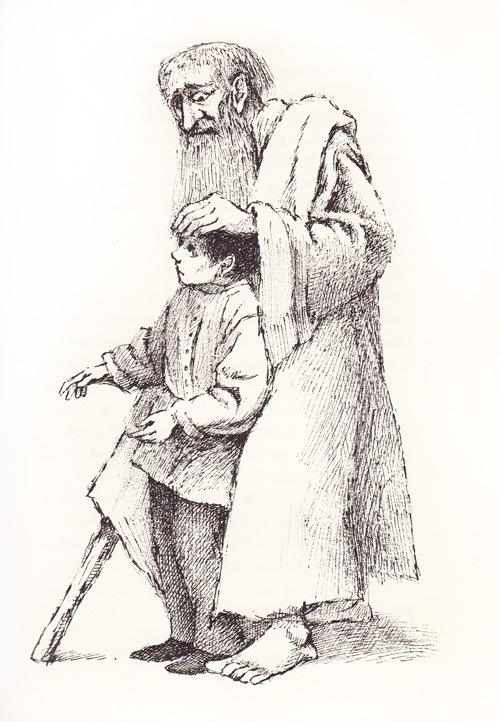
Even those of us who know nothing else of Maurice Sendak’s work know Where the Wild Things Are, almost always because we read and found ourselves captivated by it in our own childhoods — if, of course, our childhoods happened in 1963 or later. Though that year saw the publication of that best-known of Sendak’s many works as an illustrator and writer — and indeed, quite possibly the best-known children’s book of the twentieth century, illustrated or written by anyone — the world got something else intriguing from Sendak at the same time: an illustrated edition of Leo Tolstoy’s 1852 autobiographical novel Nikolenka’s Childhood.
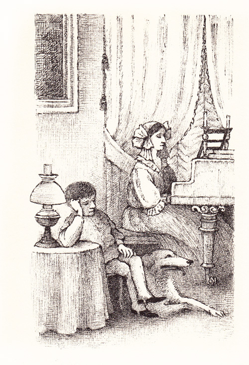
At Brainpickings, Maria Popova writes of the struggle Sendak, then a young and insecure artist at the beginning of his career, endured to complete this lesser-known project: “His youthful insecurity, however, presents a beautiful parallel to the coming-of-age themes Tolstoy explores. The illustrations, presented here from a surviving copy of the 1963 gem, are as tender and soulful as young Sendak’s spirit.” Here we’ve selected a few of the images that Popova gathered from this out-of-print book; to see more, do have a look at her original post.
Later in life Sendak explained his anxiety about accompanying the words of the man who wrote War and Peace: “You can’t illustrate Tolstoy. You’re competing with the greatest illustrator in the world. Pictures bring him down and just limp along.” At Letters of Note, you can read the words of encouragement written to the young Sendak by his editor Ursula Nordstrom, who acknowledged that, “sure, Tolstoy and Melville have a lot of furniture in their books and they also know a lot of facts, but that isn’t the only sort of genius, you know that. Yes, Tolstoy is wonderful (his publisher asked me for a quote) but you can express as much emotion and ‘cohesion and purpose’ in some of your drawings as there is in War and Peace. I mean that.”
Again, find more of Sendak’s illustrations of Tolstoy’s Nikolenka’s Childhood at BrainPickings. Used copies can be found on AbeBooks.
Related Content:
Maurice Sendak Sent Beautifully Illustrated Letters to Fans — So Beautiful a Kid Ate One
Maurice Sendak’s Bawdy Illustrations For Herman Melville’s Pierre: or, The Ambiguities
The Only Drawing from Maurice Sendak’s Short-Lived Attempt to Illustrate The Hobbit
An Animated Christmas Fable by Maurice Sendak (1977)
Colin Marshall writes elsewhere on cities, language, Asia, and men’s style. He’s at work on a book about Los Angeles, A Los Angeles Primer, the video series The City in Cinema, and the crowdfunded journalism project Where Is the City of the Future? Follow him on Twitter at @colinmarshall or on Facebook.