Patti Smith’s Polaroids of Artifacts from Virginia Woolf, Arthur Rimbaud, Roberto Bolaño & More

16well-smith-custom3-tmagArticle

Polaroid pho­tog­ra­phy has seen a new wave of inter­est over the past decade, in large part from young pho­tog­ra­phers look­ing to do some­thing dif­fer­ent from what they can with the dig­i­tal tech­nol­o­gy on which they grew up.

The oth­er mod­ern prac­ti­tion­ers include no less a cre­ator than Pat­ti Smith, who have per­son­al­ly wit­nessed the for­mat’s appear­ance, fade, and return. A few years ago, her Polaroid pho­tog­ra­phy reached the gal­leries, becom­ing shows and instal­la­tions in Con­necti­cut and Paris.

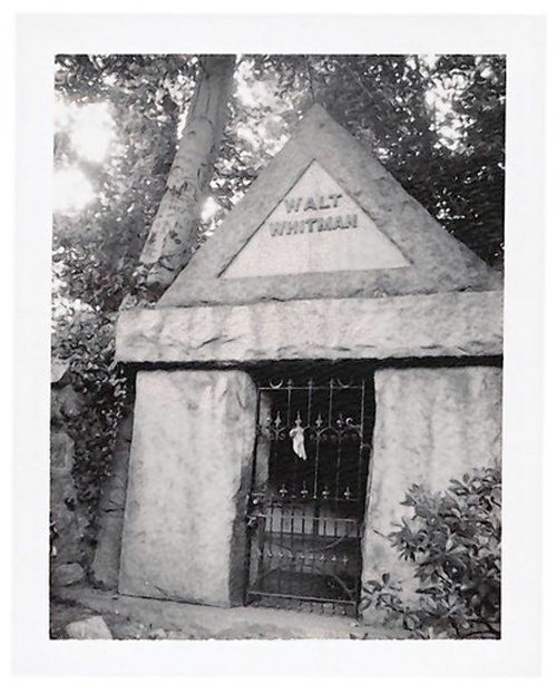
"Walt Whitman's Tomb, Camden, NJ"

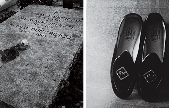
These “black-and-white sil­ver gelatin prints made from Polaroid neg­a­tives, small and square and in soft focus,” writes the New York Times’ A.O. Scott, “are culled from a col­lec­tion that doc­u­ments hun­dreds of encoun­ters with world­ly effects trans­formed into sacred relics. A fork and a spoon that belonged to Arthur Rim­baud, the French sym­bol­ist poet who has been one of Smith’s touch­stones for­ev­er. [Robert] Mapplethorpe’s bed­room slip­pers and the tam­bourine he made for Smith. A chair that belonged to the Chilean nov­el­ist Rober­to Bolaño. William S. Burroughs’s ban­dan­na. A repli­ca of a life mask cast from the fea­tures of William Blake.”

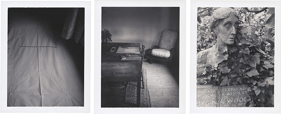
Virginia Woolf’s bed, writing desk, and gravestone

Smith’s “gor­geous, misty pho­tographs are inspired by arti­facts from some of Smith’s favorite artists, from muse­ums she has vis­it­ed around the world, and many are from her per­son­al life,” writes Fla­vor­wire’s Emi­ly Tem­ple on “Cam­era Solo,” the Hart­ford exhi­bi­tion which intro­duced these Polaroids to Amer­i­ca in 2011. If you did­n’t make it to the Wadsworth Atheneum for that show, you can still expe­ri­ence it through Pat­ti Smith: Cam­era Solo, its com­pan­ion book. Or have a look at her work on dis­play at the BBC’s site, the gallery that offers the pho­tos of Vir­ginia Woolf’s bed, writ­ing desk, and grave­stone just above.

16well-smith-custom4-tmagArticle

You can see even more at this post from Lens Cul­ture on “Land 250,” the exhi­bi­tion of Smith’s Polaroid pho­tog­ra­phy at Paris’ Fon­da­tion Cartier.“I first took Polaroids in the ear­ly 1970s as com­po­nents for col­lages,” it quotes Smith as say­ing. “In 1995, after the death of my hus­band, I was unable to cen­ter on the com­plex process of draw­ing, record­ing or writ­ing a poem. The need for imme­di­a­cy drew me again to the Polaroid. I chose a vin­tage Land 100.” In 2002, she set­tled on the Land 250, the ven­er­a­ble instant cam­era that gave the Paris show and its asso­ci­at­ed mono­graph their titles. It sure­ly counts as one of the most impor­tant arti­facts of Smith’s artis­tic life — and one with which she has cap­tured the arti­facts of so many oth­er artis­tic lives impor­tant to her.

Relat­ed Con­tent:

Watch Pat­ti Smith Read from Vir­ginia Woolf, and Hear the Only Sur­viv­ing Record­ing of Woolf’s Voice

Pat­ti Smith Reads Her Final Words to Robert Map­plethor­pe

Pat­ti Smith’s List of Favorite Books: From Rim­baud to Susan Son­tag

Andy Warhol’s 85 Polaroid Por­traits: Mick Jag­ger, Yoko Ono, O.J. Simp­son & Many Oth­ers (1970–1987)

The Mas­ter­ful Polaroid Pic­tures Tak­en by Film­mak­er Andrei Tarkovsky

Col­in Mar­shall writes on cities, lan­guage, Asia, and men’s style. He’s at work on a book about Los Ange­les, A Los Ange­les Primer, and the video series The City in Cin­e­ma. Fol­low him on Twit­ter at @colinmarshall or on Face­book.

Robert De Niro Tells Graduating NYU Arts Grads, “You Made It… And You’re F*cked”

I’ve attend­ed my share of grad­u­a­tions and hence my share of grad­u­a­tion speeches—from politi­cians more inter­est­ed in stump­ing than inspir­ing their audi­ence; to local TV per­son­al­i­ties assur­ing grad­u­ates they too could become local TV per­son­al­i­ties; to the real Patch Adams, who wasn’t near­ly as fun­ny as Robin Williams in his less-than-fun­ny turn as Patch Adams. My expe­ri­ence has taught me that grad­u­a­tion speech­es gen­er­al­ly suck.

But not for the most recent batch of grad­u­ates of NYU’s Tisch School of the Arts, who got both brac­ing hon­esty and career val­i­da­tion from a speak­er most like­ly to give it to you straight. With his trade­mark foul-mouth gruff­ness, De Niro told the grad­u­at­ing class what every aspir­ing artist needs to know: “You made it,” he said, “and you’re f*cked.” The world, De Niro told his audi­ence, is not open­ing its arms to embrace art school grads. For all our pop cul­tur­al cel­e­bra­tion of cre­ativ­i­ty, the so-called “cre­ative class”—as we’re told again and again—is most­ly in decline.

Of course it’s nev­er been an easy road for artists. De Niro knows this full well not only through his own ear­ly expe­ri­ences before super­star­dom but from his upbring­ing: both his moth­er and father were bohemi­an painters with tur­bu­lent, fas­ci­nat­ing lives. And so he also knows of what he speaks when he tells the NYU grads that they “didn’t have a choice.” Where prag­mat­ic account­ing grads may be “pas­sion­ate about account­ing,” De Niro says, “it’s more like­ly that they used rea­son and log­ic and com­mon sense to reach for a career that could give them the expec­ta­tion of suc­cess and sta­bil­i­ty.”

Not the arts grads, the famous actor says: “You dis­cov­ered a tal­ent, devel­oped an ambi­tion and rec­og­nized your pas­sion.” Their path, he sug­gests, is one of self-actu­al­iza­tion:

When it comes to the arts, pas­sion should always trump com­mon sense. You aren’t just fol­low­ing dreams, you’re reach­ing for your des­tiny. You’re a dancer, a singer, a chore­o­g­ra­ph­er, a musi­cian, a film­mak­er, a writer, a pho­tog­ra­ph­er, a direc­tor, a pro­duc­er, an actor, an artist. Yeah, you’re f***ed. The good news is that that’s not a bad place to start.

Maybe not. And maybe, for those dri­ven to sing, dance, paint, write, etc., it’s the only place to start. Grant­ed, NYU stu­dents are already a pret­ty select and priv­i­leged bunch, who cer­tain­ly have a leg up com­pared to a great many oth­er strug­gling artists. Nev­er­the­less, giv­en cur­rent eco­nom­ic real­i­ties and the U.S.’s depress­ing aver­sion to arts edu­ca­tion and fund­ing, these grads have a par­tic­u­lar­ly dif­fi­cult road ahead, De Niro says. And who bet­ter to deliv­er that hard truth with such con­vic­tion and good humor?

h/t @sheerly

Relat­ed Con­tent:

David Byrne’s Grad­u­a­tion Speech Offers Trou­bling and Encour­ag­ing Advice for Stu­dents in the Arts

Jim Car­rey Com­mence­ment Speech: It’s Bet­ter to Fail at What You Love Than Fail at What You Don’t

‘This Is Water’: Com­plete Audio of David Fos­ter Wallace’s Keny­on Grad­u­a­tion Speech (2005)

Josh Jones is a writer and musi­cian based in Durham, NC. Fol­low him at @jdmagness

Mœbius Illustrates Paulo Coelho’s Inspirational Novel The Alchemist (1998)

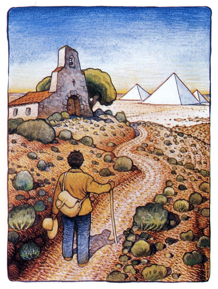
moebius alchemist 1

When Paulo Coel­ho’s nov­el The Alchemist came out in Eng­lish, the lev­el of pop­u­lar­i­ty it even­tu­al­ly attained seri­ous­ly impressed me. Then I went to Latin Amer­i­ca, where the Span­ish ver­sion seemed to have won a vaster read­er­ship still. I haven’t yet gone to Brazil to gauge the book’s pop­u­lar­i­ty on the streets of Coel­ho’s home­land since its first pub­li­ca­tion to rel­a­tive­ly lit­tle inter­est, but it sure­ly has­n’t gone unknown there. As many fans as The Alchemist has, though, the inspi­ra­tion-and-des­tiny-inflect­ed appeal of the text entire­ly escapes some read­ers, in whichev­er lan­guage they read it. Per­haps they’d pre­fer an edi­tion illus­trat­ed by Mœbius?

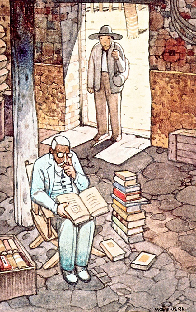
moebius alchemist 2

Born Jean Giraud, Mœbius’ career guar­an­tees him a per­ma­nent place as one of the most influ­en­tial com­ic artists ever to live. Even apart from the achieve­ments in the medi­um in which he became famous — his found­ing work on Heavy Met­al, his cre­ation of non­tra­di­tion­al west­ern out­law Blue­ber­ry — he did a good deal of work that brought his sin­gu­lar­ly imag­i­na­tive aes­thet­ic into oth­er cre­ative realms, such as con­cept art from Ale­jan­dro Jodor­owky’s Dune and illus­tra­tions for Dan­te’s Par­adiso. In some sense, it might have seemed nat­ur­al for him to lend his hand to Coel­ho’s fan­ta­sy tale of an Andalu­sian shep­herd boy on a trea­sure-hunt­ing jour­ney to Egypt.

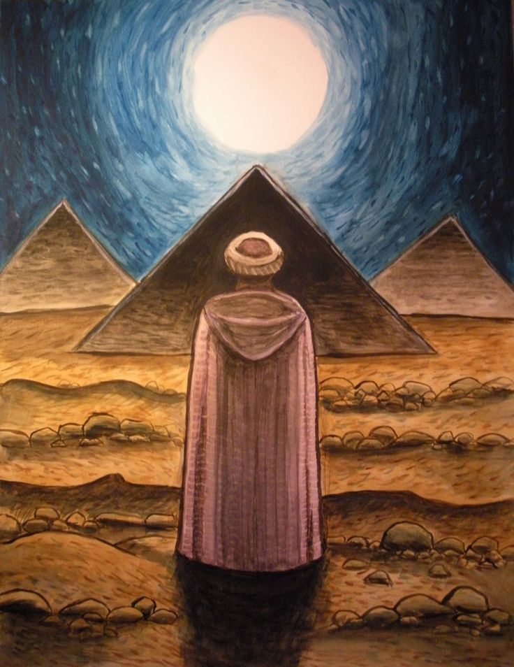
moebius alchemist 3

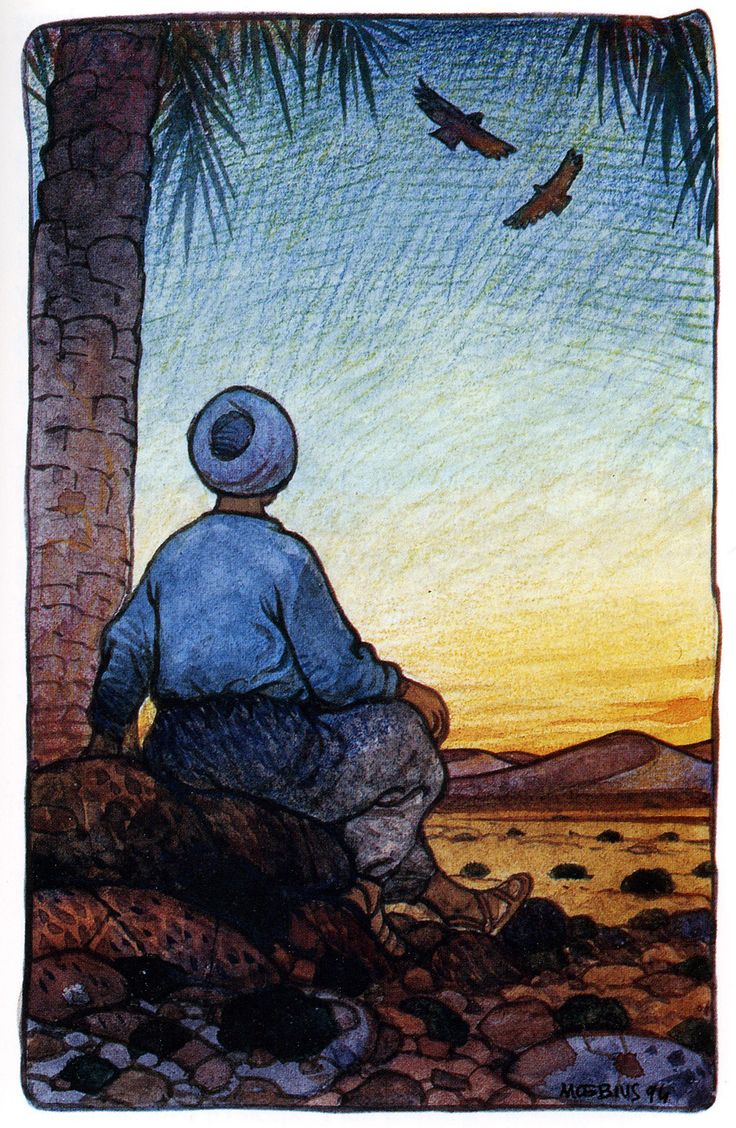
The Illus­trat­ed Alchemist: A Fable About Fol­low­ing Your Dream came out in 1998, and it includ­ed 35 Mœbius illus­tra­tions, four of which you see here. The artist’s sig­na­ture style, which he usu­al­ly used in the ser­vice of dark, com­plex fusions of past and present, might at first sound ill-suit­ed for Coel­ho’s sim­ple fable, but Mœbius adapts well to the mate­r­i­al. Even if you put down the book uncon­vinced by Coel­ho’s argu­ments about fol­low­ing your dream, you might con­sid­er look­ing to Mœbius instead with our post on his tips for aspir­ing artists. Either way, The Illus­trat­ed Alchemist itself show­cas­es a col­lab­o­ra­tion between two well-known cre­ators who most def­i­nite­ly paid their dues.

moebius alchemist 4

Relat­ed con­tent:

How Paulo Coel­ho Start­ed Pirat­ing His Own Books (And Where You Can Find Them)

Paulo Coel­ho on the Fear of Fail­ure

The Inscrutable Imag­i­na­tion of the Late Com­ic Artist Mœbius

Mœbius’ Sto­ry­boards & Con­cept Art for Jodorowsky’s Dune

Mœbius Illus­trates Dante’s Par­adiso

Moe­bius Gives 18 Wis­dom-Filled Tips to Aspir­ing Artists (1996)

Col­in Mar­shall writes on cities, lan­guage, Asia, and men’s style. He’s at work on a book about Los Ange­les, A Los Ange­les Primer, and the video series The City in Cin­e­maFol­low him on Twit­ter at @colinmarshall or on Face­book.

Norman Rockwell Illustrates Mark Twain’s Tom Sawyer & Huckleberry Finn (1936–1940)

Sawyer 1

There’s no get­ting around it: Nor­man Rock­well was a square. There’s also no get­ting around the fact that his career helped define the way main­stream Amer­i­cans saw them­selves for decades. And while an artist like Rockwell—so steeped in nos­tal­gia, so lack­ing in irony and a taste for transgression—might have fad­ed into com­plete irrel­e­vance amidst the tumult of the six­ties, the oppo­site in fact occurred. Instead of pale, freck­le-faced scamps and neigh­bor­ly civ­il ser­vants, Rock­well paint­ed like­ness­es of world lead­ers like Nehru and Nass­er, as well as a now icon­ic sym­bol of the Civ­il Rights strug­gle on a 1964 Look mag­a­zine cov­er.

Sawyer 2

The six­ties Rock­well, though still very much a pur­vey­or of small town Amer­i­cana, became a some­what weight­i­er fig­ure, even if he nev­er gained (or sought) accep­tance in the art world. But we might think of Rock­well as work­ing on two reg­is­ters through­out his career—as the PG-rat­ed painter of mis­chie­vous, child­ish nice­ness, and the earnest com­men­ta­tor on mores and val­ues in adult soci­ety. In a way, these two sides of America’s most pop­u­lar illus­tra­tor mir­ror those of the nation’s most pop­u­lar writer, Mark Twain. Though sep­a­rat­ed by a gen­er­a­tion, the two, writes the Mark Twain House & Museum’s web­site, are “twinned in many ways in the pub­lic con­scious­ness.”

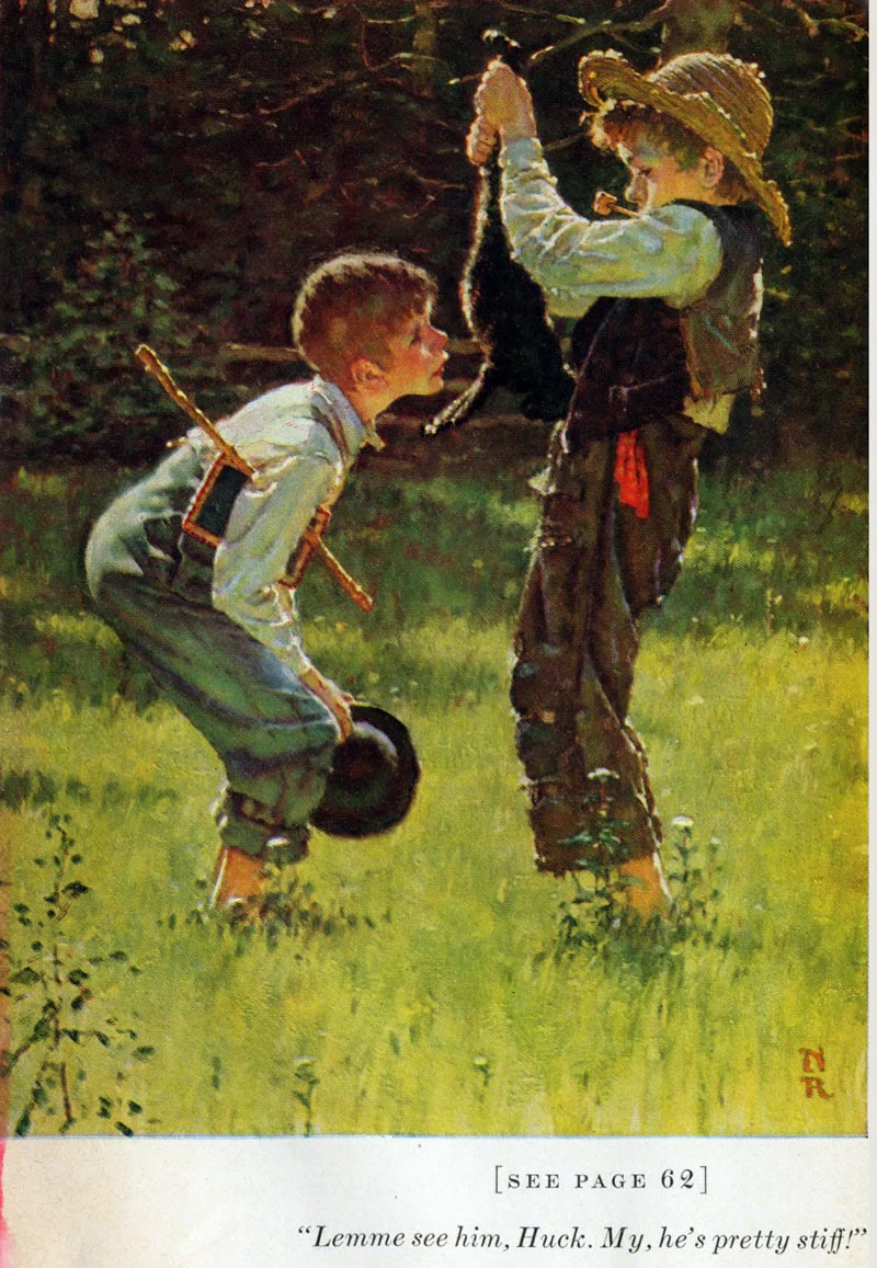
Sawyer 3

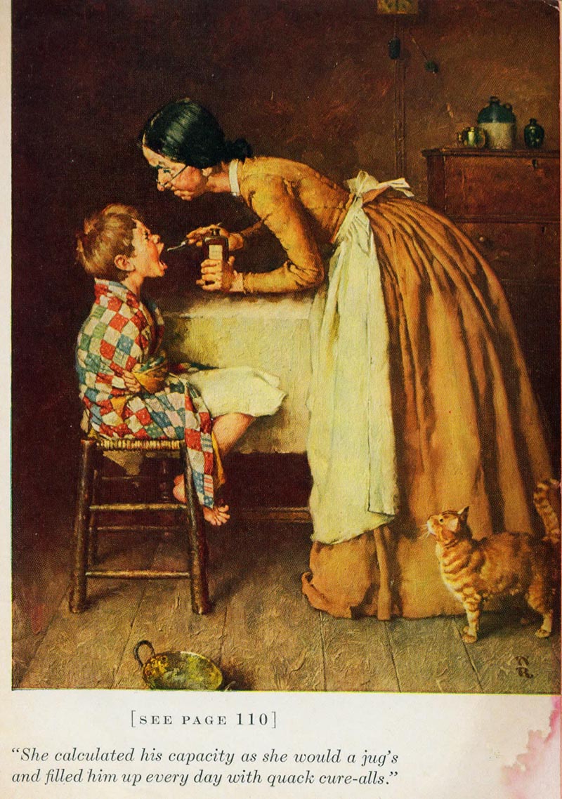
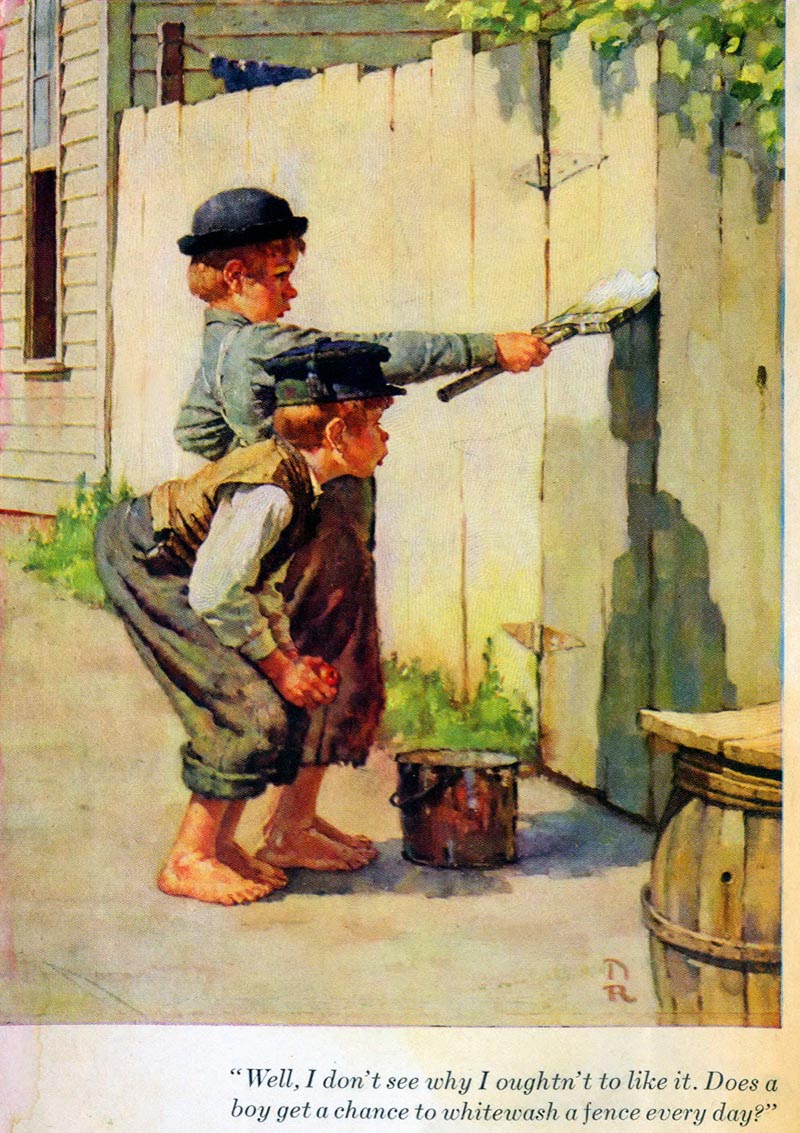
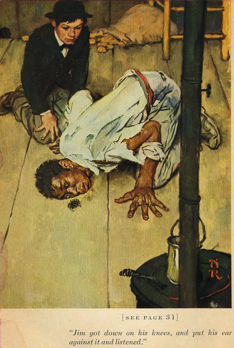
In part, this is because Rock­well illus­trat­ed for Her­itage Press two of Twain’s most famous books, The Adven­tures of Tom Sawyer in 1936 and The Adven­tures of Huck­le­ber­ry Finn in 1940. Above, see three of Rockwell’s illus­tra­tions from Tom Sawyer and, below, one from his Huck Finn. The dif­fer­ences between the two books (so hilar­i­ous­ly con­trast­ed by Louis CK), could stand for the two sides of both Twain and Rock­well. As the Mark Twain House puts it, “some crit­ics have dis­missed [Twain and Rockwell’s] work as light­weight, blithe­ly ignor­ing the impor­tant state­ments they made on race.” Tom Sawyer is a light­weight book, the work of Twain the pop­u­lar humorist. (Twain him­self would say, “my books are water: those of the great genius­es are wine. Every­body drinks water.”) Huck Finn on the oth­er hand is a seri­ous adult nov­el with seri­ous adult themes. For all of its flaws, it makes an admirable attempt to iden­ti­fy with and faith­ful­ly ren­der the plight of enslaved peo­ple.

Huck Finn Rockwell

Twain’s great strength as a seri­ous writer was his wealth of empa­thy, a qual­i­ty Rock­well man­i­fest­ed as well. In fact, in order to best rep­re­sent Twain’s books, the illus­tra­tor trav­eled to their set­ting, Han­ni­bal, Mis­souri, where he “acquired a new respect for the char­ac­ters,” writes the Nor­man Rock­well Muse­um. “The longer I worked at the task,” Rock­well wrote, “the more in love with the dif­fer­ent per­son­al­i­ties I became.” Illus­tra­tion and design blog Today’s Inspi­ra­tion points out that Rock­well pur­chased old clothes from the Han­ni­bal locals to “soak up the atmos­phere”: “Of all the illus­tra­tors (and there were quite a few) that illus­trat­ed these nov­els in the past, Rock­well was the first to vis­it Mark Twain’s home town. In typ­i­cal Rock­well fash­ion, no amount of detail or research was ignored, faked or quick­ly glossed over.”

Sawyer 4

Today’s Inspi­ra­tion zooms in on details from sev­er­al of the Tom Sawyer paint­ings to show the fine, almost Ver­meer-like atten­tion Rock­well lav­ished on each illus­tra­tion. The exten­sive exam­i­na­tion of these ear­ly Rock­well clas­sics makes a good case for the folksy illus­tra­tor as a “sto­ry­telling genius with pal­let and brush.” Rock­well may be dis­missed as a cre­ator of kitsch, and in some cas­es the charge is jus­ti­fied, but—like Twain—even his lighter work depend­ed on a fine atten­tion to details of set­ting and char­ac­ter­i­za­tion that make his work mem­o­rable and mov­ing, in its corni­est and its weight­i­est moments.

Relat­ed Con­tent:

50,000 Nor­man Rock­well Pho­tographs Now Dig­i­tized and Avail­able Online

Bill Mur­ray Gives a Delight­ful Dra­mat­ic Read­ing of Twain’sHuckleberry Finn (1996)

Mark Twain & Helen Keller’s Spe­cial Friend­ship: He Treat­ed Me Not as a Freak, But as a Per­son Deal­ing with Great Dif­fi­cul­ties

Mark Twain Writes a Rap­tur­ous Let­ter to Walt Whit­man on the Poet’s 70th Birth­day (1889)

Josh Jones is a writer and musi­cian based in Durham, NC. Fol­low him at @jdmagness

The Art of Collotype: See a Near Extinct Printing Technique, as Lovingly Practiced by a Japanese Master Craftsman

When I was a kid,  I spent a lot of time at the Indi­anapo­lis Star, where my moth­er worked in what was then referred to as the “women’s pages.” She kept me busy return­ing the pho­tos that accom­pa­nied mar­riage and engage­ment announce­ments, using the SASEs the young brides had sup­plied. After that, I’d hit the print­ing floor, where vet­er­an work­ers sport­ed square caps fold­ed from the pre­vi­ous day’s edi­tion, as that day’s issue clacked on tracks over­head. If I was lucky, some­one would make me a gift of my name, set in hot type.

The Star still pub­lish­es — I shud­der to report that its web­site seems to have renamed it IndyS­tar… — but cul­tur­al and dig­i­tal advances have rel­e­gat­ed all of the par­tic­u­lars men­tioned above to the scrap pile.

They came rush­ing back with wild, Prous­t­ian urgency when Osamu Yamamo­to, a mas­ter print­er at Ben­ri­do Col­lo­type Ate­lier in Kyoto, men­tions the smell of the ink, in the short doc­u­men­tary above, how over the years, it has seeped into his skin, and become a part of his being.

Col­lo­type, defined by the Get­ty Con­ser­va­tion Insti­tute as “a screen­less pho­to­me­chan­i­cal process that allows high-qual­i­ty prints from con­tin­u­ous-tone pho­to­graph­ic neg­a­tives,” has been on the way out since the 70s. As mas­ter print­er Yamamo­to notes, it’s a low-effi­cien­cy, small batch oper­a­tion, involv­ing messy matrix­es, hand-oper­at­ed press­es, and heavy iron machines that give off a sort of ani­mal warmth when work­ing.

Rather than pressmen’s caps, Ben­ri­do’s shirt­less print­ers wear hachi­ma­ki, rub­ber aprons, and pur­ple dis­pos­able gloves.

Film­mak­er Fritz Schu­mann (whose film on the old­est hotel in Japan we pre­vi­ous­ly fea­tured before) evokes the work­place — one of two remain­ing col­lo­type com­pa­nies in the world — through small details like the plas­tic-wrapped dig­i­tal Ham­taro clock and also by draw­ing view­ers’ atten­tion to the num­ber of years logged by each employ­ee. The art of col­lo­type takes a long time to mas­ter and novices appear to be in short sup­ply.

Should we con­ceive of this oper­a­tion as a quaint rel­ic, creep­ing along thanks to the whim­sy of a few nos­tal­gia buffs?

Sur­pris­ing­ly, no. The labo­ri­ous col­lo­type process remains the best way to dupli­cate pre­cious art­works and his­toric doc­u­ments. The way the ink inter­acts with retic­u­la­tions in the gelatin sur­face atop results in sub­tleties that pixel­lat­ed dig­i­tal images can­not hope to achieve.

Vis­i­tors to the stu­dio may sup­port the enter­prise by pick­ing up a hand­ful of col­lo­type-print­ed post­cards in the gift shop, but the office of the Japan­ese Emper­or is the one who’s real­ly keep­ing them in busi­ness, with orders to copy hun­dreds of del­i­cate, cen­turies old scrolls, paint­ings and let­ters.

Like a cir­cle in a circle…cultural preser­va­tion via cul­tur­al preser­va­tion! Per­haps the smell of the ink will pre­vail.

Relat­ed Con­tent:

Hōshi: A Short Film on the 1300-Year-Old Hotel Run by the Same Fam­i­ly for 46 Gen­er­a­tions

Mark Twain Wrote the First Book Ever Writ­ten With a Type­writer


- Ayun Hal­l­i­day is an author, illus­tra­tor, and Chief Pri­ma­tol­o­gist of the East Vil­lage Inky zine. Fol­low her @AyunHalliday


3D Printed Zoetrope Animates Rubens’ Famous Painting, “The Massacre of the Innocents”

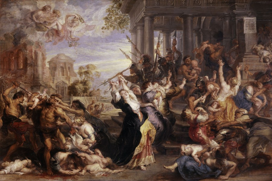
In the 17th cen­tu­ry, the Flem­ish Baroque painter Peter Paul Rubens paint­ed “The Mas­sacre of the Inno­cents” (see below), an artis­tic depic­tion of a very brief Bib­li­cal pas­sage in The Gospel of Matthew. The pas­sage recounts the sto­ry of how Herod the Great, a Roman client king of Judea, ordered the exe­cu­tion of young male chil­dren in Beth­le­hem, hop­ing to avoid los­ing his throne to a new­ly-born King of the Jews. And it reads like this:

Then Herod, when he saw that he was deceived by the wise men, was exceed­ing­ly angry; and he sent forth and put to death all the male chil­dren who were in Beth­le­hem and in all its dis­tricts, from two years old and under, accord­ing to the time which he had deter­mined from the wise men. Then was ful­filled what was spo­ken by Jere­mi­ah the prophet, say­ing:

“A voice was heard in Ramah,
Lamen­ta­tion, weep­ing, and great mourn­ing,
Rachel weep­ing for her chil­dren,
Refus­ing to be com­fort­ed,
Because they are no more.”

In the 21st cen­tu­ry, Sebas­t­ian Bur­don and Mat Coll­ishaw have now come along and cre­at­ed “All Things Fall,” a 3d zoetrope that brings the “Mas­sacre of the Inno­cents” to life. Using a 19th cen­tu­ry opti­cal tech­nique that pro­duces the illu­sion of motion, the zoetrope vir­tu­al­ly ani­mates the grue­some Bib­li­cal scene. You can watch it play out, eeri­ly, above.

Accord­ing to Bur­don, it took “6 months to do all the 3d mod­el­ing and ani­ma­tions” and involved “cre­at­ing over 350 char­ac­ter fig­ures, envi­ron­ment ele­ments and archi­tec­ture. A pret­ty stun­ning effort.

Peter_Paul_Rubens_-_Massacre_of_the_Innocents_-_WGA20259

Relat­ed Con­tent:

Down­load Over 250 Free Art Books From the Get­ty Muse­um

Watch Art on Ancient Greek Vas­es Come to Life with 21st Cen­tu­ry Ani­ma­tion

5‑Minute Ani­ma­tion Maps 2,600 Years of West­ern Cul­tur­al His­to­ry

by | Permalink | Make a Comment ( 1 ) |

Salvador Dalí Takes His Anteater for a Stroll in Paris, 1969

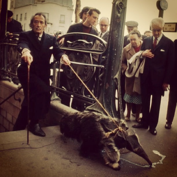
dali anteater

Sal­vador Dalí had a thing for anteaters. They made for good schtick, espe­cial­ly in Europe, and Dalí nev­er saw schtick that he did­n’t like.

And yet maybe there’s some­thing a lit­tle more to this pic­ture tak­en in Paris, in 1969. Maybe there’s some kind of sym­bol­ism, or even a play­ful trib­ute, tak­ing place in the pho­to above.

Sur­re­al­ism offi­cial­ly came into being in 1924, when André Bre­ton wrote Le Man­i­feste du Sur­réal­isme (read an Eng­lish trans­la­tion here). First a lit­er­ary move­ment, Sur­re­al­ism lat­er embraced painters, includ­ing fig­ures like Dalí.

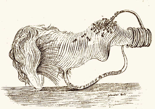
LeTamanoir

In 1930, Dalí cre­at­ed a book­plate for Bre­ton called, “André Bre­ton le tamanoir.” That trans­lates to “André Bre­ton the Anteater,” the nick­name giv­en to Bre­ton by his fel­low sur­re­al­ists. Now con­sid­er the fact that the 1969 pho­to was tak­en three short years after Bre­ton’s death, and per­haps we can read an homage into it.

What nick­name did Bre­ton give to Dalí, you might ask? “Avi­da Dol­lars.” An ana­gram for “Sal­vador Dalí,” “Avi­da Dol­lars” trans­lates to “eager for dol­lars.” Pret­ty apt.

Fol­low us on Face­book, Twit­ter, Google Plus and LinkedIn and  share intel­li­gent media with your friends. Or bet­ter yet, sign up for our dai­ly email and get a dai­ly dose of Open Cul­ture in your inbox.

Relat­ed Con­tent:

Sal­vador Dalí Illus­trates Don Quixote: Two Spaniards with Unique World Views

Sal­vador Dalí Sketch­es Five Span­ish Immor­tals: Cer­vantes, Don Quixote, El Cid, El Gre­co & Velázquez

Sal­vador Dalí’s Haunt­ing 1975 Illus­tra­tions for Shakespeare’s Romeo and Juli­et

Sal­vador Dalí Illus­trates Shakespeare’s Mac­beth

Chris Burden (R.I.P.) Turns Late-Night TV Commercials Into Conceptual Art

Chris Bur­den got shot with a rifle, closed up in a lock­er for five days, made to crawl across fifty feet of bro­ken glass, cru­ci­fied on a Volk­swa­gen Bee­tle, and wedged for an extend­ed peri­od under a large piece of non-bro­ken glass. But he did it all vol­un­tar­i­ly, sur­viv­ing these and oth­er threats to life and limb, all under­tak­en in the name of art, only dying this past Sun­day. That con­clud­ed a long and aston­ish­ing­ly var­ied career in which Bur­den pro­duced work not just of the grim trapped-in-a-box and bul­let-in-the-arm vari­ety, but elab­o­rate, even whim­si­cal sculp­tures, mod­els, and machines that cap­ti­vate their view­ers to this day.

Bur­den also, between the years of 1973 and 1977 (a peri­od after the shoot­ing and the lock­er entrap­ment), worked in the medi­um of tele­vi­sion com­mer­cials, pro­duc­ing work that, aired late at night, sure­ly cap­ti­vat­ed their own view­ers (who, giv­en the era, may have already entered their own states of altered con­scious­ness). At the top of the post, you can watch all of them in a row, a pro­gram accom­pa­nied by tex­tu­al com­men­tary from Bur­den him­self which details the nature of his self-assigned mis­sion “to break the omnipo­tent stran­gle­hold of the air­waves that broad­cast tele­vi­sion held.”

The 2013 video from the Muse­um of Con­tem­po­rary Art just above fea­tures Bur­den remem­ber­ing this dar­ing project of buy­ing and artis­ti­cal­ly repur­pos­ing Los Ange­les com­mer­cial air­time. But Bur­den’s inter­est in tele­vi­sion did­n’t stop, or indeed start, with these com­mer­cials. At East of Bor­neo, Nick Still­man has an essay putting all the artist’s TV-relat­ed work in con­text. “By sit­u­at­ing the tele­vi­sion set and by using the com­mer­cial form as implic­it ves­sels of author­i­ty,” Still­man writes, “Burden’s work about how tele­vi­sion influ­ences behav­ior asked the most pen­e­trat­ing and eth­i­cal ques­tion of any artist I can think of who used the medi­um: Do you believe in tele­vi­sion?”

Though Bur­den’s com­mer­cials haven’t seen reg­u­lar broad­cast in near­ly forty years, his spir­it nev­er­the­less enjoys strong prospects of liv­ing on through his lat­er work, which reflects and inhab­its not the medi­at­ed world around us, but the con­crete one. In 2011, we fea­tured his Metrop­o­lis II, a kinet­ic sculp­ture mod­el­ing the city of the future in swoop­ing ramps, archi­tec­tural­ly fan­tas­ti­cal tow­ers, and count­less toy cars on dis­play at the Los Ange­les Coun­ty Muse­um of Art.

And if you so much as pass by the muse­um on Wilshire Boule­vard, you’ll see his instal­la­tion of vin­tage lamp­posts known as Urban LightOdds are you’ll also take a pic­ture with it; from what I’ve seen, it has to rank has the most pho­tographed place in the city. “Heat is life,” Bur­den blankly intoned in his 1975 com­mer­cial Poem for L.A. — but light seems to have a pret­ty fair claim as well.

Relat­ed Con­tent:

Metrop­o­lis II: Chris Burden’s Amaz­ing, Fre­net­ic Mini-City

Sal­vador Dalí Goes Com­mer­cial: Three Strange Tele­vi­sion Ads

Fellini’s Fan­tas­tic TV Com­mer­cials

Col­in Mar­shall writes on cities, lan­guage, Asia, and men’s style. He’s at work on a book about Los Ange­les, A Los Ange­les Primer, and the video series The City in Cin­e­maFol­low him on Twit­ter at @colinmarshall or on Face­book.

« Go BackMore in this category... »
Quantcast