Get talking with graphic design people, and Japan will come up sooner or later. That country, always a world leader in aesthetics, has put the time and energy of generations into perfecting the discipline. You can see this progress charted out on the Tokyo-based Ian Lynam Design’s “Misruptions/Disruptions: A Japanese Graphic Design History Timeline.” It labels the busy period of 1910–1941 as the time of an “adoption of Western Avant Garde aesthetics in Graphic Design & Typography, coinciding with Left-leaning experimentation and increased state suppression of the Left” — and the time that gave rise to Japanese Art Deco.
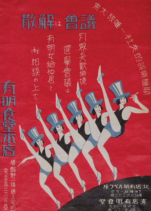
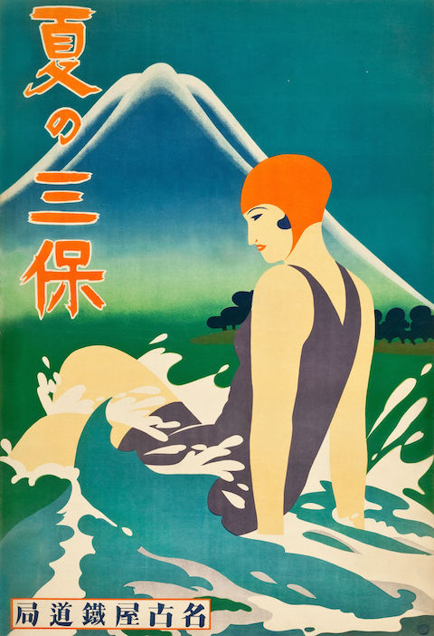
Last year, I attended Deco Japan, a show at the Seattle Art Museum, which showcased a great many artifacts from that prewar movement of such combined artistic and commercial abundance. It put on display all manner of paintings, vases, pieces of furniture, household items, and packages, but somehow, the period advertisements struck me as still the most vital of all. The Japanese graphic designers who made them drew, in the words of Capital’s Grace-Yvette Gemmell, “on staples of progressive European and American high and popular art, incorporating stylized versions of gears and clocks that bring to mind Fritz Lang’s Metropolis and Charlie Chaplin’s Modern Times.”
This makes more sense than it sounds like it would: “the Deco use of foreign imagery and design elements was a virtually seamless process given existing practices of both abstraction and cultural appropriation at work in the decorative arts at the time in Japan. Many traditional designs already possessed a sort of visual affinity with the Art Deco aesthetic; the synthesis of conventional design elements with contemporary, pared-down forms appealed to the culture’s collective knowledge of traditional motifs and symbols while feeding their desire for modern consumer products that reflected a keen sense of cosmopolitanism perfectly combining the old with the ultramodern.”
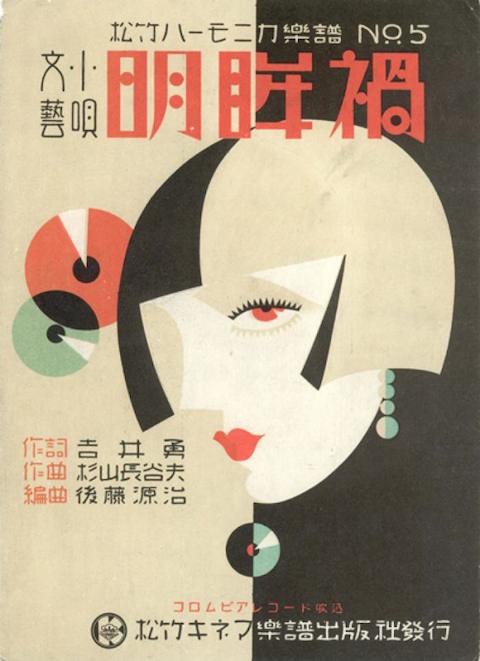
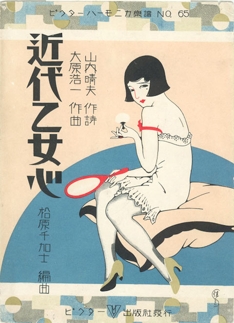
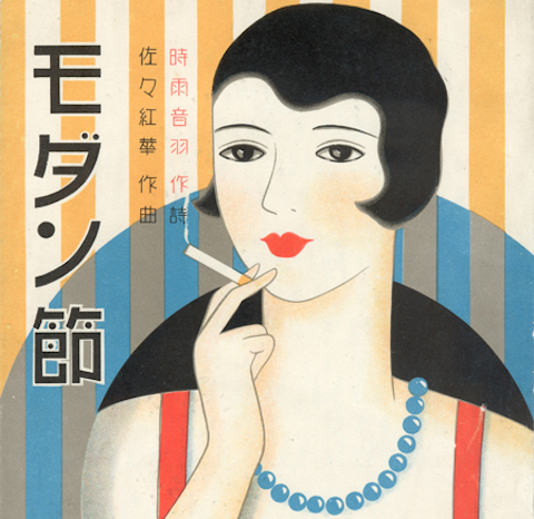
Many of the advertisements, or other works of graphic design like leaflets and magazine covers, to come out of Japan’s Art Deco golden age feature the image of the “moga,” or, in Japanized English, “modern girl.” Having appeared in Japan as a new kind of jazz-loving, bob-haired, relatively liberated woman, the moga quickly became an attractive commercial proposition. The Asian Art Museum printed up a leaflet of their own, listing off the “ten qualifications for being a moga” as originally enumerated in 1929 by illustrator Takabatake Kashō in the magazine Fujin sekai (Ladies’ World):
- Strength, the “enemy” of conventional femininity
- Conspicuous consumption of Western food and drink
- Devotion to jazz records, dancing, and smoking Golden Bat cigarettes from a metal cigarette holder
- Knowledge of the types of Western liquor and a willingness to flirt to get them for free
- Devotion to fashion from Paris and Hollywood as seen in foreign fashion magazines
- Devotion to cinema
- Real or feigned interest in dance halls as a way to show off one’s ostensible decadence to mobo (modern boys)
- Strolling in the Ginza every Saturday and Sunday night
- Pawning things to get money to buy new clothes for each season
- Offering one’s lips to any man who is useful, even if he is bald or ugly, but keeping one’s chastity because “infringement of chastity” lawsuits are out of style
Sound a fair bit more interesting than the women demanded for today’s ads in the West, don’t they?
Related Content:
Gaze at Global Movie Posters for Hitchcock’s Vertigo: U.S., Japan, Italy, Poland & Beyond
René Magritte’s Early Art Deco Advertising Posters, 1924–1927
Hand-Colored Photographs of 19th Century Japan
Colin Marshall hosts and produces Notebook on Cities and Culture as well as the video series The City in Cinema and writes essays on cities, language, Asia, and men’s style. He’s at work on a book about Los Angeles, A Los Angeles Primer. Follow him on Twitter at @colinmarshall or on Facebook.