Earlier this month, we featured advertisements from Japan’s prewar Art Deco golden age, a period that shows off one facet of the country’s rich graphic history. While all forms of Japanese design remain compelling today, any time or place would be hard pressed to compete with the world of Japan’s pre-war print advertising. It has, especially for the modern Westerner, not just a visual novelty but a commercial novelty as well: as often as not, surviving examples glorify now-restricted addictive substances like alcohol and tobacco.
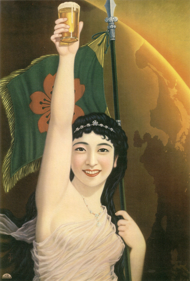
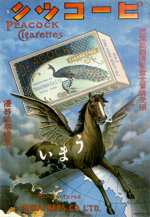
At Pink Tentacle (a completely safe-for-work page, believe it or not), you can find a roundup of Japanese print advertisements for products that tap into just such vices. Japan opened up to the world in a big way in the mid-to-late 19th century, and the country’s acceptance (and subsequent Japanification) of all things foreign kept chugging along right up until the Second World War. At the top, we have an appealing example of this internationalism at work in the service of Sakura Beer in the late 1920s. The 1902 ad just above depicts not just the globe but a smoking Pegasus astride it in the name of Peacock cigarettes.
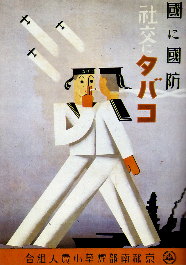
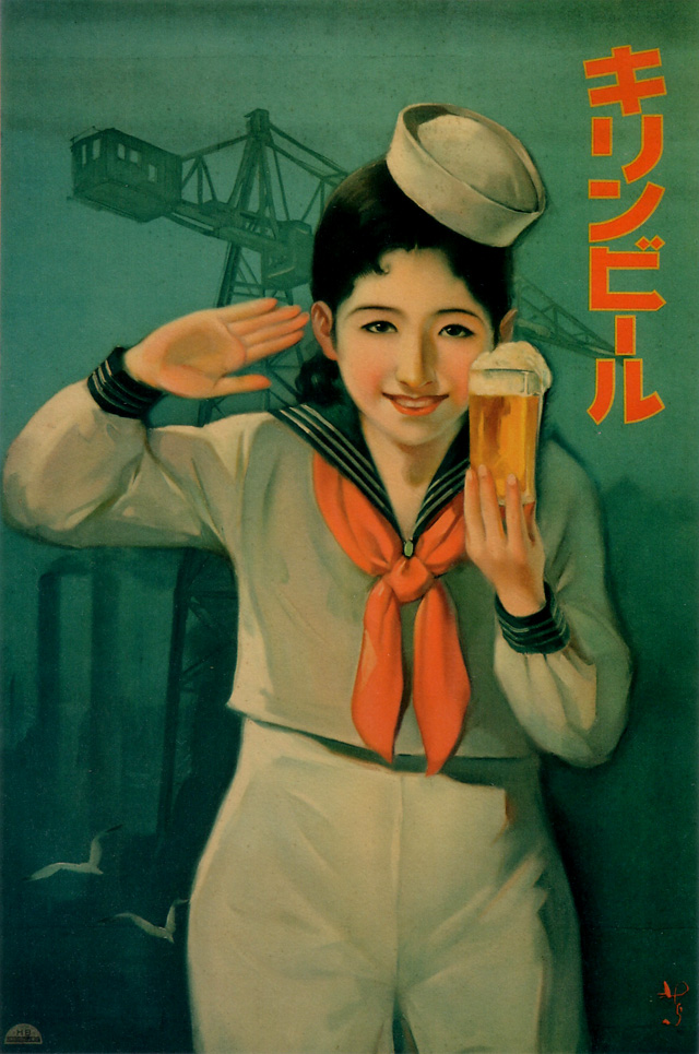
When the tone of Japanese life got militaristic in the 1930s, so did the tone of Japanese ads. The 1937 poster just above proclaims “Defense for Country, Tobacco for Society,” a message brought to you by the South Kyoto Tobacco Sellers’ Union. Below, the kind of Japanese maiden prewar graphic design always rendered so well appears in a different, more outwardly patriotic, and much more naval form.
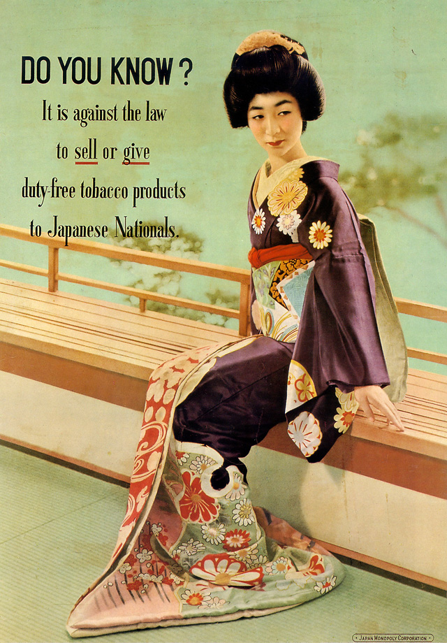
It goes without saying that most of these ads’ designers geared them toward the eyes of the Japanese — most, but not all. After the war, during the United States’ occupation of the country, there appeared print announcements in this same stylistic vein urging GIs and other American military personnel to keep on their best commercial behavior. Take, for instance, these words the straightforwardly named Japan Monopoly Corporation placed beside this archetypically courtly but uncharacteristically stern traditional lady in 1954:
A valiant effort, but from the stories I’ve heard of the occupation, no amount of graphic design could’ve shut down that particular black market. And finally, no look back at vintage Japanese ads would be complete without including one advertisement for sake. The ad below is for Zuigan sake, created in 1934.
The art of the album cover is ground we cover here often enough, from the jazz deco creations of album art inventor Alex Steinweiss to the bawdy burlesques of underground comix legend R. Crumb. We could add to these American references the iconic covers of European graphic artists like Peter Saville of Joy Divisions’ Unknown Pleasures and Storm Thorgerson of Pink Floyd’s Dark Side of the Moon.These names represent just a small sampling of the many renowned designers who have given popular music its distinctive look over the decades, and without whom the experience of record shopping—perhaps itself a bygone art—would be a dreary one. Though these creative personalities work in a primarily commercial vein, there’s no reason not to call their products fine art.
But in a great many cases, the images that grace the covers of records we know well come directly from the fine art world—whether appropriated from pieces that hang on museum walls or commissioned from famous artists by the bands. Such, of course, was the case with the much-ballyhooed cover of Lady Gaga’s Artpop, a candy-colored collaboration with pop art darling Jeff Koons, who gets a namecheck in the Gaga single “Applause.” Gaga has put a unique spin on the mélange of pop and pop art, but she hardly pioneered such collaborations.
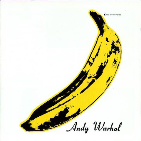
Long before Artpop, there was Warhol, whose promotion of the Velvet Underground included his own design of their 1967 debut album, The Velvet Underground & Nico. The cover originally featured a yellow banana record buyers could peel away, as Flavorwire writes, “to reveal a suggestively pink flesh-toned banana.” The “saucy covers” required “special machinery, extra costs, and the delay of the album release,” but Warhol’s name persuaded MGM the added overhead was worth it. It’s a gamble that hardly paid off for the label, but pop music is infinitely better off for Warhol’s promotion of Lou Reed and company’s dark, droning art rock.
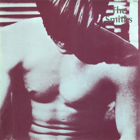
Of the many millions of bands inspired by that first Velvets’ release, The Smiths also looked to Warhol for inspiration when it came to the even more suggestive album cover (above) for their first, self-titled record in 1984. This time, the image comes not from the pop artist himself, but from his protégée Paul Morrissey—a still from his salacious, Warhol-produced film Flesh. Just one of many savvy uses of monochromatic film stills and photographs by the image-conscious Steven Patrick Morrissey and band.
Ten years earlier, another Smith, Patti, posed for the photograph above, a Polaroid taken by her close friend, Robert Mapplethorpe. At the time, the two were roommates and “just kids” struggling jointly in their starving artisthood. In her National Book Award-winning memoir of their time together, Smith describes the “exquisitely androgynous image” as deliberately posed in a “Frank Sinatra style,” writing, “I was full of references.” Mapplethorpe, of course, would go on to infamy as the focus of a conservative congressional campaign against “obscene” art in 1989, which tended to make his name synonymous with sensationalism and scandal and obscured the breadth of his work.
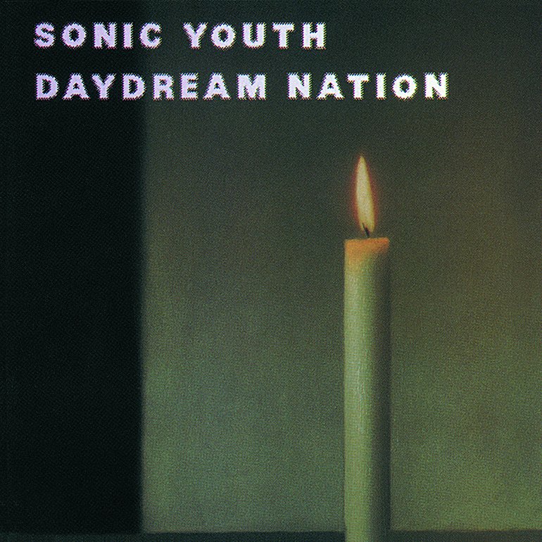
Like the Velvets and Patti Smith, the members of Sonic Youth have had a long and fruitful relationship with the art world, pursuing several art projects of their own and collaborating frequently with famous fine artists. The relationship between their noisy art rock and the visual arts crystalizes in their many iconic album covers. My personal favorite, and perhaps the most recognizable of the bunch, is Raymond Pettibon’s cover for 1990’s Goo, inspired from a photograph of two witnesses to a serial killer case. Pettibon, brother to Black Flag founder and guitarist Greg Ginn, is much better known in the punk rock world than the fine art world, but Sonic Youth has also collaborated with established high art figures like Gerhard Richter, whose painting Kerze (“Candle”) graces the cover of their acclaimed 1988 album Daydream Nation (above).
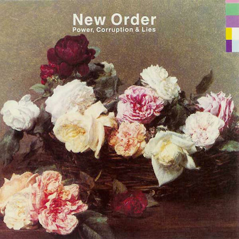
Another example of a band using already existing artwork—this time from a painter long dead—the cover of New Order’s Power, Corruption & Lies comes from the still life A Basket of Roses by 19th century French realist Henri Fantin-Latour. Designer Peter Saville, who, as noted above, created the look of New Order’s previous incarnation, chose the image on a whim. Writes Artnet, “the art director for the post-punk band… had originally planned to use a Renaissance portrait of a dark prince to tie in with the Machiavellian theme of the title, but failed to find anything he liked. While visiting [the National Gallery in London], Saville picked up a postcard of the Fantin-Latour work, and his girlfriend joked that he should use it as the cover.” Saville thought it was “a wonderful idea.” As Saville explains his choice, “Flowers suggested the means by which power, corruption and lies infiltrate our lives. They’re seductive.”
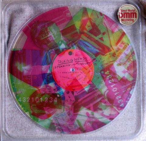
Another art-rock band, the Talking Heads—formed at the Rhode Island School of Design and originally called “The Artistics”—went in a very high art direction for 1983’s new wave masterpiece Speaking in Tongues, their fifth album. Though we’re probably more familiar with frontman David Byrne’s cover art for the album, the band also produced a limited edition LP featuring the work of artist Robert Rauschenberg, which you can see above. Byrne, writes Artnet, approached Rauschenberg “after seeing his work at the Leo Castelli Gallery” and Rauschenberg agreed on the condition that he could “do something different.” He certainly did that. The cover is a “transparent plastic case with artwork and credits printed on three 12 inch circular transparent collages, one per primary color. Only by rotating the LP and the separate plastic discs could one see—and then only intermittently—the three-color images included in the collage.” The artist won a Grammy for the design.
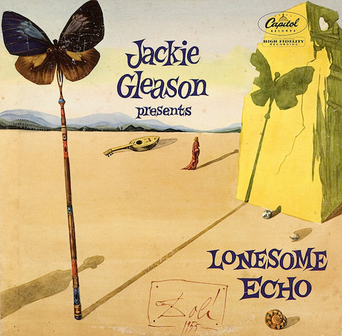
You can see many more fine art album covers by painters like Banksy, Richard Prince, and Fred Tomaselli and photographers like Duane Michaels and Nobuyoshi Araki at Artnet and Flavorwire. The selection of enticing album covers above will hopefully also propel you to revisit, or hear for the first time, some of the finest art-pop of the last four decades. Finally, we leave you with a bizarre and seemingly unlikely collaboration, above, between pop-surrealist Salvador Dalí and Honeymooners comedian Jackie Gleason for Gleason’s 1955 album Lonesome Echo. No weirder, perhaps, than Dalí’s work with Walt Disney, it’s still a rather unexpected look for the comedian, in his role here as a kitschy easy listening composer. Gleason’s many album covers tended toward the Mad Men-esque cheap and tawdry. Here, he gets conceptual. Dalí himself explained the work thus:
The first effect is that of anguish, of space, and of solitude. Secondly, the fragility of the wings of a butterfly, projecting long shadows of late afternoon, reverberates in the landscape like an echo. The feminine element, distant and isolated, forms a perfect triangle with the musical instrument and its other echo, the shell.
Make of that what you will. I’d say it’s the one album on this list with a cover much more interesting by far than the music inside.
I envy book designers tasked with putting together covers for Philip K. Dick novels, and yet I don’t envy them. On one hand, they get the chance to visually interpret some of the most unusual, indescribable genre fiction ever written; on the other hand, they bear the burden of visually representing some of the most unusual, indescribable genre fiction ever written.
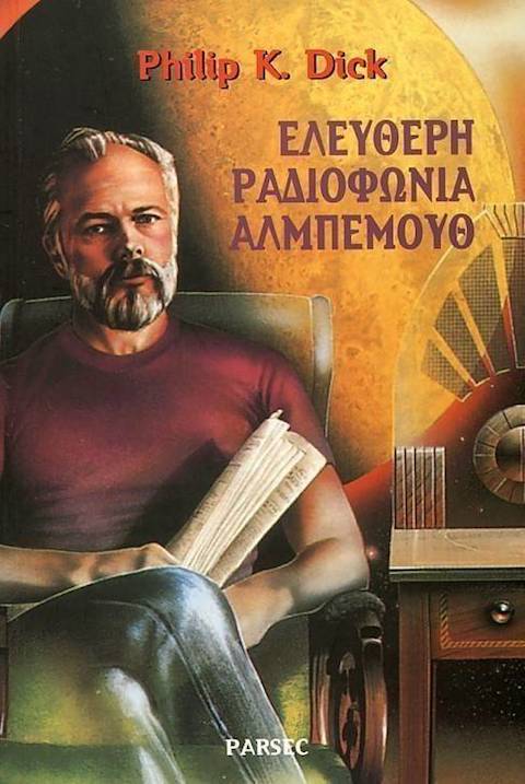
Dick wrote interesting books, to put it mildly, and as book-lovers know, certain countries’ publishing industries tend to put out more interesting book covers than others. So what happens at the intersection? Here we present to you a selection of Philip K. Dick covers from around the world, beginning with a Greek cover of his posthumously published novel Radio Free Albemuth that features the man himself, relaxing in his natural interplanetary environment beside his vintage radio.
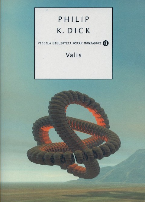
That book put a barely fictional gloss on Dick’s own psychological experiences, as did Valis, whose Italian edition you also see pictured here. But his more fantastical novels, such as the I Ching-driven story of an America that lost the Second World War, have received equally compelling international covers, such as the one from Chile just above.
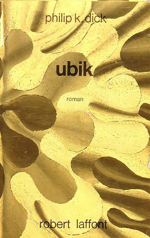
You can usually trust Japanese publishers to come up with book designs neither too abstract nor too literal for the contents within, as one of their editions of Flow My Tears, the Policeman Said quite literally illustrates just above. And if you can rely on Japan for that sort of cover, you can rely on France for understatement; half the French novels I’ve seen have nothing on the front but the name of the work, the author, and the publisher, but behold how Dick’s untamed experimental spirit allowed Robert Laffont to cut loose:
But if you really want to see an unusual graphic design culture, you’ve got to look to Poland. We featured that country’s distinctive movie posters a few years ago, but their books also partake of the very same delightfully askew visual tradition, one I imagine that would have done Dick himself proudest. Below we have Polish cover art for Confessions of a Crap Artist, his novel of midcentury suburban strife, composed with materials few of us would have thought to use:
You can see 600+ international Philip K. Dick covers at philipkdick.com’s cover gallery, which has for some reason gone offline, but which mostly survives through the magic of the Internet Wayback Machine — a device Dick never imagined even in his farthest-out, trickiest-to-represent fantasies.
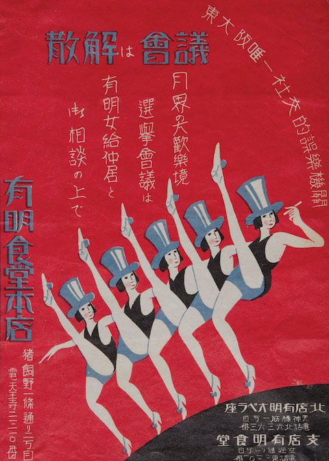
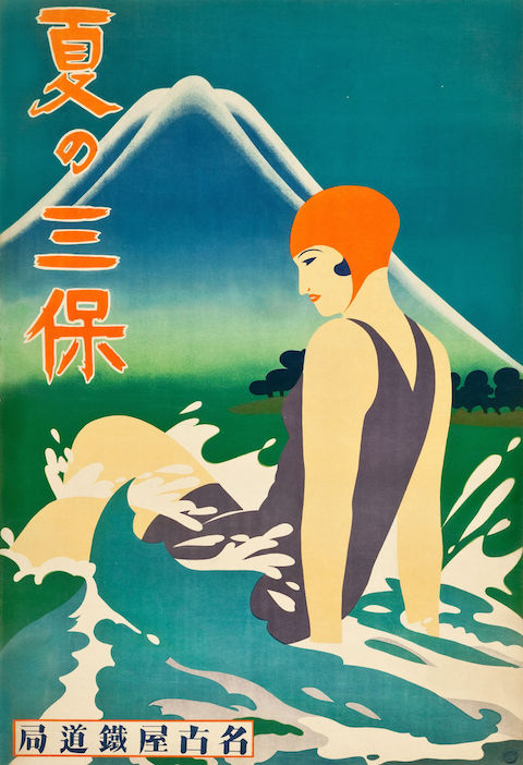
Get talking with graphic design people, and Japan will come up sooner or later. That country, always a world leader in aesthetics, has put the time and energy of generations into perfecting the discipline. You can see this progress charted out on the Tokyo-based Ian Lynam Design’s “Misruptions/Disruptions: A Japanese Graphic Design History Timeline.” It labels the busy period of 1910–1941 as the time of an “adoption of Western Avant Garde aesthetics in Graphic Design & Typography, coinciding with Left-leaning experimentation and increased state suppression of the Left” — and the time that gave rise to Japanese Art Deco.
Last year, I attended Deco Japan, a show at the Seattle Art Museum, which showcased a great many artifacts from that prewar movement of such combined artistic and commercial abundance. It put on display all manner of paintings, vases, pieces of furniture, household items, and packages, but somehow, the period advertisements struck me as still the most vital of all. The Japanese graphic designers who made them drew, in the words of Capital’s Grace-Yvette Gemmell, “on staples of progressive European and American high and popular art, incorporating stylized versions of gears and clocks that bring to mind Fritz Lang’s Metropolis and Charlie Chaplin’s Modern Times.”
This makes more sense than it sounds like it would: “the Deco use of foreign imagery and design elements was a virtually seamless process given existing practices of both abstraction and cultural appropriation at work in the decorative arts at the time in Japan. Many traditional designs already possessed a sort of visual affinity with the Art Deco aesthetic; the synthesis of conventional design elements with contemporary, pared-down forms appealed to the culture’s collective knowledge of traditional motifs and symbols while feeding their desire for modern consumer products that reflected a keen sense of cosmopolitanism perfectly combining the old with the ultramodern.”
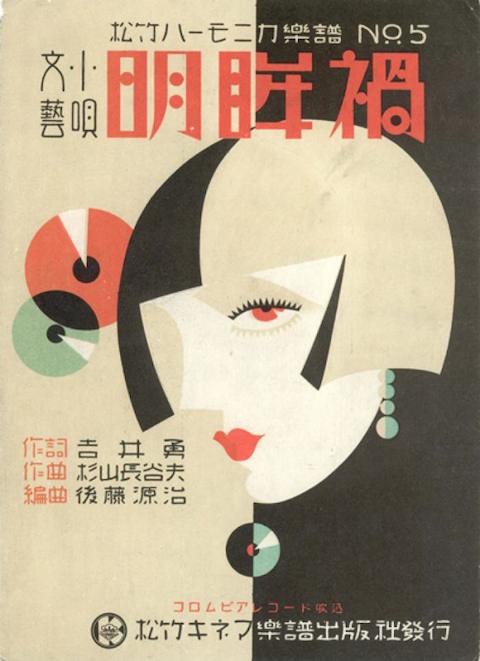
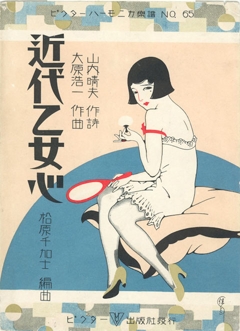
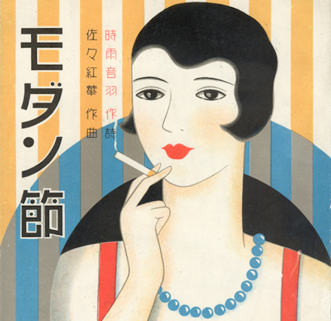
Many of the advertisements, or other works of graphic design like leaflets and magazine covers, to come out of Japan’s Art Deco golden age feature the image of the “moga,” or, in Japanized English, “modern girl.” Having appeared in Japan as a new kind of jazz-loving, bob-haired, relatively liberated woman, the moga quickly became an attractive commercial proposition. The Asian Art Museum printed up a leaflet of their own, listing off the “ten qualifications for being a moga” as originally enumerated in 1929 by illustrator Takabatake Kashō in the magazine Fujin sekai (Ladies’ World):
Strength, the “enemy” of conventional femininity
Conspicuous consumption of Western food and drink
Devotion to jazz records, dancing, and smoking Golden Bat cigarettes from a metal cigarette holder
Knowledge of the types of Western liquor and a willingness to flirt to get them for free
Devotion to fashion from Paris and Hollywood as seen in foreign fashion magazines
Devotion to cinema
Real or feigned interest in dance halls as a way to show off one’s ostensible decadence to mobo (modern boys)
Strolling in the Ginza every Saturday and Sunday night
Pawning things to get money to buy new clothes for each season
Offering one’s lips to any man who is useful, even if he is bald or ugly, but keeping one’s chastity because “infringement of chastity” lawsuits are out of style
Sound a fair bit more interesting than the women demanded for today’s ads in the West, don’t they?
J.R.R. Tolkien’s The Lord of the Rings trilogy has had an enormously wide, cross-cultural appeal. This despite the fact that its creator was a university professor of a long-dead language, Anglo-Saxon, who set his story in a world of customs and mores—supernatural elements aside—that bear a fairly close resemblance to ancient and medieval England. But such similarly provincial settings have raised no barriers to the global reach of the Iliad, say, or Shakespeare. Western epics, ancient and modern, may on the one hand have traveled the globe on waves of cultural imperialism (and Hollywood film), and, on the other, they have their own built-in global reach because they tap into archetypal story-types and human characteristics—because their use of myth and folklore reads as universal, though the particulars change from place to place and age to age.
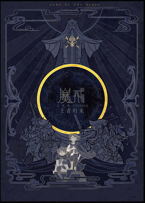
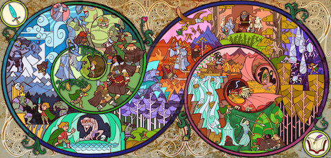
The multilingual among us have the opportunity to see how well, or not, great stories translate into different cultural contexts. Readers, for example, of both Chinese and English will be able to compare Tolkien’s originals with forthcoming editions of the books from WenJing Publishing. The rest of us provincial monolinguals can still make comparisons of visual interpretations of the text, like these possible book covers drawn by artist Jian Guo. Part of a competition held by the publisher of the new Chinese text, the beautiful, monochromatic illustrations draw on many of the design elements of Tolkien’s original paintings for the trilogy’s covers, elaborating on the iconic ring and towers with intricate Asian lines and flourishes. At the top, see The Fellowship of the Ring, above The Two Towers, and below, The Return of the King.
The artist, an architectural student, describes his style as “glass painting style,” which he uses for its “sense of religious magnificence.” Interestingly, before seeing Peter Jackson’s Lord of the Rings adaptation in 2002, he had never heard of the books. (Previous Chinese translations of the books feature rather unimaginative covers with images from Jackson’s movies.) The films converted him into an avid reader of Tolkien—see a Hobbit illustration at the bottom of the post. Jian is also a lover of J.K. Rowling’s popular fantasy series and has designed some wonderfully stylized illustrations for Harry Potter and the Chamber of Secrets and Harry Potter and the Philosopher’s Stone.
Ralph Steadman is best known as the artist who realized the gonzo vision of Hunter S. Thompson in illustrations for the latter’s books and articles (and more recently, perhaps, for the labels on Colorado’s Flying Dog brew). His work has famously appeared over the past several decades in Punch, Private Eye, The New York Times, and Rolling Stone, and he produced a brilliantly illustrated edition of Alice in Wonderland. Like his friend Gerald Scarfe, another wickedly satirical cartoonist who created the look of Pink Floyd’s The Wall, Steadman has made significant contributions to the look of the counterculture.
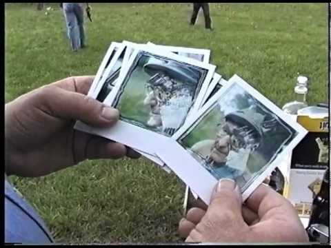
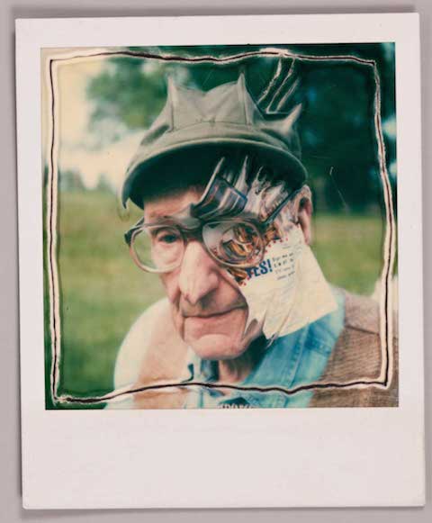
But while Steadman’s work with Hunter Thompson may largely define his career, another notable collaboration with a literary figure, William S. Burroughs, also proved fruitful many years later. In 1995, Steadman brought together his own illustrations with Burroughs love of guns, asking the octogenarian writer to blast holes in original Steadman creations.
Some of these paintings feature the Polaroid portraits of Burroughs above and at the top of the post (see a resulting Steadman/Burroughs silkscreen print, with gunshot holes, here). Just above, you can see Steadman taking the photos. First, he makes some test shots with an assistant, then, at 2:50, we see him with Burroughs and an entourage. As The Independent described the meeting at Burroughs’ house in Lawrence, Kansas, it was something of a “contrived event,” with “swarms of assistants” and “acolytes” in attendance, “taping the whole thing on video.”
Luckily for us, I’d say. Unfortunately, we don’t seem to have video from later in the day, when the group drove “out to Burrough’s friends place outside town, where he does his shooting.” Once there, “Burroughs, Steadman and his wife Anna and Burroughs’ entourage take turns blazing away with .33s, .45s, pump-action shotguns and Saturday-night specials at a variety of targets,” including Steadman’s art. That would be something to see. We’ll have to settle for the art itself, and Steadman’s fascinating demonstration below of his approach to portraiture.
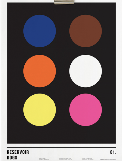
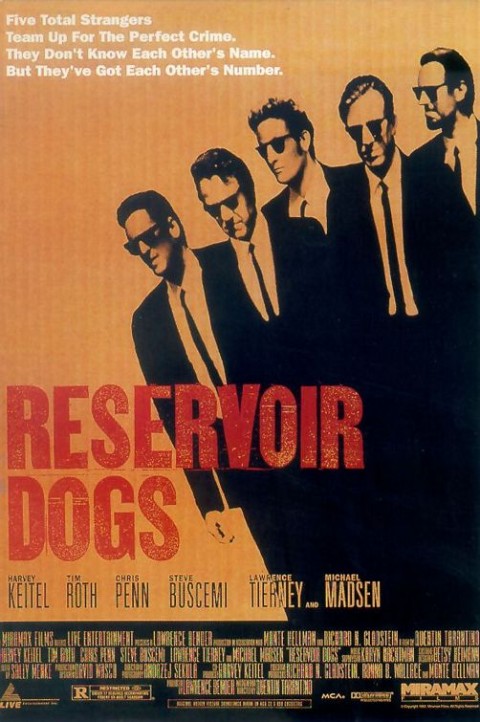
While watching Interstellar and hating it, designer Nick Barclay came up with a project for himself — taking the posters of famous films and reimagining them with a minimalist design that uses only circles. Above, you can see his clever take on Tarantino’s Reservoir Dogs. It’s a far cry, to be sure, from the original movie poster found below.
Over at My Modern Met, you’ll find other minimalist designs for The Matrix, The Lord of the Rings, Bram Stoker’s Dracula, Forrest Gump, Harry Potter, Pulp Fiction, Trainspotting, 101 Dalmations, Léon: The Professional, The Deer Hunter, Total Recall, Monsters Inc., and, of course, 2001: A Space Odyssey.
We all know that Michelangelo sculpted in marble. What’s less well known is that he worked in bronze too. The historical record shows that Michelangelo once made a David in bronze for a French aristocrat, and a bronze statue of Pope Julius II. But the David disappeared during the French Revolution, and the Julius was later melted down for military purposes in Italy. For years, scholars thought that Michelangelo’s bronze creations were all irretrievably lost to history. And then came the big discovery.
A team of international experts (from Cambridge, the Rijksmuseum and the University of Warwick) recently gathered evidence suggesting that two bronze male nudes “are early works by Michelangelo, made just after he completed the marble David and as he was about to embark on the Sistine Chapel ceiling,” reports a Cambridge blog post. Although the statues aren’t signed by Michelangelo, *****@****ac.uk”>Prof Paul Joannides (Emeritus Professor of Art History at Cambridge) “connected them to a drawing by one of Michelangelo’s apprentices now in the Musée Fabre, Montpellier, France,” and it turns out that the drawing contains figures that closely resemble the statues. What’s more, Cambridge reports, the “bronzes were compared with other works by Michelangelo and found to be very similar in style and anatomy to his works of 1500–1510.” The Cambridge video above gives you a further introduction to this important discovery.
We're hoping to rely on loyal readers, rather than erratic ads. Please click the Donate button and support Open Culture. You can use Paypal, Venmo, Patreon, even Crypto! We thank you!
Open Culture scours the web for the best educational media. We find the free courses and audio books you need, the language lessons & educational videos you want, and plenty of enlightenment in between.