Any fan of “underground” comic artist Robert Crumb knows that the man has no shyness about his preferences: not in jazz music, not in politics, and certainly not in the female form. Alex Wood, co-operator of the official R. Crumb site (pictured with Crumb above), has discovered that the artist’s opinions offer a vivid window into the artist’s mind. “Over the years, talking with Robert about many different things, I’ve been surprised by some of the things he likes and dislikes,” Wood writes. “We all know he loves old music from the early part of the last century, and doesn’t like rock music. But then he says he likes Tommy James and the Shondells, and Sam the Sham and the Pharaohs? So in a discussion in May, 2011, I asked his opinion on a list of people in the news past and present.” This became part one of the series “Crumb on Others,” which has at this point grown to seven full pages.
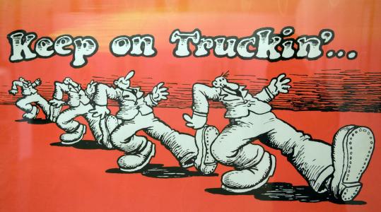
Below, we offer you a selection of the roughly 150 figures from music, film, visual art, and letters Crumb has so far assessed, his reactions ranging from high praise to outright dismissal to amusing anecdotes of his own encounters with the luminaries in question. With these, you can see how your notes on the likes of Bob Dylan, Alfred Hitchcock, Philip K. Dick, and Charles Darwin compare with those of the creator of Fritz the Cat and Mr. Natural, the hand that gave us “Keep on Truckin’,” and the leading light of of Zap Comix — a luminary who has generated no small amount of high praise, outright dismissal, and amusing anecdote himself. Here are the remaining parts. Part 2, Part 3, Part 4, Part 5, Part 6, and Part 7.
On Mark Twain: “Tom Sawyer and Huckleberry Finn don’t do that much for me. But his later stuff, he gets more cranky as he gets older. His critique gets more interesting. When I was 15, I read What Is Man? and it made a profound impression on me. It changed my life. It’s all about predestination versus freewill. He was a big believer in predestination. He didn’t think we had any free will.”
On Bob Dylan: “I hate his voice. I can’t stand to hear him sing. I thought some of the songs that he wrote in the mid-60s were kind of clever, with clever lyrics. But I just can’t stand to hear him or see him perform. And I think his heart is in the right place a lot of times, you know. Someone told me he was an aficionado of old 20s, old time music, and that he listens to the same kind of stuff I like.”
On Walt Disney: “When I was a little kid in the 50s, we were profoundly enthralled by Disney, and profoundly affected by the Disney vision. But to my taste, the whole thing starts to decline in the early 1950s. The last one that I think is a truly visionary work is Alice In Wonderland. Beginning with Peter Pan circa 1953 it starts to slide into something too corporate.”
On Janis Joplin: “Sad case, very sad case. She tried to act like she was hard and tough, but she wasn’t at all. She was soft and vulnerable. She drank a lot, and got a lot of bad advice. She was surrounded by vultures and vampires and scoundrels, and they just did her in. She finally ended up face-down in her own vomit alone in some hotel room; too much heroin and alcohol, 27 years old.”
On Alfred Hitchcock: “I talked to somebody who knew Kim Novak, some older woman, and Kim Novak told her shocking things about Alfred Hitchcock and his sexual proclivities. That kind of surprised me. I don’t know why. I guess when you look at Hitchcock you don’t see a guy with an aggressive sexual libido. Just goes to show you can never tell a book by its cover. I ought to know that by now.”
On The Beatles: “Some of the last stuff they did, you know, it kind of gets dark, and that’s more interesting to me, the last stuff they did before they broke up. Well, that and the music they did before they actually started recording under Brian Epstein. The only way you can hear that, I think, is to see the documentaries where it shows them playing in Hamburg and the Cavern Club. Before Brian Epstein got ahold of them and cleaned them up and made them over into those cute mop-tops and put them in those mod suits. Before that, they were greaser guys – leather jackets and greasy hair. And they just played this sort of driving, hard rock-a-billy music. And they were really good at that.”
On Pablo Picasso: “I once wrote that I envied Picasso, because he was the type of artist who didn’t let anything stand in the way of his art. He would just slam the door on his wives, his girlfriends, his children – anybody, when it was time to do his art. I always envied that about him. Also his powerful, penetrating, hypnotic way with women. I envied that about him too.”
On Franz Kafka: “Before I did that book on Kafka, I had never read him and didn’t know anything about him. But once I took that book project on, then I had to read all his stuff. And then I really got to like him. And while working on that project, I felt a very close kinship with Kafka. It was very strange. I started feeling deeply connected to Kafka somehow. Something I hadn’t expected at all.”
On Charles Bukowski: “Love ’im, love his writing. He was a very difficult guy to hang out with in person, but on paper he was great. One of the great American writers of the late 20th Century. [ … ] The last time I saw Bukowski, he came to this party in San Francisco, it was a poetry reading. And these two women that I knew they just kind of closed in on Bukowski. One was talking to him in one ear and the other was talking to him in his other ear. He was standing there with a beer bottle in each hand and getting drunk as fast as he could. And the last moment I saw him, they were leading him off to the bedroom.”
On William Burroughs: “He was a very eccentric character; very eccentric ideas and thoughts. He tried all kinds of strange, avant-garde psychotherapies. He was into psychic experimentation. He built himself an orgone box based upon the theories of Wilhelm Reich. He later got involved in Scientology and had this E‑meter and used it as a way to psychically clear himself. He said it was his electrical Ouija board. He tried other stuff too, like out of body experience. I can relate to all that stuff because I’m interested in all that fringe, psychic experimentation also. But he was very serious about that stuff.”
On Bettie Page: “She had the most perfect body and the cutest face of all in that pinup era of the 1940s and 1950s. She was the gold standard. There was nobody superior to her physically. And her poses, she always looked cheerful and wholesome, she never looked sleazy. It didn’t matter if she was posing in a sadomasochistic setup with those high heel boots and whips, it always looks like it’s just a funny game to her, you know? She could have a ball-gag in her mouth and she looks like the girl next door just having fun.”
On Woody Allen: “One of my favorite movies of his was Crimes and Misdemeanors. It was a great movie. In that movie, there was an esteemed ophthalmologist, very respected in his profession. He has this mistress, this neurotic woman and she’s threatening to expose him and the secret affair he’s having. She threatens to come over to his house and make a big scene and ruin his life. He also has a brother who’s involved in the crime syndicate. So he goes to the brother and the brother has her killed by a professional. All the main male characters in the movie, I’ve come to suspect that they’re all parts of Woody Allen’s personality. The respected ophthalmologist is part of him; this nerdy, idealistic documentary film-maker — that’s part of him. And there’s this really arrogant comedy writer/director played by Alan Alda who plays such a jerk, and that’s part of Woody Allen also; very interesting. And I suspect that movie is kind of — and I don’t even know how aware of it he was — a confession. It was right around the time that whole scandal with Mia Farrow’s daughter happened — maybe right before — because Mia Farrow was in it. But, the ophthalmologist gets away with it.”
On Philip K. Dick: “I’ve actually never read any of his books. All I ever read was interviews with him and that account he gave of his religious experience — his mystical experience. The whole experience… the way he described it, it was great. I should read his books but I never got around to it. I was never big on science fiction, but he was always more interesting and imaginative than a lot of science fiction writers.” (Crumb illustrated Dick’s “meeting with God.”)
On Charles Darwin: “I never really read Darwin or studied much about him. I have the most broad, general idea about his theories of natural selection and evolution. But I do know that when a lot of upper class English people started reading his books, and his theories began to be widely known in the 1870s, it created a huge change that hasn’t been widely recognized by historians, to my knowledge. People’s attitudes toward religion changed due to his book, particularly in the upper classes in England, they stopped considering it their absolute duty to go to church and be a good church-going person. A lot of the upper class dropped out, let their church membership lapse. Before that. they all went to church, for appearance sake if nothing else. But after Darwin, that all changed.”
On Jack Kerouac: “When I was 17, I read On The Road, and it sickened me, because my reaction was, ‘Oh God, these guys are out there having so much fun. I’m not having any fun at all. I’m just sitting here in my parents house. But them — the girls, the adventures, they’re just like having a fuckin’ lark On The Road.’ ”
On Jean-Paul Sartre: “A funny guy, Sarte’s a funny guy. You know, people don’t think of him as funny because he was so serious about existentialism and communism and stuff like that. [ … ] He wrote a book about his childhood that was pretty funny. It’s very self-deprecating, and he writes about what a little bourgeois, arrogant shit he was as a kid. Funny guy, I like Sarte.”
On Michelangelo: “The guy is just like glorifying the male body. It’s all about writhing, muscular male bodies. And even the women, they have male bodies with tits pasted on. The guy’s not into women, you can tell. He’s not into feminine at all. He’s not interested in the round, elliptical charms of the female form. No, he’s interested in the lumpy, muscular male body. And the whole [Sistine] Chapel is nothing but that.”
On Henry Miller: “Just like Kerouac, I was about nineteen when I read him, and again, I was devastated because he was having too much fucking fun. He was fucking so many women. He was so successful with women, it made me sick. He’d brag about how he came on to some woman on the street and ended up fucking her in the bushes. I thought, ‘God, how does he do that?’ It made me sick with envy. But trying to read him later, I thought he was way, way, too long-winded. I thought he needed serious editing.”
On Orson Welles: “I don’t understand why some people are so impressed by that guy. The most entertaining Orson Welles thing I’ve ever heard was some outtakes from a radio commercial that he was doing. And he’s really in a bad mood and he’s insulting the producers and technicians in the studio and telling them, ‘This is a lot of shit I hope you know.’ ”
On Hunter Thompson: “I met him a couple of times. He used to hang out at that Mitchell Brothers Theater on O’Farrell Street in San Francisco, which was a strip joint run by the Mitchell Brothers. There was this kind of like Irish-Journalist-Mafia that used to hang around there. He and these other Irish characters from San Francisco who were into journalism there, newspaper guys, they hung around there for some reason, I don’t know why. But Thompson did a lot of cocaine and drank, and then he would go on these long ‘cocaine raps,’ ranting and raving. But by the time I met him, y’ know, he was already well-advanced to being really fucking out of his mind.”
On Martin Scorsese: “I think Goodfellas is probably the best film about the modern American crime syndicates. Casino was kind of a follow-up to Goodfellas, and I didn’t think it was quite as good. Probably Goodfellas got so much praise it kind of went to his head so everybody got together and made this indulgent film. It had it’s good parts, it was good, it just wasn’t as good as Goodfellas. For one thing, there were too many close ups on DeNiro’s face. I just kept wanting the camera to back-off. OK, you think the guy’s great looking, but Jesus, OK, it’s enough, back-off!”
Related Content:
The Confessions of Robert Crumb: A Portrait Scripted by the Underground Comics Legend Himself (1987)
Record Cover Art by Underground Cartoonist Robert Crumb
A Short History of America, According to the Irreverent Comic Satirist Robert Crumb
R. Crumb’s Heroes of Blues, Jazz & Country Features 114 Illustrations of the Artist’s Favorite Musicians
Robert Crumb Illustrates Philip K. Dick’s Infamous, Hallucinatory Meeting with God (1974)
Colin Marshall hosts and produces Notebook on Cities and Culture and writes essays on cities, Asia, film, literature, and aesthetics. He’s at work on a book about Los Angeles, A Los Angeles Primer. Follow him on Twitter at @colinmarshall or on his brand new Facebook page.
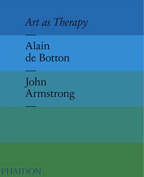 De Botton first identifies the problem. While the secular gatekeepers of culture pretend to believe in the mollifying spiritual effects of art, “in fact,” he says, “the idea is dead.” Museums are moribund because, for example, they don’t directly address individual’s fear of death. Presumably, his “art as therapy” approach does. The book’s website contains snippets divided into broad categories like “Politics,” “Work,” “Love,” “Anxiety,” “Self,” and “Free Time.” In his sermon, de Botton doesn’t seem to evince any recognition of the field of art therapy, which has been chugging along since the early 20th century, but as he tells Joshua Rothman in an interview for The New Yorker he means the word therapy—“a big, simple, vulgar word”—broadly. Sounding for all like an Anglican theologian, de Botton says of an annunciation altarpiece by Fra Fillippo Lippi:
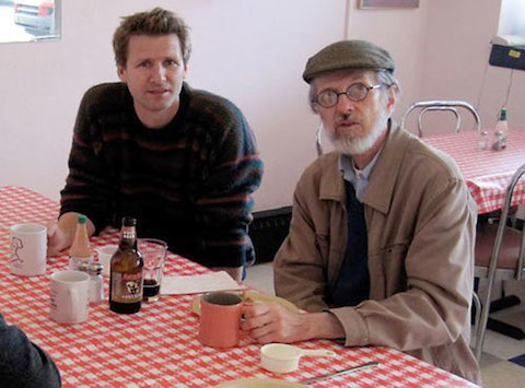

