Earlier this week, Oxford’s Bodleian Library announced that it had digitized a 550 year old copy of the Gutenberg Bible along with a number of other ancient bibles, some of them quite beautiful. Not to be outdone, the British Library came out with its own announcement on Thursday:
We have released over a million images onto Flickr Commons for anyone to use, remix and repurpose. These images were taken from the pages of 17th, 18th and 19th century books digitised by Microsoft who then generously gifted the scanned images to us, allowing us to release them back into the Public Domain. The images themselves cover a startling mix of subjects: There are maps, geological diagrams, beautiful illustrations, comical satire, illuminated and decorative letters, colourful illustrations, landscapes, wall-paintings and so much more that even we are not aware of.
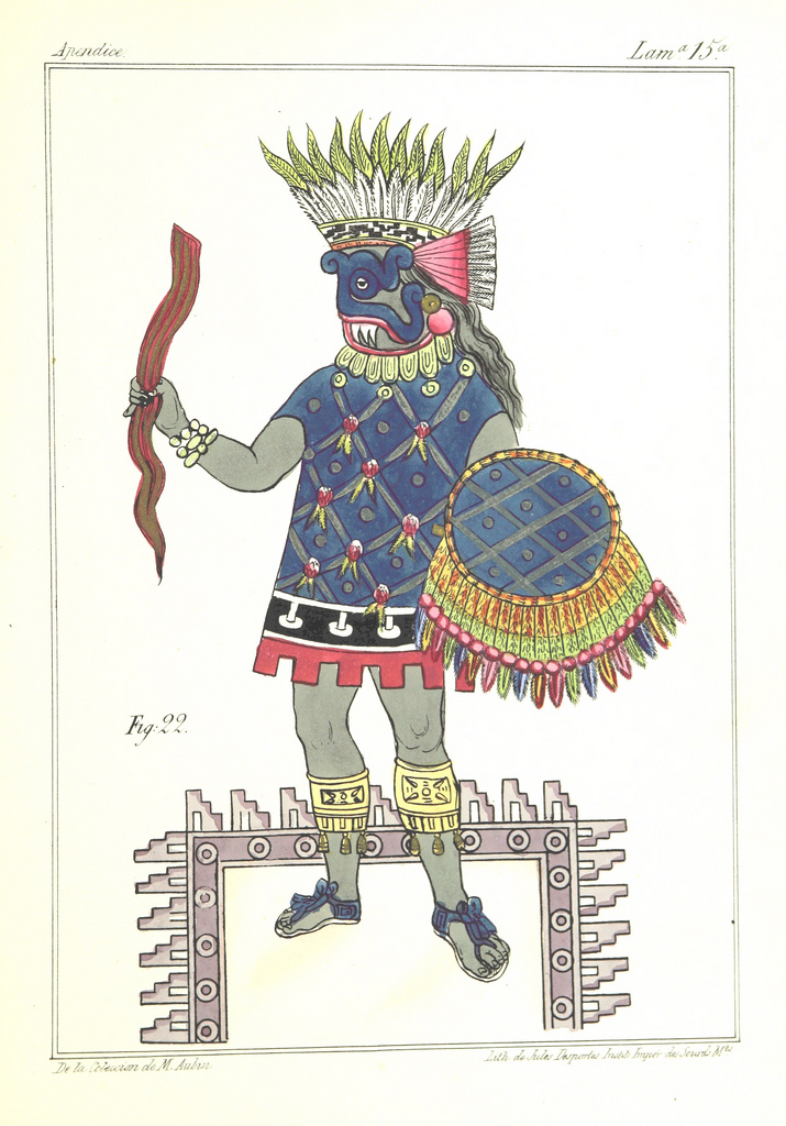
The librarians behind the project freely admit that they don’t exactly have a great handle on the images in the collection. They know what books the images come from. (For example, the image above comes from Historia de las Indias de Nueva-España y islas de Tierra Firme, 1867.) But they don’t know much about the particulars of each visual. And so they’re turning to crowdsourcing for answers. In fairly short order, the Library plans to release tools that will let willing participants gather information and deepen our understanding of everything in the Flickr Commons collection.
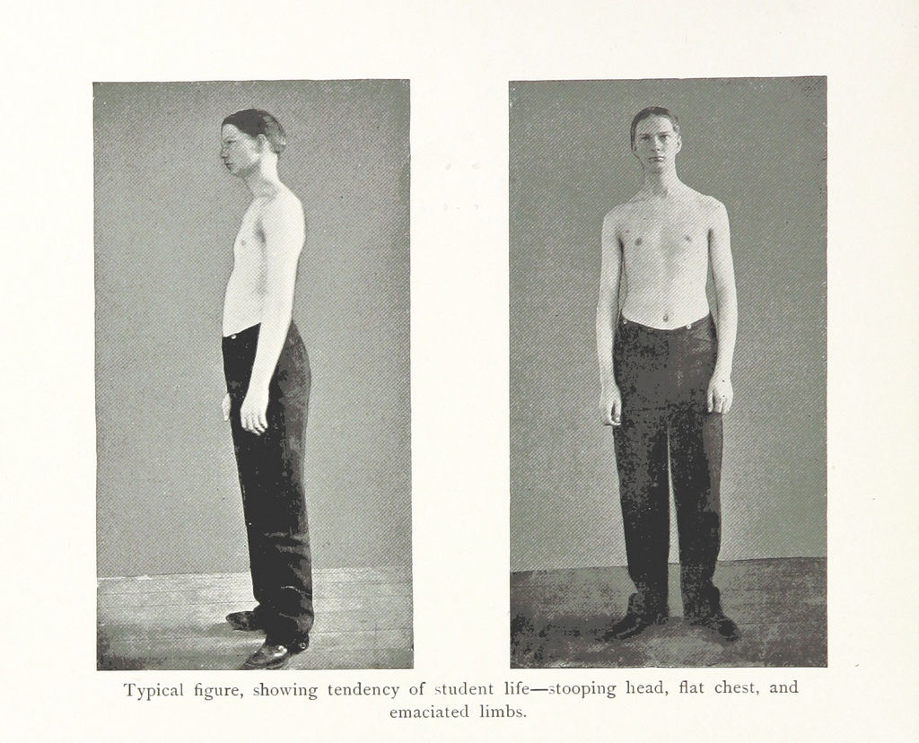
You can jump into the entire collection here, or view a set of highlights here. The latter happens to include a curious image. (See below.) It’s from an 1894 book called The United States of America. A study of the American Commonwealth, its natural resources, people, industries, manufactures, commerce, and its work in literature, science, education and self-government. And the picture features, according to the text, a “Typical figure, showing tendency of student life–stooping head, flat chest, and emaciated limbs.” It’s hard to know what to say about that.
To learn more about this British Library initiative, read this other Open Culture post which takes a deeper dive into the image collection.
Related Content:
The Rijksmuseum Puts 125,000 Dutch Masterpieces Online, and Lets You Remix Its Art
The Getty Puts 4600 Art Images Into the Public Domain (and There’s More to Come)
The Digital Public Library of America Launches Today, Opening Up Knowledge for All