With the savage cuts in arts funding, perhaps we’ll return to a system of noblesse oblige familiar to students of The Gilded Age, when artists needed independent wealth or patronage, and wealthy industrialists often decided what was art, and what wasn’t. Unlike fine art, however, haute cuisine has always relied on the patronage of wealthy donors—or diners. It can be marketed in premade pieces, sold in cookbooks, and made to look easy on TV, but for reasons both cultural and practical, given the nature of food, an exquisitely-prepared dish can only be made accessible to a select few.
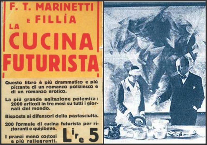
Still, we would be mistaken, suggested Futurist poet and theorist F.T. Marinetti (1876–1944), should we neglect to see cooking as an art form akin to all the others in its moral and intellectual influence on us. While hardly the first or the last artist to publish a cookbook, Marinetti’s Futurist Cookbook seems at first glance deadly, even aggressively, serious, lacking the whimsy, impractical weirdness, and surrealist art of Salvador Dali’s Les Diners de Gala, for example, or the eclectic wistfulness of the MoMA’s Artist’s Cookbook.
Just as he had sought with his earlier Futurist Manifesto to revolutionize art, Marinetti intended his cookbook to foment a “revolution of cuisine,” as Alex Revelli Sorini and Susanna Cutini point out. You might even call it an act of war when it came to certain staples of Italian eating, like pasta, which he thought responsible for “sluggishness, pessimism, nostalgic inactivity, and neutralism” (anticipating scads of low and no-carb diets to come).
Believing that people “think, dream and act according to what they eat and drink,” Marinetti formulated strict rules not only for the preparation of food, but also the serving and eating of it, going so far as to call for abolishing the knife and fork. A short excerpt from his introduction shows him applying to food the techno-romanticism of his Futurist theory—an ethos taken up by Benito Mussolini, whom Marinetti supported:
The Futurist culinary revolution … has the lofty, noble and universally expedient aim of changing radically the eating habits of our race, strengthening it, dynamizing it and spiritualizing it with brand-new food combinations in which experiment, intelligence and imagination will economically take the place of quantity, banality, repetition and expense.
In hindsight, the fascist overtones in Marinetti’s language seem glaring. In 1932, when the Futurist Cookbook was published, his Futurism seemed like a much-needed “jolt to all the practical and intellectual activities,” note Sorini and Cutini. “The subject [of cooking] needed a good shake to reawaken its spirit.” And that’s just what it got. The Futurist Cookbook acted as “a preview of Italian-style Nouvelle Cuisine,” with such innovations as “additives and preservatives added to food, or using technological tools in the kitchen to mince, pulverize, and emulsify.”
Yet, for all the high seriousness with which Marinetti seems to treat his subject, “what the media missed” at the time, writes Maria Popova, “was that the cookbook was arguably the greatest artistic prank of the twentieth century.” In an introduction to the 1989 edition, British journalist and historian Lesley Chamberlain called the Futurist Cookbook “a serious joke, revolutionary in the first instance because it overturned with ribald laughter everything ‘food’ and ‘cookbooks’ held sacred.” Marinetti first swept away tradition in favor of creative dining events the Futurists called “aerobanquets,” such as one in Bologna in 1931 with a table shaped like an airplane and dishes called “spicy airport” (Olivier salad) and “rising thunder” (orange risotto). Lambrusco wine was served in gas cans.
It’s performance art worthy of Dali’s bizarre costumed dinner parties, but fueled by a genuine desire to revolutionize food, if not the actual eating of it, by “bringing together elements separated by biases that have no true foundation.” So remarked French chef Jules Maincave, a 1914 convert to Futurism and inspiration for what Marinetti calls “flexible flavorful combinations.” See several such recipes excerpted from the Futurist Cookbook at Brain Pickings, read the full book in Italian here, and, just below, see Marinetti’s rules for the perfect meal, first published in 1930 as the “Manifesto of Futurist Cuisine.”
Futurist cuisine and rules for the perfect lunch
1. An original harmony of the table (crystal ware, crockery and glassware, decoration) with the flavors and colors of the dishes.
2. Utter originality in the dishes.
3. The invention of flexible flavorful combinations (edible plastic complex), whose original harmony of form and color feeds the eyes and awakens the imagination before tempting the lips.
4. The abolition of knife and fork in favor of flexible combinations that can deliver prelabial tactile enjoyment.
5. The use of the art of perfumery to enhance taste. Each dish must be preceded by a perfume that will be removed from the table using fans.
6. A limited use of music in the intervals between one dish and the next, so as not to distract the sensitivity of the tongue and the palate and serves to eliminate the flavor enjoyed, restoring a clean slate for tasting.
7. Abolition of oratory and politics at the table.
8. Measured use of poetry and music as unexpected ingredients to awaken the flavors of a given dish with their sensual intensity.
9. Rapid presentation between one dish and the next, before the nostrils and the eyes of the dinner guests, of the few dishes that they will eat, and others that they will not, to facilitate curiosity, surprise, and imagination.
10. The creation of simultaneous and changing morsels that contain ten, twenty flavors to be tasted in a few moments. These morsels will also serve the analog function […] of summarizing an entire area of life, the course of a love affair, or an entire voyage to the Far East.
11. A supply of scientific tools in the kitchen: ozone machines that will impart the scent of ozone to liquids and dishes; lamps to emit ultraviolet rays; electrolyzers to decompose extracted juices etc. in order to use a known product to achieve a new product with new properties; colloidal mills that can be used to pulverize flours, dried fruit and nuts, spices, etc.; distilling devices using ordinary pressure or a vacuum, centrifuge autoclaves, dialysis machines.
The use of this equipment must be scientific, avoiding the error of allowing dishes to cook in steam pressure cookers, which leads to the destruction of active substances (vitamins, etc.) due to the high temperatures. Chemical indicators will check if the sauce is acidic or basic and will serve to correct any errors that may occur: lack of salt, too much vinegar, too much pepper, too sweet.”
Note: An earlier version of this post appeared on our site in 2017.
Related Content
When Italian Futurists Declared War on Pasta (1930)
Salvador Dalí’s 1973 Cookbook Gets Reissued: Surrealist Art Meets Haute Cuisine
MoMA’s Artists’ Cookbook (1978) Reveals the Meals of Salvador Dalí, Willem de Kooning, Andy Warhol, Louise Bourgeois & More
The Artists’ and Writers’ Cookbook Collects Recipes From T.C. Boyle, Marina Abramović, Neil Gaiman, Joyce Carol Oates & More
Josh Jones is a writer and musician based in Durham, NC.


