Imagine you could talk to Hieronymus Bosch, the authors of the Book of Revelation, or of the Voynich Manuscript—a bizarre 15th century text written in an uncrackable code; that you could solve centuries-old mysteries by asking them, “what were you thinking?” You might be disappointed to hear them say, as does Luigi Serafini, author and illustrator of the Codex Seraphinianus, “At the end of the day [it’s] similar to the Rorschach inkblot test. You see what you want to see. You might think it’s speaking to you, but it’s just your imagination.”
If you were a longtime devotee of an intensely symbolic, mythic text, you might refuse to believe this. It must mean something, fans of the Codex have insisted since the book’s appearance in 1981.
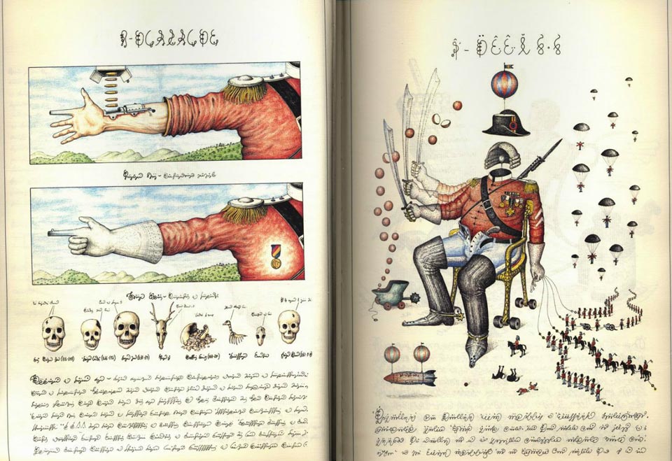
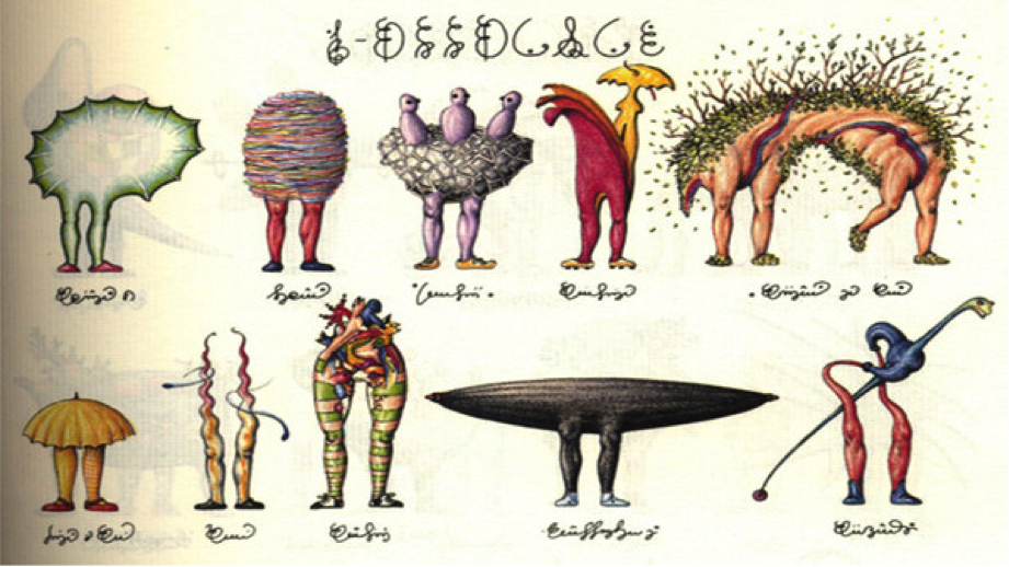
It shares many similarities with the Voynich Manuscript, save its relatively recent vintage and living author: both the Seraphinianus and the Voynich seem to be compendiums of an otherworldly natural science and art, and both are written in a wholly invented language.
Serafini tells Wired he thinks Voynich is a fake. “The Holy Roman Emperor Rudolf II loved ancient manuscripts; somebody swindled him and spread the rumor that it was original. The idea of made-up languages is not new at all.” As for his own made-up language in the Codex, he avers, “I always said that there is no meaning behind the script; it’s just a game.” But it is not a hoax. Though he hasn’t minded the money from the book’s cult popularity, he created the book, he says, “trying to reach out to my fellow people, just like bloggers do.” It is, he says, “the product of a generation that chose to connect and create a network, rather than kill each other in wars like their fathers did.”
The Codex, writes Abe Books, who made the short video review above, is “essentially an encyclopedia about an alien world that clearly reflects our own, each chapter appears to deal with key facets of this surreal place, including flora, fauna, science, machines, games and architecture.” That’s only a guess given the unintelligible language.
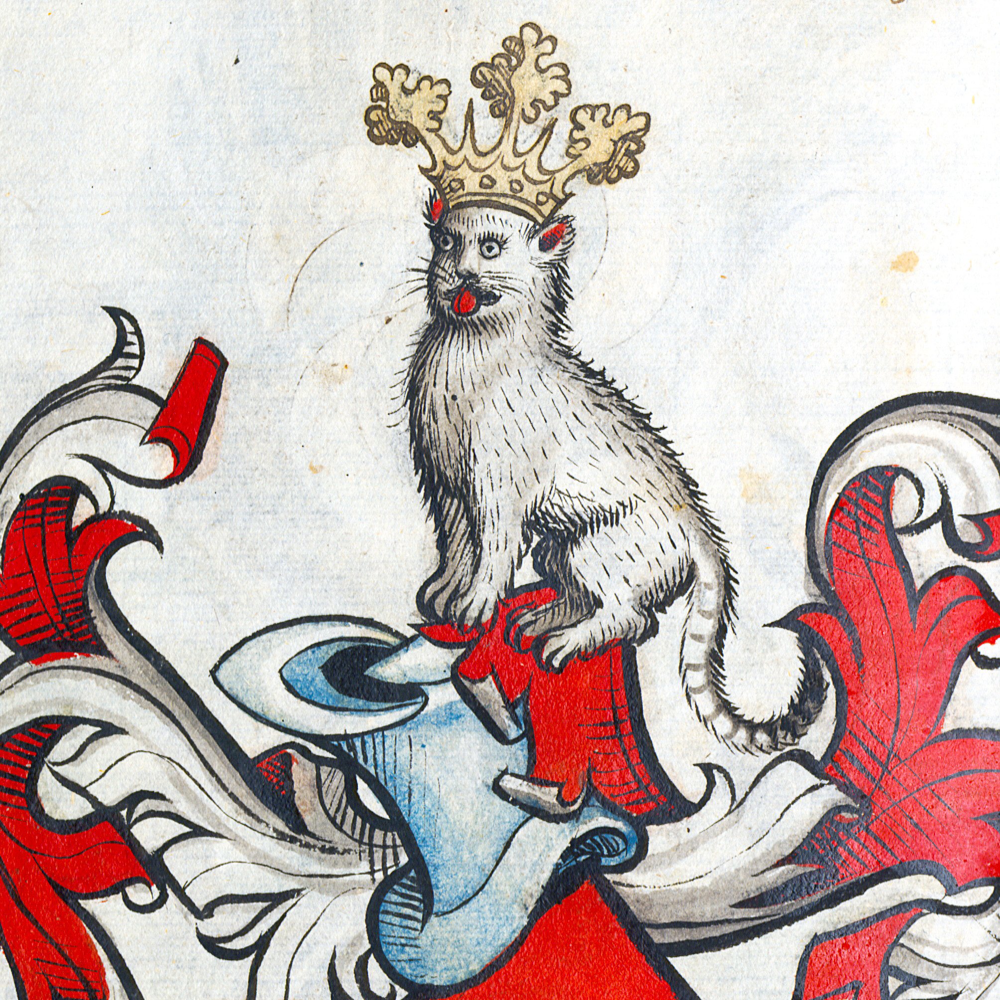
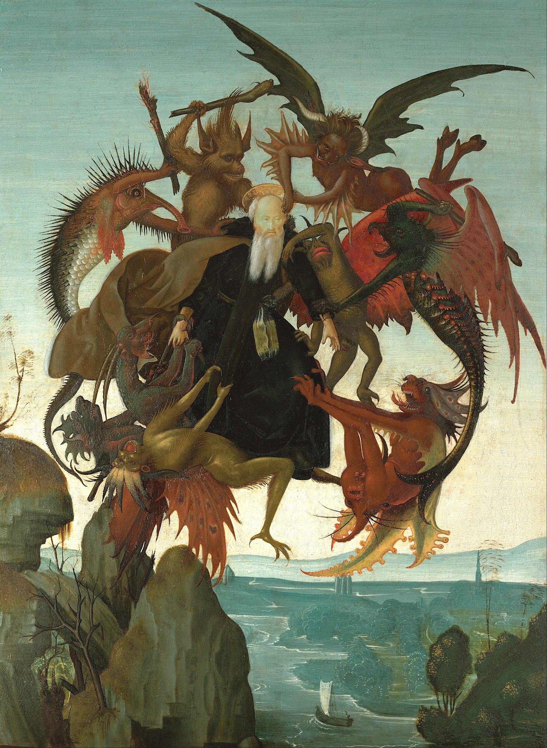
The illustrations seem to draw from Bosch, Leonardo da Vinci, and the medieval travelogue as much as from the surrealism of contemporary European artists like Fantastic Planet animator René Laloux.
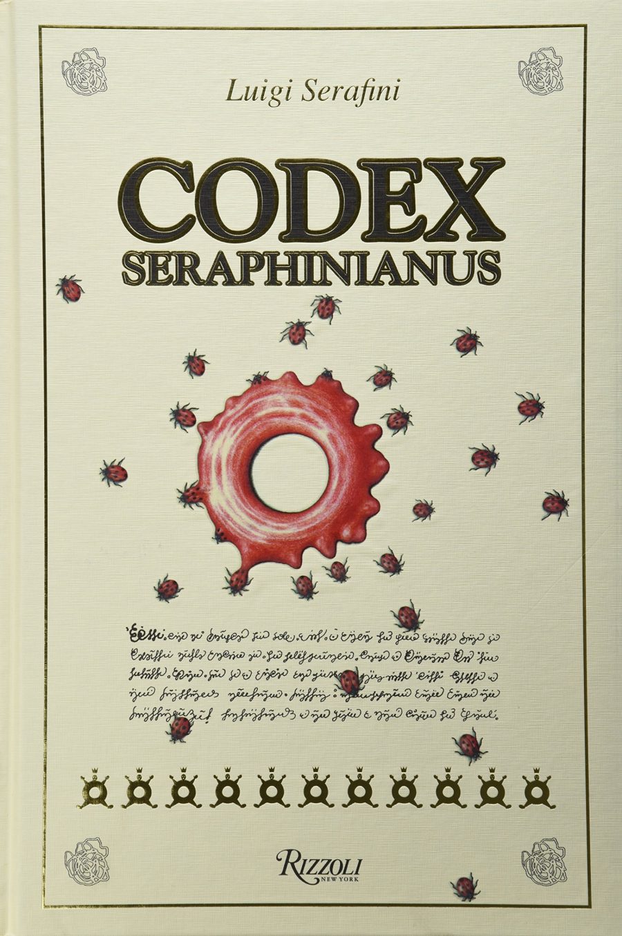
Serafini has been delighted to see an extensive internet community coalesce around the book, and has had his fun with it. He “now states,” writes Dangerous Minds, “that a stray white cat that joined him while he created the Codex in Rome in the 1970s was actually the real author, telepathically guiding Serafini as he drew and ‘wrote.’” You can now, thanks to a recent, relatively affordable edition published by Rizzoli, purchase your copy of the Codex. Buy now, I’d say. First editions of the book now fetch upwards of $6000, and its popularity shows no sign of slowing.
Note: An earlier version of this post appeared on our site in 2017.
Related Content:
A Digital Archive of Hieronymus Bosch’s Complete Works: Zoom In & Explore His Surreal Art
Explore a Digitized Edition of the Voynich Manuscript, “the World’s Most Mysterious Book”
Carl Jung’s Hand-Drawn, Rarely-Seen Manuscript The Red Book
The Foot-Licking Demons & Other Strange Things in a 1921 Illustrated Manuscript from Iran
Josh Jones is a writer and musician based in Durham, NC.