Metamorphose: 1999 Documentary Reveals the Life & Work of Artist M.C. Escher

Made in 1999 by Dutch direc­tor Jan Bos­driesz, the doc­u­men­tary Meta­mor­phose: M.C. Esch­er, 1898–1972 takes its title from one of Escher’s more well-known prints in which the word “meta­mor­phose” trans­forms itself into pat­terns of abstract shapes and ani­mals. It’s one of those col­lege-dorm prints one thinks of when one thinks of M.C. Esch­er, and it’s won­der­ful in its own way. But the doc­u­men­tary reveals oth­er sides of the artist—his art-school days, his sojourn in Italy—that pro­duced a very dif­fer­ent kind of work. Esch­er began as a stu­dent of archi­tec­ture, enrolled in the School for Archi­tec­ture and Dec­o­ra­tive arts in Haar­lem by his par­ents, who strug­gled to help him find his way after he failed his high school exams.

Once in Haar­lem, the lone­ly and some­what morose Esch­er finds him­self drawn to graph­ic art instead. One of his teach­ers, accom­plished Dutch artist Samuel Jes­su­run de Mesqui­ta, whose influ­ence is evi­dent in Escher’s work and life, sees some of Escher’s linocuts and likes them. In archival footage of an inter­view with Esch­er, the artist says that Jes­su­run de Mesqui­ta asked him, “Wouldn’t you rather be a graph­ic artist instead of an archi­tect?”

Esch­er admits, “I wasn’t all that inter­est­ed in archi­tec­ture.” It’s a lit­tle bit of a sur­pris­ing admis­sion giv­en Escher’s wild archi­tec­tur­al imag­i­na­tion, but per­haps what he meant was that he wasn’t inter­est­ed in the con­ven­tion­al, but rather in the archi­tec­ture of the fan­tas­tic, the impos­si­ble spaces he imag­ined in much of his work.

We learn oth­er things about Esch­er: One of his wood­cuts from this peri­od is titled “Nev­er Think before You Begin,” show­ing a lone­ly fig­ure on a dark and treach­er­ous path with only a tiny light to guide him, a rep­re­sen­ta­tion of Escher’s deci­sion to pur­sue graph­ic art. The nar­ra­tor informs us that “it took more than thir­ty years for him to earn enough from his work to live on.” Luck­i­ly, as with many artists who strug­gle for years, Esch­er had rich par­ents. We can thank them for their patron­age.  To give you some idea of Escher’s mor­bid char­ac­ter, we learn that he chose the top­ic “Dance of Death” for a three-hour lec­ture to his fel­low art stu­dents in Haar­lem. Esch­er told them, “The dance of death and life are two expres­sions with the same mean­ing. What else do we do oth­er than dance death into our souls?”

Meta­mor­phose is an impres­sive doc­u­men­tary, beau­ti­ful­ly shot and edit­ed, with a bal­ance of stock footage of the peri­od, inter­views with the artist him­self, and long, lin­ger­ing shots of his work. The film cov­ers Escher’s entire artis­tic life, end­ing with footage of the artist at work. These “last images” of Esch­er, the nar­ra­tor says, “are not gloomy. We see an artist in his stu­dio, doing the things he enjoys,” a man “proud of his suc­cess.” At the end of his life, he still hon­ored his teacher, de Mesqui­ta, and the South Ital­ian coast that shel­tered him dur­ing his for­ma­tive years.

Relat­ed Con­tent:

Math­e­mat­ics Made Vis­i­ble: The Extra­or­di­nary Art of M.C. Esch­er

Inspi­ra­tions: A Short Film Cel­e­brat­ing the Math­e­mat­i­cal Art of M.C. Esch­er

Josh Jones is a doc­tor­al can­di­date in Eng­lish at Ford­ham Uni­ver­si­ty and a co-founder and for­mer man­ag­ing edi­tor of Guer­ni­ca / A Mag­a­zine of Arts and Pol­i­tics.

Art Lovers Rejoice! New Goya and Rembrandt Databases Now Online

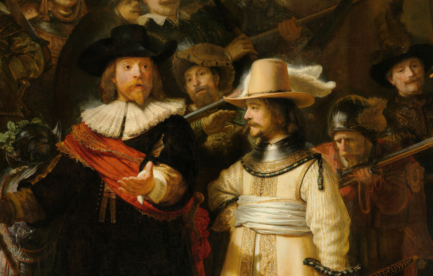
Two of the the tow­er­ing fig­ures of West­ern art–Fran­cis­co de Goya and Rem­brandt van Rijn–have just become more acces­si­ble to peo­ple around the world with the intro­duc­tion of a pair of new online data­bas­es.

The Museo del Pra­do in Madrid has just launched a Web site, Goya en el Pra­do, which makes over 1,000 works by the late 18th- and ear­ly 19th-cen­tu­ry Span­ish mas­ter avail­able for online view­ing, along with his cor­re­spon­dence and oth­er doc­u­ments. Although the site is cur­rent­ly avail­able only in Span­ish (tip: view the site with Google Chrome and it will trans­late things for you!) the pic­to­r­i­al con­tents are easy to explore for peo­ple who are not flu­ent in the lan­guage. They fall under three cat­e­gories: paint­ings (pin­turas), draw­ings (dibu­jos) and prints (estam­pas). More than half of Goy­a’s sur­viv­ing works–from his mas­ter­pieces to obscure sketches–are housed at the Pra­da and are now avail­able for brows­ing by schol­ars and the gen­er­al pub­lic alike. Many of the works are rarely seen. “Notable fea­tures with­in this excep­tion­al­ly impor­tant and inter­est­ing project,” writes artdaily.org, “include the option to access online the unique col­lec­tion of works on paper by Goya in the Muse­um, which is not nor­mal­ly on dis­play for con­ser­va­tion rea­sons.” Here’s the link: Goya en el Pra­do.

Two ven­er­a­ble Dutch art institutions–the Nether­lands Insti­tute for Art His­to­ry (RKD) and the Roy­al Pic­ture Gallery Mau­rit­shuis have joined forces to cre­ate The Rem­brandt Data­base, a resource that brings togeth­er mate­ri­als from research insti­tu­tions around the world, includ­ing the Nation­al Gallery of Lon­don and the Met­ro­pol­i­tan Muse­um of Art. Unlike the Prado’s Goya project, which is intend­ed for a wide audi­ence, the Rem­brandt site is designed specif­i­cal­ly for art schol­ars. “The Rem­brandt Data­base aims to become the first port of call for research on Rem­brandt’s paint­ings,” accord­ing to a state­ment on the site. “Our objec­tive is not to present a final set of data, but to devel­op and grow con­tin­u­al­ly, espe­cial­ly as more doc­u­men­ta­tion becomes avail­able through new research and col­lab­o­ra­tion with new part­ners.” By 2014 the orga­niz­ers hope to have mate­r­i­al from 20 muse­ums. At present there are only a dozen Rem­brandt paint­ings in the data­base, but some of the entries are sup­port­ed by exten­sive doc­u­men­ta­tion, includ­ing infrared and X‑ray imagery. Here’s the link: The Rem­brandt Data­base.

via Metafil­ter/The Art Tri­bune

Hand Lettering Bob Dylan’s Lyrics to “Subterranean Homesick Blues”

If you’ve ever seen D.A. Pen­nebak­er’s clas­sic 1967 doc­u­men­tary Don’t Look Back (or even if you haven’t), you know the famous scene — Bob Dylan flip­ing through cue cards as the dizzy­ing lyrics of “Sub­ter­ranean Home­sick Blues” flow by, all while poet Allen Gins­berg and singer Bob Neuwirth make cameo appear­ances in the back­ground. (Watch it below.) This inno­v­a­tive clip has since inspired count­less trib­ute videos by the likes of Steve Ear­le, the rap­per Evi­dence“Weird Al” Yankovic, Google, and the 1992 film Bob Roberts. Now comes the lat­est riff on the icon­ic footage by designer/illustrator Lean­dro Sen­na. He gives us “Bob Dylan’s Hand Let­ter­ing Expe­ri­ence,” a video that stitch­es togeth­er 66 hand-designed cards, each made with only pen­cil, black tint pens and brush­es. No tech­no­log­i­cal enhance­ments or retouch­ing were allowed. On Sen­na’s web site, you can see each and every card in a larg­er for­mat.

via Boing­Bo­ing

Wearable Sculpture by Nick Cave (But No, Not That Nick Cave) Invade Microsoft

Don’t get too excit­ed, Bad Seeds fans — although, come to think of it, you might rea­son­ably get excit­ed any­way at these “sound­suits,” craft­ed by the oth­er Nick Cave, a dancer and visu­al artist. The brief video above, from Cave’s show Meet Me at the End of the Earth last year at the Seat­tle Art Muse­um, gives you an idea of what these things look like and how they move. Using a near-bewil­der­ing vari­ety of strik­ing tex­tures and uncon­ven­tion­al com­po­nents â€” “sand­wich bags, spin­ning tops and cro­cheted doilies” get spe­cif­ic men­tions — Cave crafts sev­er­al lay­ers of visu­al inter­est inside which to place a par­tic­u­lar­ly adven­tur­ous mod­ern dancer. Seat­tle Art Muse­um cura­tor Pam McClusky describes the sound­suits as “a cross between Car­ni­val, Lib­er­ace, Shon­i­bare, Cock­ney, haute cou­ture and African cer­e­mo­ny.” To say the least.

View­ing Cave’s sound­suits in a muse­um set­ting is one thing; wit­ness­ing them in action out in the wild is quite anoth­er. As long as we’re talk­ing about the greater Puget Sound area, play the video just above and watch a squadron of sound­suit-clad dancers invade Microsoft. One can hard­ly imag­ine a stark­er clash than Cave’s aes­thet­ic of patch­work flam­boy­ance and the Microsoft cam­pus, that locus clas­si­cus of the slick­ly beige Pacif­ic North­west high-tech nineties. But for an even more fas­ci­nat­ing artis­tic con­trast, I say we put an end to the name-relat­ed con­fu­sion and unite this Nick Cave in col­lab­o­ra­tion with the brood­ing Aus­tralian singer-song­writer. Until that comes togeth­er, fans of one Cave can vis­it the oth­er’s Sound­suit Shop to gath­er the mate­ri­als for their own mash-up.

via Metafil­ter

Col­in Mar­shall hosts and pro­duces Note­book on Cities and Cul­ture. Fol­low him on Twit­ter at @colinmarshall.

Classic Films and Filmmakers, Rendered in Woodcut By a Los Angeles Artist-Cinephile

A great many indus­tri­ous cinephiles live in Los Ange­les. It’s no mis­take, for instance, that those rock-and-roll auteur shirts you see around come from there. In fact, I write you from that very town, to which I moved for a vari­ety of rea­sons relat­ed to my film habit. While I may not count myself as par­tic­u­lar­ly indus­tri­ous, I do count myself as a cinephile, and I can thus appre­ci­ate a project of gen­uine film-lov­ing indus­try like Loren Kan­tor’s clas­sic movie wood­cuts and linocuts.

Tak­ing Hol­ly­wood and its fringes as inspi­ra­tion, Kan­tor cre­ates strik­ing, high-con­trast black-and-white images that bring icons of con­tem­po­rary cul­ture into a far old­er aes­thet­ic realm. And who counts as more of an icon of con­tem­po­rary cul­ture — at least, I sense, in the minds of most Open Cul­ture read­ers — than David Lynch? Kan­tor’s wood­cut, seen above, cap­tures the air of simul­ta­ne­ous unflag­ging whole­some­ness and infi­nite dark­ness that swirls about the direc­tor and his films.

Or per­haps you con­sid­er Steve Busce­mi more rel­e­vant to our times; in that case, Kan­tor has cre­at­ed a wood­cut of him as well, one that evokes the actor’s alter­nat­ing lay­ers of worn-down malaise and pecu­liar alert­ness. Just above, you’ll see Kan­tor going in a dif­fer­ent direc­tion with a ren­di­tion of the poster for Man­hat­tan, one of Woody Allen’s most beloved New York pic­tures. “I fell in love with wood­cuts in the 80’s when I attend­ed a Ger­man Expres­sion­ist art show at LA Coun­ty Muse­um,” Kan­tor tells Open Cul­ture. “The stark lines and brusque images remind­ed me of film noir clas­sics.”  Should you ever find your­self in Los Ange­les with time to take in a movie screen­ing at the Los Ange­les Coun­ty Muse­um of Art, pay a vis­it down­stairs, to the floor below the the­ater. There, through­out the hall­way, the muse­um dis­plays the posters for all its Ger­man Expres­sion­ist art shows â€” includ­ing the one that inspired these wood­cuts in the first place.

To view more of Kan­tor’s work, vis­it Wood Cut­ting Fool: Jour­ney of a Carv­ing Enthu­si­ast or this recent spread on Brain­Pick­ings.

Col­in Mar­shall hosts and pro­duces Note­book on Cities and Cul­ture. Fol­low him on Twit­ter at @colinmarshall.

Exquisite Paper Craft Animations Tell the Stories of Words

The beau­ti­ful Mys­ter­ies of Ver­nac­u­lar is a word-nerd’s delight, a series of ani­ma­tions delv­ing into the ori­gin of words, using exquis­ite paper craft ani­ma­tion to spin an ety­mo­log­i­cal yarn.

The ani­ma­tions are nar­rat­ed in author­i­ta­tive British, giv­ing each sto­ry the feel of the 1970s show, Con­nec­tionsin which sci­ence his­to­ri­an James Burke unwound the links between small moments in his­to­ry and mod­ern life. In this way, Mys­ter­ies of Ver­nac­u­lar, cre­at­ed by Myr­i­a­pod Pro­duc­tions, lays out the con­nec­tions between an ancient word for wolf, a tri­an­gu­lar rake, a frame that held can­dles in funer­als and, final­ly, a car­riage (or car) that con­veys coffins. All of these things come togeth­er to bring us the mod­ern-day word hearse. Watch above.

The words cov­ered so far are not in alpha­bet­i­cal order: assas­sin, clue, hearse and pants. Click on one of the videos for a beau­ti­ful­ly non-lin­ear sto­ry about how words shift and change as human soci­eties do. There are con­nec­tions, of course, between the ear­ly spelling and mean­ing of a word and its cur­rent use, but the jour­ney from one iter­a­tion to anoth­er is the fun part—dotted with side trips through his­to­ry.

The word clue, for exam­ple, was also spelled clew in ancient times and meant, of all things, a ball of yarn. If you know the sto­ry of The­seus, who was deter­mined to slay the Mino­taur at the cen­ter of the labyrinth, you might be able to fig­ure out how a ball of yarn came to refer, more gen­er­al­ly, to some­thing used to solve a rid­dle or prob­lem.

It may inter­est a few of you that the word ver­nac­u­lar has a shad­owy sto­ry of its own to tell. Com­ing from the Latin word for a house slave born in their house of servi­tude, ver­nac­u­lar has come to mean native espe­cial­ly in the con­text of describ­ing a lan­guage. Lin­guis­tic anthro­pol­o­gists, how­ev­er, find the term offen­sive and pre­fer the phrase dialect. 

Accord­ing to Myr­i­a­pod Pro­duc­tions, the Mys­ter­ies of Ver­nac­u­lar “will [ulti­mate­ly] con­tain 26 ety­mo­log­i­cal install­ments, one for each let­ter of the alpha­bet. Each episode takes more than 80 hours to cre­ate between the research, con­struc­tion of the book, and ani­ma­tion.”

Kate Rix is an Oak­land-based writer. See more of her work at .

53 Years of Nuclear Testing in 14 Minutes: A Time Lapse Film by Japanese Artist Isao Hashimoto

It’s strange what can make an impact. Some­times a mes­sage needs to be loud and over-the-top to come across, like punk rock or the films of Oliv­er Stone. In oth­er cas­es, cool and qui­et works much bet­ter.

Take the new time lapse map cre­at­ed by Japan­ese artist Isao Hashimo­to. It is beau­ti­ful in a sim­ple way and eerie as it doc­u­ments the 2,053 nuclear explo­sions that took place between 1945 and 1998.

It looks like a war room map of the world, black land­mass­es sur­round­ed by deep blue ocean. It starts out slow, in July of 1945, with a blue blip and an explo­sion sound in the Amer­i­can southwest—the Man­hat­tan Project’s “Trin­i­ty” test near Los Alam­os. Just one month lat­er come the explo­sions at Hiroshi­ma and Nagasa­ki.

From there the months click by—condensed down to seconds—on a dig­i­tal clock. Each nation that has explod­ed a nuclear bomb gets a blip and a flash­ing dot when they det­o­nate a weapon, with a run­ning tal­ly kept on the screen.

Eeri­est of all is that each nation gets its own elec­tron­ic sound pitch: low tones for the Unit­ed States, high­er for the Sovi­et Union—beeping to the metronome of the months tick­ing by.

What starts out slow picks up by 1960 or so, when all the cold neu­tral beeps and flash­es become over­whelm­ing.

If you’re like me, you had no idea just how many det­o­na­tions the Unit­ed States is respon­si­ble for (1,032—more than the rest of the coun­tries put togeth­er). The sequence ends with the Pak­istani nuclear tests of May 1998.

Hashimo­to worked for many years as a for­eign exchange deal­er but is now an art cura­tor. He says the piece express­es “the fear and fol­ly of nuclear weapons.”

Kate Rix is an Oak­land-based free­lance writer. See more of her work at .

If you would like to sign up for Open Culture’s free email newslet­ter, please find it here. It’s a great way to see our new posts, all bun­dled in one email, each day.

If you would like to sup­port the mis­sion of Open Cul­ture, con­sid­er mak­ing a dona­tion to our site. It’s hard to rely 100% on ads, and your con­tri­bu­tions will help us con­tin­ue pro­vid­ing the best free cul­tur­al and edu­ca­tion­al mate­ri­als to learn­ers every­where. You can con­tribute through Pay­Pal, Patre­on, and Ven­mo (@openculture). Thanks!

Relat­ed Con­tent:

63 Haunt­ing Videos of U.S. Nuclear Tests Now Declas­si­fied and Put Online

Kurt Von­negut Gives a Ser­mon on the Fool­ish­ness of Nuclear Arms: It’s Time­ly Again (Cathe­dral of St. John the Divine, 1982)

Haunt­ing Unedit­ed Footage of the Bomb­ing of Nagasa­ki (1945)

How a Clean, Tidy Home Can Help You Sur­vive the Atom­ic Bomb: A Cold War Film from 1954

Roy Lichtenstein and Andy Warhol Demystify Their Pop Art in Vintage 1966 Film

By the mid-six­ties, Roy Licht­en­stein and Andy Warhol had come to define a cer­tain cur­rent of process-inten­sive, only super­fi­cial­ly sim­ple Amer­i­can visu­al art. Licht­en­stein cre­at­ed his work using process­es and mate­ri­als devel­oped for tra­di­tion­al com­mer­cial pro­duc­tion; Warhol devel­oped meth­ods for pro­duc­ing his work as if they were tra­di­tion­al com­mer­cial prod­ucts. This half-hour doc­u­men­tary cap­tures both artists in 1966, dis­cussing their meth­ods in inter­views and exe­cut­ing them in their stu­dios. Licht­en­stein speaks clear­ly and in great detail about how he finds the Amer­i­can land­scape “made up of the desire to sell prod­ucts,” how he decid­ed to por­tray in his paint­ings “an anti-sen­si­bil­i­ty that per­vades the soci­ety” with­in a “struc­ture of half-tone dots and flat print­ed areas,” and his dri­ving notion that “what­ev­er approach one uses, he ought to go as far as he can with it, in order to make as much impact as pos­si­ble.”

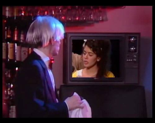
Warhol, though, as jour­nal­ists who encoun­tered him will winc­ing­ly remem­ber, was­n’t much for inter­views. Or rather, he grant­ed inter­views, but respond­ed most­ly in ways that rein­forced his per­sona of unknowa­bil­i­ty — indeed, of con­tain­ing noth­ing to be known. “Andy Warhol’s ret­i­cence about him­self masks a unique sen­si­bil­i­ty,” reads the nar­ra­tor. That’s one way of putting it. Here he tells his inter­view­er, who main­tains an admirable equa­nim­i­ty through­out, how nice it would be if he could just be told what sen­tences to answer with, and then repeat them. Yet behind his opaque-look­ing sun­glass­es and inter­cut with footage of his var­i­ous projects, Warhol reveals things, and inter­est­ing ones, about the whats, hows, and whys of his grand enter­prise. He even revealed a detail about his imme­di­ate plans to which audi­ences of 1966 would’ve done par­tic­u­lar­ly well to pay atten­tion: “We’re spon­sor­ing a new band. It’s called the Vel­vet Under­ground.”

Andy Warhol and Roy Licht­en­stein will be added to our col­lec­tion, 4,000+ Free Movies Online: Great Clas­sics, Indies, Noir, West­erns, Doc­u­men­taries & More.

Col­in Mar­shall hosts and pro­duces Note­book on Cities and Cul­ture. Fol­low him on Twit­ter at @colinmarshall.

« Go BackMore in this category... »
Quantcast