Back in 2014, this image won a contest on a subreddit devoted to Blender, “the amazing open-source software program for 3D modeling, animation, rendering and more.” (You can download the free software here.) The image riffs, of course, on Edward Hopper’s classic 1942 painting, “Nighthawks,” taking its theme of loneliness to new extremes–extremes that we’re just starting to get accustomed to now.
Find lots of background information on the original “Nighthawks” painting in the Relateds below.
If you would like to support the mission of Open Culture, consider making a donation to our site. It’s hard to rely 100% on ads, and your contributions will help us continue providing the best free cultural and educational materials to learners everywhere. You can contribute through PayPal, Patreon, and Venmo (@openculture). Thanks!
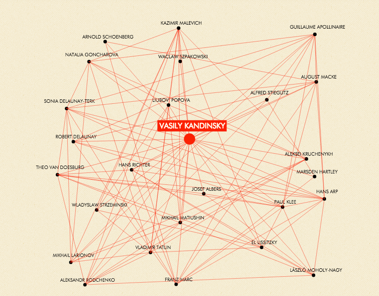
Who’s your favorite abstract artist? Some of us, if we like early abstraction, might name a painter like Wassily Kandinsky, some a composer like Arnold Schoenberg, some a poet like Guillaume Apollinaire, and some, even, a photographer like Alfred Stieglitz. When we answer a question like this, we tend to consider each artist, and each artist’s body of work, in isolation. But when we talk about artistic movements, especially one overarching and influential as abstraction, all names, all paintings, all compositions, all poems, all photographs — all works of any kind — are interconnected. Just as abstract artists managed to make visible, audible, and legible concepts and feelings never before realized in art, the Museum of Modern Art’s interactive social-network map of abstract art puts all those connections on display for us to see.
“Abstraction may be modernism’s greatest innovation,” says the web site of Inventing Abstraction 1910–1925, the MoMA exhibit for which the map (downloadable as a PDF poster here) was originally designed. “Today it is so central to our conception of artmaking that the time when an abstract artwork was unimaginable has become hard to imagine.”
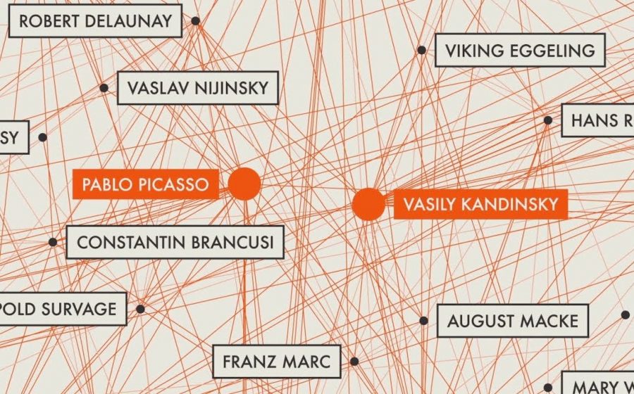
But when abstract art emerged, it seemed to do so quite suddenly: beginning in 1911, Kandinsky and other artists, including Fernand Léger, Robert Delaunay, František Kupka, and Francis Picabia, “exhibited works that marked the beginning of something radically new: they dispensed with recognizable subject matter.” You can view the Inventing Abstraction diagram with Léger at the center, which reveals his connections to such figures as Man Ray, Marcel Duchamp, and Pablo Picasso. Reconfigured with Delaunay at the center, links emerge to the likes of Blaise Cendrars, Edgard Varèse, and Paul Klee.
But no abstract artist seems to have been as well-connected as Kandinsky, who “became a central force in the development and promotion of abstraction through his intrepid efforts as a painter, theorist, publisher, exhibition organizer, teacher, and as a generous host to the dozens of artists and writers who trekked, often from great distances, to meet him.” So says the bio alongside Kandinsky’s page on the diagram, which depicts him as the node connecting figures, influential in their own right, like Josef Albers, László Moholy-Nagy, and Hans Richter. Kandinsky’s “message about abstraction’s potential transcended distinctions between mediums, and his impact was felt from New York to Moscow.” But only a community of artists spanning at least that range of the globe, each in his or her own way looking to create a new world, could bring abstract art into being. More than a century later, we can safely call it here to stay.
Based in Seoul, Colin Marshall writes and broadcasts on cities, language, and culture. His projects include the book The Stateless City: a Walk through 21st-Century Los Angeles and the video series The City in Cinema. Follow him on Twitter at @colinmarshall or on Facebook.
But we can take heart that one store of common wealth has majorly expanded recently, and will continue to grow each year since January 1, 2019—Public Domain Day—when hundreds of thousands of works from 1923 became freely available, the first time that happened in 21 years. This year saw the release of thousands more works into the public domain from 1924, and so it will continue ad infinitum.
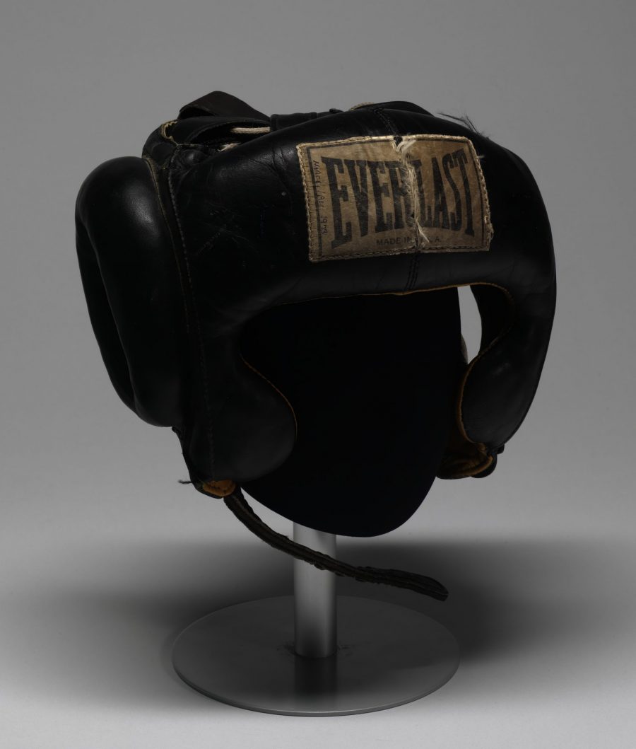
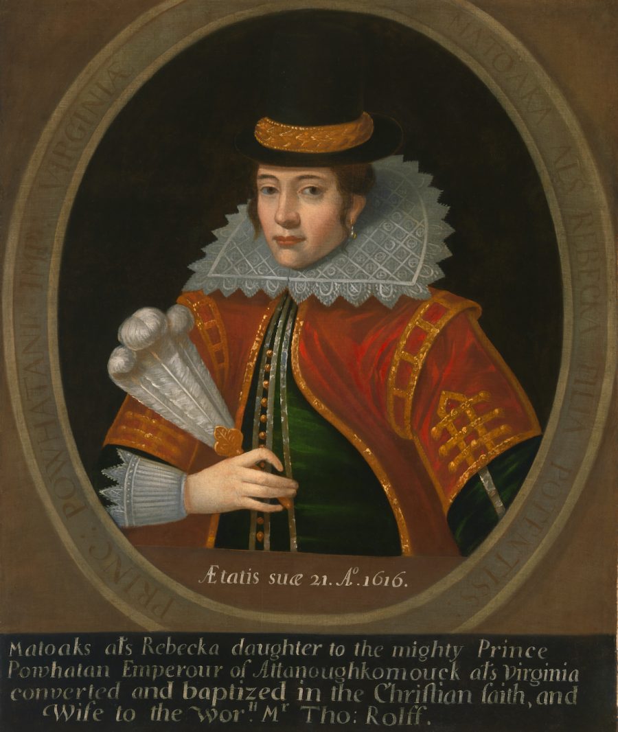
And now—as if that weren’t enough to keep us busy learning about, sharing, adapting, and repurposing the past into the future—the Smithsonian has released 2.8 million images into the public domain, making them searchable, shareable, and downloadable through the museum’s Open Access platform.
This huge release of “high resolution two- and three-dimensional images from across its collections,” notes Smithsonian Magazine, “is just the beginning. Throughout the rest of 2020, the Smithsonian will be rolling out another 200,000 or so images, with more to come as the Institution continues to digitize its collection of 155 million items and counting.”
There are those who would say that these images always belonged to the public as the holdings of a publicly-funded institution sometimes called “the nation’s attic.” It’s a fair point, but shouldn’t take away from the excitement of the news. “Smithsonian” as a conveniently singular moniker actually names “19 museums, nine research centers, libraries, archives, and the National Zoo,” an enormous collection of art and historic artifacts.
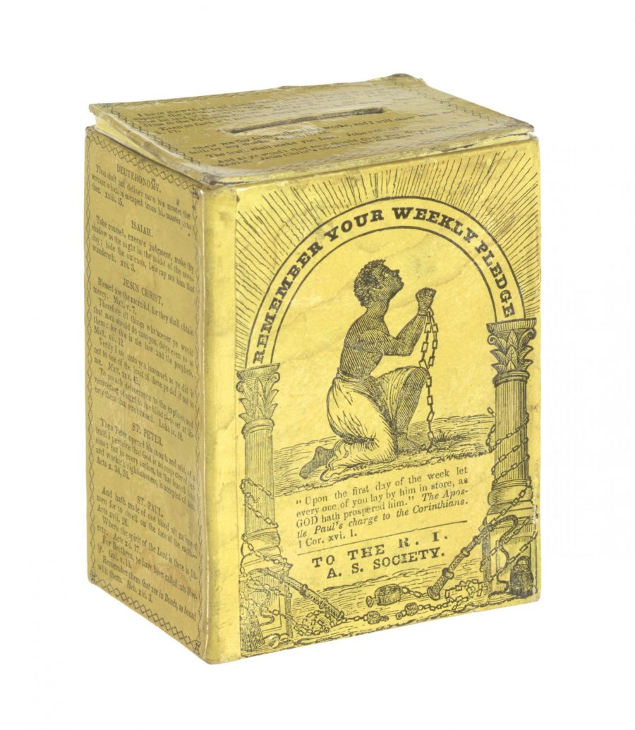
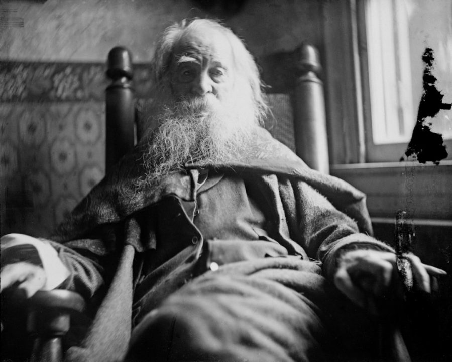
That’s quite a lot to sift through, but if you don’t know what you’re looking for, the site’s highlights will direct you to one fascinating image after another, from Mohammad Ali’s 1973 headgear to the historic Elizabethan portrait of Pocahontas, to the collection box of the Rhode Island Anti-Slavery Society owned by William Lloyd Garrison’s family, to Walt Whitman in 1891, as photographed by the painter Thomas Eakins, to just about anything else you might imagine.
Enter the Smithsonian’s Open Access archive here and browse and search its millions of newly-public domain images, a massive collection that may help expand the definition of common knowledge.
Whether painting scenes of paradise, damnation, or somewhere in between, Hieronymus Bosch realized elaborately grotesque visions that fascinate us more than 500 years later. But no matter how long we gaze upon his work, especially his large-format altarpiece triptychs, most of us wouldn’t want to spend our lives in his world. But a group of dedicated Bosch fans has made it possible to live in it for three days a year, when the annual Bosch Parade floats down the Dommel River. Last year that small waterway hosted “a story in motion, presented on 14 separate tableaux. They shape a universal tale of power and counterforce, battle and rapprochement, chaos and hope. From the chaos after the battle a new order shall emerge.”
In practical terms, writes Colossal’s Grace Ebert, that meant “a musical performance played on a partially submerged piano and a scene with two people straddling enormous horns,” as well as a dozen other water-based vignettes that passed through the Dutch town of ‘s‑Hertogenbosch, Bosch’s birthplace and later his namesake.
Everything that rolled down the Dommel was designed by a group of artists selected, according to the parade’s web site, “on the basis of their complementary characteristics, the various disciplines they represent and their clear match with the Bosch Parade artistic ‘DNA’ in the way they work and perform.” As you can see in the 2019 Bosch Parade’s program, the artists’ creations draw on 15th-century conceptions of life, art, technology, and the human body while also taking place unmistakably in the 21st.
Though Bosch’s paintings look alive even in their motionlessness, to appreciate a parade requires seeing it in action. Hence the videos here of the 2015 Bosch Parade: at the top of the post is a short teaser; just above is a longer compilation of some of the event’s most Boschian moments, which puts the painter’s images side-by-side with the floats they inspired. Viewers will recognize elements of The Garden of Earthly Delights, Bosch’s single best-known work, but also of The Haywain Triptych, The Seven Deadly Sins and the Four Last Things, and The Temptations of St. Anthony. As art history buffs know, some of those paintings may or may not have been painted by Bosch himself, but by one of his followers or contemporary imitators.
But to the extent that all these images can inspire modern-day painters, sculptors, musicians, dancers, and spectacle-makers, they enrich the Boschian reality — a reality of water and fire, bodies and body parts, men and monsters, contraptions and projections, and even video games and the internet — that comes to life every summer in ‘s‑Hertogenbosch. Or rather, most every summer: the next Bosch Parade is scheduled not for June of this year but June of 2021. But when that time comes around around it will last for four days, from the 17th through the 20th. That information comes from the parade’s Twitter account, which in the run-up to the event will presumably also post answers to all the most important questions — such as whether next year will feature any live buttock music.
Based in Seoul, Colin Marshall writes and broadcasts on cities, language, and culture. His projects include the book The Stateless City: a Walk through 21st-Century Los Angeles and the video series The City in Cinema. Follow him on Twitter at @colinmarshall or on Facebook.
There was a time when you could flip on the TV in the evening, tune in to a major network’s late-night talk show, and see Salvador Dalí walking an anteater. That time was the early 1970s, the network was ABC, and the talk show’s host was Dick Cavett, who dared to converse on camera, and at length, with everyone from Ingmar Bergman and Woody Allen to Norman Mailer and Gore Vidal to David Bowie and Janis Joplin, and John Lennon with Yoko Ono. Whether they went smoothly or bumpily, Cavett’s conversations played out like no others on television, then or now. Dalí’s March 1970 appearance above makes for a case in point: not only does he come on with his anteater, he wastes little time tossing it into the lap of another of the evening’s guests, silent-film star Lillian Gish.
Dalí praises anteaters to Cavett as the sole “angelic” animal, a quality that has something to go with their tongues. He goes on to explain his admiration for the mathematical properties of rhinoceroses, whose proportions agree with the “golden ratio” he tended to incorporate into his art.
Other subjects to arise during Dalí’s twenty minutes on set include the razor blade and the eyeball in Un Chien Andalou; the vivid, irrational, and “liliputitian” images that come to life in the mind “ten minutes or fifteen minutes before you fall [asleep]”; and the artist’s maintenance of his famous mustache (which he’d previously discussed, sixteen years before, on The Name’s the Same). At one point Gish asks Dalí if his work has “a message to give to the people that we, perhaps, don’t understand.” His unhesitating reply: “No message.” Cavett, of course, has a smooth follow-up: “Could you invent one?”
In his show’s 1970s prime, Cavett demonstrated an unmatched ability to make entertainment out of difficult guests — not by making fun of them, exactly, but by cracking jokes that revealed a certain self-awareness about the form of the talk show itself. “Am I alone in finding you somewhat to difficult to follow in terms of what your theories are?” he asks Dalí amid all the talk of anteaters and eyeballs, dreams and mathematics. And the difficulty wasn’t just conceptual: “Is it my imagination,” Cavett asks later on, “or are you speaking a mixture of languages?” But Dalí’s deliberately idiosyncratic English, ideas, and personality all came of a piece, and at the end of the night Cavett admits his own admiration for the artist’s work, even going so far as to request an autograph on air. The viewers of America must have come away from Dalí’s TV appearances with more questions than answers. But for us watching today, one is particularly salient: what on Earth must Satchel Paige have thought of all this?
Based in Seoul, Colin Marshall writes and broadcasts on cities, language, and culture. His projects include the book The Stateless City: a Walk through 21st-Century Los Angeles and the video series The City in Cinema. Follow him on Twitter at @colinmarshall or on Facebook.
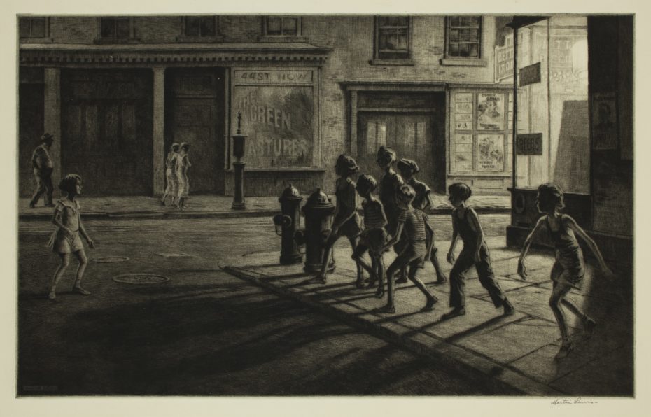
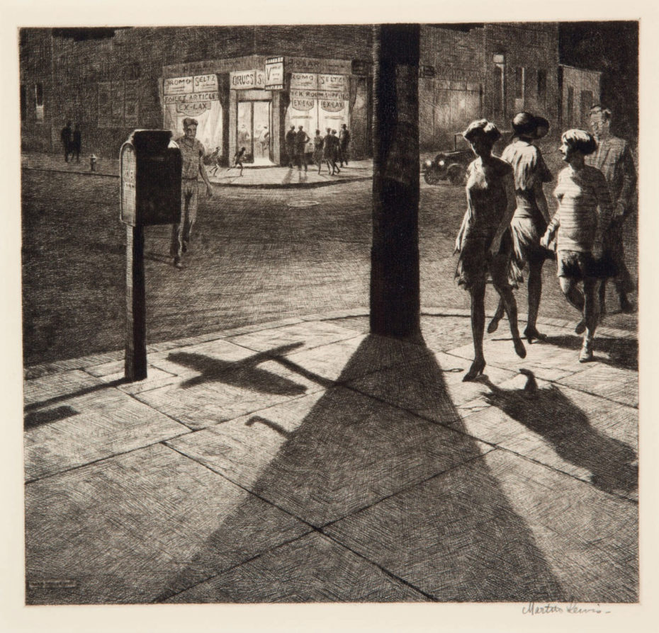
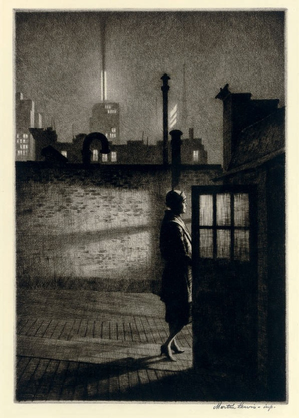
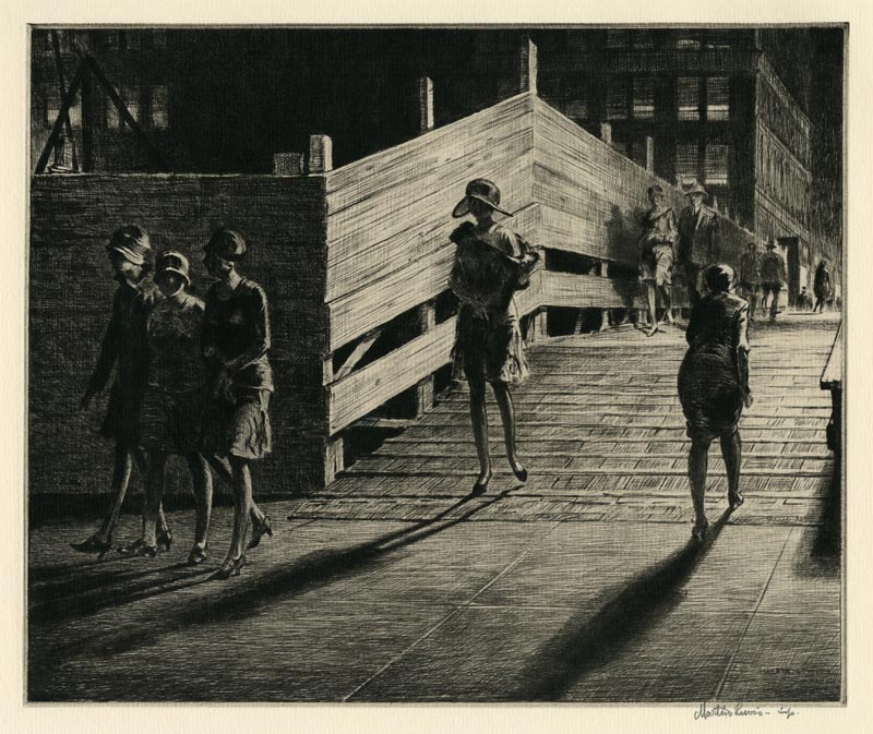
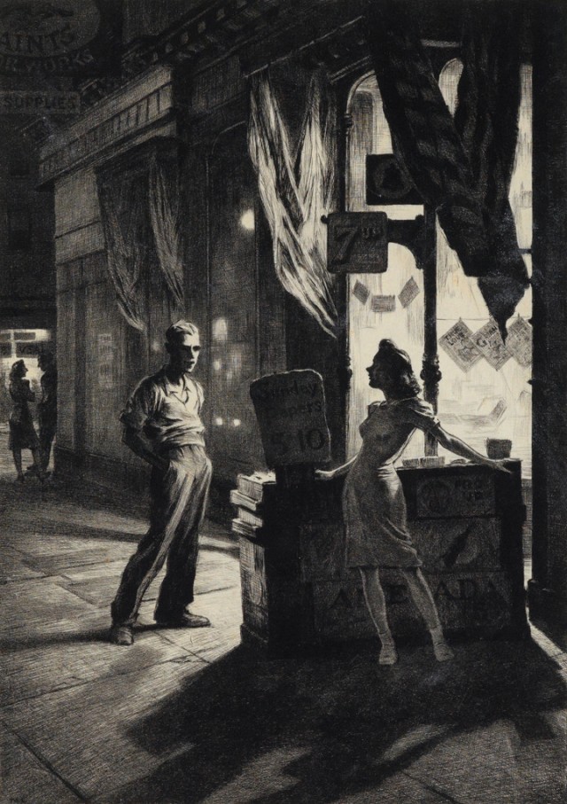
Every good teacher must be prepared for the students who surpass them. Such was the case with Martin Lewis, Edward Hopper’s onetime teacher, an Australian-born printmaker who left rural Victoria at age 15 and traveled the world before settling in New York City in 1900 to make his fame and fortune. By the 1910s, Lewis had become a commercially successful illustrator, well-known for his etching skill. It was then that he took on Hopper as an apprentice.
“Hopper asked that he might study alongside him,” writes DC Pae at Review 31, “and Lewis thereafter became his mentor in the discipline.” The future painter of Nighthawks even “cited his apprenticeship with the printmaker as inspiration for his later painting, the consolidation of his individual style.” Messy Nessy quotes Hopper’s own words: “after I took up my etching, my painting seemed to crystallize.” Hopper, she writes, “learned the finer points of etching and both artists used the great American metropolis at night as their muse.”
Though he is not popularly known for the art, Hopper himself became an accomplished printmaker, creating a series of around 70 works in the 1920s that drew from both Edgar Degas and his etching teacher, Lewis.
“Hopper easily took to etching and drypoint,” writes the Seattle Artist League. “He had a preference for a deeply etched plate, and very black ink on very white paper, so the prints were high contrast, similar to Martin Lewis…, Hopper’s primary influence in printmaking.”
A similar series by Lewis in the 1920s, which includes the striking prints you see here, shows a far stronger hand in the art, though also, perhaps, some mutual influence between the two friends, who exhibited together during the period. But there’s no doubt Lewis’s long shadows, forlorn street-lit corners, and cinematic scenes left their mark on Hopper’s famous later paintings.
It was to painting, after the massive popularity of printmaking, that the art world turned when the Depression hit. Lewis found himself out of date. Hopper left off etching in 1928 to focus on his primary medium. In many ways, Pae points out, Lewis served as a bridge between the documentary Ashcan School and the more psychological realism of Hopper and his contemporaries. Yet he “died in obscurity in 1962, largely forgotten” notes Messy Nessy (see much more of Lewis’s workthere). “History chose Edward Hopper but Martin Lewis was his mentor,” and a figure well worth celebrating on his own for his technical mastery and originality.
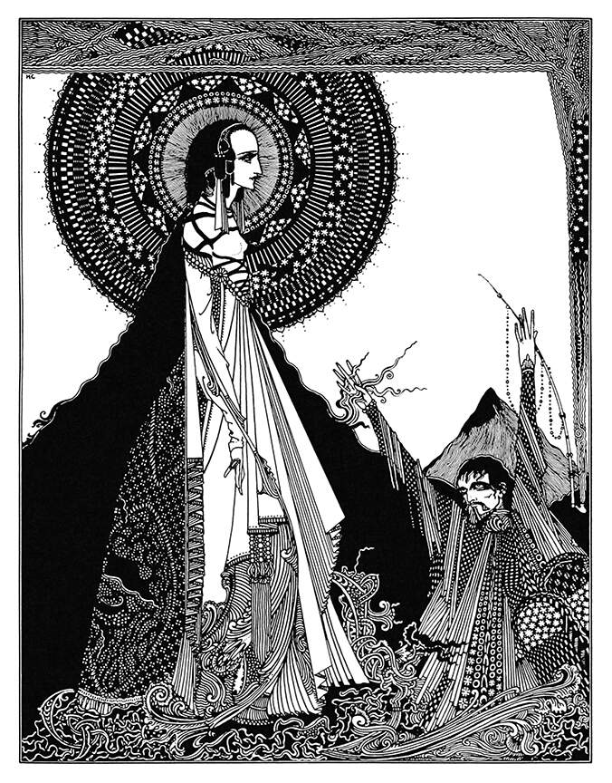
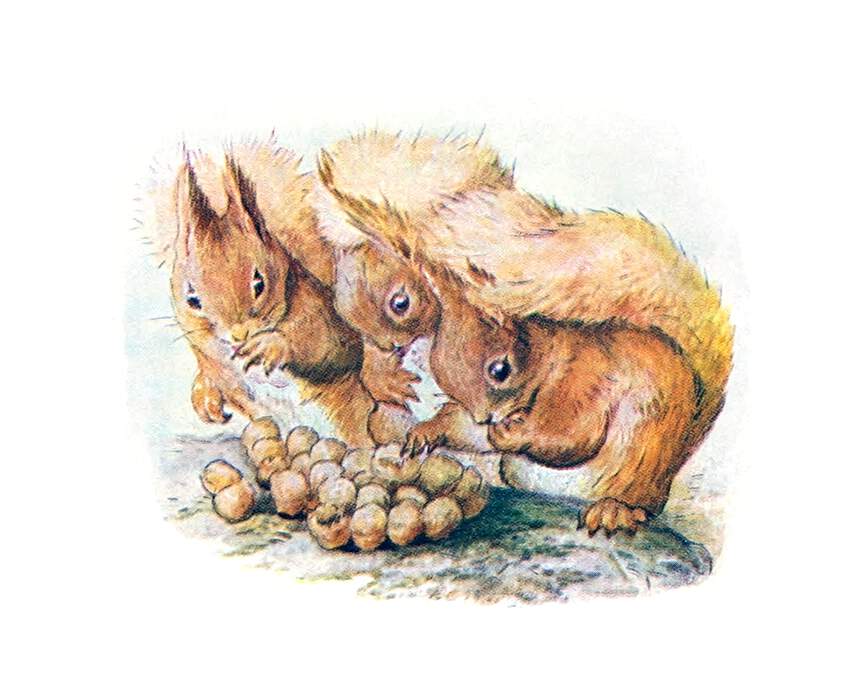
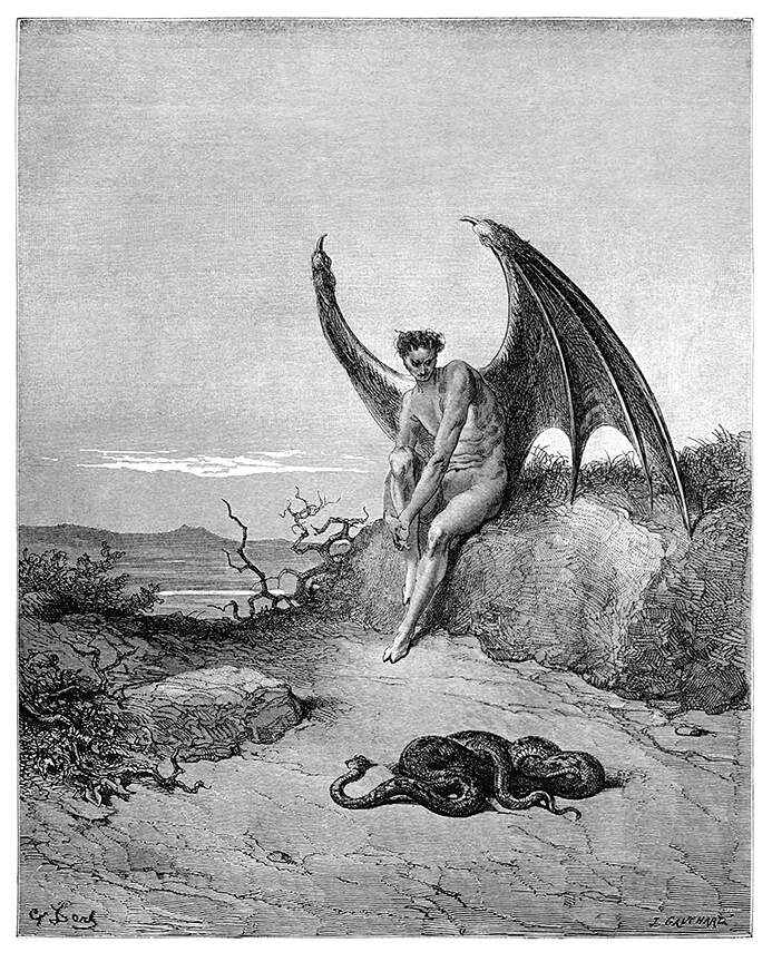
The Golden Age of Illustration is typically dated between 1880 and the early decades of the 20th century. This was “a period of unprecedented excellence in book and magazine illustration,” writes Artcyclopedia; the time of artists like John Tenniel, Beatrix Potter (below), Arthur Rackham, and Aubrey Beardsley. Some of the most prominent illustrators, such as Beardsley and Harry Clarke (see one of his Poe illustrations above), also became internationally known artists in the Art Nouveau, Arts and Crafts, and Pre-Raphaelite movements.
But extensive book illustration as the primary visual culture of print precedes this period by several decades. One of the most revered and prolific of fine art book illustrators, Gustave Doré, did some of his best work in the mid-nineteenth century.
Other French illustrators, such as Alphonse de Neuville and Emile-Antoine Bayard, made impressive contributions in the 1860s and 70s—for example, to Jules Verne’s lavishly illustrated, 54-volume Voyages Extraordinaires.
As Colin Marshall wrote in a recent post here, these copious illustrations (4,000 in all) served more than a just decorative purpose. A less than “fully literate public” benefited from the picture-book style. So too did readers hungry for stylish visual humor, for documentary representations of nature, architecture, fashion, etc., before photography became not only possible but also inexpensive to reproduce. Whatever the reason, readers throughout the nineteenth and early twentieth centuries would generally expect their reading material to come with pictures, and very finely rendered ones at that.
The online database Old Book Illustrations has catalogued thousands of these illustrations, lifted from their original context and searchable by artist name, source, date, book title, techniques, formats, publishers, subject, etc. “There are also a number of collections to browse through,” notesKottke, “and each are tagged with multiple keywords.” Not all of the work represented here is up to the uniquely high standards of a Gustave Doré (below), Aubrey Beardsley, or John Tenniel, all of whom, along with hundreds of other artists, get their own categories. But that’s not entirely the point of this library.
Old Book Illustrations presents itself as a scholarly resource, including a digitized Dictionary of the Art of Printing and short articles on some of the most famous artists and significant texts from the period. The site’s publishers are also transparent about their selection process. They are guided by their “reasons pertaining to taste, consistency, and practicality,” they write. The archive might have broadened its focus, but “due to obvious legal restrictions, [they] had to stay within the limits of the public domain.”
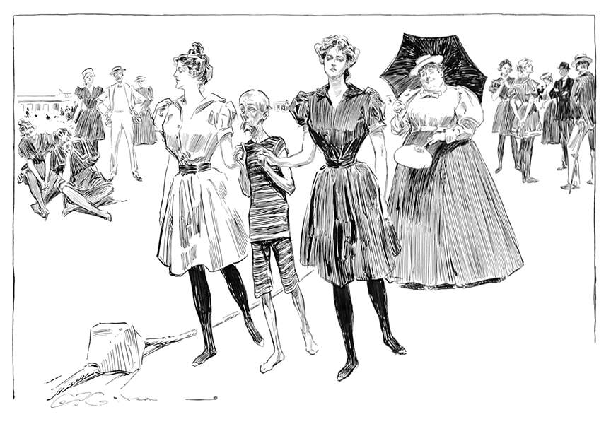
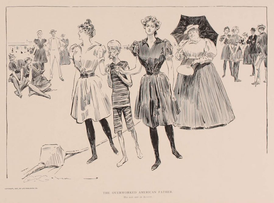
Likewise, they note that the digitized images on the site have been restored to “make them as close as possible to the perfect print the artist probably had in mind when at work.” Visitors who would prefer to see the illustrations as “time handed them to us” can click on “Raw Scan” to the right of the list of resolution options at the top of each image. (See a processed and unprocessed scan above and below of fashion illustrator and humorist Charles Dana Gibson’s “overworked American father” on “his day off in August.”)
All of the images on Old Book Illustrations are available in high resolution, and the site authors intend to add more articles and to make available in English articles on French Romanticism unavailable anywhere else. “We are not the only image collection on the web,” they write, “neither will we ever be the largest one. We hope however to be a destination of choice for visitors more particularly interested in Victorian and French Romantic illustrations.” They give visitors who fit that description plenty of incentive to keep coming back.
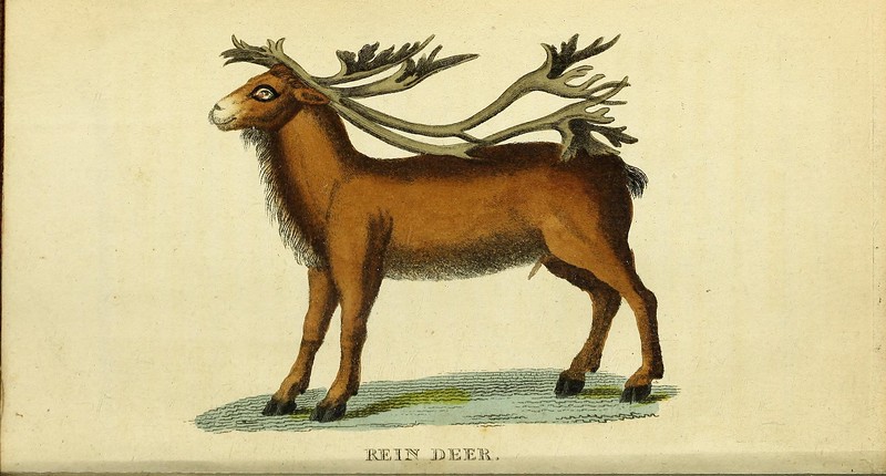
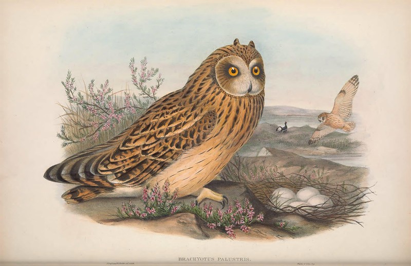
You may have heard of “plant blindness,” a condition defined about 20 years ago that has started to get more press in recent years. As its name suggests, it refers to an inability to identify or even notice the many plant species around us in our everyday lives. Some have connected it to a potentially more widespread affliction they call “nature deficit disorder,” which is also just what it sounds like: a set of impairments brought on by insufficient exposure to the natural world. One might also draw a line from these concepts to our attitudes about climate change, or to our ever-less-interrupted immersion in the digital world. But if any part of that digital world can open our eyes to nature once again, it’s the Biodiversity Heritage Library (present also on Flickr and Instagram.)
Previously featured here on Open Culture for its vast archive of two million illustrations of the natural world, the BHL has received more coverage this year for the more than 150,000 it’s made available for copyright-free download. Hyperallergic’s Hakim Bishara quotes Henry David Thoreau — “We need the tonic of wildness. We can never get enough of nature” — before writing of how thrilled Thoreau would have been by the existence of such a resource for images of nature.
These images include “animal sketches, historical diagrams, botanical studies, and scientific research collected from hundreds of thousands of journals and libraries across the world,” some dating to the 15th century. He highlights “Joseph Wolf’s 19th-century book Zoological Sketches, containing about 100 lithographs depicting wild animals in London’s Regent’s Park” and “watercolors depicting flowers indigenous to the Hawaiian islands” as well as “an 1833 DIY Taxidermist’s Manual.”
As Smithsonian.com’s Theresa Machemer notes, “The practice of creating detailed illustrations of flora and fauna, whether to document an expedition or a medical practice, gained popularity well before photography was up to the task.” Hence such ambitious projects as the United States government’s commissioning, in 1866, of watercolor paintings depicting every fruit known to man. But even today, “an illustration can offer more clarity than a photograph,” as you’ll find when you zoom in on any of the BHL’s high-resolution illustrations. According to the BHL, “a worldwide consortium of natural history, botanical, research, and national libraries,” its mission is to provide “access to the world’s collective knowledge about biodiversity,” in order to help researchers “document Earth’s species and understand the complexities of swiftly-changing ecosystems in the midst of a major extinction crisis and widespread climate change.” But by revealing how our predecessors saw nature, it can also help all of us see nature again. Access the illustrations here.
Based in Seoul, Colin Marshall writes and broadcasts on cities, language, and culture. His projects include the book The Stateless City: a Walk through 21st-Century Los Angeles and the video series The City in Cinema. Follow him on Twitter at @colinmarshall or on Facebook.
We're hoping to rely on loyal readers, rather than erratic ads. Please click the Donate button and support Open Culture. You can use Paypal, Venmo, Patreon, even Crypto! We thank you!
Open Culture scours the web for the best educational media. We find the free courses and audio books you need, the language lessons & educational videos you want, and plenty of enlightenment in between.