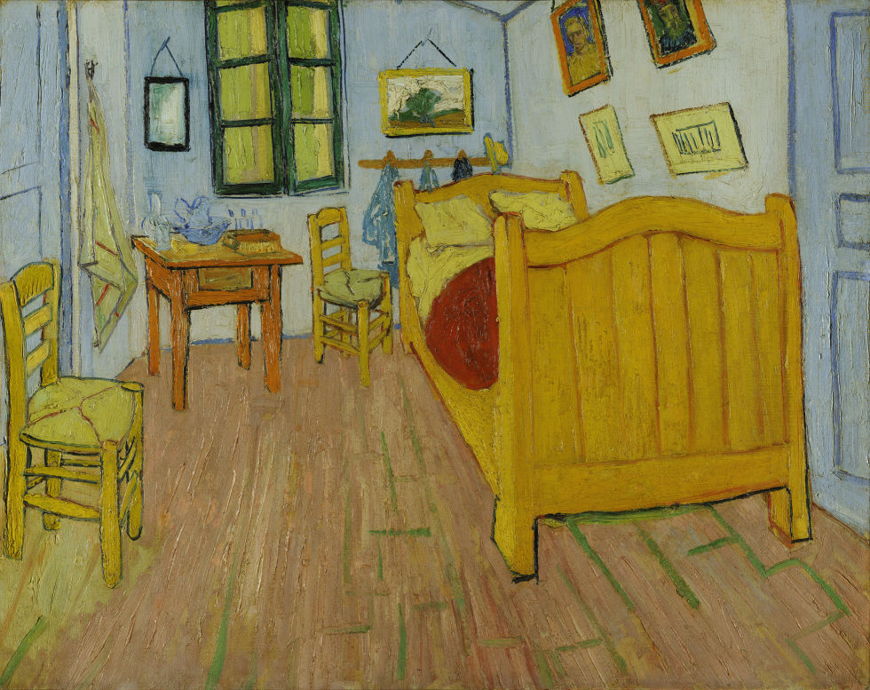
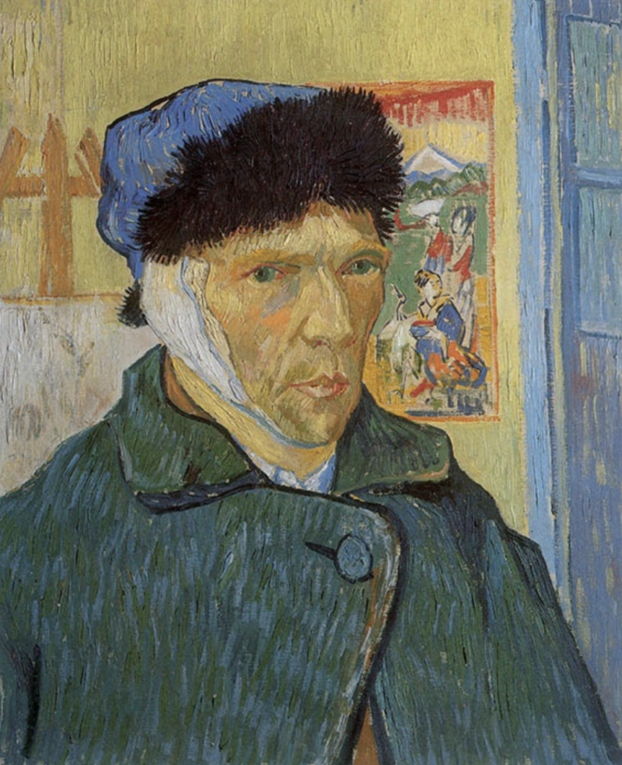
Readers will receive no prizes for guessing what they’ll find, broadly speaking, at the Van Gogh Museum. But they may well be surprised by the full scope of the Van Gogh and Van Gogh-related work and information on offer for their free perusal at the Van Gogh Museum’s online collection. Naturally, you can view and learn about all of the paintings and drawings by Vincent van Gogh in the collection, including some of his best-known pieces like The Potato Eaters, a scene of “the harsh reality of country life” the artist deliberately chose for its difficulty; The Bedroom (or Bedroom in Arles), with its bright colors “meant to express absolute ‘repose’ or ‘sleep’”; and, painted between 1886 and 1889, no fewer than 21 self-portraits, including Self-Portrait with Bandaged Ear, the face we think of when we think of van Gogh himself.
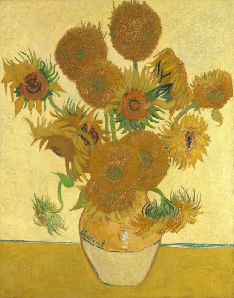
For van Gogh’s most famous series of floral still-life paintings the Van Gogh Museum’s online collection goes much deeper, offering an entire section of its site dedicated to “everything about Sunflowers.”
Among its subsections you’ll find the story of how van Gogh “painted sunflowers as no one before him had ever done,” a look into the conservation of one of the most fragile of the artist’s masterpieces, and even a for-the-young-and-young-at-heart Sunflowers coloring-book page. If you get through all that and still feel your appetite for post-impressionist renderings of Helianthus not fully satiated, the collection’s curators also offer a link to van Gogh’s other depictions of sunflowers, from Shed with Sunflowers to Sunflowers Gone to Seed.
Online or off, collections dedicated to the work of a single artist sometimes suffer tunnel vision, providing a wealth of detail about the life and the masterpieces, but little in the way of context. The Van Gogh Museum doesn’t, having put on view not just van Gogh’s work, but also that of the Japanese woodblock makers from whom he drew inspiration (previously featured here on Open Culture) as well as that of more recent artists who have drawn their own inspiration from van Gogh: Britain’s Jason Brooks, China’s Zeng Fanzhi, and the Netherlands’ own Pieter Laurens Mol, to say nothing of the likes of Edvard Munch and Francis Bacon. Elsewhere you can even explore “the Parisian print world of the 19th century,” a “period of artistic innovation and decadence” that did more than its part to shape van Gogh’s sensibility. As the Van Gogh Museum clearly understands, to know an artist requires immersing yourself not just in their work, but in their world as well. Enter the van Gogh online collection here.
Related Content:
Download Hundreds of Van Gogh Paintings, Sketches & Letters in High Resolution
13 of Van Gogh’s Paintings Painstakingly Brought to Life with 3D Animation & Visual Mapping
Van Gogh’s Ugliest Masterpiece: A Break Down of His Late, Great Painting, The Night Café (1888)
Based in Seoul, Colin Marshall writes and broadcasts on cities, language, and culture. His projects include the book The Stateless City: a Walk through 21st-Century Los Angeles and the video series The City in Cinema. Follow him on Twitter at @colinmarshall or on Facebook.