Wes Anderson’s immaculately art-directed, immediately recognizable films may take place in a reality of their own, but that doesn’t mean a reality with no connection to ours. To go by their results, the director of The Life Aquatic, Moonrise Kingdom, and The Grand Budapest Hotel (to name only three of his most visually distinctive pictures) and his collaborators have clearly immersed themselves in the very real history of the West in the twentieth century, drinking deeply of its fashion, its architecture, and its industrial and graphic design.

So no matter how fanciful his constructed settings — The Royal Tenenbaums’ dream of New York City, The Darjeeling Limited’s train crossing India in quirky old-school splendor, The Grand Budapest Hotel’s unspecific Alpine mitteleuropa — Anderson always assembles them from precedented elements.
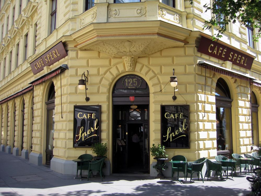
And so the habitués of a subreddit called Accidental Anderson have set out to post pictures of his sources, or places that might well pass for his sources, all over not just Europe, of course — where they found the Viennese cafe at the top of the post and the Berliner delivery van with wagon just above — but America, Asia, the Middle East, and elsewhere.
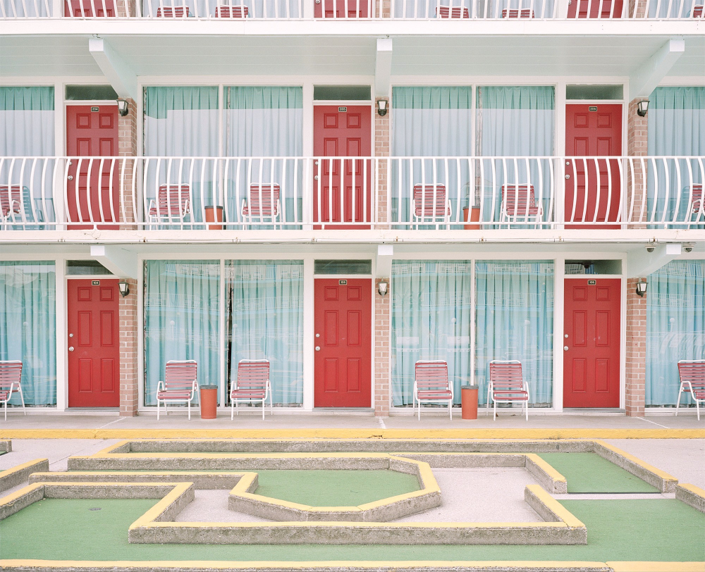
Much of a location’s accidental Andersonian potential comes down to its geometry and its colors: deep reds, bright yellows, and especially pale pinks and greens. Many of Anderson’s preferred hues appear in the Gold Crest Resort Motel just above, which may strike a fan as having come right out of an Anderson picture even more so than the motel he actually used in his debut feature Bottle Rocket. The director has since moved on to much finer hostelries, which thus form a strong thread among Accidental Anderson’s popular postings: Florida’s Don CeSar Hotel (known as the “Pink Lady”), Cuba’s Hotel Saratoga, Switzerland’s Hotel Belvédère, Italy’s Grand Hotel Misurnia.
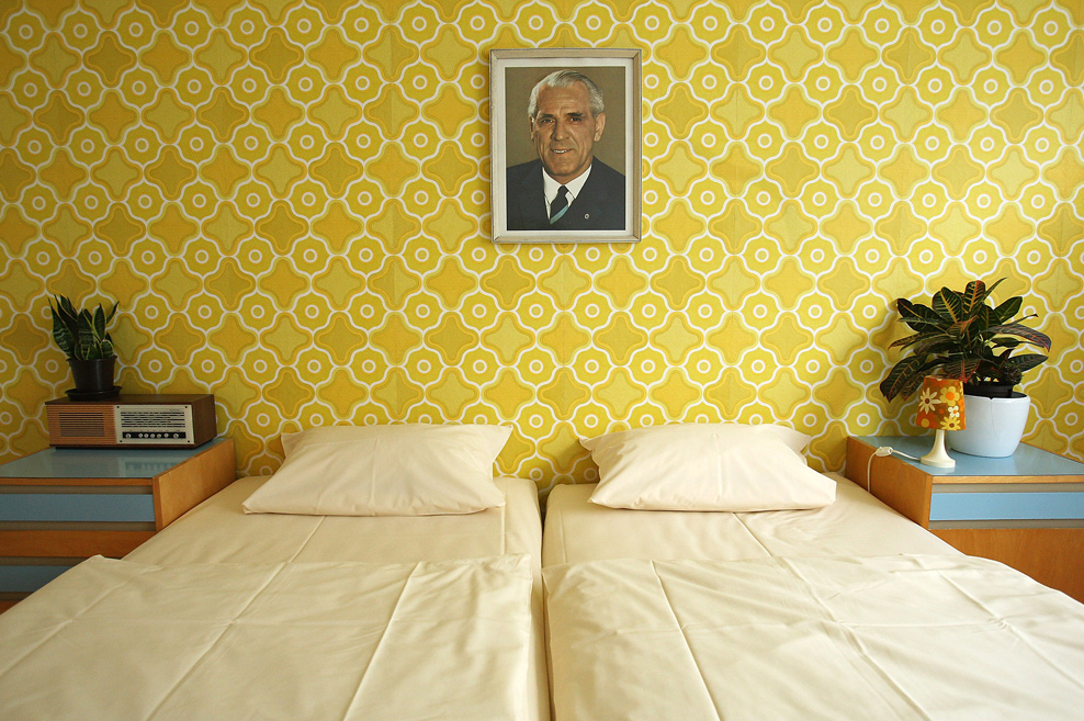
Berlin’s humbler Ostel, a themed tribute to the design sensibilities of the former East Germany, might also resonate with the ever-deepening historical consciousness of Anderson’s movies. (Remember The Grand Budapest Hotel’s titular building, sadly redone in a utilitarian, faintly Soviet avocado-and-ochre during the film’s 1960s passages.)
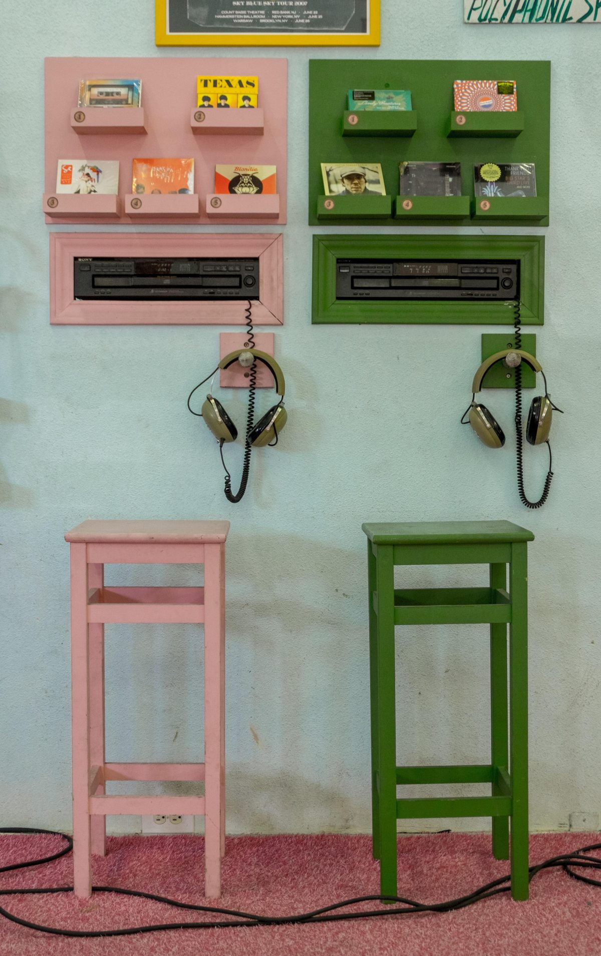
To think that Anderson came from a place no less impossibly distant from the realm of midcentury Europe than Texas, home of the Dallas music store pictured below. Given his increasing popularity, it’s hardly a surprise to see his signature aesthetic being not just reflected but adopted around the world. If life continues to imitate art, Accidental Anderson’s contributors will long have their work cut out for them. Pay a visit to Accidental Anderson here.
Related Content:
Wes Anderson Movie Sets Recreated in Cute, Miniature Dioramas
The Perfect Symmetry of Wes Anderson’s Movies
The Geometric Beauty of Akira Kurosawa and Wes Anderson’s Films
Wes Anderson Likes the Color Red (and Yellow)
Based in Seoul, Colin Marshall writes and broadcasts on cities and culture. He’s at work on the book The Stateless City: a Walk through 21st-Century Los Angeles, the video series The City in Cinema, the crowdfunded journalism project Where Is the City of the Future?, and the Los Angeles Review of Books’ Korea Blog. Follow him on Twitter at @colinmarshall or on Facebook.


