Behold, the ingenious underground bicycle storage of Japan! What a vision of futurist efficiency — the only thing missing is Raymond Scott’s Powerhouse (aka Bugs Bunny factory music).
Japanese cultural commentator Danny Choo strapped a camera to his seat to capture a bike’s eye view of the robotic Eco Cycle Anti-Seismic Underground Bicycle Park. It takes an average of 8 seconds for two-wheelers to make the journey — human involvement stops at the street level card reader.
(One internet commenter wondered what happens if the system malfunctions…and all I can say is I once spent what felt like an eternity, trapped in Disney’s Haunted Mansion.)
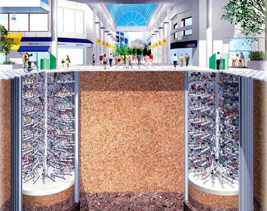
As futuristic visions go, it’s a finite one. The environmentally-friendly design allows for fairly easy de-installation, should public demand for safe, subterranean bike parking wane.
It’s also earthquake-proof, a feature which gives rise to all sorts of dystopian Planet of the Apes-style fantasies (replace Apes with Bikes).
Cities from London and Paris to New York and Hangzhou have embraced bikesharing schemes, but the Japanese model allows cyclists to keep their own rides. Signs posted at street level remind riders to remove personal effects like pets (!) before using the system.) Unlimited parking and retrieval comes in at under 20 bucks a month.
It’s an idea whose time has come. As of this writing, the cycle-friendly Netherlands is plotting the world’s largest bike park — underderground — to be launched in 2018.
Hat tip to Danny Choo.
- Ayun Halliday is an author, illustrator, and Chief Primatologist of the East Village Inky zine. Follow her @AyunHalliday
Related Content:
Turn Your Bike into an Electric Hybrid with MIT’s “Copenhagen Wheel”
How Leo Tolstoy Learned to Ride a Bike at 67, and Other Tales of Lifelong Learning