In a new video by Tested, Adam Savage (model maker, industrial designer and television personality) shows you how to build a replica of the space rifle from the 1968 sci-fi film Barbarella. To design the replica, Savage had only one document to work with — a photograph showing Jane Fonda holding the gun, which originally appeared on the cover of a 1968 issue of LIFE Magazine. The 77-minute video above takes you inside Savage’s build process, moving from start to finish. If DIY is your thing, you won’t want to miss it.
Yet when Bass got a chance to actually direct, he didn’t make slick movies with simple plots and great visuals, as you might expect. Instead, he made profoundly trippy movies with great visuals. His one and only feature film, Phase IV(1974), is a deeply weird movie about evolution. Think of it as a low-budget 2001: A Space Odyssey. With ants. The movie was butchered by scared distributors and consequently, it bombed at the box office. Almost a decade later, Bass, along with his second wife Elaine, made a short film called Quest, based on Ray Bradbury’s story “Frost and Fire.” You can watch it here.
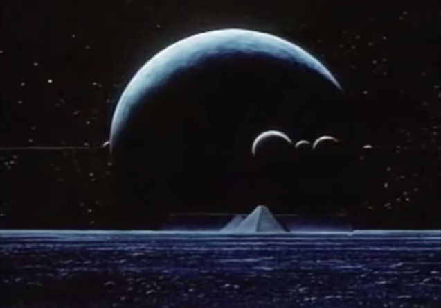
The film centers on a tribe of robe-sporting people who live for only a mere eight days. If you’re an infant on a Monday, you will be elderly by the time the next Monday rolls around. At the opening, a nameless child is born as his elders ask in hushed tones, “Is this the one?” Of course he is. The reason he and his tribe have a shorter shelf life than grocery store sushi has something to do with a gate that blocks life sustaining light. “Beyond the great gate,” intones one elder, “people live 20,000 days or more.” The problem is that gate is five or so days away by foot.
So after a very brief training montage, the youth sets off across strange and fanciful landscapes that recall Yes album covers. Along the way, he faces down a beast that looks like a bear crossed with a lamprey, plays a video game with a Yeti on top of a ziggurat, and stumbles across a wizened old man who only the previous week was the tribe’s golden boy.
The movie is incredibly, hilariously dated, so much so that it goes right past kitsch into something close to sublime. If you remember watching, and loving, The Dark Crystal, Beast Master, Krull and Tron in your youth, you must check this out.
Jonathan Crow is a Los Angeles-based writer and filmmaker whose work has appeared in Yahoo!, The Hollywood Reporter, and other publications. You can follow him at @jonccrow. And check out his blog Veeptopus, featuring lots of pictures of badgers and even more pictures of vice presidents with octopuses on their heads. The Veeptopus store is here.
You might think that a movie about information from 1953 couldn’t possibly be relevant in the age of iPhone apps and the Internet but you’d be wrong. A Communications Primer, directed by that power couple of design Charles and Ray Eames, might refer to some hopelessly quaint technology – computer punch cards, for instance – but the underlying ideas are as current as anything you’re likely to see at a TED talk. You can watch it above.
In fact, the film made for IBM was the result of the first ever multi-media presentations that Charles Eames developed for the University of Georgia and UCLA. Using slides, music, narration and film, Eames broke down some elemental aspects of communications for the audience. Central to the film is an input/output diagram that was laid out by Claude Shannon, the father of information theory, in his 1949 book, The Mathematical Theory of Communication. As the perhaps overly soothing narrator intones, any message is transmitted by a signal through a channel to its receiver. While in the channel, the signal is altered and degraded by noise. The key to effective communication is to reduce “noise” (construed broadly) that interferes with the message and to generally simplify things.
The issue of signal vs noise is probably more relevant now in this age of perpetual distraction than it was during the Eisenhower administration. Every email, text message or Buzzfeed article seen individually is clearly a signal. Yet for someone trying to work, say on an article about a short film by Charles and Ray Eames, they are definitely noise.
The Eames use the terms “signal,” “noise,” and “communication” quite broadly. Not only do they use these terms to describe, say, a radio broadcast or a message being relayed by Morse code but also the creation of architecture, design and even visual art.
The source of a painting is the mind and experience of the painter. Message? His concept of a particular painting. Transmitter? His talent and technique. Signal? The painting itself. Receiver? All the eyes and nervous systems and previous conditioning of those who see the painting. Destination? Their minds, their emotions, their experience. Now in this case, the noise that tends to disrupt the signal can take many forms. It can be the quality of the light. The color of the light. The prejudices of the viewer. The idiosyncrasies of the painter.
Of course, a painting — or a poem, or a film by Andrei Tarkovsky — is a different kind of signal than an email. It’s message is multilayered and multivalent. And while a generation of cultural theorists would no doubt chafe at Eames’s reductive, Modernist view of art, it is still interesting to think of a painting in the same manner as smoke signals.
The film’s narrator continues:
But besides noise, there are other factors that can keep information from reaching its destination in tact. The background and conditioning of the receiving apparatus may so differ from that of the transmitter that it may be impossible for the receiver to pick up the signal without distortion.
That’s about as good a description of cable new pundits as I’ve ever seen.
Jonathan Crow is a Los Angeles-based writer and filmmaker whose work has appeared in Yahoo!, The Hollywood Reporter, and other publications. You can follow him at @jonccrow. And check out his blog Veeptopus, featuring lots of pictures of vice presidents with octopuses on their heads. The Veeptopus store is here.
From the layman’s perspective, the project above starts with a bit of self-mythologizing.
Bassett & Partners, the “award-winning, disruptive brand and design strategy firm” and maker of the video above, seems not to subscribe to TED-Ed’s practice of educating viewers from the get-go.
A couple of minutes in, I hit pause in order to do a little research on the word “brief.”
I’m familiar with male underpants (though technically those are plural, even if the garment is singular).
I have the average moviegoers handle on the meaning of legal briefs.
And now I know what the noted architects, illustrator, designer, and ad execs are talking about above! If only they’d referred to it as an elevator pitch, I’d have been on board from the start. Of course, why would they? Only those of us who want to sound all Hollywood call it that.
…without (as per ad exec John Boiler) dictating creative terms. Of all the interviewees, the trucker hatted Boiler exudes the schmooziest, most off-putting Hollywood vibe. I’d rather do lunch with Frank Gehry. Does this make me guilty of comparing apples to oranges, when director (and “disruptive brand and design” strategist) Tom Bassett leveled the playing field by giving them equal time?
Perhaps if Boiler had humbled himself by sharing an experience as heartbreaking as Gehry’s ill-fated Eisenhower Memorial. (Skip ahead to the 16:16 mark if you want to hear how outside opinion can pound context, research, poetry, and many months of thoughtful work to a heap of rubble.)
I love Maira Kalman, but remain unclear as to whether she’s fielding or submitting briefs. If the latter, how do those differ from book proposals?
What if the emotion, creativity, and enthusiastic research that went into Nike’s 1996 Olympics ads resulted in an equally fierce campaign to end hunger in a country with no Olympic teams?
What if the client’s problem was cancer? Could the brief demand a cure? That sounds simple.
Let us acknowledge that most grand scale visions require a fleet of underlings to come to fruition. I wonder what plumbers and electricians would make of seeing their contributions described in such poetic terms. Never underestimate the power of a soundtrack.
To be a New Yorker is to be a gourmand—of food carts, local diners, supermarkets, outer borough mercados, whatever latest upscale restaurant surfaces in a given season.… It is to be as likely to have a menu in hand as a newspaper, er… smartphone…, and it is to notice the design of said menus. Well, some of us have done that. Often the added attention goes unrewarded, but then sometimes it does. Now you, dear reader, can experience well over one-hundred years of staring at menus, thanks to the New York Public Library’s enormous digitized collection. Fancy a time warp through dining halls abroad? You’ll not only find several hundred New York restaurants represented here, but hundreds more from all over the world. With a collection of 17,000 menus and counting, a person could easily get lost.
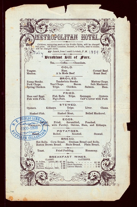
You may notice I used the word “gourmand,” and not “foodie” above. While it might be a gross anachronism to call someone a “foodie” in 1859, the year the menu for the Metropolitan Hotel (above) was printed, it might also import a cosmopolitan concept of dining that didn’t seem to exist, at least at this establishment. More than anything, the menu resembles the various descriptions of pub food that populate Joyce’s Ulysses. Though much of it was delicious, I’m sure, for heavy eaters of meat, eggs, potatoes, and bread, you won’t find a vegetable so much as mentioned in passing. The fare does include such hearty staples as “Hashed Fish,” “Stale Bread,” and “Breakfast Wine.” The design marries flowery Victorian elements with the kind of font found in Old West typesets.
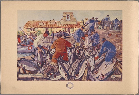
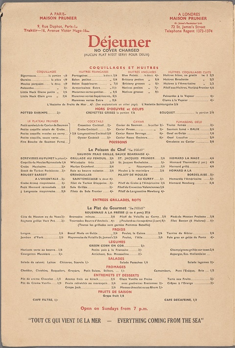
1939 was a good year for menus, at least in Europe. While New York institutions like the Waldorf Astoria practiced certain design austerities, the Maison Prunier, with locations in Paris and London, spared no expense in the printing of their full-color fishermans’ slice of life painting on the menu cover above and the elegant typography of its extensive contents below. A version was printed in English—though The New York Public Library (NYPL) doesn’t seem to have a copy of it digitized. One English phrase stands out at the bottom, however: the translation of “Tout Ce Qui Vient De La Mer–Everything From the Sea.” Other menus for this restaurant show the same kind of careful attention to design. Clicking on the pages of many of the NYPL menus—like this one from a 1938 Maison Prunier menu—brings up an interactive feature that links each dish to close-up views.
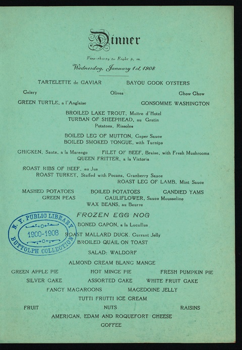
In a post on the NYPL menu collection, Buzzfeed specifically compares New York menus of today with those of 100 years ago, noting that prices quoted signify cents, not dollars. A 1914 Delmonico “Rib of Roast” would run you .75 cents, for example, while a 2014 rib eye there sells for 58 big ones. Of course then, as now, many restaurants considered it gauche to print prices at all. See, for example, the dinner menu at New Orleans’ St. Charles Hotel from 1908 below. We may have an all-inclusive feast here since this comes from a New Years Eve bill, which also includes a “Musical Program” in two parts and a list of local “Amusements” at such places as Blaney’s Lyric Theatre, Tulane, Dauphine, “French Orera” (sic), and the 2:00 pm races at City Park. Matinees and 8 o’clock shows every day except Sunday.
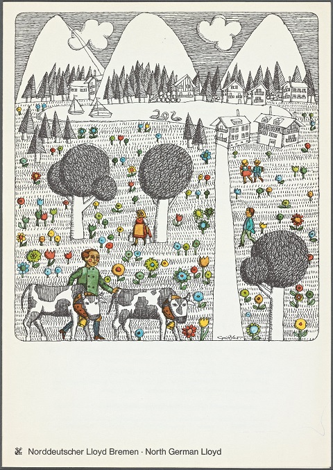
The sixties gave us an explosion of menus that parallel in many cases the breakout designs of magazine and album covers. See two standouts below. The North German Lloyd, just below, went with a funky children’s book-cover illustration for its 1969 menu cover, though its interior maintains a minimalist clarity. Below it, see the striking first page of a menu for Johnny Garneau’s Golden Spike from that same year. The cover boasts a nostalgic headline story for Promontory News: “Golden Spike is Driven: The last rail is laid! East meets West in Utah!” Put it on the cover of a Band or CSNY album and no one bats an eye.
See many, many, many more menus at the NYPL site. With the steady growth of food scholarship, this collection is certainly a boon to researchers, as well as curious gourmands, foodies, and rabid diners of all stripes.
Living in Los Angeles, I suppose I could go up and have a look (albeit a distant one) at Charles and Ray Eames’ Eames House any time I like. But I’ve never got around to visiting that most notable of all works of midcentury modern California architecture, since I have another example of their era- (and coast-) defining design much closer at hand. Whenever I look to my left, I see an Eames’ Lounge Chair — not my Eames Lounge Chair, per se, but the one my girlfriend brought with her when we moved in together. Much more than the sum of its molded plywood and leather parts, the Eames Chair made even more of a mark on the design sensibility of the 20th century than did the Eames House. Could the Eamses themselves have known, when they first rolled it out in 1956, that the chair would remain unsurpassed in its furniture niche more than 55 years later? Watch them debuting the Eames Chair on TV, to Home Show host Arlene Francis,and see if you can read it between the lines.
We first see the Eames Chair only in silhouette — but already we recognize it. “Well, that is quite a departure, Charles, and it looks wonderfully comfortable,” says host to designer. He takes the question quite literally: “It’s rosewood, plywood, and it’s black leather, and its insides are all feathers and down. I think it’d be a better idea if we would just build it for you right here.” We then see a short film, produced in a combination of live action and stop motion, showing the complete assembly and subsequent disassembly of an Eames Chair. It also includes the packing of its parts into a box with the logo of Herman Miller, the company for whom the Eames originally designed it, and one that, so Charles says, allowed them seemingly complete aesthetic independence, dependent on no specific market or season. Hence the range of timeless Eames-designed chairs displayed on the segment that reveal the design evolution leading up to the Eames Chair itself, the most timeless of them all. “You really create your own market, don’t you?” Francis asks. Charles remains modest (and Ray has already exited stage left), but on some level must have understood that every important designer does just that.
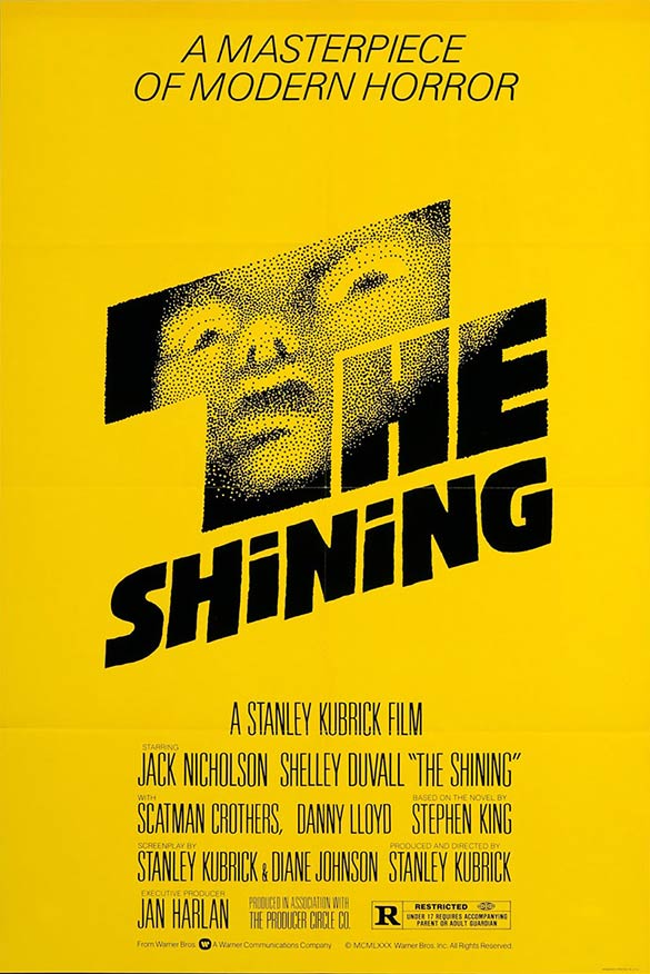
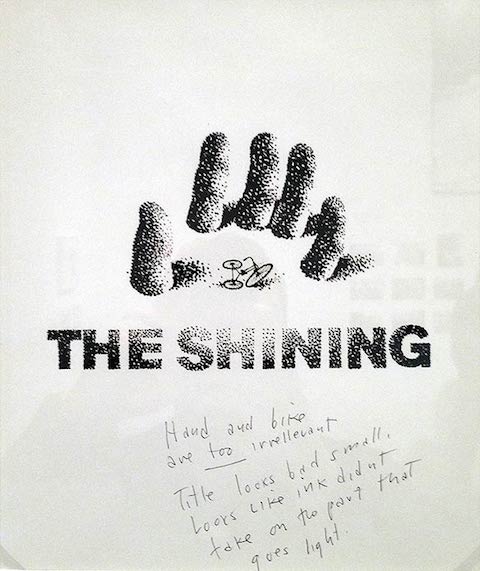
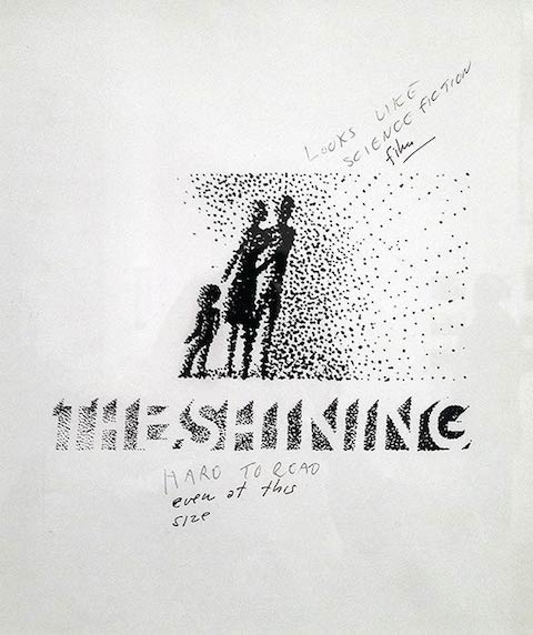
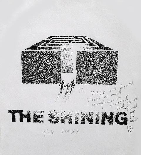
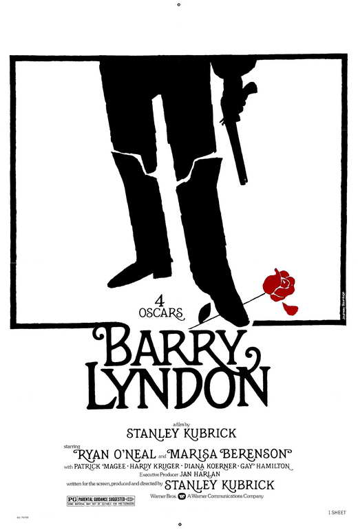
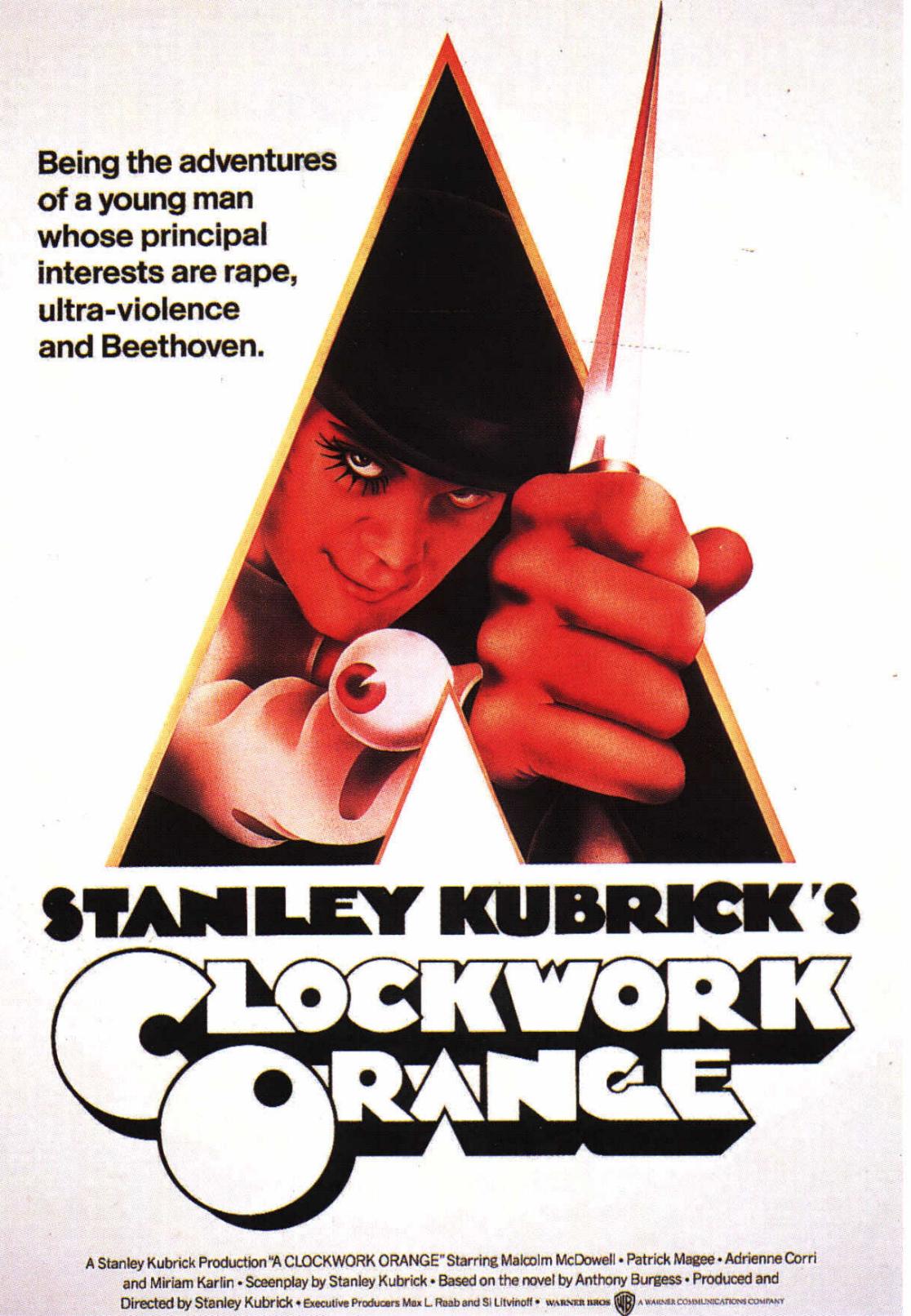
Stanley Kubrick’s perfectionism extended well beyond his films themselves. He even took pains to ensure the promotion of his projects with posters as memorable as the actual experience of watching them. The poster for Barry Lyndonremains perhaps the most elegant of all time, and who could forget the first time A Clockwork Orange’s promised audiences (or threatened audiences with the promise of) “the adventures of a young man whose principal interests are rape, ultra-violence, and Beethoven”? Though less often seen today, the bright yellow original poster for The Shining, with that unidentified pointillist face and its expression of shock, may well unsettle you more than even the film itself.
It came from the office of famous graphic designer Saul Bass, known not just for storyboarding Kubrick’s Spartacus but for creating the title sequences for movies like Otto Preminger’s The Man with the Golden Arm and Alfred Hitchcock’s Vertigo (whose poster Bass also designed), North by Northwest, and Psycho (whose immortal “shower scene” Bass may also have come up with). Kubrick rightly figured Bass had what it took to deliver the considerable impact of his psychological horror picture in graphic form.
“This poster design wasn’t a ‘design and done’ deal however,” writes Derek Kimball in a DesignBuddy post on the evolution of the image. “Many of Bass’ concepts were rejected by Kubrick before settling on the final design.” You can see three of them here in this post, and the rest there. Each one includes Kubrick’s handwritten notes of objection: “hand and bike are too irrelevant,” “title looks bad small,” “too much emphasis on maze,” “looks like science fiction film,” “hotel looks peculiar.” You’ve got to admit that the man has a point in every case, although I suspect Bass knew in advance which design the auteur would, once through the wringer of revisions, have the least trouble with. “I am excited about all of them,” Bass writes, “and I could give you many reasons why I think they would be strong and effective identifiers for the film,” but one in particular, “provocative, scary, and emotional,” “promises a picture I haven’t seen before.”
You have to appreciate that kind of confidence in his team’s work when dealing with such a famously exacting client — and, looking at the letter itself, you really have to have to appreciate the kind of confidence it takes to sign your name with a caricature of your own face on the body of your namesake fish.
Some things are difficult to improve upon. Take crayons. The new generation may be clamoring for shades like “mango tango” and “jazzberry jam” but the actual technology appears unchanged since Sesame Street detailed the process in the early 80s, in the lovely, non verbal documentary above. Not a product placement in sight, I might add, though few can mistake that familiar green and gold box.
Those who prefer a bit more explanation might prefer Fred Rogers’ hypnotic step-by-step guide, playing in perpetuity on Picture Picture.
By the time the industry’s giant gorilla got around to weighing in, the wooden collection boxes and analog counters had been replaced, but otherwise, it’s still business as usual on the ol’ crayon-manufacturing floor. Don’t expect to find the recipe for the “secret proprietary blend of pigments and other ingredients” any time soon. Just know they’re capable of cranking out 8500 crayons per minute. For those playing along at home, that’s enough to encircle the globe 6 times per calendar year, with a full third owing their existence to solar energy.
There’s a Homeland Security-ish vibe to some of the dialogue, but the Life of an American Crayon, above, does our native assembly lines proud. Prouder than the American slaughterhouse, anyway, or some other factory floors, I could name. The workers seem content enough to stay in their positions for decades, happily declaring allegiance to this or that hue.
We're hoping to rely on loyal readers, rather than erratic ads. Please click the Donate button and support Open Culture. You can use Paypal, Venmo, Patreon, even Crypto! We thank you!
Open Culture scours the web for the best educational media. We find the free courses and audio books you need, the language lessons & educational videos you want, and plenty of enlightenment in between.
