I like old newspaper, smoothing it out to read about what was happening on the day an older relative packed away the good crystal or some other fragile tchotchke.
Traveling in India, I dug how the snacks I purchased to eat on the train came wrapped in old book pages. When my traveling companion realized he had lost his journal, there was comfort in knowing that it would be reincarnated as cones to hold delicious chana jor garam.
Taking a thrift store frame apart, I was thrilled to discover that behind the previous owners kittens in a basket print lurked a homemade Mother’s Day card from the 40’s and a calendar page that noted the date someone named David quit drinking. (I sent it along to Found Magazine.)
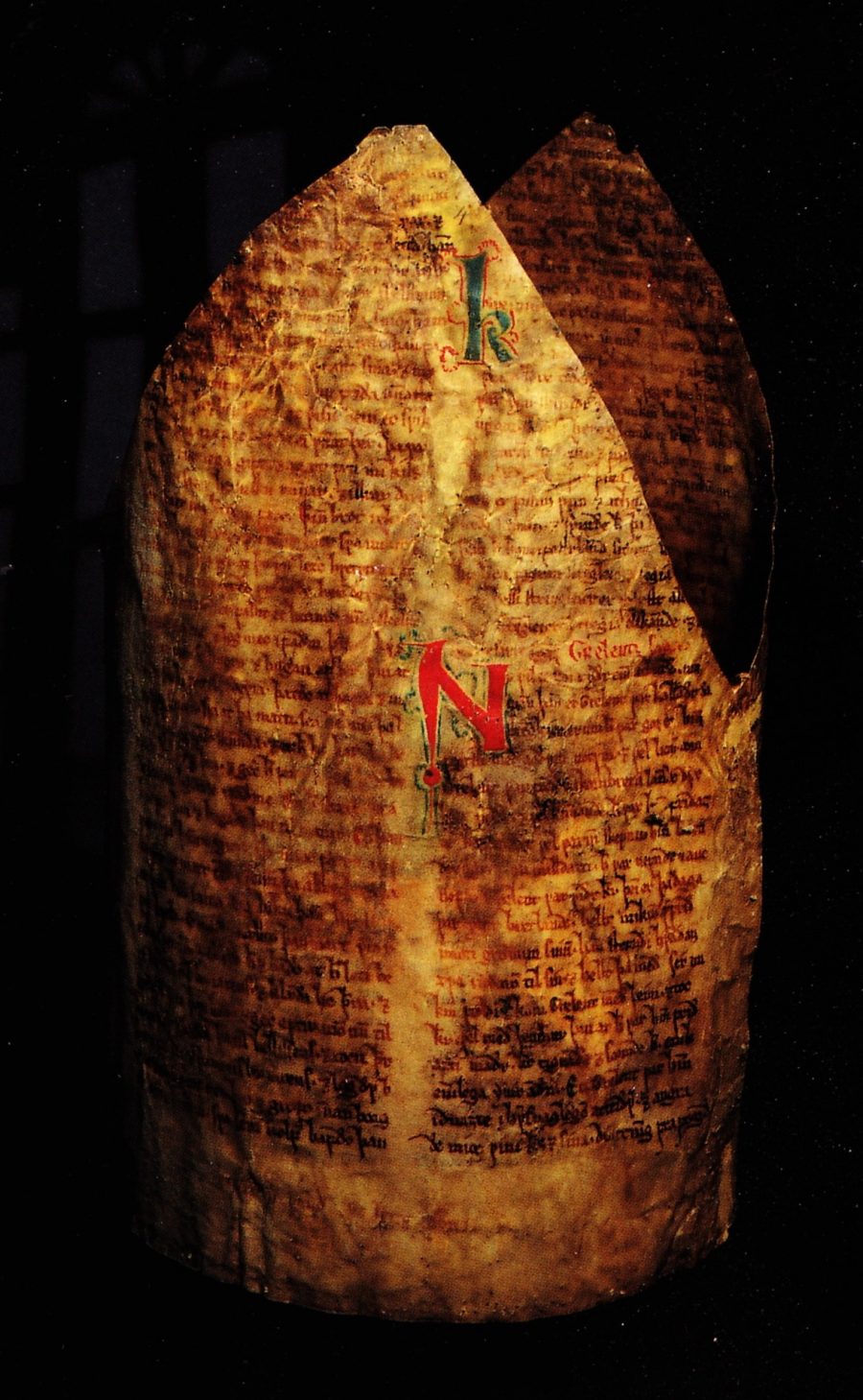
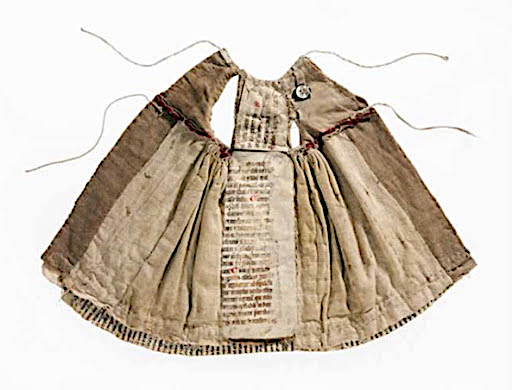
What I wouldn’t give to stumble upon a dress lined with a 13th-century manuscript. Or a bishop’s miter stiffened with racy 13th-century Norse love poetry!
Apparently, it’s a rich tradition, putting old pages to good use, once they start feeling like they’ve outlived their intended purpose. The bishop likely didn’t know the specifics on the material that made his hat stand up. I’ll bet the sisters of the German Cistercian convent where the dress above originated were more concerned with the outward appearance of the garments they were stitching for their wooden statues than the not-for-display lining.
As Dutch art historian Erik Kwakkel explains on his medievalfragments blog, the invention of the Gutenberg press demoted scads of handwritten text to more proletarian purpose. Ultimately, it’s not as grim as it sounds:
the dismembered books were to have a second life: they became travelers in time, stowaways… with great and important stories to tell. Indeed, stories that may otherwise not have survived, given that classical and medieval texts frequently only come down to us in fragmentary form. The early history of the Bible as a book could not be written if we were to throw out fragment evidence.
Related Content:
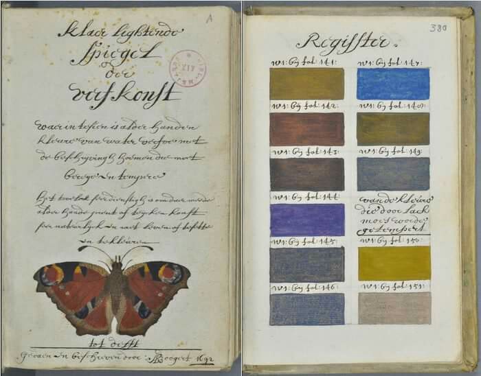
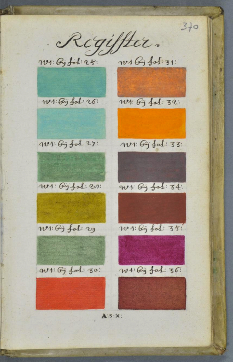
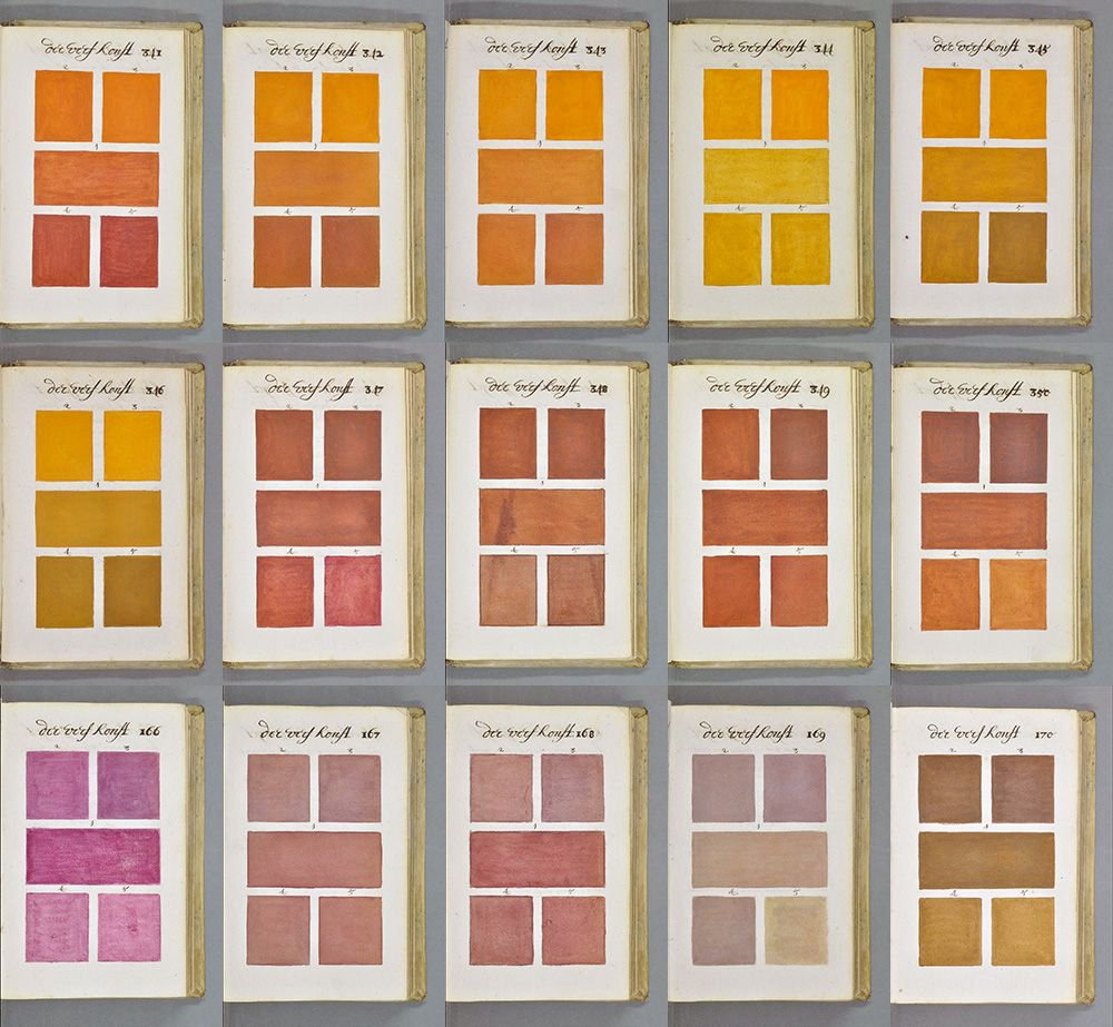
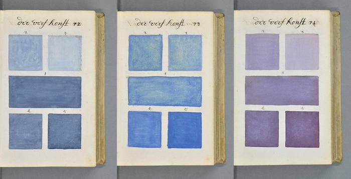
Dutch Book From 1692 Documents Every Color Under the Sun: A Pre-Pantone Guide to Colors
Archive of Handwritten Recipes (1600 – 1960) Will Teach You How to Stew a Calf’s Head and More
Ayun Halliday is an author, homeschooler and the Chief Primatologist of The East Village Inky zine. Follow her @AyunHalliday

