Keep copying those Sunday funnies, kids, and one day you may beat Al Jaffee’s record to become the Longest Working Cartoonist in History.
You’ll need to take extra good care of your health, given that the Guinness Book of World Records notified Jaffee, above, of his honorific on his 95th birthday.
Much of his legendary career has been spent at Mad Magazine, where he is best known as the father of Fold-ins.
Conceived of as the satirical inverse of the expensive-to-produce, 4‑color centerfolds that were a staple of glossier mags, the first Fold-In spoofed public perception of actress Elizabeth Taylor as a man-eater. Jaffe had figured it as a one-issue gag, but editor Al Feldstein had other ideas, demanding an immediate follow up for the June 1964 issue.
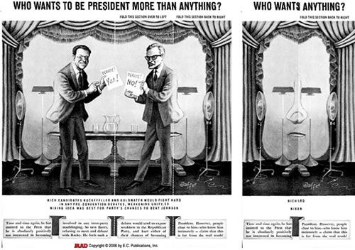
Jaffe obliged with the Richard Nixon Fold-in, which set the tone for the other 450 he has hand rendered in subsequent issues.
For those who made it to adulthood without the singular pleasure of creasing Mad’s back cover, you can digitally fold-in a few samples using this nifty interactive feature, courtesy of The New York Times.
With all due respect, it’s not the same, just enough to give a feel for the thrill of drawing the outermost panel in to reveal the visual punchline lurking within the larger picture. The print edition demands precision folding on the reader’s part, if one is to get a satisfactory answer to the rhetorical text posed at the outset.
Jaffe must be even more precise in his calculations. In an interview with Sean Edgar of Paste Magazine, he described how he turned a Republican primary stage shared by Nelson Rockefeller and Barry Goldwater into a surprise portrait of the man who would become president five years hence:
The first thing I did was draw Richard Nixon’s face, not in great detail, just a very rough establishment of where the eyes, nose and mouth would be, and the general shape. I did an exaggerated caricature of Nixon and then I cut it in half, and moved it apart. Once the face was cut in half, it didn’t have the integrity of a face anymore — it was sort of a half of face. Then I looked at what the eyes were like, and I said, ‘what can I make out of the eyes?’ He had these heavy eyebrows. I played around with many things, but I had to keep in mind all the time what the big picture was. So there they (Goldwater and Rockefeller) were up on a stage somewhere, doing a debate, and I thought, ‘What kind of stage prop can I put alongside these guys that would seem natural there?’ I decided that I could make eyes out of the lamps, and as far as the nose was concerned, that could come out of the figures — their clothing. Then I figured the mouth; I could use some sort of table that could give me those two sides. That’s how it all came about. You have to have some kind of visual imagination to see the possibilities. I had to concentrate on stuff that looked natural on a stage.
Each Fold-In is a reflection of the zeitgeist. Past preoccupations have included Vietnam, feminism, illegal drug use and, more recently, the Jersey Shore.
via Gothamist
Related Content:
A Gallery of Mad Magazine’s Rollicking Fake Advertisements from the 1960s
Watch Mad Magazine’s Edgy, Never-Aired TV Special (1974)
A Look Inside Charlie Hebdo, Their Creative Process & the Making of a Fateful Cartoon
Cartoonists Draw Their Famous Cartoon Characters While Blindfolded (1947)
Ayun Halliday is an author, illustrator, and Chief Primatologist of the East Village Inky zine. Follow her @AyunHalliday
