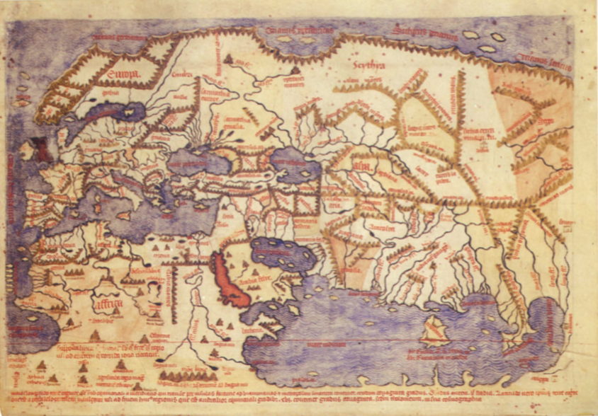
“Cartography was not born full-fledged as a science or even an art,” wrote map historian Lloyd Brown in 1949. “It evolved slowly and painfully from obscure origins.” Many ancient maps made no attempt to reproduce actual geography but served as abstract visual representations of political or theological concepts. Written geography has an ancient pedigree, usually traced back to the Greeks and Phoenicians and the Roman historian Strabo. But the making of visual approximations of the world seemed of little interest until later in world history. As “mediators between an inner mental world and an outer physical world”—in the words of historian J.B. Harley—the maps of the ancients tended to favor the former. This is, at least, a very general outline of the early history of maps.
The University of Chicago project, begun in the mid-80s, combines “essays based on original research by authoritative scholars with extensive illustrations of rare and unusual maps.” Unlike histories like Brown’s, however, this one aims to move beyond “a deeply entrenched Eurocentricity.” The project includes non-Western and pre-medieval maps, presenting itself as “the first serious global attempt” to describe the cartography of African, American, Arctic, Asian, Australian, and Pacific societies as well as European. In so doing, it illuminates many of those “obscure origins.”
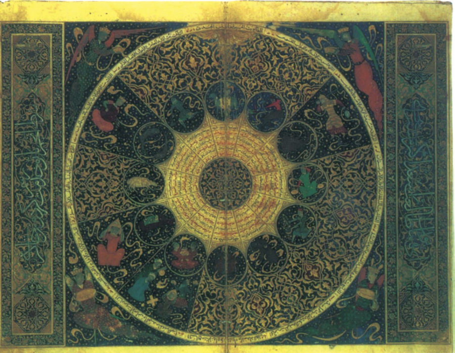
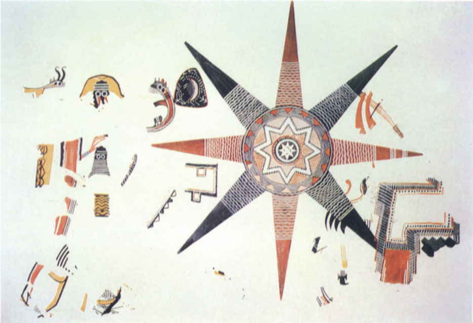
You might expect such an ambitious offering to come with an equally ambitious pricetag, and you’d be right. But rather than pay over $200 dollars for each individual book in the series, you can read and download Volumes One through Three and Volume Six as free PDFs at the University of Chicago Press’s site. In these extraordinary scholarly works, you’ll find maps reproduced nowhere else—like the Star Fresco from Jordan just above—with deeply learned commentary explaining how they correspond to very different ways of seeing the world.
At the links below, see images of maps from all over the globe and throughout recorded human history, and begin to see the history of cartography in very different ways yourself.
“Now when I was a little chap I had a passion for maps. I would look for hours at South America, or Africa, or Australia, and lose myself in the all the glories of exploration. At that time there were many blank spaces on the earth, and when I saw one that looked particularly inviting on a map (but they all look that) I would put my finger on it and say, ‘When I grow up I will go there.’”
—Joseph Conrad, Heart of Darkness
In his post-WWII historical survey, The Story of Maps, Lloyd A. Brown observes that “the very material used in the making of maps, charts and globes contributed to their destruction.” Paper burns, rots, succumbs to water-damage and insects. Maps and globes made from solid silver, brass, copper, and other metals made too-tempting targets for looters and thieves. In this way, maps serve doubly as symbolic indices of what they represent—lands that, in the very act of mapping them, were often despoiled, overrun, and stolen from their inhabitants.
Moreover, in mapping history, it often happened that “if a map were old and obsolete and parchment was scarce, the old ink and rubrication could be scraped off and the skin used over again. This practice, accounting for the loss of many codices as well as valuable maps and charts, at one time became so pernicious” that the Catholic Church issued decrees to forbid it. What better allegory for conquest, the wiping away of civilizations in order to write new names and borders over them?
The old imperial tropes of “blank spaces” on the map and “dark places of the earth” (like “darkest Africa”), used with such effectiveness in Joseph Conrad’s Heart of Darkness, hide the plain truth, in the words of Conrad’s Marlow:
The conquest of the earth, which mostly means the taking it away from those who have a different complexion or slightly flatter noses than ourselves, is not a pretty thing when you look into it too much. What redeems it is the idea only. An idea at the back of it; not a sentimental pretence but an idea; and an unselfish belief in the idea—something you can set up, and bow down before, and offer a sacrifice to.…
Blank spaces represent those areas that had not yet been forcibly brought into the European economy of property, the sine qua non of Enlightenment humanity. “Once discovered by Europeans,” writes historian Michel-Rolph Trouillot—once classified, mapped, and made subject, “the Other finally enters the human world.” For several decades now, postcolonial projects have engaged in the progressive disenchantment of “the idea,” in the recognition of messy relationships between naming, mapping, and power, and the recovery, to the extent possible, of the names, borders, and identities beneath palimpsest histories.
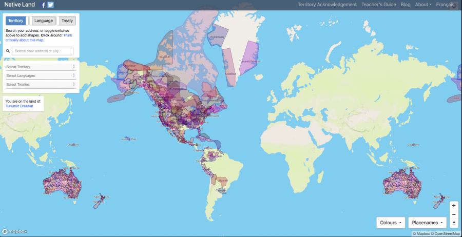
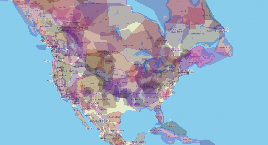
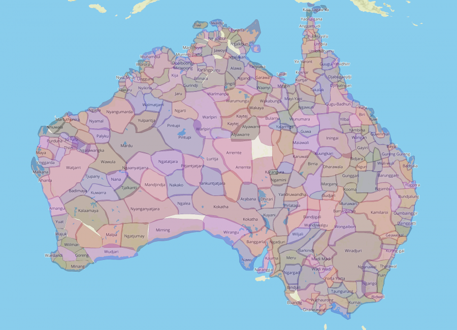
Such projects proliferate outside academia as technology amplifies previously unheard dissenting voices and perspectives and as, to use an old postcolonial phrase, “the empire writes back”—or, in this case, “maps back.” Such is the intent of the online project Native Land, an interactive website that “does the opposite” of centuries of colonial mapping, writes Atlas Obscura, “by stripping out country and state borders in order to highlight the complex patchwork of historic and present-day Indigenous territories, treaties, and languages that stretch across the United States, Canada,” the Canadian Arctic, Greenland, and Australia.
Also a mobile app for Apple and Android, the map allows visitors to enter street addresses or ZIP codes in the search bar, “to discover whose traditional territory their home was built on.”
White House officials will discover that 1600 Pennsylvania Avenue is found on the overlapping traditional territories of the Pamunkey and Piscataway tribes. Tourists will learn that the Statue of Liberty was erected on Lenape land, and aspiring lawyers that Harvard was erected in a place first inhabited by the Wamponoag and Massachusett peoples.
The map was created by Canadian activist and programmer Victor Temprano, founder of the company Mapster, which funds the project. Temprano prefaces the Native Land “About” page with a disclaimer: “This is not an academic or professional survey,” he writes, and is “constantly being refined from user input.” He defines his purpose as “helping people get interested and engaged” by asking questions like “who has the right to define where a particular territory ends, and another begins?”
As neo-colonial projects like oil pipelines once again threaten the survival of Indigenous communities, and indigenous people find themselves and their children caged in prisons for crossing militarized national borders, such questions could not be more relevant. Temprano does not make any claims to definitive historical accuracy and points to other, similar projects that supplement the “blank spaces” in his own online map, such as huge areas of South America being re-mapped on the ground by Amazonian tribes entering field data into smart phones, and Aaron Capella’s Tribal Nations Maps, which offers attractive printed products, perfect for use in classrooms.
Temprano quotes Capella in order to illuminate his work: “This map is in honor of all the Indigenous Nations [of colonial states]. It seeks to encourage people—Native and non-Native—to remember that these were once a vast land of autonomous Native peoples, who called the land by many different names according to their languages and geography. The hope is that it instills pride in the descendants of these People, brings an awareness of Indigenous history and remembers the Nations that fought and continue to fight valiantly to preserve their way of life.”
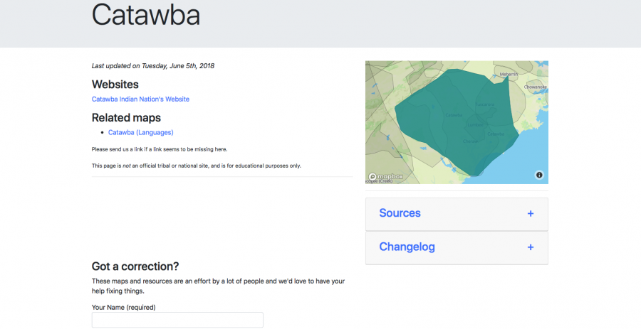
Visit Native Land here and enter an address in North or South America or Australia to learn about previous or concurrent Native inhabitants, their languages, and the historical treaties signed and broken over the centuries. Clicking on the territory of each Indigenous nation brings up links to other informative sites and allows users to submit corrections to help guide this inclusive project toward greater accuracy.
The site also features a Teacher’s Guide, Blog by Temprano, and a page on the importance of Territory Acknowledgement, a way for us to “insert an awareness of indigenous presence and land rights in everyday life,” and one of many “transformative acts,” as Chelsea Vowel, a Métis woman from the Plains Cree writes, “that to some extent undo Indigenous erasure.”
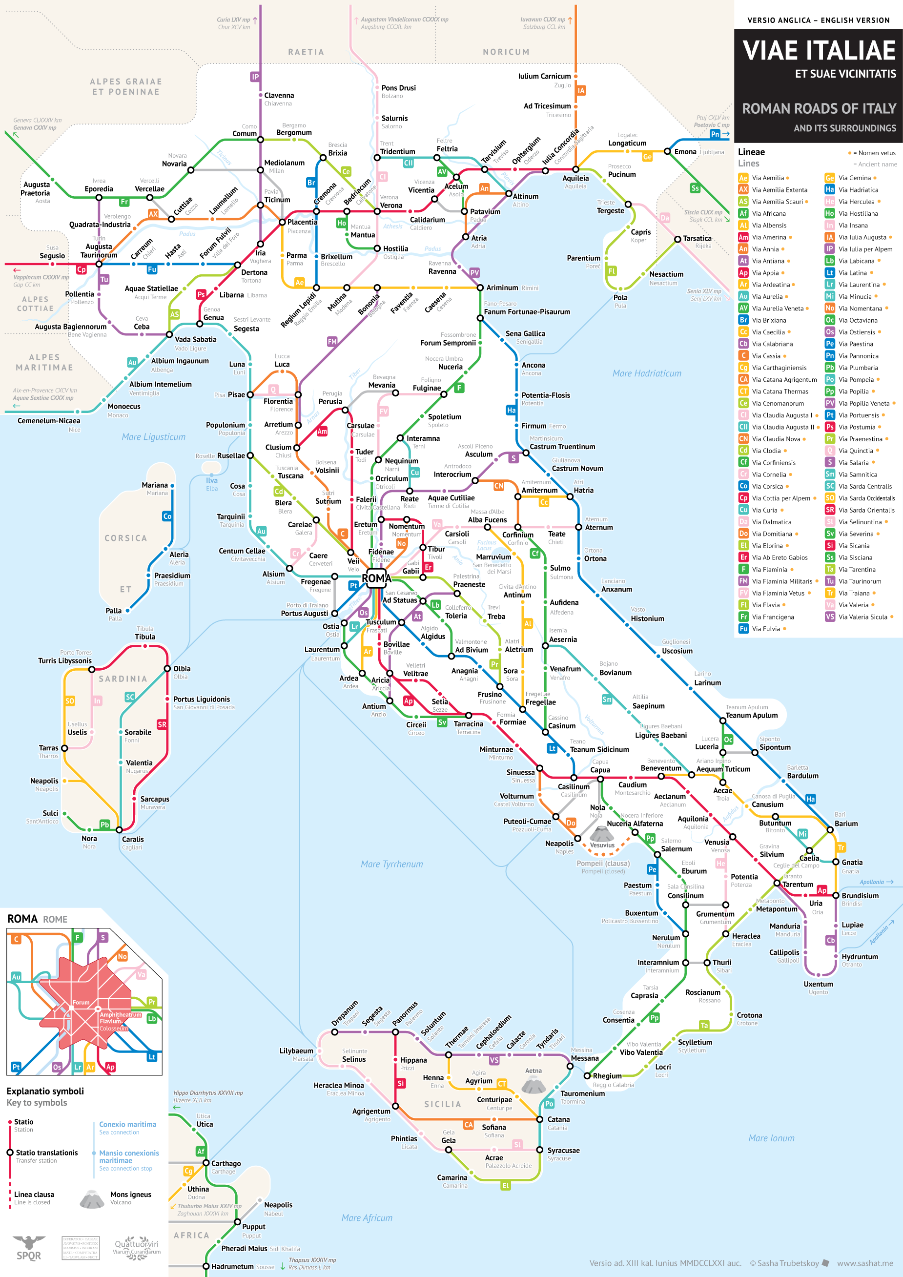
At its peak around the year 117 AD, the mighty Roman Empire owned five million square kilometers of land. It ruled more than 55 million people, between a sixth and a quarter of the population of the entire world. The empire, as classicist and historian Christopher Kelly describes it, “stretched from Hadrian’s Wall in drizzle-soaked northern England to the sun-baked banks of the Euphrates in Syria; from the great Rhine-Danube river system, which snaked across the fertile, flat lands of Europe from the Low Countries to the Black Sea, to the rich plains of the North African coast and the luxuriant gash of the Nile Valley in Egypt.” All that power, of course, originally emanated from Italy.
The builders of the Roman Empire couldn’t have pulled it off without serious infrastructural acumen, including the skill to make concrete that lasts longer than even the modern variety as well as the forcefulness and sheer manpower to lay more than 400,000 kilometers of road.
“It was fortunate enough that Italy’s Roman roads are quite well-studied and documented, especially when it comes to their actual ancient names,” Trubetskoy writes of this latest project. “This meant that I had to do less artistic interpretation in order to make this look like a sensible, modern chart. That said, there are still some cases where I had to creatively reconstruct certain roads, and I make it clear in the legend which roads those were.” As for the color-coded sidelining of Sicily and Sardinia, “this is a map of Italia (Italy) as the Romans saw it, which did not include those islands. On the other hand, it did include parts of what are today Slovenia and Croatia.”
You can buy a high-resolution version of Trubetskoy’s Viae Italiae et Suae Vicinitatis, or Roman Roads of Italy and Its Surroundings, for $9.00 USD at his site. Printed at poster quality, it could make a suitable gift indeed for any of the cartography enthusiasts, historically minded transit fans, Roman Empire history buffs, or Italian patriots in your life. And in a way, it shows history coming full circle, since much of our sense of how subway maps should look comes from a revolutionary 1972 map of the New York subway system. We’ve featured it before here on Open Culture, alongside an interview with its designer, a certain Massimo Vignelli. And where do you suppose he hailed from?
Based in Seoul, Colin Marshall writes and broadcasts on cities and culture. His projects include the book The Stateless City: a Walk through 21st-Century Los Angeles and the video series The City in Cinema. Follow him on Twitter at @colinmarshall or on Facebook.
The light was departing. The brown air drew down all the earth’s creatures, calling them to rest from their day-roving, as I, one man alone,
prepared myself to face the double war of the journey and the pity, which memory shall here set down, nor hesitate, nor err.
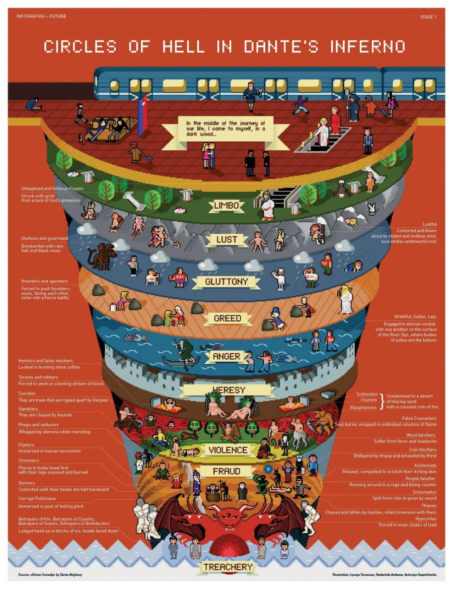
Reading Dante’s Inferno, and Divine Comedygenerally, can seem a daunting task, what with the book’s wealth of allusion to 14th century Florentine politics and medieval Catholic theology. Much depends upon a good translation. Maybe it’s fitting that the proverb about translators as traitors comes from Italian. The first Dante that came my way—the unabridged Carlyle-Okey-Wicksteed English translation—renders the poet’s terza rimain leaden prose, which may well be a literary betrayal.
Gone is the rhyme scheme, self-contained stanzas, and poetic compression, replaced by wordiness, antiquated diction, and needless density. I labored through the text and did not much enjoy it. I’m far from an expert by any stretch, but was much relieved to later discover John Ciardi’s more faithful English rendering, which immediately impresses upon the senses and the memory, as in the description above in the first stanzas of Canto II.
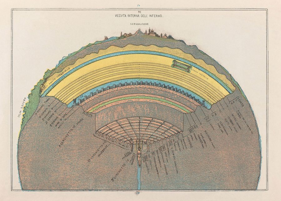
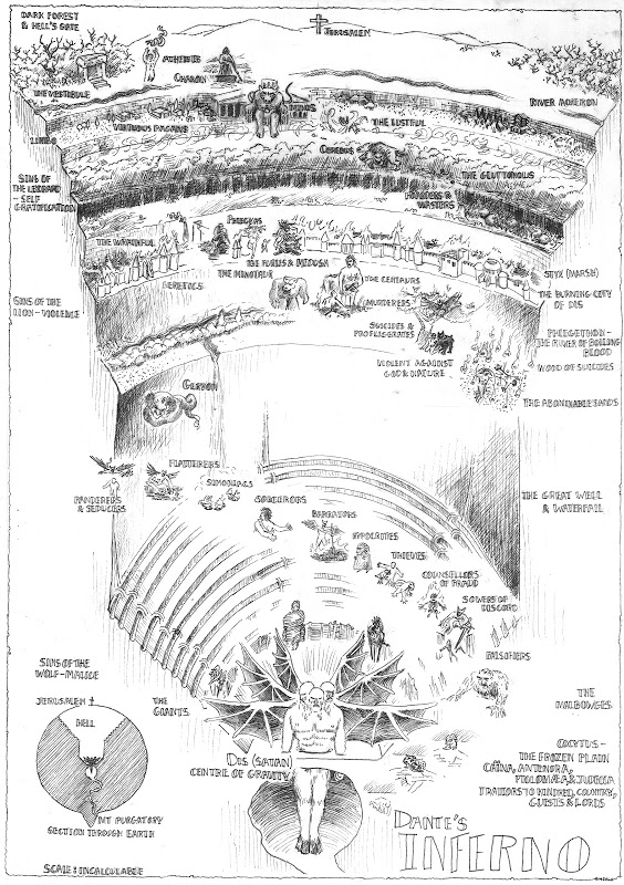
The sole advantage, perhaps, of the translation I first encountered lies in its use of illustrations, maps, and diagrams. While readers can follow the poem’s vivid action without visual aids, these lend to the text a kind of imaginative materiality: saying yes, of course, this is a real place—see, it’s right here! We can suspend our disbelief, perhaps, in Catholic doctrine and, doubly, in Dante’s weirdly officious, comically bureaucratic, scheme of hell.
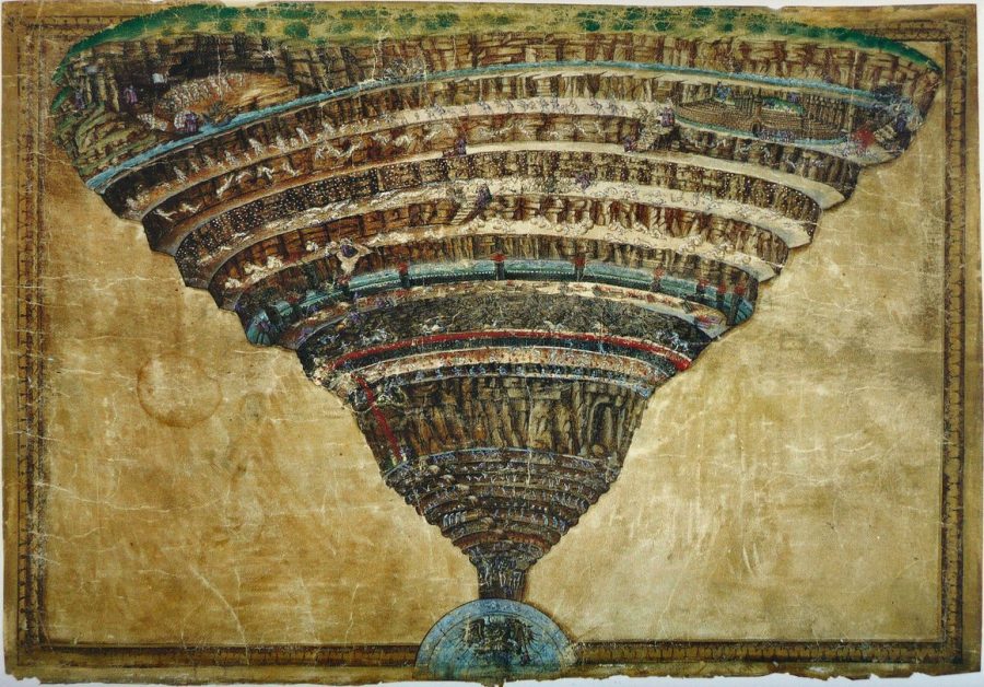
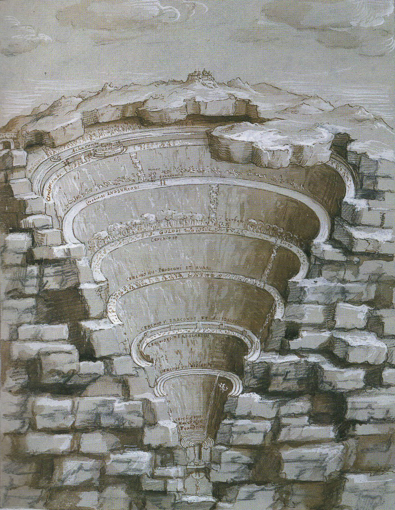
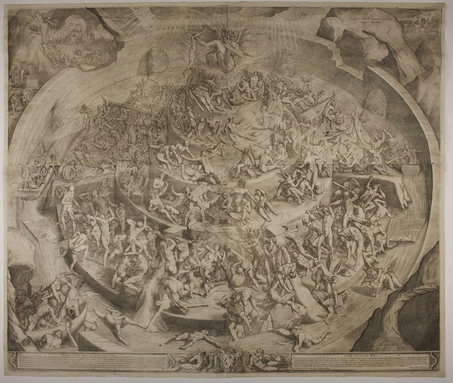
Indeed, readers of Dante have been inspired to map his Inferno for almost as long as they have been inspired to translate it into other languages—and we might consider these maps more-or-less-faithful visual translations of the Inferno’s descriptions. One of the first maps of Dante’s hell (top) appeared in Sandro Botticelli’s series of ninety illustrations, which the Renaissance great and fellow Florentine made on commission for Lorenzo de’Medici in the 1480s and 90s.
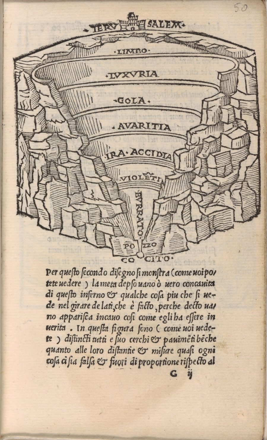
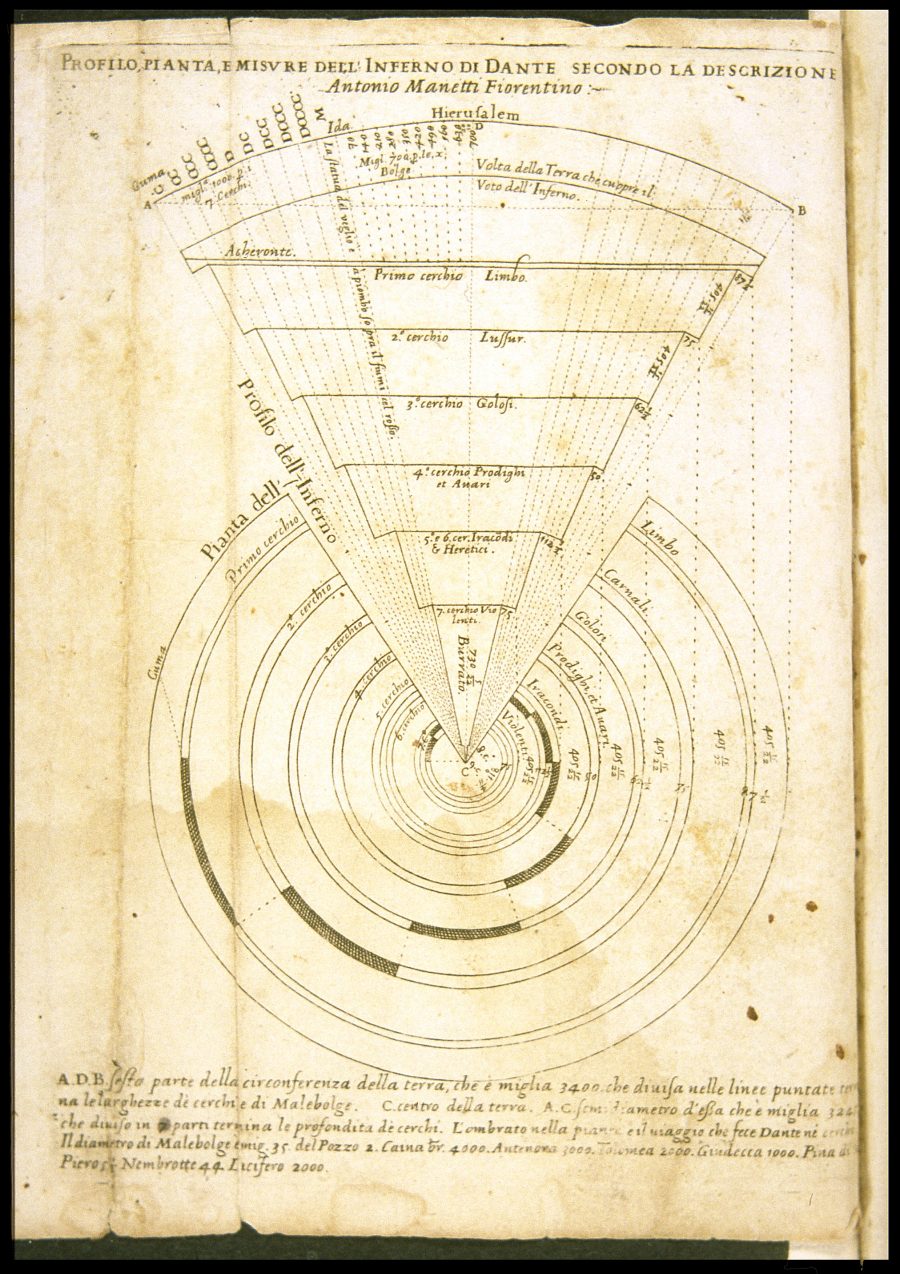
Botticelli’s “Chart of Hell,” writes Deborah Parker, “has long been lauded as one of the most compelling visual representations… a panoptic display of the descent made by Dante and Virgil through the ‘abysmal valley of pain.’” Below it, we see one of Antonio Manetti’s 1506 woodcut illustrations, a series of cross-sections and detailed views. Maps continued to proliferate: see printmaker Antonio Maretti’s 1529 diagram further up, Joannes Stradanus’ 1587 version, above, and, below, a 1612 illustration below by Jacques Callot.
Dante’s hell lends itself to any number of visual treatments, from the purely schematic to the broadly imaginative and interpretive. Michelangelo Caetani’s 1855 cross-section chart, below, lacks the illustrative detail of other maps, but its use of color and highly organized labeling system makes it far more legible that Callot’s beautiful but busy drawing above.
Though we are within our rights as readers to see Dante’s hell as purely metaphorical, there are historical reasons beyond religious belief for why more literal maps became popular in the 15th century, “including,” writes Atlas Obscura, “the general popularity of cartography at the time and the Renaissance obsession with proportions and measurement.”
Even after hundreds of years of cultural shifts and upheavals, the Inferno and its humorous and horrific scenes of torture still retain a fascination for modern readers and for illustrators like Daniel Heald, whose 1994 map, above, while lacking Botticelli’s gilded brilliance, presents us with a clear visual guide through that perplexing valley of pain, which remains—in the right translation or, doubtless, in its original language—a pleasure for readers who are willing to descend into its circular depths. Or, short of that, we can take a digital train and escalators into an 8‑bit video game version.
See more maps of Dante’s Inferno here, here, and here.
Christopher R. Scotese, a geologist affiliated with Northwestern University, has created an animation showing “the plate tectonic evolution of the Earth from the time of Pangea, 240 million years ago, to the formation of Pangea Proxima, 250 million years in the future.” The blurb accompanying the video on Youtube adds:
The animation starts with the modern world then winds it way back to 240 million years ago (Triassic). The animation then reverses direction, allowing us to see how Pangea rifted apart to form the modern continents and ocean basins. When the animation arrives back at the present-day, it continues for another 250 million years until the formation of the next Pangea, “Pangea Proxima”.
According to an article published by NASA back in 2000, Scotese’s visualization of the future is something of an educated “guesstimate.” “We don’t really know the future, obviously,” he says. “All we can do is make predictions of how plate motions will continue, what new things might happen, and where it will all end up.” You can see his predictions play out above.
If you would like to support the mission of Open Culture, consider making a donation to our site. It’s hard to rely 100% on ads, and your contributions will help us continue providing the best free cultural and educational materials to learners everywhere. You can contribute through PayPal, Patreon, and Venmo (@openculture). Thanks!
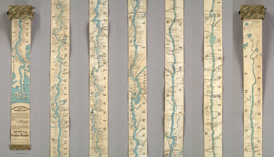
Everybody knows a fact or two about the United States of America, even those who’ve never set foot there. At the very least, they know the US is a big country, but it’s one thing to know that and another to truly understand the scale involved. Today we offer you an artifact from cartographic history that illustrates it vividly: a 19th-century traveler’s map of the Mississippi River that, in order to display the length of that mighty 2,320-mile waterway, extends to a full eleven feet. (Or, for those especially unfamiliar with how things are in America, displays the river’s full 3,734-kilometer length at a full 3.35 meters.)
With a width of only three inches (or 7.62 centimeters), the Ribbon Map of the Father of Waterscame on a spool the reader could use to unroll it to the relevant section of the river anywhere between the Gulf of Mexico and northern Minnesota. First published in 1866, just a year after the end of the Civil War, the map “was marketed toward tourists, who were flocking to the Mississippi to see the sights and ride the steamboats.” So writes Atlas Obscura’s Cara Giamo, who quotes art historian Nenette Luarca-Shoaf as describing the river as “a source of great awe. That kind of length, that kind of spaciousness was incomprehensible to a lot of folks who were coming from the East Coast.”
Luarca-Shoaf describes the map, an invention of St. Louis entrepreneurs Myron Coloney and Sidney B. Fairchild, in more detail in an article of her own at Common-Place. “The completely unfurled map extends beyond the limits of the user’s reach, wondrously embodying the scope of the river in the time it took to unroll it and in the eleven feet of space it now occupies,” she writes. “At the same time, the care required to wind the strip back into Coloney and Fairchild’s patented spool apparatus reiterates the precariousness of human control — either representational or environmental — over the mercurial Mississippi.” We still today talk about “scrolling” maps, though we now mean it as nothing more than a digital metaphor.
Unwieldy though it may seem, the Ribbon Map of the Father of Waters must have struck its travel-minded buyers in the 1860s — some 150 years before technology put touchscreens in all of our hands — as the height of cartographic convenience. Despite having sold out their Mississippi River map quickly enough to necessitate a second edition, though, Coloney and Fairchild did little more with their patented concept. You can see a surviving example of the Ribbon Map in greater detail at the Library of Congress and the David Rumsey Map Collection. The current generation of river tourists yearning for an understanding of the surprising breadth of America’s land and depth of its history may even constitute sufficient market for a replica. But what happens when it gets wet?
Based in Seoul, Colin Marshall writes and broadcasts on cities and culture. His projects include the book The Stateless City: a Walk through 21st-Century Los Angeles and the video series The City in Cinema. Follow him on Twitter at @colinmarshall or on Facebook.
The genre of animated time-lapse video maps—portraying the rise and fall of empires, the spread of people groups, the succession of rulers over hundreds of years, and other histories that used to fill entire textbooks—is one of those internet-only phenomena with useful, if limited application. As the bombastic music that sometimes accompanies these videos suggests, one primary effect is the production of maximally sweeping historical drama through mapping, which captures the imagination in ways dry prosaic descriptions often can’t.
The subject of the video above—the British Empire—seems to justify such an approach, given that, as one educational website notes, “the British Empire was the largest formal empire that the world had ever known.” Whether one celebrates or deplores this fact is a matter for political or moral debate—categories that have little seeming relevance to the production of animated video maps.
“At its height in 1922,” writes Jon Stone at The Independent, “the British Empire governed a fifth of the world’s population and the quarter of the world’s total land area.” His comment that this legacy “divides opinion” grossly understates the case. Yet as bare historical fact, the spread of the Empire is astonishing, an achievement of military and maritime power, unprecedented commercial ambition, bureaucratic systemization, trade maneuvering, and the massive displacement, detention, and enslavement of millions of people.
The video begins in 519 A.D., after the end of Roman rule in England, when the so-called Heptarchy formed, the seven Anglo-Saxon tribal kingdoms ruled by Germanic peoples who killed off or enslaved the native Celts. From there, we proceed through the Norman invasion, the English attempts to take French territory in Europe, Henry VIII’s invasion and annexation of Ireland, and other colonizing and empire-building events that precede British entry onto the far-flung global stage with the founding of the British East India Company’s first post in Surat, India in 1612 and Puritan settlement at Plymouth in 1620.
We see these events unfold in a split screen map showing different parts of the world, with a box on the side providing context and a color-coded legend. This rush through Imperial history occurs at a relatively breakneck speed, taking only 18 minutes to cover 1,500 years.
The long, slow rise of the British Empire was followed by a precipitous fall. By the mid-20th century postwar years, Britain saw its major colonies in India, Africa, and the West Indies achieve independence one by one. “By 1979,” writes Adam Taylor at The Washington Post, the Empire “was reduced to a few pockets around the world.” And by the current year, the former global power’s overseas colonial holdings comprise 14 small territories, including mostly unpopulated Antarctic land and the Falkland Islands.
See many more fascinating animated time-lapse maps, documenting all of world history, at the creator Ollie Bye’s YouTube channel.
By reasons of parenting, I’ve become well acquainted with a song—perhaps you know it?— called “Fifty Nifty United States,” taught to schoolchildren as a geographical mnemonic device. The lyrics mention that “each individual state contributes a quality that is great.” What are some great qualities of, say, Delaware, New Mexico, or South Dakota? We aren’t told. Hey, it’s enough that a five or six-year-old can remember “shout ‘em, scout ‘em, tell all about ‘em” before rattling off an alphabetical list of “ev’ry state in the good old U.S.A.”
But if you hail from the U.S., you can enumerate many contributions from a few nifty states, whether culinary delights, historical events, writers, artists, sports heroes, etc. And most everyone’s got stories about visiting natural wonders, hiking mountain trails, fording rivers, gazing upon breathtaking vistas.
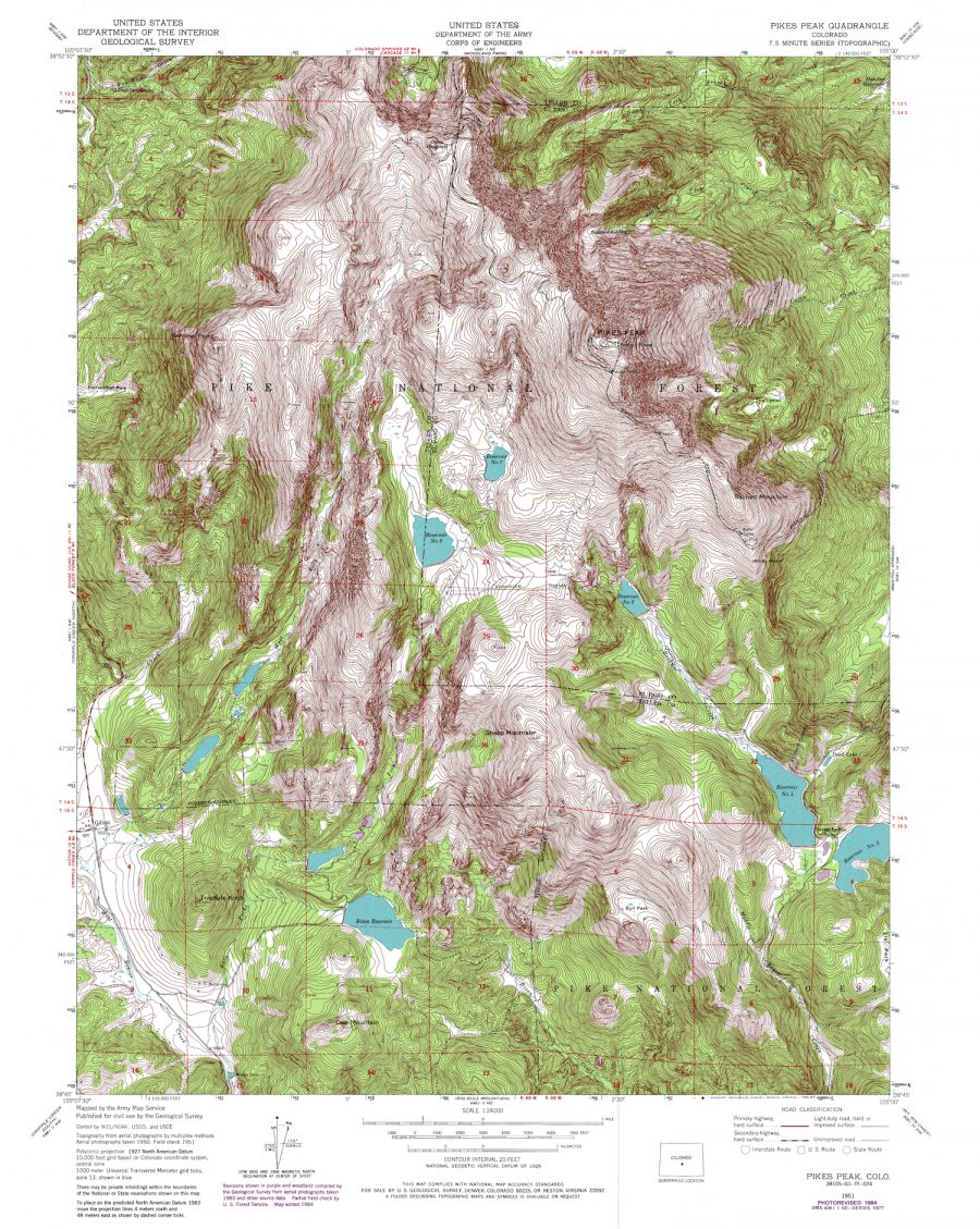
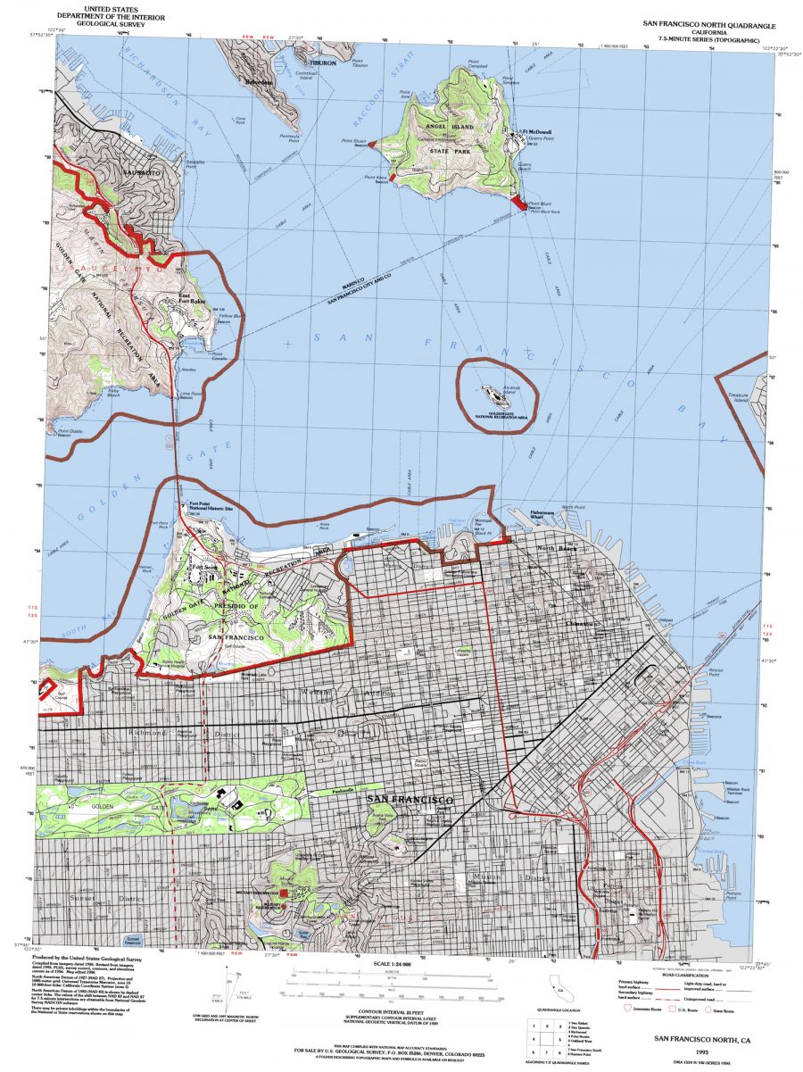
We may be occasional tourists, travel enthusiasts, or experts, but whatever our level of experience in the country, it’s probably kid stuff compared to the work of the scientists at the U.S. Geological Survey (USGS).
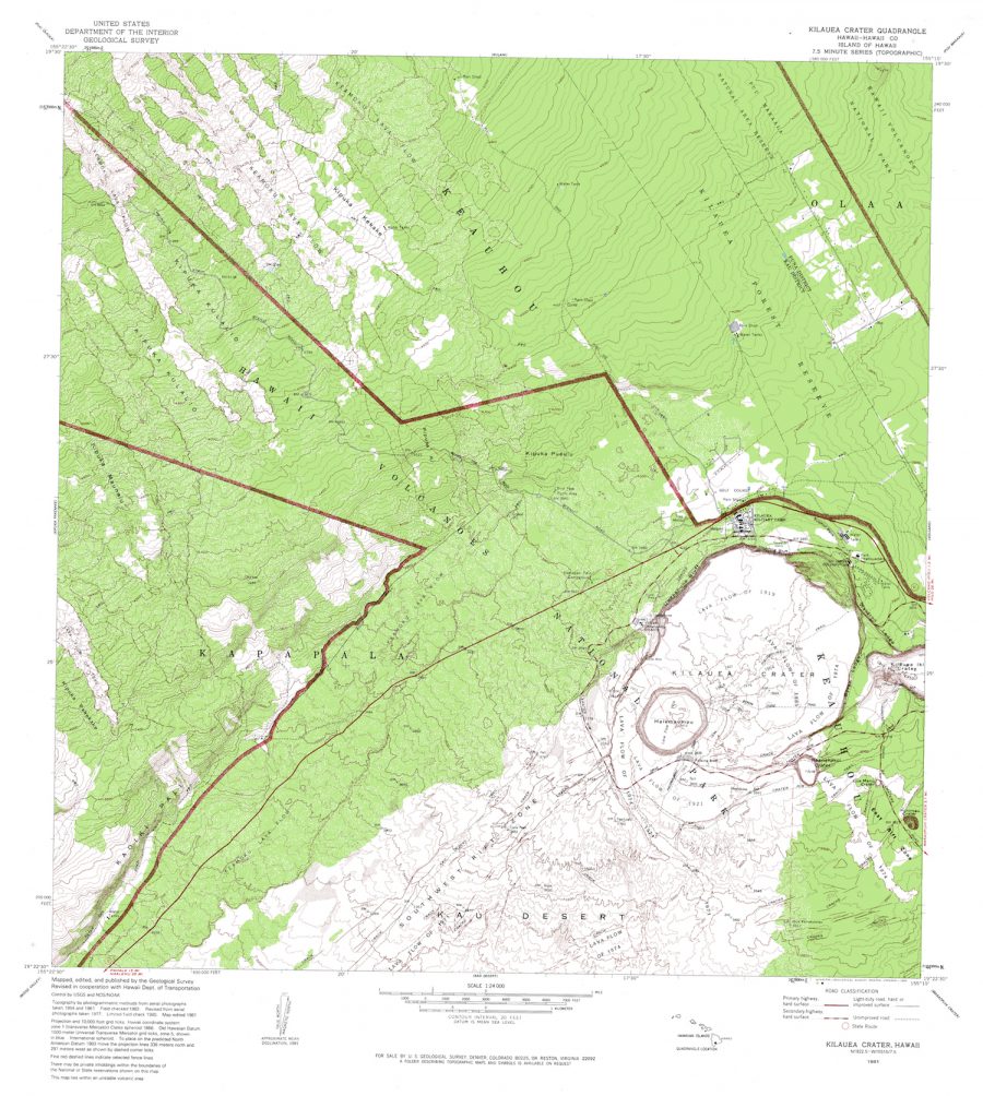
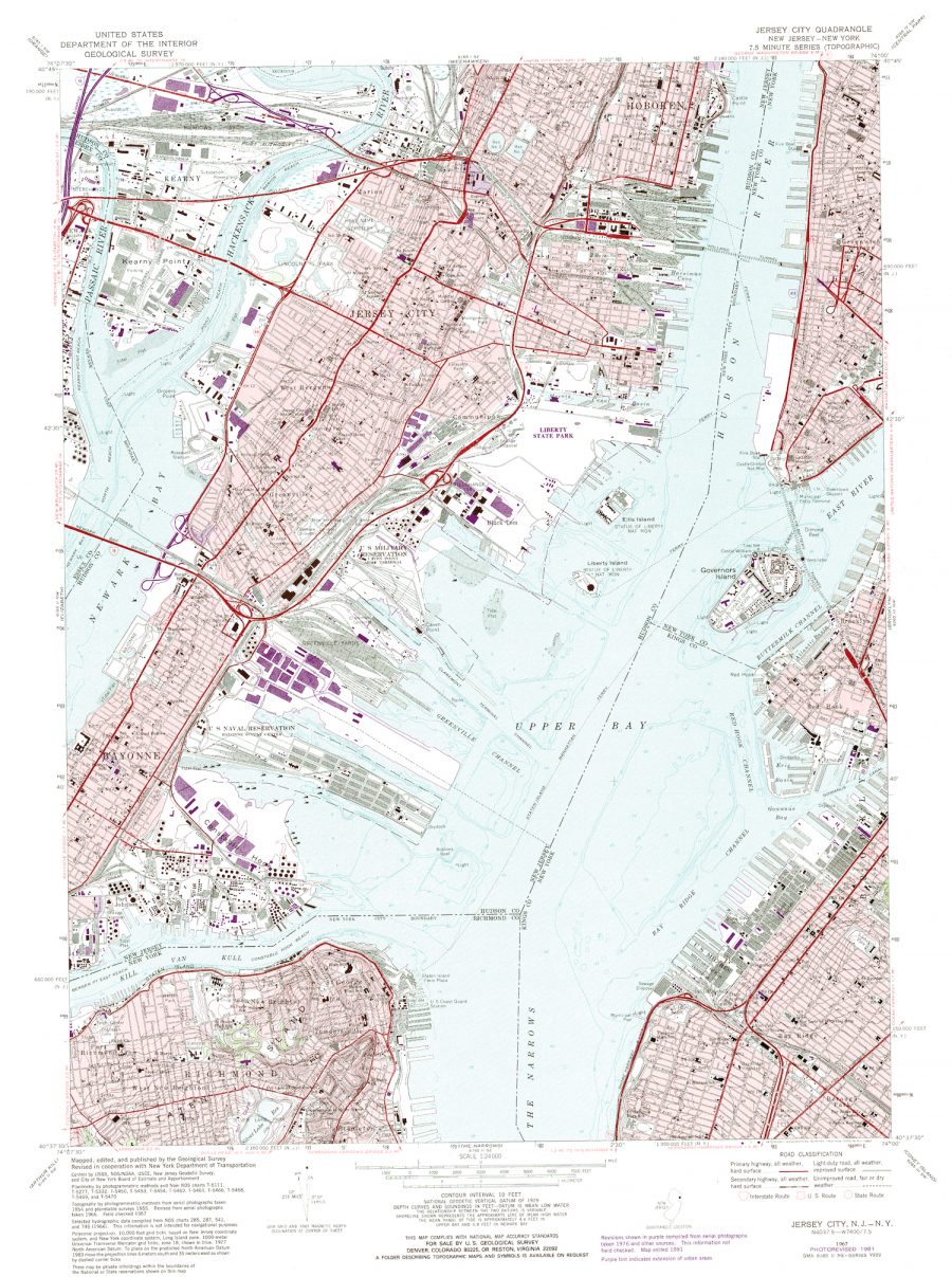
And just above, the devastating Kīlauea Volcano, in a map compiled from aerial photos taken in 1954 and 1961. (See the USGS site for the latest info about the ongoing eruption there.) Below, a nifty map of New York City, created “by photogrammetric methods from aerial photographs taken [in] 1954 and planetable surveys [in] 1955. Revised from aerial photographs taken [in] 1966.” Google maps may be more current, but these USGS maps have an aura of scientific authority around them, evidence of painstaking surveys, checked and rechecked over the decades by hundreds of pairs of hands and eyes.
Browsing the archive can be a challenge, since the maps are catalogued by coordinates rather than place names, but you can enter the names of specific locations in the search field. Also, be advised, the maps “are best used with global positioning software,” the archive tells visitors. Nonetheless, you can click on the first download option for “Multi Page Processed TIFF” to pull up a huge, downloadable image. Enter the archive here and get to scouting.
We're hoping to rely on loyal readers, rather than erratic ads. Please click the Donate button and support Open Culture. You can use Paypal, Venmo, Patreon, even Crypto! We thank you!
Open Culture scours the web for the best educational media. We find the free courses and audio books you need, the language lessons & educational videos you want, and plenty of enlightenment in between.