From curb cuts to safer playgrounds, the public spaces we occupy have been transformed for the better as they become easier for different kinds of bodies to navigate. Closed captioning and printable transcripts benefit millions, whatever their level of ability. Accessibility tools on the web improve everyone’s experience and provide the impetus for technologies that engage more of our senses. While smell may not be a high priority for developers, attention to a sense most sighted people tend to take for granted could open up an age of using feedback systems to make visual media touch responsive.
One such tactile system designed for Smithsonian Museums has developed “new methods for fabricating replicas of museum artifacts and other 3D objects that describe themselves when touched,” reported the National Rehabilitation Information Center in a February post for Low Vision Awareness Month. “Depth effects are achieved by varying the height of relief of raised lines, and texture fills help improve awareness of figure-ground distinctions.” Haptic feedback technology, like that the iPhone and various video game systems have introduced over the past few years, promises to open up much more of the world to the visually-impaired… and to everyone else.
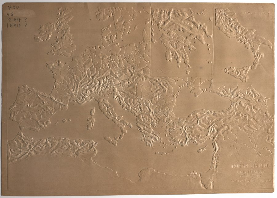
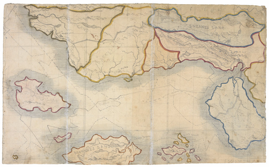
One invention introduced over a century ago held out the same promise. The tactile map, “an innovation of the 19th century,” writes Rebecca Onion at Slate, “allowed both blind and sighted students to feel their way across a given geography.” One popularizer of the tactile map, former school superintendent L.R. Klemm, who made the example above, believed that “while the waterproof map could be used to teach students without sight,” it could also “fruitfully engage sighted students through the sense of touch.”
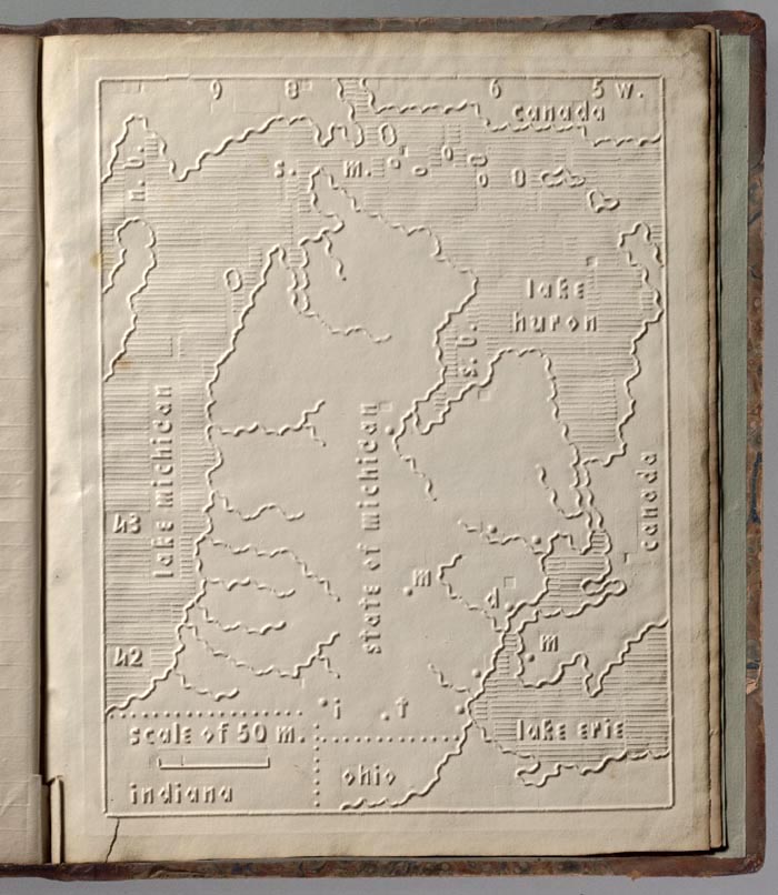
Though created in Europe, tactile maps have had a relatively long history in the U.S., debuting in 1837 with an atlas of the United States developed by Samuel Gridley Howe of the Perkins School for the Blind. (See Michigan above.) Klemm’s map up top, depicting the Roman Empire (284–476 CE), is a later entry, patented in 1888, and, he promises it’s a decided improvement on earlier models. In an article that year for The American Teacher, he described “the painstaking process of creating one of these relief maps,” notes Onion, “a process he used as another teaching tool, enlisting students to help him scrape and carve plaster casts into negative shapes of mountain ranges and plateaus.”
Those students, he wrote, developed “so clear a conception of the topography and irrigation of the respective country that it can scarcely be improved.” Tactile accuracy meant a lot to Klemm. In text published alongside the map, he took Howe and other publishers to task for raising water above land, an idea “so unnatural, that the mind never thoroughly becomes accustomed to it.” Klemm also critiques a French map of “very perfect construction.” This handmade version, he says, though ingenious, is “expensive and very inefficient.” While its utility “in the case of institutions, and for the use of pupils of the wealthy classes is undoubted… the costliness of maps constructed on such a principle places the advantages of the system beyond the reach of the blind generally.”
Klemm’s concern for the quality, accuracy, utility, and economic accessibility of this early accessibility tool is admirable. And though you can’t experience it through your screen, his method is probably a vastly-improved way of learning geography for many people, sighted or not. Tactile maps did not quite become general use technologies, but their digital progeny may soon have us all experiencing more of the world through touch. View and download a larger (2D) version of Klemm’s map and learn more at 19th Century Disability Cultures & Contexts.
via Slate
Related Content:
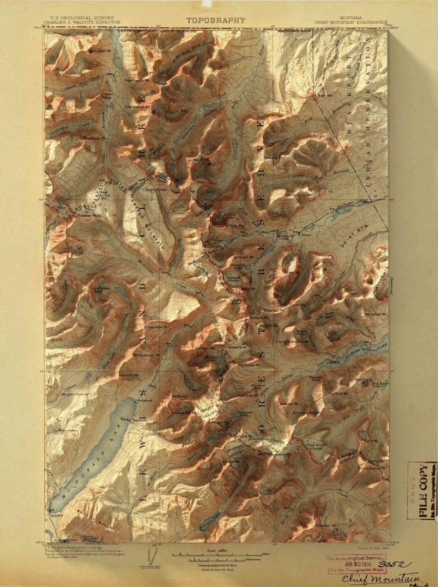
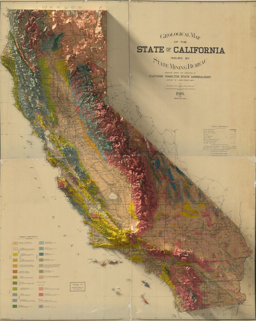
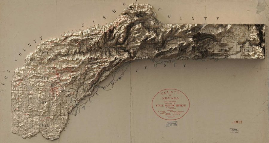
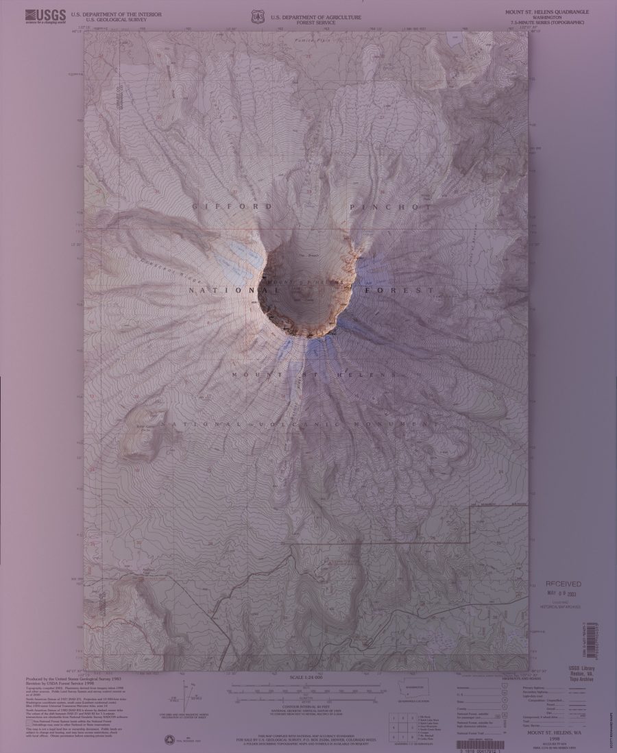
Vintage Geological Maps Get Turned Into 3D Topographical Wonders
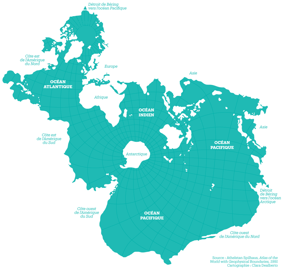
A Radical Map Puts the Oceans–Not Land–at the Center of Planet Earth (1942)
Josh Jones is a writer and musician based in Durham, NC. Follow him at @jdmagness
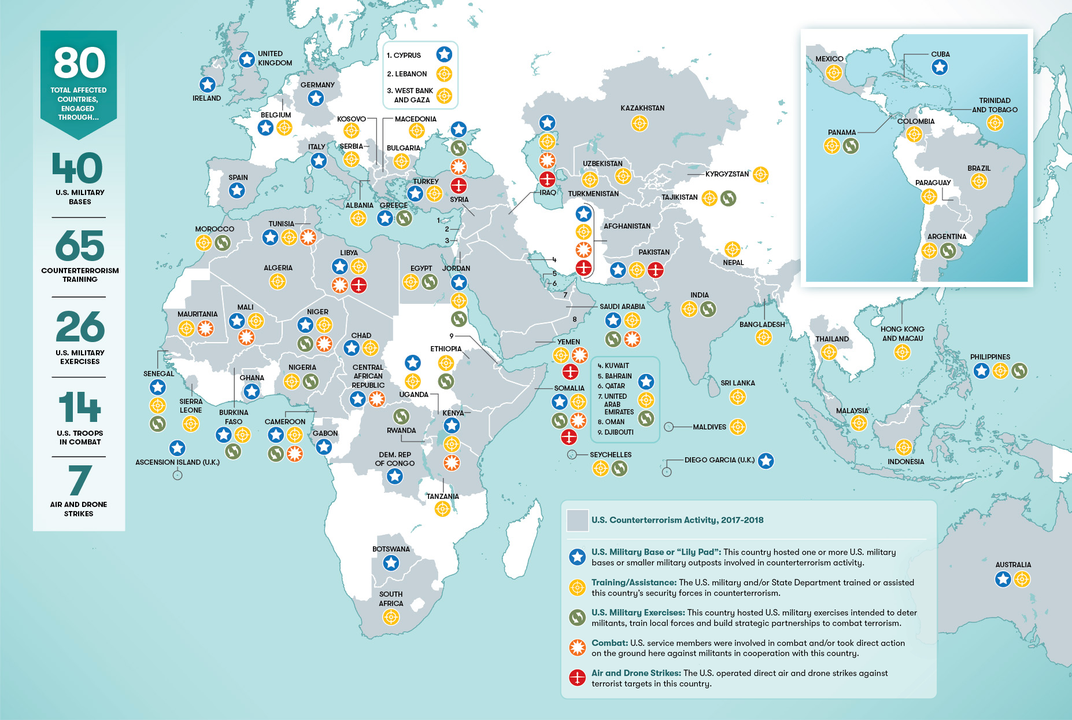
/https://public-media.si-cdn.com/filer/76/45/7645fe6c-a982-4828-bdff-7043074884b2/counterterrorismmapweb.png)