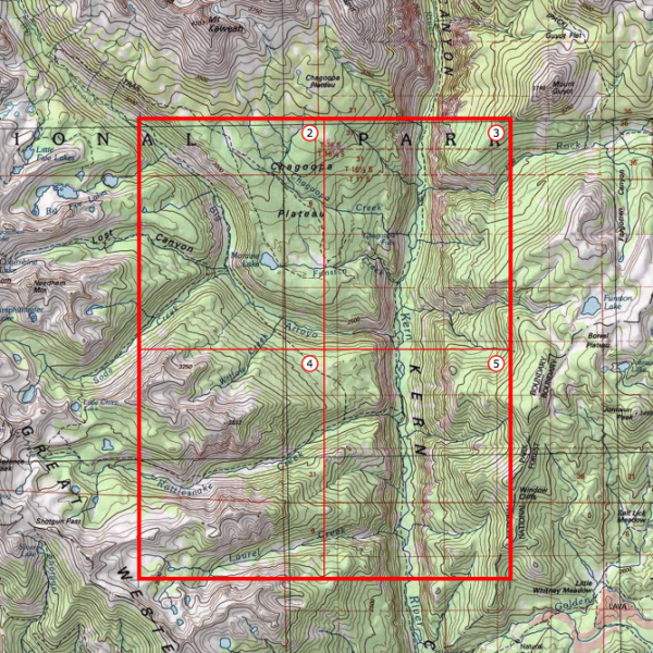
Briefly noted: National Geographic has built a web interface that allows anyone to find any quad in the United States, and then download and print it. During past decades, these quads (topographic maps) were printed by the United States Geological Survey (USGS) on giant bus-sized presses. But now they’ve been pre-processed to print on standard printers found in most homes.
To access the maps, click here, pick a location, then start zooming in until you see red icons. Then choose the geographically-appropriate icon and print/download a map in PDF format.
If you would like to support the mission of Open Culture, consider making a donation to our site. It’s hard to rely 100% on ads, and your contributions will help us continue providing the best free cultural and educational materials to learners everywhere. You can contribute through PayPal, Patreon, and Venmo (@openculture). Thanks!
Jack Kerouac’s On the Roadhas, in the almost 60 years since its publication, inspired its readers to do many things: some try their hands at writing their own carefully composed yet carelessness-exuding prose, but others find themselves moved to replicate the American road trip whose story Kerouac uses that near-inimitable style to tell. They might do so by following the author’s own hand-drawn map, or the more recently composed set of Google driving directions we featured a couple years ago. But now they have another detailed research tool in the form of Dennis Mansker’s interactive maps.
Mansker, himself the author of a book called A Bad Attitude: A Novel from the Vietnam War, has put together not one but four On the Road maps, each one detailing one of the road trips Kerouac used to create his Beat narrative of America: Map One follows his summer 1947 trip from New York to San Francisco by way of Denver and back again; Map Two, his winter 1949 trip from Rocky Mount, North Carolina to San Francisco by way of New Orleans; Map Three, his spring 1949 trip from Denver to New York by way of San Francisco; Map Four, his spring 1950 trip from New York to Mexico City by way of Denver.
“Click on one of the placemarkers on the map to see a quotation from the book,” Mansker explains. “Zoom in it to see the location on the map. In many cases where the narrative wasn’t clear on a given place, I’ve had to approximate — apply a ‘best guess’ solution to a given location.” He also provides information on the three cars, a 1949 Hudson, a 1947 Cadillac Limousine, and a 1937 Ford Sedan (as well as a Greyhound Bus (protagonist Sal Paradise’s transportation mode of choice “when he couldn’t boost a ride” with the irrepressible Dean Moriarty) which “themselves became sort of minor characters during the course of the adventures.”
“He came right out to Paterson, New Jersey, where I was living with my aunt,” writes Kerouac of Dean’s return to Sal’s life in the small city that figured early in that first 1947 road trip. “He was gone,” says Sal of Dean’s departure from his life as he recovers from a fever in Mexico City, the last stop of Kerouac’s 1950 road trip. “When I got better I realized what a rat he was, but then I had to understand the impossible complexity of his life, how he had to leave me there, sick, to get on with his wives and woes.” If you love Kerouac’s novel, by all means follow in his tire tracks — just make sure to find a more reliable traveling companion.
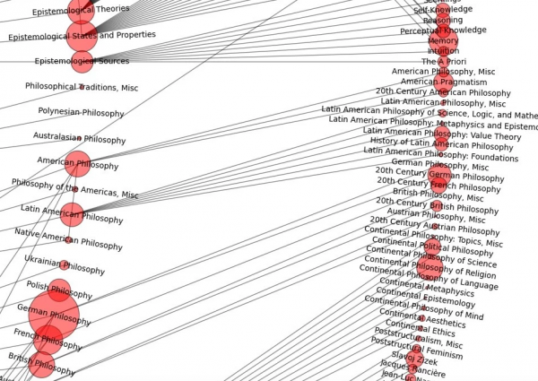
Daily Nous, a website about philosophy and the philosophy profession, recently featured a detailed mapping of the entire discipline of philosophy, created by an enterprising French grad student, Valentin Lageard. Drawing on a taxonomy provided by PhilPapers, Lageard used NetworkX (a Python software package that lets you study the structure and dynamics of complex networks) to map out the major fields of philosophy, and show how they relate to various sub-fields and even sub-sub-fields. The image above shows the complete map, revealing the astonishing size of philosophy as an overall field. The images below let you see what happens when you zoom in and move down to different levels.
To explore the map, head over to Daily Nous–or open this image, click on it, wait for it to expand (it takes a second), and then start maneuvering through the networks.
If you would like to support the mission of Open Culture, consider making a donation to our site. It’s hard to rely 100% on ads, and your contributions will help us continue providing the best free cultural and educational materials to learners everywhere. You can contribute through PayPal, Patreon, and Venmo (@openculture). Thanks!
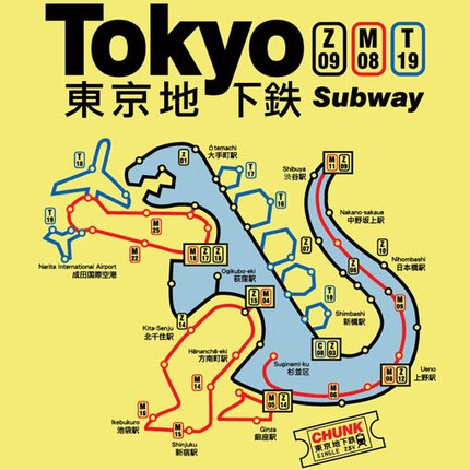
Anyone who loves cities almost certainly loves transit maps: for well over a century, they’ve not only played an essential role in the navigation of urban spaces but developed into their very own distinctive form at the intersection of utility and aesthetics. The finest examples simultaneously possess the clarity and information-richness of the best graphic design and hold out promises of excitement and modernity that require a true artistic sensibility to properly express. None of this is lost on Cameron Booth, the Australian graphic designer living in Portland, Oregon who runs the site Transit Maps.
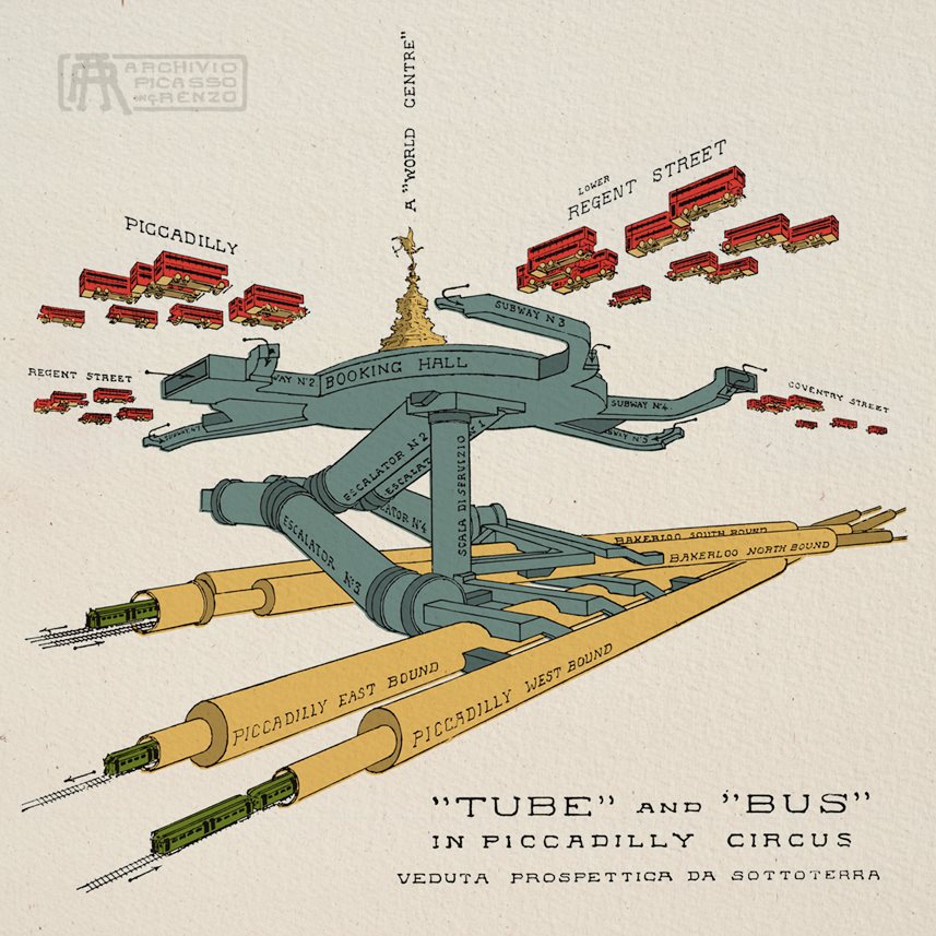
“A well designed transit map conveys a lot of information in a very small space,” writes Booth on the site’s About page. “In an instant, we learn how to get from ‘A’ to ‘B’, simply by following some coloured lines. The very best maps become symbols of their city, admired and loved by all.” None have become quite so symbolic as the map of the London Underground, the oldest subway system in the world, and Transit Maps’ posts filed under the London Underground tag, such as the 1929 cutaway diagram of its Piccadilly Circus station by Italian architect and urban designer Renzo Picasso just above provide plenty of good reading — and even better viewing — for its many enthusiasts.
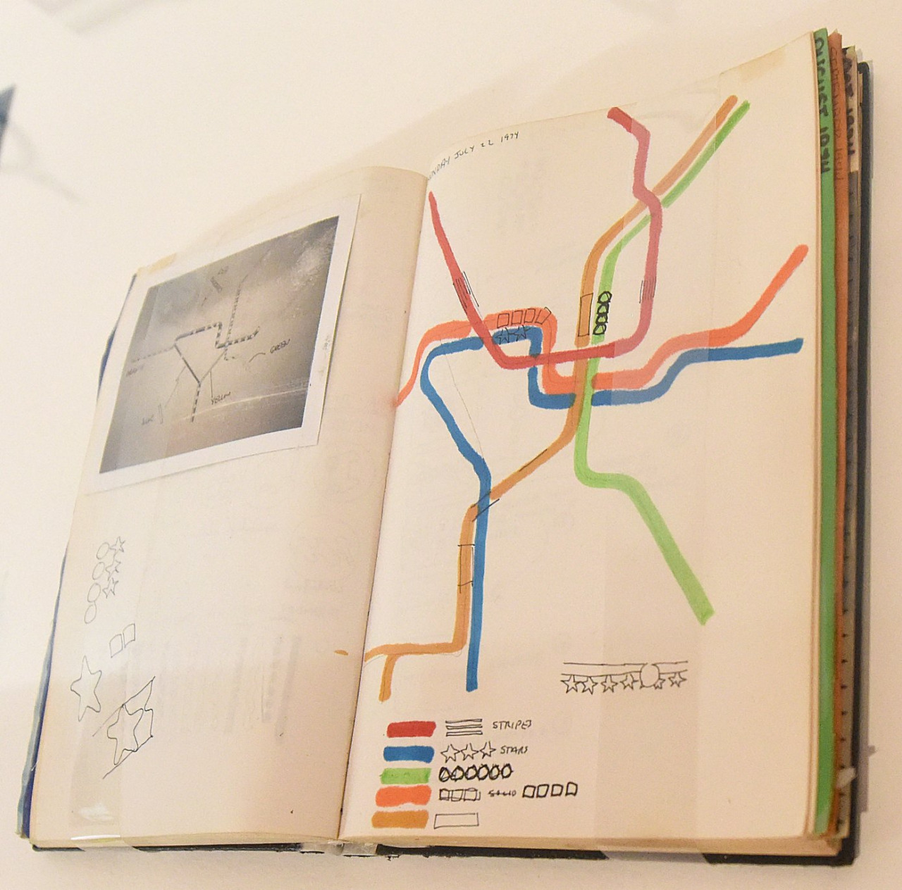
Among American cities, no subway system has a more respected map than Washington, DC’s, the work of graphic designer Lance Wyman, for whom it has remained a work in progress: he oversaw a redesign just five years ago, almost forty years after the system went into service and his original map made its debut. Here we have one of Wyman’s original working sketches for the map straight from his notebook. “Interestingly, it looks like Wyman was experimenting with textural treatments for the route lines at this time,” adds Booth, “an idea I’m ever so glad he abandoned, because it would have looked so busy and hideous.”
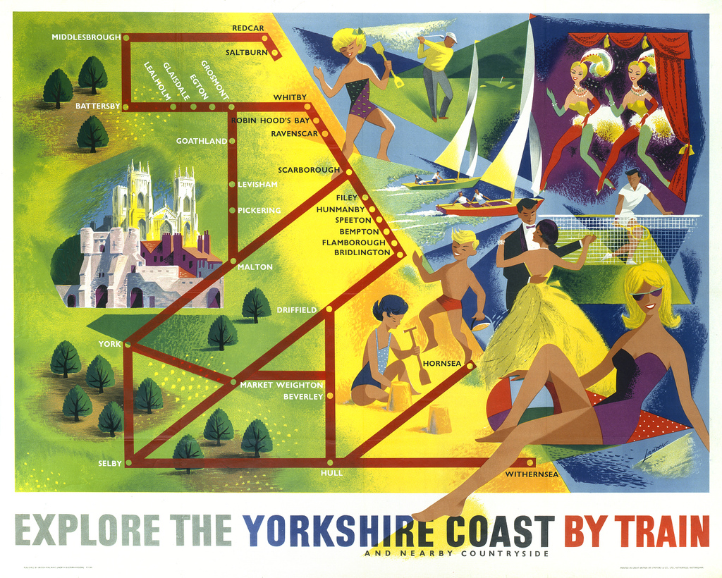
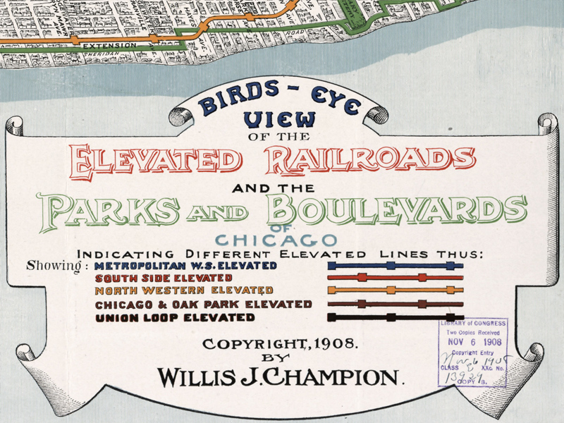
Having seen many more transit maps than most, and even having designed some of his own (including a reworking of the DC Metro map), Booth doesn’t hesitate to point out both the virtues and the flaws of the ones he posts. He even grades them on a star rating system (with, of course, circular London Underground logos substituting for actual stars), collecting the very best under the five-star tag. One such passage with flying colors, the 1950s Yorkshire coast train map at the top of the post, has Booth exclaiming that “they don’t make ‘em like this any more. The 1908 bird’s-eye view of Chicago, source of the legend above, scores its own five stars by “minute attention to detail,” down to the inclusion of “smoke curls from factory chimneys” and “almost every tree in the city’s parks.”
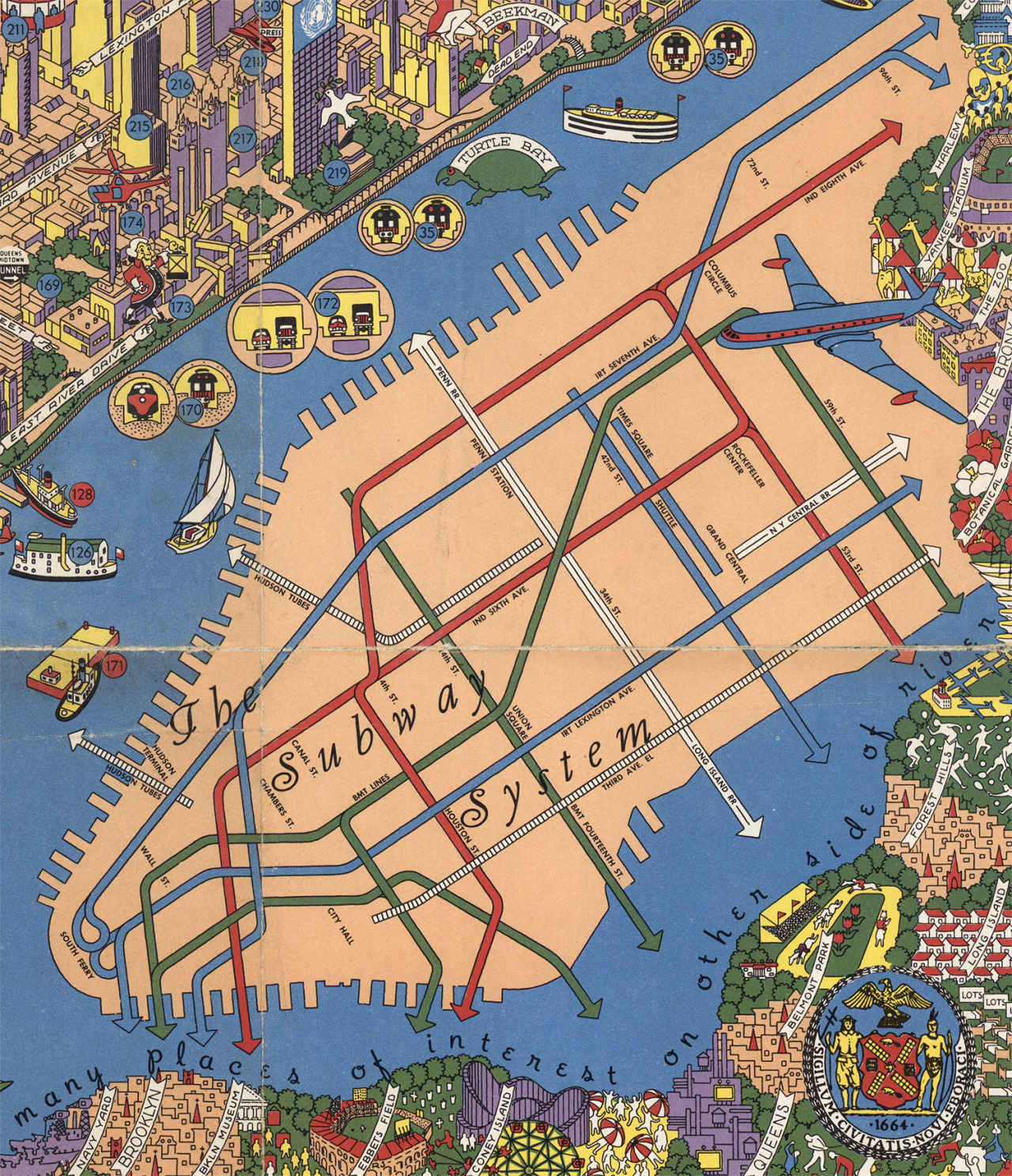
Few cities have attracted as much attention from mapmakers as New York, possibly due to all its wonders — or at least those are what IBM graphic designer Nils Hansell emphasizes in his mid-1950s map “Wonders of New York” which, despite not looking far past Manhattan, does include transit and much else besides: Booth mentions its depiction of “300-odd numbered points of interest” as well as “the last vestiges of New York’s once-extensive elevated railway lines.” You need quite a high-definition scan to really appreciate all this, and Booth found one in the David Rumsey Map Collection, which we’ve previously featured here on Open Culture.
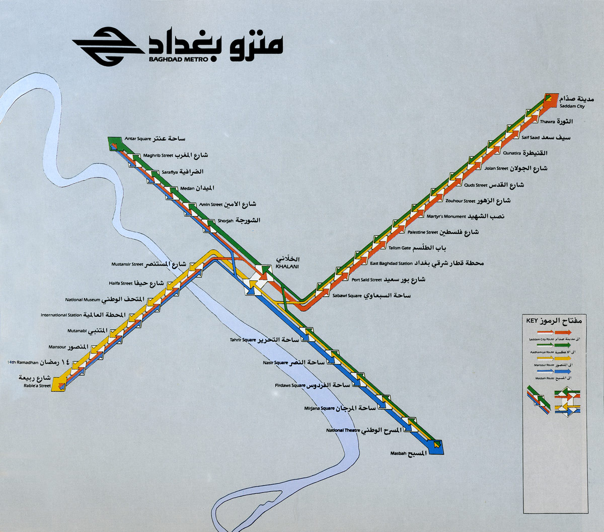
Scroll through the pages and pages of Transit Maps’ historical tag, and you’ll find a wealth of fascinating showpieces of the transit mapper’s art, not just from the Londons and New Yorks of the world, but also from times and places like Berlin in 1931, Madison, Wisconsin in 1975, and Booth’s own old hometown of Sydney in 1950 and new hometown of Portland in 1978. The archive even includes transit maps from unusual places, such as a delightful one printed on the back of a Japanese matchbox in the 1920s, and maps for transit systems never completed, such as the one for the Baghdad Metro from the early 1980s just above. Iraq’s capital may still await a full-service subway system — and much else besides — but at least its map earns top marks.
“Where is the wisdom we have lost in knowledge? Where is the knowledge we have lost in information?,” asked T.S. Eliot in lines from his play “The Rock.”His prescient description of the dawning information age has inspired data scientists and their dissenters for decades. Thirty-six years after Eliot’s prophetic lament over “Endless invention, endless experiment,” futurist Alvin Toffler described the effects of information overload in his book Future Shock, and though many of his predictions haven’t aged well, his “prognosis,” writes Fast Company, “was more accurate than not.” Among his many “Tofflerisms” is one I believe Eliot would appreciate: “The illiterate of the future will not be the person who cannot read. It will be the person who does not know how to learn.”
Indeed, the exponential accumulation of data and information, and the incredible amount of ready access would make both men’s heads spin. Internet archives grow vaster and vaster, their contents an embarrassing richness of the world’s treasures, and a perhaps even greater store of its obscurities. Each week, it seems, we bring you news of one or two more open access databases filled with images, texts, films, recorded music. It can indeed be dizzying. And of all the archives I’ve surveyed, used in my own research, and presented to Open Culture readers, none has seemed to me vaster than Europeana Collections, a portal of “48,796,394 artworks, artefacts, books, videos and sounds from across Europe,” sourced from well over 100 institutions such as The European Library, Europhoto, the National Library of Finland, University College Dublin, Museo Galileo, and many, many more, including contributions from the public at large. Where does one begin?
The possibilities may literally be endless, as the collection continues to expand at a rate far beyond the ability of any one person, or team of people, or entire research institute of people to match. It is easy to feel adrift in such a database as this, which stretches on like a Borgesian library, offering room after endless room of visual splendor, documentation, and interpretation. It is also easy to make discoveries, to meet people, stumble upon art, hear music, see photographs, learn histories you would never have encountered if you knew what you were looking for and knew exactly how to find it. Eliot warned us—and rightly so—of the dangers of information overload. But he neglected, in his puritanical way, to describe the pleasures, the minor epiphanies, the happy chance occurrences afforded us by the ever-expanding sea of information in which we swim. One can learn to navigate it, one can drift aimlessly, and one can, simultaneously, feel immensely overwhelmed.
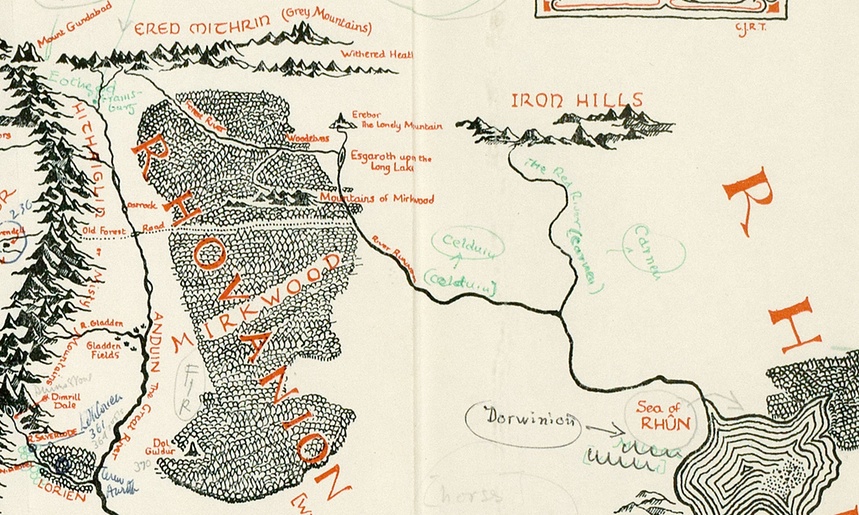
Back in April, we highlighted for you a trove of 110 illustrations by J.R.R. Tolkien, offering a rare glimpse of the author’s artistic talents. Tolkien didn’t just like to write books, as we saw. He also liked to draw illustrations for these books, which helped him to conceptualize the fantasy worlds he was creating.
Just this month, Houghton Mifflin released a new book called The Art of The Lord of the Rings by J.R.R. Tolkien, which brings together more than 180 drawings, inscriptions, maps, and plans–all drawn by Tolkien as part of his worldbuilding creative process. Most were never published until now.
And then we get this: a newly-discovered map annotated by Tolkien. Found in a copy of The Lord of the Rings thatoriginallybelonged to Pauline Baynes (the artist who illustrated Tolkien’s novels in print), the map intriguingly connects Tolkien’s fantasy world to real places on our globe. According to The Guardian, annotations on the map (click here to view the materials in a larger format) suggests that “Hobbiton is on the same latitude as Oxford [where Tolkien taught], and implies that the Italian city of Ravenna could be the inspiration behind the fictional city of Minas Tirith.” Belgrade, Cyprus, and Jerusalem also get listed as reference points. Discovered by Blackwell’s Rare Books, the rare map will be put on the market for an asking price of £60,000.
You can learn more about this map, considered “perhaps the finest piece of Tolkien ephemera to emerge in the last 20 years,” over at The Guardian.
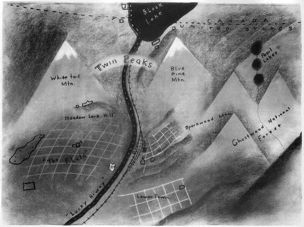
“How did this even get on the air?” Both the die-hard fans and bewildered haters asked that question about Twin Peaks, David Lynch and Mark Frost’s surreal television drama that famously aired on ABC primetime in 1990 and 1991. That such an unconventional vision — and one realized, at least throughout the first season, with such thorough commitment — ever made it to the mainstream airwaves now seems like a historical achievement in and of itself. So how, given the stultifying rigors of the entertainment industry, did Lynch and Frost actually sell this package of cryptic dreams, backward speech, small-town savagery, a murdered homecoming queen, and damn fine cherry pie?
First, Lynch drew a map. Knowing that no TV executive would understand Twin Peaks without understanding Twin Peaks, the fictional Washington town which gives the story its setting and title, he drew what you see above. Nigel Holmes included it in his out-of-print Pictorial Maps, commenting that “the peaks of the title, and the town they name, are clearly visible as white-topped mountains rising out of the modeled landscape.
By creating a sense of place, Lynch made the town all the more believable. A straightforward map would have been dull by comparison and might have suggested that there was something intrinsically interesting about the geography of the place. What was much more important to convey was the mood of the story, and it’s nicely captured in Lynch’s quirky drawing.”
The book also includes a quote from Lynch himself, on the utility of the map: “We knew where everything was, and it helped us decide what mood each place had, and what could happen there. Then the characters just introduced themselves to us and walked into the story.” As any Twin Peaks fan will notice, the map identifies a host of locations referenced in the show, such as White Tail and Blue Pine mountains (the peaks themselves), Ghostwood National Forest, and Lucky Highway 21. But “can you locate Sparkwood and 21, One-Eyed Jack’s and The Great Northern?” asks fan site Welcome to Twin Peaks. And if the much-discussed 21st-century Twin Peaks revival comes to fruition, will it dust off this trusty reference document and revive the askew but deep sense of place we (or at least some us) savored the first time around?
The border-obsessed map animator known as Emperor Tigerstar views war from a distance. The Emperor leaves such details as journal entries, letters home, and tales of valor and cowardice for other history buffs.
His niche is meticulously clocking the defeat and triumph in terms of shifting territories, by year, by fortnight, and, in the case of World War Iand World War II, by day.
The Blue and the Gray are here represented by blue and red, with the mustard-colored disputed border states picking sides before the first minute is out. (The Union’s Naval Blockade is in formation within seconds.)
Legend:
Maroon = Confederate States of America and territories
Red = Areas occupied by Confederate forces
Pink = Gains for that Day
Dark Blue = United States of America and territories
Blue = Areas occupied by Union forces.
Light blue = Gains for that day
Yellow = Border states / disputed areas.
The magnitude is moving, especially when paired with ground-level observations, be they fictional, historical or eyewitness.
Even the place-names on the map, which now were merely quaint, would take on the sound of crackling flame and distant thunder, the Biblical, Indian and Anglo-Saxon names of hamlets and creeks and crossroads, for the most part unimportant in themselves until the day when the armies came together, as often by accident as on purpose, to give the scattered names a permanence and settle what manner of life future generations were to lead.
Ayun Halliday is an author, illustrator, and Chief Primatologist of the East Village Inky zine. Her play, Fawnbook, opens in New York City later this fall. Follow her @AyunHalliday
We're hoping to rely on loyal readers, rather than erratic ads. Please click the Donate button and support Open Culture. You can use Paypal, Venmo, Patreon, even Crypto! We thank you!
Open Culture scours the web for the best educational media. We find the free courses and audio books you need, the language lessons & educational videos you want, and plenty of enlightenment in between.


