Though he’s hardly a household name like Kandinsky or Klee, Hungarian painter and photographer László Moholy-Nagy was just as influential as those members of Walter Gropius’ Bauhaus during the 1920s. As a teacher and one of the collective’s “leading figures,” Fiona MacCarthy argues, he may have indeed been, “the most inventive and engaging of all the Bauhaus artists.” Where all of the school’s members embraced, and sometimes critiqued, emerging technologies, materials, and modes of production, perhaps none did so with such conviction as Moholy-Nagy.
“Everyone is equal before the machine,” he once wrote, “I can use it; so can you. It can crush me; the same can happen to you.” His cool “grasp of new technologies,” writes MacCarthy, “was prophetic.… Entranced by the mechanized production of artworks,” he ridiculed “the artists’ traditional stance as individual creator.” Many modern artists shunned advertising work, but in Moholy-Nagy’s case, the transition seems perfectly natural and consistent with his theory. He also needed the money. Having fled the Nazis and settled in London in 1935, the artist found himself, notes Hyperallergic, “looking to pick up some work to support his displaced life.”
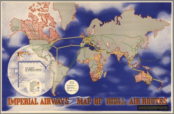
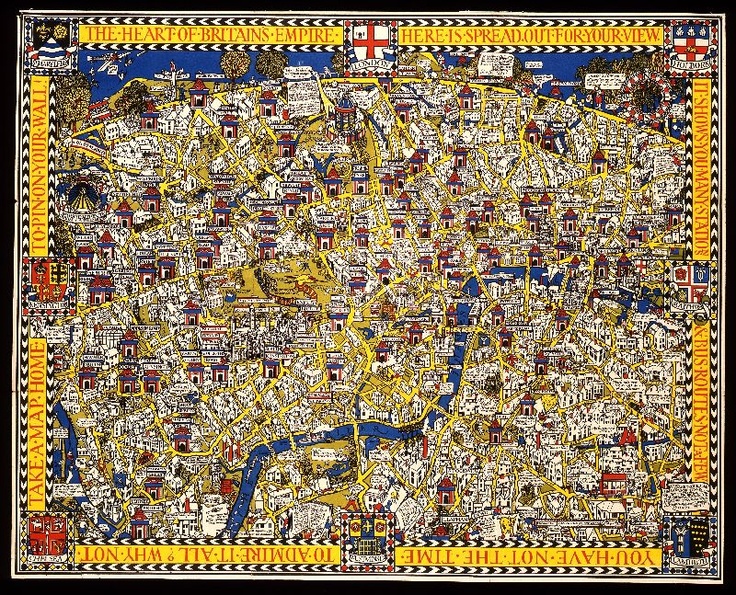
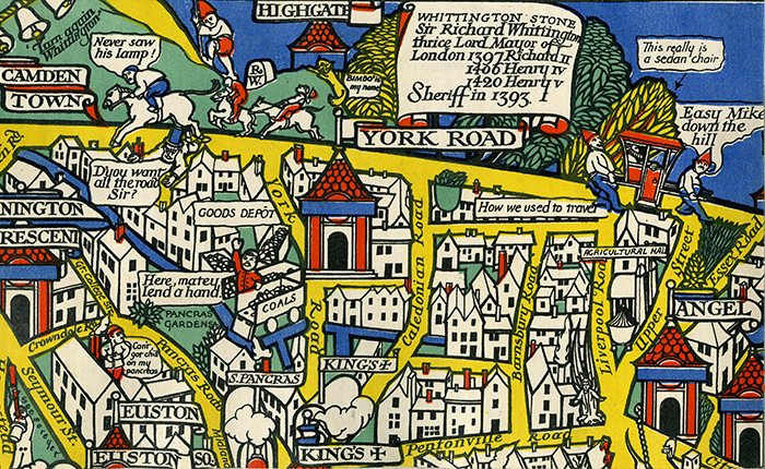
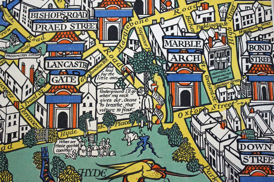
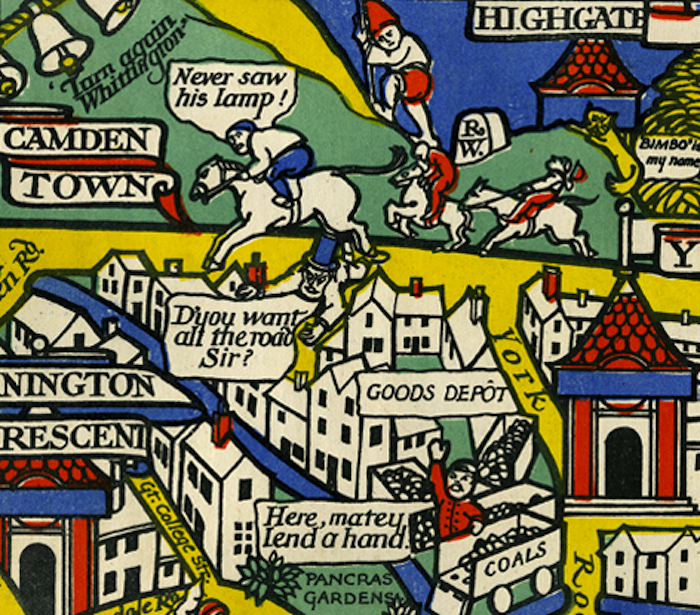
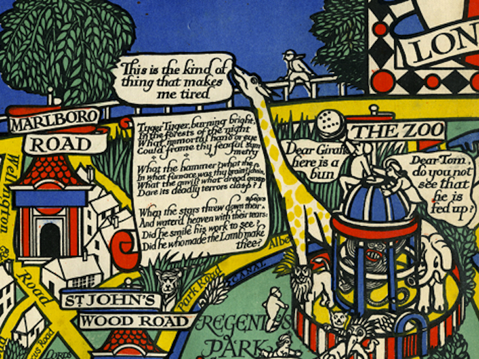
He found it in 1936 through the UK’s Imperial Airways, who commissioned him to apply “his constructivist style” to a map (view it in a larger format here) intended to reassure nervous potential customers of the safety of air travel, a still new and frightening prospect for most travelers. He did so in a way that “makes air travel seem as approachable as stepping on the subway,” with his officiously color-coded “Map of Empire & European Air Routes.” The map, according to Rumsey, “draws on the pioneering information design work of Harry Beck and his London subway maps,” made in 1933 and “originally considered too radical.”
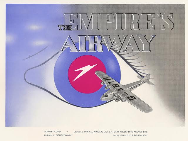
In addition to this businesslike presentation of orderly and predictable flight patterns, Moholy-Nagy created a brochure for the British airline (see the cover above and more pages here). Incorporating the so-called “Speedbird symbol,” these designs, writes Paul Jarvis, made “the point that Imperial spanned the empire and in time would span the world.” Not everyone was impressed. British transit executive Frank Pick, who presided over the visual identity of the London Underground, called Mohagy-Nagy “a gentleman with a modernistic tendency… of a surrealistic type, and I am not at all clear why we should fall for this.” His comments underscore MacCarthy’s argument that the Hungarian artist’s reputation suffered in England because of nationalist hostilities.
Mohagy-Nagy’s art “is international,” said Pick, “or at least continental. Let us leave the continent to pursue their own tricks.” The statement now seems a bit uncanny, though of course Pick could have had nothing like Brexit in mind. As far as Imperial Airlines was concerned, Mohagy-Nagy’s “continental” avant-gardism was exactly what the company needed to entice wary, yet adventurous passengers. You can download free high resolution scans of the map, or buy a print, at the David Rumsey Map Collection (an original vintage poster will cost you between four and six thousand dollars). And see some of Mohagy-Nagy’s less commercial work at this downloadable collection of Bauhaus books and journals.
Related Content:
Designer Massimo Vignelli Revisits and Defends His Iconic 1972 New York City Subway Map
Josh Jones is a writer and musician based in Durham, NC. Follow him at @jdmagness
