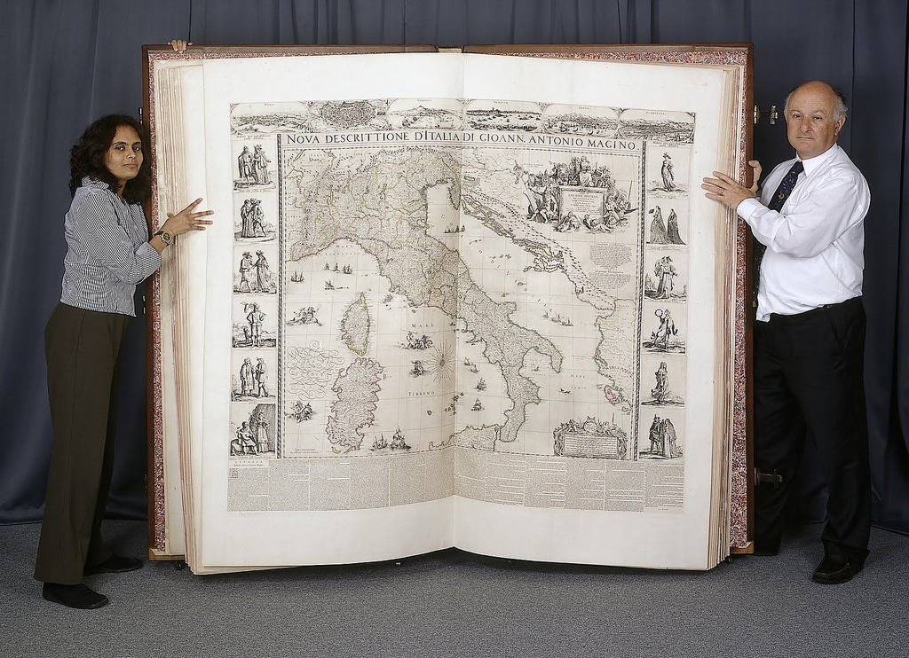
Last week, we featured the free digital edition of the The History of Cartography. Or what’s been called “the most ambitious overview of map making ever undertaken.” The three-volume series contains illustrations of countless maps, produced over hundreds of years. And it, of course, references this fine specimen: A gift given to England’s Charles II in 1660, The Klencke Atlas featured state-of-the-art maps of the continents and various European states. It was also notable for its size. Standing six feet tall and six feet wide (when opened), the volume remains 355 years later the largest atlas in the world. Learn more about it with the BBC clip below.
If you would like to support the mission of Open Culture, consider making a donation to our site. It’s hard to rely 100% on ads, and your contributions will help us continue providing the best free cultural and educational materials to learners everywhere. You can contribute through PayPal, Patreon, and Venmo (@openculture). Thanks!
People come to know the world the way they come to map it—through their perceptions of how its elements are connected and of how they should move among them. This is precisely what the series is attempting by situating the map at the heart of cultural life and revealing its relationship to society, science, and religion…. It is trying to define a new set of relationships between maps and the physical world that involve more than geometric correspondence. It is in essence a new map of human attempts to chart the world.
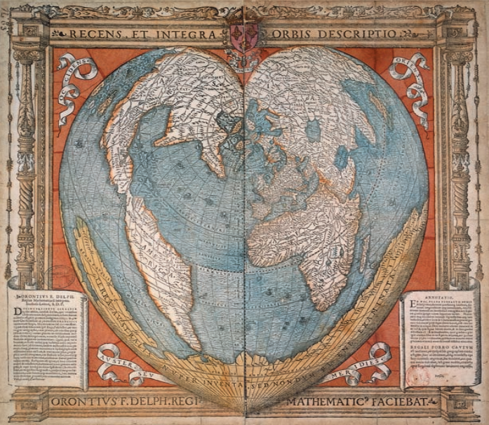
If you head over to this page, then look in the upper left, you will see links to three volumes (available in a free PDF format). My suggestion would be to look at the gallery of color illustrations for each book, links to which you’ll find below. The image above, appearing in Vol. 2, dates back to 1534. It was created by Oronce Fine, the first chair of mathematics in the Collège Royal (aka the Collège de France), and it features the world mapped in the shape of a heart. Pretty great.
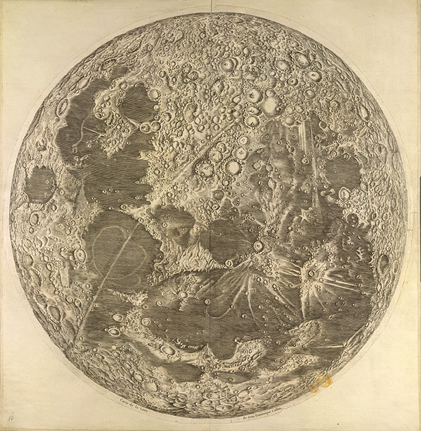
Needless to say, the event was not televised and Cassini never had the opportunity to walk on the surface he studied. Instead he observed it through the eyepiece of a telescope, a relatively new invention.
Cassini, then eight years into his forty year career as Director of the Paris Observatory, produced a map so exhaustive, it provided his peers with far more details of the moon’s surface than they had with regard to their own planet.
He also used his powers of observation to expand human understanding of Mars, Saturn, and France itself (which turned out to be much smaller than previously believed).
A man of science, he may not have been entirely immune to the sort of moon-based whimsy that has long infected poets, songwriters, and 19th-century romantic heroines. Hiding in the lower right quadrant, near Cape Heraclides on the Sinus Iridum (aka Bay of Rainbows), is a tiny, bare-shouldered moon maid. See right above.
Or perhaps this appealingly playful vision can be attributed to Cassini’s engraver Claude Mellan.
Either way, she seems exactly the sort of female life form a 17th-century human male might hope to encounter on a trip to the moon.
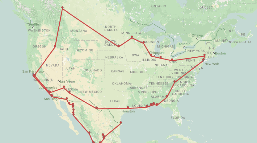
Fantasy fiction invariably includes a map for readers to understand the hero’s journey, literally. We know that Hobbits had to walk a long way into Mordor, but seeing it cartographically really hits home. But what of the great road trip novels, where the country is America, the journey is long and often circular, and self-actualization awaits the hero, and not an army of orcs?
Atlas Obscura, Joshua Foer and Dylan Thuras’ blog of discovery and adventure in the modern world, have come to the rescue with an interactive map that plots out the travels of road trip-filled books, some non-fiction, others fictionalized reality. Where a location is mentioned in a text, it has been pinned to the map, and by clicking on the pin, the relevant text is revealed. Clever stuff.
For example, the map for Jack Kerouac’s On the Road (see snapshot above) plots out the five trips contained in the novel, and one can see the main hubs of the story: NYC and San Francisco, of course, but also Denver and the crazed detour town to Mexico City, where Sal, Dean, and Stan Shephard party hard in a bordello and Sal winds up with dysentery for his troubles.
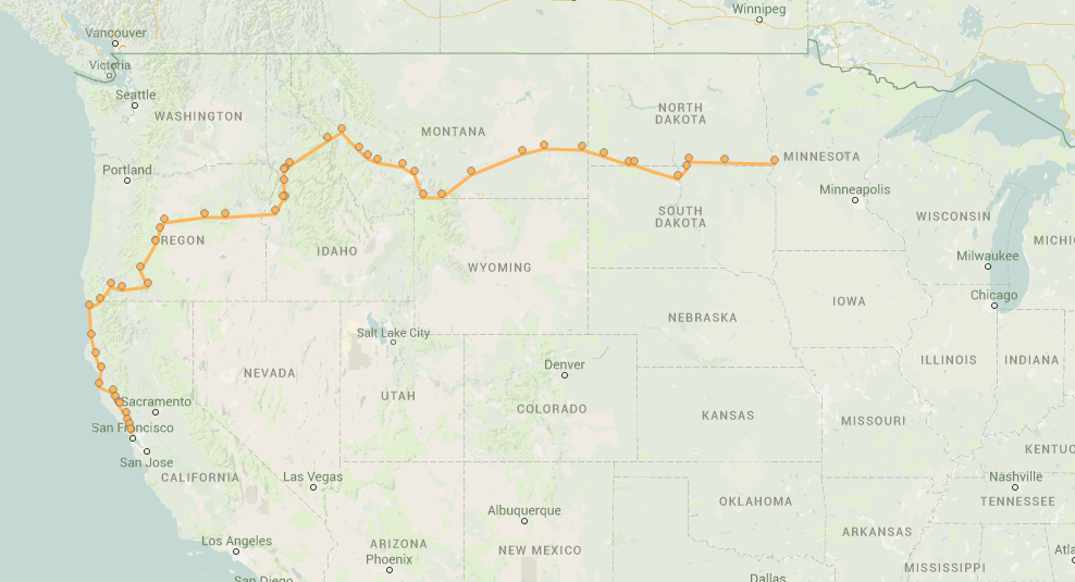
For something more straightforward, check out the Northwest travels at the heart of Robert M. Pirsig’s Zen and the Art of Motorcycle Maintenance. Written in the first person, the novel’s narrator travels by motorcycle with his son from Minnesota to Northern California, ending up in San Francisco, taking 17 days. The philosophical journey, however, covers wider terrain.
Another Bay Area tale, Tom Wolfe’s account of Ken Kesey and the Merry Pranksters in The Electric Kool-Aid Acid Test starts in La Honda, California, a mountain getaway to the west of San Jose, and, as one can see, completes a circle of the States, including trips to both Calgary, Canada and Manzanillo, Mexico, where everybody is “uptight,” man, heading northeast to both Guanajuato and Aguascalientes, where Acid Tests are administered.
Ted Mills is a freelance writer on the arts who currently hosts the FunkZone Podcast. You can also follow him on Twitter at @tedmills, read his other arts writing at tedmills.com and/or watch his films here.
This delirious artifact comes courtesy of Elmer Simms Campbell (1906–1971), an artist whose race proved an impediment to career advancement in his native Midwest. Not long after relocating to New York City, he had the good fortune to be befriended by the great Cab Calloway, star of the Cotton Club. Hi-de-hi-de-hi-de-ho! Check the lower left corner of your map.
You may notice that the compass rose deviates rather drastically from established norms. As you’ve no doubt heard, the Bronx is up, and the Battery’s down, but not in this case. Were you to choose those trees in the upper left corner as your starting point, you’d be at the top of Central Park, basically equidistant from the east and west sides. (Take the 2 or the 3 to 110th St…)
But keep in mind that this map is not drawn to scale. I know it looks like the joints are jumping from the second you step off the curb, but in reality, you’ll need to hoof it 21 blocks from the top of Central Park to 131st street for things to start cookin’. Hopefully, this geographical liberty won’t get you too hot under the collar. And if it does, well, it may be Prohibition, but stress-relieving beverages await you in every location listed, as well as in some 500 speakeasies Campbell allowed to remain on the down low.
If that doesn’t do it for you, there’s a guy selling reefer across the street from Earl “Snakehips” Tucker.
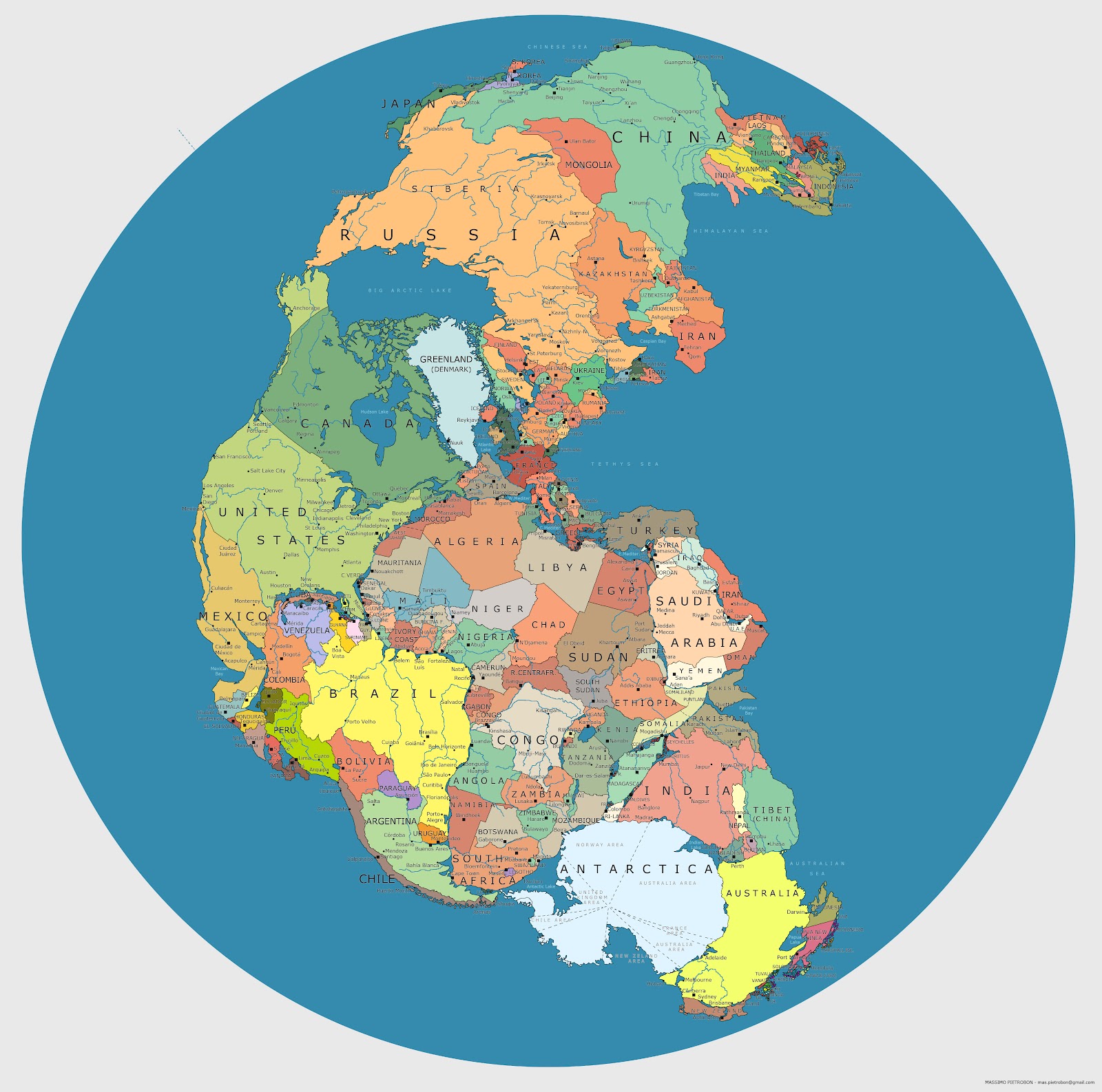
The supercontinent of Pangea formed some 270 million years ago, during the Early Permian Period, and then began to break up 70 million years later, eventually yielding the continents we inhabit today. Pangea was, of course, a peopleless place. But if you were to drop today’s nations on that great land mass, here’s what it might look like. (Click on the image to view it in a much larger, high resolution format.) The map’s creator is Massimo Pietrobon, someone who playfully describes himself as “a famous explorer and cartographer of Atlantis,” and who has taken on other experiments with maps in the past. When someone claimed that the scale of certain countries wasn’t exactly right, Massimo was quick to confess on his blog, “Yes, it’s just a trial, it can be better.” But it’s a creative start.
If you would like to support the mission of Open Culture, consider making a donation to our site. It’s hard to rely 100% on ads, and your contributions will help us continue providing the best free cultural and educational materials to learners everywhere. You can contribute through PayPal, Patreon, and Venmo (@openculture). Thanks!
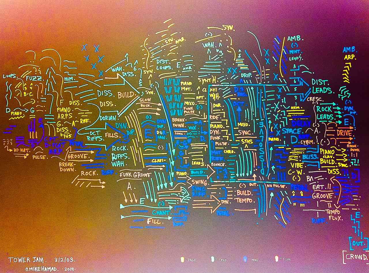
Mike Hamad, a music writer for The Hartford Courant, has a deep and abiding love for Phish. He also has a talent for drawing “schematics” or maps that turn the experience of listening to music into something visual. Over at his tumblr SetlistSchematics, you can find nearly 200 schematics of songs (usually performed live) by The Grateful Dead, The Dave Matthews Band, Pink Floyd, and mostly Phish. According to a short profile in The New York Times, Hamad “has a master’s degree in music theory and a Ph.D. in musicology” — his dissertation focused on the tonal relationships in Franz Liszt’s songs — and, somewhere along the way, he developed a tendency to translate music into schematics, a flurry of “arrows, descriptive notes, roman numerals and wavy lines.”
As time places us ever further from the event, our knowledge of (and—generally speaking—interest in World War I) has shrunk precipitously. That trend is reversing as the centennial of Archduke Franz Ferdinand’s assassination draws nigh.
Before I started studying this game-changing catastrophic event with my young son, one of my few germane pieces of information was that a lot of soldiers lived and died in trenches dug along the Western front. Even without photos, statistics, or personal stories, this defining aspect hits home hard in Emperor Tigerstar’s animated map of the Great War’s changing front lines in Europe and the Middle East, above.
The trenches were built following the First Battle of the Marne in September 1914. Eventually they covered over 25,000 miles. Hundreds of thousands met their ghastly ends there, via bombs, illness, and poison gas attacks, but these losses resulted in very little geographic gain for one side or the other.
If you’re looking for change, keep your eye peeled for the Russian Revolution. The Western Front was a deadlock.
We're hoping to rely on loyal readers, rather than erratic ads. Please click the Donate button and support Open Culture. You can use Paypal, Venmo, Patreon, even Crypto! We thank you!
Open Culture scours the web for the best educational media. We find the free courses and audio books you need, the language lessons & educational videos you want, and plenty of enlightenment in between.


