When I was a kid, my father brought home from I know not where an enormous collection of National Geographic magazines spanning the years 1917 to 1985. I found, tucked in almost every issue, one of the magazine’s gorgeous maps—of the Moon, St. Petersburg, the Himalayas, Eastern Europe’s ever-shifting boundaries. I became a cartography enthusiast and geographical sponge, poring over them for years just for the sheer enjoyment of it, a pleasure that remains with me today. Whether you’re like me and simply love the imaginative exercise of tracing a map’s lines and contours and absorbing information, or you love to do that and you get paid for it, you’ll find innumerable ways to spend your time on the new Open Access Maps project at the New York Public Library. The NYPL announces the release with the explanation below:
The Lionel Pincus & Princess Firyal Map Division is very proud to announce the release of more than 20,000 cartographic works as high resolution downloads. We believe these maps have no known US copyright restrictions.* To the extent that some jurisdictions grant NYPL an additional copyright in the digital reproductions of these maps, NYPL is distributing these images under a Creative Commons CC0 1.0 Universal Public Domain Dedication. The maps can be viewed through the New York Public Library’s Digital Collections page, and downloaded (!), through the Map Warper.
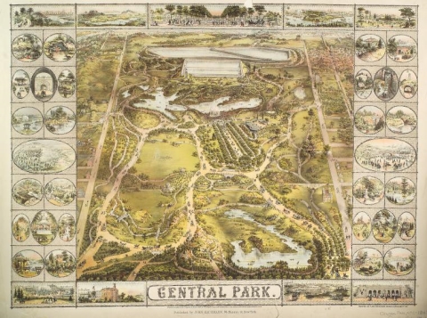
What does this mean? Simply put, “it means you can have the maps, all of them if you want, for free, in high resolution.” Maps like that above, of New York’s Central Park, issued in 1863, ten years before Frederick Law Olmsted and Calvert Vaux completed their historic re-design.
Can you—as I did with my neatly folded, yellowing archive—have all the maps in full-color print? Well, no, unless you’re prepared to bear the cost in ink and paper and have some specialized printing equipment that can render each map in its original dimensions. But you can access something worlds away from what I could have imagined—a digital enhancement technology called “warping,” also known as “georectification.”
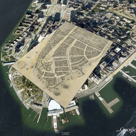
This, explains the NYPL, “is the process where digital images of maps are stretched, placing the maps themselves into their geographic context, rendered either on the website or with tools such as Google Earth.” For example, below see a “warping” of the 1916 Redraft of the 1660 “Castello Plan” for then-New Amsterdam over a current-day Google Earth image of lower Manhattan (and note how much the island has been expanded past its 17th century shores). The “warping” technology is open access, meaning that “anybody with a computer can create an account, log in, and begin warping and tracing maps.” User contributions remain, “a la Wikipedia,” and add “one more piece to this new historical geographic data model.”
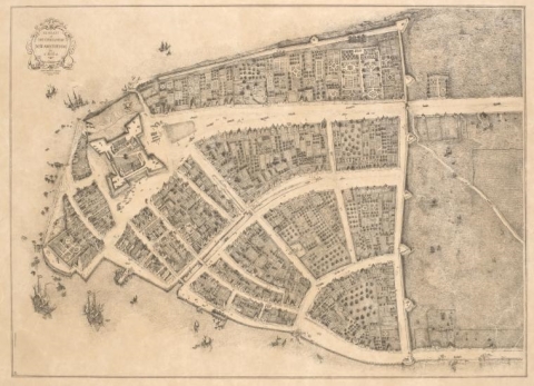
The “warper” is a special feature that helps place historical maps in a modern visual field, but it in no way ruins the enjoyment of those maps as archival pieces or art objects. You can see cartographer John Wolcott Adams original 1916 Castello Plan redraft below, and visit NYPL’s Digital Collections for a high resolution image, fully zoomable and, yes, printable. For more on the incredible warping technology NYPL makes available to us, see this extended blog post, “Unbinding the Atlas: Working with Digital Maps.” Over ten thousand of the collection’s maps are of New York and New Jersey, dating from 1852 to 1922, including property, zoning, and topographic maps. In addition, over one thousand of the maps depict Mid-Atlantic cities from the 16th to the 19th centuries, and over 700 are topographic maps of the Austro-Hungarian Empire between 1877 and 1914. That should be enough to keep any amateur or professional map-lover busy for a good long while. Start digging into the maps here.
Related Content:
Download 15,000+ Free Golden Age Comics from the Digital Comic Museum
Download Over 250 Free Art Books From the Getty Museum
14,000 Free Images from the French Revolution Now Available Online
Josh Jones is a writer and musician based in Durham, NC. Follow him at @jdmagness

