Beatboxing, the practice of producing drum machine-like beats (especially TR-808-like beats) with one’s voice, has long since made the transition from parlor trick to acknowledged musical art form. But we still have much to understand about it, as the recently-emerged first generation of beatboxing scholars knows full well. “A team of linguistics and engineering students at USC wanted to learn more about the mechanics behind the rhythms,” writes Los Angeles Times music critic Randall Roberts. “By using MRI technology, they recorded an unnamed local beatboxer working his magic, broke down the most commonly employed sounds by examining the movements of his mouth and then analyzed the data.”
This resulted in a paper called “Paralinguistic Mechanisms of Production in Human ‘Beatboxing’: A Real-Time Magnetic Resonance Imaging Study.” Roberts describes it as “predictably heavy with linguistic jargon, but even to a civilian, the results are illuminating,” especially the video the research team recorded, “which reveals how the human mouth can so convincingly create the pop of a snare drum.” At the top of the post, you can see this sort of thing for yourself: in this video “The Diva and the Emcee,” featured at the International Society for Magnetic Resonance in Medicine (ISMRM) Scientific Sessions in Seattle, we see how a beatboxer’s technique compares to that of an opera singer.
You can find out more at the site of the Speech Production and Articulation Knowledge group (SPAN), the USC team that performed this pioneering research into an important component of one of the pillars of hip hop. Keep their findings in mind next time you watch a beatboxing clip that goes viral (such as the Goldberg Variations one we featured back in 2012) for a richer listening experience. After all, it does no harm to the romance of the beatbox, to paraphrase Carl Sagan, to know a little bit about it.
If you would like to support the mission of Open Culture, consider making a donation to our site. It’s hard to rely 100% on ads, and your contributions will help us continue providing the best free cultural and educational materials to learners everywhere. You can contribute through PayPal, Patreon, and Venmo (@openculture). Thanks!
I freely admit it—like a great many people these days, I have a social media addiction. My drug of choice, Twitter, can seem like a particularly schizoid means of acquiring and sharing information (or knee-jerk opinion, rumor, innuendo, nonsense, etc.) and a particularly accelerated form of distractibility that never, ever sleeps. Given the profound degree of over-stimulation such outlets provide, we might be justified in thinking we owe our short attention spans to 21st century technological advances. Not necessarily, says Michigan State University professor Natalie Phillips—who studies 18th and 19th century English literature from the perspective of a 21st century cognitive theorist, and who cautions against “adopting a kind of historical nostalgia, or assuming those of the 18th century were less distracted than we are today.”
Early modern writers were just as aware of—and as concerned about—the problem of inattention as contemporary critics, Phillips argues, “amidst the print-overload of 18th-century England.” We might refer, for example, to Alexander Pope’s epic satire “The Dunciad,” a hilariously apocalyptic jeremiad against the proliferation of careless reading and writing in the new media environment of his day. (A world “drowning in print, where everything was ephemeral, of the moment.”)
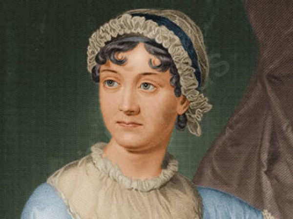
Phillips focuses on the work of Jane Austen, whom, she believes, “was drawing on the contemporary theories of cognition in her time” to construct distractible characters like Pride and Prejudice’s Elizabeth Bennett. Taking her cues from Austen and other Enlightenment-era writers, as well as her own inattentive nature, Phillips uses contemporary neuroscience to inform her research, including the use of brain imaging technology and computer programs that track eye movements.
In collaboration with Stanford’s Center for Cognitive and Biological Imaging (CNI), Phillips devised an experiment in 2012 in which she asked literary PhD candidates—chosen, writes Stanford News, “because Phillips felt they could easily alternate between close reading and pleasure reading”—to read a full chapter from Austen’s Mansfield Park, projected onto a mirror inside an MRI scanner. At times, the subjects were instructed to read the text casually, at others, to read closely and analytically. Afterwards, they were asked to write an essay on the passages they read with attention. As you’ll hear Phillips describe in the short NPR piece above, the neuroscientists she worked with told her to expect only the subtlest of differences between the two types of reading. The data showed otherwise. Phillips describes her surprise at seeing “how much the whole brain, global activations across a number of different regions, seems to be transforming and shifting between the pleasure and the close reading.” As CNI neuroscientist Bob Dougherty describes it, “a simple request to the participants to change their literary attention can have such a big impact on the pattern of activity during reading,” with close reading stimulating many more areas of the brain than the casual variety. What are we to make of these still inconclusive results? As with many such projects in the emerging interdisciplinary field of “literary neuroscience,” Phillips’ goal is in part to demonstrate the continued relevance of the humanities in the age of STEM. Thus, she theorizes, the practice and teaching of close reading “could serve—quite literally—as a kind of cognitive training, teaching us to modulate our concentration and use new brain regions as we move flexibly between modes of focus.”
The study also provides us with a fascinating picture—quite literally—of the ways in which the imaginative experience of reading takes place in our bodies as well as our minds. Close, sustained, and attentive reading, Phillips found, activates parts of the brain responsible for movement and touch, “as though,” writes NPR, “readers were physically placing themselves within the story as they analyzed it.” Phillips’ study offers a scientific look at a mysterious experience serious readers know well—“how the right patterns of ink on a page,” says Dougherty, “can create vivid mental imagery and instill powerful emotions.” As with the so-called “hard problem of consciousness,” we may not understand exactly how this happens anytime soon, but we can observe that the experience of close reading is a rewarding one for our entire brain, not just the parts that love Jane Austen. While not everyone needs convincing that “literary study provides a truly valuable exercise of people’s brains,” Phillips’ research may prove exactly that.
The app asks you a few basic questions — what’s the color, size, and behavior of the bird you saw, and also when and where did you see it — and then, drawing on a database of information gathered by Cornell experts and thousands of bird enthusiasts, the app will give you a shortlist of possibilities. From there you can zero in on the actual bird you saw.
The free app (introduced in the video above) launched with “285 species most commonly encountered in North America.” But Cornell plans to add more species and features over time. Meanwhile, the current app already offers “more than 2,000 stunning images taken by top photographers,” “more than 1,000 audio recordings from the Macaulay Library, identification tips from experts, and range maps from the Birds of North America Online.”
Happy birdwatching!
If you would like to support the mission of Open Culture, consider making a donation to our site. It’s hard to rely 100% on ads, and your contributions will help us continue providing the best free cultural and educational materials to learners everywhere. You can contribute through PayPal, Patreon, and Venmo (@openculture). Thanks!
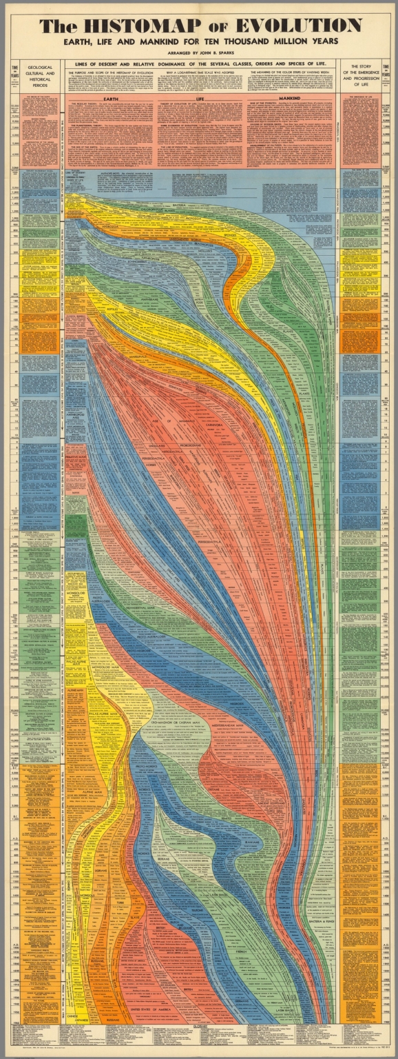
The early decades of the twentieth century belonged to Cecil B. DeMille and his epic films both Biblical and classical: The Ten Commandments, Cleopatra, Samson and Delilah. The grand scale of these pseudo-histories required the most up-to-date cinematic invention of the day, and the most imperial vision, one later decades looked upon rather cynically. But just as the epic has roared back with a vengeance—with technological feats that make The Greatest Show on Earth look like community theater—so another medium of ambitious scope once popular between the wars has made a reappearance: the historical infographic, or as it was called back then, the “histomap”—5‑foot long visual histories of a variety of disciplines.
As with film, information technology has advanced to such a degree to make this early means of condensing huge amounts of data perhaps seem quaint. But if we imagine a world pre-internet, when the prospect of visualizing a subject as complex as, say, evolution, would be daunting indeed, we might just find the histomap as impressive a means of conveying information as its early readers did. These huge graphs of big ideas, writes Rebecca Onion at Slate, fit “with a trend in nonfiction book publishing of the 1920s and 1930s: the ‘outline,’ in which large subjects (the history of the world! every school of philosophy! All of modern physics!) were distilled into a form comprehensible to the most uneducated layman.”
We’ve previously featured that 1931 “History of the World!” histomap, an impressive condensing of 4000 years of human activity. The evolution graphic you see here, also from 1931 and “arranged” by John B. Sparks, is equally impressive, and speaks to the times in ways that DeMille’s Bible movies did as well. Bear in mind that the Scopes Monkey Trial had only concluded six years earlier, and the country—as it is again today—was hotly divided over the subject represented here. Nonetheless, Sparks and publisher Rand McNally gamely presented this “Story of the Emergence and Progression of Life” with confident precision and without apology.
I couldn’t begin to tell you how the science here has aged, though some of it, I’d suspect, not particularly well. In any case, the form of this elegant data map, with its graceful lines of descent flowing down the page like magma, complements its content. Rather than presenting the theory of evolution as a forgone conclusion or belief, Sparks’ graphic lays out all of the evidence, and fits it together neatly and comprehensively. Some modern evolution infographics surpass the visual appeal, but not the level of scientific detail shown here. Others reduce the science, and the design, to the level of oversimplified ideology. And though we may have enough historical distance to make infographicss of hundreds of years of evolutionary thought, it may seem that the technology of the evolution infographic may not have advanced as much as we might expect.
Back in December, Ayun Halliday took you inside an MRI machine to explore the neuroscience of jazz improvisation and musical creativity. Along the way, you got to see Johns Hopkins surgeon Charles Limb jam on a keyboard inside one of those crowded, claustrophobia-inducing tubes. How could you beat that for entertainment?
Today, we return with a new video showing another way the MRI machine is giving scientists new insights into the making of music. This time the focus is on how we produce sounds when we sing. When “we sing or speak, the vocal folds—the two small pieces of tissue [in our neck]—come together and, as air passes over them, they vibrate,” and produce sound. That’s basically what happens. We know that. But the typical MRI machine, capturing about 10 frames per second, is too slow to really let scientists break down the action of the larynx. Enter the new, high speed MRI machine at the Beckman Institute at the University of Illinois, working at 100 frames per second. It does the trick.
Above, you can see the new machine in action, as a volunteer sings ‘If I Only Had a Brain.’ Get more of the backstory over at the Beckman Institute.
Japanese scientists have developed a camera that confirms what we’ve long sensed: “wine glass shape has a very sophisticated functional design for tasting and enjoying wine.” That’s what Kohji Mitsubayashi, a researcher at the Tokyo Medical and Dental University, told Chemistry World.
It’s a little complicated, and I’d encourage you to read this Chemistry World article, but the upshot is this: Mitsubayashi’s team used a special camera to analyze “different wines, in different glasses – including different shaped wine glasses, a martini glass and a straight glass – at different temperatures.” And they found that “different glass shapes and temperatures can bring out completely different bouquets and finishes from the same wine.”
In the video above, you can see the new-fangled camera in action, demonstrating how wines at different temperatures (something that’s affected by the geometry of the glass) release different vapors. And those translate into different flavors. Get more on this at Chemistry World.
If you would like to support the mission of Open Culture, consider making a donation to our site. It’s hard to rely 100% on ads, and your contributions will help us continue providing the best free cultural and educational materials to learners everywhere. You can contribute through PayPal, Patreon, and Venmo (@openculture). Thanks!
We're hoping to rely on loyal readers, rather than erratic ads. Please click the Donate button and support Open Culture. You can use Paypal, Venmo, Patreon, even Crypto! We thank you!
Open Culture scours the web for the best educational media. We find the free courses and audio books you need, the language lessons & educational videos you want, and plenty of enlightenment in between.