I remember opening my college newspaper one day, and out of it fell what looked like an advertising supplement of unusually utilitarian design. Upon closer inspection, it contained a series of math‑y looking problems for the reader to work out and, if they did so, mail in to an address provided. Word soon began to circulate that this unusual leaflet came from no less an institution than Google itself, already well known as a provider of advanced search services but not quite yet as a benevolent provider of dream jobs (an image now satirized in movies like The Internship).
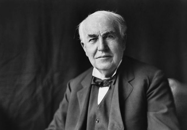
The unusual hiring practices of giant, innovative American technology companies have become the stuff of modern myth, but the usage of seemingly job-unrelated intellectual tests as a filter for potential employees has a much longer history. Thomas Edison, that original giant of American technological innovation, put forward the first famous example: a 146-question test on subjects of general knowledge from geography to history to physics to the price of gold.
“Americans obsessed over the test following [the] publication of many questions in the May 11, 1921 New York Times,” writes Paleofuture’s Matt Novak. “From there the test was debated, copied, and parodied in newspapers and magazines around the country.” If you’d like to get a sense of how you’d have fared in the scramble for a sweet Edison job, set your mind back to the early 1920s and tackle these questions as best you can:
1. What countries bound France?
2. What city and country produce the finest china?
3. Where is the River Volga?
4. What is the finest cotton grown?
5. What country consumed the most tea before the war?
6. What city in the United States leads in making laundry machines?
7. What city is the fur centre of the United States?
8. What country is the greatest textile producer?
9. Is Australia greater than Greenland in area?
10. Where is Copenhagen?
11. Where is Spitzbergen?
12. In what country other than Australia are kangaroos found?
13. What telescope is the largest in the world?
14. Who was Bessemer and what did he do?
15. How many states in the Union?
16. Where do we get prunes from?
17. Who was Paul Revere?
18. Who was John Hancock?
19. Who was Plutarch?
20. Who was Hannibal?
21. Who was Danton?
22. Who was Solon?
23. Who was Francis Marion?
24. Who was Leonidas?
25. Where did we get Louisiana from?
26. Who was Pizarro?
27. Who was Bolivar?
28. What war material did Chile export to the Allies during the war?
29. Where does most of the coffee come from?
30. Where is Korea?
31. Where is Manchuria?
32. Where was Napoleon born?
33. What is the highest rise of tide on the North American Coast?
34. Who invented logarithms?
35. Who was the Emperor of Mexico when Cortez landed?
36. Where is the Imperial Valley and what is it noted for?
37. What and where is the Sargasso Sea?
38. What is the greatest known depth of the ocean?
39. What is the name of a large inland body of water that has no outlet?
40. What is the capital of Pennsylvania?
41. What state is the largest? Next?
42. Rhode Island is the smallest state. What is the next and the next?
43. How far is it from New York to Buffalo?
44. How far is it from New York to San Francisco?
45. How far is it from New York to Liverpool?
46. Of what state is Helena the capital?
47. Of what state is Tallahassee the capital?
48. What state has the largest copper mines?
49. What state has the largest amethyst mines?
50. What is the name of a famous violin maker?
51. Who invented the modern paper-making machine?
52. Who invented the typesetting machine?
53. Who invented printing?
54. How is leather tanned?
55. What is artificial silk made from?
56. What is a caisson?
57. What is shellac?
58. What is celluloid made from?
59. What causes the tides?
60. To what is the change of the seasons due?
61. What is coke?
62. From what part of the North Atlantic do we get codfish?
63. Who reached the South Pole?
64. What is a monsoon?
65. Where is the Magdalena Bay?
66. From where do we import figs?
67. From where do we get dates?
68. Where do we get our domestic sardines?
69. What is the longest railroad in the world?
70. Where is Kenosha?
71. What is the speed of sound?
72. What is the speed of light?
73. Who was Cleopatra and how did she die?
74. Where are condors found?
75, Who discovered the law of gravitation?
76. What is the distance between the earth and sun?
77. Who invented photography?
78. What country produces the most wool?
79. What is felt?
80. What cereal is used in all parts of the world?
81. What states produce phosphates?
82. Why is cast iron called pig iron?
83. Name three principal acids?
84. Name three powerful poisons.
85. Who discovered radium?
86. Who discovered the X‑ray?
87. Name three principal alkalis.
88. What part of Germany do toys come from?
89. What States bound West Virginia?
90. Where do we get peanuts from?
91. What is the capital of Alabama?
92. Who composed “Il Trovatore”?
93. What is the weight of air in a room 20 by 30 by 10?
94. Where is platinum found?
95. With what metal is platinum associated when found?
96. How is sulphuric acid made?
97. Where do we get sulphur from?
98. Who discovered how to vulcanize rubber?
99. Where do we import rubber from?
100. What is vulcanite and how is it made?
101. Who invented the cotton gin?
102. What is the price of 12 grains of gold?
103. What is the difference between anthracite and bituminous coal?
104. Where do we get benzol from?
105. Of what is glass made?
106. How is window glass made?
107. What is porcelain?
108. What country makes the best optical lenses and what city?
109. What kind of a machine is used to cut the facets of diamonds?
110. What is a foot pound?
111. Where do we get borax from?
112. Where is the Assuan Dam?
113. What star is it that has been recently measured and found to be of enormous size?
114. What large river in the United States flows from south to north?
115. What are the Straits of Messina?
116. What is the highest mountain in the world?
117. Where do we import cork from?
118. Where is the St. Gothard tunnel?
119. What is the Taj Mahal?
120. Where is Labrador?
121. Who wrote “The Star-Spangled Banner”?
122. Who wrote “Home, Sweet Home”?
123. Who was Martin Luther?
124. What is the chief acid in vinegar?
125. Who wrote “Don Quixote”?
126. Who wrote “Les Miserables”?
127. What place is the greatest distance below sea level?
128. What are axe handles made of?
129. Who made “The Thinker”?
130. Why is a Fahrenheit thermometer called Fahrenheit?
131. Who owned and ran the New York Herald for a long time?
132. What is copra?
133. What insect carries malaria?
134. Who discovered the Pacific Ocean?
135. What country has the largest output of nickel in the world?
136. What ingredients are in the best white paint?
137. What is glucose and how made?
138. In what part of the world does it never rain?
139. What was the approximate population of England, France, Germany and Russia before the war?
140. Where is the city of Mecca?
141. Where do we get quicksilver from?
142. Of what are violin strings made?
143. What city on the Atlantic seaboard is the greatest pottery centre?
144. Who is called the “father of railroads” in the United States?
145. What is the heaviest kind of wood?
146. What is the lightest wood?
Some of these questions, like those on the location of Copenhagen or the identity of Leonidas (you need think back only to 300), have grown easier with time. Some — “What is coke?” “What is vulcanite and how is it made?” — have grown harder. Others will require you to call upon not current knowledge, but period knowledge: sure, you know the number of states in the union now, but how about in 1921? And sure, you know which city is the fur center of the United States now, but how about in 1921?