The Jan van Eyck Academie, a “multiform institute for fine art, design and reflection” in Holland, has come up with a novel way of presenting Ray Bradbury’s 1953 work of dystopian fiction, Fahrenheit 451. On Instagram, they write:
This week our colleagues from Super Terrain are working in the Lab as a last stop on their all-over-Europe printing adventures. They showed us this remarkable book they made “Fahrenheit 451”. —
Want to see how the novel unfolds? Just add heat. That’s the idea.
Apparently they actually have plans to market the book. When asked on Instagram, “How can I purchase one of these?,” they replied “We’re working on it! Stay tuned.”
When that day comes, please handle the book with care.
If you would like to support the mission of Open Culture, consider making a donation to our site. It’s hard to rely 100% on ads, and your contributions will help us continue providing the best free cultural and educational materials to learners everywhere. You can contribute through PayPal, Patreon, and Venmo (@openculture). Thanks!
If you find yourself in New Mexico, traveling down a stretch of Route 66, you can drive over a quarter mile-long rumble strip and your car’s tires will play “America the Beautiful.” That’s assuming you’re driving at the speed limit, 45 miles per hour. Don’t believe me? Watch the clip above.
As Atlas Obscura explains, the “Musical Highway” or “Singing Highway” was “installed in 2014 as part of a partnership between the New Mexico Department of Transportation and the National Geographic Channel.” It’s all part of an elaborate attempt to get drivers to slow down and obey the speed limit. “Getting the rumble strips to serenade travelers required a fair bit of engineering. The individual strips had to be placed at the precise distance from one another to produce the notes they needed to sing their now-signature song.”
If you would like to support the mission of Open Culture, consider making a donation to our site. It’s hard to rely 100% on ads, and your contributions will help us continue providing the best free cultural and educational materials to learners everywhere. You can contribute through PayPal, Patreon, and Venmo (@openculture). Thanks!
Every piece of technology has a precedent. Most have several different types of precedents. You’ve probably used (and may well own) an eBook reader, for instance, but what would have afforded you a selection of reading material two or three centuries ago? If you were a Jacobean Englishman of means, you might have used the kind of traveling library we featured in August, a handsome portable case custom-made for your books. (If you’re Tom Stoppard in the 21st century, you still do.) If you were Napoleon, who seemed to love books as much as he loved military power — he didn’t just amass a vast collection of them, but kept a personal librarian to oversee it — you’d take it a big step further.
“Many of Napoleon’s biographers have incidentally mentioned that he […] used to carry about a certain number of favorite books wherever he went, whether traveling or camping,” says an 1885 Sacramento Daily Union article posted by Austin Kleon, “but it is not generally known that he made several plans for the construction of portable libraries which were to form part of his baggage.” The piece’s main source, a Louvre librarian who grew up as the son of one of Napoleon’s librarians, recalls from his father’s stories that “for a long time Napoleon used to carry about the books he required in several boxes holding about sixty volumes each,” each box first made of mahogany and later of more solid leather-covered oak. “The inside was lined with green leather or velvet, and the books were bound in morocco,” an even softer leather most often used for bookbinding.
To use this early traveling library, Napoleon had his attendants consult “a catalogue for each case, with a corresponding number upon every volume, so that there was never a moment’s delay in picking out any book that was wanted.” This worked well enough for a while, but eventually “Napoleon found that many books which he wanted to consult were not included in the collection,” for obvious reasons of space. And so, on July 8, 1803, he sent his librarian these orders:
The Emperor wishes you to form a traveling library of one thousand volumes in small 12mo and printed in handsome type. It is his Majesty’s intention to have these works printed for his special use, and in order to economize space there is to be no margin to them. They should contain from five hundred to six hundred pages, and be bound in covers as flexible as possible and with spring backs. There should be forty works on religion, forty dramatic works, forty volumes of epic and sixty of other poetry, one hundred novels and sixty volumes of history, the remainder being historical memoirs of every period.
In sum: not only did Napoleon possess a traveling library, but when that traveling library proved too cumbersome for his many and varied literary demands, he had a whole new set of not just portable book cases but even more portable books made for him. (You can see how they looked packed away in the image tweeted by Cork County Library above.) This prefigured in a highly analog manner the digital-age concept of recreating books in another format specifically for compactness and convenience — the kind of compactness and convenience now increasingly available to all of us today, and to a degree Napoleon never could have imagined, let alone demanded. It’s always good to be the Emperor, but in many ways, it’s better to be a reader in the 21st century.
Based in Seoul, Colin Marshall writes and broadcasts on cities and culture. His projects include the book The Stateless City: a Walk through 21st-Century Los Angeles and the video series The City in Cinema. Follow him on Twitter at @colinmarshall or on Facebook.
In a post earlier this year, we wrote about a drawing John Coltrane gave his friend and mentor Yusef Lateef, who reproduced it in his book Repository of Scales and Melodic Patterns. The strange diagram contains the easily recognizable circle of fifths (or circle of fourths), but it illustrates a much more sophisticated scheme than basic major scale theory. Just exactly what that is, however, remains a mystery. Like every mystical explorer, the work Coltrane left behind asks us to expand our consciousness beyond its narrow boundaries. The diagram may well show a series of “multiplicities,” as saxophonist Ed Jones writes. From the way Coltrane has “grouped certain pitches,” writes vibes player Corey Mwamba, “it’s easy to infer that Coltrane is displaying a form of chromatic modulation.” These observations, however, fail to explain why he would need such a chart. “The diagram,” writes Mwamba, “may have a theoretical basis beyond that.” But does anyone know what that is?
Perhaps Coltrane cleared certain things up with his “corrected” version of the tone circle, above, which Lateef also reprinted. From this—as pianist Matt Ratcliffe found—one can derive Giant Steps, as well as “the Star of David or the Seal of Solomon, very powerful symbolism especially to ancient knowledge and the Afrocentric and eventually cosmic consciousness direction in which Coltrane would ultimately lead on to with A Love Supreme.”
Sound too far out? On the other side of the epistemological spectrum, we have physicist and sax player Stephon Alexander, who writes in his book The Jazz of Physicsthat “the same geometric principle that motivated Einstein’s theory was reflected in Coltrane’s diagram.” Likewise, saxophonist Roel Hollander sees in the tone circle a number of mathematical principles. But, remaining true to Coltrane’s synthesis of spirituality and science, he also reads its geometry according to sacred symbolism.
In a detailed exploration of the math in Coltrane’s music, Hollander writes, “all tonics of the chords used in ‘Giant Steps’ can be found back at the Circle of Fifths/Fourths within 2 of the 4 augmented triads within the octave.” Examining these interlocking shapes shows us a hexagram, or Star of David, with the third triad suggesting a three-dimensional figure, a “star tetrahedron,” adds Hollander, “also known as ‘Merkaba,” which means “light-spirit-body” and represents “the innermost law of the physical world.” Do we actually find such heavy mystical architecture in the Coltrane Circle?—a “’divine light vehicle’ allegedly used by ascended masters to connect with and reach those in tune with the higher realms, the spirit/body surrounded by counter-rotating fields of light (wheels within wheels)”?
As the occult/magical/Kabbalist associations within the circle increase—the numerology, divine geometry, etc.—we can begin to feel like Tarot readers, joining a collection of random symbolic systems together to produce the results we like best. “That the diagram has to do with something,” writes Mwamba, “is not in doubt: what it has to do with a particular song is unclear.” After four posts in which he dissects both versions of the circle and ponders over the pieces, Mwanda still cannot definitively decide. “To ‘have an answer,’” he writes, “is to directly interpret the diagram from your own viewpoint: there’s a chance that what you think is what John Coltrane thought, but there’s every chance that it is not what he thought.” There’s also the possibility no one can think what Coltrane thought.
The circle contains Coltrane’s musical experiments, yet cannot be explained by them; it hints at theoretical physics and the geometry of musical composition, while also making heavy allusion to mystical and religious symbolism. The musical relationships it constructs seem evident to those with a firm grasp of theory; yet its strange intricacies may be puzzled over forever. “Coltrane’s circle,” writes Faena Aleph, is a “mandala,” expressing “precisely what is, at once, both paradoxical and obvious.” Ultimately, Mwamba concludes in his series on the diagram, “it isn’t possible to say that Coltrane used the diagram at all; but exploring it in relation to what he was saying at the time has led to more understanding and appreciation of his music and life.”
The circle, that is, works like a key with which we might unlock some of the mysteries of Coltrane’s later compositions. But we may never fully grasp its true nature and purpose. Whatever they were, Coltrane never said. But he did believe, as he tells Frank Kofsky in the 1966 interview above, in music’s ability to contain all things, spiritual, physical, and otherwise. “Music,” he says, “being an expression of the human heart, or of the human being itself, does express just what is happening. The whole of human experience at that particular time is being expressed.”
BoingBoing recently ran a short profile on a new documentary that takes you inside the intriguing Ritman Library. Located in Amsterdam, the library houses 23,000 rare books from hermetic/esoteric/occult traditions–Alchemy, Hermetica, Cabala, Magic, Rosicrucianism, Mystic, Theosophy, Freemasonry, Pansophy and much more.
The same deal applies to other films we’ve featured during the past year. Jim Jarmusch’s new documentary Gimme Danger–his “love letter” to punk icons Iggy Pop and The Stooges. And also Long Strange Trip, the new 4‑hour documentary on the Grateful Dead.
If you would like to support the mission of Open Culture, consider making a donation to our site. It’s hard to rely 100% on ads, and your contributions will help us continue providing the best free cultural and educational materials to learners everywhere. You can contribute through PayPal, Patreon, and Venmo (@openculture). Thanks!
Super Dimension Fortress Macross, Mobile Suit Gundam Wing, Neon Genesis Evangelion — these are the kind of titles that might ring a bell even if you have no particular interest in futuristic Japanese animated television shows. But how about Cowboy Bebop? That evocatively Western name itself, not an awkward English translation of a Japanese title but English in the original, hints that the series stands apart from all the dimension fortresses, mobile suits, and neon geneses out there. And indeed, when it first aired in 1997, viewers the world over took quick note of the distinctive sensibility of its stories of a shipful of bounty hunters drifting through outer space in the year 2071.
“On paper, Cowboy Bebop, the legendary cult anime series from Shinichirō Watanabe” — recently director of one of Blade Runner 2049’s short prequels — “reads like something John Wayne, Elmore Leonard, and Philip K. Dick came up with during a wild, all-night whiskey bender.” So writes the Atlantic’s Alex Suskind in a piece on the show’s lasting legacy. “Everyone speaks like they’re background extras in Chinatown. The show ultimately features so many cross-ranging influences and nods to other famous works it’s almost impossible to keep track. It’s Sergio Leone in a spacesuit. It’s Butch Cassidy and the Sundance Kid with automatic weapons.”
And yet Cowboy Bebop remains, thoroughly, a work of Japanese imagination, and like many of the most respected of the form, it has serious philosophical inclinations. Channel Criswell creator Lewis Bond examines those in “The Meaning of Nothing,” his video essay on the series. “Can we as humans find something in nothing, find purpose beyond survival?” Bond asks. “These ontological thoughts that plague us make up the same existential drift our characters repeatedly find themselves in, and it’s what is most significant to the journey of Cowboy Bebop.” He looks past the cooler-than-cool style, snappy dialogue, witty gags, and rich, unexpected mixture of aesthetic influences to which fans have thrilled to find “a metaphysical expression of how people overcome their lives, particularly the lingering grief that comes with them.”
Taken as a whole, the show resolves into a presentation of life as “less of a linear path towards a goal, more of a haze that we must venture through without any guidance, because the sad reality of Bebop’s story is that our cast of characters are lost in the cosmos without any justification for why they live, other than to exist.” The series came to a famously ambiguous end after 26 episodes, but this past summer we heard that it may return, rebooted as a live-action series. Whatever its medium, the world of Cowboy Bebop — with its spacecraft, its interplanetary cops and robbers, and its superintelligent corgi — amounts to nothing less than the human condition, a place we have no choice but to revisit. Might as well do it in style.
Based in Seoul, Colin Marshall writes and broadcasts on cities and culture. His projects include the book The Stateless City: a Walk through 21st-Century Los Angeles and the video series The City in Cinema. Follow him on Twitter at @colinmarshall or on Facebook.
Quick tip: The new software package, Storyboarder, makes it “easy to visualize a story as fast you can draw stick figures.” You can create a story idea without actually making a full-blown movie and see how it looks. Storyboarder is free. It’s open source. It’s available for Mac, Windows, and Linux. And you can download it here.
As the website Cartoon Brew notes, the stories created in Storyboarder “can be exported to Premiere, Final Cut, Avid, PDF, and animated GIF formats.” Or you can “refine the artwork in Photoshop.”
If you would like to support the mission of Open Culture, consider making a donation to our site. It’s hard to rely 100% on ads, and your contributions will help us continue providing the best free cultural and educational materials to learners everywhere. You can contribute through PayPal, Patreon, and Venmo (@openculture). Thanks!
Though he eventually disappeared from the public eye, Syd Barrett did not fade into obscurity all at once after his “erratic behavior,” as Andy Kahn writes at JamBase, “led to his leaving” Pink Floyd in 1968. The founding singer/songwriter/guitarist went on in the following few years to write, record, and even sporadically perform new solo material, appearing on John Peel’s BBC show in 1970 and giving a long Rolling Stone interview the following year. He even started, briefly, a new band in 1972 and worked on new recordings in the studio until 1974.
Barrett released two solo albums, The Madcap Laughs and Barrett, in 1970. Like the solo work of Roky Erickson and Skip Spence—two other tragic psychedelic-era geniuses with mental health struggles—Barrett’s later compositions are frustratingly rough-cut gems: quirky, sinister, meandering folk-psych adventures that provide an alternate look into what Pink Floyd might have sounded like if their original intentions of keeping him on as a non-performing songwriter had worked out.
Assisting him during his studio sessions were former bandmates Roger Waters, Richard Wright, and David Gilmour. The band still admired his singular talent, but they found working, and even speaking, with him difficult in the extreme.
As Gilmour has described those years in interviews, they carried a considerable amount of guilt over Barrett’s ouster. In addition to the heartbreaking tribute “Shine on You Crazy Diamond,” Gilmour has often performed Syd’s solo songs onstage in affecting, often solo acoustic, renditions that became all the more poignant after Barrett’s death in 2006.
In the videos at the top, you can see Gilmour play two songs from Barrett’s The Madcap Laughs—“Terrapin” and “Dark Globe”—and further up, see him play “Dominoes” from Barrett, with Richard Wright on Keyboards. Gilmour has also revisited onstage Pink Floyd’s earliest, Barrett-fronted, days. Just above, we have the rare treat of seeing him play the band’s first single, “Arnold Layne,” with special guest David Bowie on lead vocals. And below, see Gilmour and Wright play a version of the early Floyd classic “Astronomy Domine,” live at Abbey Road studios.
It was, sadly, at Abbey Road where the band last saw Barrett, when he entered the studio in 1975 during the final mixes of Wish You Were Here. Overweight and with shaved head and eyebrows, Barrett was at first unrecognizable. After this last public appearance, he felt the need, as Waters put it, to “withdraw completely” from “modern life.” But the tragic final months with Pink Floyd and few sightings afterward should hardly be the way we remember Syd Barrett. He may have lost the ability to communicate with his former friends and bandmates, but for a time he continued to speak in hauntingly strange, thoroughly original songs.
This collection of videos comes to us via JamBase.
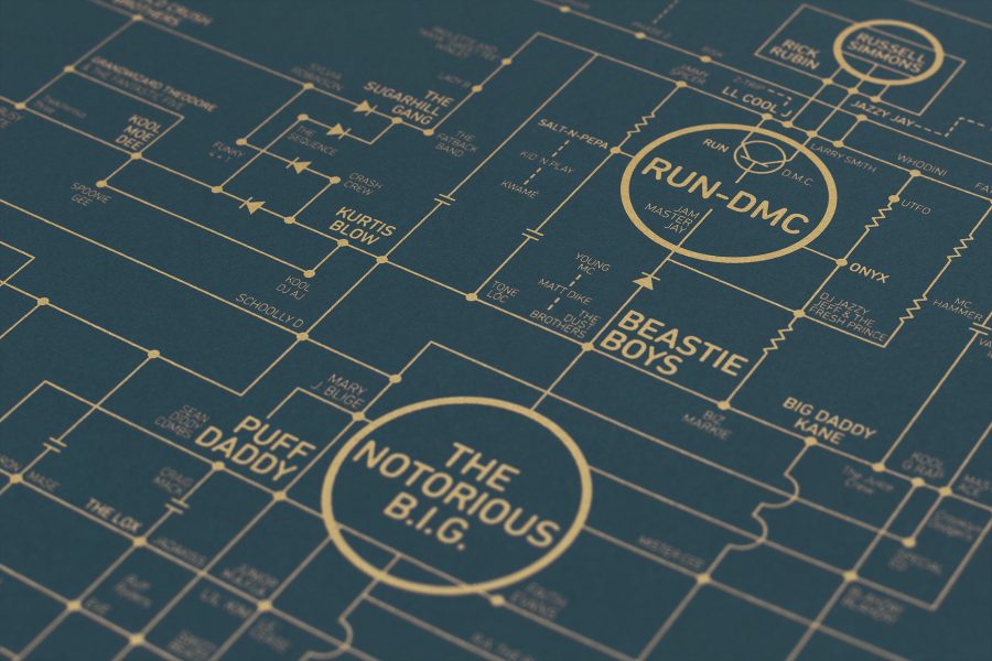
Every genre of music has its lineages and filiations, and each generation tries to outdo its predecessors. In no genre of music are these relationships so clearly defined as in hip-hop, where good-natured battles, furious beefs, nostalgic tributes, and guest appearances explicitly connect rappers from different eras, cities, and styles. Since the earliest days of hip-hop, groups have formed crews and loose alliances, built their own labels and media empires together, and defined the sounds of their region. At the center of it all was the turntable, which founding fathers like Kool DJ Herc repurposed from consumer playback machines to electronic instruments and proto-samplers. No matter how far the music has come in its sophisticated adaptations of digital studio technology, hip-hop’s essential architecture came from the meeting of two turntables, a mixer, and a microphone.
Paying homage to that humble origin, the Hip-Hop Love Blueprint by design house Dorothy takes the circuit diagram of a turntable as the basis for a map connecting 700 of hip-hop’s major players, from godfathers like Cab Calloway, Gil Scott-Heron, and the Last Poets, to originators like Herc and Grandmaster Flash, golden age heroes like Run-DMC and Eric B. and Rakim, political artists like Public Enemy and KRS-One, West Coast giants like N.W.A. and Dr. Dre, underground and indie rappers, turntablists and star producers, and everything in-between.
Contemporary stars like Kendrick Lamar, Drake, Jay‑Z, and Kanye appear, as, of course, do the martyred icons Biggie and Tupac. The Beastie Boys, De La Soul, Eminem, Nas, Jurassic 5, J Dilla, Mos Def, MF Doom, Kool Keith, Run the Jewels… you name ‘em, they’ve probably made the cut. The diagram–viewable online for free, and purchasable for £35.00–even features the names of early breakdancers like the Rock Steady Crew and graffiti artists like Lady Pink and Futura 2000.
As in earlier such charts from Dorothy, like Alternative Love and Electric Love, fans may find fault with the placement of certain figures and groups, and with the choice of emphasis. Rap abounds in masculine bravado—and at times no small amount of misogyny—but it should go without saying that female stars like Salt ‘n’ Pepa, MC Lyte, Queen Latifah, Missy Elliott, and Lauryn Hill are as influential as many of the biggest male names on the chart. Yet not one of them gets top billing, so to speak, here. This unfortunate fact aside, Hip-Hop Love does a very impressive job of cataloguing and connecting the most commercially successful, big-name artists with some of the most underground and experimental. Though we associate artists with particular regions—Outkast epitomizes the South, for example, Wu-Tang Clan is New York to the core—the blueprint pulls them all together, reaching out even to UK grime and trip-hop, in a schematic that resembles one huge, interconnected electric city. You can get your own copy of the poster online here.
Tom Petty grew up in Gainesville, Florida, in the backyard of the University of Florida. On Saturday, during a football game against LSU, some 90,000 Gators fans gave Petty a raucous send off, singing “I Won’t Back Down” in unison. Don’t know about you, but it gave me the chills.
BTW, if you’re wondering what the occasional boos are all about, it’s the U. of Florida fans taking the LSU marching band to task for disrupting the Petty sing-along. Or so it was perceived.
In addition to summing up Socrates and his European heirs, Alain de Botton has also applied his five-minute animated video approach to the very basics of Eastern philosophy. While offering its introductory surveys, the series may hopefully spur viewers on to greater appreciation of, for example, the Buddha, Lao Tzu, and Japanese Zen master Sen no Rikyu, who refined the tea ceremony as a meticulous meditative ritual. Rikyu’s practice shows us how much philosophical and religious traditions (often a distinction without a difference) in Japan and China engage rigorously with everyday objects and routines as often as they do with texts and lectures.
Yesterday, we brought you several short explanations of one such practice, Kintsugi, the wabi sabi art of “finding beauty in broken things” by turning cracked and broken pottery into gilded, beautifully flawed vessels. Several hundred years earlier, in 826 AD, renowned Tang Dynasty poet and civil servant Bai Juyi discovered a pair of oddly shaped rocks that captivated his attention. Taking them home to his study, he then wrote a poem about them, influenced by Daoism’s reverence for the forces of nature and inspired by the hard evidence such forces carved into the rocks. Like the broken pottery of Japan’s Kintsugi, Bai’s rocks come in part to symbolize human frailty. In this case, he casts the rocks as friends in his lonely old age, asking them, “Can you keep company with an old man like myself?”
After Bai Juyi, aesthetic meditations on the beauty of rock formations became highly popular and quickly refined into “four principal criteria,” writes the Metropolitan Museum of Art: “thinness (shou), openness (tou), perforations (lou), and wrinkling (zhou).” The found artifacts are often known as “scholar’s rocks”—a mistranslation, de Botton says, of a term meaning “spirit stones”—and are chosen for their natural wildness, as well as shaped by human hands. They were placed in gardens and studies, and “became a favorite and enduring pictorial genre.” During the early Song dynasty, such stones were “constant sources of inspiration,” and were “valued quite as highly as any painting or calligraphic scroll.”
So highly-prized were these objects, in fact, that they appear to “have hastened the collapse of the Northern Song Empire,” through a mania not unlike that which drove the tulip craze in the 17th century Netherlands. As did many Chinese cultural traditions—including Zen Buddhism—the love of rocks crossed over into Japan, where it was adapted “in a particularly Japanese way” in the 15th century, inspiring the “subdued, smooth,” minimalist rock gardens we’re likely familiar with, if only through their consumer novelty versions.
As per usual, de Botton imbues his lesson with a takeaway moral: rock reverence teaches us that “wisdom can hang off bits of the natural world just as well as issuing from books.” We may also see the love of rocks as a kind of anti-consumerist practice, in which we shift the attention we typically lavish on disposable objects destined for landfills, trashheaps, and plastic-littered oceans, and instead apply it to beautiful bits of the natural world, which require few investments of labor or capital to enrich our lives, and can be found right outside our doors, if we’re careful and attentive enough to see them.
We're hoping to rely on loyal readers, rather than erratic ads. Please click the Donate button and support Open Culture. You can use Paypal, Venmo, Patreon, even Crypto! We thank you!
Open Culture scours the web for the best educational media. We find the free courses and audio books you need, the language lessons & educational videos you want, and plenty of enlightenment in between.