70 years ago this month, Albert Camus made his first and only trip to the United States, briefly visiting Philadelphia and Boston, but mostly staying in New York, the city that captivated him most. As Jennifer Schuessler writes in The New York Times, Camus didn’t quite know what to make of the city’s “swarming lights” and “frantic streets.” But he had to appreciate the warmth with which he was greeted. During his 1946 stay, Camus celebrated the English publication of The Strangeron the rooftop of the Hotel Astor. He sat down for an interview with The New Yorker and gave a memorable speech at Columbia University. He also became a fashion critic for a brief moment, offering this thought on American neckties: “You have to see it to believe it. So much bad taste hardly seems imaginable.”
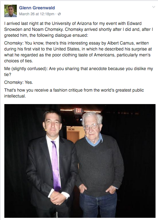
I arrived last night at the University of Arizona for my event with Edward Snowden and Noam Chomsky. Chomsky arrived shortly after I did and, after I greeted him, the following dialogue ensued:
Chomsky: You know, there’s this interesting essay by Albert Camus, written during his first visit to the United States, in which he described his surprise at what he regarded as the poor clothing taste of Americans, particularly men’s choices of ties.
Me (slightly confused): Are you sharing that anecdote because you dislike my tie?
Chomsky: Yes.
That’s how you receive a fashion critique from the world’s greatest public intellectual.
Ouch.
Note: The 70th anniversary of Camus’s trip to New York is being commemorated in “Camus: A Stranger in the City,” a monthlong festival of performances, readings, film screenings and events. If you’re in NYC, check it out. The full program is here.
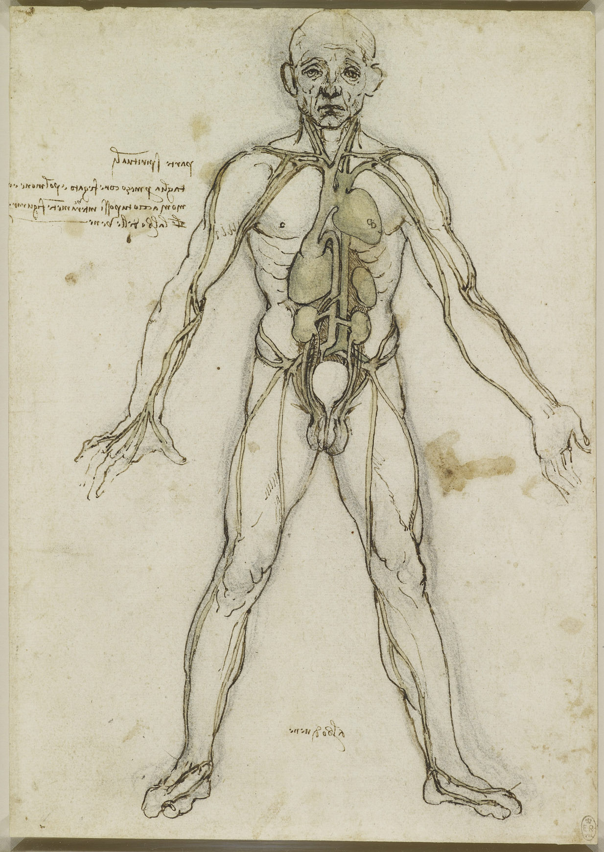
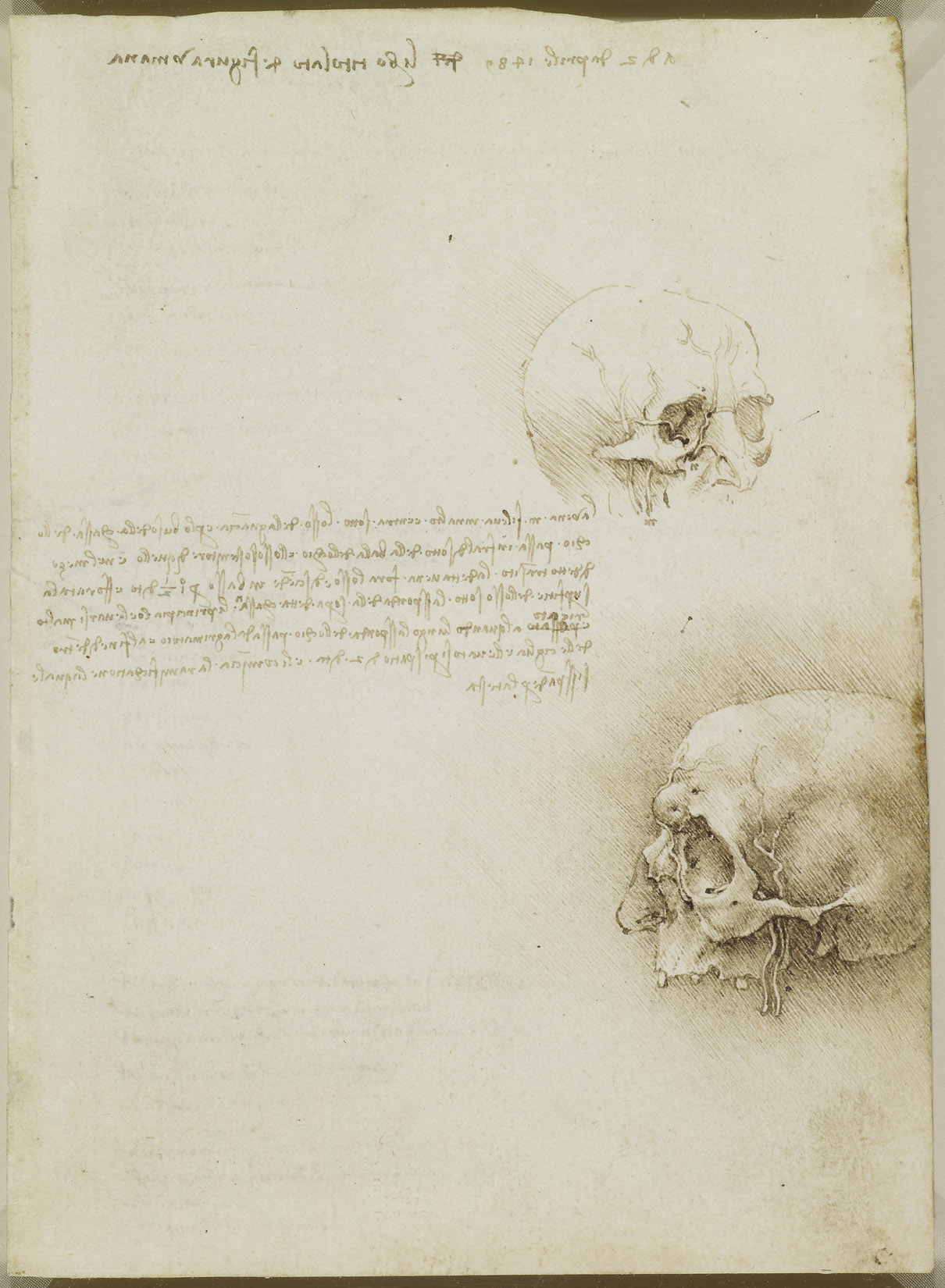
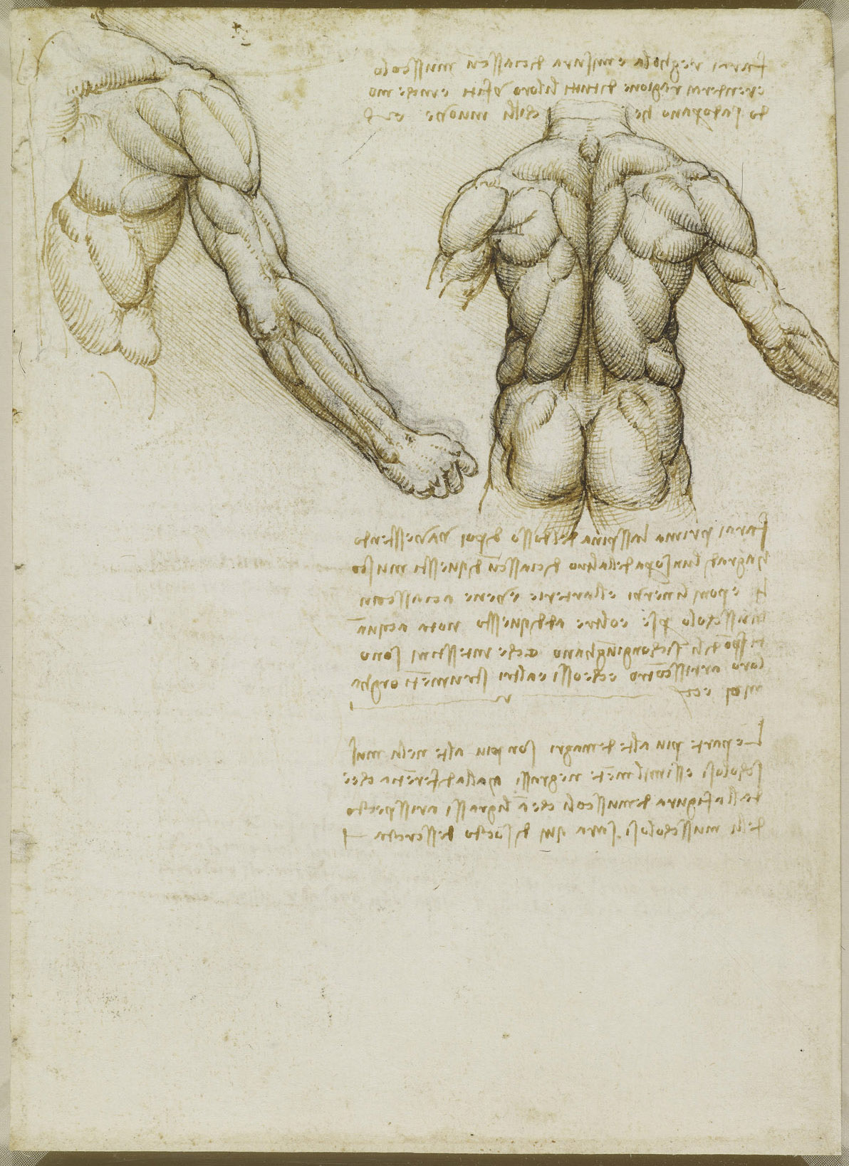
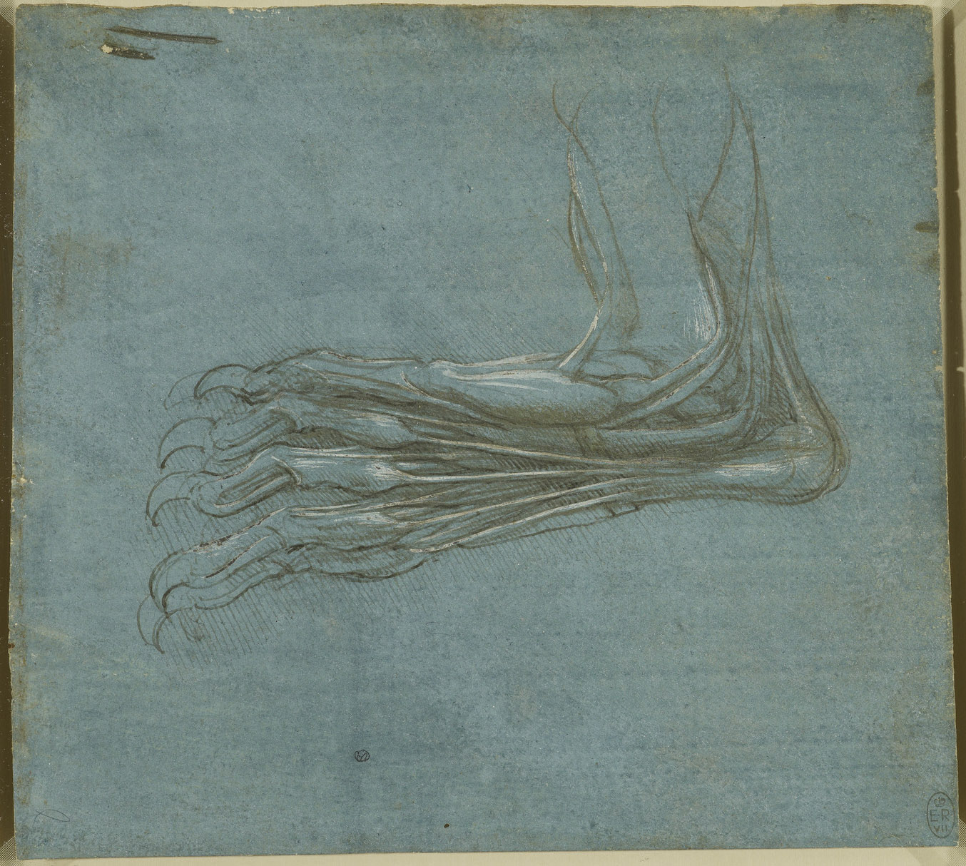
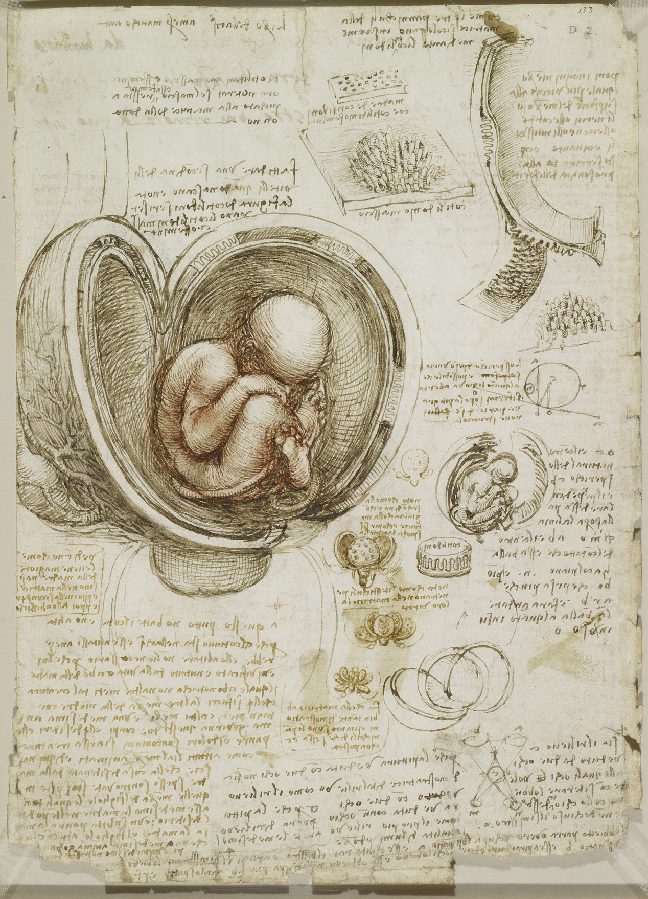
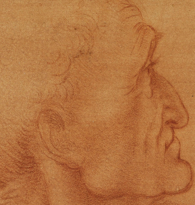
I’ve always found anatomical drawing fascinating. At its best, it occupies an aesthetic space somewhere between mystical fine art and cutting-edge scientific observation—a space carved out during the Italian Renaissance, when the boundaries between artistic training and scientific inquiry were permeable and often nonexistent.
Famously, the period introduced renderings of the human figure so anatomically accurate that “until about 1500–1510,” writes the Metropolitan Museum of Art, the artists’ “investigations surpassed much of the knowledge of anatomy that was taught at the universities.”
Artists like the great Michelangelo Buonnarroti and Leonardo da Vinci—as well as lesser-known figures like Antonio Pollaiuolo and Baccio Bandinelli—undertook “detailed anatomical dissections at various points in their long careers,” producing hundreds of sketches and studies alongside and in preparation for the muscular paintings and sculpture for which they’re best known.
Most Renaissance artists “became anatomists by necessity,” the Met points out, “as they attempted to refine a more lifelike, sculptural portrayal of the human figure.” Leonardo’s studies in anatomy, however, held a scientific interest all their own, akin to his investigations into the physics of flight, weapon and battlement design, architecture, and other pursuits.
Many of Leonardo’s anatomical drawings contain detailed notes on his observations, as you can see in the study of a heavily-muscled torso and of a human cranium, further up. He wrote these notes using his proprietary right-to-left “mirror-writing” technique, which he reserved for his private notebooks. “Only when he was writing something intended for other people,” Boston’s Museum of Science informs us, “did he write in the normal direction.”
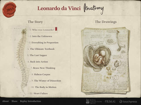
In addition to the many intriguing sketches, studies, and detailed illustrations in the Royal Collection Trust’s online archive, iPad owners can also search and view the collection on their devices with the free Leonardo da Vinci Anatomy app (screenshot above). “For the first time,” writes the description, “it is possible for anyone with an iPad to own and explore this remarkable testament to Leonardo’s scientific and artistic genius…. All 268 pages from Leonardo’s notebooks are presented here at the highest resolution, optimized for the pin-sharp retina display of the iPad.” The app includes incredibly helpful features like English translations of the notes, as well as essays and interviews with experts discussing the significance of Leonardo’s discoveries.
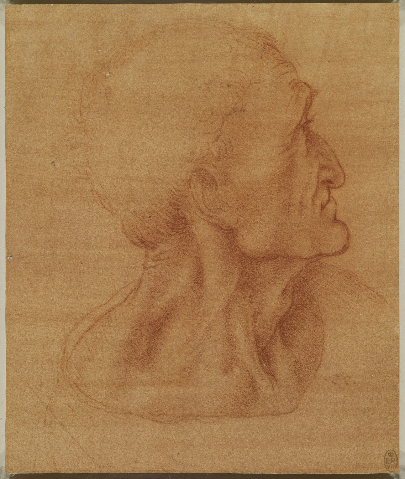
Whether you own an iPad or not, you can benefit immensely from this collection. The online version allows viewers to download high-resolution images like the “Head of Judas” sketch in red chalk above (c. 1495). Once on the page, click the download arrow to the bottom right of the drawing and you’ll be taken to a larger version of the image. You can zoom in to examine details, like the very fine lines and subtle shading that mark each of Leonardo’s illustrations, from the most utilitarian to the most artistically-rendered, as the special creations of an extraordinary artist with a gifted scientific mind.
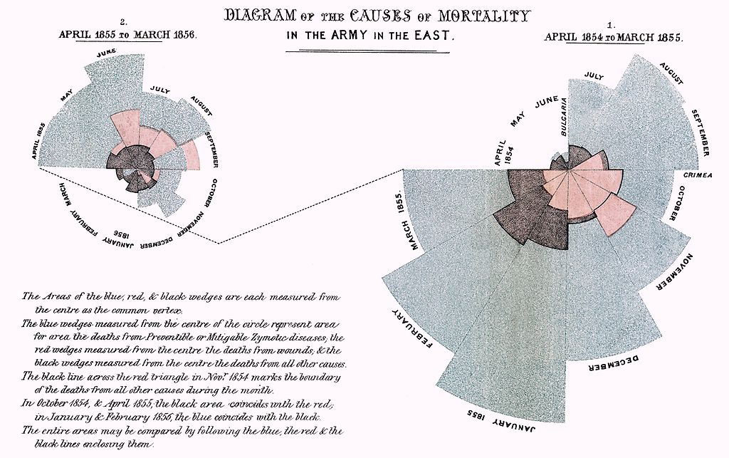
I’ve long counted myself as a fan of Edward Tufte, the preeminent living expert on the visual display of quantitative information. I like to think this puts me in the company of Florence Nightingale, founder of modern nursing as well as a prolific writer and still today a household name. Having lived in the Victorian era, she of course never got to enjoy the work of Tufte himself, though her own zeal for data and statistics, in a time that valued such things less than ours, made her, in some sense, a Tufte of her day: the first female member of the Royal Statistical Society and an honorary member of the American Statistical Association. The video above, an outtake from Hans Rosling’s The Joy of Stats, offers a brief introduction to the statistical side of Nightingale’s career, and the important role data visualization played in her mission to save lives.
“When Florence Nightingale arrived at a British hospital in Turkey during the Crimean War, she found a nightmare of misery and chaos,” writes Science News’ Julie Rehmeyer. “By the time Nightingale left Turkey after the war ended in July 1856, the hospitals were well-run and efficient, with mortality rates no greater than civilian hospitals in England.”
But feeling great regret over all the lives lost there to preventable disease, she went on to save even more of them by bringing numbers into play. She specifically compiled “vast tables of statistics about how many people had died, where and why. Many of her findings shocked her. For example, she discovered that in peacetime, soldiers in England died at twice the rate of civilians — even though they were young men in their primes.”
Nightingale’s most influential presentation of her data, which she called a “coxcomb,” appears just above. This Is Statistics describes “Diagram of the Causes of Mortality in the Army in the East” as “similar to a pie chart, but more intricate. In a pie chart the size of the ‘slices’ represent a proportion of data, while in a coxcomb the length, which the slice extends radially from the center-point, represents the first layer of data.” Her famous chart “was divided evenly into 12 slices representing months of the year, with the shaded area of each month’s slice proportional to the death rate that month. Her color-coded shading indicated the cause of death in each area of the diagram.” She stated the goal of her visualization clearly: “to affect thro’ the Eyes what we fail to convey to the public through their word-proof ears.”
We all try to do the very same thing when we present information today, though few of us—even armed with a degree of number-crunching and graphic design powers that would have seemed magical to Nightingale and her contemporaries—achieve the kind of results she did. She galvanized systemic change in hospital design and operation as well as prompted a revolution in sanitation which increased Britain’s average national life expectancy by 20 years—something to bear in mind when we start to get big ideas about how our Powerpoint slide shows will change the world.
If you would like to sign up for Open Culture’s free email newsletter, please find it here. It’s a great way to see our new posts, all bundled in one email, each day.
If you would like to support the mission of Open Culture, consider making a donation to our site. It’s hard to rely 100% on ads, and your contributions will help us continue providing the best free cultural and educational materials to learners everywhere. You can contribute through PayPal, Patreon, and Venmo (@openculture). Thanks!
In 2009, Harvard philosophy professor Michael Sandel broke some ground when he made his popular course, “Justice: What’s the Right Thing to Do?,” available online. A course taken by thousands of Harvard undergrads suddenly became a course taken by tens of thousands of lifelong learners worldwide.
Since then, Sandel has continued speaking to a broader audience, first creating a BBC podcast called “The Public Philosopher,” where he “examines the thinking behind a current controversy.” (Download the episodes here.) And now comes a new program, The Global Philosopher, which grapples with philosophical problems using an innovative digital format. According to the BBC, the show brings together “60 participants from over 30 countries using a pioneering studio developed by [the] Harvard Business School, called HBX Live. Each participant is able to see and speak to every other contributor, as well as to Professor Sandel, replicating the experience of a face-to-face debate.” In the first debate, shown above, “contributors from America, Europe, Africa, Asia and the Middle East discussed the moral justification for national borders. Hundreds more watched a live video stream and took part by sending in text comments and voting in straw polls.” This is just the first of more planned installments. Down the road, you can find new episodes of The Global Philosopher here.
Audience members who had no familiarity with the source material must’ve been very, very confused. There’s a lot of bang for the buck, but title cards aside, not much in the way of context.
No matter. There are plenty of special effects and a crowd-pleasing chorus of gratuitous beauties in tights and bloomers, just as in Georges Méliès’ seminal A Trip to the Moon.
It’s conceivable that Jack Haley and Burt Lahr, the MGM version’s Tin Woodsman and Cowardly Lion, might have been taken to see the 13 minute short as children. (Scarecrow Ray Bolger was a mere babe at the time of its release.)
Despite the presence of all the well-known characters, including two Totos, for my money, the project’s true star is Hank, the scene stealing mule.
It’s unclear to me if the Wizard’s dark makeup is meant to be blackface. According to Robin Bernstein’s Racial Innocence: Performing American Childhood from Slavery to Civil Rights, the stage play that inspired the film featured minstrel songs and popular blackface actors Fred A. Stone and David Montgomery as the Scarecrow and Tin Woodsman.
The film cast’s identities have been lost to history, though a rumor persists that the young actress playing Dorothy is frequent Harold Lloyd co-star, Bebe Daniels. The original piano score is unknown, but likely hewed closely to Paul Tietjens’ music from the play, which is what we hear in the online version.
Ayun Halliday is an author, illustrator, and Chief Primatologist of the East Village Inky zine. She was shocked to find out how much her childhood Oz books are worth, but has thus far resisted parting with them. Follow her @AyunHalliday
FYI: Early last week, Colin Marshall gave you a heads up that Studio Ghibli, the animation studio behind Hayao Miyazaki’s My Neighbor Totoro, Princess Mononoke, and Spirited Away, was preparing to release an open source version of the animation software used to create its films. This weekend, the software–called OpenToonz–officially became available for download. And we can now tell you where to find it. OpenToonz is available on Github, in versions made for both Window and OSX. This link will jump you straight to the download area.
If you make anything great with it, please share it with us.
If you would like to sign up for Open Culture’s free email newsletter, please find it here. It’s a great way to see our new posts, all bundled in one email, each day.
If you would like to support the mission of Open Culture, consider making a donation to our site. It’s hard to rely 100% on ads, and your contributions will help us continue providing the best free cultural and educational materials to learners everywhere. You can contribute through PayPal, Patreon, and Venmo (@openculture). Thanks!
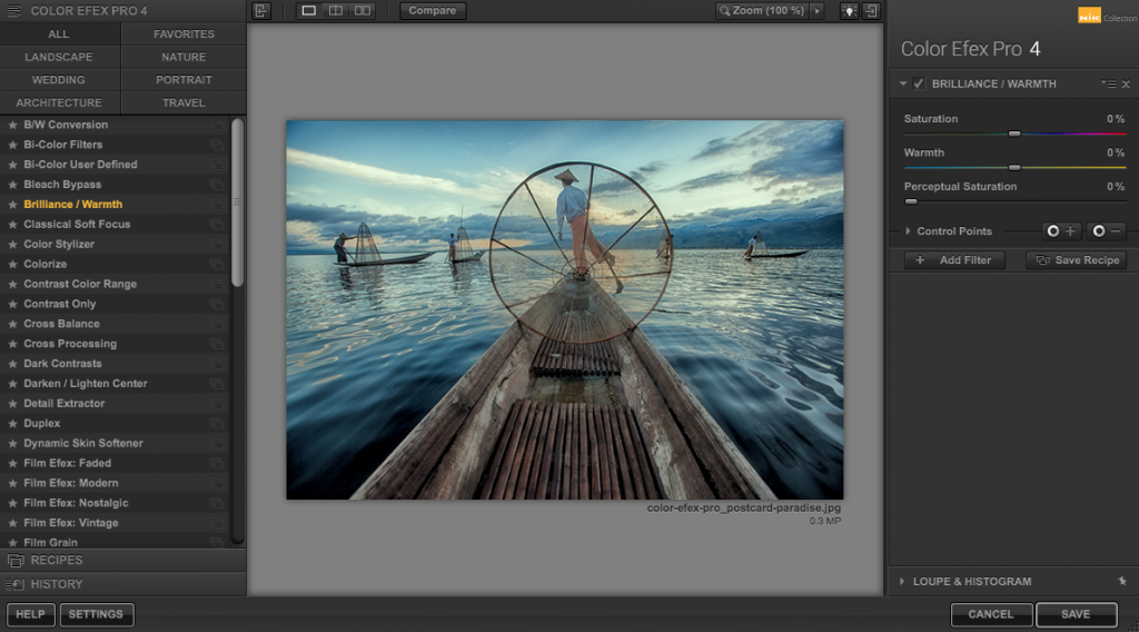
Google’s Nik Collection, a photo editing software package designed for professional photographers, once retailed for $149. Today it’s absolutely free to download, for both Windows and Mac users.
Here you can read Google’s announcement, which includes more information on the software package and its capabilities.
Today we’re making the Nik Collection available to everyone, for free.
Photo enthusiasts all over the world use the Nik Collection to get the best out of their images every day. As we continue to focus our long-term investments in building incredible photo editing tools for mobile, including Google Photos and Snapseed, we’ve decided to make the Nik Collection desktop suite available for free, so that now anyone can use it.
The Nik Collection is comprised of seven desktop plug-ins that provide a powerful range of photo editing capabilities — from filter applications that improve color correction, to retouching and creative effects, to image sharpening that brings out all the hidden details, to the ability to make adjustments to the color and tonality of images.
Starting March 24, 2016, the latest Nik Collection will be freely available to download: Analog Efex Pro, Color Efex Pro, Silver Efex Pro, Viveza, HDR Efex Pro, Sharpener Pro and Dfine. If you purchased the Nik Collection in 2016, you will receive a full refund, which we’ll automatically issue back to you in the coming days.
We’re excited to bring the powerful photo editing tools once only used by professionals to even more people now.
Once you’ve downloaded the software, head over to the Nik Collection channel on YouTube where you’ll find video tutorials, including the one below called “Introduction to the Nik Complete Collection.” It’s a good place to start.
PS: Some readers have asked whether this software can work as a standalone program, or whether it needs to run with a program like Photoshop. Here’s what PC Magazinehas to say about that: “Though you can run the seven different plugins in the collection as standalone products, they tend to work better when you integrate them into an existing image editing program, like Adobe’s PhotoShop. ‘(On Windows) You can make shortcuts to the individual .exe files on your desktop and then just drag stacks of images onto them,’ suggested one Google+ user.” In short, you have some options.
If you would like to sign up for Open Culture’s free email newsletter, please find it here. It’s a great way to see our new posts, all bundled in one email, each day.
If you would like to support the mission of Open Culture, consider making a donation to our site. It’s hard to rely 100% on ads, and your contributions will help us continue providing the best free cultural and educational materials to learners everywhere. You can contribute through PayPal, Patreon, and Venmo (@openculture). Thanks!
Each card comes with publication information. Images of the flip sides reveal that the sender often considered the publishers’ preprinted sentiments correspondence enough. (It’s something of a relief to realize that social media did not invent this kind of shorthand.)
Bunnies are not the only fruit here… seasonal flora and fauna abound, in addition to more explicitly religious iconography.
We're hoping to rely on loyal readers, rather than erratic ads. Please click the Donate button and support Open Culture. You can use Paypal, Venmo, Patreon, even Crypto! We thank you!
Open Culture scours the web for the best educational media. We find the free courses and audio books you need, the language lessons & educational videos you want, and plenty of enlightenment in between.