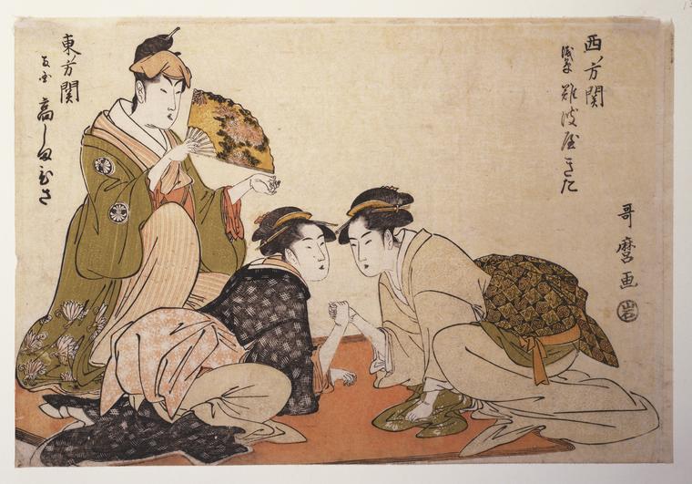
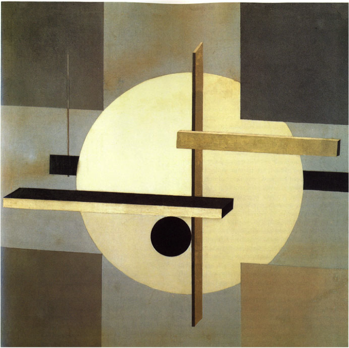
Economically depleted but filled with the desire to pose questions about the future in radically new ways, postwar Europe would prove fertile ground for the development of avant-garde art. Though that environment produced a fair few stars over the second half of the twentieth century, their work represents only the tip of the iceberg: bringing the rest out of the depths and onto the internet has constituted the last few years’ work for Forgotten Heritage. A collaboration between institutions in Poland, Belgium, Croatia, Estonia, and Germany supported by Creative Europe, the project offers a database of European avant-garde art — including many works still daring, surprising, or just plain bizarre — never properly preserved and made available until now.
Forgotten Heritage’s About page describes the project’s goal as the creation of “an innovative online repository featuring digitised archives of Polish, Croatian, Estonian, Belgian and French artists of the avant-garde movement occurring in the second half of the 20th century,” meant to eventually contain “approximately 8 thousand of sorted and classified archive entries, including descriptive data.”
Currently, writes Hyperallergic’s Claire Voon, its site “offers visitors around 800 records to explore, from documentation of artworks to texts. The majority of works stem from to the ’60s and ’70s, as a timeline illustrates, with the most recent piece dating to 2005. This interactive feature, which has embedded links to individual artists’s biographies and examples of their artworks, is one way to explore the well-designed archive.”
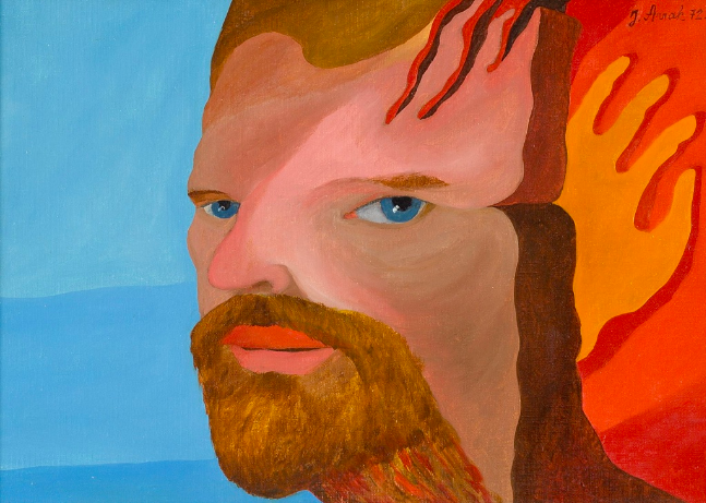
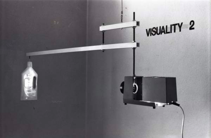
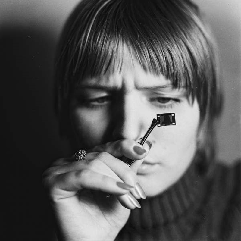
Forgotten Heritage thus makes it easy to discover artists previously difficult for even the avant-garde enthusiast to encounter. Visitors can also browse the growing archive by the medium of the work: painting (like Jüri Arrak’s Artist, 1972, seen at the top of the post), installation (Wojciech Bruszewski’s Visuality, 1980), film (Anna Kutera’s The Shortest Film in the World, 1975), “photo with intervention” (Edita Schubert’s Phony Smile, 1997), Olav Moran’s “Konktal” and many more besides.
Voon cites Marika Kuźmicz’s estimate that about 40 percent of it, mostly from Belgian and Estonian artists, has never before been available online. Debates about whether an avant-garde still exists, in Europe or anywhere else, will surely continue among observers of art, but as a visit to Forgotten Heritage’s digital archives reveals, the avant-garde of decades past, when rediscovered, retains no small amount of artistic vitality today.
Based in Seoul, Colin Marshall writes and broadcasts on cities and culture. His projects include the book The Stateless City: a Walk through 21st-Century Los Angeles and the video series The City in Cinema. Follow him on Twitter at @colinmarshall or on Facebook.
Perhaps more than any other postwar avant-garde American artist, Robert Rauschenberg matched, and maybe exceeded, Marcel Duchamp’s puckish irreverence. He once bought a Willem de Kooning drawing just to erase it and once sent a telegram declaring that it was a portrait of gallerist Iris Clert, “if I say so.” Rauschenberg also excelled at turning trash into treasure, repurposing the detritus of modern life in works of art both playful and serious, continuing to “address major themes of worldwide concern,” wrote art historian John Richardson in a 1997 Vanity Fair profile, “by utilizing technology in ever more imaginative and inventive ways…. Rauschenberg is a painter of history—the history of now rather than then.”
Critic Charles Darwent reads Rauschenberg’s motivations through a Freudian lens, his Inferno series a sublimation of his homosexuality and repressive childhood: “The young Rauschenberg… came to see Modernist art as a variant of his Texan parents’ fundamental Christianity.”
The most straightforward account has Rauschenberg conceiving the project in order to be taken more seriously as an artist. Such biographical explanations tell us something about the work, but we learn as much or more from looking at the work itself, which happens to be very much a history of now at the end of the 1950s. Though Rauschenberg based the illustrations on John Ciardi’s 1954 translationof the Divine Comedy, they were not meant to accompany the text but to stand on their own, the Italian epic—or its famous first third—providing a backdrop of ready-made ironic commentary on images Rauschenberg ripped from newspapers and magazines such as Life and Sports Illustrated.
“To create these collages,” explains MIT’s List Visual Arts Center, “he would use a solvent to adhere the images to his drawing surface, then overlay them with a variety of media, including pen, gouache (an opaque watercolor), and pencil.” Steeped in a Cold War atmosphere, the illustrations incorporate figures like John F. Kennedy and Richard Nixon, who, in the 50s, Gilbert writes, “served as one of Joseph McCarthy’s political henchmen during the Red Scare.” We see in Rauschenberg’s collage drawings allusions to the Civil Rights movement and the decade’s anti-Communist paranoia as well its reactionary sexual politics. “Political and sexual content… needed to be coded,” Gilbert claims, in such an “ultraconservative era.”
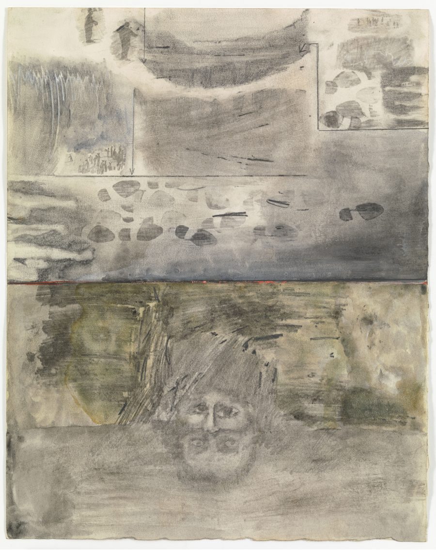
For example, we see a likely reference to the artist’s gay identity in the Canto XIV illustration, above. The text “describes the punishment of the Sodomites, who are condemned for eternity to walk across burning sand. Rauschenberg depicts the theme through a homoerotic image of a male nude… juxtaposed with a red tracing of the artist’s own foot.” Maybe Darwent is right to suppose that had Dante’s poem not existed, Rauschenberg “would have been the man to invent it”—or to invent its mid-20th century visual equivalent. He draws attention to the poem’s autobiographical center, its subversive humor, and its density of references to contemporary 15th century Italian politics, adapting all of these qualities for modernity.
But the illustration of Canto XIV—depicting “The Violent Against God, Nature, and Art”—also encodes Rauschenberg’s violent trampling of artistic convention. Many critics see this series as the artist’s reaction against Abstract Expressionism (like that of De Kooning). And while he “may have felt a creative kinship with Dante,” writes Gilbert, “he also admitted to the art critic Calvin Tomkins his impatience with the poet’s self-righteous morality, a statement likely directed against this Canto.” Like his 1953 Erased de Kooning Drawing, Rauschenberg’s Inferno drawings also perform an act of erasure—or the creation of a palimpsest, with Dante’s poem scratched over by the artist’s wild, childlike strokes.
In recognition of the way these illustrations repurpose, rather than accompany, the Inferno, MoMA recently commissioned an edition of Rauschenberg’s 34 drawings, accompanied not by the straight translation by Ciardi but poems by Kevin Young and Robin Coste Lewis, whose portion of the book is titled “Dante Comes to America: 20 January 17: An Erasure of 17 Cantos from Ciardi’s Inferno, after Robert Rauschenberg.” Rather than viewing the illustrations against Dante’s work itself, we can read their particular American proto-pop art character against literary “erasures” like Lewis’s “Canto XXIII,” below. See the full series of Rauschenberg’s 34 illustrations at the Rauschenberg Foundation website here.
Canto XXIII. by Robin Coste Lewis
“I Go with The Body That Was Always Mine”
Silent, one following the other, the Fable hunted us down. O weary mantle of eternity, turn left, reach us down into that narrow way in silence.
College of Sorry Hypocrites, I go with the body that was always mine, burnished like counterweights to keep the peace. One may still see the sort of peace
we kept. Marvel for a while over that: the cross in Hell’s eternal exile. Somewhere there is some gap in the wall, pit through which we may climb
to the next brink without the need of summoning the Black Angels and forcing them to raise us from this sink. Nearer than hope, there is a bridge
that runs from the great circle, that crosses every ditch from ridge to ridge. Except—it is broken—but with care.
If you’ve never seen Gentlemen Broncos, the little-seen third feature by the Napoleon Dynamite-making husband-and-wife team Jared and Jerusha Hess, I highly recommend it. You must, though, enjoy the peculiar Hess sense of humor, a blend of the almost objectively detached and the heartily sophomoric fixed upon the preoccupations of deeply unfashionable sections of working-class America. In Gentlemen Broncosit makes itself felt immediately, even before the film’s story of a young aspiring science fiction writer in small-town Utah begins, with a tour de force opening credits sequence made up of homages to the pulpiest sci-fi book covers of, if not recent decades, then at least semi-recent decades.
The style of these cover images, though risible, no doubt look rich with associations to anyone who’s spent even small part of their lives reading mass-market sci-fi novels. To see more than a few higher examples, watch “The Art of Sci-Fi Book Covers,” the Nerdwriter video essay above that digs into the history of that enormously inventive yet seldom seriously considered artistic subfield.
Its begins with the world’s first science-fiction magazine Amazing Stories (an online archive of which we’ve previously featured here on Open Culture) and its pieces of fantastical, eye-catching cover art by Austria-Hungary-born illustrator Frank R. Paul. In the mid-1920s, says the Nerdwriter, “these covers were probably among the strangest art that the average American ever got to see.”
It would get stranger. The Nerdwriter follows the development of sci-fi cover art from the heyday of the Paul-illustrated Amazing Stories to the introduction of mass-market paperback books in the late 1930s to Penguin’s experimentation with existing works of modern art in the 1960s to the commissioning of new, even more bizarre and evocative works by all manner of publishers (some of them sci-fi specialists) thereafter. “You can walk into any used book store anywhere and get five of these old pulp books for a dollar each,” the Nerdwriter reminds us. “And then the art is with you; it’s in your home. As you read the stories, it’s on your bedside table. It’s art you hold with your hands. It’s not precious: it’s bent, folded, and creased. And above all, it’s weird.”
Based in Seoul, Colin Marshall writes and broadcasts on cities and culture. His projects include the book The Stateless City: a Walk through 21st-Century Los Angeles and the video series The City in Cinema. Follow him on Twitter at @colinmarshall or on Facebook.
When The Electric Kool-Aid Acid Test first came out in 1968, Eliot Fremont-Smith wrote in The New York Times that “it is not simply the best book on the hippies, it is the essential book.” The book “is printed in black and white, but the words come through in crazy Day-Glo–fluorescent, psychedelic, at once energetic and epicene.”
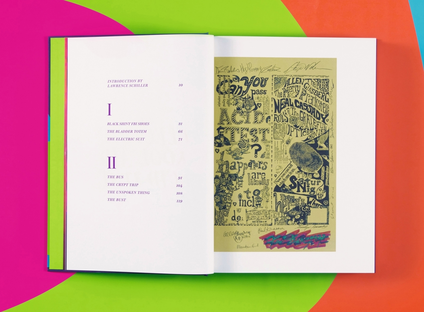
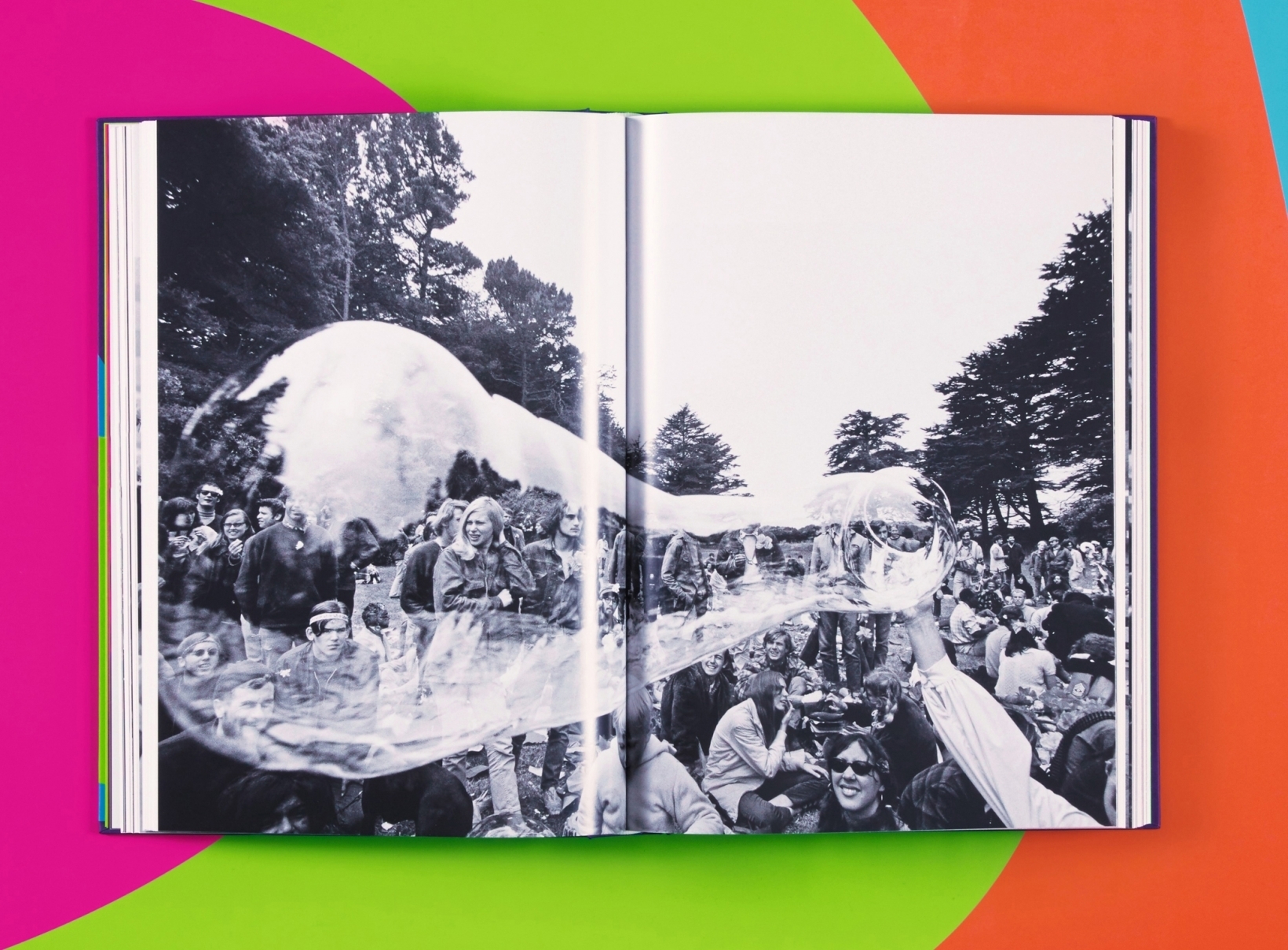
The new Taschen edition is something different. The abridged text is published in “traditional letterpress, with facsimile reproductions of Wolfe’s manuscript pages, as well as Ken Kesey’s jailhouse journals, handbills, and underground magazines of the period.” “Interweaving the prose and ephemera are photographic essays from Lawrence Schiller, whose coverage of the acid scene for Life magazine helped inspire Wolfe to write his story, and Ted Streshinsky, who accompanied Wolfe while reporting for the New York Herald Tribune.” There are also photographs by poet Allen Ginsberg.
In total, Taschen has produced 1,968 signed copies of the collector’s edition, each signed by Tom Wolfe himself. The cost is set at $350.
If you never spent time with The Electric Kool-Aid Acid Test and want to read a simple paperback edition that costs less than $10, you can find a copy here.
Note: We belong to the Taschen affiliate program. So if you get a copy of the collector’s edition, it benefits not just you and Taschen. It benefits Open Culture too. So consider it win-win-win.
If you would like to support the mission of Open Culture, consider making a donation to our site. It’s hard to rely 100% on ads, and your contributions will help us continue providing the best free cultural and educational materials to learners everywhere. You can contribute through PayPal, Patreon, and Venmo (@openculture). Thanks!
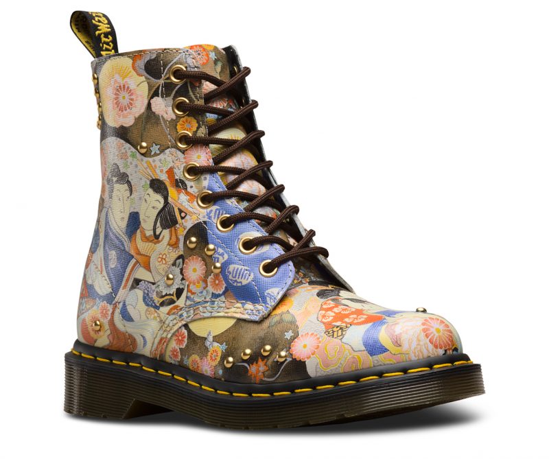
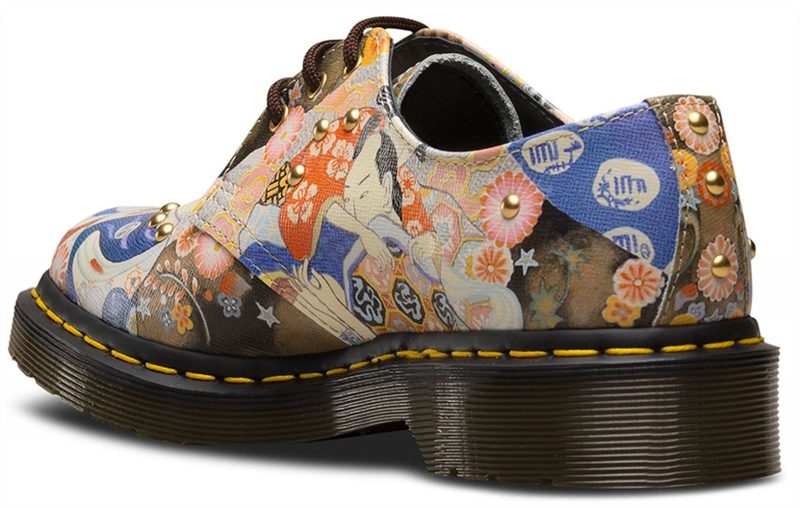
In wake of a recent prom cheongsam dust up, it remains to be seen whether Doc Martens’ special edition Eastern Art shoes and boots will be regarded as a misstep.
Those eye-catching kicks may have inspired more than a few fashion-conscious punks to delve into art history, but what will consumers—and more importantly activists on the alert for cultural appropriation—make of the Eastern Art line?
The company website describes the inaugural design as:
…a new homage to traditional Japanese art with a fresh, contemporary … spin. Featuring detailed hand-drawn paintings, the art is digitally printed on a textured leather designed to emulate traditional Japanese parchment, while gold-tone eyelets and studding complete the look.
One wonders what led the footwear giant to go with a mishmash “inspired by” approach, when there are so many wonderful Edo period artists who merit a boot of their own?
Thus far, the lone complaints have centered on the pain of breaking in the new boots, a badge of honor among longtime wearers of the company’s best-selling 1460 Pascalstyle.
Asia Trendreports that Doc Martens has two shops in Japan, with plans to open more.
If you’re inclined to stomp around in a pair of Dr. Martens 1460 Pascal Eastern Art boots or 1461 Oxfords, best place your order soon, as these special editions have a way of selling out quickly.
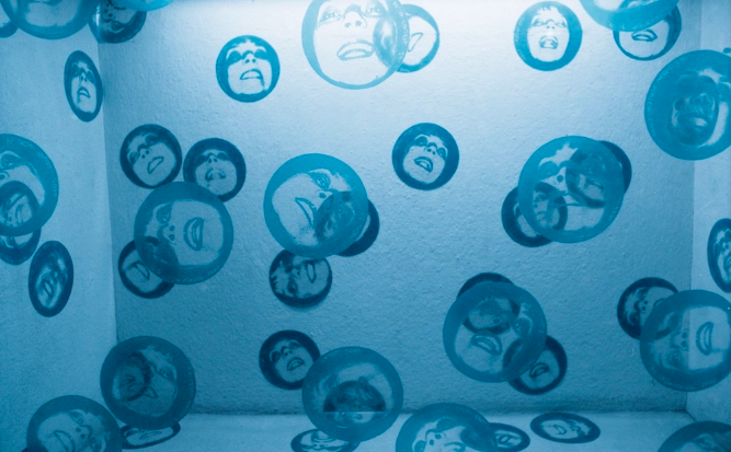
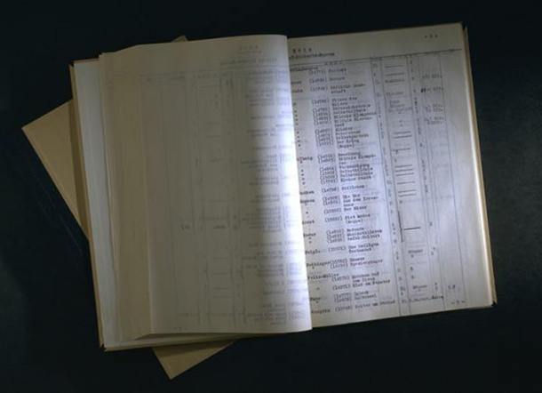
The Nazis may not have known art, but they knew what they liked, and much more so what they didn’t. We’ve previously featured here on Open Culture the “Degenerate Art Exhibition” of 1937, put on by Hitler’s party four years after it rose to power. Following on a show of only Nazi-approved works — including many depictions of classically Germanic landscapes, robust soldiers in action, blonde nudes — it toured the country with the intent of revealing to the German people the “insult to German feeling” committed by Entartete Kunst (Degenerate art), a Nazi-defined category of art created by the likes of Paul Klee, Wassily Kandinsky, Max Beckmann, George Grosz, and others, a roster heavy on the abstract, the expressionistic, and the Jewish.
“The list of more than 16,000 artworks was produced by the Reichsministerium für Volksaufklärung und Propaganda (Reich Ministry for Public Enlightenment and Propaganda) in 1942 or thereabouts. It seems that the inventory was compiled as a final record, after the sales and disposals of the confiscated art had been completed in the summer of 1941.”
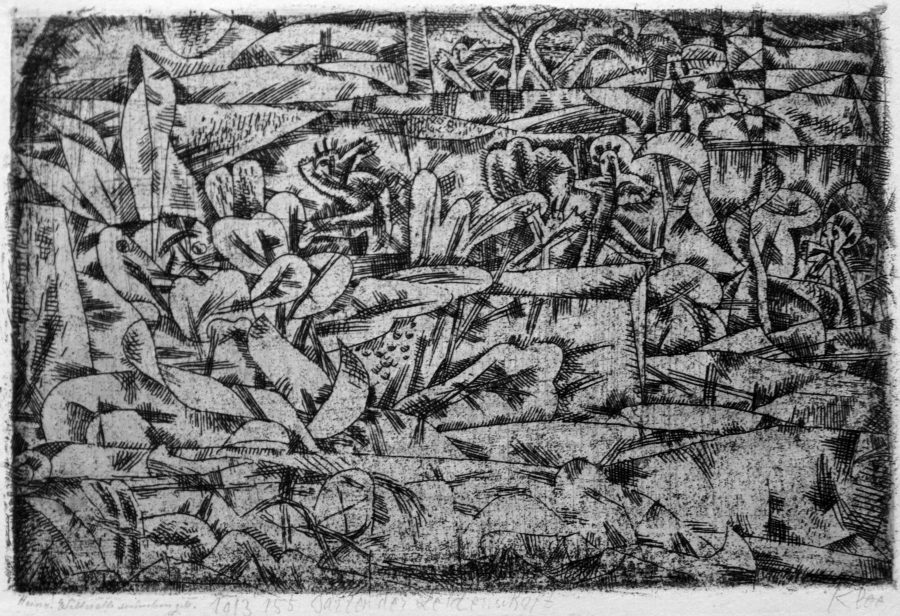
Daunting though the inventory itself may seem, Hyperallergic’s Jillian Steinhauer points out “a way to connect many of these pieces to the present day: an online database maintained by the Freie Universität Berlin. You can plug an artwork’s inventory number from the Nazi log books directly into their search engine, and it will pull up a record.” Here you see Max Beckmann’s Zwei Auto-Offiziere, El Lissitzky’s Proun R.V.N. 2, and Paul Klee’s Garten der Leidenschaft, just three examples of the thousands upon thousands of images that Hitler and company considered a threat to their regime. Today, the artistic merits of work by these and other artists once labeled Entartete Kunst have drawn more admirers than ever — though the very fact that the Nazis didn’t like it constitutes a decent reason for appreciation as well.
Based in Seoul, Colin Marshall writes and broadcasts on cities and culture. His projects include the book The Stateless City: a Walk through 21st-Century Los Angeles and the video series The City in Cinema. Follow him on Twitter at @colinmarshall or on Facebook.
“Dada thrives on contradictions. It is creative and destructive. Dada denounces the world and wishes to save it.” So says one narrator of journalist-filmmaker Mick Gold’s Europe After the Rain, a 1978 Arts Council of Great Britain documentary on not just the international avant-garde movement called Dada but the associated currents of surrealism churning around that continent during the first half of the twentieth century. “Dada wanted to replace the nonsense of man with the illogically senseless. Dada is senseless, like nature. Dada is for nature, and against art. Philosophers have less value for Dada than an old toothbrush, and Dada abandons them to the great leaders of the world.”
Of the many bold and often contradictory claims made about Dada, none describe it as easily understood. But Dada has less to do with intellectual, aesthetic, or political coherence than with a certain energy. That energy could fire up the likes of André Breton, Salvador Dalí, René Magritte, Giorgio de Chirico, and many other artists besides, channeling frustrations with the state of post-World War I Europe into a sensibility that demanded ripping everything up and building it all again, beginning with the very foundations of sense.
Gold and his collaborators on Europe After the Rain understand this, audiovisually interpreting the legacy of Dada, which despite its short lifespan left behind a host of still-striking works in text, image, and sculpture, in a variety of ways.
“The movie is full of treasures,” writes Dangerous Minds’ Oliver Hall, including “BBC interviews with Max Ernst and Marcel Duchamp from the Sixties, a reading of Artaud’s ‘Address to the Dalai Lama,’ an account of Freud’s meeting with Dalí.” He adds that its “re-enactment of Breton’s dialogue with an official of the Parti communiste français is illuminating, and complements the other valuable material on the ‘Pope of Surrealism’: his work with shell-shocked soldiers in World War I, trials and expulsions of other Surrealists, collaboration with Leon Trotsky in Mexico, less-than-heroic contributions to the French Resistance, and study of the occult.” But then, the kind of mind that could launch a movement like Dada — which fifty years after its end remained fascinating enough to inspire a documentary that itself holds its fascination forty years on — is capable, one suspects, of anything.
Based in Seoul, Colin Marshall writes and broadcasts on cities and culture. His projects include the book The Stateless City: a Walk through 21st-Century Los Angeles and the video series The City in Cinema. Follow him on Twitter at @colinmarshall or on Facebook.
Among the many other 50ths commemorated this year, one will largely go unnoticed by the U.S. press, given that it happened in France, a country we like to ignore as much as possible, and concerned the politics of anarchists and communists, people we like to pretend don’t exist except as caricatures in scare-mongering cartoons. But the French remember May 1968, and not only on its fiftieth. The wildcat strikes, student marches, and barricades in the Latin Quarter haunt French politics. “We’re slightly prisoners of a myth,” laments historian Danielle Tartakowsky.
The international historical events surrounding the strikes and marches are well-known or should be. The founding ethos of the movement, Situationism, perhaps less so. Reading Guy Debord’s Society of the Spectacleand the 1968 movement’s other essential texts can feel like looking into a funhouse mirror.
The 1966 pamphlet manifesto that began the student agitation—“On the Poverty of Student Life”—might sound mighty familiar: it has no kind words for consumerist student radicals who “convert their unconscious contempt into a blind enthusiasm.” Yet they have been attacked, it clarifies, “from the wrong point of view.”
Since we seem to be, in some denatured way, reliving events of fifty years ago, the thinking of that not-so-distant moment illuminates our circumstances. “If there’s one thing in common between 1968 and today,” remarks Antoine Guégan, whose father Gérard staged Paris campus sit-ins, “it’s young people’s despair. But it’s a different kind of despair…. Today’s youth is facing a moment of stagnation, with little to lean on.” Despite the riotous, bloody nature of the times, a global movement then found reason for hope.
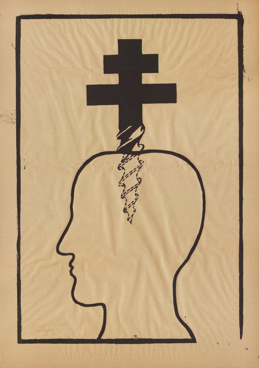
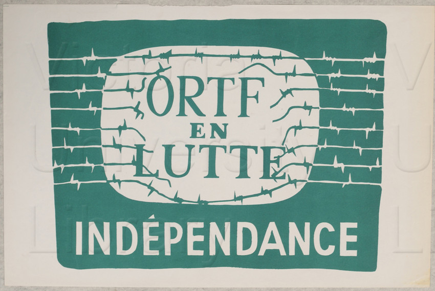
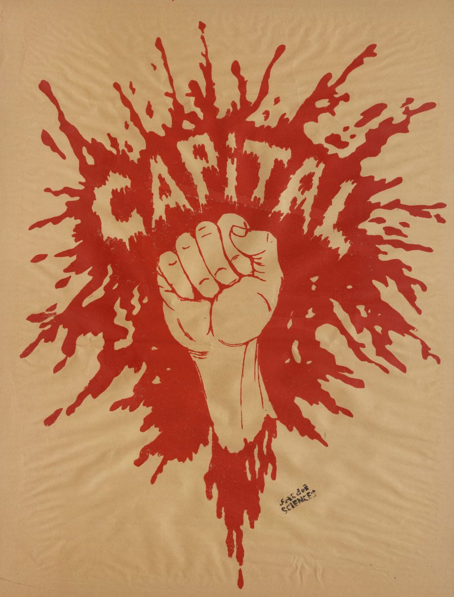
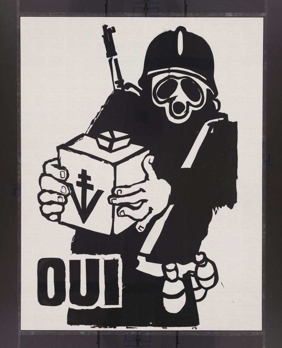
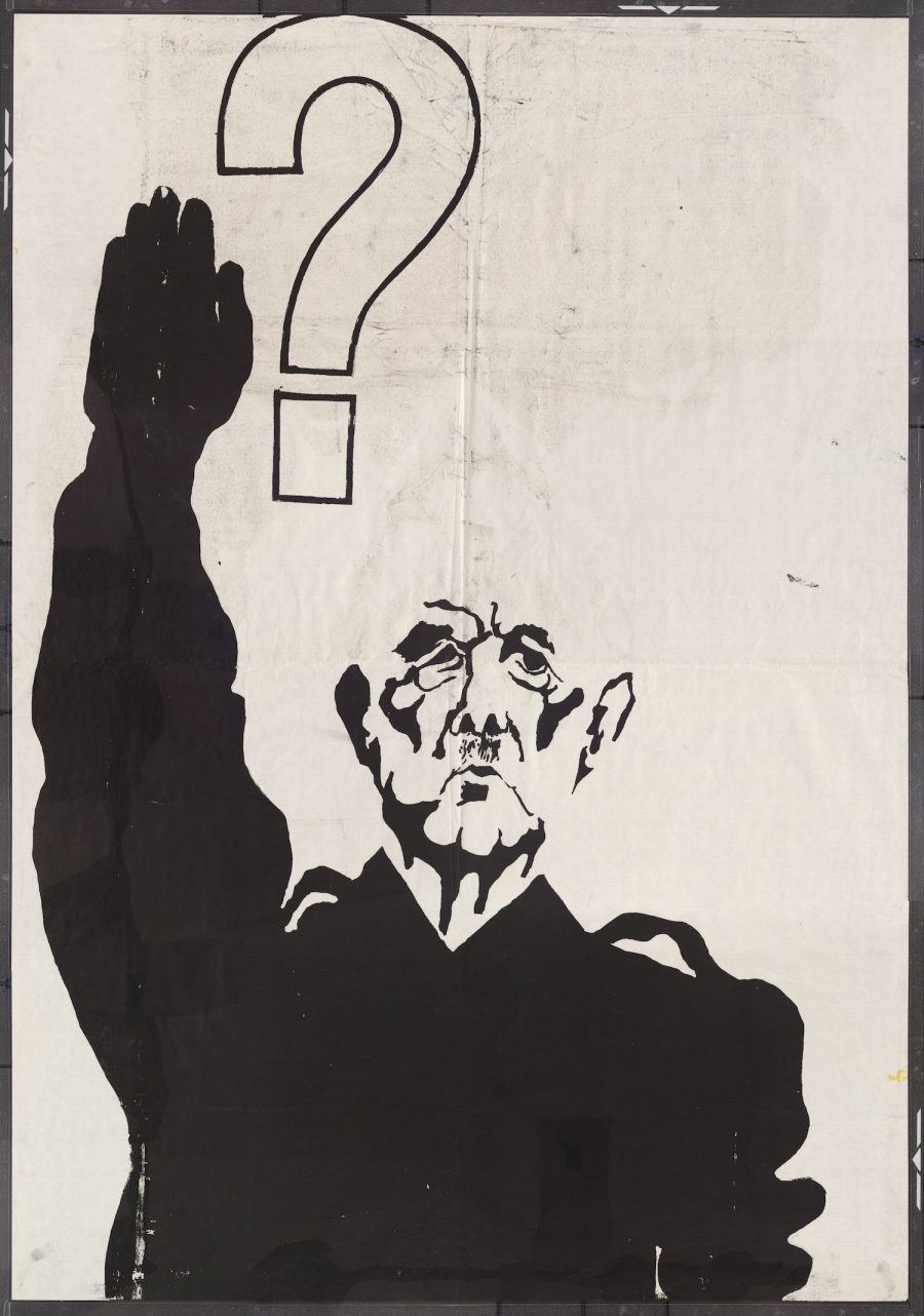
We see it reflected in the defiant art and cinema of the time, from revolutionary work by a 75-year-old Joan Miró to vérité film by 20-year-old wunderkind Philippe Garrel. And we see it, especially, in the huge number of posters printed to advertise the movement, radical graphic designs that illustrate the exhilaration and defiance of the loose collective of Marxists-Leninists, Trotskyites, Maoists, Anarchists, Situationists, and so on who propelled the movement forward.
Last year, we featured a gallery of these arresting images from the Atelier Populaire, a group of artists and students, notes Dangerous Minds, which “occupied the École des Beaux-Arts and dedicated its efforts to producing thousands of silk-screened posters using bold, iconic imagery and slogans as well as explicitly collective/anonymous authorship.” Today, we bring you a huge gallery of more than 300 such images, housed online at Victoria University in the University of Toronto.
Some of the images are downloadable. You can request downloads of others from the university library for private use or publication. These posters represent a movement confronting an oppressive society with its own logic, a society of which Debord wrote just the previous year, “the spectacle is not a collection of images; it is a social relation between people that is mediated by images.” There is no understanding of the events of May 1968 without an understanding of its visual culture as, Debord wrote, “a means of unification.” Enter the gallery of posters and prints here.
We're hoping to rely on loyal readers, rather than erratic ads. Please click the Donate button and support Open Culture. You can use Paypal, Venmo, Patreon, even Crypto! We thank you!
Open Culture scours the web for the best educational media. We find the free courses and audio books you need, the language lessons & educational videos you want, and plenty of enlightenment in between.
