The Tree of Modern Art: Elegant Drawing Visualizes the Development of Modern Art from Delacroix to Dalí (1940)

Select­ing cer­tain fea­tures, sim­pli­fy­ing them, exag­ger­at­ing them, and using them to pro­vide a deep insight, at a glance, into the sub­ject as a whole: such is the art of the car­i­ca­tur­ist, one that Miguel Covar­ru­bias ele­vat­ed to anoth­er lev­el in the ear­ly- to mid-20th cen­tu­ry. Those skills, com­bined with his knowl­edge as an art his­to­ri­an, also served him well when he drew “The Tree of Mod­ern Art.” This aes­thet­i­cal­ly pleas­ing dia­gram first appeared in Van­i­ty Fair in May of 1933, a time when many read­ers of such mag­a­zines would have felt a great curios­i­ty about how, exact­ly, all these new paint­ings and sculp­tures and such — many of which did­n’t seem to look much like the paint­ings and sculp­tures they knew at all — relat­ed to one anoth­er.

“Because it stops in 1940, the tree fails to account for abstract expres­sion­ism and oth­er post–World War II move­ments,” writes Vox’s Phil Edwards, in a piece that includes a ver­sion of the Covar­ru­bias’ 1940 “Tree of Mod­ern Art” revi­sion with click­able exam­ples of rel­e­vant art­work.

But “the orga­ni­za­tion­al struc­ture alone reveals a sur­pris­ing­ly large amount about the way art has evolved,” includ­ing how it “becomes broad­er and more inclu­sive over time,” even­tu­al­ly turn­ing into a “glob­al affair”; how “artis­tic schools have become more aes­thet­i­cal­ly diverse”; how “the canon evolved quick­ly”; and how “all art is inter­twined,” cre­at­ed as it has so long been by artists who “work togeth­er, bor­row from each oth­er, and grow in tan­dem.”

You can also find the “Tree of Mod­ern Art” at the David Rum­sey His­tor­i­cal Map Col­lec­tion, a hold­ing that illus­trates, as it were, just how wide a swath of infor­ma­tion design the term “map” can encom­pass. “The date is esti­mat­ed based on the ver­so of the paper being a blue lined base map of the Nation­al Park Ser­vice dat­ed 12/28/39,” says the col­lec­tion’s site. “This draw­ing was found in the papers of B. Ash­bur­ton Tripp” — also a map­mak­er in the col­lec­tion — “and we assume that Covar­ru­bias and Tripp were friends (ver­i­fied by Trip­p’s descen­dants) and that the blue line base map was some­thing Tripp was work­ing on in his land­scape archi­tec­ture busi­ness.”

The leg­end describes the tree as hav­ing been “plant­ed 60 years ago,” a num­ber that has now passed 130. Many more leaves have grown off those branch­es of impres­sion­ism, expres­sion­ism, post-impres­sion­ism, sur­re­al­ism, cubism, and futur­ism in the years since Covar­ru­bias drew the tree, but for some­one to go back and aug­ment such a ful­ly-real­ized cre­ation would­n’t do at all — as with any work of art, mod­ern or oth­er­wise.

Relat­ed Con­tent:

Down­load 67,000 His­toric Maps (in High Res­o­lu­tion) from the Won­der­ful David Rum­sey Map Col­lec­tion

The His­to­ry of Mod­ern Art Visu­al­ized in a Mas­sive 130-Foot Time­line

Take a Trip Through the His­to­ry of Mod­ern Art with the Oscar-Win­ning Ani­ma­tion Mona Lisa Descend­ing a Stair­case

Every Exhi­bi­tion Held at the Muse­um of Mod­ern Art (MoMA) Pre­sent­ed in a New Web Site: 1929 to Present

The Guggen­heim Puts Online 1600 Great Works of Mod­ern Art from 575 Artists

Based in Seoul, Col­in Mar­shall writes and broad­casts on cities and cul­ture. His projects include the book The State­less City: a Walk through 21st-Cen­tu­ry Los Ange­les and the video series The City in Cin­e­ma. Fol­low him on Twit­ter at @colinmarshall or on Face­book.

New Iranian Video Game, Engare, Explores the Elegant Geometry of Islamic Art

The inter­sec­tion of math­e­mat­ics and art holds out great poten­tial for not just end­less dis­cov­er­ies but deeply mem­o­rable cre­ations. The 20th-cen­tu­ry vision­ary M.C. Esch­er under­stood that, but so did the Islam­ic artists of cen­turies before that inspired him. They’ve also inspired the Iran­ian game devel­op­er Mah­di Bahra­mi, whose newest effort Engare stands at the cross of math­e­mat­ics, art, and tech­nol­o­gy, a puz­zle video game that chal­lenges its play­ers to com­plete the kind of bril­liant­ly col­or­ful, math­e­mat­i­cal­ly rig­or­ous, and at once both strik­ing­ly sim­ple and strik­ing­ly com­plex pat­terns seen in tra­di­tion­al Islam­ic art and design.

“The leap from the bare bones pro­to­type to it becom­ing a game about cre­at­ing art was a small one, giv­en that Islam­ic art is steeped in math­e­mat­i­cal knowl­edge,” writes Kill Screen’s Chris Priest­man.

“The visu­al flair of Islam­ic art also helps to fur­ther ensure that Engare doesn’t ever feel ‘dry.’ Yes, it’s a game about math, but there are no dull equa­tions to solve. Yet, the same ideas that those equa­tions belong to are approached in Engare, just from a dif­fer­ent angle and one that Bahra­mi reck­ons can also evoke emo­tions. You can see this in mes­mer­iz­ing action in the game­play trail­er just above.

“There are geo­met­ri­cal shapes that make us feel hap­py, pat­terns that make some­one nervous/hypnotized, the tiling of a ceil­ing can make some­one feel lone­ly,” Priest­man quotes Bahra­mi as writ­ing. He’s done this sort of emo­tion­al think­ing about visu­al math­e­mat­ics before: his pre­vi­ous game Farsh “had you rolling out Per­sian car­pets in such a way as to cre­ate paths across the lev­els,” and his next one Tan­dis is “inspired by Celtic shapes, and is a wild and unpre­dictable exper­i­ment in topo­graph­i­cal trans­for­ma­tion.” If you’d like to give Engare a try, you can get it from its web­site or on Steam. When the 21st cen­tu­ry’s M.C. Esch­er dis­cov­ers Islam­ic art, will he do it through the medi­um of video games?

via Kill Screen

Relat­ed Con­tent:

The Com­plex Geom­e­try of Islam­ic Art & Design: A Short Intro­duc­tion

Back to Bed: A New Video Game Inspired by the Sur­re­al Art­work of Esch­er, Dali & Magritte

Cal­i­forni­um: New Video Game Lets You Expe­ri­ence the Sur­re­al World of Philip K. Dick

Ancient Greek Pun­ish­ments: The Retro Video Game

Math­e­mat­ics Made Vis­i­ble: The Extra­or­di­nary Math­e­mat­i­cal Art of M.C. Esch­er

Based in Seoul, Col­in Mar­shall writes and broad­casts on cities and cul­ture. His projects include the book The State­less City: a Walk through 21st-Cen­tu­ry Los Ange­les and the video series The City in Cin­e­ma. Fol­low him on Twit­ter at @colinmarshall or on Face­book.

Meet the Characters Immortalized in Lou Reed’s “Walk on the Wild Side”: The Stars and Gay Rights Icons from Andy Warhol’s Factory Scene

Lou Reed weath­ered his share of bad press in the decades after leav­ing one of the most influ­en­tial bands in rock history—either for his famed iras­ci­bil­i­ty or his spells of lack­lus­ter song­writ­ing. Some­how, he always had a way of bounc­ing back, prov­ing again and again his cul­tur­al rel­e­vance. For exam­ple, when it seemed like he had cashed in all his cred­i­bil­i­ty with the godaw­ful “Orig­i­nal Rap­per” in the mid-eight­ies, he returned in 1989 with the grit­ty clas­sic rock and roll of New York (and played the White House at the request of his long­time fan and friend Vaclav Hav­el). Reed was a true sur­vivor of a down­town scene that claimed more casu­al­ties than it made stars, and he most­ly made sur­vival look pret­ty good.

When he released his first solo album after quit­ting the Vel­vet Under­ground in 1972, how­ev­er, it seemed like­ly Reed was head­ed for obscu­ri­ty. Lou Reed is most­ly a great col­lec­tion of (most­ly over­pro­duced) songs, “but it isn’t a ter­ri­bly inter­est­ing” record, writes Mark Dem­ing at All­mu­sic, “and it stands today more as a his­tor­i­cal curios­i­ty than any­thing else” for its ear­ly ver­sions of songs like “Berlin.” Not so the fol­low-up, Trans­former, an album boast­ing what may well be some of the best record­ings Reed ever made, like “Per­fect Day” and “Satel­lite of Love.” What made the dif­fer­ence? The influ­ence of David Bowie, who pro­duced with Mick Ron­son, didn’t hurt one bit.

Trans­former also hap­pens to con­tain the only song that broke Reed “through to the main­stream,” notes the Poly­phon­ic video above, the “rock clas­sic” hit, “Walk on the Wild Side.” The song draws its nar­ra­tive strength and its “incred­i­bly sub­ver­sive” nature from its sub­ject: the 60s Fac­to­ry scene sur­round­ing Andy Warhol, which, in effect, made Lou Reed, Lou Reed when Warhol took the Vel­vet Under­ground under his wing. The song reminds us that Reed was at his strongest when he told the tales of his milieu, whether that be the world of junkies, hus­tlers, and sex­u­al out­siders, or of fringe down­town artists unafraid to exper­i­ment with new iden­ti­ties and per­sonas.

These were shared worlds, and Reed knew them well enough to cap­ture them in a lit­er­ary frame pro­vid­ed by Nel­son Algren’s nov­el A Walk on the Wild Side (1956). Rather than cre­ate an adap­ta­tion of the book as he first intend­ed, Reed wrote about six com­pelling Fac­to­ry char­ac­ters, “Super­stars” in Warhol’s coterie, who embod­ied the edgy, coura­geous cool Reed made his theme. First up is Hol­ly Wood­lawn, a trans­gen­der woman who moved to New York from Mia­mi to escape dis­crim­i­na­tion. Warhol dis­cov­ered Wood­lawn work­ing the streets, and put her in films, “where she thrived,” the video notes, becom­ing “an impor­tant fig­ure in LGBTQ his­to­ry and, thanks to Lou Reed, in music his­to­ry, too.”

The next verse intro­duces us to anoth­er impor­tant mem­ber of Warhol’s inner cir­cle, Can­dy Dar­ling, who was also trans­gen­der and a star of Warhol’s films, and who inspired not only “Walk on the Wild Side” but “Can­dy Says” and, quite pos­si­bly, the Kinks’ “Lola.” Dar­ling is already famil­iar to those who know the Fac­to­ry scene, as is the sub­ject of the third vignette, Joe Dalle­san­dro, whom Warhol turned into a cult star in films like Flesh, and who—unlike most of the Fac­to­ry artists—actually achieved main­stream suc­cess, with roles in The Cot­ton Club and The Limey. (He also served as the crotch mod­el on the cov­er of the Rolling Stones’ Sticky Fin­gers and the “top­less tor­so” on the cov­er of The Smiths’ debut album.)

As the video out­lines brief biogra­phies of each “Walk on the Wild Side” muse, we see that Reed wasn’t only pay­ing homage to his artis­tic com­mu­ni­ty of ori­gin, he also was also pre­serv­ing a pan­theon of cul­tur­al fig­ures who were impor­tant to the gay rights move­ment in one way or anoth­er, as well as to the 60s Warhol aes­thet­ic and the birth of glam rock in the 70s. “Walk on the Wild Side,” notes Poly­phon­ic, “gives us a great lit­tle glimpse into a his­tor­i­cal scene, and it helps us under­stand the peo­ple around Lou Reed that influ­enced the great artist he was.” With­out a doubt, Reed’s most endur­ing work comes from his sym­pa­thet­ic por­traits of the artists and hang­ers-on who made the world he wrote of so sexy, dan­ger­ous, com­plex, and intrigu­ing.

Relat­ed Con­tent:

Lou Reed Cre­ates a List of the 10 Best Records of All Time

Lou Reed Sings “Sweet Jane” Live, Julian Schn­abel Films It (2006)

Lou Reed and Lau­rie Anderson’s Three Rules for Liv­ing Well: A Short and Suc­cinct Life Phi­los­o­phy

Josh Jones is a writer and musi­cian based in Durham, NC. Fol­low him at @jdmagness

The Van Gogh of Microsoft Excel: How a Japanese Retiree Makes Intricate Landscape Paintings with Spreadsheet Software

Just when you thought you’ve mas­tered Microsoft Excel–creating piv­ot tables, VLOOKUPs and the rest–you dis­cov­er the fea­ture you nev­er knew was there. The one that lets you cre­ate Japan­ese land­scape paint­ings. When Tat­suo Hori­uchi retired, he found that fea­ture and leaned on it, hard. Now 77 years old, he has enough land­scape paint­ings to stage an exhibition–all made with the point and click of a mouse.

So what’s the moral of this sto­ry? Maybe it’s you’re nev­er too old to make art. Or maybe it’s nev­er too late to mas­ter those hid­den fea­tures and push tech­nol­o­gy to the bleed­ing edge. In Tat­suo’s case, he’s doing both.

via Swiss Miss

Relat­ed Con­tent:

The Art of Hand-Drawn Japan­ese Ani­me: A Deep Study of How Kat­suhi­ro Otomo’s Aki­ra Uses Light

A Hyp­not­ic Look at How Japan­ese Samu­rai Swords Are Made

Down­load 2,500 Beau­ti­ful Wood­block Prints and Draw­ings by Japan­ese Mas­ters (1600–1915)

The Art of the Japan­ese Teapot: Watch a Mas­ter Crafts­man at Work, from the Begin­ning Until the Star­tling End

Enter a Dig­i­tal Archive of 213,000+ Beau­ti­ful Japan­ese Wood­block Prints

The Vibrant Color Wheels Designed by Goethe, Newton & Other Theorists of Color (1665–1810)

Maybe it’s the clois­tered headi­ness of Rene Descartes, or the rig­or­ous aus­ter­i­ty of Isaac New­ton; maybe it’s all the leath­ern breach­es, gray waist­coats, sal­low faces, and pow­dered wigs… but we tend not to asso­ciate Enlight­en­ment Europe with an explo­sion of col­or the­o­ry. Yet, philoso­phers of the late 17th and 18th cen­turies were obsessed with light and sight. Descartes wrote a trea­tise on optics, as did New­ton.

New­ton first described in his 1672 Opticks the “rev­o­lu­tion­ary new the­o­ry of light and colour,” the Uni­ver­si­ty of Cam­bridge Whip­ple Library writes, “in which he claimed that exper­i­ments with prisms proved that white light was com­prised of light of sev­en dis­tinct colours.” Sci­en­tists debat­ed Newton’s the­o­ry “well into the 19th cen­tu­ry.”

One ear­ly oppo­nent famous­ly illus­trat­ed his rebut­tal. Poet, writer, and sci­en­tist Johann Wolf­gang von Goethe pub­lished The­o­ry of Col­ors (see here), with its care­ful­ly hand-drawn and col­ored dia­grams and wheels, in 1809. From New­ton’s time onward, col­or the­o­rists elab­o­rat­ed pre­vail­ing con­cepts with col­or wheels, the first attrib­uted to New­ton in 1704 (and drawn in black and white, above).

Newton’s wheel “arranged red, orange, yel­low, green, blue, indi­go, and vio­let into a nat­ur­al pro­gres­sion on a rotat­ing disk.” Four years lat­er, painter Claude Boutet made his 7‑color and 12-col­or cir­cles (top), based on Newton’s the­o­ries. Artists, chemists, map­mak­ers, poets, even ento­mol­o­gists… every­one seemed to have a pet the­o­ry of col­or, gen­er­al­ly accom­pa­nied by elab­o­rate col­ored charts and dia­grams.

The col­or wheel was one among many forms—which often pre­sent­ed con­trast­ing the­o­ries, like that of Jacques-Fabi­en Gau­ti­er, who argued that black and white were pri­ma­ry col­ors. But the wheel, and Newton’s basic ideas about it, have endured almost unchanged. The wheel fur­ther up (third one from top) by British ento­mol­o­gist Moses Har­ris from 1776 shows Newton’s 7‑color scheme sim­pli­fied to the 6 pri­ma­ry and sec­ondary col­ors we usu­al­ly see, arranged in the com­ple­men­tary and anal­o­gous scheme, with ter­tiary gra­da­tions between them. Anoth­er ento­mol­o­gist, Ignaz Schif­fer­müller, drew the 12-col­or wheel right above.

Col­or is always rep­re­sen­ta­tive. Newton’s orig­i­nal wheel includ­ed “musi­cal notes cor­re­lat­ed with col­or.” By the end of the 18th cen­tu­ry, col­or the­o­ry had become increas­ing­ly tied to psy­cho­log­i­cal the­o­ries and typolo­gies, as in the wheel above, the “rose of tem­pera­ments,” made by Goethe and Friedrich Schiller in 1789 to illus­trate “human occu­pa­tions and char­ac­ter traits,” the Pub­lic Domain Review notes, includ­ing “tyrants, heroes, adven­tur­ers, hedo­nists, lovers, poets, pub­lic speak­ers, his­to­ri­ans, teach­ers, philoso­phers, pedants, rulers,” grouped into the four tem­pera­ments of humoral the­o­ry.

It’s a fair­ly short leap from these psy­cholo­gies of col­or to those used by adver­tis­ers and com­mer­cial design­ers in the 20th century—or from the artists and sci­en­tists’ col­or the­o­ries to abstract expres­sion­ism, the Bauhaus school, and the chemists and pho­tog­ra­phers who recre­at­ed the col­ors of the world on film. (Goethe’s col­or wheel, below, from The­o­ry of Col­or, illus­trates his chap­ter on “Alle­gor­i­cal, sym­bol­ic, and mys­ti­cal use of colour.”) See more ear­ly col­or wheels, like Philipp Otto Runge’s 1810 Far­benkugel, as well as oth­er con­cep­tu­al col­or schemes, at the Pub­lic Domain Review.

via Pub­lic Domain Review

Relat­ed Con­tent:

Goethe’s The­o­ry of Col­ors: The 1810 Trea­tise That Inspired Kandin­sky & Ear­ly Abstract Paint­ing

How Tech­ni­col­or Rev­o­lu­tion­ized Cin­e­ma with Sur­re­al, Elec­tric Col­ors & Changed How We See Our World

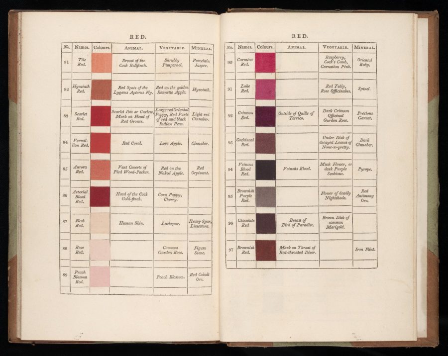
A Pre-Pan­tone Guide to Col­ors: Dutch Book From 1692 Doc­u­ments Every Col­or Under the Sun

Sir Isaac Newton’s Papers & Anno­tat­ed Prin­cip­ia Go Dig­i­tal

Josh Jones is a writer and musi­cian based in Durham, NC. Fol­low him at @jdmagness

Andy Warhol’s Seven Hand-Illustrated Books: Charming, Little-Known, and Now Available to the World (1952–1959)

Got a knack for draw­ing, paint­ing, sculpt­ing, cre­at­ing hand­made objects of any kind? You’re maybe more like­ly to mon­e­tize your skill—with an Etsy or Pin­ter­est account, for example—than move to New York and try to make a go of it. Were such con­ve­nient means of set­ting up shop avail­able in the late 40’s, when Andy Warhol stud­ied art edu­ca­tion and com­mer­cial art at the Uni­ver­si­ty of Pitts­burgh and Carnegie Mel­lon Uni­ver­si­ty, respec­tive­ly, one won­ders whether the often bedrid­den, intro­vert­ed artist might have found it more appeal­ing to work from home in Pitts­burgh, and stay there.

Instead, he moved to New York and became a suc­cess­ful com­mer­cial artist by using his illus­tra­tion skills to mar­ket him­self. Before he was a “bell­wether of post-war and con­tem­po­rary art” with those famous silkscreen paint­ings in the 60s; before he made those famous films, dis­cov­ered (and invent­ed the con­cept of) art stars, and man­aged the Vel­vet Under­ground, Warhol cre­at­ed sev­en hand­made books “as part of his strat­e­gy to woo clients and forge friend­ships.” So writes Taschen books, who have col­lect­ed and reprint­ed Warhol’s art books in a sin­gle edi­tion. (Five of the sev­en have nev­er before been repub­lished.)

Warhol reserved the sig­na­ture books for “his most val­ued con­tacts. These fea­tured per­son­al, unique draw­ings and quirky texts reveal­ing his fond­ness for—among oth­er subjects—cats, food, myths, shoes, beau­ti­ful boys, and gor­geous girls.”

They are inti­mate and charm­ing, show­ing a side of the artist we don’t often see—but one we do see of so many con­tem­po­rary illus­tra­tors. His hand-drawn illus­tra­tions have a very 21st cen­tu­ry feel to them in their obses­sion with cats, cakes, fash­ion, and hap­py, nude zaftig beau­ties. Cre­at­ed between 1952 and 59, they could have come from any num­ber of illus­tra­tion or design sites. It’s easy to imag­ine a cur­rent-day Warhol mak­ing a liv­ing sell­ing work like this online.

Had he been able to do so, might he have become a dif­fer­ent kind of artist entire­ly? It’s impos­si­ble to say. I can imag­ine a num­ber of peo­ple for whom I might buy copies of Love Is a Pink Cake, 25 Cats Named Sam, or À la Recherche du Shoe Per­du, as a hol­i­day gift. But Warhol didn’t make copies of these books. He saved the mass pro­duc­tion for his lat­er gallery work. Instead the hand­made call­ing cards remain “lit­tle-known, much-cov­et­ed jew­els in the Warhol crown,” ear­ly exam­ples of “the artists’ off-the-wall char­ac­ter as well as his accom­plished drafts­man­ship, bound­less cre­ativ­i­ty, and innu­en­do-laced humor.”

You might not know it from can­vas­es like Eight Elvis­es, the Mar­i­lyn Mon­roe series, or Campbell’s Soup Cans, but Warhol had a par­tic­u­lar tal­ent for light, whim­si­cal hand-drawn illus­tra­tion. It’s a side of him­self he showed few peo­ple once he became the Andy Warhol most of us know. Thanks to Taschen’s new book, a recent gallery show­ing of Warhol’s draw­ings, a 2012 Chron­i­cle col­lec­tion of his quirky illus­tra­tions from the 50s, and, well, Pin­ter­est, it’s a side of him that can now belong to every­one.

You can now get your own copy of Andy Warhol: Sev­en Illus­trat­ed Books 1952–1959.

Relat­ed Con­tent:

The Big Ideas Behind Andy Warhol’s Art, and How They Can Help Us Build a Bet­ter World

Short Film Takes You Inside the Recov­ery of Andy Warhol’s Lost Com­put­er Art

Miyaza­ki Meets Warhol in Campbell’s Soup Cans Reimag­ined by Design­er Hyo Taek Kim

Josh Jones is a writer and musi­cian based in Durham, NC. Fol­low him at @jdmagness

The Codex Quetzalecatzin, an Extremely Rare Colored Mesoamerican Manuscript, Now Digitized and Put Online

To para­phrase Don­ald Rums­feld, there are known knowns in the art world, and there are unknown knowns. The Codex Quet­za­le­catzin, a rare col­ored Mesoamer­i­can man­u­script, recent­ly went from a unknown known (a French col­lec­tor owned it, and before them William Ran­dolph Hearst, and many oth­ers, for sev­er­al cen­turies) to a known known (the French col­lec­tor donat­ed it to the Library of Con­gress).

Bet­ter still, the Library has scanned the illus­trat­ed document–essentially a map of Mex­i­co City and Puebla, drawn up for both Span­ish col­o­niz­ers and indige­nous peo­ple to lay claim to the land–in super hi-res for the pub­lic and schol­ars world­wide to pore over. It dates from between 1570 and 1595.

Accord­ing to John Hessler of the Library’s Worlds Revealed blog, the map depicts the land owned by the de Leon fam­i­ly.

As is typ­i­cal for an Aztec, or Nahu­atl, codex of this ear­ly date, it relates the extent of land own­er­ship and prop­er­ties of a fam­i­ly line known as “de Leon,” most of the mem­bers of which are depict­ed on the man­u­script. With Nahu­atl styl­ized graph­ics and hiero­glyphs, it illus­trates the family’s geneal­o­gy and their descent from Lord-11 Quet­za­le­catzin, who in 1480, was the major polit­i­cal leader of the region. It is from him the Codex derives one of its many names.

The map is one of 450 sur­viv­ing pic­to­r­i­al man­u­scripts of the Mesoamer­i­can peri­od, and con­tains nat­ur­al pig­ments such as Maya blue and cochineal red (made from insects).

If it wasn’t so tied in to bloody Span­ish colo­nial­ism, you could say the Codex looks like a video game map, a la Leg­end of Zel­da. But instead it shows a region in tran­si­tion, between the old order and a new world pop­u­lat­ed by Catholic church­es, and is all the more fas­ci­nat­ing.

Click here to find the dig­i­tized ver­sion of the Codex Quet­za­le­catzin at the Library of Con­gress.

via LoC

Relat­ed Con­tent:

An Intro­duc­tion to the Codex Seraphini­anus, the Strangest Book Ever Pub­lished

Leonar­do da Vinci’s Vision­ary Note­books Now Online: Browse 570 Dig­i­tized Pages

Hear The Epic of Gil­gamesh Read in its Orig­i­nal Ancient Lan­guage, Akka­di­an

Ted Mills is a free­lance writer on the arts who cur­rent­ly hosts the artist inter­view-based FunkZone Pod­cast and is the pro­duc­er of KCR­W’s Curi­ous Coast. You can also fol­low him on Twit­ter at @tedmills, read his oth­er arts writ­ing at tedmills.com and/or watch his films here.

How Art Spiegelman Designs Comic Books: A Breakdown of His Masterpiece, Maus

Maus, car­toon­ist Art Spiegel­man’s ground­break­ing, Pulitzer Prize-win­ning account of his com­pli­cat­ed rela­tion­ship with his Holo­caust sur­vivor father, is a sto­ry that lingers.

Spiegel­man famous­ly chose to depict the Jews as mice and the Nazis as cats. Non-Jew­ish civil­ians of his father’s native Poland were ren­dered as pigs. He flirt­ed with the idea of depict­ing his French-born wife, the New Yorker’s art edi­tor, Françoise Mouly, as a frog or a poo­dle, until she con­vinced him that her con­ver­sion to Judaism mer­it­ed mouse­hood, too.

The char­ac­ters’ anthro­po­mor­phism is not the only visu­al inno­va­tion, as the Nerd­writer, Evan Puschak, points out above.

Draw­ing on inter­views in Meta­Maus: A Look Inside a Mod­ern Clas­sic, taped con­ver­sa­tions with Neil Gaiman, and the Uni­ver­si­ty of Washington’s Mar­cia Alvar, and oth­er sources, the Nerd­writer pans an eight-pan­el page from the first chap­ter for max­i­mum mean­ing.

On first glance, noth­ing much appears to be hap­pen­ing on that page—hoping to con­vince his elder­ly father to sub­mit to inter­views for the book that would even­tu­al­ly become Maus, Spiegel­man trails him to his child­hood bed­room, which the old­er man has equipped with an exer­cise bike that he ped­als in dress shoes and black socks.

But, as Spiegel­man him­self once point­ed out:

Those pan­els are each units of time. You see them simul­ta­ne­ous­ly, so you have var­i­ous moments in time simul­ta­ne­ous­ly made present. 

Read­ers must force them­selves to pro­ceed slow­ly in order to ful­ly appre­ci­ate the coex­is­tence of all those moments.

Left to our own devices, we might pick up on the senior Spiegelman’s con­cen­tra­tion camp tat­too, or the intro­duc­tion of Art’s late moth­er via the framed pho­to he shows him­self pick­ing up.

But Puschak takes us on an even deep­er dive, not­ing the sig­nif­i­cance of Art’s place­ment in the long mid-page pan­el. Watch out for the 4:30 mark, anoth­er visu­al stun­ner is teased out in a man­ner rem­i­nis­cent of the rev­e­la­tion of a mes­sage writ­ten in invis­i­ble ink.

So Maus con­ferred com­mer­cial suc­cess upon its cre­ator, while hang­ing onto some of the bold visu­al exper­i­ments from ear­li­er in his career, when he and Mouly helped dri­ve the under­ground comix scene—the past and present entwined yet again.

And this is just one page. Should you ven­ture forth in search of fur­ther visu­al cues lat­er in the text, please use the com­ments sec­tion to share your dis­cov­er­ies.

Relat­ed Con­tent:

R. Crumb Shows Us How He Illus­trat­ed Gen­e­sis: A Faith­ful, Idio­syn­crat­ic Illus­tra­tion of All 50 Chap­ters

23 Car­toon­ists Unite to Demand Action to Reduce Gun Vio­lence: Watch the Result

Lyn­da Bar­ry on How the Smart­phone Is Endan­ger­ing Three Ingre­di­ents of Cre­ativ­i­ty: Lone­li­ness, Uncer­tain­ty & Bore­dom

Ayun Hal­l­i­day is an author, illus­tra­tor, the­ater mak­er and Chief Pri­ma­tol­o­gist of the East Vil­lage Inky zine.  Fol­low her @AyunHalliday.

« Go BackMore in this category... »
Quantcast