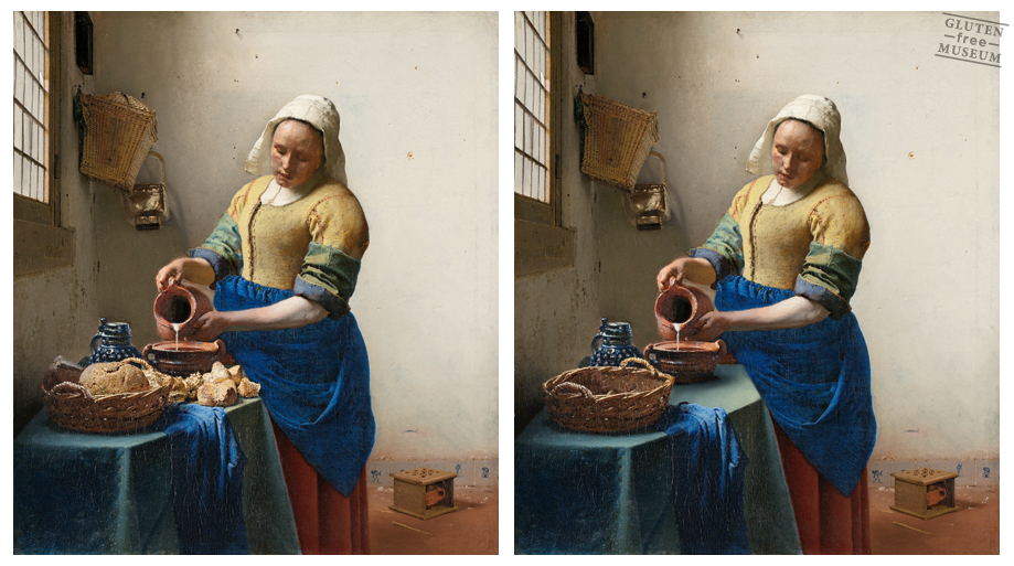
left: Johannes Vermeer, The Milkmaid. right: Arthur Coulet, d’après Johannes Vermeer
It has been suggested plausibly that Vermeer’s kitchen maid is making bread porridge, which puts stale bread—there is an unusual amount of bread on the table—to good use by combining it with milk and a few other ingredients to make a filling mash or meal.
- Walter Liedtke, Department of European Paintings, The Metropolitan Museum of Art
It’s a matter for conjecture. Perhaps Vermeer wanted to title his painting The Bread Porridge Maid, but caved to market research suggesting that Milkmaid would better appeal to what Liedtke calls “male viewer’s amorous musings.”
Recently, graphic artist Arthur Coulet made bread a focal point in Vermeer’s Milkmaid and other iconic works, ironically by Photoshopping it out.
His online Gluten Free Museum is a nod to détournement, manipulations of existing works born of Letterist International and the Situationists. Gone are the crusty loaves, fields golden with wheat, and anything containing grains that could cause discomfort to those afflicted by gluten intolerance or celiac disease.
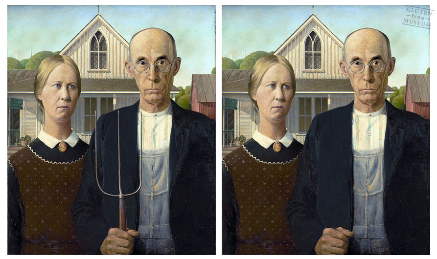
Even the pitchfork in Grant Wood’s American Gothic gets the digital heave ho…with nothing to harvest, what’s the point?
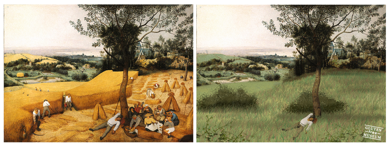
Pieter Bruegel’s the Harvesters gets the most radical redo.
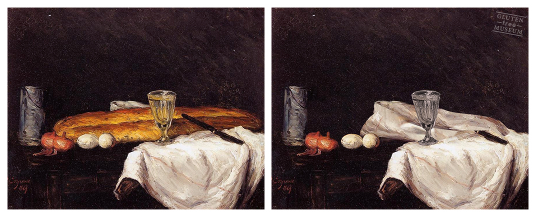
Cezanne’s Still Life with Bread and Eggs is now just Eggs…
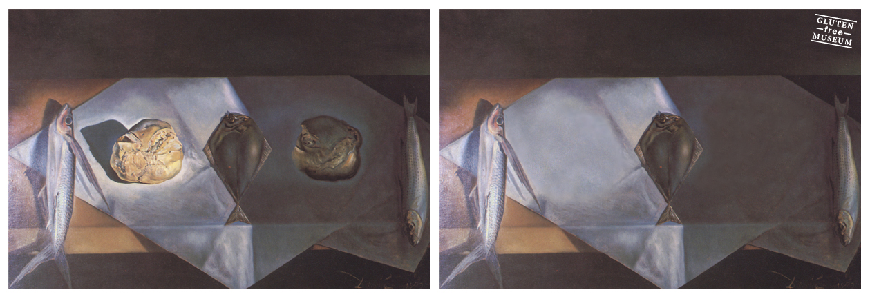
…and Salvador Dali’s Eucharistic Still Life has been reduced to mere fishes.
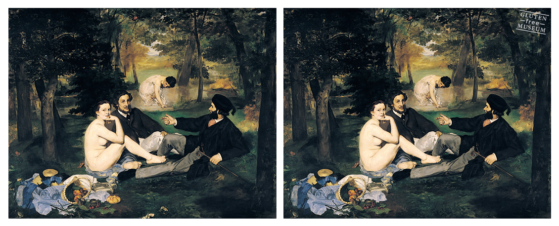
By contrast, the picnickers in Édouard Manet’s Le Déjeuner Sur L’Herbe probably don’t even notice the omission.
See more, including work by Jean-François Millet, Vincent van Gogh, Caravaggio, Giuseppe Arcimboldo, and Jeff Koons in Coulet’s Gluten Free Museum.
A quick image search using the phrase “bread painting” suggests that much work remains to be done.
Related Content:
Philosopher Portraits: Famous Philosophers Painted in the Style of Influential Artists
What Happens When a Cheap Ikea Print Gets Presented as Fine Art in a Museum
Salvador Dalí’s Melting Clocks Painted on a Latte
Ayun Halliday is an author, illustrator, and Chief Primatologist of the East Village Inky zine. Her play, Fawnbook, is playing in New York City through November 20. Follow her @AyunHalliday
