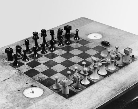
What would Marcel Duchamp have thought of the age of 3D printing, had he foreseen it? I reckon that the inventor of the “readymade” work of art — i.e., a piece found in the real world and placed into an artistic context, as he famously/infamously did with a urinal for 1917’s Fountain — would endorse it as the logical extension of his own creative principles. But man, especially a man like Duchamp, does not live by recontextualized plumbing alone: he also painted, sculpted, and even carved. This last practice resulted, after some time in Buenos Aires the year after Fountain, in his very own one-of-a-kind Art Deco chess set. But now this unique item has turned readymade, so Boingboing reports via Kottke, as “freely downloadable 3D print-files on Thingiverse, where the community is actively remixing them” into versions “like this one, with self-supporting overhangs.”
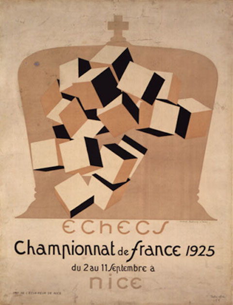
Duchamp himself, who appears in the video at the top of the post describing his passion for chess, surely would have enjoyed all this. After his time in Buenos Aires, he moved to Paris, then to America, and, in 1923, back to Paris again, by which time he’d dedicated himself almost fully to the game. Chess has obsessed many of humanity’s finest minds over centuries and centuries, and Duchamp seems to have shown little resistance to its intellectual and aesthetic pull. Still, just as he crossed chess and art when he crafted his Art Deco set (pictured above), he did it again in 1925, when he not only competed in the Third French Chess Championship (earning the title of grand master as a result) but also designed its striking poster below. The New York Times’ Holland Cotter, reviewing the Francis M. Naumann Fine Arts show “Marcel Duchamp: The Art of Chess,” writes that Duchamp ultimately found his two passions not just reconcilable but “complementary, an ideal intersection of brainpower and beauty. Chess was art; art was chess. Everything was about making the right moves.”
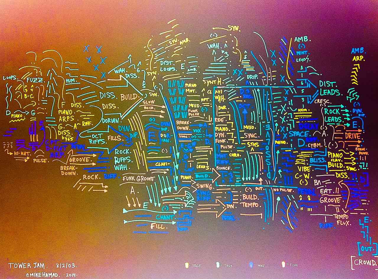
Mike Hamad, a music writer for The Hartford Courant, has a deep and abiding love for Phish. He also has a talent for drawing “schematics” or maps that turn the experience of listening to music into something visual. Over at his tumblr SetlistSchematics, you can find nearly 200 schematics of songs (usually performed live) by The Grateful Dead, The Dave Matthews Band, Pink Floyd, and mostly Phish. According to a short profile in The New York Times, Hamad “has a master’s degree in music theory and a Ph.D. in musicology” — his dissertation focused on the tonal relationships in Franz Liszt’s songs — and, somewhere along the way, he developed a tendency to translate music into schematics, a flurry of “arrows, descriptive notes, roman numerals and wavy lines.”
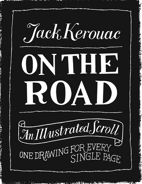
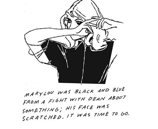
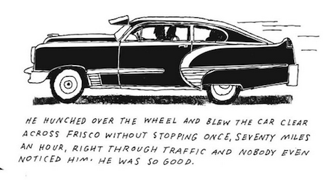
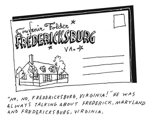
A great deal of mythology has built up around the life of Jack Kerouac, and especially around the experiences that went into his best-known work, the 1957 novel On the Road. Even the very act of its composition — perhaps especially the act of its composition — has, in the imaginations of many of Kerouac’s readers, turned into an image of the man “writing the book on a long scroll of teletype paper in three coffee-soaked-benzedrine-fueled days.” With this image in mind, illustrator Paul Rogers of Pasadena’s Art Center College of Design created On the Road, the illustrated scroll, featuring “a drawing for every page” of the novel, and depicting the historically researched “cars, buses, roadside architecture, and old signs” from Kerouac’s America of the late 1940s and early 50s, one that “looked awfully different than it does now.” You can scroll, as it were, through this work in progress at Rogers’ site.
We’ve here included only four of the over 100 drawings Rogers has so far made, but these examples capture the novel’s multigenerationally intoxicating mix of Americana and pure momentum. You’ll also notice that, underneath each image, Rogers excerpts a passage of Kerouac’s. “Adding Kerouac’s words as captions to the drawings makes the series feel like a journal and not a carefully planned out illustrated book,” he writes, “and it seems to capture some of the spirit of Kerouac’s ‘this-happened-then-this-then-this’ writing style.”
You can read the scroll part-by-part on these pages: one through three, four, five, six, seven. Though I never took quite the lifestyle inspiration from On the Road some have, I can’t wait to see what visual inspiration Rogers draws from the bit about fabulous yellow roman candles exploding like spiders across the stars.
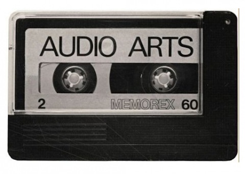
As a podcaster, I’ve long since grown used to the idea of periodically issuing audio content. But the convenient recording, internet, and computer, and mobile listening technologies that made such a medium possible only really converged in the early 2000s. How would I have gone about it had I wanted to put out a “podcast,” say, 40 years earlier? We have one such example in Audio Arts, a British contemporary art “sound magazine” distributed through the mail on audio cassettes. “The seventies were the years of conceptual art with text adding value to the actual works,” co-creator William Furlong once said in an interview. “As an artist I was more interested in ‘discussion,’ the idea of language and the people that already worked in conceptual fields in Great Britain. Soon I realised there weren’t magazines capable of reporting such material inspired by conversation, sounds and discussions. The evocative force of a voice is lost with the written word as it will only ever be a written voice.”
Furlong, a sculptor, and Barry Barker, a gallerist, began publishing Audio Arts in 1973. Its run lasted until, astonishingly, 2006, by which time its archives had come to 25 volumes of four issues each. Its list of subscribers included the formidable Tate, such fans that they actually acquired the magazine’s master tapes, digitized them, and made them all publicly available on their web site. No longer must you seek out nth-generation duplicated analog cassettes and dig out your Walkman; now you can simply stream on your media player of choice every issue from January 1973, “four cassettes with contributions from Caroline Tisdall, Noam Chomsky, James Joyce and W.B. Yeats,” to January 2006, which caps everything off with contributions by Gilbert & George and Jake and Dinos Chapman. Other notable artistic presences include Marcel Duchamp in Volume 2, Philip Glass in Volume 6, and Andy Warhol in Volume 8. Helpfully, Tate has also put together a section with tools to explore Audio Arts’ highlights — something more than a few modern-day podcasts could no doubt use.
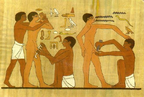
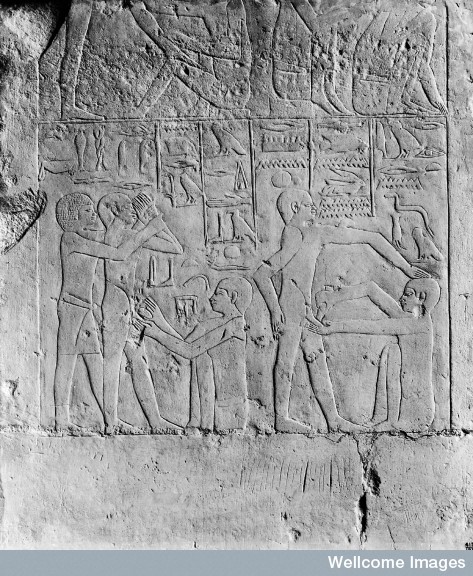
The origins of circumcision remain unclear. According to this online essay, a stele (carving on stone) from the 23rd century B.C.E. suggests that an author named “Uha” was circumcised in a mass ritual. He wrote:
“When I was circumcised, together with one hundred and twenty men, there was none thereof who hit out, there was none thereof who was hit, and there was none thereof who scratched and there was none thereof who was scratched.”
By the time you get to 4,000 B.C.E., you start to find exhumed Egyptian bodies that show signs of circumcision. And then come the artistic depictions. The Sakkara depiction comes with the perhaps helpful written warning,“Hold him and do not allow him to faint.”
“When I got off the boat from France years ago, the first person I met was Salvador Dalí, and I realized I was born surrealist,” said Isabelle Collin Dufresne, better known by her artistic nom-de-plume Ultra Violet. Dufresne died Saturday in New York City after years of battling cancer. She may have been inspired by Dalí, but she was also a legitimate artist in her own right.
Though perhaps not as well known as other “superstars” linked to Andy Warhol such as Edie Sedgwick or the Velvet Underground, Ultra Violet worked in a similar pop style. Her creations were symbolic, approachable and vibrant. Of course, she associated strongly with the color in her namesake—violet was one of the most important colors in her palette.
“It’s in my color, my signature, but it’s also in the color of mourning, the royal color,” she said of a violet memoriam to the events of September 11.
A New Yorker by choice, Ultra Violet was one of probably thousands to create art after the September 11, 2001 terrorist attacks. “IXXI” was distinctly non-political. It neither attacks nor defends; it only memorializes. It portrays the Roman numerals for nine and 11. A palindrome, she noted.
Once allegedly “exorcised” in her hometown in France, Dufresne grew up in a conservative, religious household. It wasn’t until she came to the United States that she became a serious participant in the art world.
The youthful energy around many of the Factory artists didn’t always age well. As an older woman, Ultra Violet sometimes looked strange with her violet hair and flamboyant clothing, and she was sometimes criticized for producing sloppy work instead of developing a tighter style with age.
Pieces like 2007’s “Electric Love Chair” even reference the glory days of Pop Art, but Ultra Violet spent most of her life experimenting with new ideas and technologies for the production of art.
“I’m interested more in the future than in the past,” she told Ernie Manouse in a 2005 interview.
This is a guest post from Zach Lindsey, an English as a Second Language Teacher living in Austin, Texas. He’s written about artists’ muses before, for Lehigh Valley Style and Be About It.
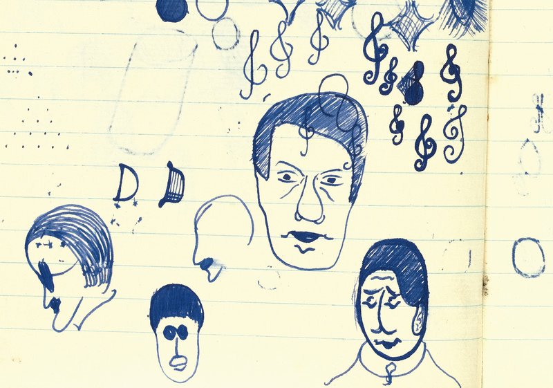
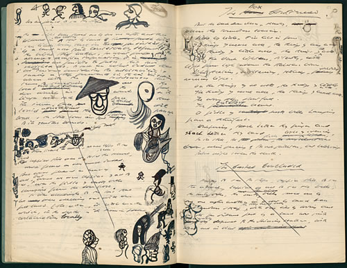
The manuscript for Murphy, comprising six notebooks, was auctioned off last year by Sotheby’s to the tune of £962,500 (or over $1.6 million). The book was written between the years of 1935 to 1936 and the manuscript shows numerous revisions. It also contains this doodle (above) of Charlie Chaplin, who would later influence his seminal play Waiting for Godot. Beckett’s doodle of James Joyce appears beneath it.
For someone who made a career exploring heavy themes like nothingness and futility, his drawings are nothing like the stark, angular doodles of Franz Kafka. Beckett’s pictures are curvy, light-hearted and whimsical. Look at the drawing below. I really don’t know what’s going on there but it sort of looks like a man in earmuffs giving birth to a hat.
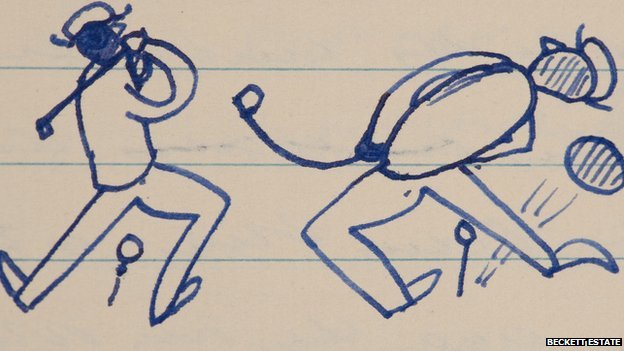
And this one is of a couple golfers.
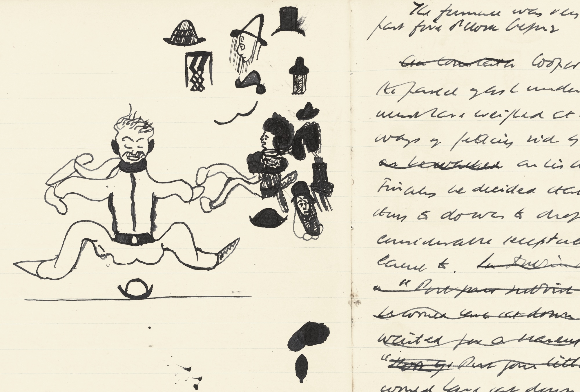
Beckett’s second novel Watt, the last book he wrote in English, also took up six notebooks. According to Beckett’s recollections, Watt was written “in drips and drabs” while he was in living in France during WWII. In the first notebook, alongside an X‑ed out page of text is this odd drawing of a long-haired centaur in a top hat.
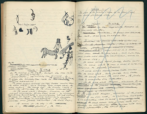
And this page, in the second notebook, features a bunch of terrific, strikingly graphic doodles including one that looks like Morley Safer in an Asian cone hat. (Again with the hats.)
Jonathan Crow is a Los Angeles-based writer and filmmaker whose work has appeared in Yahoo!, The Hollywood Reporter, and other publications. You can follow him at @jonccrow.
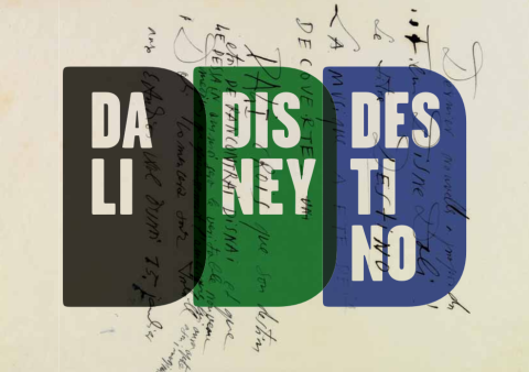
Unlikely collaborations in pop music abound: Run DMC and Aerosmith? It works! U2 and Luciano Pavarotti? Why not? Robert Plant and Alison Krauss? Sure! Anyone and Kermit the Frog? Yes. They don’t always work out, but the attempts, whether kismet or trainwreck, tend to reveal a great deal about the partners’ strengths and weaknesses. Unlikely collaborations in feature film are somewhat rarer, though not for lack of wishing. I would guess the high financial stakes have something to do with this, as well as the sheer number of people required for the average production. One particularly salient example of an ostensible mismatch in animated movies—a planned co-creation by surrealist Salvador Dalí and populist Walt Disney—offers a fascinating look at how the two artists’ careers could have taken very different creative directions. The collaboration may also have fallen victim to a film industry whose economics discourage experimental duets.
We’ve previously featured the animated short— Destino—at the top of the post. The 6 and a half minute film shows us what Dalí and Disney’s planned project might have looked like. Recreated from 17 seconds of original animation and storyboards drawn by Dalí and released in 2003 by Disney’s nephew Roy, Destino gives us an almost perfect symbiosis of the two creators’ sensibilities, with Walt Disney’s Fantasia-like flights smoothly animating Dalí’s fluid dream imagery. According to Chris Pallant, author of Demystifying Disney, work between the two on the original project also moved smoothly, with little friction between the two artists. Meeting in 1945, Dalí and Disney “quickly developed an industrious working relationship” and “ease of collaboration.” Pallant writes that “Disney’s desire for absolute creative control changed, and, for the first time, the animators working within the studio felt the influence of other artistic forces.” I imagine it might prove difficult, if not impossible, to micromanage Salvador Dalí. In any case, the fruitful relationship produced results:
Destino reached a relatively advanced stage before being abandoned. By mid-1946 the Disney- Dalí collaboration encompassed approximately ’80 pen-and-ink sketches’ and numerous ‘storyboards, drawings and paintings that were created over nine months in 1945 and 1946.’
Roy E. Disney discovered Dalí’s Destino artwork in the late 90s, leading to his short re-creation of what might have been. Above, you can flip through a slideshow of twelve of those drawings and storyboards, courtesy of Park West Gallery, who represent the work. The Destino materials went on display at the Drawings Room in Figueres, Spain. The exhibition featured “1 oil painting, 1 watercolour, 15 preparatory drawings—10 of which are unpublished—and 9 photographs of Dalí in the creative process of this material, of the Disney couple in Port Lligat in 1957, and the Dalí couple in Burbank.” You can see many of those photographs in the exhibit’s pamphlet (in pdf here, in Spanish and English; cover image below), which offers a detailed description of the original project, including its narrative concept, a “love story” between a dancer and “baseball-player-cum-god Cronos” meant to represent “the importance of time as we wait for destiny to act on our lives.”
Inspired by a Mexican song by Armando Dominguez, Destino, on its face, seems like a very strange choice for Disney, who generally trafficked in more recognizable (and European) folk-tale sources. And yet, the exhibition pamphlet asserts, the co-production made a great deal of sense for Dalí, “if we consider that one Dalinian constant is his bringing together of the elitist artistic idea and mass culture (and vice versa) […]. Destino becomes a unique artistic product in which Dalinian expressiveness is combined with Disney’s fantasy and sonority, making it a film in which Dalí’s images take on movement and Disney’s figures become ‘Dalinised.’ ”
And yet, while both Dalí and Disney worked excitedly on the project, it was ultimately not to be, at least until almost sixty years later. Destino would have been part of a “package film,” like Fantasia, a compilation of short vignettes. John Hench, a Disney artist who worked on the project with Dalí, speculated that the company “foresaw the end” of such features. Pallant, however, goes further in speculating the film “would have resembled a potential box-office bomb” for Disney, who remarked later that is was “no fault of Dalí’s that the project… was not completed—it was simply a case of policy changes in our distribution plans.”
This cryptic remark, writes Pallant, alludes to Disney’s plans to focus his creative energy on “safe” feature-length projects “to strengthen the company’s position within the film industry.” While such a decision might have made good business sense, it probably doomed many more Destino-like ideas that might have made the Walt Disney company a very different entity indeed. One can only imagine what the studio might have become had Disney opted to pursue experiments like this instead of taking the more profitable route. Of course, given the market pressures on the movie industry, it’s also possible the studio might not have survived at all.
We're hoping to rely on loyal readers, rather than erratic ads. Please click the Donate button and support Open Culture. You can use Paypal, Venmo, Patreon, even Crypto! We thank you!
Open Culture scours the web for the best educational media. We find the free courses and audio books you need, the language lessons & educational videos you want, and plenty of enlightenment in between.
