If the name of Napoleon Bonaparte should come up in a game of charades, we all know what to do: stand up with one foot in front of the other, stick a hand into our shirt, and consider the round won. Yet the recognition of this pose as distinctively Napoleonic may not be as wide as we assume, or so Coleman Lowndes discovered in the research for the video above, “Napoleon’s Missing Hand, Explained.” Asked to act out the image of Napoleon, not all of Lowndes colleagues at Vox tried to evoke his hand in his waistcoat, opting instead for grand posturing and an approximation of the (probably apocryphal) modest stature for which that posturing supposedly compensated. Yet enough of us still picture Napoleon hand-in-waistcoat that we might well wonder: how did that image take shape in the first place?
Representations of the most famous statesman in all French history, from paintings made in his life time to Bill and Ted’s Excellent Adventure, include countless examples of the pose. This has given rise to bodily-oriented speculations — a manual deformity, internal organs pained by the cancer that killed him — but the form came with historical precedent.
“Concealing a hand in one’s coat was a portraiture cliche long before Napoleon was painted that way in the early 1800s,” says Lowndes, in reference to Jacques-Louis David’s The Emperor Napoleon in His Study at the Tuileries, a portrait definitive enough to head up Napoleon’s Wikipedia entry. Notables previously depicted with one conspicuously hidden hand include George Washington, Mozart, and Francisco Pizarro.
Even ancient Greek orator Aeschines “claimed that restricting the movement of one hand was the proper way to speak in public.” According to one 18th-century British etiquette guide, “keeping a hand in one’s coat was key to posturing oneself with manly boldness, tempered with becoming modesty.” It eventually became common enough to lose its high status, until David captured Napoleon’s use of it in his masterly propagandistic portrait. But the extent we think of Napoleon keeping a hand perpetually in his waistcoat today surely owes much to the many caricaturists and parody artists who took up the trope, including Charlie Chaplin — who, after trying a mustache and bowler hat for a role, knew what it was to be turned iconic by a seemingly minor stylistic choice.
Based in Seoul, Colin Marshall writes and broadcasts on cities, language, and culture. His projects include the Substack newsletterBooks on Cities, the book The Stateless City: a Walk through 21st-Century Los Angeles and the video series The City in Cinema. Follow him on Twitter at @colinmarshall, on Facebook, or on Instagram.
For those with the time, skill, and drive, LEGO is the perfect medium for wildly impressive recreations of iconic structures, like the Taj Mahal, Eiffel Tower, the Titanic and now the Roman Colosseum.
While other LEGO enthusiasts have created excellent facsimiles of famous artworks, doing justice to the curves and implied motion of The Great Wave seems a nearly impossible feat.
Having spent his childhood in a house by the sea, waves are a familiar presence to Mitsui. To get a better sense of how they work, he read several scientific papers and spent four hours studying wave videos on YouTube.
He made only one preparatory sketch before beginning the build, an effort that required 50,000 some LEGO pieces.
His biggest hurdle was choosing which color bricks to use in the area indicated by the red arrow in the photo below. Hokusai had taken advantage of the newly affordable Berlin blue pigment in the original.
Mitsui tweeted:
I tried a total of 7 colors including transparent parts, but in the end, I adopted the same blue color as the waves. If you use other colors, the lines will be overemphasized and unnatural, but if you use blue, the shade will be created just by adjusting the light, and the natural lines will appear nicely. It can be said that it was possible because it was made three-dimensional.
Ayun Halliday is an author, illustrator, theater maker and Chief Primatologist of the East Village Inky zine. She most recently appeared as a French Canadian bear who travels to New York City in search of food and meaning in Greg Kotis’ short film, L’Ourse. Follow her @AyunHalliday.
If MasterClass comes calling, you know you’ve made it. In the five years since its launch, the online learning platform has brought on such instructors as Martin Scorsese, Helen Mirren, Steve Martin, Annie Leibovitz, and Malcolm Gladwell, all of whom bring not just knowledge and experience of a craft, but the glow of high-profile success as well. Though MasterClass’ lineup has expanded to include more writers, filmmakers, and performers (as well as chefs, designers, CEOs, and poker players) it’s long been light on visual artists. But it may signal a change that the site has just released a course taught by Jeff Koons, promoted by its trailer as the most original and controversial American artist — as well as the most expensive one.
Just last year, Koons’ sculpture Rabbit set a new record auction price for a work by a living artist: $91.1 million, which breaks the previous record of $58.4 million that happened to be held by another Koons, Balloon Dog (Orange). This came as the culmination of a career that began, writes critic Blake Gopnik, with “taking store-bought vacuum cleaners and presenting them as sculpture,” then creating “full-size replicas of rubber dinghies and aqualungs, cast in Old Master-ish bronze” and later “giant hard-core photos of himself having sex with his wife, the famous Italian porn star known as La Cicciolina (“Chubby Chick”)” and “simulacra of shiny blow-up toys and Christmas ornaments and gems, enlarged to monumental size in gleaming stainless steel.”
With such work, Gopnik argues, Koons has “rewritten all the rules of art — all the traditions and conventions that usually give art order and meaning”; his elevation of kitsch allows us to “see our world, and art, as profoundly other than it usually is.” Not that the artist himself puts it in quite those words. In his well-known manner — “like a space alien who has spent long years studying how to be the perfect, harmless Earthling, but can’t quite get it right” — Koons uses his MasterClass to tell the story of his artistic development, which began in the showroom of his father’s Pennsylvania furniture store and continued into a reverence for the avant-garde in general and Salvador Dalí in particular. From his life he draws lessons on turning everyday objects into art, using size and scale, and living life with “the confidence in yourself to follow your interests.”
Also new for this holiday season is a MasterClass on storytelling and writing taught by no less renowned a storyteller and writer than Salman Rushdie. The author of Midnight’s Children and The Satanic Verses thus joins on the site a group of novelists as varied as Neil Gaiman, Joyce Carol Oates, Dan Brown, Margaret Atwood, and Judy Blume, but he brings with him a much different body of work and life story. “I’ve been writing, now, for over 50 years,” he says in the course’s trailer just above. “There’s all this stuff about three-act structure, exactly how you must allow a story to unfold. My view is it’s all nonsense.” Indeed, by this point in his celebrated career, Rushdie has narrowed the rules of his craft down to just one: Be interesting.
Easier said than done, of course, which is why Rushdie’s MasterClass comes structured in nineteen practically themed lessons. In these he deals with such lessons as building a story’s structure, opening with powerful lines, drawing from old storytelling traditions, and rewriting — which, he argues, all writing is. To make these fiction-writing concepts concrete, Rushdie offers exercises for you, the student, to work through, and he also takes a critical look back at the failed work he produced in his early twenties. But though his techniques and process have greatly improved since then, his resolve to create, and to do so using his own distinctive sets of interests and experiences, has wavered no less than Koons’. At the moment you can learn from both of them (and MasterClass’ 100+ other instructors) if you take advantage of MasterClass’ holiday 2‑for‑1 deal. For $180, you can buy an annual subscription for yourself, and give one to a friend/family member for free. Sign up here.
Note: If you sign up for a MasterClass course by clicking on the affiliate links in this post, Open Culture will receive a small fee that helps support our operation.
Based in Seoul, Colin Marshall writes and broadcasts on cities, language, and culture. His projects include the Substack newsletterBooks on Cities, the book The Stateless City: a Walk through 21st-Century Los Angeles and the video series The City in Cinema. Follow him on Twitter at @colinmarshall, on Facebook, or on Instagram.
All over New York City, tree stands are springing up like mushrooms.
Unlike the fanciful windows lining 5th avenue, the Union Square holiday market, or Rockefeller Center’s tree and skating rink, this seasonal pleasure requires no special trip, no threat of crowds.
You could battle traffic, and lose half a day, dragging the kids to a cut-your-own farm on Long Island or in New Jersey, but why, when the sidewalk stands are so festive, so convenient, so quintessentially New York?
The vendors hail from as far away as Vermont and Canada, shivering in lawn chairs and mobile homes 24–7.
What befalls the unsold trees on Christmas Eve?
No one knows. They vanish along with the vendors by Christmas morning.
The spontaneous cooperation of two such vendors was critical to artist Nina Katchadourian’s “Tree Shove,” above.
My friend Andrew had been hearing me say for years that I wanted to be shoved through one of those things and he found two friendly Canadians selling Christmas trees in a Brooklyn supermarket parking lot and worked it out with them.
The result is highly accessible, gonzo performance art from an artist who always lets the public in on the joke.
Add it to your annual holiday special playlist.
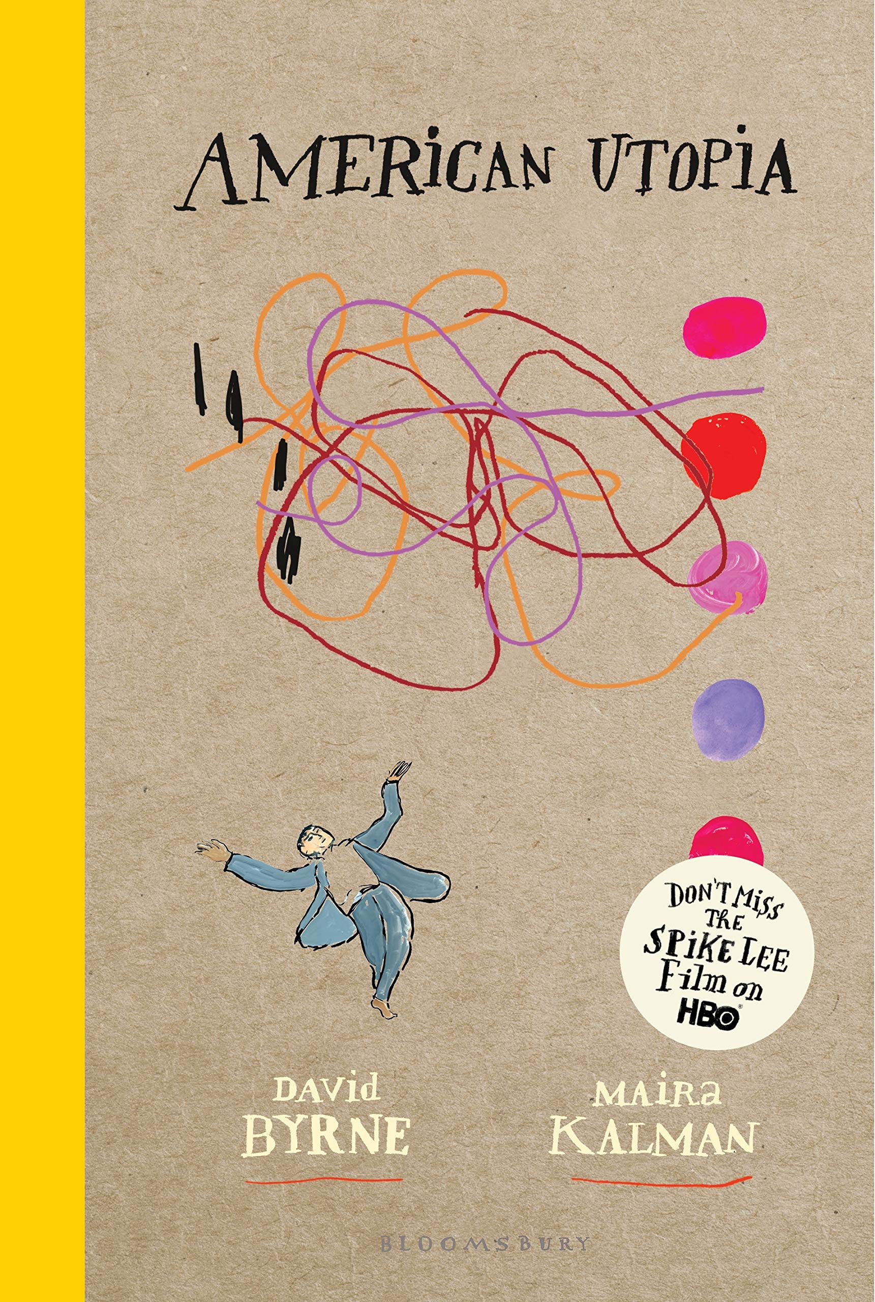
Whatever your feelings about the sentimental, lighthearted 1960 Disney film Pollyanna, or the 1913 novel on which it’s based, it’s fair to say that history has pronounced its own judgment, turning the name Pollyanna into a slur against excessive optimism, an epithet reserved for adults who display the guileless, out-of-touch naïveté of children. Pitted against Pollyanna’s effervescence is Aunt Polly, too caught up in her grown-up concerns to recognize, until it’s almost too late, that maybe it’s okay to be happy.
Maybe we all have to be a little like practical Aunt Polly, but do we also have a place for Pollyannas? Can that not also be the role of the modern artist? David Byrne hasn’t been waiting for permission to spread joy in his late career. Contra the common wisdom of most adults, a couple years back Byrne began to gather positive news stories under the heading Reasons to Be Cheerful, now an online magazine.
Then, Byrne had the audacity to call a 2018 album, tour, and Broadway showAmerican Utopia, and the gall to have Spike Lee direct a concert film with the same title, and release it smack in the middle of 2020, a year all of us will be glad to see in hindsight. Byrne’s two-year endeavor can be seen as his answer to “American Carnage,” the grim phrase that began the Trump era.
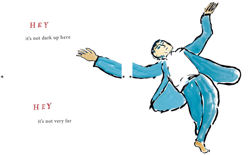
Byrne’s project is not naive, Maria Popova argues at Brain Pickings, it’s Whitmanesque, a salvo of irrepressible optimism against “a kind of pessimistic ahistorical amnesia” in which we “judge the deficiencies of the present without the long victory ledger of past and fall into despair.” American Utopia doesn’t articulate this so much as perform it, either with bare feet and gray suits onstage or the vivid colors of Kalman’s drawings, “lightly at odds,” Meyer notes, “with Byrne’s words, transforming their plain optimism into a more nuanced appeal.”
American Utopia the book, like the musical before it, was written and drawn before the pandemic. Do Byrne and Kalman still have reasons to be cheerful post-COVID? Just last week, they sat down with Isaac Fitzgerald for Live Talks LA to discuss it. You can see the whole, hour-long conversation just above. Kalman confesses she’s still in “quiet shock,” but finds hope in historical perspective and “incredible people out there doing fantastic things.”
Byrne takes us on one of his fascinating investigations into the history of thought, referencing a theorist named Aby Warburg who saw in the sum total of art a kind “animated life” that connects us, past, present, and future, and who reminded him, “Yes, there are other ways of thinking about things!” Perhaps the visionary and the Pollyannaish need not be so far apart. See several more of Kalman and Byrne’s beautifully optimistic pages from American Utopia, the book, at Brain Pickings.
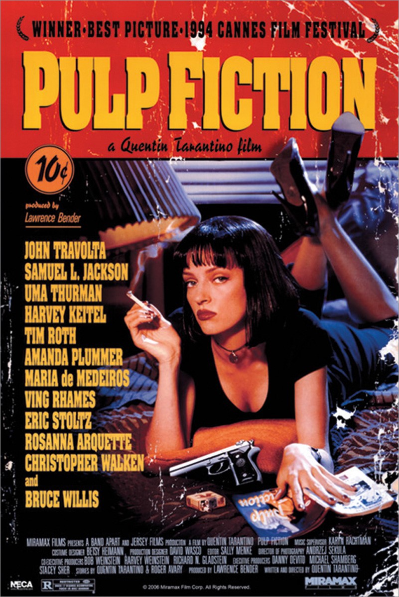
If you can’t judge a movie by its poster, it’s not for the poster designer’s lack of trying. Nearly as venerable as cinema itself, the art of the movie poster has evolved to attract the attention and interest of generation after generation of filmgoers — and, safe to say, developed a few best practices along the way. Some examples go beyond effective advertisement to become icons in and of themselves: take for example, the poster for Quentin Tarantino’s Pulp Fiction, designed by James Verdesoto. In the Vanity Fair video above, Verdesoto draws on a variety of “one-sheets” in order to explain a few of the tricks of the trade.
Like any cultural artifact, movie posters are subject to trend and fashion. It just happens that trends and fashions in movie poster design can last for decades, with each revival bringing an underlying aesthetic concept back into the zeitgeist in a new way. Surely you’ll recall a few years, not long ago, when every major comedy seemed to stamp bold red text on a pure white background: American Pie, the remakes of Cheaper by the Dozen, and The Heartbreak Kid, even the likes of Norbit.
This has been going on at least since the 1980s, as Verdesoto shows by pulling out the poster for John Hughes’ beloved Planes, Trains, and Automobiles, then comparing it to the conceptually similar one for Meet the Parents to note differences in the use of fonts, photographs, and negative space.
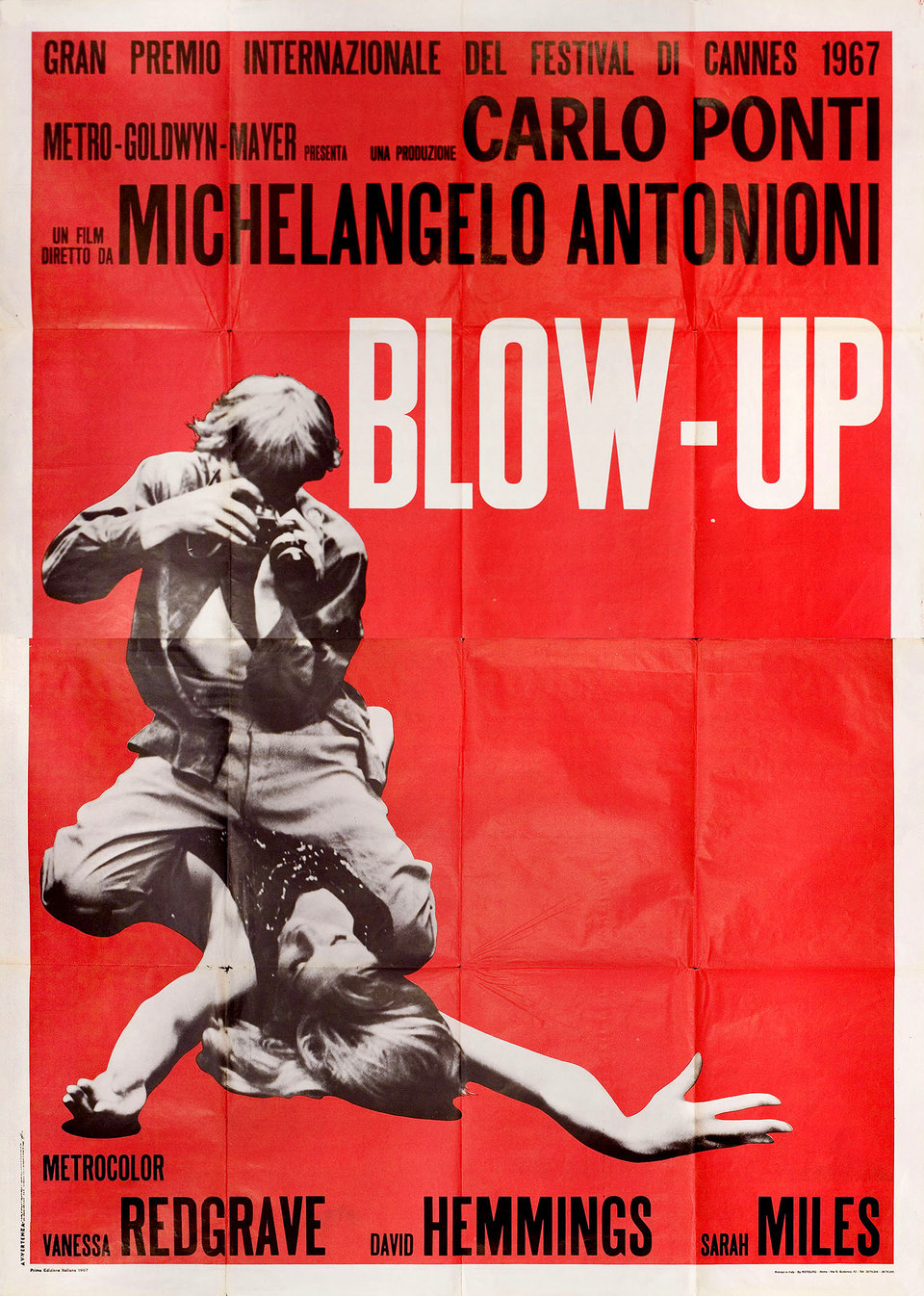
Since The Firm, thrillers have often been signaled with hunted-looking men running down blue-toned corridors or streets, often in silhouette; a great many explosive action movies since Die Hard have gone in for black-and-white posters that emphasize slashes of red or orange. Even the non-genre of “independent films,” often modest of marketing budget, have their own color: canary yellow “a cheap way to catch the eye.” Case in point: Vincent Gallo’s The Brown Bunny, a notorious film that also happened to come with one of the most memorable posters of the 2000s, due not just to its yellow background but because its conscious reference to European designs of the 1950s and 60s, such as the one for Michelangelo Antonioni’s Blow-Up.
You can behold (and in some cases even download) countless many works of movie-poster art, from a variety of decades and a variety of nations, at the sites of the University of Texas Harry Ransom Center and the New York movie poster gallery Posteritati. Here on Open Culture we’ve also featured Taschen’s book of dynamic movie posters of the Russian avant-garde, online archives of the famously artistic movie posters of Poland and Czechoslovakia, not to mention compellingly odd hand-painted movie posters from Ghana. Spend enough time with all of them, and you may find yourself possessed of enough of an intellectual investment in this thoroughly modern art form to start investing in a genuine collection of your own. But no matter your enthusiasm for movie posters, it’ll be a while before you catch up with Martin Scorsese.
Based in Seoul, Colin Marshall writes and broadcasts on cities, language, and culture. His projects include the Substack newsletterBooks on Cities, the book The Stateless City: a Walk through 21st-Century Los Angeles and the video series The City in Cinema. Follow him on Twitter at @colinmarshall, on Facebook, or on Instagram.
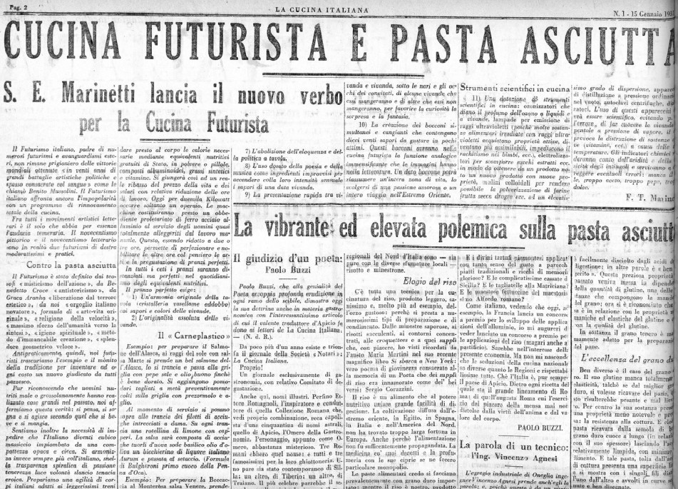
We must fight against puddles of sauce, disordered heaps of food, and above all, against flabby, anti-virile pastasciutta. —poet Filippo Tommaso Marinetti
Odds are Filippo Tommaso Marinetti, the father of Futurism and a dedicated provocateur, would be crestfallen to discover how closely his most incendiary gastronomical pronouncement aligns with the views of today’s low-carb crusaders.
In denouncing pasta, “that absurd Italian gastronomic religion,” his intention was to shock and criticize the bourgeoisie, not reduce bloat and inflammation.
He did, however, share the popular 21st-century view that heavy pasta meals leave diners feeling equally heavy and lethargic.
Futurist cooking will be free of the old obsessions with volume and weight and will have as one of its principles the abolition of pastasciutta. Pastasciutta, however agreeable to the palate, is a passéist food because it makes people heavy, brutish, deludes them into thinking it is nutritious, makes them skeptical, slow, pessimistic… Any pastascuittist who honestly examines his conscience at the moment he ingurgitates his biquotidian pyramid of pasta will find within the gloomy satisfaction of stopping up a black hole. This voracious hole is an incurable sadness of his. He may delude himself, but nothing can fill it. Only a Futurist meal can lift his spirits. And pasta is anti-virile because a heavy, bloated stomach does not encourage physical enthusiasm for a woman, nor favour the possibility of possessing her at any time.
Bombast came naturally to him. While he truly believed in the tenets of Futurism—speed, industry, technology, and the cleansing effects of war, at the expense of tradition and the past—he gloried in hyperbole, absurdity, and showy pranks.
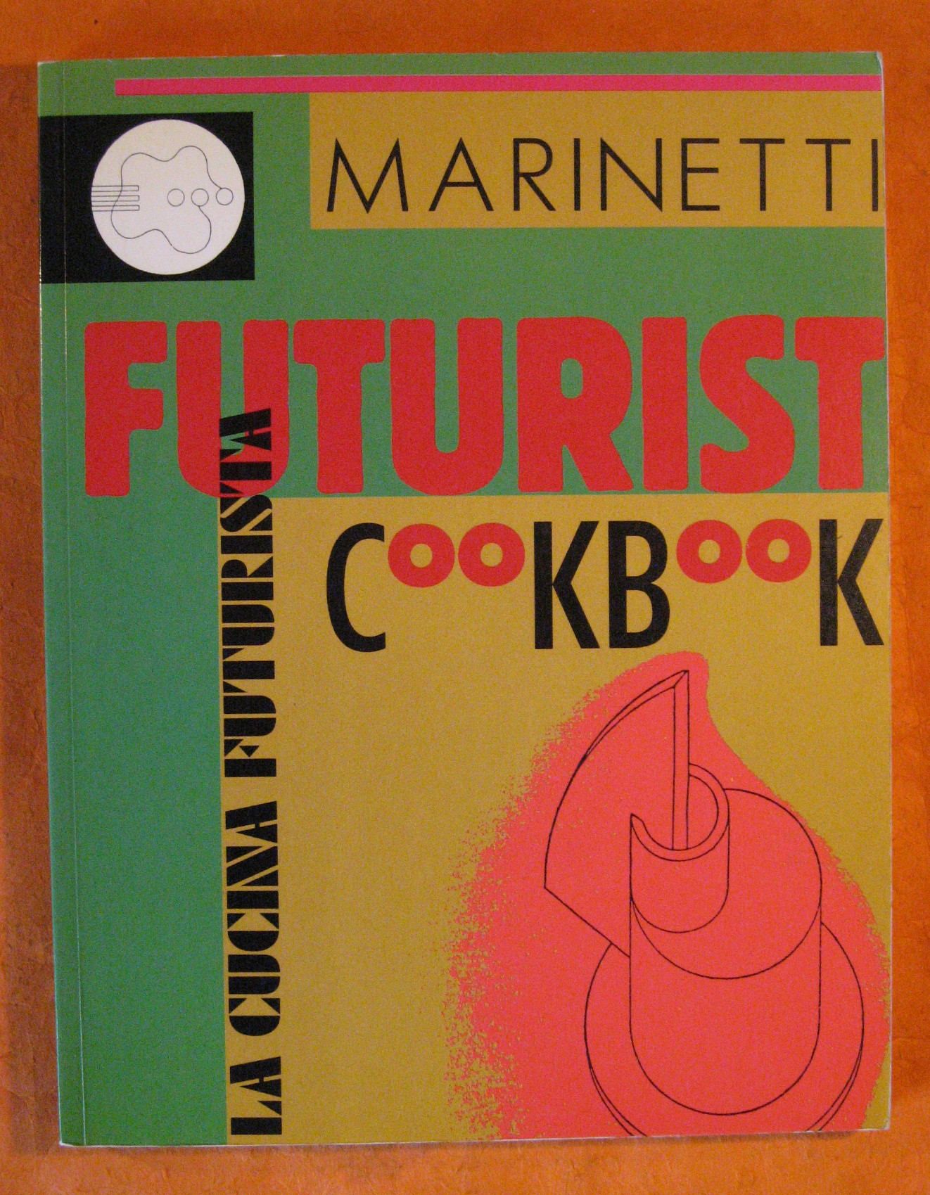
The Futurist Cookbookreflects this, although it does contain actual recipes, with very specific instructions as to how each dish should be served. A sample:
RAW MEAT TORN BY TRUMPET BLASTS: cut a perfect cube of beef. Pass an electric current through it, then marinate it for twenty-four hours in a mixture of rum, cognac and white vermouth. Remove it from the mixture and serve on a bed of red pepper, black pepper and snow. Each mouthful is to be chewed carefully for one minute, and each mouthful is divided from the next by vehement blasts on the trumpet blown by the eater himself.
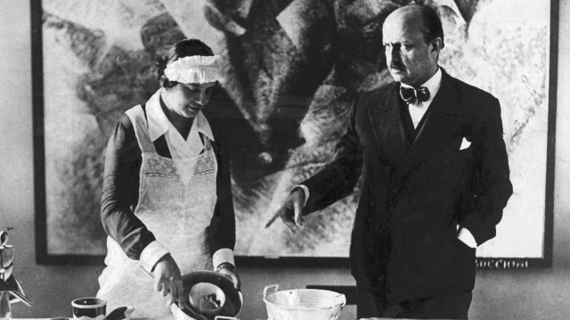
Intrepid host Trevor Dunseith documents his attempt to stage a faithful Futurist dinner party in the above video.
Guests eat salad with their hands for maximum “pre-labial tactile pleasure” before balancing oranges stuffed with antipasto on their heads to randomize the selection of each mouthful. While not all of the flavors were a hit, the party agreed that the experience was—as intended—totally novel (and 100% pasta free).
Marinetti’s anti-pasta campaign chimed with Prime Minister Benito Mussolini’s goal of eliminating Italy’s economic dependence on foreign markets—the Battle for Grain. Northern farmers could produce ample supplies of rice, but nowhere near the amount of wheat needed to support the populace’s pasta consumption. If Italians couldn’t grow more wheat, Mussolini wanted them to shift from pasta to rice.
F.T. Marinetti by W. Seldow, 1934
Marinetti agreed that rice would be the “patriotic” choice, but his desired ends were rooted in his own avant-garde art movement:
… it is not just a question of replacing pasta with rice, or of preferring one dish to another, but of inventing new foods. So many mechanical and scientific changes have come into effect in the practical life of mankind that it is also possible to achieve culinary perfection and to organize various tastes, smells and functions, something which until yesterday would have seemed absurd because the general conditions of existence were also different. We must, by continually varying types of food and their combinations, kill off the old, deeply rooted habits of the palate, and prepare men for future chemical foodstuffs. We may even prepare mankind for the not-too-distant possibility of broadcasting nourishing waves over the radio.
Futurism’s ties to fascism are not a thing to brush off lightly, but it’s also important to remember that Marinetti believed it was the artist’s duty to put forward a bold public personae. He lived to ruffle feathers.
Mission accomplished. His anti-pasta pronouncements resulted in a tumult of public indignation, both locally and in the States.
The Duke of Bovino, mayor of Naples, reacted to Marinetti’s statement that pasta is “completely hostile to the vivacious spirit and passionate, generous, intuitive soul of the Neapolitans” by saying, “The angels in Heaven eat nothing but vermicelli al pomodoro.” Proof, Marinetti sniped back, of “the unappetizing monotony of Paradise and of the life of the Angels.”
He agitated for a futuristic world in which kitchens would be stocked with ”atmospheric and vacuum stills, centrifugal autoclaves (and) dialyzers.”
His recipes, as Trevor Dunseith discovered, function better as one-time performance art than go-to dishes to add to one’s culinary repertoire.
Marinetti supported Fascism to the extent that it too advocated progress, but his allegiance eventually wavered. To Marinetti, Roman ruins and Renaissance paintings were not only boring but also antithetical to progress. To Mussolini, by contrast, they were politically useful. The dictator drew on Italian history in his quest to build a new, powerful nation—which also led to a national campaign in food self-sufficiency, encouraging the growing and consumption of such traditional foods as wheat, rice, and grapes. The government even funded research into the nutritional benefits of wheat, with one scientist claiming whole-wheat bread boosted fertility. In short, the prewar dream of futurist food was tabled yet again.
Ayun Halliday is an author, illustrator, theater maker and Chief Primatologist of the East Village Inky zine. See her as a French Canadian bear who travels to New York City in search of food and meaning in Greg Kotis’ short film, L’Ourse. Follow her @AyunHalliday.
Anyone can develop basic woodworking skills — and, per the advice of Nick Offerman, perhaps everyone should. Those who do learn that things of surprising functionality can be made just by cutting pieces of wood and nailing or gluing them together. Fewer, however, have the patience and dedication to master woodworking without nails or glue, an art that in Japan has been refined over many generations. Traditional Japanese carpenters put up entire buildings using wood alone, cutting the pieces in such a way that they fit together as tightly as if they’d grown that way in the first place. Such unforgiving joinery is surely the truest test of woodworking skill: if you don’t do it perfectly, down comes the temple.
“At the end of the 12th century, fine woodworking skills and knowledge were brought into Japan from China,” writes Yamanashi-based woodworker Dylan Iwakuni. “Over time, these joinery skills were refined and passed down, resulting in the fine wood joineries Japan is known for.”
As it became a tradition in Japan, this carpentry developed a canon of joining methods, several of which Iwakuni demonstrates in the video at the top of the post. Can it be a coincidence that these most trustworthy joints — and the others featured on Iwakuni’s joinery playlist, including the seemingly “impossible” shihou kama tsugi— are also so aesthetically pleasing, not just in their creation but their finished appearance?
In addition to his Youtube channel, Iwakuni maintains an Instagram account where he posts photos of joinery not just in the workshop but as employed in the construction and maintenance of real buildings. “Joineries can be used to replace a damaged part,” he writes, “allowing the structure to stand for another hundreds of years.” To do it properly requires not just a painstakingly honed set of skills, but a perpetually sharpened set of tools — in Iwakuni’s case, the visible sharpness of which draws astonished comment from woodworking aficionados around the world. “Blimey,” as one Metafilter user writes, “it’s hard enough getting a knife sharp enough to slice onions.” What an audience Iwakuni could command if he expanded from woodworking Youtube into cooking Youtube, one can only imagine.
Based in Seoul, Colin Marshall writes and broadcasts on cities, language, and culture. His projects include the Substack newsletterBooks on Cities, the book The Stateless City: a Walk through 21st-Century Los Angeles and the video series The City in Cinema. Follow him on Twitter at @colinmarshall, on Facebook, or on Instagram.
We're hoping to rely on loyal readers, rather than erratic ads. Please click the Donate button and support Open Culture. You can use Paypal, Venmo, Patreon, even Crypto! We thank you!
Open Culture scours the web for the best educational media. We find the free courses and audio books you need, the language lessons & educational videos you want, and plenty of enlightenment in between.