A 10 Billion Pixel Scan of Vermeer’s Masterpiece Girl with a Pearl Earring: Explore It Online

We admire Johannes Ver­meer’s Girl with a Pearl Ear­ring for many rea­sons, not least that it looks exact­ly like a girl with a pearl ear­ring. Or at least it does from a dis­tance, as the mas­ter of light him­self no doubt stepped back to con­firm count­less times dur­ing the paint­ing process, at any moment of which he would have been more con­cerned with the brush­strokes con­sti­tut­ing only a small part of the image. But even Ver­meer him­self could have per­ceived only so much detail of the paint­ing that would become his mas­ter­piece.

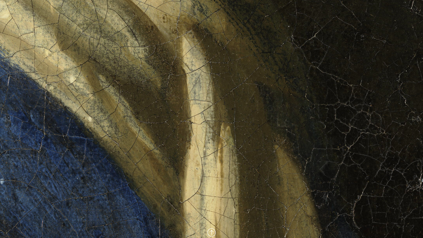
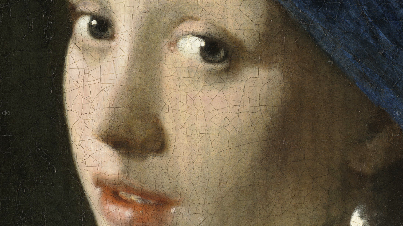
Now, more than 350 years after its com­ple­tion, we can get a clos­er view of Girl with a Pearl Ear­ring than any­one has before through a new­ly released 10 bil­lion-pix­el panora­ma. At this res­o­lu­tion, writes Petapix­el’s Jason Schnei­der, we can “see the paint­ing down to the lev­el of 4.4‑microns per pix­el.”

Under­tak­en by Emi­lien Leon­hardt and Vin­cent Sabati­er of 3D micro­scope mak­er Hirox Europe “in order to eval­u­ate the sur­face con­di­tion of the paint­ing, mea­sure cracks, and see the topog­ra­phy of var­i­ous key areas while assess­ing past restora­tions,” the project required tak­ing 9,100 pho­tos, which “were auto­mat­i­cal­ly cap­tured and stitched togeth­er to form one fin­ished panora­ma image where one pix­el equals 4.4 microns.”

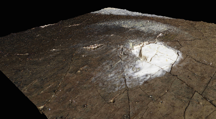
You’ll under­stand what this means if you view the panora­ma and click the plus sym­bol on the bot­tom con­trol bar to zoom in — and click it again, and again, and again. (Or just click it and hold it down.) Before long, Girl with a Pearl Ear­ring will look less like a girl with a pearl ear­ring than what she real­ly is: cen­turies-old oil paints on a cen­turies-old can­vas. The phys­i­cal­i­ty of this work of art, one so often held up as the real­iza­tion of aes­thet­ic ide­al, becomes even less ignor­able if you click the “3D” but­ton. This presents ten indi­vid­ual sec­tions of the paint­ing scanned in three dimen­sions, which you can freely rotate and even light from all direc­tions.

The 3D-scanned por­tions include the tit­u­lar pearl ear­ring, which appears to have a bit of a gouge in it. They’re more clear­ly vis­i­ble in 5x topo­graph­i­cal view­ing mode (selec­table on the top con­trol bar). This offi­cial Hirox video offers a glimpse of the pro­ce­dure required to achieve the kind of unprece­dent­ed­ly high-res­o­lu­tion view of Girl with a Pearl Ear­ring that allows us to behold details hereto­fore prac­ti­cal­ly invis­i­ble. At more than 10,000 megapix­els, the back­ground reveals itself to be in fact a dark green cur­tain, and the girl her­self has clear­ly defined eye­lash­es. But as for her long-spec­u­lat­ed-about iden­ti­ty, well, there are some things microscopy can’t deter­mine. Take a close look at Ver­meer’s paint­ing here. And if you’d like to take a sim­i­lar look at Rem­brandt’s The Night Watch, click here.

via Colos­sal

Relat­ed Con­tent:

Why is Vermeer’s Girl with a Pearl Ear­ring Con­sid­ered a Mas­ter­piece?: An Ani­mat­ed Intro­duc­tion

Mas­ter of Light: A Close Look at the Paint­ings of Johannes Ver­meer Nar­rat­ed by Meryl Streep

Down­load All 36 of Jan Vermeer’s Beau­ti­ful­ly Rare Paint­ings (Most in Bril­liant High Res­o­lu­tion)

The Largest & Most Detailed Pho­to­graph of Rembrandt’s The Night Watch Is Now Online: Zoom In & See Every Brush Stroke

Based in Seoul, Col­in Mar­shall writes and broad­casts on cities, lan­guage, and cul­ture. His projects include the Sub­stack newslet­terBooks on Cities, the book The State­less City: a Walk through 21st-Cen­tu­ry Los Ange­les and the video series The City in Cin­e­ma. Fol­low him on Twit­ter at @colinmarshall, on Face­book, or on Insta­gram.

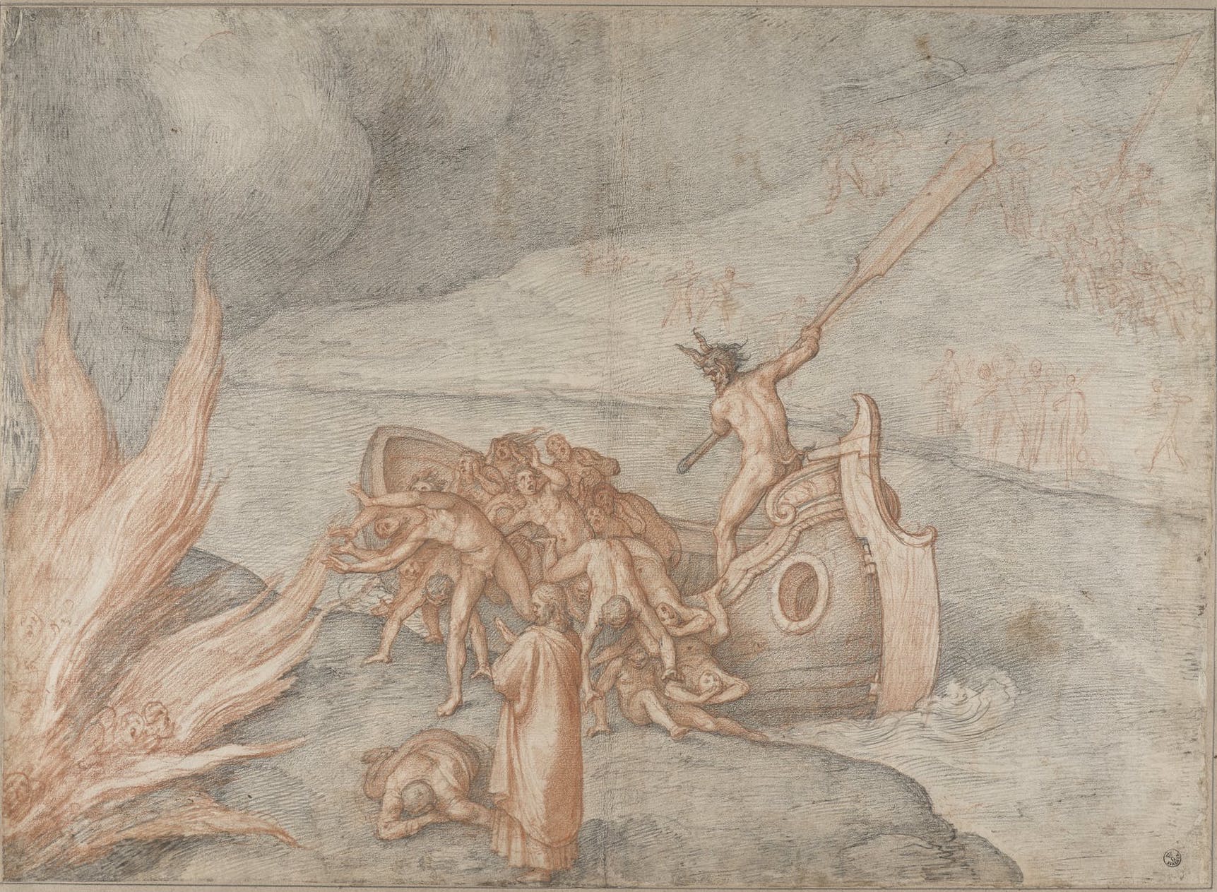
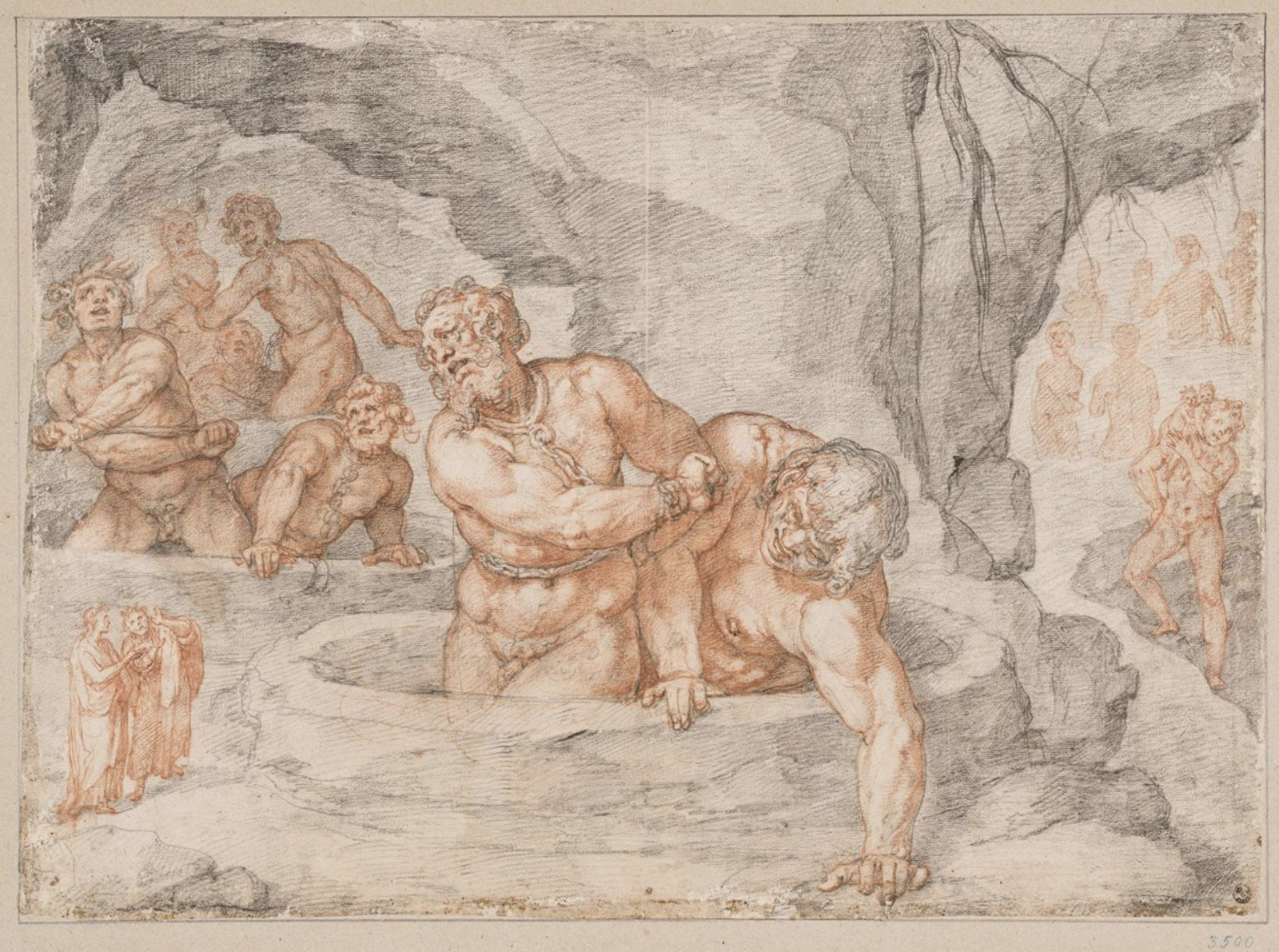
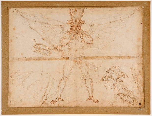
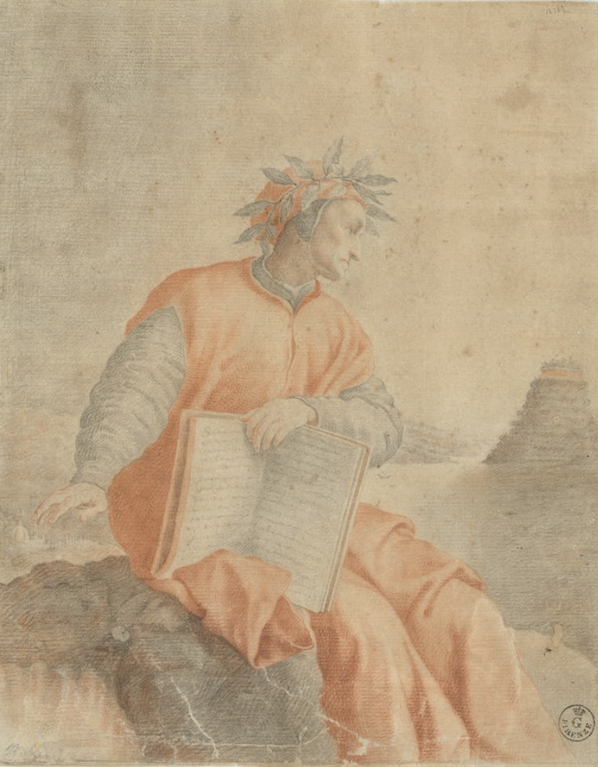
Rarely-Seen Illustrations of Dante’s Divine Comedy Are Now Free Online, Courtesy of the Uffizi Gallery

We know Dante’s Divine Com­e­dy—espe­cial­ly its famous first third, Infer­no—as an extend­ed the­o­log­i­cal trea­tise, epic love poem, and vicious satire of church hypocrisy and the Flo­ren­tine polit­i­cal fac­tion that exiled Dante from the city of his birth in 1302. Most of us don’t know it the way its first read­ers did (and as Dante schol­ars do): a com­pendi­um in which “a num­ber of medieval lit­er­ary gen­res are digest­ed and com­bined,” as Robert M. Durl­ing writes in his trans­la­tion of the Infer­no.

These lit­er­ary gen­res include ver­nac­u­lar tra­di­tions of romance poet­ry from Provence, pop­u­lar long before Dante turned his Tus­can dialect into a lit­er­ary lan­guage to rival Latin. They include “the dream-vision (exem­pli­fied by the Old French Romance of the Rose)”; “accounts of jour­neys to the Oth­er­world (such as the Visio Pauli, Saint Patrick’s Pur­ga­to­ry, the Nav­i­ga­tio Sanc­ti Bren­dani)”; and Scholas­tic philo­soph­i­cal alle­go­ry, among oth­er well-known forms of writ­ing at the time.

By the time the Divine Com­e­dy cap­tured imag­i­na­tions in the peri­od of incunab­u­la, or the infan­cy of the print­ed book, many of these asso­ci­a­tions and influ­ences had reced­ed. And by the time of the Counter-Ref­or­ma­tion, the poem most impressed read­ers and illus­tra­tors of the text as a divine plan for a tor­ture cham­ber and an ency­clo­pe­dia of the tor­tures there­in. What­ev­er oth­er asso­ci­a­tions we have with Dante’s poem, we all know the nine cir­cles of hell and have an omi­nous sense of what goes on there.

No doubt we also have in our mind’s eye some of the hun­dreds of illus­tra­tions made of the text’s grue­some depic­tions of hell, from San­dro Bot­ti­cel­li to Robert Rauschen­berg. Illus­trat­ed edi­tions of Dante’s poem began appear­ing in 1472, and the first ful­ly illus­trat­ed edi­tion in 1491. By the late 16th cen­tu­ry, the poem had become a lit­er­ary clas­sic (the word Divine joined Com­e­dy in the title in 1555). By this time, the tra­di­tion of depict­ing a lit­er­al, rather than a lit­er­ary, hell was firm­ly estab­lished.

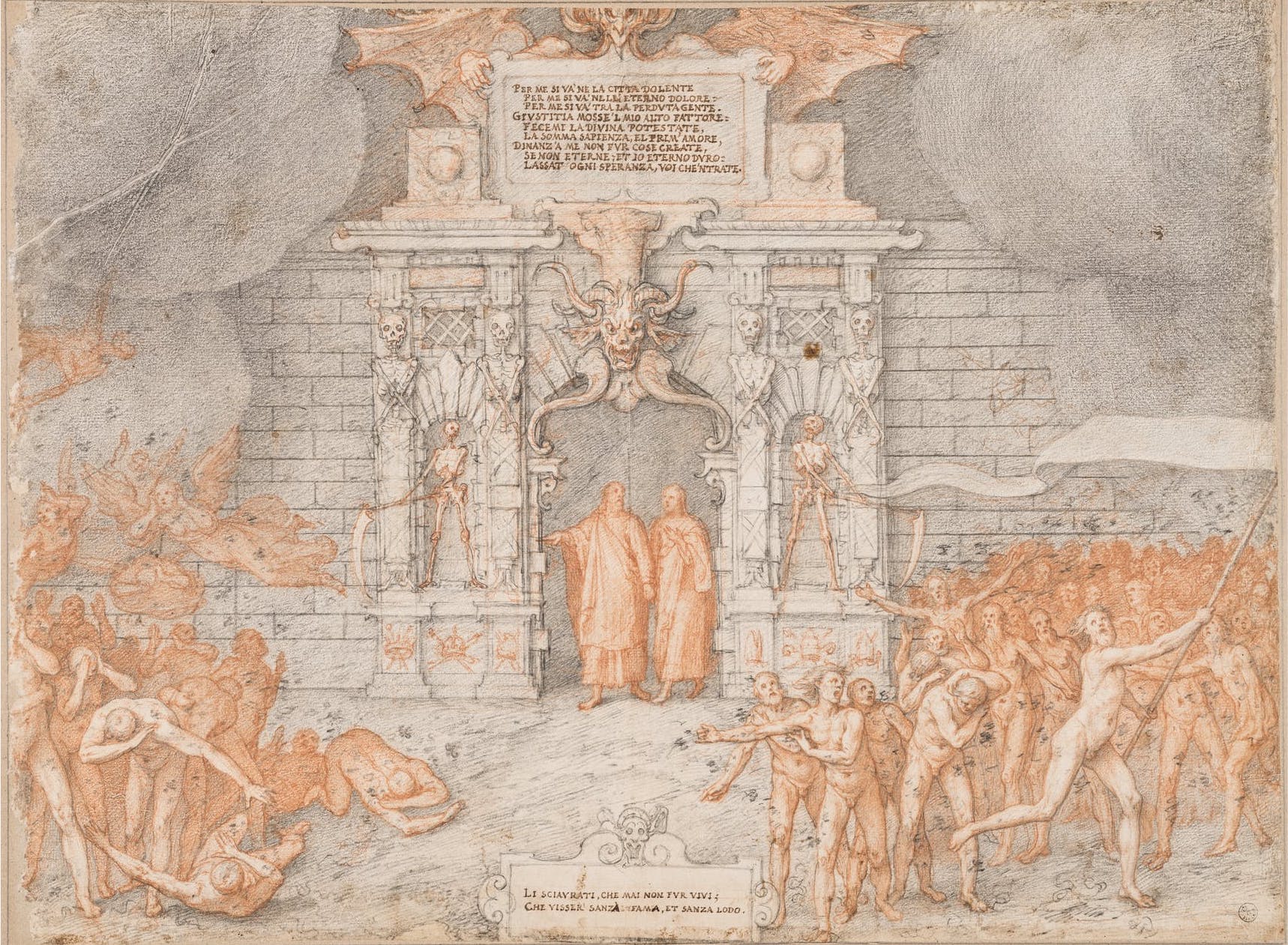
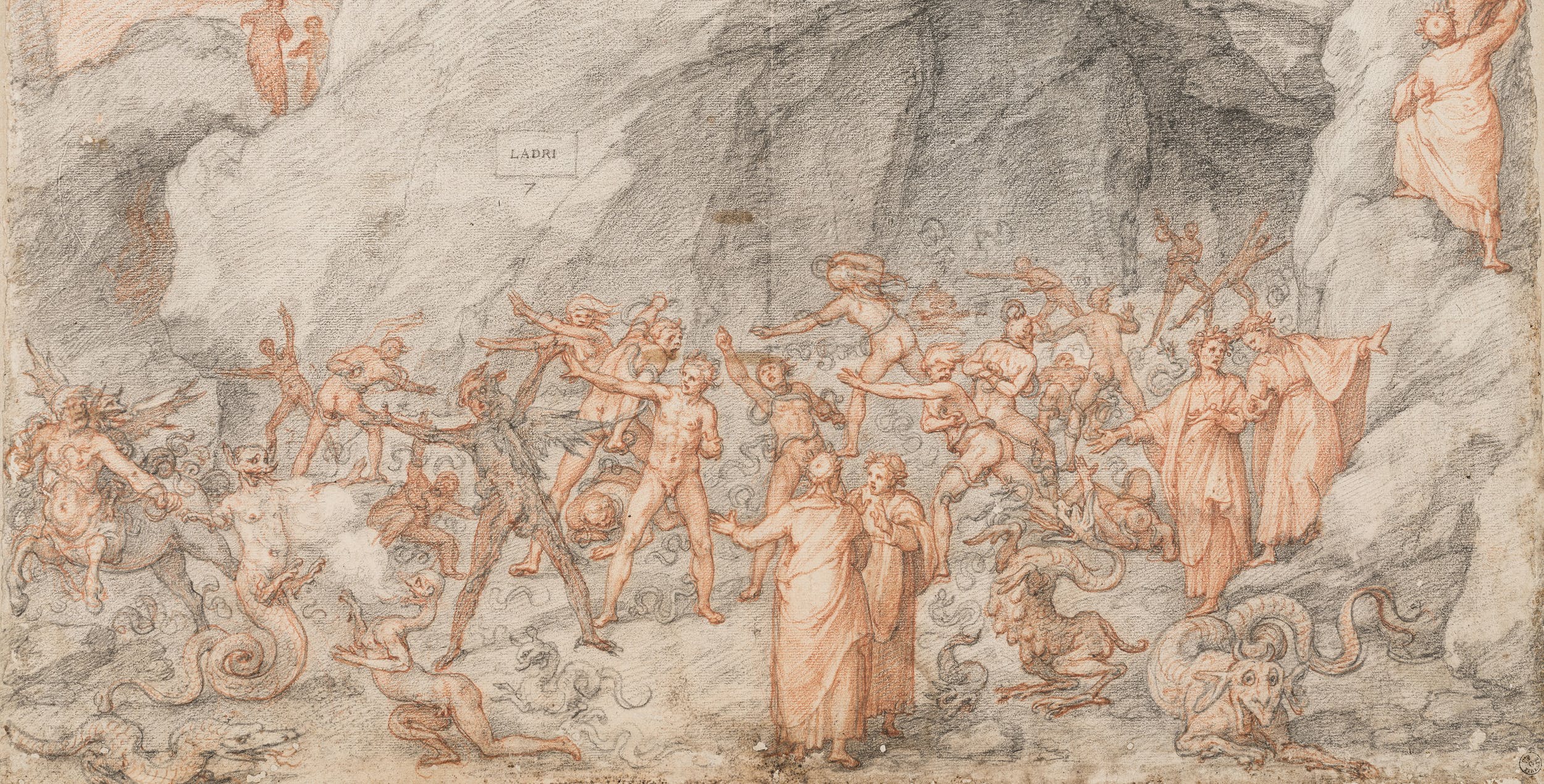
It was in this peri­od that Fred­eri­co Zuc­cari made the beau­ti­ful illus­tra­tions you see here, com­plet­ed, Angela Giuf­fri­da writes at The Guardian, “dur­ing a stay in Spain between 1586 and 1588. Of the 88 illus­tra­tions, 28 are depic­tions of hell, 49 of pur­ga­to­ry and 11 of heav­en. After Zuccari’s death in 1609, the draw­ings were held by the noble Orsi­ni fam­i­ly, for whom the artist had worked, and lat­er by the Medici fam­i­ly before becom­ing part of the Uffizi col­lec­tion in 1738.”

The pen­cil-and-ink draw­ings have rarely been seen before because of their frag­ile con­di­tion. They were only exhib­it­ed pub­licly for the first time in 1865 for the 600th anniver­sary of Dante’s birth and of Ital­ian uni­fi­ca­tion. Now, they are on dis­play, vir­tu­al­ly, for free, as part of a “year-long cal­en­dar of events to mark the 700th anniver­sary of the poet’s death.” This is an extra­or­di­nary oppor­tu­ni­ty to see these illus­tra­tions, which have until now “only been seen by a few schol­ars and dis­played to the pub­lic only twice, and only in part,” says Uffizi direc­tor Eike Schmidt.

Much of the promised “didac­tic-sci­en­tif­ic com­ment” to accom­pa­ny each draw­ing is marked as “upcom­ing” on the Eng­lish ver­sion of the Uffizi site, but you can see high res­o­lu­tion scans of each draw­ing and zoom in to exam­ine the many tor­tures of the damned and the grotesque demons who tor­ment them. Learn much more at Khan Acad­e­my about how Dante’s lit­er­ary epic in terza rima left “a last­ing impres­sion on the West­ern imag­i­na­tion for more than half a mil­len­ni­um,” solid­i­fy­ing and reshap­ing images of hell “into new guis­es that would become famil­iar to count­less gen­er­a­tions that fol­lowed.” If you like, you can also take a free course on Dan­te’s Divine Com­e­dy from Yale Uni­ver­si­ty.

via MyMod­ern­Met/The Guardian

Relat­ed Con­tent: 

Why Should We Read Dante’s Divine Com­e­dy? An Ani­mat­ed Video Makes the Case

A Dig­i­tal Archive of the Ear­li­est Illus­trat­ed Edi­tions of Dante’s Divine Com­e­dy (1487–1568)

Artists Illus­trate Dante’s Divine Com­e­dy Through the Ages: Doré, Blake, Bot­ti­cel­li, Mœbius & More

Josh Jones is a writer and musi­cian based in Durham, NC. Fol­low him at @jdmagness

Brâncuși Captures His Sculpture & Life on Film: Watch Rare Footage Shot Between 1923–1939

Here in the ear­ly 21st cen­tu­ry, even the non-artists among us car­ry dig­i­tal video cam­eras in our pock­ets. Back in the ear­ly 20th cen­tu­ry, the abil­i­ty to film your own life and work, or that of your coterie, was­n’t so close at hand — unless, of course, you ran with the avant-garde. Con­stan­tin Brân­cuși did, hav­ing been brought into the artis­tic and intel­lec­tu­al scene of the Paris of the 1910s, to which he’d made his way from his native Roma­nia. He even­tu­al­ly count­ed among his friends the likes of Pablo Picas­so, Ezra Pound, Mar­cel Duchamp, Guil­laume Apol­li­naire, Tris­tan Tzara, and Man Ray, who got the inno­v­a­tive, hard­work­ing and famous­ly low-tech sculp­tor prac­tic­ing cin­e­ma.

“In the ear­ly 1920s, Man Ray, who had pre­vi­ous­ly taught Con­stan­tin Brân­cuși how to han­dle a still cam­era, intro­duced him to the movie cam­era,” says Ubuweb in a descrip­tion of “fifty min­utes of film, shot between 1923 and 1939,” that rep­re­sents “the sum total of all the images ever filmed by Brân­cuși.”

The artist “makes use of fram­ing, shad­ows, inci­den­tal light and refrac­tion in order to acti­vate the plas­tic prop­er­ties of his sculp­tures, and opens up this visu­al analy­sis to move­ment and to time.” Pieces such as Leda and the scan­dalous Princess X become the sub­jects of their own sequences; lat­er, we wit­ness “Bran­cusi’s jour­ney to Roma­nia and the con­struc­tion of the End­less Col­umn in Târ­gu Jiu.”

These End­less Col­umn pas­sages, as art crit­ic Blake Gop­nik sees them, show “Brân­cuși obsessed with how his soar­ing sculp­ture comes to life in the open air.” From all this footage Gop­nik gets the sense that Brân­cuși was “less inter­est­ed in mak­ing fan­cy muse­um objects than in putting new kinds of almost-liv­ing things into the world,” and indeed draw­ing inspi­ra­tion from the liv­ing things of the world: “In one of the clips, Brân­cuși turns his cam­era on a pac­ing hawk, which comes across as a close, nat­ur­al ana­log to the many ‘birds’ he cre­at­ed as sculp­tures.” Anoth­er “shows one of his stone pedestals, which meant as much to him as the sculp­tures set on them, sup­port­ing a live flap­per doing an ecsta­t­ic dance” — cap­ti­vat­ing evi­dence of his inter­est in forms of life beyond the avian.

Relat­ed Con­tent:

Rare Film of Sculp­tor Auguste Rodin Work­ing at His Stu­dio in Paris (1915)

Man Ray’s Por­traits of Ernest Hem­ing­way, Ezra Pound, Mar­cel Duchamp & Many Oth­er 1920s Icons

Watch Dreams That Mon­ey Can Buy, a Sur­re­al­ist Film by Man Ray, Mar­cel Duchamp, Alexan­der Calder, Fer­nand Léger & Hans Richter

Based in Seoul, Col­in Mar­shall writes and broad­casts on cities, lan­guage, and cul­ture. His projects include the Sub­stack newslet­terBooks on Cities, the book The State­less City: a Walk through 21st-Cen­tu­ry Los Ange­les and the video series The City in Cin­e­ma. Fol­low him on Twit­ter at @colinmarshall, on Face­book, or on Insta­gram.

A Magical Look Inside the Painting Process of Studio Ghibli Artist Kazuo Oga

The mag­ic of Stu­dio Ghi­b­li’s films owes much to their char­ac­ters: the high-fly­ing Princess Nau­si­caä of the Val­ley of the Wind; the World War I‑fighter ace-turned-swine Por­co Rosso; the spir­it­ed ten-year-old Chi­hi­ro, spir­it­ed away into the realm of folk­lore; the dog-rac­coon-bear-cat for­est spir­it known only as Totoro. But to under­stand what makes these fig­ures come alive, we must remem­ber that they inhab­it liv­ing worlds. A Ghi­b­li pro­duc­tion stands or falls (which would still count as an artis­tic tri­umph at most oth­er stu­dios) on not just char­ac­ter design and ani­ma­tion but back­ground art, which demands the kind of care­ful and inspired work you can wit­ness in the video above.

The artist at the desk is Kazuo Oga, a vet­er­an back­ground artist cred­it­ed as art direc­tor on Ghi­b­li’s My Neigh­bor Totoro, Only Yes­ter­day, Pom Poko, Princess Mononoke, and The Tale of Princess Kaguya, among oth­er ani­me projects. His work begins at about 9:30 in the morn­ing, as he brings out a mod­est­ly size sheet of paper and pre­pares its sur­face to receive paint.

24 dif­fer­ent col­ors of Japan­ese-made Nick­er Poster Col­or brand gouache stand ready right near­by, and with them Oga applies the ground, or first lay­er of paint. Even before he takes a seat, a for­est scene has clear­ly begun to emerge. Then down­ward strokes become the thin trunks of its trees, which by the ear­ly after­noon have branch­es.

Broad­ly speak­ing, Oga works from the large details in toward the small, arriv­ing mid­way through the 2:00 hour to the stage of adding light pur­ple flow­ers. These are Paulow­n­ia, called kiri in Japan, where these “princess trees” (that also appear on the offi­cial Gov­ern­ment Seal) car­ry a cer­tain sym­bol­ic weight. The final paint­ing, Paulow­n­ia Rain (or kiri same), emerges only at 3:40 in the after­noon, after six hours of paint­ing. This evoca­tive for­est land­scape attests to the truth of an inver­sion of the Pare­to prin­ci­ple, in that the parts of the job that seem small­est require most of the work to achieve — and to the truth of the Ghi­b­li’s appar­ent artis­tic prin­ci­ple that every pain is worth tak­ing.

Relat­ed Con­tent:

Stu­dio Ghi­b­li Pro­duc­er Toshio Suzu­ki Teach­es You How to Draw Totoro in Two Min­utes

Hayao Miyazaki’s Sketch­es Show­ing How to Draw Char­ac­ters Run­ning: From 1980 Edi­tion of Ani­ma­tion Mag­a­zine

Watch Hayao Miyaza­ki Ani­mate the Final Shot of His Final Fea­ture Film, The Wind Ris­es

A Vir­tu­al Tour Inside the Hayao Miyazaki’s Stu­dio Ghi­b­li Muse­um

Stu­dio Ghi­b­li Makes 1,178 Images Free to Down­load from My Neigh­bor Totoro, Spir­it­ed Away & Oth­er Beloved Ani­mat­ed Films

Watch Every Episode of Bob Ross’ The Joy Of Paint­ing Free Online: 403 Episodes Span­ning 31 Sea­sons

Based in Seoul, Col­in Mar­shall writes and broad­casts on cities, lan­guage, and cul­ture. His projects include the Sub­stack newslet­terBooks on Cities, the book The State­less City: a Walk through 21st-Cen­tu­ry Los Ange­les and the video series The City in Cin­e­ma. Fol­low him on Twit­ter at @colinmarshall, on Face­book, or on Insta­gram.

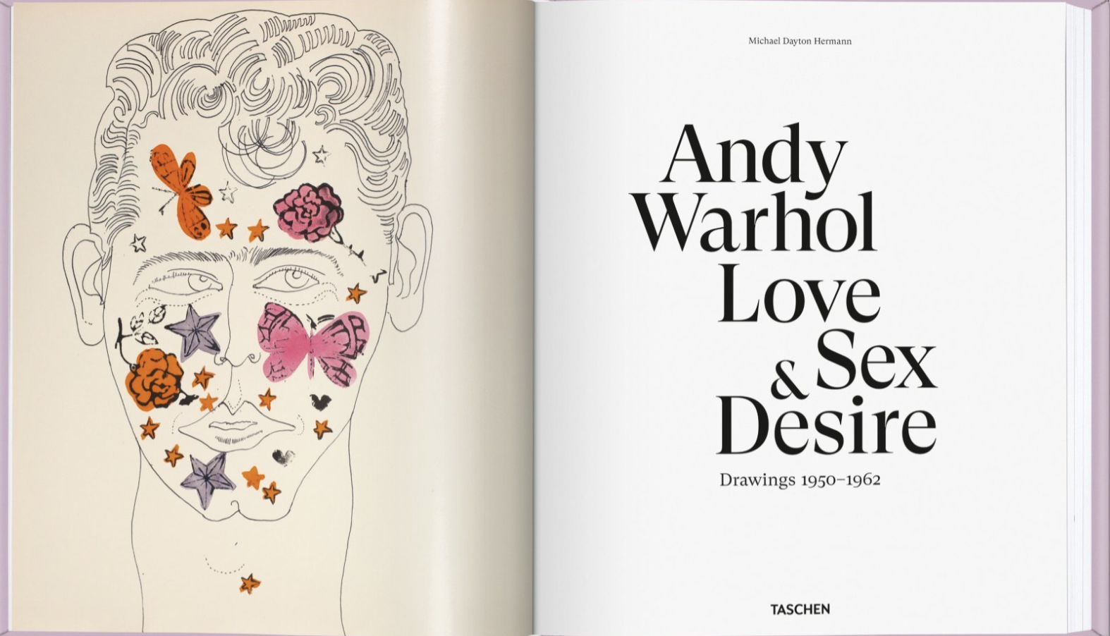
300 Rarely-Seen, Risqué Drawings by Andy Warhol Published in the New Book, Andy Warhol: Love, Sex, and Desire. Drawings (1950–1962)

It’s not the ingre­di­ents that sell the prod­uct. It’s how Warhol makes you feel about the prod­uct. 

Young and Rubi­cam employ­ee, cir­ca ear­ly 1950s

It did not take Andy Warhol long to find the sta­tus he sought as a young man. Short­ly after mov­ing to New York City in 1949, he estab­lished him­self as one of the high­est paid free­lance illus­tra­tors of the peri­od.

His whim­si­cal, eye-catch­ing line draw­ings for var­i­ous lux­u­ry brands appeared in such high pro­file pub­li­ca­tions as Vogue and Harper’s Bazaar.

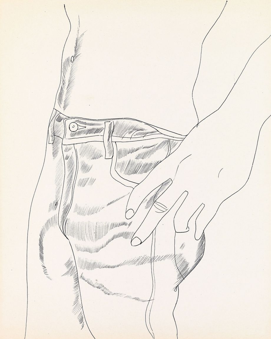
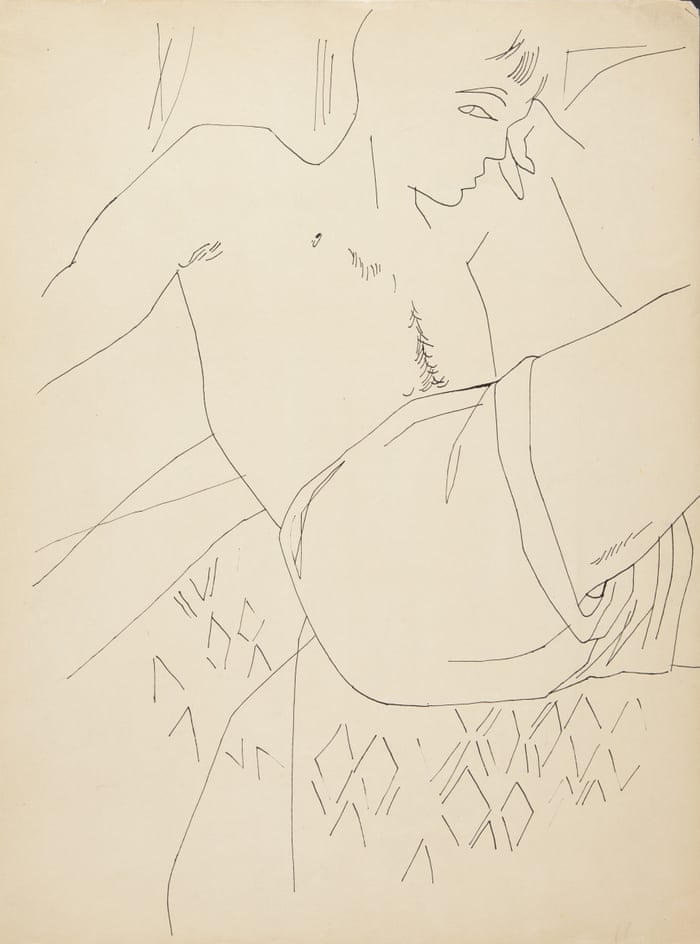
The sense of pret­ti­ness and play that ani­mat­ed his pic­tures of shoescats, and per­fume bot­tles is evi­dent in the 1000-some homo­erot­ic draw­ings he pro­duced dur­ing the same time, but those proved to be a tougher sell.

In an era when sodomy was judged to be a felony in every state, full-frontal male nudi­ty was con­sid­ered obscene, and the art world was in the thrall of the macho Abstract Expres­sion­ists, Warhol had dif­fi­cul­ty find­ing a gallery to show his gen­tle depic­tions of gay inti­ma­cy.

Final­ly, a per­son­al con­nec­tion at the Bod­ley Gallery on New York’s Upper East Side agreed to host a small exhi­bi­tion, open­ing Stud­ies for a Boy Book by Andy Warhol on Valentine’s Day 1956.

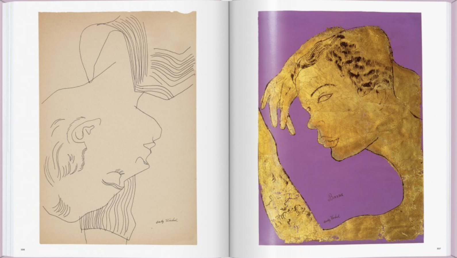
The draw­ings were rem­i­nis­cent of Warhol favorite Jean Cocteau’s sketch­es’ in both sub­ject mat­ter and clean­ly exe­cut­ed line. His mod­els were friends, lovers, assis­tants, and oth­er scene­mak­ers.

Warhol’s friend, Robert Fleis­ch­er, a sta­tionery buy­er at Bergdorf Goodman’s, recalled:

He used to come over to my apart­ment on 76th Street. He used to come quite often. He always want­ed to sketch me. At the same time, just about that time, I became a mod­el. I was pho­tographed a lot, and I was in retail­ing but earned part of my income by mod­el­ing and Andy used to sketch and sketch and sketch and sketch… He said he was going to do what he called his ‘Boy Book,’ and he want­ed all of us to pose nude, and we did. There was loads of us… Andy loved to sketch mod­els and very inti­mate sex­u­al acts. Real­ly! 

Warhol’s ambi­tion to pub­lish a mono­graph of A Boy Book went unre­al­ized dur­ing his life­time, but 300 of the draw­ings appear in Taschen’s just-released Andy Warhol. Love, Sex, and Desire. Draw­ings 1950–1962.

The col­lec­tion also fea­tures essays by biog­ra­ph­er Blake Gop­nik and crit­ic Drew Zei­ba, as well as poems by James Bald­winThom GunnHarold NorseAllen Gins­berg, and Essex Hemphill.

Warhol’s first stu­dio assis­tant, anti­quar­i­an and illus­tra­tor Vito Gial­lo, remem­bered Warhol dur­ing this peri­od: “He nev­er con­sid­ered him­self a fine artist but he wished he could be. We often talked about that.”

As Michael Day­ton Her­mann, who edit­ed Andy Warhol. Love, Sex, and Desire. Draw­ings 1950–1962 observes:

Col­lec­tive­ly, the hun­dreds of draw­ings Warhol made from life dur­ing this peri­od pro­vide a touch­ing por­trait of the one per­son not depict­ed in any of them—Andy Warhol.

Relat­ed Con­tent: 

130,000 Pho­tographs by Andy Warhol Are Now Avail­able Online, Cour­tesy of Stan­ford Uni­ver­si­ty

When Andy Warhol & Edie Sedg­wick, the First Cou­ple of Pop Art, Made an Odd Appear­ance on the Merv Grif­fin Show (1965)

Take a Vir­tu­al Tour of the Andy Warhol Exhi­bi­tion at the Tate Mod­ern

Ayun Hal­l­i­day is an author, illus­tra­tor, the­ater mak­er and Chief Pri­ma­tol­o­gist of the East Vil­lage Inky zine. She most recent­ly appeared as a French Cana­di­an bear who trav­els to New York City in search of food and mean­ing in Greg Kotis’ short film, L’Ourse.  Fol­low her @AyunHalliday.

Fonts in Use: Enter a Giant Archive of Typography, Featuring 12,618 Typefaces

Type selec­tion is an inten­sive process that requires inti­mate knowl­edge of a brand’s val­ues, audi­ence, com­pe­ti­tion, voice, and goals.

Fonts in Use, FAQ

Fonts in Use is a typog­ra­phy nerd’s dream come true.

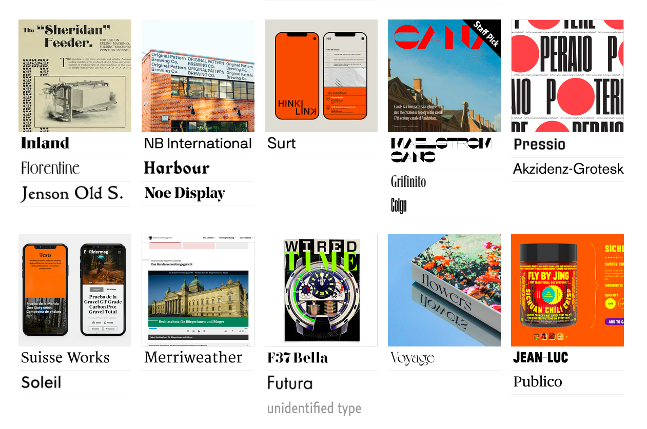
The 10-year-old inde­pen­dent archive of typog­ra­phy has col­lect­ed over 17,000 designs, each using at least one of over 12,000 type­face fam­i­lies from more than 3,500 type com­pa­nies. Each font is con­tex­tu­al­ized with images depict­ing them in the wild, on every­thing from wine labels and store­fronts to book cov­ers, record albums, movie posters and of course, adver­tis­ing of all shapes and sizes.

Fonts can cre­ate unlike­ly bed­fel­lows.

The Ramones’ icon­ic seal achieved its pres­i­den­tial look thanks to ITC Tiffany.

Oth­er mem­o­rable appear­ances include the first edi­tion cov­er of Ita­lo Calvino’s exper­i­men­tal nov­el If On a Winter’s Night a Trav­el­er and the titles for Ham­mer Film’s 1980 anthol­o­gy TV series, Ham­mer House of Hor­ror.

Fonts in Use’s man­ag­ing edi­tor, Flo­ri­an Hard­wig, describes ITC Tiffany as “Ed Ben­guiat’s 1974 revis­i­ta­tion and inter­pre­ta­tion of 19th-cen­tu­ry faces like West Old Style or Old Style Title,” not­ing such “Vic­to­ri­an details” as “large angled ser­ifs and sharply ter­mi­nat­ed diag­o­nals.”

The prin­ci­pal cast of Law & Order under­went sev­er­al changes over the show’s 20-year run, but Friz Quadra­ta remained a con­stant, sup­ply­ing titles and such nec­es­sary details as loca­tion, time, and date.

Friz Quadra­ta should be equal­ly famil­iar to Dun­geons & Drag­ons play­ers of a cer­tain age and fans of Gar­den Wafers, the pack­aged cook­ies from Hong Kong that are a sta­ple of state­side Asian mar­kets.

Artist Bar­bara Kruger’s dis­tinc­tive text-based work places overt com­men­tary in white ital­i­cized Futu­ra on red bands on top of black and white images.

Futu­ra was also the face of a tourist map to Berlin dur­ing the 1936 sum­mer Olympics and author David Rees’ tongue-in-cheek guide How to Sharp­en Pen­cils: A Prac­ti­cal & The­o­ret­i­cal Trea­tise on the Arti­sanal Craft of Pen­cil Sharp­en­ing for Writ­ers, Artists, Con­trac­tors, Flange Turn­ers, Angle­smiths, & Civ­il Ser­vants.

Com­ic Sans may not get much love out in the real world, but it’s well rep­re­sent­ed in the archive’s user sub­mis­sions.

You’ll find grow­ing num­bers of fonts in Cyril­lic, as well as fonts famil­iar to read­ers of Chi­neseJapan­eseKore­anAra­bicGreek and Hebrew

New­bie Net­flix Sans keeps com­pa­ny with 19th-cen­tu­ry sans Bureau Grot, a favorite of Vice Pres­i­dent-Elect Kamala Har­ris

Fat AlbertTin­toret­toBen­guiat CaslonScor­pio, Hoopla and Saphir are your tick­et back to a far groovi­er peri­od in the his­to­ry of graph­ic art.

Spend an hour or two rum­mag­ing through the col­lec­tion and we guar­an­tee you’ll feel an urgent need to upload typo­graph­ic exam­ples pulled from your shelves and cab­i­nets.

Fonts in Use wel­comes such sub­mis­sions, as long as type is clear­ly vis­i­ble in your uploaded image and isor wasin use (as opposed to an exam­ple of let­ter­ing for lettering’s sake). They will also con­sid­er cus­tom type­faces which are his­tor­i­cal­ly sig­nif­i­cant or oth­er­wise out­stand­ing, and those that are avail­able to the gen­er­al pub­lic. Please include a short descrip­tion in your com­men­tary, and when­ev­er pos­si­ble, cred­it any design­ers, pho­tog­ra­phers, or sources of your image.

Typog­ra­phy nerds are stand­ing by to help.

Begin your explo­rations of Fonts in Use here. If you’re feel­ing over­whelmed, the Staff Picks are a great place to start.

via MetaFil­ter

Relat­ed Con­tent:

The His­to­ry of Typog­ra­phy Told in Five Ani­mat­ed Min­utes

Why This Font Is Every­where: How Coop­er Black Became Pop Culture’s Favorite Font

Down­load Hel­l­veti­ca, a Font that Makes the Ele­gant Spac­ing of Hel­veti­ca Look as Ugly as Pos­si­ble

Ayun Hal­l­i­day is an author, illus­tra­tor, the­ater mak­er and Chief Pri­ma­tol­o­gist of the East Vil­lage Inky zine. She most recent­ly appeared as a French Cana­di­an bear who trav­els to New York City in search of food and mean­ing in Greg Kotis’ short film, L’Ourse.  Fol­low her @AyunHalliday.

When Our World Became a de Chirico Painting: How the Avant-Garde Painter Foresaw the Empty City Streets of 2020

This past spring, media out­lets of every kind pub­lished pho­tos and videos of eeri­ly emp­ty pub­lic spaces in cities like Bei­jing, New York, Milan, Paris, and Seoul, cities not known for their lack of street life. At least in the case of Seoul, where I live, the depop­u­lat­ed image was a bit of an exag­ger­a­tion, but tak­en as a whole, these stunned visu­al dis­patch­es from around the world reflect­ed a real and sud­den change in urban life caused by this year’s coro­n­avirus pan­dem­ic. They also got us think­ing, not just about our cities but about the built envi­ron­ment, and even human civ­i­liza­tion, in gen­er­al. Life, as often, had imi­tat­ed art: specif­i­cal­ly, it had imi­tat­ed the paint­ings of Gior­gio de Chiri­co, the founder of the Meta­phys­i­cal art move­ment.

“In 1909, de Chiri­co was sit­ting on a bench in the Piaz­za San­ta Croce in Flo­rence, recov­er­ing from an intesti­nal ill­ness, when all of a sud­den he had a pro­found expe­ri­ence.” So says Evan Puschak, bet­ter known as the Nerd­writer, in his new video essay “When the World Became a de Chiri­co Paint­ing.”

As the artist him­self lat­er remem­bered it a few years lat­er, “The whole world, down to the mar­ble of the build­ings and foun­tains, seemed to me to be con­va­les­cent.” There fol­lowed the paint­ing The Enig­ma of an Autumn After­noon, depict­ing a hol­lowed-out Piaz­za San­ta Croce, its stat­ue of Dante now head­less. “This and all the plazas in his Meta­phys­i­cal Town Square series are sim­pli­fied, emp­ty, cut with dra­mat­ic shad­ows.”

Sel­dom does a human being — that is, a human being not made of stone — appear in de Chiri­co’s Meta­phys­i­cal Town Squares. But he does include the occa­sion­al train in the dis­tance, usu­al­ly with a bil­low­ing smoke­stack. This sug­gests that, though life in the fore­ground seems to have stopped indef­i­nite­ly, moder­ni­ty con­tin­ues apace in the back­ground. To many of us, the vague dis­ori­en­ta­tion this caus­es now feels almost nor­mal, as does the sen­sa­tion of see­ing famil­iar places made unfa­mil­iar. In 2020, Puschak says, “cities and towns became immense muse­ums of strange­ness, and it was pos­si­ble to see what we built through alien eyes.” For more than a cen­tu­ry, De Chiri­co’s paint­ings have, on a much small­er scale, pre­sent­ed us the same oppor­tu­ni­ty for reflec­tion. But among oth­er things we’ve learned this year, nobody wants to live in a De Chiri­co for long.

Relat­ed Con­tent:

See Web Cams of Sur­re­al­ly Emp­ty City Streets in Venice, New York, Lon­don & Beyond

How To Under­stand a Picas­so Paint­ing: A Video Primer

A Quick Six Minute Jour­ney Through Mod­ern Art: How You Get from Manet’s 1862 Paint­ing, “The Lun­cheon on the Grass,” to Jack­son Pol­lock 1950s Drip Paint­ings

2,000+ Impres­sion­ist, Post-impres­sion­ist & Ear­ly Mod­ern Paint­ings Now Free Online, Thanks to the Barnes Foun­da­tion

The Muse­um of Mod­ern Art (MoMA) Puts Online 75,000 Works of Mod­ern Art

Based in Seoul, Col­in Mar­shall writes and broad­casts on cities, lan­guage, and cul­ture. His projects include the Sub­stack newslet­ter Books on Cities, the book The State­less City: a Walk through 21st-Cen­tu­ry Los Ange­les and the video series The City in Cin­e­ma. Fol­low him on Twit­ter at @colinmarshall, on Face­book, or on Insta­gram.

How Jan van Eyck’s Masterpiece, the Ghent Altarpiece, Became the Most Stolen Work of Art in History

It’s a lit­tle mirac­u­lous that so much Euro­pean art and archi­tec­ture sur­vives, giv­en how often the con­ti­nent has erupt­ed into wars that burned down near­ly every­thing else. The Ghent Altar­piece, or Ado­ra­tion of the Lamb, may be the most famous case in point. It is also, by far, the most stolen work of art in his­to­ry, the vic­tim of 13 dif­fer­ent crimes over the past 600 years. Com­plet­ed in 1432 by Flem­ish painter Jan van Eyck, and con­sid­ered one of the world’s great­est trea­sures, the huge, mul­ti-pan­eled paint­ing (a polyp­tych) has weath­ered it all.

The altar­piece has “almost been destroyed in a fire,” Noah Char­ney writes at The Guardian, “was near­ly burned by riot­ing Calvin­ists, it’s been forged, pil­laged, dis­mem­bered, cen­sored, stolen by Napoleon, hunt­ed in the first world war, sold by a rene­gade cler­ic, then stolen repeat­ed­ly dur­ing the sec­ond world war…. Göring want­ed it for his pri­vate col­lec­tion, Hitler as the cen­tre­piece of his city­wide super-muse­um.”

In the short TED-Ed les­son above, Char­ney, author of the book Steal­ing the Mys­tic Lamb: The True Sto­ry of the World’s Most Cov­et­ed Mas­ter­piece, sketch­es the his­to­ry of the final theft in 1934 by the Nazis of a low­er pan­el that has nev­er been recov­ered. “This may sound very sil­ly,” Char­ney tells NPR, “but in fact, the Nazis and Hitler in par­tic­u­lar were absolute­ly con­vinced that the occult and the super­nat­ur­al was real.” They thought of the Ghent altar­piece as a map to the relics of Christ’s cru­ci­fix­ion.

The case of the miss­ing pan­el remains open to this day “and new leads are fol­lowed all the time,” Char­ney writes. It is a sto­ry full of “many bizarre twists,” and just one of many in the altarpiece’s long his­to­ry. But why? What is it about the Ghent Altar­piece, besides occult fas­ci­na­tion, that has drawn so much unwant­ed atten­tion? Eleven feet high by 15 feet wide and made up of 24 pan­els (orig­i­nal­ly), the work “rede­fined art and became instant­ly famous,” notes New Statesman’s Michael Prodger. In his mas­ter­piece, Jan van Eyck, who took over for his old­er broth­er Hubert, “cre­at­ed a series of firsts in art.”

The Ghent altar­piece is “the first real­is­tic inte­ri­or, the first gen­uine land­scape, the first prop­er cityscape, the first tan­gi­ble nudes, the first life­like Renais­sance por­traits. [Van Eyck took oil paint to unprece­dent­ed lev­els of sophistication—with glazes and trans­par­ent lay­ers giv­ing depth and undreamed of effects of light—to match his preter­nat­ur­al pow­ers of obser­va­tion.” In the video series above and below by art his­to­ri­ans Beth Har­ris and Steven Zuck­er, you can learn much more about the qual­i­ties that have made the Ghent Altar­piece irre­sistible.

Relat­ed Con­tent: 

Lis­ten to Last Seen, a True-Crime Pod­cast That Takes You Inside an Unsolved, $500 Mil­lion Art Heist

Anato­my of a Fake: Forgery Experts Reveal 5 Ways To Spot a Fake Paint­ing by Jack­son Pol­lock (or Any Oth­er Artist)

Meet Noto­ri­ous Art Forg­er Han Van Meegeren, Who Fooled the Nazis with His Coun­ter­feit Ver­meers

Josh Jones is a writer and musi­cian based in Durham, NC. Fol­low him at @jdmagness

« Go BackMore in this category... »
Quantcast