Like many a great artist, the fortunes of Michelangelo Merisi da Caravaggio rose and fell dramatically. After his death, possibly from syphilis or murder, his influence spread across the continent as followers called Caravaggisti took his extreme use of chiaroscuro abroad. He influenced Rubens, Rembrandt, and Velázquez—indeed, the entire Baroque period in European art history probably would never have happened without him. “With the exception of Michelangelo,” art historian Bernard Berenson wrote, “no other Italian painter exercised so great an influence.”
But later critics savaged his hyper-dramatic, high-contrast realism. His style, called “tenebrism” for its use of deep darkness in paintings like The Calling of St. Matthew, is shocking by comparison with the fanciful Mannerism that came before. In the video above, Evan Puschak, the Nerdwriter, explains what makes Caravaggio’s work so strangely hyperreal. He “preferred to paint his subjects as the eye sees them,” the Caravaggio Foundation writes, “with all their natural flaws and defects instead of as idealized creations…. This shift from standard practice and the classical idealism of Michelangelo was very controversial at the time…. His realism was seen by some as unacceptably vulgar.”
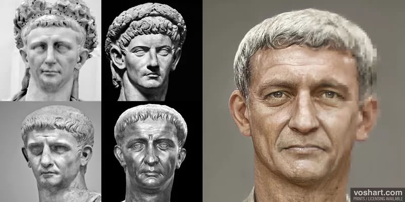
Also controversial was Caravaggio himself. His wild life made an ideal subject for Derek Jarman’s 1986 arthouse biopic starring Tilda Swinton. Famous for brawling, “the transcripts of his police records and trial proceedings fill several pages.” He never married or settled down and the male eroticism in his paintings has led many to suggestions he was gay .(Jarman’s film makes this an explicit part of his biography.) It’s likely, art historians think, that the painter had many tumultuous relationships, sexual and otherwise, with both men and women before his early death at the age of 38.
Despite his profane life, Caravaggio’s paintings evince a “remarkable spirituality” and illustrate, as Puschak notes, exactly the kind of passionate intensity the counter-Reformation Catholic Church wanted to use to stir the faithful. Caravaggio’s popularity meant commissions from wealthy patrons, and for a time, he was the most famous painter in Rome, as well as one of the city’s most infamous characters. Caravaggio painted from life, staging his intricate arrangements with real models who held the poses as he worked.
His figures were ordinary people one might meet on the 17th century streets of the city. And Caravaggio himself, despite his enormous talent, was an ordinary person as well, stereotypes of tragic, tortured geniuses aside. He was deeply flawed, it’s true, yet driven by an incredible longing to become something greater.
Related Content:
Living Paintings: 13 Caravaggio Works of Art Performed by Real-Life Actors
Paintings by Caravaggio, Vermeer, & Other Great Masters Come to Life in a New Animated Video
Why Babies in Medieval Paintings Look Like Middle-Aged Men: An Investigative Video
Josh Jones is a writer and musician based in Durham, NC. Follow him at @jdmagness