
A great deal remains to be learned about our solar system, but a great deal has already been learned about it as well. Yet huge amounts of data such as those produced by outer-space research so far can’t do much for us unless we can interpret them. Luckily, the age of the internet has made possible unprecedentedly easy access to data as well as unprecedentedly easy distribution of interpretations of that data. Eleanor Lutz, a biology graduate student at the University of Washington and the creator of the science illustration blog Tabletop Whale, has taken advantage of both conditions to wow her ever-growing fan base with her maps of the realms beyond Earth.
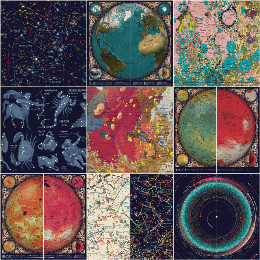
“Atlas of Space, her latest project, is all about the solar system,” writes Wired’s Sara Harrison. “She plumbed the depths of publicly available data sets from agencies like NASA and the US Geological Survey and used them to create vivid maps of constellations, asteroids, and planets. In one image, luminescent bands of fuchsia and aquamarine asteroids swirl around the bright, white point of the Sun. In another, Earth seems to pulsate as an animation of Arctic sea ice shows how it extends down the continents during the winter and then retracts back to the poles in summer.”
Lutz plans to release all the images she has created for her Atlas of Space over the next few weeks, along with instructions teaching readers how to create similar illustrations themselves. In her introductory post to the project, she promises “an animated map of the seasons on Earth, a map of Mars geology, and a map of everything in the solar system bigger than 10km.”
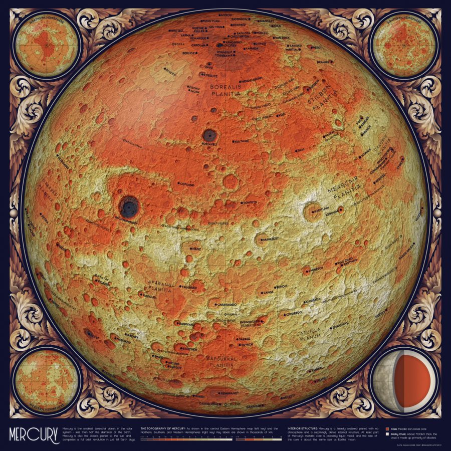
Lutz also briefly describes her plans to write about everything from “working with Digital Elevation Models (DEMs) in Bash and Python” to “using the NASA HORIZONS orbital mechanics server and scraping internet data” to “updating vintage illustrations and painting in Photoshop.” That last element has already made the project particularly eye-catching: you’ll notice the Atlas of Space pages published so far, “An Orbit Map of the Solar System” and “A Topographic Map of Mercury,” both possess a strong retro design sensibility, though each of a completely different kind. Levi Walter Yaggy would be proud — and no doubt astonished by just how much more information we’ve managed to gather about the solar system over the past 130 years.
Related Content:
The Strikingly Beautiful Maps & Charts That Fired the Imagination of Students in the 1880s
3D Map of Universe Captures 43,000 Galaxies
The Solar System Drawn Amazingly to Scale Across 7 Miles of Nevada’s Black Rock Desert
Based in Seoul, Colin Marshall writes and broadcasts on cities, language, and culture. His projects include the book The Stateless City: a Walk through 21st-Century Los Angeles and the video series The City in Cinema. Follow him on Twitter at @colinmarshall, on Facebook, or on Instagram.