The Impossibly Cool Album Covers of Blue Note Records: Meet the Creative Team Behind These Iconic Designs

If you stepped into a record store in the 1950s and 60s, you would like­ly be drawn almost imme­di­ate­ly to a Blue Note release—whether or not you were a fan of jazz or had heard of the artist or even the label. “If you went to those record stores,” says Estelle Caswell in the Vox Ear­worm video above, “it prob­a­bly wasn’t the sound of Blue Note that imme­di­ate­ly caught your atten­tion. It was their album cov­ers.”

Now those designs are hal­lowed jazz iconog­ra­phy, with their “bold typog­ra­phy, two tone pho­tog­ra­phy, and min­i­mal graph­ic design.” Of course, it should go with­out say­ing that the sound of Blue Note is as dis­tinc­tive and essen­tial as its look, thanks to its founders’ musi­cal vision, the fault­less ear of pro­duc­er and engi­neer Rudy Van Gelder, and the ros­ter of unbe­liev­ably great musi­cians the label recruit­ed and record­ed.

But back to those cov­ers….

“Their bold use of col­or, inti­mate pho­tog­ra­phy, and metic­u­lous­ly placed typog­ra­phy came to define the look of jazz” in the hard bop era, and thus, defined the look of cool, a “refined sophis­ti­ca­tion” vibrat­ing with rest­less, sul­try, smoky, classy, moody ener­gy. The rat pack had noth­ing on Blue Note. Their cov­ers “have today become an epit­o­me of graph­ic hip,” writes Robin Kin­ross at Eye mag­a­zine. (And lest we fetishize the cov­ers at the expense of their con­tents, Kin­ross makes sure to add that they “are no more than the vis­i­ble man­i­fes­ta­tion of an organ­ic whole.”)

Flip over any one of those beau­ti­ful­ly-designed Blue Note records from, say, 1955 to 65, the label’s peak years, and you’ll find two names cred­it­ed for almost all of their designs: pho­tog­ra­ph­er Fran­cis Wolff and graph­ic design­er Reid Miles. Wolff, says pro­duc­er and Blue Note archivist Michael Cus­cu­na in the Ear­worm video, shot almost every Blue Note ses­sion from “the minute he arrived.”

“One of the most impres­sive, and shock­ing things” about Wolff’s pho­to shoots, “was that the aver­age suc­cess rate of those pho­tos was real­ly extra­or­di­nary. He was like the jazz artist of pho­tog­ra­phy in that he could nail it imme­di­ate­ly.” Once Wolff filled a con­tact sheet with great shots, it next came to Miles to select the per­fect one—and the per­fect crop—for the album cov­er. These sat­u­rat­ed por­traits turned Blue Note artists into immor­tal heroes of hip.

But Reid’s exper­i­ments with typog­ra­phy, “inspired by the ever present Swiss let­ter­ing style that defined 20th cen­tu­ry graph­ic design,” notes Vox, pro­vid­ed such an impor­tant ele­ment that the let­ter­ing some­times edged out the pho­tog­ra­phy, such as in the cov­er of Joe Henderson’s In ‘n Out, which fea­tures only a tiny por­trait of the artist in the upper left-hand cor­ner, nes­tled in the dot of a low­er-case “i.”

Miles pushed the excla­ma­tion point to absurd lengths on Jack­ie McLean’s It’s Time, which again rel­e­gates the artist’s pho­to to a tiny square in the cor­ner while the rest of the cov­er is tak­en up with bold, black “!!!!!!!!!!!”s over a white back­ground. It’s “star­tling­ly get­ting your atten­tion,” Cus­cu­na com­ments. On Lou Donaldson’s Sun­ny Side Up, Miles dis­pens­es with pho­tog­ra­phy alto­geth­er, for a strik­ing black and white design that makes the title seem like it might up and float away.

But Miles’ type-cen­tric cov­ers, though excel­lent, are not what we usu­al­ly asso­ciate with the clas­sic Blue Note look. The syn­the­sis of Wolff’s impec­ca­ble pho­to­graph­ic instincts and Miles’ sur­gi­cal­ly keen eye for fram­ing, col­or, and com­po­si­tion com­bined to give us the pen­sive, mys­te­ri­ous Coltrane on Blue Train, the impos­si­bly cool Son­ny Rollins on the cov­er of Newk’s Time, the total­ly, wild­ly in-the-moment Art Blakey on The Big Beat, and so, so many more.

Reid Miles had the rare tal­ent only the best art direc­tors pos­sess, says Cus­cu­na: the abil­i­ty to “cre­ate a look for a record that was high­ly indi­vid­ual but also that fit into a stream that gave the label a look.” Learn more about his work with Wolff in Robin Kinross’s essay, see many more clas­sic Blue Note album cov­ers here, and make sure to lis­ten to the music behind all that bril­liant graph­ic design in this huge, stream­ing discog­ra­phy of Blue Note record­ings. To view them in print for­mat, see the defin­i­tive book, The Cov­er Art of Blue Note Records: The Col­lec­tion.

Relat­ed Con­tent:

Stream a 144-Hour Discog­ra­phy of Clas­sic Jazz Record­ings from Blue Note Records: Miles Davis, Art Blakey, John Coltrane, Ornette Cole­man & More

The Ground­break­ing Art of Alex Stein­weiss, Father of Record Cov­er Design

Enter the Cov­er Art Archive: A Mas­sive Col­lec­tion of 800,000 Album Cov­ers from the 1950s through 2018

Josh Jones is a writer and musi­cian based in Durham, NC. Fol­low him at @jdmagness
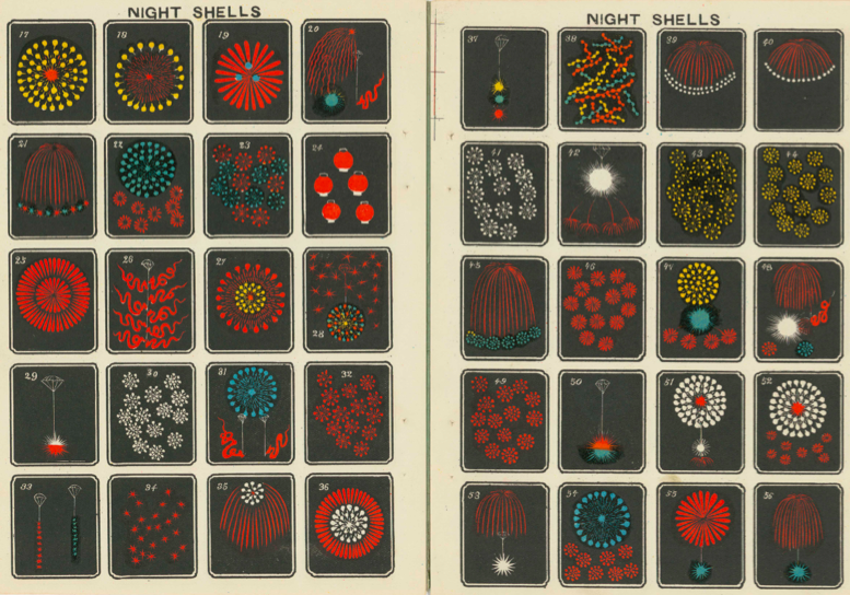
Hundreds of Wonderful Japanese Firework Designs from the Early-1900s: Digitized and Free to Download

The Japan­ese term for fire­works, han­abi (花火), com­bines the words for fire, bi (), and flower, hana (). If you’ve seen fire­works any­where, that deriva­tion may seem at least vague­ly apt, but if you’ve seen Japan­ese fire­works, it may well strike you as evoca­tive indeed. The tra­di­tion­al Japan­ese way with pre­sent­ing flow­ers, their shapes and col­ors as well as their scents, has some­thing in com­mon with the tra­di­tion­al Japan­ese way of putting on a fire­works show.

Not that the pro­duc­tion of fire­crack­ers goes as far back, his­tor­i­cal­ly, as the arrange­ment of flow­ers does, nor that fire­crack­ers them­selves, orig­i­nal­ly a prod­uct of Chi­na, have any­thing essen­tial­ly Japan­ese about them.

But as more recent­ly with cars, com­ic books, con­sumer elec­tron­ics, and Kit-Kats, when­ev­er Japan re-inter­prets a for­eign inven­tion, the project amounts to rad­i­cal re-inven­tion, and often a daz­zling one at that.

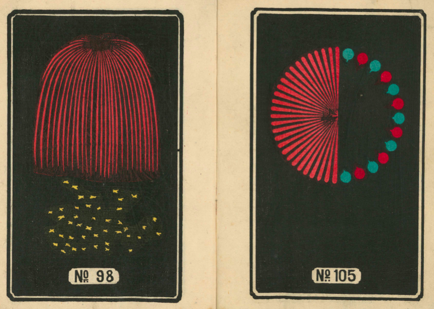
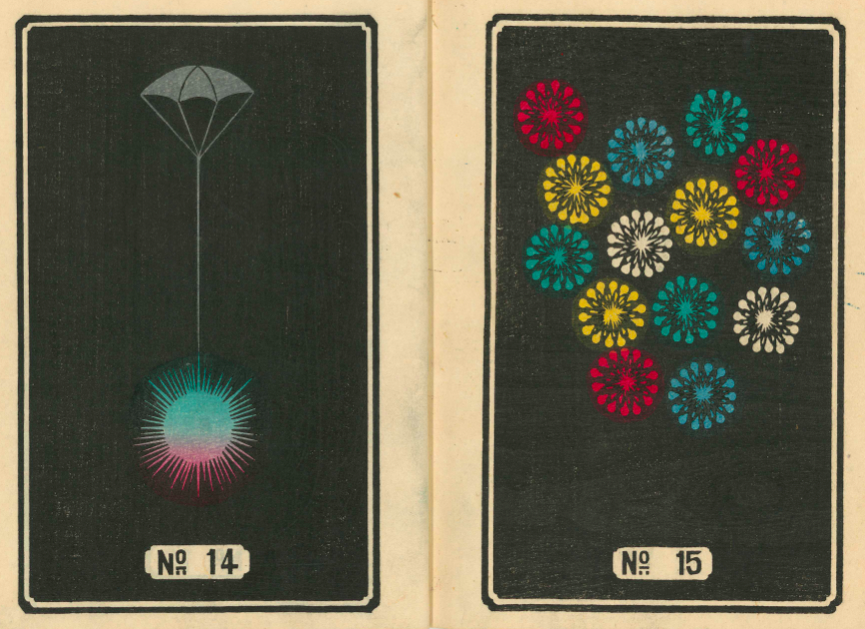
These Japan­ese ver­sions of non-Japan­ese things often become high­ly desir­able around the world in their own right. It cer­tain­ly hap­pened with Japan­ese fire­works, here proud­ly dis­played in these ele­gant and vivid­ly col­ored Eng­lish cat­a­logs of Hiraya­ma Fire­works and Yokoi Fire­works, pub­lished in the ear­ly 1900s by C.R. Brock and Com­pa­ny, whose found­ing date of 1698 makes it the old­est fire­work con­cern in the Unit­ed King­dom.

These Brocks cat­a­logs been dig­i­tized by the Yoko­hama Board of Edu­ca­tion and made avail­able online at the Inter­net Archive. Though I’ve nev­er seen a fire­works show in Yoko­hama, that city, dot­ted as it is with impec­ca­bly designed pub­lic gar­dens, cer­tain­ly has its flower-appre­ci­a­tion cre­den­tials in order.

Orga­nized into such cat­e­gories as “Ver­ti­cal Wheels,” “Phan­tom Cir­cles,” and “Col­ored Flo­ral Bomb Shells,” the cat­a­logs present their import­ed Japan­ese wares sim­ply, as var­i­ous pat­terns of col­or against a black or blue back­ground. But sim­plic­i­ty, as even those only dis­tant­ly acquaint­ed with Japan­ese art have seen, sup­ports a few par­tic­u­lar­ly strong and endur­ing branch­es of Japan­ese aes­thet­ics.

No mat­ter where you take in your dis­plays of fire­works, you’ll sure­ly rec­og­nize more than a few of these designs from hav­ing seen them light up the night sky. And as far as where to look for the next fire­work inno­va­tor, I might sug­gest South Korea, where I live: at this past sum­mer’s Seoul Inter­na­tion­al Fire­works fes­ti­val I wit­nessed fire­works explod­ing into the shape of cat faces, whiskers and all. Such elab­o­rate­ness many vio­late the more rig­or­ous ver­sions of the Japan­ese sen­si­bil­i­ty as they apply to han­abi — but then again, just imag­ine what won­ders Japan, one of the most cat-lov­ing coun­tries in the world, could do with that con­cept.

Relat­ed Con­tent:

1,000+ His­toric Japan­ese Illus­trat­ed Books Dig­i­tized & Put Online by the Smith­son­ian: From the Edo & Meji Eras (1600–1912)

Down­load Clas­sic Japan­ese Wave and Rip­ple Designs: A Go-to Guide for Japan­ese Artists from 1903

Enter a Dig­i­tal Archive of 213,000+ Beau­ti­ful Japan­ese Wood­block Prints

What Hap­pens When a Japan­ese Wood­block Artist Depicts Life in Lon­don in 1866, Despite Nev­er Hav­ing Set Foot There

A Firework’s Point of View

Based in Seoul, Col­in Mar­shall writes and broad­casts on cities, lan­guage, and cul­ture. His projects include the book The State­less City: a Walk through 21st-Cen­tu­ry Los Ange­les and the video series The City in Cin­e­ma. Fol­low him on Twit­ter at @colinmarshall or on Face­book.

A Database of Paper Airplane Designs: Hours of Fun for Kids & Adults Alike

Though we can trace the his­to­ry of paper air­craft back 2000 years to the Chi­nese and their kites, and into the 19th cen­tu­ry with the French and their imag­i­nary air­ships, the ori­gin of the mod­ern paper air­plane is shroud­ed in mys­tery. A San Diego Read­er arti­cle placed the birth some­where in 1910. By 1915, most Amer­i­can kids were already tor­ment­ing teach­ers. And Jack Northrup used paper mod­els to work on aero­dy­nam­ics at Lock­heed in the 1930s, but even that doesn’t do much to explain how such a ubiq­ui­tous object has con­tin­ued to be so hum­ble and ordi­nary while inspir­ing a recent upsurge of inter­est.

The data­base at Fold’n’Fly shows how much vari­ety there is beyond the basic “dart” style, and each air­plane comes with step-by-step fold­ing instruc­tions, a print­able pat­tern page, and a help­ful video.

You can choose by dif­fi­cul­ty lev­el, whether or not you will need scis­sors, or sort by dis­tance, acro­bat­ics, time aloft, or pure­ly dec­o­ra­tive.

One of the rea­sons for the renewed inter­est in paper air­planes is the use of CAD (com­put­er aid­ed design) in con­struct­ing pro­to­types, and that in itself is a response to the chal­lenge set by var­i­ous Guin­ness world records.

The cur­rent dis­tance record is 226 feet, 10 inch­es, set in March 2012 by a for­mer col­lege quar­ter­back Joe Ayoob. The plane was designed by tele­vi­sion pro­duc­er John Collins, who used Ayoob’s throw­ing arm strength to break the pre­vi­ous record hold­er by near­ly 20 feet.

The longest time a paper air­plane has been in the air is cur­rent­ly 27.6 sec­onds, set in 1998 by Ken Black­burn at the Geor­gia Dome. He was break­ing his own record for the third time.

Last­ly, the record for largest paper air­plane is 40 ft 10 inch­es, designed by stu­dents from the Tech­nol­o­gy Uni­ver­si­ty of Delft in 1995.

So, now you know what you’re up against. If you think you can do bet­ter, dive into this web­site and get fold­ing.

via Metafil­ter

Relat­ed Con­tent:

The Sci­ence of Beer: A New Free Online Course Promis­es to Enhance Your Appre­ci­a­tion of the Time­less Bev­er­age

NASA Puts 400+ His­toric Exper­i­men­tal Flight Videos on YouTube

NASA Releas­es a Mas­sive Online Archive: 140,000 Pho­tos, Videos & Audio Files Free to Search and Down­load

Ted Mills is a free­lance writer on the arts who cur­rent­ly hosts the artist inter­view-based FunkZone Pod­cast and is the pro­duc­er of KCR­W’s Curi­ous Coast. You can also fol­low him on Twit­ter at @tedmills, read his oth­er arts writ­ing at tedmills.com and/or watch his films here.

157 Animated Minimalist Mid-Century Book Covers

Graph­ic and motion design­er Hen­ning M. Led­er­er can’t get enough of those min­i­mal­ist mid­cen­tu­ry book cov­ers.

Appar­ent­ly, the over-the-top pulp sce­nar­ios that inspire fel­low peri­od cov­er enthu­si­ast Todd Alcott leave Led­er­er cold.

He’s drawn to the stark, the geo­met­ric, the abstract. No heav­ing bosoms, no for­bid­den love, though there’s no deny­ing that sex was a top­ic of great clin­i­cal inter­est to sev­er­al of the authors fea­tured above, includ­ing psy­chi­a­trists Charles Rycroft, H. R. Beech, and R.D. Laing.

Visu­al­ly, the psy­cho-ana­lyt­ic titles appear inter­change­able with the more straight­for­ward texts in this, Lederer’s third in a series of light­ly ani­mat­ed peri­od book cov­ers:

The Intel­li­gent Woman’s Guide to Atom­ic Radi­a­tion

Med­ical Com­pli­ca­tions Dur­ing Preg­nan­cy

Gen­er­al­ized Ther­mo­dy­nam­ics

Pin­wheels, rip­ples, and scrolling har­le­quin pat­terns abound. Stare at them long enough if you want to cure your insom­nia or become one with the uni­verse.

Tilman Grundig’s sound­track ensures that the play­ing field will stay lev­el. No title is sin­gled out for extra son­ic atten­tion.

That said, Noise by Rupert Tay­lor, an expert con­sul­tant in acoustics and noise con­trol, stands apart for the humor and nar­ra­tive sen­si­bil­i­ty of its visu­al rep­re­sen­ta­tion.

Per­haps that’s why Led­er­er saved it for last.

To date, he’s ani­mat­ed 157 cov­ers. Enjoy them all above.

Relat­ed Con­tent:

Songs by David Bowie, Elvis Costel­lo, Talk­ing Heads & More Re-Imag­ined as Pulp Fic­tion Book Cov­ers

The Art of Sci-Fi Book Cov­ers: From the Fan­tas­ti­cal 1920s to the Psy­che­del­ic 1960s & Beyond

French Book­store Blends Real People’s Faces with Book Cov­er Art

Ayun Hal­l­i­day is an author, illus­tra­tor, the­ater mak­er and Chief Pri­ma­tol­o­gist of the East Vil­lage Inky zine.  Join her in NYC on Mon­day, Novem­ber 12 for anoth­er month­ly install­ment of her book-based vari­ety show, Necro­mancers of the Pub­lic Domain. Fol­low her @AyunHalliday.

Buckminster Fuller Creates Striking Posters of His Own Inventions


In addi­tion to his for­mi­da­ble body of work in archi­tec­ture, design, and the­o­ry of the kind the world had nev­er known before, Buck­min­ster Fuller also knew how to pro­mote him­self. Some­times this meant appear­ing on late-night new-age talk shows, but at its core it meant com­ing up with ideas that would imme­di­ate­ly “read” as rev­o­lu­tion­ary to any­one who saw them in action. But how to put them before the eyes of some­one who has­n’t had the chance to see a geo­des­ic dome, a Dymax­ion House and Car, or even a Geodome 4 tent in real life?

The ascent of graph­ic design in the 20th cen­tu­ry, a cen­tu­ry Fuller saw begin and lived through most of, pro­vid­ed one promis­ing answer: posters. The ones you see here show off “Fuller’s most famous inven­tions, with line draw­ings from his patents super­im­posed over a pho­to­graph of the thing itself,” writes Fast Com­pa­ny’s Katharine Schwab.

“While they look like some­thing Fuller afi­ciona­dos might have cre­at­ed after the man’s death to cel­e­brate his work, Fuller actu­al­ly cre­at­ed them in part­ner­ship with the gal­lerist Carl Sol­way near the end of his career.”

These posters, “strik­ing with their two-lay­er design, are Fuller’s visu­al homage to his own genius — and an attempt to bring what he believed were world-chang­ing utopi­an con­cepts to the mass­es.” They’re also now on dis­play at the Edward Cel­la Art + Archi­tec­ture in Los Ange­les, whose exhi­bi­tion “R. Buck­min­ster Fuller: Inven­tions and Mod­els” runs until Novem­ber 2nd. “Fuller’s objects and prints func­tion not only as mod­els of the math­e­mat­i­cal and geo­met­ric prop­er­ties under­ly­ing their con­struc­tion but also as ele­gant works of art,” says the gallery’s site. “As such, the works rep­re­sent the hybrid­i­ty of Fuller’s prac­tice, and his lega­cy across the fields of art, design, sci­ence, and engi­neer­ing.”

You can see more of Fuller’s posters, which depict and visu­al­ly explain the struc­tures of such inven­tions as the geo­des­ic dome and Dymax­ion Car, of course, but also less­er-known cre­ations like a “Fly­’s Eye” dome cov­ered in bub­ble win­dows (indi­vid­u­al­ly swap­pable for solar pan­els), a sub­mersible for off­shore drilling, and a row­boat with a body reduced to two thin “nee­dles,” at Design­boom. Edward Cel­la Art + Archi­tec­ture has also made the posters avail­able for pur­chase at $7,000 apiece. That price might seem in con­tra­dic­tion with Fuller’s utopi­an ideals about uni­ver­sal acces­si­bil­i­ty through sheer low cost, but then, who could look at these and call them any­thing but works of art?

via Curbed

Relat­ed con­tent:

A Three-Minute Intro­duc­tion to Buck­min­ster Fuller, One of the 20th Century’s Most Pro­duc­tive Design Vision­ar­ies

Buck­min­ster Fuller’s Map of the World: The Inno­va­tion that Rev­o­lu­tion­ized Map Design (1943)

The Life & Times of Buck­min­ster Fuller’s Geo­des­ic Dome: A Doc­u­men­tary

Buck­min­ster Fuller Cre­ates an Ani­mat­ed Visu­al­iza­tion of Human Pop­u­la­tion Growth from 1000 B.C.E. to 1965

Buck­min­ster Fuller’s Col­lab­o­ra­tion with The North Face Cul­mi­nates with a New Geo­des­ic Dome Tent, the Geodome 4

Based in Seoul, Col­in Mar­shall writes and broad­casts on cities, lan­guage, and cul­ture. His projects include the book The State­less City: a Walk through 21st-Cen­tu­ry Los Ange­les and the video series The City in Cin­e­ma. Fol­low him on Twit­ter at @colinmarshall or on Face­book.

The History of Philosophy Visualized in an Interactive Timeline

The con­nec­tions we make between var­i­ous philoso­phers and philo­soph­i­cal schools are often con­nec­tions that have already been made for us by teach­ers and schol­ars on our paths through high­er edu­ca­tion. Many of us who have tak­en a phi­los­o­phy class or two leave it at that, con­tent we’ve got the gist of things and that spe­cial­ists can parse the details per­fect­ly well with­out us. But there are those curi­ous peo­ple who con­tin­ue to read abstruse and dif­fi­cult phi­los­o­phy after their intro class­es are over, for the sheer, per­verse joy of it, or from a burn­ing desire to under­stand truth, beau­ty, jus­tice, or what­ev­er.

And then there are those who embark on a thor­ough self-guid­ed tour of West­ern philo­soph­i­cal his­to­ry, attempt­ing, with­out the aid of uni­ver­si­ty depart­ments and fad­dish inter­pre­tive schemes, to weave the dis­parate strains of thought togeth­er. One such auto­di­dact and aca­d­e­m­ic out­sider, design­er Deniz Cem Önduygu of Istan­bul, has com­bined an ency­clo­pe­dic mind with a tal­ent for rig­or­ous out­line orga­ni­za­tion to pro­duce an inter­ac­tive time­line of the his­to­ry of philo­soph­i­cal ideas. It is “a pure­ly per­son­al project,” he writes, “that I’m doing in my own time, with my lim­it­ed knowl­edge, for myself.”

Önduygu shares the project not to show off his learn­ing but, more humbly, to “get feed­back and to make it acces­si­ble to those who are inter­est­ed.” It may be pre­cious few peo­ple who have both the time and incli­na­tion to teach them­selves the his­to­ry of phi­los­o­phy, but if you are one of them, this incred­i­bly dense info­graph­ic is as good a place to start as any, and while it may appear intim­i­dat­ing at first glance, its menu in the upper right cor­ner allows users to zero in on spe­cif­ic thinkers and schools, and to con­fine them­selves to small­er, more man­age­able areas of the whole.

As for the time­line itself, “view­ers can zoom in and out,” notes Dai­ly Nous, “and see philoso­phers list­ed in chrono­log­i­cal order, with ideas they’re asso­ci­at­ed with list­ed beneath them. These ideas, in turn, are con­nect­ed by green lines to sim­i­lar or sup­port­ing ideas else­where on the time­line, and con­nect­ed by red lines to oppos­ing or refut­ing ideas else­where on the time­line. If you hov­er your mouse cur­sor over a sin­gle idea, all but it and its con­nect­ed ideas fade. You can then click on the idea to bring those con­nect­ed ideas clos­er for ease of view­ing.”

The design­er admits this is a “nev­er-end­ing work in progress” and main­ly a source for remind­ing him­self of the main argu­ments of the philoso­phers he’s sur­veyed. The major sources for his time­line are “Bryan Magee’s The Sto­ry of Phi­los­o­phy and Thomas Baldwin’s Con­tem­po­rary Phi­los­o­phy, along with oth­er works for spe­cif­ic philoso­phers and ideas.” But many of the con­nec­tions Önduygu draws in this exten­sive web of green and red are his own.

He explains his ratio­nale here, not­ing, “The lines here do not always depict a direct trans­fer between two peo­ple; I think of them as trac­ing the devel­op­ment of an idea through­out time with­in our col­lec­tive con­cep­tion.” Spend some more time with this impres­sive project at the His­to­ry of Phi­los­o­phy Sum­ma­rized & Visu­al­ized (the site works best in Chrome), and feel free to get in touch with its cre­ator with con­struc­tive crit­i­cism. He wel­comes feed­back and is open to oppos­ing ideas, as every life­long learn­er should be.

via Dai­ly Nous

Relat­ed Con­tent:

150+ Free Online Phi­los­o­phy Cours­es

The His­to­ry of Phi­los­o­phy Visu­al­ized

A His­to­ry of Phi­los­o­phy in 81 Video Lec­tures: From Ancient Greece to Mod­ern Times 

The His­to­ry of Phi­los­o­phy … With­out Any Gaps

Josh Jones is a writer and musi­cian based in Durham, NC. Fol­low him at @jdmagness
Download Classic Japanese Wave and Ripple Designs: A Go-to Guide for Japanese Artists from 1903

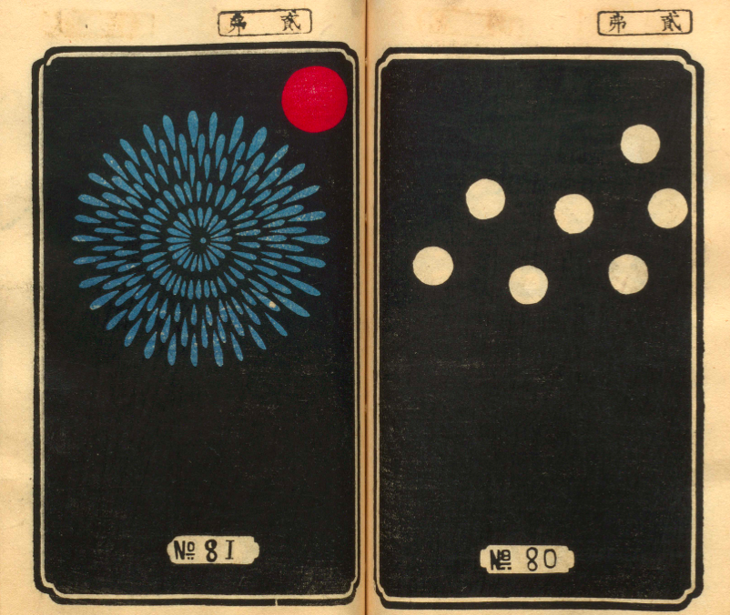
Tra­di­tion­al Japan­ese art may please so many of us, even those of us with lit­tle inter­est in Japan itself, because of the way it inhab­its the realm between rep­re­sen­ta­tion and abstrac­tion. But then, it does­n’t just inhab­it that realm: it has set­tled those bor­der­lands, made them its own, for much longer than most cul­tures have been doing any­thing at all. The space between art, strict­ly defined, and what we now call design has also seen few achieve­ments quite so impres­sive as those made in Japan, going all the way back to the rope mark­ings on the clay ves­sels used by the islands’ Jōmon peo­ple in the 11th cen­tu­ry BC.

Those ancient rope-on-clay mark­ings can eas­i­ly look like pre­de­ces­sors of the “wave pat­terns” still seen in Japan­ese art and design today. Since time almost immemo­r­i­al they have appeared on “swords (both blades and han­dles) and asso­ci­at­ed para­pher­na­lia (known as ‘sword fur­ni­ture’), as well as lac­quer­ware, Net­suke, reli­gious objects, and a host of oth­er items.”

So says the Pub­lic Domain Review, which has fea­tured a series of three books full of ele­gant wave and rip­ple designs orig­i­nal­ly pub­lished in 1903 and now avail­able to down­load free at the Inter­net Archive (vol­ume onevol­ume twovol­ume three).

Called Hamon­shū, the books were pro­duced by the artist Mori Yuzan, “about whom not a lot is known,” adds the Pub­lic Domain review, “apart from that he hailed from Kyoto, worked in the Nihon­ga style” — or the “Japan­ese paint­ing” style of Japan­ese paint­ing, which emerged dur­ing the Mei­ji peri­od, a time of rapid West­ern­iza­tion in Japan.

He “died in 1917. The works would have act­ed as a kind of go-to guide for Japan­ese crafts­men look­ing to adorn their wares with wave and rip­ple pat­terns.” Though they do con­tain text, they require no knowl­edge of the Japan­ese lan­guage to appre­ci­ate the many illus­tra­tions they present.

Tak­en togeth­er, Mori’s books offer a com­plete spec­trum from tra­di­tion­al Japan­ese-style rep­re­sen­ta­tion — espe­cial­ly of land, water, moun­tains, sky, and oth­er nat­ur­al ele­ments — to a taste of the infi­nite vari­ety of abstract pat­terns that result. Such imagery remains preva­lent in Japan more than a cen­tu­ry after the pub­li­ca­tion of Hamon­shū, as any vis­i­tor to Japan today will see.

But now that the Inter­net Archive has made the books freely avail­able online (vol­ume onevol­ume twovol­ume three), they’ll sure­ly inspire work not just between rep­re­sen­ta­tion and abstrac­tion as well as between art and design, but between Japan­ese aes­thet­ics and those of every oth­er cul­ture in the world as well.

via Pub­lic Domain Review

Relat­ed Con­tent:

Watch Japan­ese Wood­work­ing Mas­ters Cre­ate Ele­gant & Elab­o­rate Geo­met­ric Pat­terns with Wood

Mes­mer­iz­ing GIFs Illus­trate the Art of Tra­di­tion­al Japan­ese Wood Join­ery — All Done With­out Screws, Nails, or Glue

Down­load 2,500 Beau­ti­ful Wood­block Prints and Draw­ings by Japan­ese Mas­ters (1600–1915)

1,000+ His­toric Japan­ese Illus­trat­ed Books Dig­i­tized & Put Online by the Smith­son­ian: From the Edo & Meji Eras (1600–1912)

The Art of Col­lo­type: See a Near Extinct Print­ing Tech­nique, as Lov­ing­ly Prac­ticed by a Japan­ese Mas­ter Crafts­man

Based in Seoul, Col­in Mar­shall writes and broad­casts on cities and cul­ture. His projects include the book The State­less City: a Walk through 21st-Cen­tu­ry Los Ange­les and the video series The City in Cin­e­ma. Fol­low him on Twit­ter at @colinmarshall or on Face­book.

Classic Songs by Bob Dylan Re-Imagined as Pulp Fiction Book Covers: “Like a Rolling Stone,” “A Hard Rain’s A‑Gonna Fall” & More

Screen­writer Todd Alcott has been very busy since we intro­duced you to his hilar­i­ous Mid-Cen­tu­ry Pulp Fic­tion Cov­er project last month.

To restate what should be obvi­ous from the sec­ond, if not first glance, none of Alcott’s titles are real. His aes­thet­i­cal­ly con­vinc­ing mock-ups pay trib­ute to favorite songs by favorite artists: David Bowie, Talk­ing Heads, Joy Divi­sion, Elvis Costel­lo…

The start of the school year finds him in a Dylan mood, ren­der­ing some of his best known hits in a vari­ety of pulp genre for­mats:

Bob Dylan is the per­fect sub­ject for this project, because his work has always been all about quo­ta­tion and repur­pos­ing. From the very begin­ning, he took old songs, changed the lyrics and called them his own…. And it’s not just the melodies, he’s also not shy about lift­ing phras­es and whole lines from oth­er sources. One of the fun things about being a Bob Dylan fan is being able to spot the influ­ences. It’s not just lift­ing lines from clas­sic blues songs, where we don’t real­ly know who “wrote” the orig­i­nals, it’s real, iden­ti­fi­able, copy­right-pro­tect­ed mate­r­i­al. And you nev­er know where it’s going to come from, a book about the Yakuza from Japan, a cook­book, an old Time Mag­a­zine arti­cle, or 1940s noir pic­tures.

I was watch­ing a clas­sic Robert Mitchum noir, Out of the Past, and Mitchum is talk­ing to some­one, and they men­tion San Fran­cis­co, and Mitchum says “I always liked San Fran­cis­co, I was there for a par­ty once.” 

And I was like “Wait, what?” Because that’s a line from a real­ly obscure Dylan song, “Maybe Some­day,” off his album Knocked-Out Loaded. 

I was like “Wait, why did that line stick in Dylan’s mind? Why did he decide to quote that? Is it just the way Mitchum says it? What hap­pened there?” And sud­den­ly a song I had­n’t thought about much became a lot more inter­est­ing.

So for my Dylan cov­ers, I try to car­ry on that tra­di­tion of tak­ing quotes and repur­pos­ing them. So “Just Like a Woman” becomes a sto­ry in a sci­ence-fic­tion pulp, and “Like a Rolling Stone” becomes an expose on juve­nile delin­quen­cy, and “Rainy Day Women” becomes a post-apoc­a­lyp­tic adven­ture sto­ry. 

In a way, it’s what this project is all about, tak­ing dis­card­ed pieces of cul­ture and stick­ing them back togeth­er with new ref­er­ences to make them breathe again.

Just Like a Woman”’s lyrics have nev­er sat par­tic­u­lar­ly well with fem­i­nists. (“There’s no more com­plete cat­a­logue of sex­ist slurs,” author Mar­i­on Meade wrote in The New York Times.)

I think it’s fair to say that Alcott’s bux­om flame-haired cyborg leans in to that crit­i­cism. The cov­er of this faux sci­ence fic­tion mag also harkens back to a time when the depic­tion of sexy female robots left some­thing to the imag­i­na­tion.

From a design stand­point, it’s a great illus­tra­tion of the heavy lift­ing a sin­gle well-cho­sen punc­tu­a­tion change can do.

The magazine’s title is an extra gift to Dylan fans.

The Blonde-on-Blonde Chron­i­cles con­tin­ue with Rainy Day Women #12 & 35. Does it mat­ter that the breast-plat­ed, and for all prac­ti­cal pur­pos­es bot­tom­less war­riors are raven tressed?

Only if tongue’s not firm­ly in cheek.

The night­mare vision of Dylan’s sev­en-minute protest song “A Hard Rain’s A‑Gonna Fall” makes for a smooth tran­si­tion to a dis­as­ter nov­el of the 1970s.

In a 1963 radio inter­view with author Studs Terkel, Dylan assert­ed that the song wasn’t direct­ly relat­ed to the nuclear fears all-per­va­sive at the time:

It’s not the fall­out rain. It isn’t that at all. The hard rain’s gonna fall is in the last verse…That means all the lies, you know, that peo­ple get told on their radios and in news­pa­pers. All you have to think for a minute, you know. Try­ing to take people’s brains away, you know. Which maybe has been done already. I hate to think it’s been done. All the lies, which I con­sid­er poi­son.

This writer can think of anoth­er rea­son cit­i­zens might find them­selves fight­ing for their lives in a row­boat lev­el with the very tip­py top of the Empire State Build­ing. So, I sus­pect, can Alcott.

Or maybe we’re wrong and cli­mate change is noth­ing but fake news.

Alcott gets some mileage out of anoth­er rain-based lyric on Maggie’s Farm, a steamy rur­al romp whose creased cov­er is also part and par­cel of the genre.

Who’s that young punk on the cov­er of Like a Rolling Stone? Beats me, but the girl’s a dead ringer for Warhol super­star, Edie Sedg­wick, the pur­port­ed inspi­ra­tion for the song that shares the novel’s name. Ms. Sedgwick’s real life fig­ure was much less volup­tuous, but if the genre cov­ers that sparked this project demon­strate any­thing, it’s that sex sells.

Visions of Johan­na is pos­i­tive­ly under­stat­ed in com­par­i­son. While many pulp authors toiled in obscu­ri­ty, let us pre­tend that Nobel Prize win­ner and (faux) pulp-nov­el­ist Dylan wouldn’t have. Espe­cial­ly if he had a series like the pseu­do­ny­mous Brett Halliday’s pop­u­lar Mike Shayne mys­ter­ies. At that lev­el, the cov­er wouldn’t real­ly need quotes.

Though what harm would there be? There’s plen­ty of neg­a­tive space here. Read­ers, which line would you splash across the cov­er if you were this prankster, Alcott?

Ain’t it just like the night to play tricks when you’re tryin’ to be so qui­et?

We sit here strand­ed, though we’re all doin’ our best to deny it

And Louise holds a hand­ful of rain, temptin’ you to defy it

Lights flick­er from the oppo­site loft

In this room the heat pipes just cough

The coun­try music sta­tion plays soft

But there’s noth­ing, real­ly noth­ing to turn off

Just Louise and her lover so entwined

And these visions of Johan­na that con­quer my mind

In the emp­ty lot where the ladies play blindman’s bluff with the key chain

And the all-night girls they whis­per of escapades out on the “D” train

We can hear the night watch­man click his flash­light

Ask him­self if it’s him or them that’s real­ly insane

Louise, she’s all right, she’s just near

She’s del­i­cate and seems like the mir­ror

But she just makes it all too con­cise and too clear

That Johanna’s not here

The ghost of ’lec­tric­i­ty howls in the bones of her face

Where these visions of Johan­na have now tak­en my place

Now, lit­tle boy lost, he takes him­self so seri­ous­ly

He brags of his mis­ery, he likes to live dan­ger­ous­ly

And when bring­ing her name up

He speaks of a farewell kiss to me

He’s sure got a lot­ta gall to be so use­less and all

Mut­ter­ing small talk at the wall while I’m in the hall

How can I explain?

Oh, it’s so hard to get on

And these visions of Johan­na, they kept me up past the dawn

Inside the muse­ums, Infin­i­ty goes up on tri­al

Voic­es echo this is what sal­va­tion must be like after a while

But Mona Lisa mus­ta had the high­way blues

You can tell by the way she smiles

See the prim­i­tive wall­flower freeze

When the jel­ly-faced women all sneeze

Hear the one with the mus­tache say, “Jeeze

I can’t find my knees”

Oh, jew­els and binoc­u­lars hang from the head of the mule

But these visions of Johan­na, they make it all seem so cru­el

The ped­dler now speaks to the count­ess who’s pre­tend­ing to care for him

Sayin’, “Name me some­one that’s not a par­a­site and I’ll go out and say a prayer for him”

But like Louise always says

“Ya can’t look at much, can ya man?”

As she, her­self, pre­pares for him

And Madon­na, she still has not showed

We see this emp­ty cage now cor­rode

Where her cape of the stage once had flowed

The fid­dler, he now steps to the road

He writes ev’rything’s been returned which was owed

On the back of the fish truck that loads

While my con­science explodes

The har­mon­i­cas play the skele­ton keys and the rain

And these visions of Johan­na are now all that remain

You can see more of Todd Alcott’s Mid-Cen­tu­ry Pulp Fic­tion Cov­er project, and pick up archival qual­i­ty prints from his Etsy shop.

Relat­ed Con­tent:

Songs by David Bowie, Elvis Costel­lo, Talk­ing Heads & More Re-Imag­ined as Pulp Fic­tion Book Cov­ers

Bob Dylan Pota­to Chips, Any­one?: What They’re Snack­ing on in Chi­na

Bob Dylan Hates Me: An Ani­ma­tion

Ayun Hal­l­i­day - no rela­tion to Brett — is an author, illus­tra­tor, the­ater mak­er and Chief Pri­ma­tol­o­gist of the East Vil­lage Inky zine.  Join her in NYC on Mon­day, Sep­tem­ber 24 for anoth­er month­ly install­ment of her book-based vari­ety show, Necro­mancers of the Pub­lic Domain. Fol­low her @AyunHalliday.

« Go BackMore in this category... »
Quantcast