The Japanese term for fireworks, hanabi (花火), combines the words for fire, bi (火), and flower, hana (火). If you’ve seen fireworks anywhere, that derivation may seem at least vaguely apt, but if you’ve seen Japanese fireworks, it may well strike you as evocative indeed. The traditional Japanese way with presenting flowers, their shapes and colors as well as their scents, has something in common with the traditional Japanese way of putting on a fireworks show.
Not that the production of firecrackers goes as far back, historically, as the arrangement of flowers does, nor that firecrackers themselves, originally a product of China, have anything essentially Japanese about them.
But as more recently with cars, comic books, consumer electronics, and Kit-Kats, whenever Japan re-interprets a foreign invention, the project amounts to radical re-invention, and often a dazzling one at that.
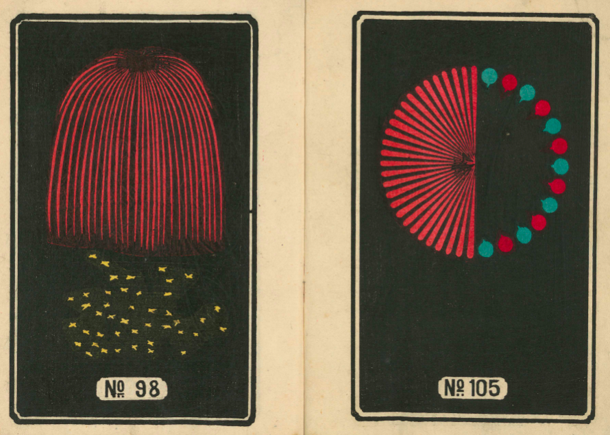
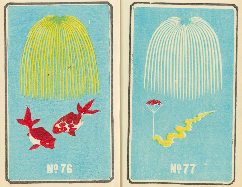
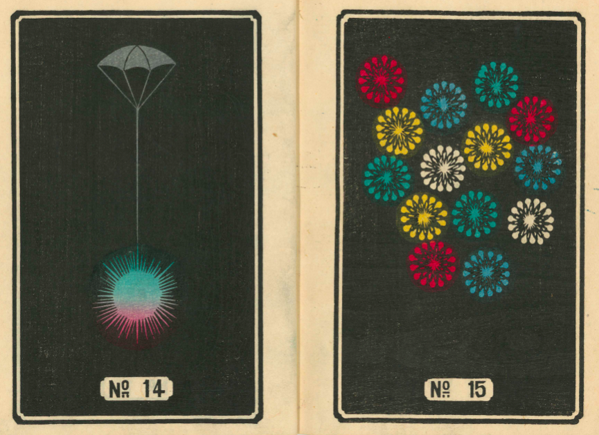
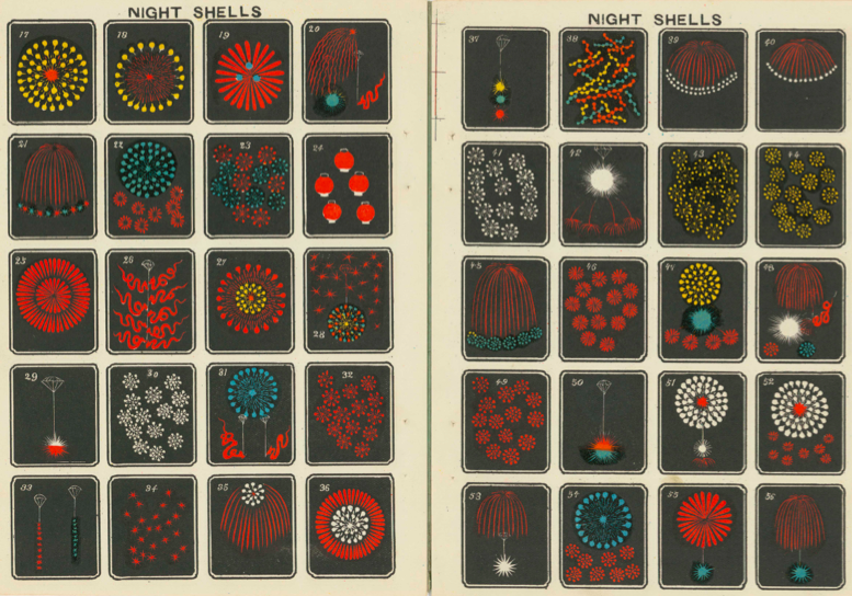
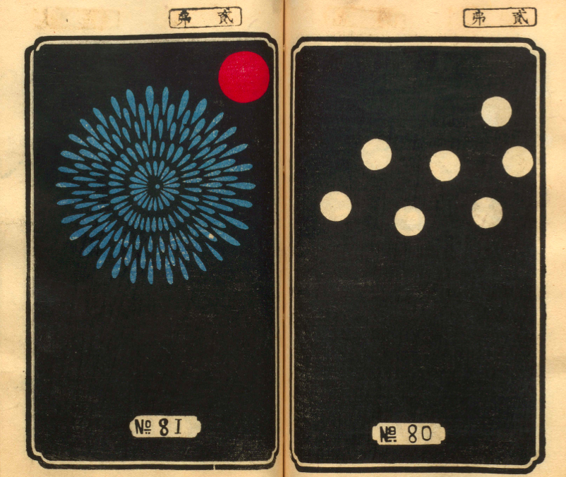
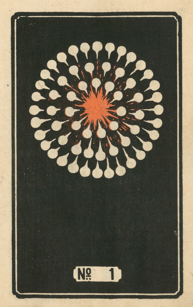
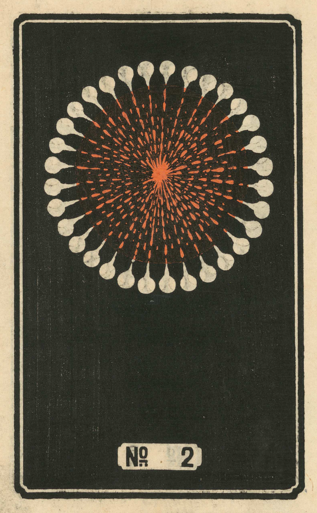
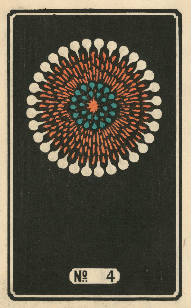
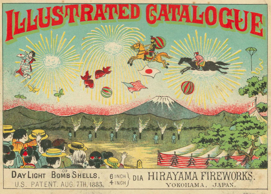
These Japanese versions of non-Japanese things often become highly desirable around the world in their own right. It certainly happened with Japanese fireworks, here proudly displayed in these elegant and vividly colored English catalogs of Hirayama Fireworks and Yokoi Fireworks, published in the early 1900s by C.R. Brock and Company, whose founding date of 1698 makes it the oldest firework concern in the United Kingdom.
These Brocks catalogs been digitized by the Yokohama Board of Education and made available online at the Internet Archive. Though I’ve never seen a fireworks show in Yokohama, that city, dotted as it is with impeccably designed public gardens, certainly has its flower-appreciation credentials in order.
Organized into such categories as “Vertical Wheels,” “Phantom Circles,” and “Colored Floral Bomb Shells,” the catalogs present their imported Japanese wares simply, as various patterns of color against a black or blue background. But simplicity, as even those only distantly acquainted with Japanese art have seen, supports a few particularly strong and enduring branches of Japanese aesthetics.
No matter where you take in your displays of fireworks, you’ll surely recognize more than a few of these designs from having seen them light up the night sky. And as far as where to look for the next firework innovator, I might suggest South Korea, where I live: at this past summer’s Seoul International Fireworks festival I witnessed fireworks exploding into the shape of cat faces, whiskers and all. Such elaborateness many violate the more rigorous versions of the Japanese sensibility as they apply to hanabi — but then again, just imagine what wonders Japan, one of the most cat-loving countries in the world, could do with that concept.
Based in Seoul, Colin Marshall writes and broadcasts on cities, language, and culture. His projects include the book The Stateless City: a Walk through 21st-Century Los Angeles and the video series The City in Cinema. Follow him on Twitter at @colinmarshall or on Facebook.
Though we can trace the history of paper aircraft back 2000 years to the Chinese and their kites, and into the 19th century with the French and their imaginary airships, the origin of the modern paper airplane is shrouded in mystery. A San Diego Reader article placed the birth somewhere in 1910. By 1915, most American kids were already tormenting teachers. And Jack Northrup used paper models to work on aerodynamics at Lockheed in the 1930s, but even that doesn’t do much to explain how such a ubiquitous object has continued to be so humble and ordinary while inspiring a recent upsurge of interest.
You can choose by difficulty level, whether or not you will need scissors, or sort by distance, acrobatics, time aloft, or purely decorative.
One of the reasons for the renewed interest in paper airplanes is the use of CAD (computer aided design) in constructing prototypes, and that in itself is a response to the challenge set by various Guinness world records.
The current distance record is 226 feet, 10 inches, set in March 2012 by a former college quarterback Joe Ayoob. The plane was designed by television producer John Collins, who used Ayoob’s throwing arm strength to break the previous record holder by nearly 20 feet.
The longest time a paper airplane has been in the air is currently 27.6 seconds, set in 1998 by Ken Blackburn at the Georgia Dome. He was breaking his own record for the third time.
Lastly, the record for largest paper airplane is 40 ft 10 inches, designed by students from the Technology University of Delft in 1995.
Ted Mills is a freelance writer on the arts who currently hosts the artist interview-based FunkZone Podcast and is the producer of KCRW’s Curious Coast. You can also follow him on Twitter at @tedmills, read his other arts writing at tedmills.com and/or watch his films here.
He’s drawn to the stark, the geometric, the abstract. No heaving bosoms, no forbidden love, though there’s no denying that sex was a topic of great clinical interest to several of the authors featured above, including psychiatrists Charles Rycroft, H. R. Beech, and R.D. Laing.
Visually, the psycho-analytic titles appear interchangeable with the more straightforward texts in this, Lederer’s third in a series of lightly animated period book covers:
The Intelligent Woman’s Guide to Atomic Radiation
Medical Complications During Pregnancy
Generalized Thermodynamics
Pinwheels, ripples, and scrolling harlequin patterns abound. Stare at them long enough if you want to cure your insomnia or become one with the universe.
Tilman Grundig’s soundtrackensures that the playing field will stay level. No title is singled out for extra sonic attention.
That said, Noise by Rupert Taylor, an expert consultant in acoustics and noise control, stands apart for the humor and narrative sensibility of its visual representation.
Perhaps that’s why Lederer saved it for last.
To date, he’s animated 157 covers. Enjoy them all above.
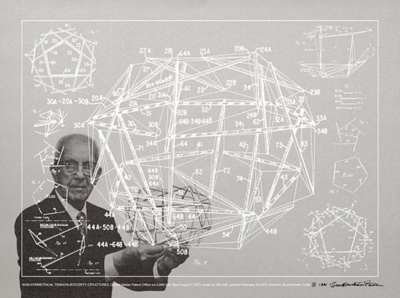
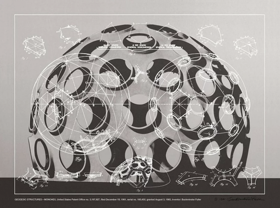
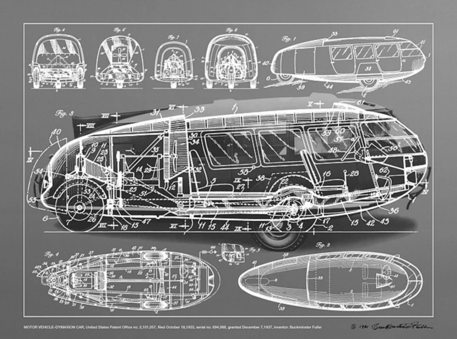
In addition to his formidable body of work in architecture, design, and theory of the kind the world had never known before, Buckminster Fuller also knew how to promote himself. Sometimes this meant appearing on late-night new-age talk shows, but at its core it meant coming up with ideas that would immediately “read” as revolutionary to anyone who saw them in action. But how to put them before the eyes of someone who hasn’t had the chance to see a geodesic dome, a Dymaxion House and Car, or even a Geodome 4 tent in real life?
The ascent of graphic design in the 20th century, a century Fuller saw begin and lived through most of, provided one promising answer: posters. The ones you see here show off “Fuller’s most famous inventions, with line drawings from his patents superimposed over a photograph of the thing itself,” writes Fast Company’s Katharine Schwab.
“While they look like something Fuller aficionados might have created after the man’s death to celebrate his work, Fuller actually created them in partnership with the gallerist Carl Solway near the end of his career.”
These posters, “striking with their two-layer design, are Fuller’s visual homage to his own genius — and an attempt to bring what he believed were world-changing utopian concepts to the masses.” They’re also now on display at the Edward Cella Art + Architecture in Los Angeles, whose exhibition “R. Buckminster Fuller: Inventions and Models” runs until November 2nd. “Fuller’s objects and prints function not only as models of the mathematical and geometric properties underlying their construction but also as elegant works of art,” says the gallery’s site. “As such, the works represent the hybridity of Fuller’s practice, and his legacy across the fields of art, design, science, and engineering.”
You can see more of Fuller’s posters, which depict and visually explain the structures of such inventions as the geodesic dome and Dymaxion Car, of course, but also lesser-known creations like a “Fly’s Eye” dome covered in bubble windows (individually swappable for solar panels), a submersible for offshore drilling, and a rowboat with a body reduced to two thin “needles,” at Designboom. Edward Cella Art + Architecture has also made the posters available for purchase at $7,000 apiece. That price might seem in contradiction with Fuller’s utopian ideals about universal accessibility through sheer low cost, but then, who could look at these and call them anything but works of art?
Based in Seoul, Colin Marshall writes and broadcasts on cities, language, and culture. His projects include the book The Stateless City: a Walk through 21st-Century Los Angeles and the video series The City in Cinema. Follow him on Twitter at @colinmarshall or on Facebook.
The connections we make between various philosophers and philosophical schools are often connections that have already been made for us by teachers and scholars on our paths through higher education. Many of us who have taken a philosophy class or two leave it at that, content we’ve got the gist of things and that specialists can parse the details perfectly well without us. But there are those curious people who continue to read abstruse and difficult philosophy after their intro classes are over, for the sheer, perverse joy of it, or from a burning desire to understand truth, beauty, justice, or whatever.
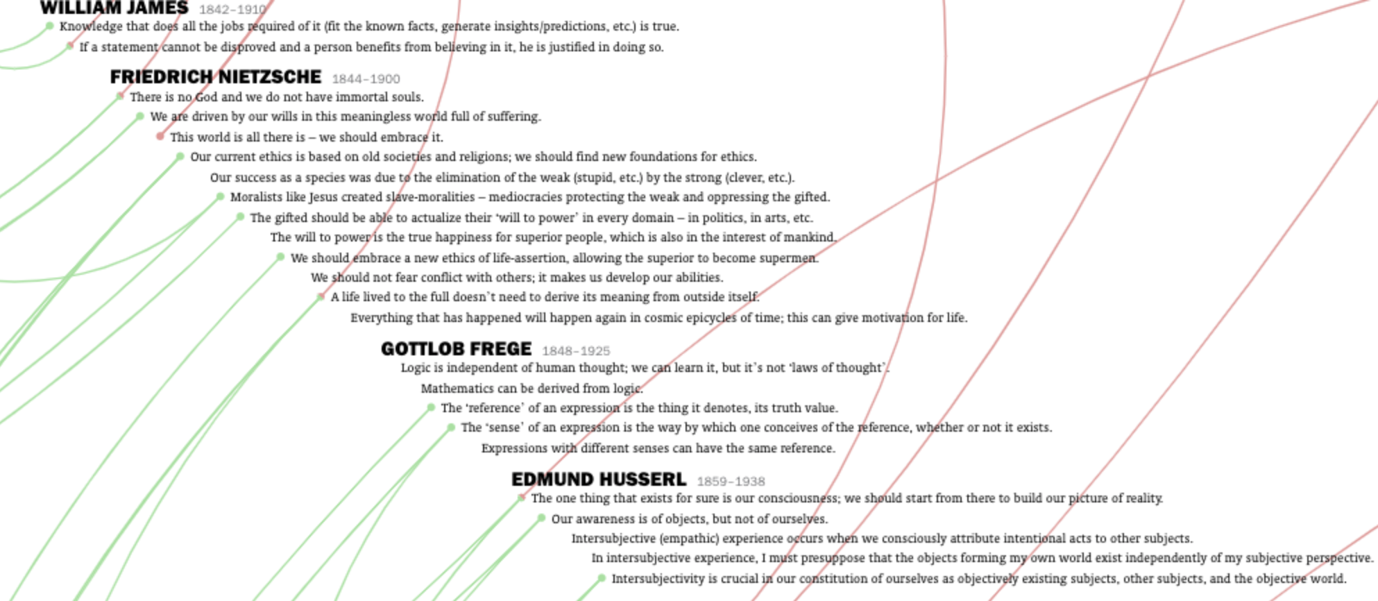
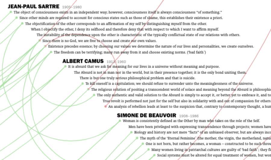
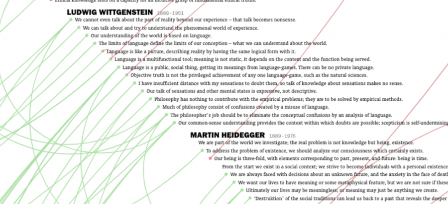
And then there are those who embark on a thorough self-guided tour of Western philosophical history, attempting, without the aid of university departments and faddish interpretive schemes, to weave the disparate strains of thought together. One such autodidact and academic outsider, designer Deniz Cem Önduygu of Istanbul, has combined an encyclopedic mind with a talent for rigorous outline organization to produce an interactive timeline of the history of philosophical ideas. It is “a purely personal project,” he writes, “that I’m doing in my own time, with my limited knowledge, for myself.”
Önduygu shares theproject not to show off his learning but, more humbly, to “get feedback and to make it accessible to those who are interested.” It may be precious few people who have both the time and inclination to teach themselves the history of philosophy, but if you are one of them, this incredibly dense infographic is as good a place to start as any, and while it may appear intimidating at first glance, its menu in the upper right corner allows users to zero in on specific thinkers and schools, and to confine themselves to smaller, more manageable areas of the whole.
As for the timeline itself, “viewers can zoom in and out,” notes Daily Nous, “and see philosophers listed in chronological order, with ideas they’re associated with listed beneath them. These ideas, in turn, are connected by green lines to similar or supporting ideas elsewhere on the timeline, and connected by red lines to opposing or refuting ideas elsewhere on the timeline. If you hover your mouse cursor over a single idea, all but it and its connected ideas fade. You can then click on the idea to bring those connected ideas closer for ease of viewing.”
The designer admits this is a “never-ending work in progress” and mainly a source for reminding himself of the main arguments of the philosophers he’s surveyed. The major sources for his timeline are “Bryan Magee’s The Story of Philosophy and Thomas Baldwin’s Contemporary Philosophy, along with other works for specific philosophers and ideas.” But many of the connections Önduygu draws in this extensive web of green and red are his own.
He explains his rationale here, noting, “The lines here do not always depict a direct transfer between two people; I think of them as tracing the development of an idea throughout time within our collective conception.” Spend some more time with this impressive project at the History of Philosophy Summarized & Visualized (the site works best in Chrome), and feel free to get in touch with its creator with constructive criticism. He welcomes feedback and is open to opposing ideas, as every lifelong learner should be.
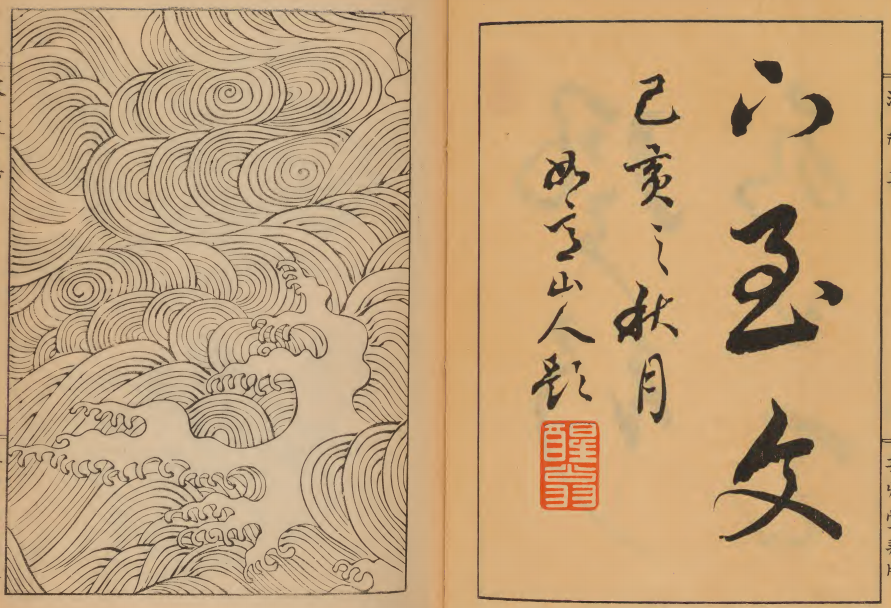
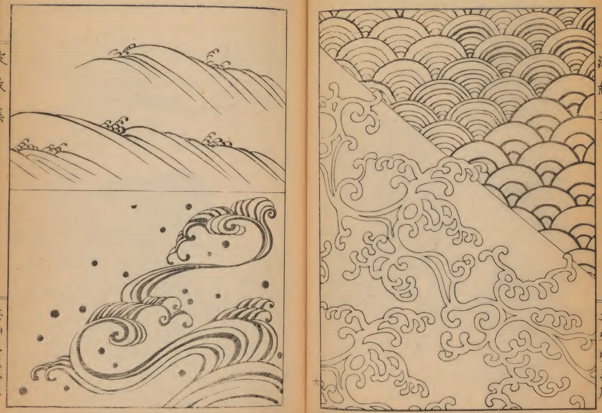
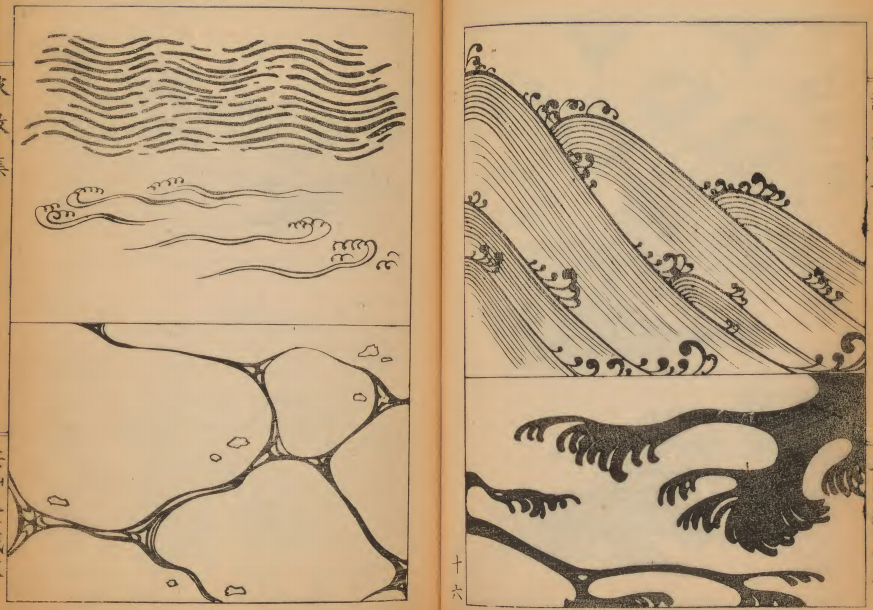
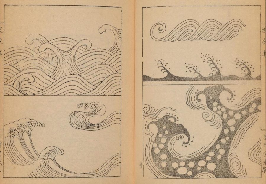
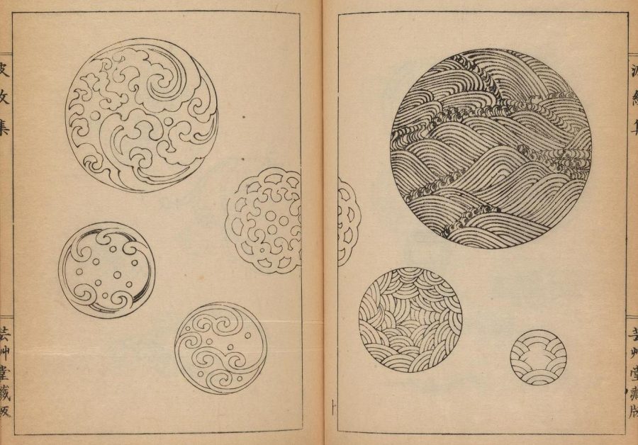
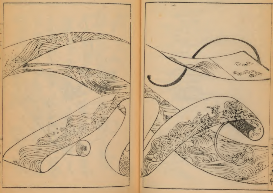
Traditional Japanese art may please so many of us, even those of us with little interest in Japan itself, because of the way it inhabits the realm between representation and abstraction. But then, it doesn’t just inhabit that realm: it has settled those borderlands, made them its own, for much longer than most cultures have been doing anything at all. The space between art, strictly defined, and what we now call design has also seen few achievements quite so impressive as those made in Japan, going all the way back to the rope markings on the clay vessels used by the islands’ Jōmon people in the 11th century BC.
Those ancient rope-on-clay markings can easily look like predecessors of the “wave patterns” still seen in Japanese art and design today. Since time almost immemorial they have appeared on “swords (both blades and handles) and associated paraphernalia (known as ‘sword furniture’), as well as lacquerware, Netsuke, religious objects, and a host of other items.”
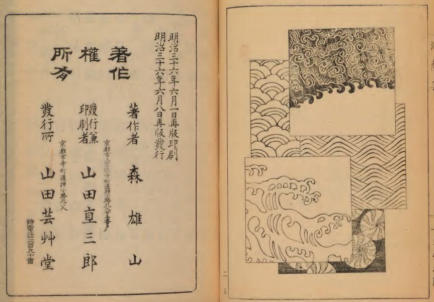
Called Hamonshū, the books were produced by the artist Mori Yuzan, “about whom not a lot is known,” adds the Public Domain review, “apart from that he hailed from Kyoto, worked in the Nihonga style” — or the “Japanese painting” style of Japanese painting, which emerged during the Meiji period, a time of rapid Westernization in Japan.
He “died in 1917. The works would have acted as a kind of go-to guide for Japanese craftsmen looking to adorn their wares with wave and ripple patterns.” Though they do contain text, they require no knowledge of the Japanese language to appreciate the many illustrations they present.
Taken together, Mori’s books offer a complete spectrum from traditional Japanese-style representation — especially of land, water, mountains, sky, and other natural elements — to a taste of the infinite variety of abstract patterns that result. Such imagery remains prevalent in Japan more than a century after the publication of Hamonshū, as any visitor to Japan today will see.
But now that the Internet Archive has made the books freely available online (volume one, volume two, volume three), they’ll surely inspire work not just between representation and abstraction as well as between art and design, but between Japanese aesthetics and those of every other culture in the world as well.
Based in Seoul, Colin Marshall writes and broadcasts on cities and culture. His projects include the book The Stateless City: a Walk through 21st-Century Los Angeles and the video series The City in Cinema. Follow him on Twitter at @colinmarshall or on Facebook.
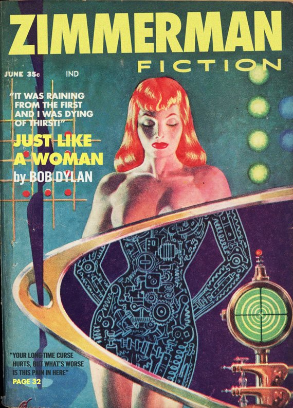
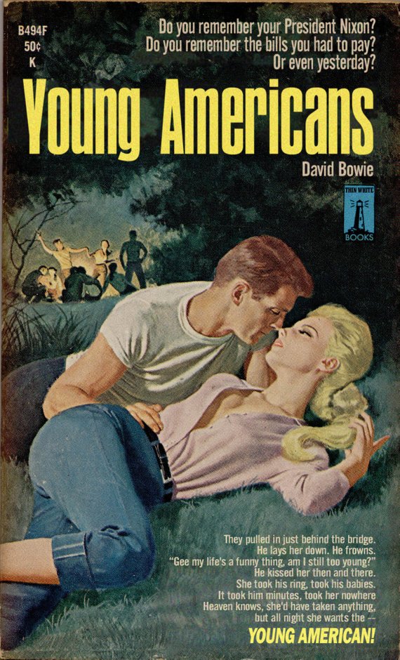
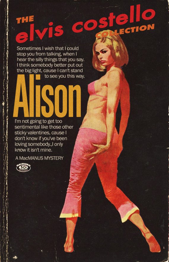
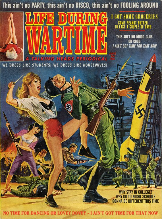
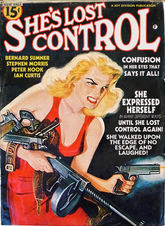
To restate what should be obvious from the second, if not first glance, none of Alcott’s titles are real. His aesthetically convincing mock-ups pay tribute to favorite songs by favorite artists: David Bowie, Talking Heads, Joy Division, Elvis Costello…
The start of the school year finds him in a Dylan mood, rendering some of his best known hits in a variety of pulp genre formats:
Bob Dylan is the perfect subject for this project, because his work has always been all about quotation and repurposing. From the very beginning, he took old songs, changed the lyrics and called them his own…. And it’s not just the melodies, he’s also not shy about lifting phrases and whole lines from other sources. One of the fun things about being a Bob Dylan fan is being able to spot the influences. It’s not just lifting lines from classic blues songs, where we don’t really know who “wrote” the originals, it’s real, identifiable, copyright-protected material. And you never know where it’s going to come from, a book about the Yakuza from Japan, a cookbook, an old Time Magazine article, or 1940s noir pictures.
I was watching a classic Robert Mitchum noir, Out of the Past, and Mitchum is talking to someone, and they mention San Francisco, and Mitchum says “I always liked San Francisco, I was there for a party once.”
And I was like “Wait, what?” Because that’s a line from a really obscure Dylan song, “Maybe Someday,” off his album Knocked-Out Loaded.
I was like “Wait, why did that line stick in Dylan’s mind? Why did he decide to quote that? Is it just the way Mitchum says it? What happened there?” And suddenly a song I hadn’t thought about much became a lot more interesting.
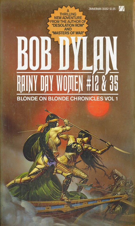
So for my Dylan covers, I try to carry on that tradition of taking quotes and repurposing them. So “Just Like a Woman” becomes a story in a science-fiction pulp, and “Like a Rolling Stone” becomes an expose on juvenile delinquency, and “Rainy Day Women” becomes a post-apocalyptic adventure story.
In a way, it’s what this project is all about, taking discarded pieces of culture and sticking them back together with new references to make them breathe again.
From a design standpoint, it’s a great illustration of the heavy lifting a single well-chosen punctuation change can do.
The magazine’s title is an extra gift to Dylan fans.
The Blonde-on-Blonde Chroniclescontinue with Rainy Day Women #12 & 35. Does it matter that the breast-plated, and for all practical purposes bottomless warriors are raven tressed?
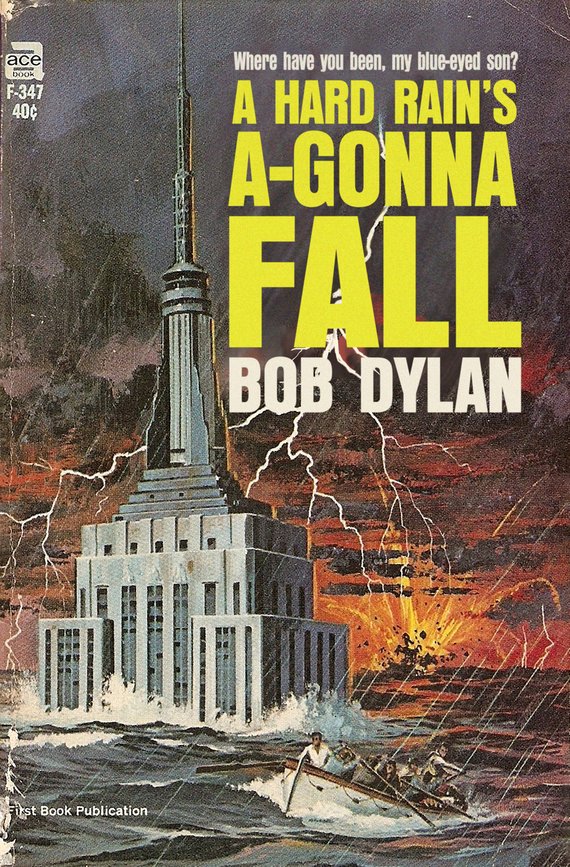
It’s not the fallout rain. It isn’t that at all. The hard rain’s gonna fall is in the last verse…That means all the lies, you know, that people get told on their radios and in newspapers. All you have to think for a minute, you know. Trying to take people’s brains away, you know. Which maybe has been done already. I hate to think it’s been done. All the lies, which I consider poison.
This writer can think of another reason citizens might find themselves fighting for their lives in a rowboat level with the very tippy top of the Empire State Building. So, I suspect, can Alcott.
Or maybe we’re wrong and climate change is nothing but fake news.
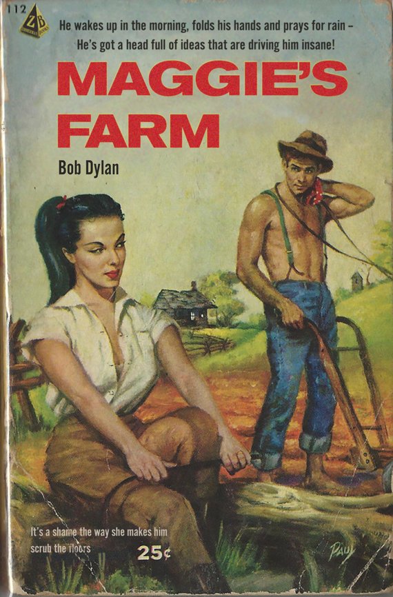
Alcott gets some mileage out of another rain-based lyric on Maggie’s Farm, a steamy rural romp whose creased cover is also part and parcel of the genre.
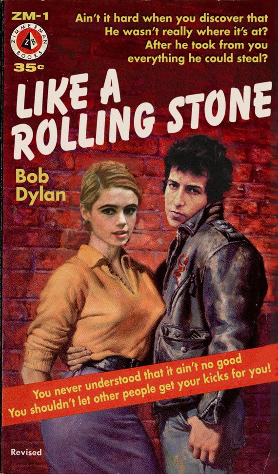
Who’s that young punk on the cover of Like a Rolling Stone? Beats me, but the girl’s a dead ringer for Warhol superstar, Edie Sedgwick, the purported inspiration for the song that shares the novel’s name. Ms. Sedgwick’s real life figure was much less voluptuous, but if the genre covers that sparked this project demonstrate anything, it’s that sex sells.
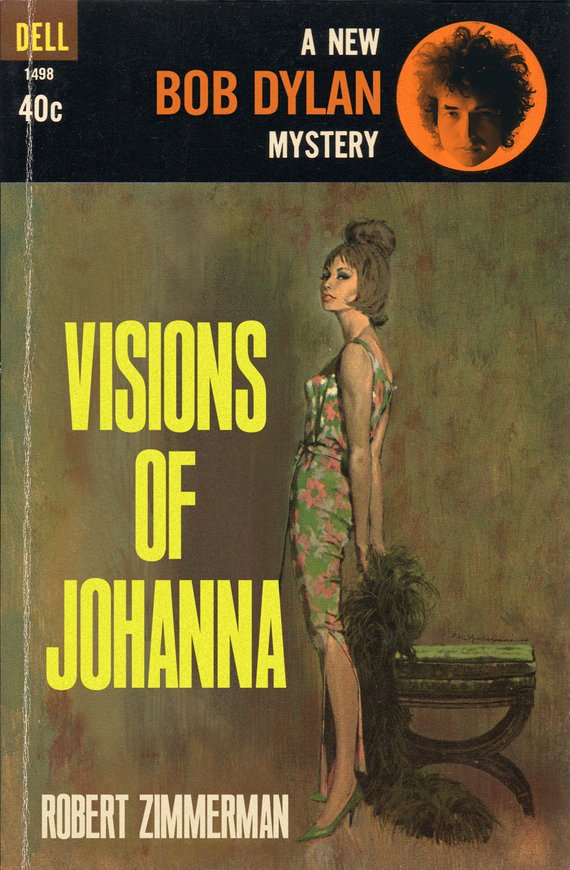
Visions of Johanna is positively understated in comparison. While many pulp authors toiled in obscurity, let us pretend that Nobel Prize winner and (faux) pulp-novelist Dylan wouldn’t have. Especially if he had a series like the pseudonymous Brett Halliday’s popular Mike Shayne mysteries. At that level, the cover wouldn’t really need quotes.
Though what harm would there be? There’s plenty of negative space here. Readers, which line would you splash across the cover if you were this prankster, Alcott?
Ain’t it just like the night to play tricks when you’re tryin’ to be so quiet?
We sit here stranded, though we’re all doin’ our best to deny it
And Louise holds a handful of rain, temptin’ you to defy it
Lights flicker from the opposite loft
In this room the heat pipes just cough
The country music station plays soft
But there’s nothing, really nothing to turn off
Just Louise and her lover so entwined
And these visions of Johanna that conquer my mind
In the empty lot where the ladies play blindman’s bluff with the key chain
And the all-night girls they whisper of escapades out on the “D” train
We can hear the night watchman click his flashlight
Ask himself if it’s him or them that’s really insane
Louise, she’s all right, she’s just near
She’s delicate and seems like the mirror
But she just makes it all too concise and too clear
That Johanna’s not here
The ghost of ’lectricity howls in the bones of her face
Where these visions of Johanna have now taken my place
Now, little boy lost, he takes himself so seriously
He brags of his misery, he likes to live dangerously
And when bringing her name up
He speaks of a farewell kiss to me
He’s sure got a lotta gall to be so useless and all
Muttering small talk at the wall while I’m in the hall
How can I explain?
Oh, it’s so hard to get on
And these visions of Johanna, they kept me up past the dawn
Inside the museums, Infinity goes up on trial
Voices echo this is what salvation must be like after a while
But Mona Lisa musta had the highway blues
You can tell by the way she smiles
See the primitive wallflower freeze
When the jelly-faced women all sneeze
Hear the one with the mustache say, “Jeeze
I can’t find my knees”
Oh, jewels and binoculars hang from the head of the mule
But these visions of Johanna, they make it all seem so cruel
The peddler now speaks to the countess who’s pretending to care for him
Sayin’, “Name me someone that’s not a parasite and I’ll go out and say a prayer for him”
But like Louise always says
“Ya can’t look at much, can ya man?”
As she, herself, prepares for him
And Madonna, she still has not showed
We see this empty cage now corrode
Where her cape of the stage once had flowed
The fiddler, he now steps to the road
He writes ev’rything’s been returned which was owed
On the back of the fish truck that loads
While my conscience explodes
The harmonicas play the skeleton keys and the rain
And these visions of Johanna are now all that remain
You can see more of Todd Alcott’s Mid-Century Pulp Fiction Cover project, and pick up archival quality prints from his Etsy shop.
Rather, it’s a portrait of ambivalence, viewed at some remove.
The same cannot be said for Young Americans, the wholly imaginary midcentury pulp novel.
One look at the lurid cover, above, and one can guess the sort of steamy passages contained within. Bowie’s sweaty palmed classmates at Bromley Technical High School could probably have recited them from memory!
He’s also got quite a knack for extracting lyrics from their original context and rendering them in the period font, magically retooling them as the sort of suggestive quotes that once beckoned from drugstore book racks.
Font has been important to him since the age of 13, when a school art project required him to combine text with an image:
I decided that I wanted the text to look like the text I’d seen in an ad for a John Lennon album, so I copied that font style. I didn’t know that the font style had a name, but I knew that my instincts for how to draw those letters didn’t match how the letters ended up looking. The font, as it turns out, was Franklin Gothic, and, as a 13-year-old, all I remember was that I would start to draw the “S” and then realize that my “S” didn’t look like Franklin Gothic’s “S,” and that the curvy letters, like “G” and “O,” didn’t look right when they sat on the lines I’d made for the other letters, because of course for a font, the curvy letters have to be a little bit bigger than the straight letters, or else they end up looking too small. I became fascinated with that kind of thing, how one font would give off one kind of feeling, and other one would give off a completely different feeling. And it turns out there’s a reason for all of that, that every font carries with it a specific cultural connotation whether the reader is aware of it or not. When I drive down the street in LA, I see billboards and I can’t just look at one and say “Okay, got it,” I get a whole other layer of meaning from them because their design and font choices tell me a whole history of the people who designed them.
While Alcott discovers many of his visuals online, he has a soft spot for the battered originals he finds in second hand shops. Their wear and tear confers the sort of verisimilitude he seeks. The rest is equal parts inspiration, Photoshop, and a growing understanding of a design form he once dismissed as the tawdry fruit of Low Culture:
I’d never understood pulp design until I started this project. As I started looking at it, I realized that the aesthetic of pulp is so deeply attached to its product that it’s impossible to separate the two. And that’s what great design is, a graphic representation of ideas. When I started examining the designs, to see why some work and some don’t, I was overwhelmed with the sheer amount of artistry involved in the covers. Pulp was a huge cultural force, there were dozens of magazines and publishers, cranking out stuff every month for decades, detective stories and police stories and noir stories and mysteries. It employed thousands of artists, writers and painters and illustrators. And the energy of the paintings is just off the charts. It had to be, because any given book cover had to compete with the ten thousand other covers that were on display. It had to grab the viewer fast, and make that person pick up the book instead of some other book. I love all kinds of midcentury stuff, but nothing grabs you the way a good pulp cover does.
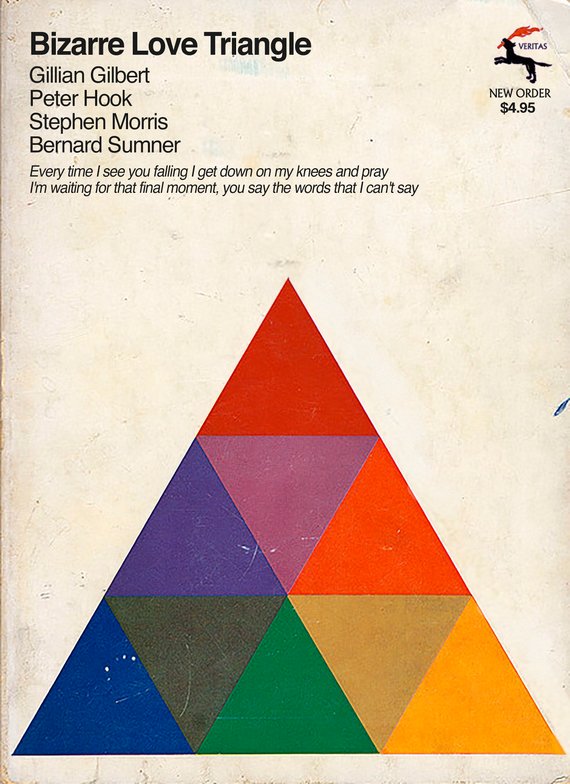
Not all of his mash ups traffic in mid-century drugstore rack nymphomania.
Needless to say, Alcott’s covers are also a tribute to the musicians he lists as authors, particularly those dating to his New Wave era youth—Bowie, Costello, Joy Division, Talking Heads, King Crimson…
I know I could find more popular contemporary artists to make tributes for, but these are the artists I love, I connect to their work on a deep level, and I try to make things that they would see and think “Yeah, this guy gets me.”
My favorite thing is when people think the pieces are real. That’s the highest compliment I can receive. I’ve had band members contact me and say “Where did you find this?” or “I don’t even remember doing this album” or “Where did you find this?” That’s when I know I’ve successfully combined ideas.
We're hoping to rely on loyal readers, rather than erratic ads. Please click the Donate button and support Open Culture. You can use Paypal, Venmo, Patreon, even Crypto! We thank you!
Open Culture scours the web for the best educational media. We find the free courses and audio books you need, the language lessons & educational videos you want, and plenty of enlightenment in between.