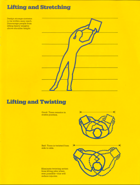
The invention of siblings Miklós and Étienne Vadász, the world’s first pocket record player caused a stir when it was introduced a century ago, nabbing first prize at an international music exhibition and finding favor with modernist architect Le Corbusier, who hailed it for embodying the “essence of the esprit nouveau.”
Unlike more recent portable audio innovations, some assembly was required.
It’s fair to assume that the Stanford Archive of Recorded Sound staffer deftly unpacking antique Mikiphone components from its cunning Sony Discman-sized case, above, has more practice putting the thing together than a nervous young fella eager to woo his gal al fresco with his just purchased, cutting edge 1924 technology.
A period advertisement extols the Mikiphone’s portability …
Fits in a jacket pocket
Goes in a lady’s handbag
Will hang on a cycle frame
Goes in a car door pocket
Ideal for picnics, car jaunts, river trips
…but fails to mention that in order to enjoy it, you’d also have to schlep along a fair amount of 78 RPM records, whose 10-inch diameters aren’t nearly so pocket and purse-compatible.
Maison Paillard produced approximately 180,000 of these hand-cranked wonders over the course of three years. When sales dropped in 1927, the remaining stock was sold off at a discount or given away to contest winners.
These days, an authentic Mikphone can fetch $500 and upward at auction. (Beware of Mikiphonies!)
Even those who remain impervious to disco fever seem willing to acknowledge its cultural significance as evidenced by a recent exchange on the Trouser Press forum:
It was everywhere and could indeed get tiresome. But today I can appreciate how well put-together those records by an artist like the Bee Gees were…
Hearing techno for the first time in the early 90s, and realizing it was just disco in a new, all-electronic package, made me realize how good a lot of it was…
And while the disco explosion eventually saw young straight singles doing the Bump in Indianapolis, Phoenix, and Spokane, Dorothy sticks close to the epicenter by including such legendary New York City clubs as Studio 54, The Gallery, Paradise Garage, The Saint, and The Loft, a private discotheque in DJ David Mancuso’s Lower Manhattan apartment.
There was a mix of sexual orientation, there was a mix of races, mix of economic groups. A real mix, where the common denominator was music.
One can’t mention the music at The Loft without giving props to the innovative and efficient sound system Rosner devised for Mancuso’s 1,850-square-foot space, using a McIntosh amplifier, an AR amplifier, Vega bass bottom speakers, and two Klipschorn Cornwall loudspeakers, whose circuit diagram inspired the Disco Love Blueprint’s layout.
As composer and producer Matt Sommers told The Vinyl Factory, those speakers surrounded dancers with the sort of high volume, undistorted sound they could lose themselves in:
…the Mancuso parties were unique because what he did was take it to a whole other level and created that envelopment experience where you could really get lost and I think that’s what people love about that, because you can just let your troubles go and enjoy it.
The non-profit digital library Internet Archive is rich in interesting material, but its lack of curation can often leave the user feeling like they’re sorting through the world’s most disorganized junk shop, rooting for hidden treasure.
Marier was also discouraged by “a combination of confusing boolean operators and an absolute hodgepodge of different metadata tags and category names:
I figured that if I was having these problems, then there were likely other folks who were as well. So I decided to put my design skills to good use and work on a solution. The biggest issues that I felt needed to be solved were the user experience, and the content curation. For the archive’s curation, I opted to curate each item manually. While I could have likely figured out a way to curate these items using an automated script, I feel that there is an inherent value to human curation. When a collection is curated by a computer it can seem confusing and arbitrary. Whereas with human curation there is often a deliberate connection between each object in the collection. For the navigation I wanted to ensure that it was simple enough that anyone could understand it and operate it. So instead of having a ton of complex operators, I instead decided to organize them by their aspect in design.
Graphic design nerds, rejoice!
Marier determines which of the finds should make the cut by considering relevance and image quality.
A quick peek suggests graphic designers are not the only ones who stand to benefit from this labor of love.
Educators, historians, and activists will be rewarded with a supplement to the Guardian from February 1970, which provided an overview of the Black Panther Party in their own words. There’s a ton of information and history packed into these 8 pages, from its formation and its 10-point program, to an interview with then-incarcerated party chairman Bobby Seale.
The IBM Ergonomics Handbook from 1989 addresses an evergreen topic. Office managers, physical therapists, and digital nomads should take note. Its recommendations on configuring the work space for maximum efficiency, productivity and employee comfort are solid. It’s not this handsome little yellow and blue employee manual’s fault that references to now-obsolete technology render it a bit quaint:
Think of two fairly recent innovations in our lives — the push button telephone and the pocket calculator. Both have a standard key set layout, but not the same layout.
Marier elected to let each pick be represented by its covers, figuring “what better way to browse designed objects than by how they look.”
We agree, though we’re worried about where this might leave 1924’s Posters & Their Designers. How can its staid blue cover compete against its sexy neighbors in the posters category?
Small business owners, set dressers and public domain fans should give Posters & Their Designers a chance. Behind that discreet blue cover are a wide assortment of stunning early 20th century posters, including some full color reproductions.
While not specifically typography related, Marier wisely gives this resource a typography tag. Hand lettering loyalists and font fanatics will find much to admire.
The artist admires the genre’s capacity for conveying subversive messages, explaining that “horror is where we think about the unthinkable and revel in the things that are bad for us:”
Drama can exalt the finest in humanity, but horror shows us who we really are. From The Golem to Frankenstein to The Shining to The Silence of the Lambs, horror uses metaphor to explore the darkest and most unforgivable aspects of human nature.
As he did with his Pulp Tarot deck, Alcott put in hundreds of research hours, studying movie posters, pulp magazines, fan mags, paperback books, and classic comics to get a feel for period design trends and execution:
I love seeing the different developments in printing, from etching to lithography to silkscreens to offset printing. All those different methods of creating images, all ridiculously complicated back then, are now taken care of easily with a few mouse clicks. In my own perverse way, I want to bring those days back. I want to see the flaws in the process, I want to see the limitations of reproduction, and, most of all, I want to be able to feel the paper the images are printed on.
The cards of the Major Arcana are inspired by film posters spanning the silent era to the present day. Each card has close ties to Horror Tarot Studios, a fictional production company that purports to have been in business since the dawn of the motion picture.
The Justice card references marketing tactics for gritty 70s drive-in staples like Last House on the Left and I Spit on Your Grave. The deck’s instruction booklet contains a few anecdotes about the production of these movies, a helpful bit of context for those who might have missed (or skipped) that fertile era of women’s revenge pictures:
I wanted the Horror Tarot Justice to be someone the reader can root for, even if they’re horrified by what Justice promises: not death, but “what you deserve.”
You may have no knowledge of that seminal publication, but you’d probably recognize some of the cover artwork by painter Basil Gogos, featuring such MVPs as Frankenstein’s monster, the Creature from the Black Lagoon, the Phantom of the Opera and Dracula. Alcott says that many of Gogos’ iconic monster portraits are more deeply ingrained in the public memory than the art the studios chose to promote their movies:
…for the Suit of Wands I wanted to create a series of portraits done in his style, featuring characters he never got around to painting. The Four of Wands is a card about homecoming and reconciliation, and I had the idea to paint Frederick March’s Dr. Jekyll and Mr. Hyde as two separate men, meeting for the first time in a back alley in Victorian London.
A homecoming doesn’t necessarily require a physical return to a physical home — it can be completely internal. I wanted to show Dr. Jekyll coming to terms with his inner struggle.
The Suit of Swords recreates the look of another indelible horror trope — the EC comics of the 1950s:
These comics were so lurid and perverse that they actually sparked a congressional investigation, which ended up putting them out of business. Again, before the internet, this is what horror fans had available to them, and comics publishers had to keep pushing the limits of what was acceptable in order to stay ahead of the competition.
For the Five of Swords, I parodied and gender-swapped the infamous cover of Crime SuspenStories #22. The Five of Swords is a card about being a bad winner, about gloating at your opponent’s defeat, about overkill. I figured that a housewife murdering her husband and then beheading him with a sword counted as overkill.
It is generally accepted that the standard deck of playing cards we use for everything from three-card monte to high-stakes Vegas poker evolved from the Tarot. “Like our modern cards,” writes Sallie Nichols, “the Tarot deck has four suits with ten ‘pip’ or numbered cards in each…. In the Tarot deck, each suit has four ‘court’ cards: King, Queen, Jack, and Knight.” The latter figure has “mysteriously disappeared from today’s playing cards,” though examples of Knight playing cards exist in the fossil record. The modern Jack is a survival of the Page cards in the Tarot. (See examples of Tarot court cards here from the 1910 Rider-Waite deck.) The similarities between the two types of decks are significant, yet no one but adepts seems to consider using their Gin Rummy cards to tell the future.
The eminent psychiatrist Carl Jung, however, might have done so.
As Mary K. Greer explains, in a 1933 lecture Jung went on at length about his views on the Tarot, noting the late Medieval cards are “really the origin of our pack of cards, in which the red and the black symbolize the opposites, and the division of the four—clubs, spades, diamonds, and hearts—also belongs to the individual symbolism.
They are psychological images, symbols with which one plays, as the unconscious seems to play with its contents.” The cards, said Jung, “combine in certain ways, and the different combinations correspond to the playful development of mankind.” This, too, is how Tarot works—with the added dimension of “symbols, or pictures of symbolical situations.” The images—the hanged man, the tower, the sun—“are sort of archetypal ideas, of a differentiated nature.”
Thus far, Jung hasn’t said anything many orthodox Jungian psychologists would find disagreeable, but he goes even further and claims that, indeed, “we can predict the future, when we know how the present moment evolved from the past.” He called for “an intuitive method that has the purpose of understanding the flow of life, possibly even predicting future events, at all events lending itself to the reading of the conditions of the present moment.” He compared this process to the Chinese I Ching, and other such practices. As analyst Marie-Louise von Franz recounts in her book Psyche and Matter:
Jung suggested… having people engage in a divinatory procedure: throwing the I Ching, laying the Tarot cards, consulting the Mexican divination calendar, having a transit horoscope or a geometric reading done.
Content seemed to matter much less than form. Invoking the Swedenborgian doctrine of correspondences, Jung notes in his lecture, “man always felt the need of finding an access through the unconscious to the meaning of an actual condition, because there is a sort of correspondence or a likeness between the prevailing condition and the condition of the collective unconscious.”
What he aimed at through the use of divination was to accelerate the process of “individuation,” the move toward wholeness and integrity, by means of playful combinations of archetypes. As another mystical psychologist, Alejandro Jodorowsky, puts it, “the Tarot will teach you how to create a soul.” Jung perceived the Tarot, notes the blog Faena Aleph, “as an alchemical game,” which in his words, attempts “the union of opposites.” Like the I Ching, it “presents a rhythm of negative and positive, loss and gain, dark and light.”
Much later in 1960, a year before his death, Jung seemed less sanguine about Tarot and the occult, or at least downplayed their mystical, divinatory power for language more suited to the laboratory, right down to the usual complaints about staffing and funding. As he wrote in a letter about his attempts to use these methods:
Under certain conditions it is possible to experiment with archetypes, as my ‘astrological experiment’ has shown. As a matter of fact we had begun such experiments at the C. G. Jung Institute in Zurich, using the historically known intuitive, i.e., synchronistic methods (astrology, geomancy, Tarot cards, and the I Ching). But we had too few co-workers and too little means, so we could not go on and had to stop.
Later interpreters of Jung doubted that his experiments with divination as an analytical technique would pass peer review. “To do more than ‘preach to the converted,’” wrote the authors of a 1998 article published in the Journal of Parapsychology, “this experiment or any other must be done with sufficient rigor that the larger scientific community would be satisfied with all aspects of the data taking, analysis of the data, and so forth.” Or, one could simply use Jungian methods to read the Tarot, the scientific community be damned.
You can see images of each of Wang’s cards here. His books purport to be exhaustive studies of Jung’s Tarot theory and practice, written in consultation with Jung scholars in New York and Zurich. Sallie Nichols’ Jung and Tarot: An Archetypal Journey is less voluminous and innovative—using the traditional, Pamela Coleman-Smith-illustrated, Rider-Waite deck rather than an updated original version. But for those willing to grant a relationship between systems of symbols and a collective unconscious, her book may provide some penetrating insights, if not a recipe for predicting the future.
Note: An earlier version of this post appeared on our site in 2017.
If you would like to sign up for Open Culture’s free email newsletter, please find it here. It’s a great way to see our new posts, all bundled in one email, each day.
If you would like to support the mission of Open Culture, consider making a donation to our site. It’s hard to rely 100% on ads, and your contributions will help us continue providing the best free cultural and educational materials to learners everywhere. You can contribute through PayPal, Patreon, and Venmo (@openculture). Thanks!
In the striking image above, you can see an early experiment in making books portable–a 17th century precursor, if you will, to the modern day Kindle.
According to the library at the University of Leeds, this “Jacobean Travelling Library” dates back to 1617. That’s when William Hakewill, an English lawyer and MP, commissioned the miniature library–a big book, which itself holds 50 smaller books, all “bound in limp vellum covers with coloured fabric ties.” What books were in this portable library, meant to accompany noblemen on their journeys? Naturally the classics. Theology, philosophy, classical history and poetry. The works of Ovid, Seneca, Cicero, Virgil, Tacitus, and Saint Augustine. Many of the same texts that showed up in The Harvard Classics (now available online) three centuries later.
Apparently three other Jacobean Travelling Libraries were made. They now reside at the British Library, the Huntington Library in San Marino, California, and the Toledo Museum of Art in Toledo, Ohio.
If you would like to sign up for Open Culture’s free email newsletter, please find it here. It’s a great way to see our new posts, all bundled in one email, each day.
If you would like to support the mission of Open Culture, consider making a donation to our site. It’s hard to rely 100% on ads, and your contributions will help us continue providing the best free cultural and educational materials to learners everywhere. You can contribute through PayPal, Patreon, and Venmo (@openculture). Thanks!
Today it would be viewed as cultural appropriation writ large, but when Louis XIV ordered the construction of a 5‑building pleasure pavilion inspired by the Porcelain Tower of Nanjing (a 7th Wonder of the World few French citizens had viewed in person) as an escape from Versailles, and an exotic love nest in which to romp with the Marquise de Montespan, he ignited a craze that spread throughout the West.
Chinoiserie was an aristocratic European fantasy of luxurious Eastern design, what Dung Ngo, founder of AUGUST: A Journal of Travel + Design, describes as “a Western thing that has nothing to do with actual Asian culture:”
Chinoiserie is a little bit like chop suey. It was wholesale invented in the West, based on certain perceptions of Asian culture at the time. It’s very watered down.
And also way over the top, to judge by the rapturous descriptions of the interiors and gardens of Louis XIV’s Trianon de Porcelaine, which stood for less than 20 years.
The blue-and-white Delft tiles meant to mimic Chinese porcelain swiftly fell into disrepair and Madame de Montespan’s successor, her children’s former governess, the Marquise de Maintenon, urged Louis to tear the place down because it was “too cold.”
Her lover did as requested, but elsewhere, the West’s imagination had been captured in a big way.
The burgeoning tea trade between China and the West provided access to Chinese porcelain, textiles, furnishings, and lacquerware, inspiring Western imitations that blur the boundaries between Chinoiserie and Rococo styles
This blend is in evidence in Frederick the Great’s Chinese House in the gardens of Sanssouci (below).
Dr Samuel Wittwer, Director of Palaces and Collections at the Prussian Palaces and Gardens Foundation, describes how the gilded figure atop the roof “is a mixture of the Greek God Hermes and the Chinese philosopher Confucius:”
His European face is more than just a symbol of intellectual union between Asia and Europe…The figure on the roof has an umbrella, an Asian symbol of social dignity, which he holds in an eastern direction. So the famous ex oriente lux, the good and wise Confucian light from the far east, is blocked by the umbrella. Further down, we notice that the foundations of the building seem to be made of feathers and the Chinese heads over the windows, resting on cushions like trophies, turn into a monkey band in the interior. The frescoes in the cupola mainly depict monkeys and parrots. As we know, these particular animals are great imitators without understanding.
Frederick’s enthusiasm for chinoiserie led him to engage architect Carl von Gontard to follow up the Chinese House with a pagoda-shaped structure he named the Dragon House (below) after the sixteen creatures adorning its roof.
Dragons also decorate the roof of the Great Pagoda in London’s Kew Gardens, though the gilded wooden originals either succumbed to the elements or were sold off to settle George IV’s gambling debts in the late 18th century.
There are even more dragons to be found on the Chinese Pavilion at Drottningholm, Sweden, an architectural confection constructed by King Adolf Fredrik as a birthday surprise for his queen, Louisa. The queen was met by the entire court, cosplaying in Chinese (or more likely, Chinese-inspired) garments.
Not to be outdone, Russia’s Catherine the Great resolved to “capture by caprice” by building a Chinese Village outside of St. Petersburg.
Architect Charles Cameron drew up plans for a series of pavilions surrounding a never-realized octagonal-domed observatory. Instead, eight fewer pavilions than Cameron originally envisioned surround a pagoda based on one in Kew Gardens.
Having survived the Nazi occupation and the Soviet era, the Chinese Village is once again a fantasy plaything for the wealthy. A St. Petersburg real estate developer modernized one of the pavilions to serve as a two-bedroom “weekend cottage.”
Given that no record of the original interiors exists, designer Kirill Istomin wasn’t hamstrung by a mandate to stick close to history, but he and his client still went with “numerous chinoiserie touches” as per a feature in Elle Decor:
Panels of antique wallpapers were framed in gilded bamboo for the master bedroom, and vintage Chinese lanterns, purchased in Paris, hang in the dining and living rooms. The star pieces, however, are a set of 18th-century porcelain teapots, which came from the estate of the late New York socialite and philanthropist Brooke Astor.
In high school, the language I most fell in love with happened to be a dead one: Latin. Sure, it’s spoken at the Vatican, and when I first began to study the tongue of Virgil and Catullus, friends joked that I could only use it if I moved to Rome. Tempting, but church Latin barely resembles the classical written language, a highly formal grammar full of symmetries and puzzles. You don’t speak classical Latin; you solve it, labor over it, and gloat, to no one in particular, when you’ve rendered it somewhat intelligible. Given that the study of an ancient language is rarely a conversational art, it can sometimes feel a little alienating.
And so you might imagine how pleased I was to discover what looked like classical Latin in the real world: the text known to designers around the globe as “Lorem Ipsum,” also called “filler text” and (erroneously) “Greek copy.”
The idea, Priceonomics informs us, is to force people to look at the layout and font, not read the words. Also, “nobody would mistake it for their native language,” therefore Lorem Ipsum is “less likely than other filler text to be mistaken for final copy and published by accident.” If you’ve done any web design, you’ve probably seen it, looking something like this:
Lorem ipsum dolor sit amet, consectetur adipiscing elit, sed do eiusmod tempor incididunt ut labore et dolore magna aliqua. Ut enim ad minim veniam, quis nostrud exercitation ullamco laboris nisi ut aliquip ex ea commodo consequat. Duis aute irure dolor in reprehenderit in voluptate velit esse cillum dolore eu fugiat nulla pariatur. Excepteur sint occaecat cupidatat non proident, sunt in culpa qui officia deserunt mollit anim id est laborum.
When I first encountered this text, I did what any Latin geek will—set about trying to translate it. But it wasn’t long before I realized that Lorem Ipsum is mostly gibberish, a garbling of Latin that makes no real sense. The first word, “Lorem,” isn’t even a word; instead it’s a piece of the word “dolorem,” meaning pain, suffering, or sorrow. So where did this mash-up of Latin-like syntax come from, and how did it get so scrambled? First, the source of Lorem Ipsum—tracked down by Hampden-Sydney Director of Publications Richard McClintock—is Roman lawyer, statesmen, and philosopher Cicero, from an essay called “On the Extremes of Good and Evil,” or De Finibus Bonorum et Malorum.
Why Cicero? Put most simply, writes Priceonomics, “for a long time, Cicero was everywhere.” His fame as the most skilled of Roman rhetoricians meant that his writing became the benchmark for prose in Latin, the standard European language of the Middle Ages. The passage that generated Lorem Ipsum translates in part to a sentiment Latinists will well understand:
Nor is there anyone who loves or pursues or desires to obtain pain of itself, because it is pain, but occasionally circumstances occur in which toil and pain can procure him some great pleasure.
Dolorem Ipsum, “pain in and of itself,” sums up the tortuous feeling of trying to render some of Cicero’s complex, verbose sentences into English. Doing so with tolerable proficiency is, for some of us, “great pleasure” indeed.
But how did Cicero, that master stylist, come to be so badly manhandled as to be nearly unrecognizable? Lorem Ipsum has a history that long predates online content management. It has been used as filler text since the sixteenth century when—as McClintock theorized—“some typesetter had to make a type specimen book, to demo different fonts” and decided that “the text should be insensible, so as not to distract from the page’s graphical features.” It appears that this enterprising craftsman snatched up a page of Cicero he had lying around and turned it into nonsense. The text, says McClintock, “has survived not only four centuries of letter-by-letter resetting but even the leap into electronic typesetting, essentially unchanged.”
The story of Lorem Ipsum is a fascinating one—if you’re into that kind of thing—but its longevity raises a further question: should we still be using it at all, this mangling of a dead language, in a medium as vital and dynamic as web publishing, where “content” refers to hundreds of design elements besides font. Is Lorem Ipsum a quaint piece of nostalgia that’s outlived its usefulness? In answer, you may wish to read Karen McGrane’s spirited defense of the practice. Or, if you feel it’s time to let the garbled Latin go the way of manual typesetting machines, consider perhaps as an alternative “Nietzsche Ipsum,” which generates random paragraphs of mostly verb-less, incoherent Nietzsche-like text, in English. Hey, at least it looks like a real language.
Note: An earlier version of this post appeared on our site in 2015.
We're hoping to rely on loyal readers, rather than erratic ads. Please click the Donate button and support Open Culture. You can use Paypal, Venmo, Patreon, even Crypto! We thank you!
Open Culture scours the web for the best educational media. We find the free courses and audio books you need, the language lessons & educational videos you want, and plenty of enlightenment in between.