The subway is a marvel of engineering, and so is the modern subway map.
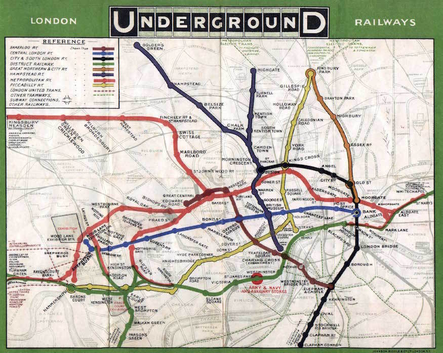
For the first 25 years of its existence, London Underground riders relied on a map that reflected the actual distance between stations, as well as rivers, parks, and other aboveground phenomena.
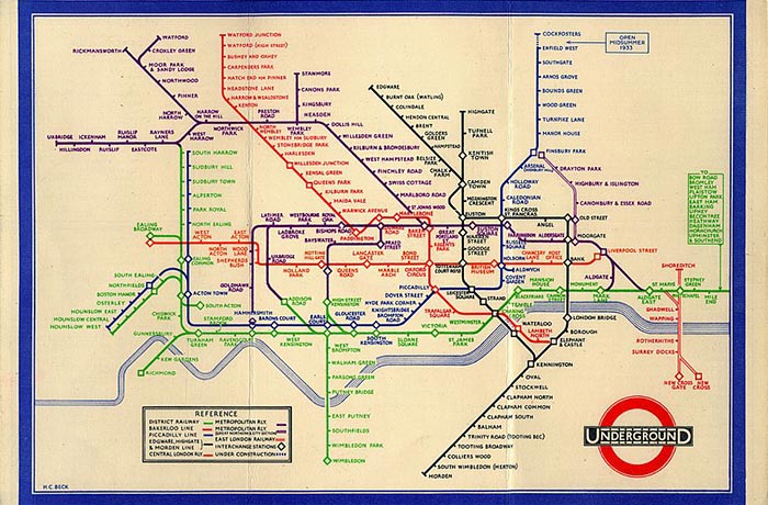
As designer Michael Bierut observes in the video at the top, the radically revised approach it finally adopted in 1933 proved so intuitive and easy to use, it remains the universal template for modern subway maps.
The brainchild of Harry Beck, a young draftsman in the London Underground Signals Office, the new map is more accurately a diagram that prioritized riders’ needs.
He did away with all aboveground references save the Thames, and replotted the stations at equidistant points along color-coded straight lines.
This innovation—for which he was paid about $8—helped riders to glean at a glance where to make the subterranean connections that would allow them to travel from point A to point B.
The former senior curator of London Transport Museum, Anna Renton, said in an interview with The Verge that Beck’s design may have helped persuade city dwellers to make the leap to suburbs serviced by the Underground “by making them look closer to the center, and showing how easy it was to commute.”
It’s not Beck’s fault if service falls short of his map’s efficient ideal, particularly on nights and weekends, when track work and service advisories abound, rendering such commutes a nightmare.
Two years ago, we highlighted collector David Rumsey’s huge map archive, which he donated to Stanford University in April of 2016 and which now resides at Stanford’s David Rumsey Map Center. The opening of this physical collection was a pretty big deal, but the digital collection has been on the web, in some part, and available to the online public since 1996. Twenty years ago, however, though the internet was decidedly becoming an everyday feature of modern life, it was difficult for the average person to imagine the degree to which digital technology would completely overtake our lives, not to mention the almost unbelievable wealth and power tech companies would amass in such short time.
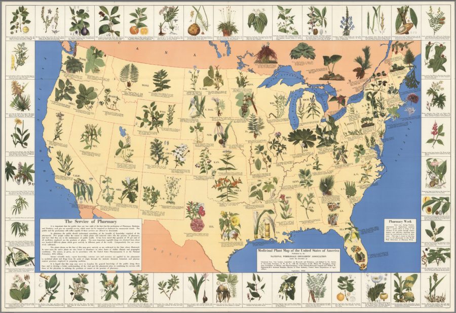
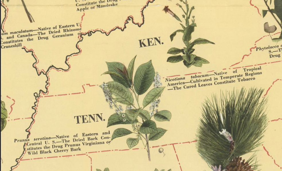
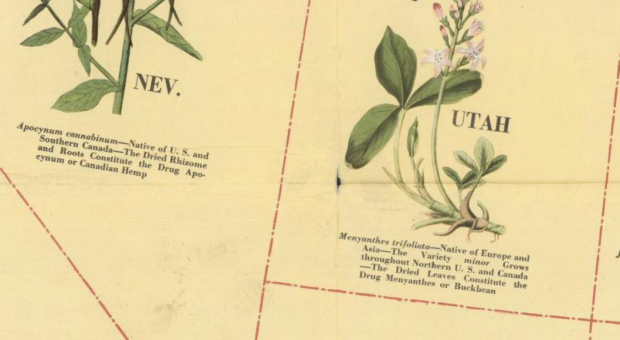
But the pharmacists had a clue. The map, produced by the National Wholesale Druggists’ Association, “was intended to boost the image of the profession,” writes Rebecca Onion at Slate, “at a time when companies were increasingly compounding new pharmaceuticals in labs,” thereby rendering much of the drug-making knowledge and skill of old-time druggists obsolete.
Although the commercial pharmaceutical industry began taking shape in the late 19th century, it didn’t fully come into its own until the so-called “golden era” of 1930–1960, when, says Onion, researchers developed “a flood of new antibiotics, psychotropics, antihistamines, and vaccines, increasingly relying on synthetic chemistry to do so.” Over-the-counter medications proliferated, and pharmacists became alarmed. They sought to persuade the public of their continued relevance by pointing out, as a short blurb at the bottom left corner of the map notes, that “few people realize the extent to which plants and minerals enter into the practice of pharmacy.”
The map appeared during “Pharmacy Week” in October, when “pharmacists in Anglo-Saxon countries” promote their services. Losing sight of those important services, the Druggists’ Association writes, will lead to suffering, should the traditional pharmacist’s function “be impaired or destroyed by commercial trends.” Thus we have this visual demonstration of competence. The map identifies important species—native or cultivated—in each region of the country. In Kentucky, we see Nicotina tabacum, whose cured leaves, you guessed it, “constitute tobacco.” Across the country in Nevada, we are introduced to Apocynum cannabinum, “native of U.S. and Southern Canada—the dried rhizome and roots constitute the drug apocynum or Canadian hemp.”
The better-known Cannibus sativa also appears, in one of the boxes around the map’s border that introduce plants from outside North America, including Erythroxylon coca, from Bolivia and Peru, and Papaver somniferum, from which opium derives. Many of the other medications will be less familiar to us—and belong to what we now call naturopathy, herbalism, or, more generally, “traditional medicine.” Though these medicinal practices are many thousands of years old, the druggists try to project a cutting-edge image, assuring the map’s readers that “intense scientific study, expert knowledge, extreme care and accuracy are applied by the pharmacist to medicinal plants.”
While pharmacists today are highly-trained professionals, the part of their jobs that involved the making of drugs from scratch has been ceded to massive corporations and their research laboratories. The druggists of 1932 saw this coming, and no amount of colorful public relations could stem the tide. But it may be the case, given changing laws, changing attitudes, the backlash against overmedication, and the devastating opioid epidemic, that their craft is more relevant than it has been in decades, though today’s “druggists” work in marijuana dispensaries and health food stores instead of national pharmacy chains.
View and download the map in a high resolution scan at the David Rumsey Map Collection, where you can zoom in to every plant on the map and read its description.
When he first spent time in Japanese cities, urban design and history professor Barrie Shelton “was baffled, irritated, and even intimidated by what I saw. Yet at the same time I found myself energized, animated, and indeed inspired by them. The effect was liberating and my intuition was quick to suggest that further exploration of their chaotic vitality might be extremely rewarding.” That exploration involved visits to “alleys, shrine and temple precincts, highways, railway stations (and their ‘magnetic’ fields), roof-tops, observation decks, arcades, underground streets, bars, gardens,” and so on, and no less essentially included “almost compulsive poring over city maps (old and new).”
It all culminated in Shelton’s book Learning from the Japanese City, a study that can help any Westerner better understand the likes of Tokyo, Osaka, Kyoto, Kanazawa, Hiroshima, Fukuoka, or indeed Nagomuru City. You won’t find that last, however, on any map of Japan, nor will you find it in the country itself. It exists in the land of Naira, which itself exists in the mind of Japanese graphic designer and cartographer Imaizumi Takayuki. Imaizumi’s painstaking, ongoing work has produced maps of Nagomuru City that look at it in different ways in different eras, which you can browse on Let’s Go to the Imaginary Cities! On this page you can explore scrollable maps of the city by first selecting one of its thirty regions; just below that, you can also download a large PDF map of the entire metropolis.
Imaizumi’s urban cartographic vision is so richly realized that it has produced art exhibitions, a book, and even a variety of physical artifacts. On one page, for instance, you’ll find photographs of the contents of several imaginary wallets lost on the imaginary streets of Nagomuru City by its imaginary citizens. On another appear the imaginary cash cards issued by the imaginary Nagomuru Bank, complete with a pair of imaginary mascots without which, as anyone with any experience of Japan knows, no card would be complete. These artifacts and others have all come as a result of the project Imaizumi began at just ten years old, a brief history of which Japanese-readers can take inhere.
“If I can imagine a fictive nation,” writes Roland Barthes in Empire of Signs, “I can give it an invented name, treat it declaratively as a novelistic object,” then “isolate somewhere in the world (faraway) a certain number of features (a term employed in linguistics), and out of all these features deliberately form a system. It is this system which I call: Japan.” Imaizumi chose to call his system Nagomuru City, but one imagines that all its carefully created and positioned features and details — the train lines and stations, the shrines and temples, the housing developments, the convenience stores, all the things celebrated in both Empire of Signs and Learning from the Japanese City — would have fired up Barthes’ imagination just as much as did the real Japan.
Based in Seoul, Colin Marshall writes and broadcasts on cities and culture. His projects include the book The Stateless City: a Walk through 21st-Century Los Angeles and the video series The City in Cinema. Follow him on Twitter at @colinmarshall or on Facebook.
… and conclude that people who live in glass houses should stop reaching for stones.
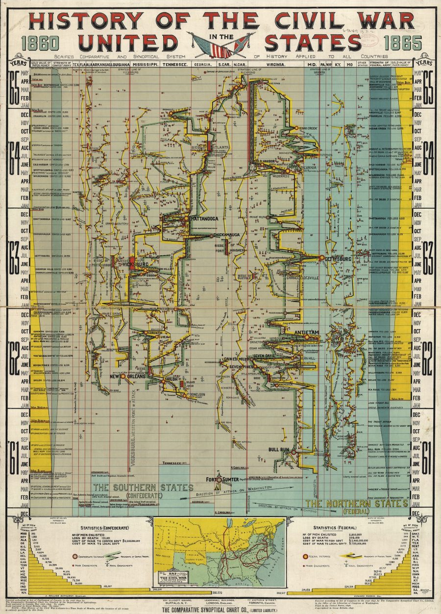
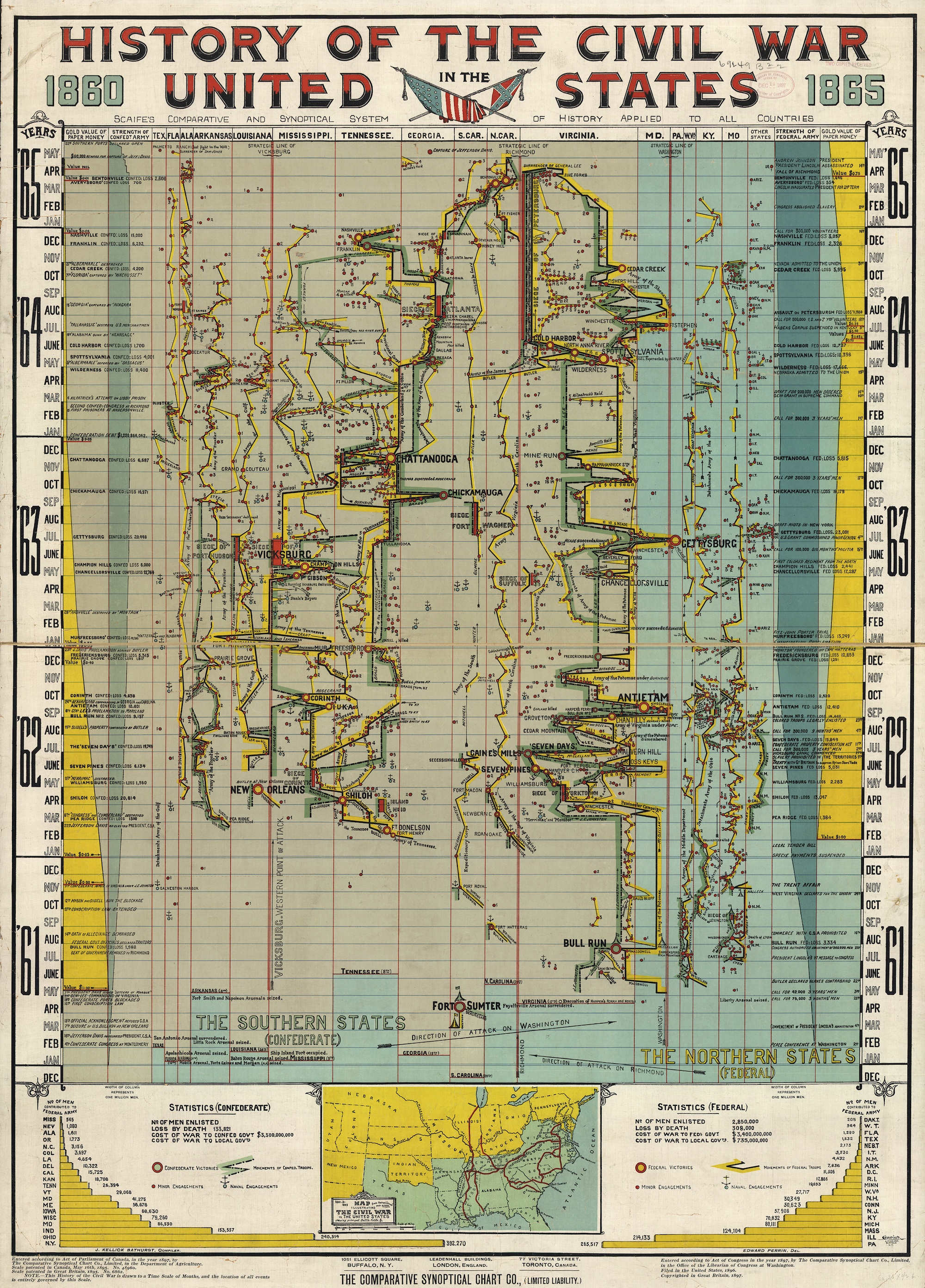
Published in 1897 by the Comparative Synoptical Chart Company, this now unfathomable document–History of the Civil War in the United States: 1860–1865–achieved its goal of squeezing the maximum amount of content onto a single sheet.
Another holds that text should be used sparingly, lest it clutter up strong visuals. Consumers have a limited attention span, and for content to be considered shareable, they should be able to take it in at a glance.
Modern eyes may be forgiven for mistaking this chart for the world’s most convoluted subway map. But those aren’t stops, friend. They’re minor engagements. Bloodier and better-known battles are delineated with larger circles—yellow centers for a Union victory, pale green for Confederate.
The fastest way to begin making heads or tails of the chart is to note that each column is assigned to a different state.
The vertical axis is divided into months. Notice all the negative space around Fort Sumter.
And the constant entries in Virginia’s column.
The publisher noted that the location of events was “entirely governed” by this time scale.
You’ll have to look hard for Lincoln’s assassination.
It would still make a superb addition to any history teacher’s classroom, both as decoration and the tinder that could ignite discussion as to how we receive information, and how much information is in fact received.
People come to know the world the way they come to map it—through their perceptions of how its elements are connected and of how they should move among them. This is precisely what the series is attempting by situating the map at the heart of cultural life and revealing its relationship to society, science, and religion…. It is trying to define a new set of relationships between maps and the physical world that involve more than geometric correspondence. It is in essence a new map of human attempts to chart the world.
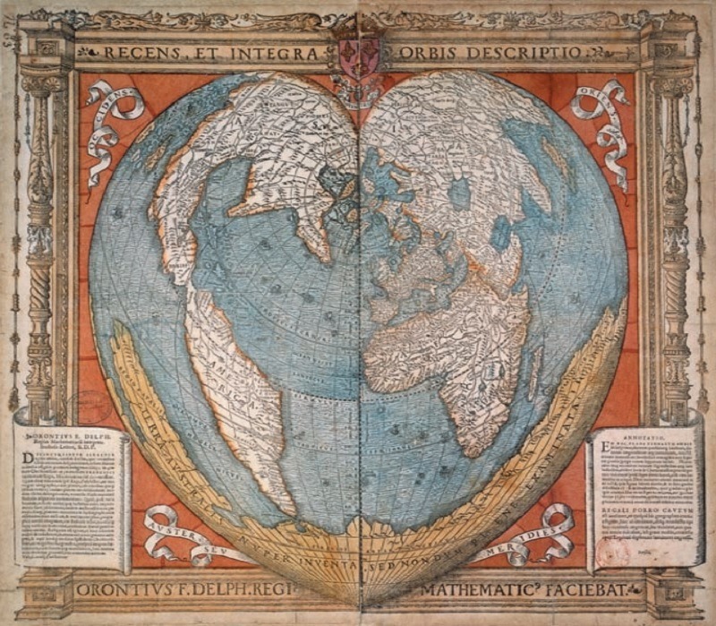
If you head over to this page, then look in the upper left, you will see links to three volumes (available in a free PDF format). My suggestion would be to look at the gallery of color illustrations for each book, links to which you’ll find below. The image above, appearing in Vol. 2, dates back to 1534. It was created by Oronce Fine, the first chair of mathematics in the Collège Royal (aka the Collège de France), and it features the world mapped in the shape of a heart. Pretty great.
Note: An earlier version of this post appeared on our site in August, 2015.
If you would like to support the mission of Open Culture, consider making a donation to our site. It’s hard to rely 100% on ads, and your contributions will help us continue providing the best free cultural and educational materials to learners everywhere. You can contribute through PayPal, Patreon, and Venmo (@openculture). Thanks!
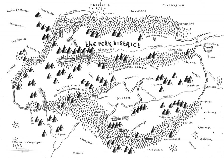
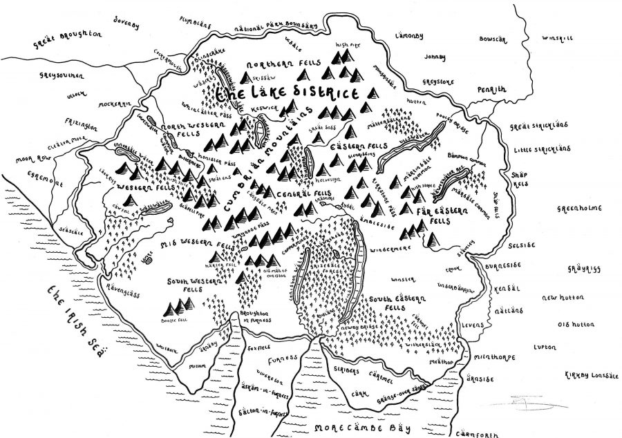
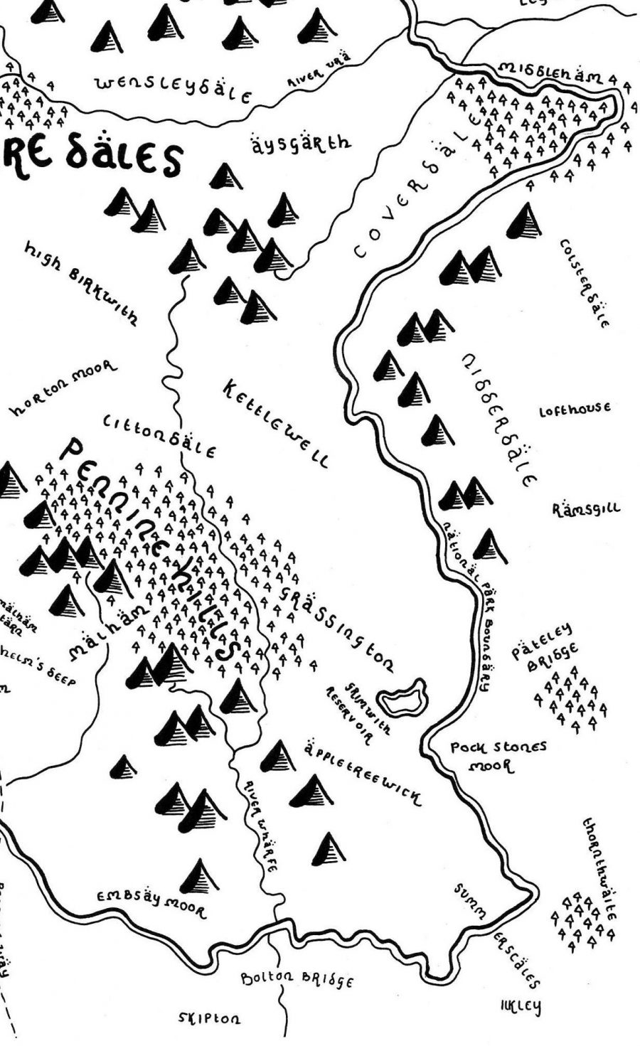
J.R.R. Tolkien imagined Middle-Earth by drawing not just from far-flung lands and old myths but the English landscape all around him. Of course, everyone who reads The Lord of the Ringstrilogy, let alone the related books written by Tolkien as well as his followers, has their own way of envisioning the place, and those who go especially deep may even start seeing their own, real environments as versions of Middle-Earth. That seems to have happened in the case of Dan Bell, an English artist who maps his homeland’s national parks in an artistic style similar to the one in which Tolkien rendered Middle-Earth.
Bell “began reading Tolkien’s books when he was 11 or 12 years old, and fell in love with them,” writes The Verge’s Andrew Liptak. “In particular, he was struck by Tolkien’s maps.” To start, he “works from an open source Ordnance Survey map, and begins drawing by hand,” adding in such additional details, not always found in most national parks, as “forests, Hobbit holes, towers, and castles.” Having so adapted the national parks of the United Kindgom “as well as places like Oxford, London, Yellowstone National Park, and George R.R. Martin’s Westeros,” he’s made them available for purchase on his site.
Most of us who first encounter The Lord of the Rings at the age Bell did have surely wished, if only for a moment or two, that we could live in Middle-Earth ourselves. Bell’s maps remind us that places like Middle-Earth always come in some way from, and resonate on some level with, the real Earth on which we have no choice but to live. Much like how the settings of science fiction stories, no matter how technologically amplified or culturally twisted and turned, always reflect the time of the story’s composition, thoroughly realized fantasy realms, no matter how fantastical — how many hobbit-holes, castles, or Eyes of Sauron with which they may be dotted — are never 100 percent made up. Just ask the tourist industry of New Zealand.
Based in Seoul, Colin Marshall writes and broadcasts on cities and culture. His projects include the book The Stateless City: a Walk through 21st-Century Los Angeles and the video series The City in Cinema. Follow him on Twitter at @colinmarshall or on Facebook.
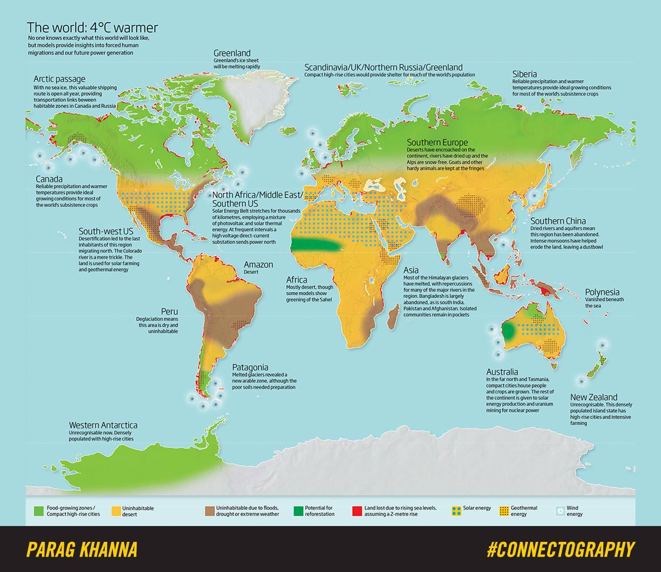
Humanity faces few larger questions than what, exactly, to do about climate change — and, in a sense larger still, what climate change even means. We’ve all heard a variety of different future scenarios laid out, each of them based on different data. But data can only make so much of an impact unless translated into a form with which the imagination can readily engage: a visual form, for instance, and few visual forms come more tried and true than the map.
And so “leading global strategist, world traveler, and best-selling author” Parag Khanna has created the map you see above (view in a larger format here), which shows us the state of our world when it gets just four degrees celsius warmer. “Micronesia is gone – sunk beneath the waves,” writes Big Think’s Frank Jacobs in an examination of Khanna’s map. “Pakistan and South India have been abandoned. And Europe is slowly turning into a desert.”
But “there is also good news: Western Antarctica is no longer icy and uninhabitable. Smart cities thrive in newly green and pleasant lands. And Northern Canada, Scandinavia, and Siberia produce bountiful harvests to feed the hundreds of millions of climate refugees who now call those regions home.”
Not quite as apocalyptic a climate-change vision as some, to be sure, but it still offers plenty of considerations to trouble us. Lands in light green, according to the map’s color scheme, will remain or turn into “food-growing zones” and “compact high-rise cities.” Yellow indicates “uninhabitable desert,” brown areas “uninhabitable due to floods, drought, or extreme weather.” In dark green appear lands with “potential for reforestation,” and in red those places that rising sea levels have rendered utterly lost.
Those last include the edges of many countries in Asia (and all of Polynesia), as well as the area where the southeast of the United States meets the northeast of Mexico and the north and south coasts of South America. But if you’ve ever wanted to live in Antarctica, you won’t have to move into a research base: within a couple of decades, according to Khanna’s data, that most mysterious continent could become unrecognizable and “densely populated with high-rise cities,” presumably with their own hipster quarters. But where best to grow the ingredients for its avocado toast?
Based in Seoul, Colin Marshall writes and broadcasts on cities and culture. His projects include the book The Stateless City: a Walk through 21st-Century Los Angeles and the video series The City in Cinema. Follow him on Twitter at @colinmarshall or on Facebook.
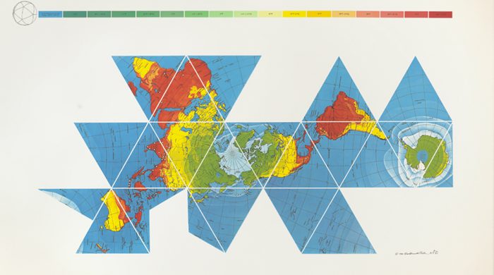
Last year, we shined a light on Buckminster Fuller’s Dymaxion Map. Unveiled back in 1943, the Dymaxion Map (shown below) revolutionized map design, allowing us to see our world in an entirely new way. As the Buckminster Fuller Institute describes it:
Also known as the “Dymaxion Map,” the Fuller Projection Map is the only flat map of the entire surface of the Earth which reveals our planet as one island in one ocean, without any visually obvious distortion of the relative shapes and sizes of the land areas, and without splitting any continents.
Fuller’s map has since inspired the award-winning AuthaGraph World Map, created by Japanese architect and artist Hajime Narukawa. And it led robotics engineer Gavin Smith to fashion The Dymaxion Globe, essentially by dividing the Dymaxion Map into triangles and and folding them into a three-dimensional figure. Smith explains the process of making a Dymaxion Globe over at Make Magazine. But above, you can watch it all happen in a video produced by Adam Savage’s Tested YouTube channel. They walk you through the creation of a laser-cut Dymaxion Globe. Enjoy.
We're hoping to rely on loyal readers, rather than erratic ads. Please click the Donate button and support Open Culture. You can use Paypal, Venmo, Patreon, even Crypto! We thank you!
Open Culture scours the web for the best educational media. We find the free courses and audio books you need, the language lessons & educational videos you want, and plenty of enlightenment in between.