This time of year especially, we complain about the greed and arrogance of airlines, the confusion and inefficiency of airports, and the sardine seating of coach. But we don’t have to go back very far to get a sense of just how truly painful long-distance travel used to be. Just step back a hundred years or so when—unless you were a WWI pilot—you traveled by train or by ship, where all sorts of misadventures might befall you, and where a journey that might now take several dull hours could take several dozen, often very uncomfortable, days. Before railroads crossed the continents, that number could run into the hundreds.
In the early 1840s, for example, notes Simon Willis at The Economist’s 1843 Magazine, “an American dry-goods merchant called Asa Whitney, who lived near New York, travelled to China on business. It took 153 days, which he thought was a waste of time.” It’s probably easier to swallow platitudes about destinations and journeys when the journey doesn’t take up nearly half the year and run the risk of cholera. By 1914, the explosion of railroads had reduced travel times considerably, but they remained at what we would consider intolerable lengths.
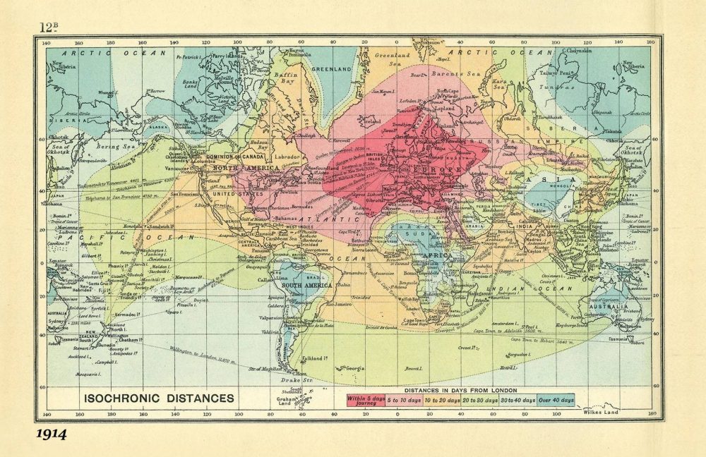
We can see just how long it took to get from place to place in the “isochronic map” above (view it in a large format here), which visualizes distances all over the globe. The railways “were well-established,” notes Gizmodo, “in Europe and the U.S., too, making travel far more swift than it had been in the past.” One could reach “the depths of Siberia” from London in under ten days, thanks to the Trans-Siberian Railway. By contrast, in Africa and South America, “any travel inland from the coast took weeks.”
The map, created by royal cartographer John G. Bartholomew, came packaged with several other such tools in An Atlas of Economic Geography, a book, Willis explains, “intended for schoolboys,” containing “everything a thrusting young entrepreneur, imperialist, trader or traveller could need.” All of the distances are measured in “days from London,” and color-coded in the legend below. Dark green areas, such as Sudan, much of Brazil, inland Australia, or Tibet might take over 40 days travel to reach. All of Western Europe is accessible, the map promises, within five days, as are parts of the east coast of the U.S., with parts further Midwest taking up to 10 days to reach.
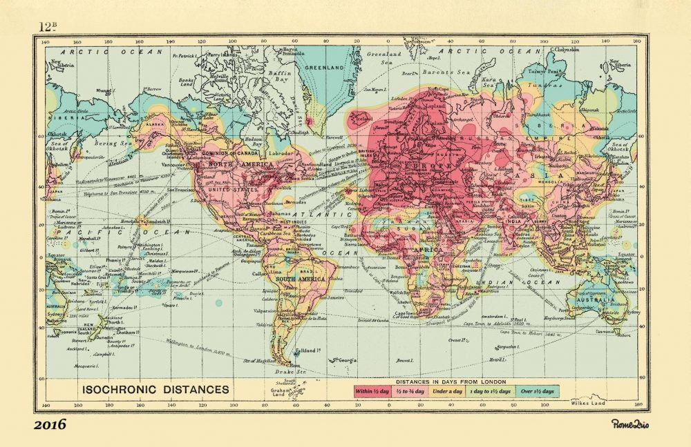
What might have seemed like wizardry to Walter Raleigh probably sounds like hell on earth to business class denizens everywhere. How do these journeys compare to the current age of rapid air travel? Rome2rio, a “comprehensive global trip planner,” aimed to find out by recreating Bartholomew’s map, updated to 2016 standards. You can see, just above (or expanded here), the same view of the world from its onetime imperialist center, London, with the same color-coded legend below, “Distances in Days from London.” And yet here, a journey to most places will take less than a day, with certain outer reaches—Siberia, Greenland, the Arctic Circle, stretching into two, maybe three.
Should we have reason to complain, when those of us who do travel—or who must—have it so easy compared to the danger, boredom, and general unpleasantness of long-distance travel even one-hundred years ago? The question presumes humans are capable of not complaining about travel. Such complaint may form the basis of an ancient literary tradition, when heroes ventured over vast terrain, slaying monsters, solving riddles, making friends, lovers, and enemies…. The epic dimensions of historic travel can seem quaint compared to the sterile tedium of airport terminals. But just maybe—as in those long sea and railway voyages that could span several months—we can discover a kind of romance amidst the queasy food courts, tacky gift shops, and motorized moving walkways.
via 1843 Magazine
Related Content:
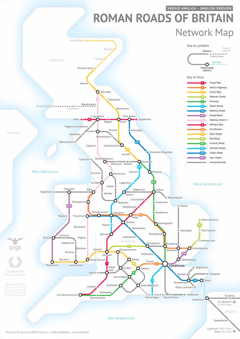
The Roman Roads of Britain Visualized as a Subway Map
Josh Jones is a writer and musician based in Durham, NC. Follow him at @jdmagness