New Yorkers have borne witness to a noticeable uptick in the number of shiny, new buildings going up in the city over the last few years, crowding the waterfront, rising from the ashes of community gardens and older, infinitely more modest structures.
Their developers have taken care to top load them with luxury amenities—rooftop cabanas, 24-hour fitness clubs, marble countertops, screening rooms.
But one thing they can’t provide is the sense of lived history that imbues every old building with a true sense of character, mystique, and oft-grubby charm.
I fear that the occupants of these newer buildings won’t have nearly as much fun as the rest of us searching for our current addresses on the NYC Municipal Archives’ interactive map, above.
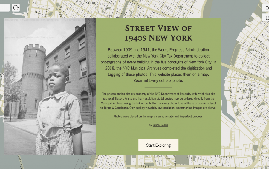
Every dot represents a Works Progress Administration photograph of a New York City building, snapped between 1939 and 1941 as a means of standardizing the way in which property values were assessed and recorded.
There are 4,282,000 dots, spread out between five boroughs.
Does that sound densely packed?
You should see it today… there’s been a lot of vertical build.
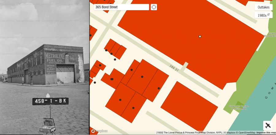
This unassuming fuel oil plant near Brooklyn’s Gowanus Canal has given way to a 430-unit building boasting a yoga room, spin studios, and valet services for those in need of dry-cleaning, laundry, apartment cleaning, or dog walking…though sadly, no on-premises motor oil. We find that omission somewhat surprising for such a full-service residential development on the banks of a Superfund site, whose clean up is estimated to tip the scales at $500 million.
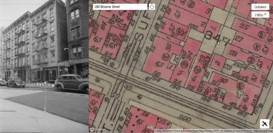

We also wonder what the occupants of the above buildings would have made of the glassy 25-story complex that opened on their coordinates earlier this year. Is it just us, or does it seem a bit disingenuous of its developers to trumpet that its location is “the epitome of New York City’s authenticity, with over a century of rich history, where the world’s sartorial and culinary trends are born”?
(You can find us a few blocks away muttering into our chopped liver at Russ and Daughters, a venerable food shop that looks much the same today as it did in 1940, though you’ll have to confirm with a bit of research on your own if you don’t want to take our word for it, the WPA “dot” revealing little more than a man with a stick and several moving vehicles.)
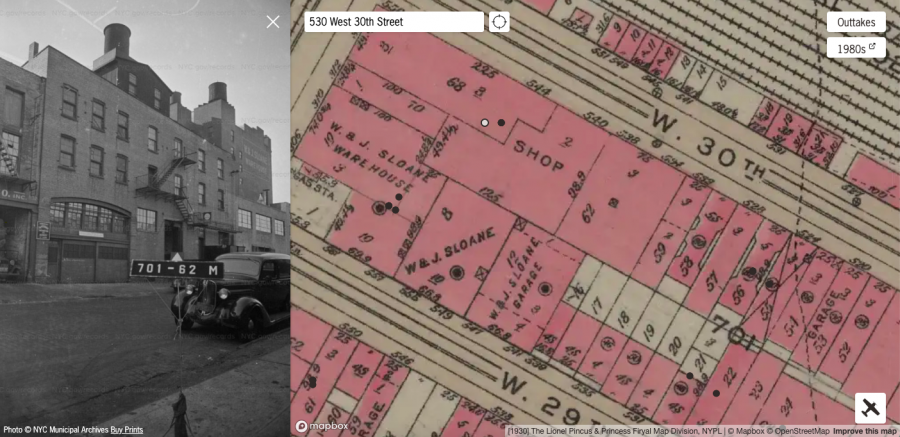
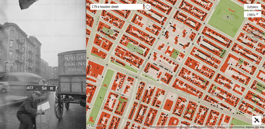
Our final stop is one of many architectural ghosts to haunt the Hudson Yards colossus, the self-described “epicenter of Manhattan’s New West Side… a beacon for creative professionals, a hub for fashion, design, communications and art.” In addition to a much reviled $200 million shawarma-shaped “3‑dimensional public space” and state of the art wine fridges, amenities now include diagnostic and antibody testing “performed by top medical professionals.”
It’s telling that in the summer of 2020, prospective tenants were offered incentives including two months’ free rent and a $2,000 gift card.
Proof, perhaps, that New York will continue as it always has—a city in constant flux. The prevalence of modern high rise buildings in dystopian fiction gives us pause.…
Explore the Street View of 1940s New York here.
Related Content:
New York Public Library Puts 20,000 Hi-Res Maps Online & Makes Them Free to Download and Use
Ayun Halliday is an author, illustrator, theater maker and Chief Primatologist of the East Village Inky zine. Follow her @AyunHalliday.