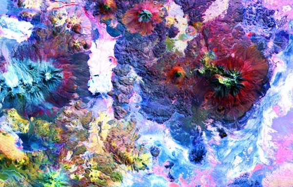
Since 1999, NASA has used ASTER (Japan’s Advanced Spaceborne Thermal Emission and Reflection Radiometer) to gather images of the Earth’s surface, providing a way to “map and monitor the changing surface of our planet.” They’ve mapped 99% of the planet’s surface over the years, generating nearly three million images, showing all kinds of things — “from massive scars across the Oklahoma landscape from an EF‑5 tornado and the devastating aftermath of flooding in Pakistan, to volcanic eruptions in Iceland and wildfires in California.”
And now, NASA is letting the public download and use those images at no cost. (Read the NASA announcement here.) You can access most of the images through a NASA database, and a smaller subset via an ASTER website.
To be completely honest, you’ll need some patience and technical chops to figure out how to download these images. The method wasn’t obvious to me. If anyone has some clarity on that, please let us know in the comments, and we’ll update the post to include your insights.
Up top, see an aerial shot of The Andes Mountains in Chile/Bolivia. Further down a shot of the Lena River in Russia.
If you would like to support the mission of Open Culture, consider making a donation to our site. It’s hard to rely 100% on ads, and your contributions will help us continue providing the best free cultural and educational materials to learners everywhere. You can contribute through PayPal, Patreon, and Venmo (@openculture). Thanks!
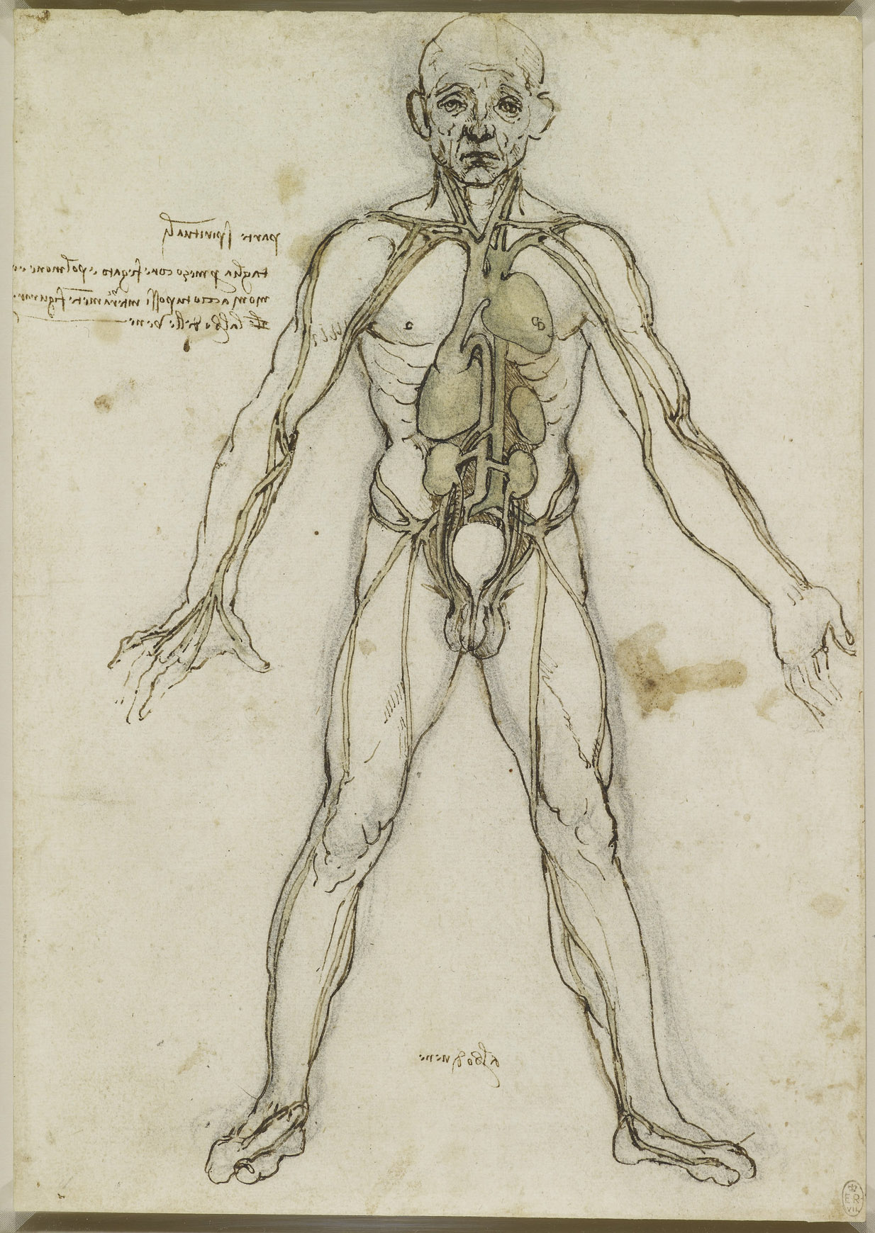
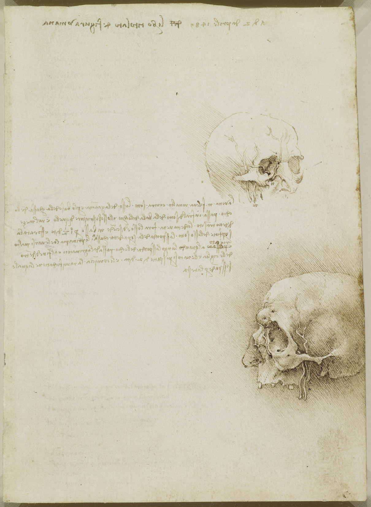
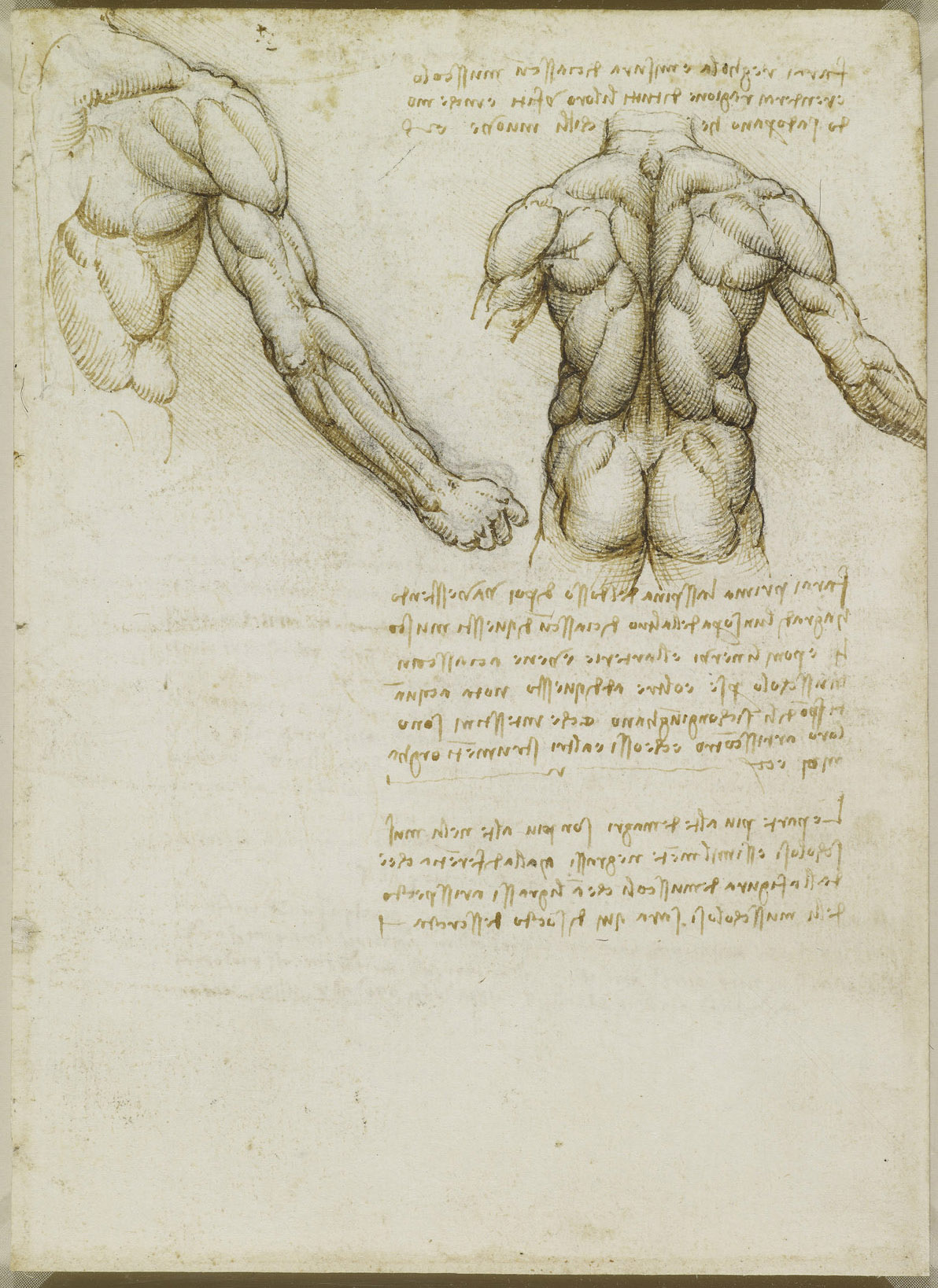
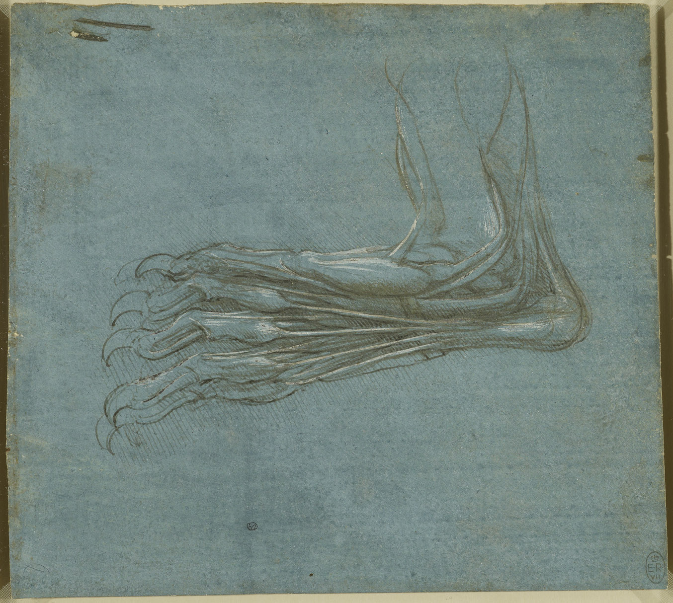
I’ve always found anatomical drawing fascinating. At its best, it occupies an aesthetic space somewhere between mystical fine art and cutting-edge scientific observation—a space carved out during the Italian Renaissance, when the boundaries between artistic training and scientific inquiry were permeable and often nonexistent.
Famously, the period introduced renderings of the human figure so anatomically accurate that “until about 1500–1510,” writes the Metropolitan Museum of Art, the artists’ “investigations surpassed much of the knowledge of anatomy that was taught at the universities.”
Artists like the great Michelangelo Buonnarroti and Leonardo da Vinci—as well as lesser-known figures like Antonio Pollaiuolo and Baccio Bandinelli—undertook “detailed anatomical dissections at various points in their long careers,” producing hundreds of sketches and studies alongside and in preparation for the muscular paintings and sculpture for which they’re best known.
Most Renaissance artists “became anatomists by necessity,” the Met points out, “as they attempted to refine a more lifelike, sculptural portrayal of the human figure.” Leonardo’s studies in anatomy, however, held a scientific interest all their own, akin to his investigations into the physics of flight, weapon and battlement design, architecture, and other pursuits.
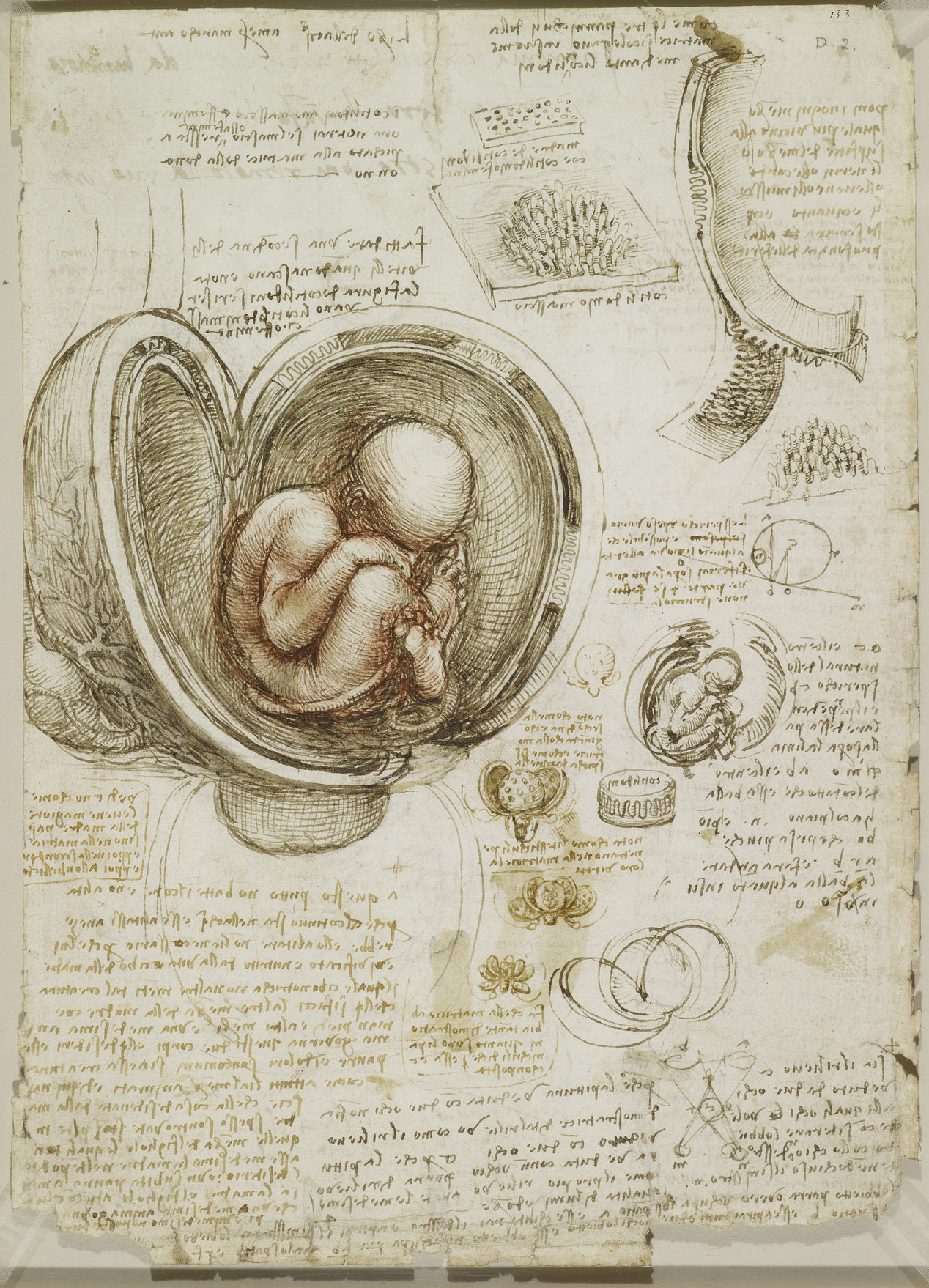
Many of Leonardo’s anatomical drawings contain detailed notes on his observations, as you can see in the study of a heavily-muscled torso and of a human cranium, further up. He wrote these notes using his proprietary right-to-left “mirror-writing” technique, which he reserved for his private notebooks. “Only when he was writing something intended for other people,” Boston’s Museum of Science informs us, “did he write in the normal direction.”
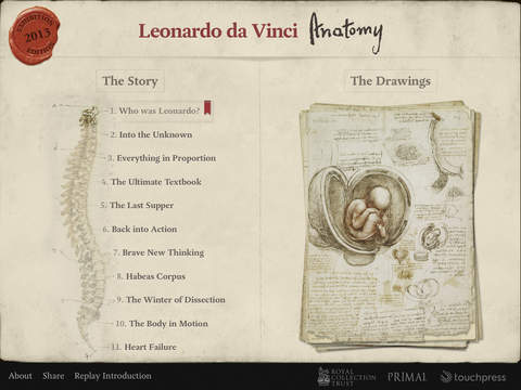
In addition to the many intriguing sketches, studies, and detailed illustrations in the Royal Collection Trust’s online archive, iPad owners can also search and view the collection on their devices with the free Leonardo da Vinci Anatomy app (screenshot above). “For the first time,” writes the description, “it is possible for anyone with an iPad to own and explore this remarkable testament to Leonardo’s scientific and artistic genius…. All 268 pages from Leonardo’s notebooks are presented here at the highest resolution, optimized for the pin-sharp retina display of the iPad.” The app includes incredibly helpful features like English translations of the notes, as well as essays and interviews with experts discussing the significance of Leonardo’s discoveries.
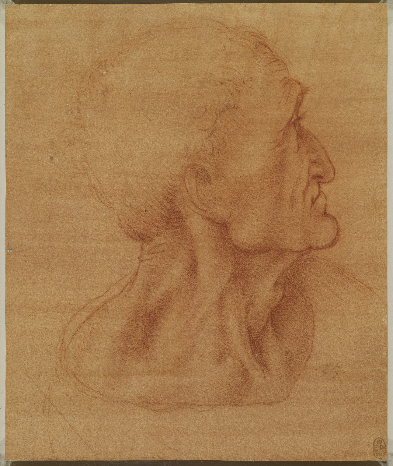
Whether you own an iPad or not, you can benefit immensely from this collection. The online version allows viewers to download high-resolution images like the “Head of Judas” sketch in red chalk above (c. 1495). Once on the page, click the download arrow to the bottom right of the drawing and you’ll be taken to a larger version of the image. You can zoom in to examine details, like the very fine lines and subtle shading that mark each of Leonardo’s illustrations, from the most utilitarian to the most artistically-rendered, as the special creations of an extraordinary artist with a gifted scientific mind.
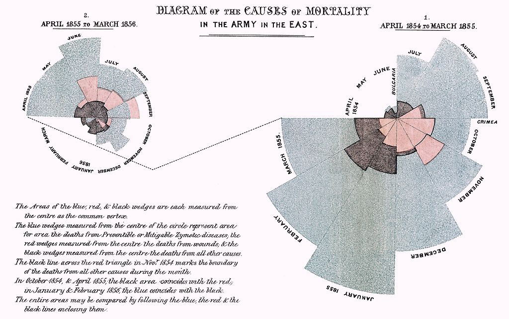
I’ve long counted myself as a fan of Edward Tufte, the preeminent living expert on the visual display of quantitative information. I like to think this puts me in the company of Florence Nightingale, founder of modern nursing as well as a prolific writer and still today a household name. Having lived in the Victorian era, she of course never got to enjoy the work of Tufte himself, though her own zeal for data and statistics, in a time that valued such things less than ours, made her, in some sense, a Tufte of her day: the first female member of the Royal Statistical Society and an honorary member of the American Statistical Association. The video above, an outtake from Hans Rosling’s The Joy of Stats, offers a brief introduction to the statistical side of Nightingale’s career, and the important role data visualization played in her mission to save lives.
“When Florence Nightingale arrived at a British hospital in Turkey during the Crimean War, she found a nightmare of misery and chaos,” writes Science News’ Julie Rehmeyer. “By the time Nightingale left Turkey after the war ended in July 1856, the hospitals were well-run and efficient, with mortality rates no greater than civilian hospitals in England.”
But feeling great regret over all the lives lost there to preventable disease, she went on to save even more of them by bringing numbers into play. She specifically compiled “vast tables of statistics about how many people had died, where and why. Many of her findings shocked her. For example, she discovered that in peacetime, soldiers in England died at twice the rate of civilians — even though they were young men in their primes.”
Nightingale’s most influential presentation of her data, which she called a “coxcomb,” appears just above. This Is Statistics describes “Diagram of the Causes of Mortality in the Army in the East” as “similar to a pie chart, but more intricate. In a pie chart the size of the ‘slices’ represent a proportion of data, while in a coxcomb the length, which the slice extends radially from the center-point, represents the first layer of data.” Her famous chart “was divided evenly into 12 slices representing months of the year, with the shaded area of each month’s slice proportional to the death rate that month. Her color-coded shading indicated the cause of death in each area of the diagram.” She stated the goal of her visualization clearly: “to affect thro’ the Eyes what we fail to convey to the public through their word-proof ears.”
We all try to do the very same thing when we present information today, though few of us—even armed with a degree of number-crunching and graphic design powers that would have seemed magical to Nightingale and her contemporaries—achieve the kind of results she did. She galvanized systemic change in hospital design and operation as well as prompted a revolution in sanitation which increased Britain’s average national life expectancy by 20 years—something to bear in mind when we start to get big ideas about how our Powerpoint slide shows will change the world.
If you would like to support the mission of Open Culture, consider making a donation to our site. It’s hard to rely 100% on ads, and your contributions will help us continue providing the best free cultural and educational materials to learners everywhere. You can contribute through PayPal, Patreon, and Venmo (@openculture). Thanks!
If I had my way, more academics would care about teaching beyond the walls of the academy. They’d teach to a broader public and consider ways to make their material more engaging, if not inspiring, to new audiences. You can find examples out there of teachers who are doing it right. The heirs of Carl Sagan–Brian Greene, Neil deGrasse Tyson, and Bill Nye–know how to light a spark and make their material come alive on TV and YouTube. How they do this is not exactly a mystery, not after M.I.T. posted online a course called “Becoming the Next Bill Nye: Writing and Hosting the Educational Show.”
Taught at M.I.T. over a month-long period, Becoming the Next Bill Nye was designed to teach students video production techniques that would help them “to engagingly convey [their] passions for science, technology, engineering, and/or math.” By the end of the course, they’d know how to script and host a 5‑minute YouTube show.
Does intelligent life exist elsewhere in the universe? The question has captivated humankind for centuries upon centuries; long before the X‑Files popularized the declaration, we’ve wanted to believe. But this curiosity-driven desire goes hand-in-hand with mortal fear: what if intelligent life does exist elsewhere in the universe, and it decides to come to Earth and exterminate us? Turn-of-the-century sci-fi master H.G. Wells tapped into that emotional current with The War of the Worlds; forty years later, Orson Welles tapped it deeper still with his adaptation of Wells’ novel, “a certain notorious radio broadcast which some of you may remember.”
That’s how Welles puts it from the narrator’s seat of Who’s Out There?, a half-hour television documentary originally broadcast in 1971. “It starts off strong with its Doctor Who-esque credits sequence,” writes io9’s Katharine Trendacosta. “Then Welles talks about becoming friends with H.G. Wells after his infamous War of the Worlds radio play. Then they interview people who had been scared by the broadcast. It gets barely more normal as it goes on. Once Carl Sagan showed up, my head exploded.”
I listened to Welles’ War of the Worlds over and over again on tape as a kid, but by that time it had already passed into the realm of historical artifact. When Who’s Out There? debuted, however, that infamous Halloween broadcast had aired less than 35 years before (Who’s Out There? itself, by comparison, aired 45 years ago), so the fright it caused remained in living memory. Even more recently, David Bowie had capitalized artistically on a new wave of outer-space fascination with “Space Oddity” in 1969 and, more directly, “Life on Mars?” two years later.
“Life on Mars?” acts as more or less the animating question of this documentary, which both examines the then-current evidence for such a phenomenon, on the Red Planet or elsewhere, and ponders why we so often assume that visitors from outer space will come with malevolent intentions. (Welles wonders aloud if it has to do with our having named Mars after the Roman god of war, and I suppose he has a point.) Still, our curiosity hasn’t gone away, as evidenced by ExoMars, the joint mission of the European Space Agency and the Russian Federal Space Agency which today launches probes out to search for, yes, life on mars. If whoever’s out there won’t come to us, well then, we’ll just have to go to them.
Who can now deny that, in the internet, we have the greatest educational tool ever conceived by mankind? Surely no Open Culture reader would deny it, anyway, nor could they fail to take an interest in a new startup aiming to increase the internet’s educational power further still: Pindex, which calls itself “a Pinterest for education.” No other company has yet staked that territory out, and certainly no other company has done it with the support of Stephen Fry.
The Telegraph’s Cara McCoogan describes Pindex, which launched just last month (visit it here), as “a self-funded online platform that creates and curates educational videos and infographics for teachers and students,” founded and run by a four-person team.
Fry’s role in the quartet includes offering “creative direction,” but he’s also put his unmistakable voice to one of Pindex’s first videos, an “explainer about the Large Hadron Collider, dark matter and extra dimensions. Other videos will focus on science and technology, including ones on the Hyperloop, colonising Mars, and robots and drones. Mr Fry is expected to do the voiceovers for several of these.”
Two years ago, World Science U debuted on the net, promising to bring free science courses to anyone, from high schoolers to retirees. (We wrote about it here.) The courses would be taught by the top scientists in their fields, featuring lectures, animations, interactive exercises, feedback, and even virtual office hours. At the time, however, Brian Greene’s project to bring the latest in research on string theory, particle physics, dark energy, relativity and more featured only two courses.
Since then, World Science U has taken off. It now offers “Science Unplugged,” a series of short videos that offer answers to layperson questions about science; “Master Classes” which are short classes about various subjects (mostly in physics) that take a few hours to complete; and “University Courses” which take eight to ten weeks to complete and are designed for the more advanced learner. These latter two offerings offer certificates upon completion.
Ted Mills is a freelance writer on the arts who currently hosts the artist interview-based FunkZone Podcast. You can also follow him on Twitter at @tedmills, read his other arts writing at tedmills.com and/or watch his films here.
If I could send a message back in time, I might send it to the wide-eyed and skyward-looking children of 1960s America, apologizing that we never did build those jetpacks, flying cars, and moon colonies, but also letting them know that at least we, the citizens of the 21st century, have developed such technologies as smartphones and a myriad of ways for snack foods to taste both sweet and salty at once.
I probably wouldn’t tell them how many of us long for the spirit of their own time, which American history has labeled “the Space Age” for good reason. It had its share of awfulness, starting with the apocalyptic tensions of the Cold War, but that competition between societies did spur mankind to voyage boldly and unhesitatingly out into the great beyond, at least for a while there.
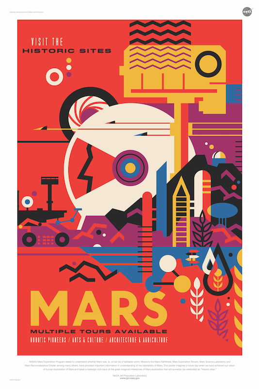
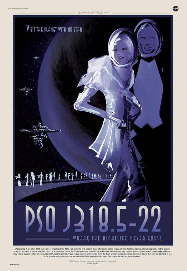
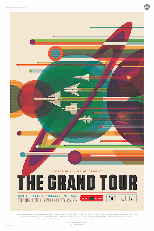
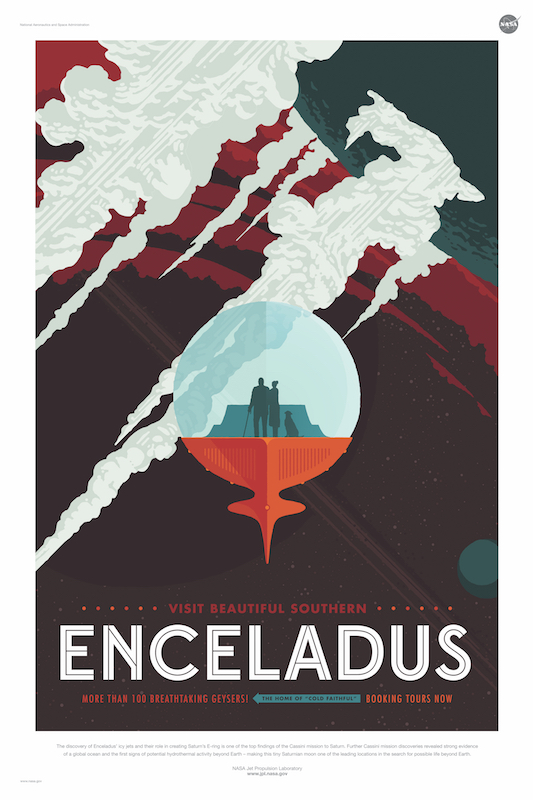
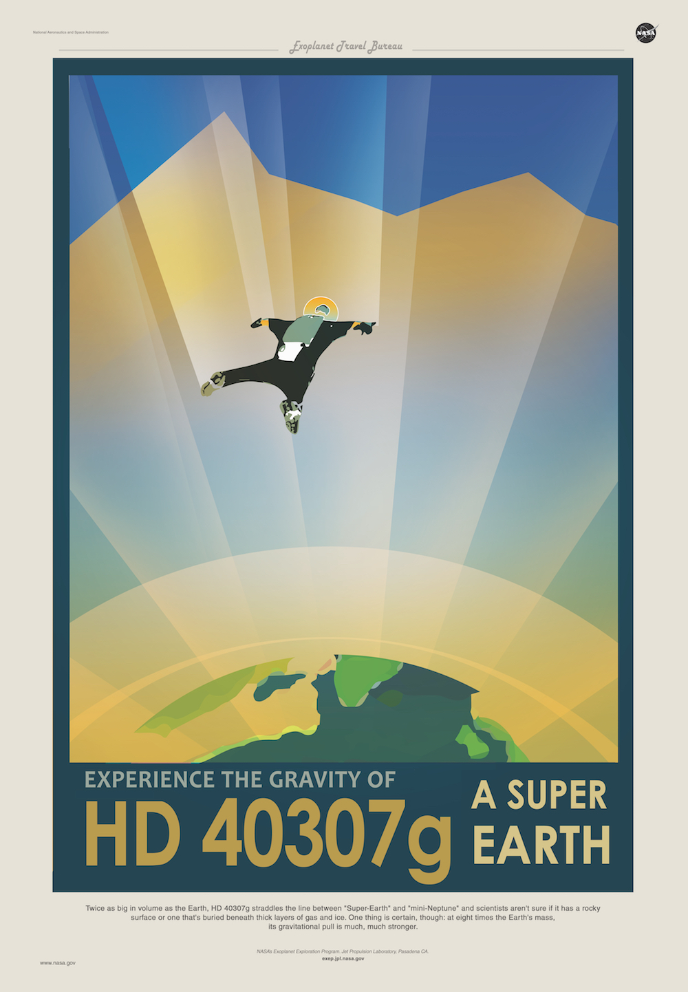
“Back in the 1930s and ’40s, during the height of the Great Depression,” writes Hyperallergic’s Allison Meier, “artists designed posters for the Works Projects Administration (WPA) to encourage travel to national parks and other tourist sites in the United States. NASA’s Jet Propulsion Laboratory (JPL) design studio is taking a similar approach to promote a future of travel to other planets at a time when its funding is up against budget constraints and even a journey to our galactic neighbor Mars may seem almost impossible.” And so we have this brand new series of fourteen Visions of the Future, free to download, print, and hang above your desk to fuel your own outer-space daydreaming.
You’ll notice that all the artists commissioned have designed their space-travel posters—whether they promote the high gravity of the “super Earth” exoplanet HD 40307g, the one-day “Historic Sites of Mars,” or the “Grand Tour” of the Solar System—in a richly retro style reminiscent of 1930s air travel advertisements. This makes them artistically captivating, but also emphasizes the continuity between our present, the century behind us, and the centuries ahead. “As you look through these images of imaginative travel destinations,” says NASA/JPL’s site, “remember that you can be an architect of the future” — and every future worthy of the name comes built solidly upon a past.
We're hoping to rely on loyal readers, rather than erratic ads. Please click the Donate button and support Open Culture. You can use Paypal, Venmo, Patreon, even Crypto! We thank you!
Open Culture scours the web for the best educational media. We find the free courses and audio books you need, the language lessons & educational videos you want, and plenty of enlightenment in between.